Interactive Plotting in Python using Bokeh
Bokeh is an interactive Python data visualization library built on top of javascript. It provides easy to use interface which can be used to design interactive graphs fast to perform in-depth data analysis.
Bokeh is a very versatile library. Apart from interactive charts, we can also add widgets (dropdowns, checkboxes, buttons, etc) to chart to add a further level of interactivity.
We can create animations as well using Bokeh.
Bokeh has rich support for creating dashboards. We can create and deploy wonderful dashboards using bokeh.
It even has support for working with streaming data which is a wonderful future. We can stream live data in charts as we receive it.
What Can You Learn From This Article?
As a part of this tutorial, we have covered how to create interactive charts in Jupyter notebook using Python data visualization library bokeh. Tutorial covers basic charts like scatter plots, line charts, bar charts, area charts, etc. Tutorial also covers how we can combine more than one chart to represent more information. Tutorial is a good starting point for someone who is totally new to Bokeh library.
Below, we have listed important sections of tutorial to give an overview of the material covered.
Important Sections Of Tutorial
- Load Datasets
- Autompg dataset
- Google OHLC dataset
- Apple OHLC dataset
- Steps to Create Charts using Bokeh
- Scatter Plots
- Modify Chart Attributes
- Line Plots
- Step Charts
- Bar Charts
- Horizontal Bar Chart
- Stacked Bar Chart
- Grouped Bar Chart
- Histograms
- Pie Charts
- Donut Chart
- Area Charts
- Stacked Area Chart
- Box Plots
- Heatmaps
- Hexbin Plots
- Rectangles
- Patches & Polygons
Bokeh Video Tutorial
Please feel free to check below video tutorial if feel comfortable learning through videos. We have covered three different chart types in video. But in this tutorial, we have covered many different chart types.
Below, we have imported bokeh and printed the version that we have used in our tutorial.
import bokeh

print("Bokeh Version : {}".format(bokeh.__version__))
Inform Bokeh to Plot Charts in Jupyter Notebook
Plotting through bokeh.plotting module requires a list of common imports based on where you want resulting plot to be displayed (Jupyter Notebook or New browser tab or save to file)
As a part of this tutorial, we'll be using output_notebook() to display all graphs inside the notebook.
If you don't call this method then bokeh will save charts to a temporary HTML file and open it in new browser tab. You need to call below method to inform bokeh to plot charts inside of Jupyter notebook.
from bokeh.io import output_notebook

output_notebook()

The successful execution of the above statement will show a message saying BokehJS 2.4.3 successfully loaded..
After calling output_notebook(), all subsequent calls to show() will display output graphs in notebook else it'll open graphs in a new browser tab.
1. Load Dataset 
We need to load datasets that we'll be using for our purpose through this tutorial.
Bokeh provides a list of datasets as pandas dataframe as a part of its bokeh.sampledata module.
1.1 AutoMpg Dataset
The first dataset that, we'll be using is autompg dataset which has information about car models along with their mpg, no of cylinders, disposition, horsepower, weight. acceleration, year launched, origin, name, and manufacturer.
from bokeh.sampledata.autompg import autompg_clean as autompg_df
autompg_df.head()
1.2 Google Stock OHLC Dataset
Another dataset that we'll be using for our purpose is google stock dataset which has information about stock open, high, low, and close prices per business day as well as daily volume data.
from bokeh.sampledata.stocks import GOOG as google
import pandas as pd

google_df = pd.DataFrame(google)
google_df["date"] = pd.to_datetime(google_df["date"])
google_df.head()
1.3 Apple Stock OHLC Dataset
The third dataset that we'll be using for our purpose is apple stock dataset which has information about stock open, high, low, and close prices per business day as well as daily volume data.
from bokeh.sampledata.stocks import AAPL as apple

import pandas as pd

apple_df = pd.DataFrame(apple)
apple_df["date"] = pd.to_datetime(apple_df["date"])
apple_df.head()
2. Steps to Create Charts using Bokeh 
Below are common steps to be followed to create graphs.
- Calling output_notebook() for displaying graphs in Jupyter Notebook or output_file() for opening in new tab / saving to file from bokeh.io.
- Create Figure object using figure() function of bokeh.plotting Module.
- Add Glyphs (lines, points, bars, etc) to figure by calling methods like circle(), line(), vbar(), varea(), etc on Figure object.
- Calling show() method for showing graphs in jupyter notebook/new browser tab or save() for saving to file from bokeh.io.
3. Scatter Plots 
We'll start by plotting simple scatter plots. Plotting graphs through bokeh has generally below mentioned simple steps.
- Create figure using figure().
- Call any glyph function (like circle(),square(), cross(), etc) on figure object created above.
- Call show() method passing it figure object to display the graph.
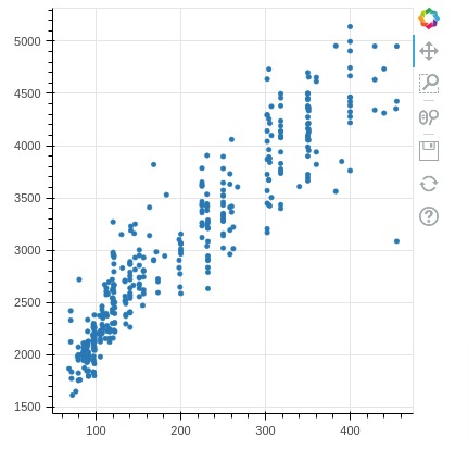
Our first scatter plot consists of autompg displ column versus weight column.
from bokeh.io import show
from bokeh.plotting import figure

fig = figure(plot_width=400, plot_height=400)

fig.circle(x=autompg_df["displ"], y=autompg_df["weight"])

show(fig)
Below, we have explained one more way to create same scatter plot as previous cell. We can specify data source using source attribute. Once we specify data source, we can provide values of parameters like x, y, size, color, etc as column names of data source.
from bokeh.io import show
from bokeh.plotting import figure

fig = figure(plot_width=400, plot_height=400)

fig.circle(x="displ", y="weight", source=autompg_df)

show(fig)
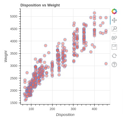
3.1 Modify Chart Attributes
We can see that it just plots graphs and lacks a lot of things like x-axis label, y-axis label, title, etc.
We'll now try various attributes of circle() to improve a plot little.
The default value for size attribute is 4 which we'll change below along with circle color and circle edge color.
We also have added attributes like alpha (responsible for transparency of glyph-circle), line_color (line color of glyph-circle), fill_color (color of glyph-circle).
We can also modify the x-axis and y-axis labels by accessing them through figure object and then setting axis_label attribute with label names.
We can also set plot width, height, and title by setting value of parameters plot_height, plot_width, and title of figure() method.
from bokeh.io import show
from bokeh.plotting import figure

fig = figure(plot_width=400, plot_height=400, title="Disposition vs Weight")

fig.circle(x="displ", y="weight",
           size=10, alpha=0.5,
           line_color="dodgerblue", fill_color="tomato",
           source=autompg_df
          )

fig.xaxis.axis_label="Disposition"
fig.yaxis.axis_label="Weight"

show(fig)
We can even use glyphs other than circles as well for plotting. Below we have given some of the glyphs provided for plotting.
- asterisk()
- circle()
- circle_cross()
- circle_x()
- cross()
- dash()
- diamond()
- diamond_cross()
- inverted_triangle()
- square()
- square_cross()
- square_x()
- triangle()
- x()
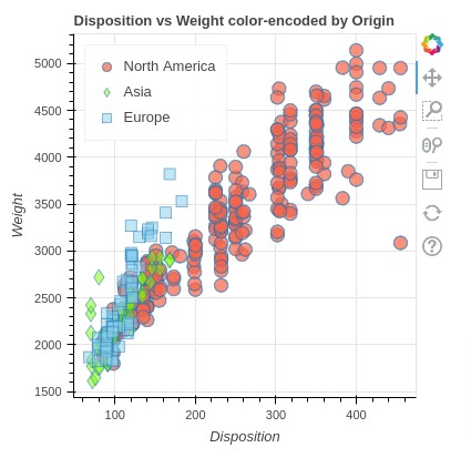
We can also combine glyphs of different types to create a scatter chart with different types of markers as described below.
We are plotting autompg displ vs weight per region by representing entries of each region with different glyphs.
We also introduced a new parameter named legend_name which will be used to set legend values.
We are also setting location legend as top_left by accessing the legend object from the figure object.
from bokeh.io import show
from bokeh.plotting import figure

fig = figure(plot_width=400, plot_height=400, title="Disposition vs Weight color-encoded by Origin")

fig.circle(
           x="displ",
           y="weight",
           fill_color="tomato",
           size=12, alpha=0.7,
           legend_label="North America",
           source=autompg_df[autompg_df["origin"]=="North America"]
        )

fig.diamond(
           x="displ",
           y="weight",
           fill_color="lawngreen",
           size=14, alpha=0.5,
           legend_label="Asia",
           source=autompg_df[autompg_df["origin"]=="Asia"]
        )

fig.square(
           x="displ",
           y="weight",
           fill_color="skyblue",
           size=10, alpha=0.5,
           legend_label="Europe",
           source=autompg_df[autompg_df["origin"]=="Europe"]
        )

fig.xaxis.axis_label="Disposition"
fig.yaxis.axis_label="Weight"

fig.legend.location = "top_left"

show(fig)
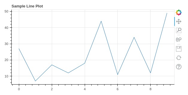
4. Line Plots 
Our second plot type will be a line plot. We'll be explaining it with a few examples below.
We can simply pass x and y values to line() method of figure object to create a line chart.
We'll be first creating a line chart of random data generated through numpy.
from bokeh.io import show
from bokeh.plotting import figure
import numpy as np

fig = figure(plot_width=600, plot_height=300, title="Sample Line Plot")

fig.line(x=range(10), y=np.random.randint(1,50, 10))

show(fig)
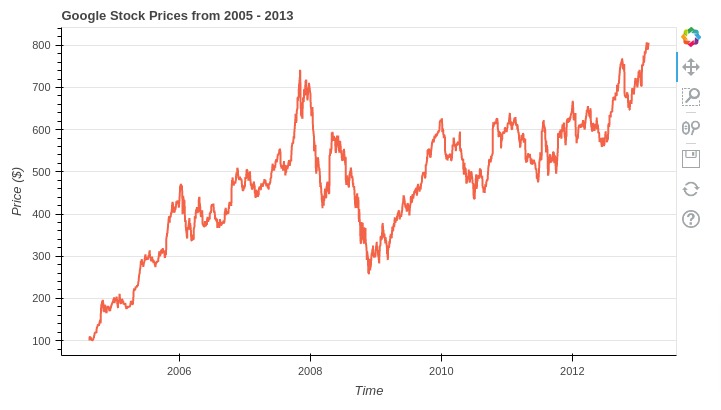
Below we are creating another line chart that depicts changes in the close price of google stock over time using the dataframe which we had created above.
We are also setting various attributes that we have mentioned above to improve the aesthetics of the graph.
We can change the line color and line format by setting line_color and line_dash parameters of line() function. We also have introduced a parameter named line_width which modifies the width of line based on integer provided to it by that many pixels.
We also introduced ways to modify grid settings of the graph. We can access x-grid and y-grid from figure object and then set parameters like grid_line_color and grid_line_alpha to set the grid line color and line transparency.
Please make a NOTE that we have set x_axis_type parameter of figure() function to datetime this time. We need to set axis type to datetime value if data we are plotting on that axis is date or datetime type.
from bokeh.io import show
from bokeh.plotting import figure

fig = figure(plot_width=700, plot_height=400, x_axis_type="datetime", title="Google Stock Prices from 2005 - 2013")

fig.line(x="date", y="close", line_width=2, line_color="tomato", source=google_df)

fig.xaxis.axis_label = 'Time'
fig.yaxis.axis_label = 'Price ($)'

fig.xgrid.grid_line_color=None
fig.ygrid.grid_line_alpha=1.0

show(fig)
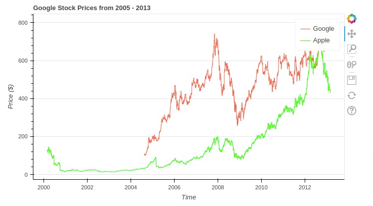
Below, we have created one more example showing how we can add more than one line to line chart.
This time, we have added Apple and Google stock prices to chart. We have a separate dataframe for both where we have close prices.
We have also set legend_label parameter which will add legend to our chart.
from bokeh.io import show
from bokeh.plotting import figure

fig = figure(plot_width=700, plot_height=400, x_axis_type="datetime", title="Google Stock Prices from 2005 - 2013")

fig.line(x="date", y="close", line_width=1, line_color="tomato",
         legend_label="Google", source=google_df)
fig.line(x="date", y="close", line_width=1, line_color="lime",
         legend_label="Apple", source=apple_df)

fig.xaxis.axis_label = 'Time'
fig.yaxis.axis_label = 'Price ($)'

fig.xgrid.grid_line_color=None
fig.ygrid.grid_line_alpha=1.0

show(fig)
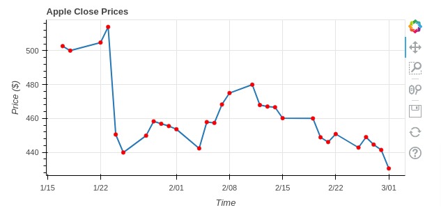
Below we have created one more example showing apple's close prices for last 30 values from dataframe. This time, we are combining line() and circle() to create a combined chart of both. We are highlighting joints of the line by circle glyph.
from bokeh.io import show
from bokeh.plotting import figure

fig = figure(plot_width=600, plot_height=300,
             x_axis_type="datetime",
             title="Apple Close Prices")

fig.line(x="date", y="close", line_width=2, source=apple_df[-30:])
fig.circle(x="date", y="close", color="red", size=5, source=apple_df[-30:])

fig.xaxis.axis_label = 'Time'
fig.yaxis.axis_label = 'Price ($)'

show(fig)
5. Step Charts 
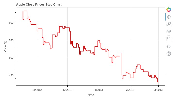
Another important glyph method provided for creating a line chart is step() which creates a line chart using step format.
Below, we have created a step chart showing close prices of apple stock. We have used last 90 values from our apple dataframe to plot chart. You can notice that total code is same as that of a line chart with only difference being that we are using step() method.
from bokeh.io import show
from bokeh.plotting import figure

fig = figure(plot_width=700, plot_height=400, x_axis_type="datetime",
             title="Apple Close Prices Step Chart")

fig.step(x="date", y="close", line_color="red", line_width=2, source=apple_df[-90:]
        )

fig.xaxis.axis_label = 'Time'
fig.yaxis.axis_label = 'Price ($)'

show(fig)
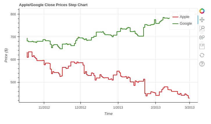
Below, we have created another example of step chart where we are creating step chart with two lines. We have created step chart using close prices of apple and google stocks data. We have used last 90 values from both datasets to keep things simple.
from bokeh.io import show
from bokeh.plotting import figure

fig = figure(plot_width=700, plot_height=400, x_axis_type="datetime",
             title="Apple/Google Close Prices Step Chart")

fig.step(x="date", y="close", line_color="red", line_width=2, legend_label="Apple",
         source=apple_df[-90:])
fig.step(x="date", y="close", line_color="green", line_width=2, legend_label="Google",
         source=google_df[-90:])

fig.xaxis.axis_label = 'Time'
fig.yaxis.axis_label = 'Price ($)'

show(fig)
6. Bar Charts 
In this section, we'll discuss various methods provided by bokeh to create bar charts. We'll discuss simple bar chart, horizontal bar chart, stacked bar chart, and grouped bar chart.
Bokeh provides a list of methods for creating bar charts.
- vbar()
- hbar()
- vbar_stack()
- hbar_stack()
We'll explain each using various examples.
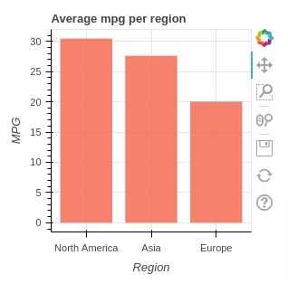
6.1 Vertical Bar Chart
In this example, we have created a simple vertical bar chart showing average mpg per region.
In order to create a bar chart, we have created a new dataframe from our original autompg dataframe using pandas grouped operation. This new dataframe has average values of dataframe columns based on origin of an automobile. We'll be using this dataframe to create a bar chart.
autompg_avg_by_origin = autompg_df.groupby(by="origin").mean().reset_index().reset_index()

autompg_avg_by_origin
Below, we have created a bar chart using our new dataframe showing average mpg per origin by calling vbar() method on figure object. The method accepts parameters x and top for setting x-axis values for each bar and height of each bar respectively.
Bar widths can be set using width parameter. We also have modified the look of the bar chart further by setting common attributes discussed above.
We have modified tick labels of the x-axis by accessing the x-axis through the figure object.
from bokeh.io import show
from bokeh.plotting import figure

fig = figure(plot_width=300, plot_height=300, title="Average mpg per region")

fig.vbar(x = "index", width=0.8, top="mpg",
         fill_color="tomato", line_width=0.0, alpha=0.8,
         source=autompg_avg_by_origin)

fig.xaxis.axis_label="Region"
fig.yaxis.axis_label="MPG"

fig.xaxis.ticker = [0, 1, 2]
fig.xaxis.major_label_overrides = {0: 'North America', 1: 'Asia', 2: 'Europe'}

show(fig)
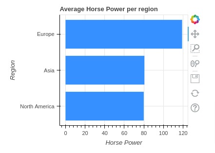
6.2 Horizontal Bar Chart
Below is another example of a bar chart but with a bar aligned horizontally. We have again created a bar chart showing average mpg per origin but bars are laid out horizontally.
We can create a horizontal bar chart using hbar() method of figure object. We need to pass y and right attributes to set y-axis values for each bar and height of each bar respectively.
We also have modified the look of the chart by modifying common attributes which we have already discussed above.
from bokeh.io import show
from bokeh.plotting import figure

fig = figure(plot_width=400, plot_height=300, title="Average Horse Power per region")

fig.hbar(y="index", height=0.8, right="hp",
         fill_color="dodgerblue", line_width=0.0,
         source=autompg_avg_by_origin
        )

fig.xaxis.axis_label="Horse Power"
fig.yaxis.axis_label="Region"

fig.yaxis.ticker = [0, 1, 2]
fig.yaxis.major_label_overrides = {0: 'North America', 1: 'Asia', 2: 'Europe'}

show(fig)
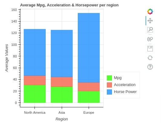
6.3 Stacked Bar Chart
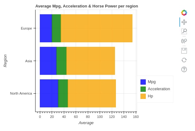
In this section, we have explained how to create stacked bar chart using bokeh. We have created a stacked bar chart showing average value of mpg, acceleration, and horse power per region.
We can create vertical stacked bar charts by calling vbar_stack() method on the figure object.
We need to pass the dataframe to source attributes of vbar_stack() method. We also need to pass a list of columns whose values will be stacked as a list to vbar_stack().
We can pass a list of colors to color attribute for setting the color of each stacked bar.
We also have modified other attributes to improve the look and feel of the chart.
We also have introduced a process to create a legend. We need to import Legend from bokeh.models module to create a legend as described below.
After creating a legend object with setting as described below, we need to add it to figure by calling add_layout() method on figure object and passing legend object along with its location.
from bokeh.io import show
from bokeh.plotting import figure
from bokeh.models import Legend

fig = figure(plot_width=500, plot_height=400, title="Average Mpg, Acceleration & Horsepower per region")

v = fig.vbar_stack(['mpg','accel', "hp"], x="index",
                   color=("lime", "tomato", "dodgerblue"),
                   width=0.8, alpha=0.8,
                   source=autompg_avg_by_origin)

fig.xaxis.axis_label="Region"
fig.yaxis.axis_label="Average Values"

fig.xaxis.ticker = [0,1,2]
fig.xaxis.major_label_overrides = {0: 'North America', 1: 'Asia', 2: 'Europe'}

legend = Legend(items=[
    ("Mpg",   [v[0]]),
    ("Acceleration",   [v[1]]),
    ("Horse Power",   [v[2]]),
], location=(0, 30))

fig.add_layout(legend, 'right')

show(fig)
6.4 Stacked Horizontal Bar Chart
In this section, we have explained how to create a horizontal stacked bar chart. We have again created stacked bar chart showing average values of mpg, acceleration, and horse power per origin.
Bokeh also provides a method named hbar_stack() to create a horizontal stacked bar chart.
We have explained its usage below with a simple example.
The process to create a horizontal stacked bar chart is almost the same as that of vertical one with few minor changes in parameter names.
from bokeh.io import show
from bokeh.plotting import figure

fig = figure(plot_width=600, plot_height=400, title="Average Mpg, Acceleration & Horse Power per region")

h = fig.hbar_stack(['mpg','accel', "hp"], y="index",
                   color=("blue", "green", "orange"),
                   height=0.85, alpha=0.8,
                   source=autompg_avg_by_origin)

fig.xaxis.axis_label="Average"
fig.yaxis.axis_label="Region"

fig.yaxis.ticker = [0,1,2]
fig.yaxis.major_label_overrides = {0: 'North America', 1: 'Asia', 2: 'Europe'}

legend = Legend(items=[
    ("Mpg",   [h[0]]),
    ("Acceleration",   [h[1]]),
    ("Hp",   [h[2]]),
], location=(0, 30))

fig.add_layout(legend, 'right')

show(fig)
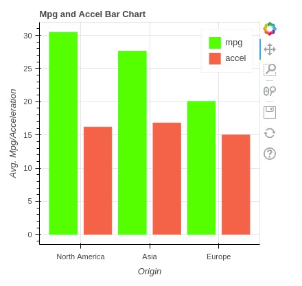
6.5 Grouped Bar Chart (Side by Side Bar Chart)
In this section, we have explained how to create grouped bar chart using bokeh. We have created grouped bar chart showing average values of mpg and acceleration per origin.
The creation of grouped bar chart is simple. We need to call vbar() method more than once.
In this example, we have provided actual values to parameters instead of strings which we have been doing for our previous few examples. We have not provided source parameter. The reason behind this is that we want to give different values for x parameter as you can see in code.
from bokeh.io import show
from bokeh.plotting import figure

fig = figure(plot_width=400, plot_height=400, title="Mpg and Accel Bar Chart")

fig.vbar(x = [1,3,5], width=0.8, top=autompg_avg_by_origin.mpg,
         fill_color="lime", line_color="lime",
         legend_label="mpg")

fig.vbar(x = [2,4,6], width=0.8, top=autompg_avg_by_origin.accel,
         fill_color="tomato", line_color="tomato",
         legend_label="accel")

fig.xaxis.axis_label="Origin"
fig.yaxis.axis_label="Avg. Mpg/Acceleration"
fig.legend.location = "top_right"

fig.xaxis.ticker = [1.5, 3.5, 5.5]
fig.xaxis.major_label_overrides = {1.5: 'North America', 3.5: 'Asia', 5.5: 'Europe'}

show(fig)
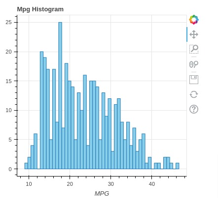
7. Histograms 
In this section, we have explained how to create histograms using bokeh. We have created histogram showing distribution of mpg values from our autompg dataframe.
We have first created bins of histogram using histogram() function available from numpy.
Then, we have created histogram using quad() method of figure object. We also have set various chart attributes to improve look and feel.
from bokeh.io import show
from bokeh.plotting import figure

import numpy as np

hist, edges = np.histogram(autompg_df["mpg"].values, bins=50)

fig = figure(plot_width=400, plot_height=400, title="Mpg Histogram")

fig.quad(top=hist, bottom=0, left=edges[:-1], right=edges[1:], fill_color="skyblue")

fig.xaxis.axis_label="MPG"

show(fig)
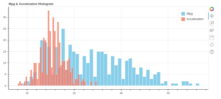
Below, we have created another example of histogram where we are showing distribution of two quantities.
- Mpg
- Acceleration
We have followed same code as previous example. We need to call quad() method twice to plot two different quantities.
from bokeh.io import show
from bokeh.plotting import figure

import numpy as np

mpg_hist, mpg_edges = np.histogram(autompg_df["mpg"].values, bins=50)
accel_hist, accel_edges = np.histogram(autompg_df["accel"].values, bins=50)

fig = figure(plot_width=900, plot_height=400, title="Mpg & Acceleration Histogram")

fig.quad(top=mpg_hist, bottom=0, left=mpg_edges[:-1], right=mpg_edges[1:],
         fill_color="skyblue", line_color="white", legend_label="Mpg")
fig.quad(top=accel_hist, bottom=0, left=accel_edges[:-1], right=accel_edges[1:], alpha=0.7,
         fill_color="tomato", line_color="white", legend_label="Acceleration")

show(fig)
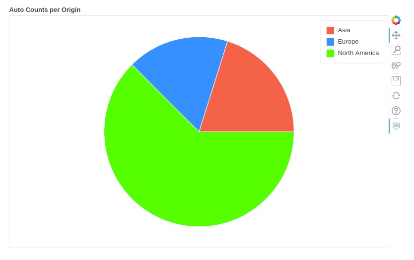
8. Pie Charts 
In this section, we have explained how to create pie charts using bokeh. We have created a simple pie chart showing count of auto entries per origin.
Below, we have created a new dataframe where we have calculated count of auto per origin using pandas groupby functionality. Then, we have also calculated angle in radians based on count. These are angles at which wedge of pie chart starts.
from math import pi

autompg_region_cnt = autompg_df.groupby("origin").count()[["mpg"]].rename(columns={"mpg": "Count"}).reset_index()
autompg_region_cnt['angle'] = autompg_region_cnt['Count'] / autompg_region_cnt['Count'].sum() * 2* pi
autompg_region_cnt['color'] = ["tomato", "dodgerblue", "lime"]

autompg_region_cnt
Below, we have created a pie chart by calling wedge() method on figure object. We have provided two important parameters to method.
- start_angle - For this one, we have provided start angles for wedges using cumsum() bokeh transform. It'll take values of angle column and perform cumulative sum on them so that we have start angles for wedges. We have set include_zero to True so that angle starts from 0.
- end_angle - For this parameter, we have again used cumsum() bokeh transform to calculate end angles of wedges.
In our case, we have three wedges for which we have provided start and end angles.
We can set radius using radius parameter of the method. The parameters x and y simply provide center location for pie chart. You can set it to (0, 0) majority of the time.
Apart from this, we have disabled axes and grids to make chart look clean.
from bokeh.io import show
from bokeh.plotting import figure
from bokeh.transform import cumsum

fig = figure(plot_width=800, plot_height=500,
             tooltips="@origin: @Count",
             title="Auto Counts per Origin")

fig.wedge(x=0, y=0, radius=0.5, start_angle=cumsum('angle', include_zero=True), end_angle=cumsum('angle'),
          line_color="white", fill_color='color', legend_field='origin', source=autompg_region_cnt)

fig.axis.visible=False
fig.grid.visible=False

show(fig)
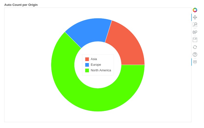
8.2 Donut Chart
Below, we have explained how to create donut chart using bokeh. We have created donut chart showing auto count per origin.
The code to create donut chart is exactly same as that of pie chart with only difference being that we need to specify inner_radius and outer_radius parameters which we have done below.
Apart from that, we have also set legend location to center of donut.
from bokeh.io import show
from bokeh.plotting import figure
from bokeh.transform import cumsum

fig = figure(plot_width=800, plot_height=500,
             tooltips="@origin: @Count",
             title="Auto Count per Origin")

fig.annular_wedge(x=0, y=0, inner_radius=0.25, outer_radius=0.5,
                  start_angle=cumsum('angle', include_zero=True), end_angle=cumsum('angle'),
                  line_color="white", fill_color='color', legend_field='origin', source=autompg_region_cnt)

fig.axis.visible=False
fig.grid.visible=False

fig.legend.location="center"

show(fig)
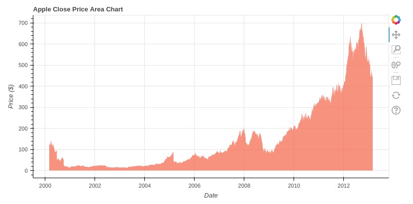
9. Area Charts 
In this section, we have explained how to create area charts using bokeh.
Areas plot lets us plot cover regions on plot. Bokeh provides below methods for creating area charts.
- varea()
- harea()
- varea_stack()
- harea_stack()
Below, we have created an area chart for close price of apple stock. The area below close price of stock is covered.
We have created an area chart using varea() method which highlights area between two horizontal lines. We need to pass x values for x-axis and y1 & y2 values of both lines. The area between these two lines will be highlighted with color settings passed.
In our case, x-axis values are dates, y1 values are set to 0 to start chart from bottom and y2 values are set to close prices of apple stock.
You can provide single value for y1 and y2 parameters or you can provide a list of values as well.
from bokeh.io import show
from bokeh.plotting import figure

fig = figure(plot_width=800, plot_height=400, x_axis_type="datetime",
             title="Apple Close Price Area Chart")

fig.varea(x=apple_df["date"],
          y1=0,
          y2=apple_df["close"],
          fill_color="tomato", alpha=0.7)

fig.xaxis.axis_label="Date"
fig.yaxis.axis_label="Price ($)"

show(fig)
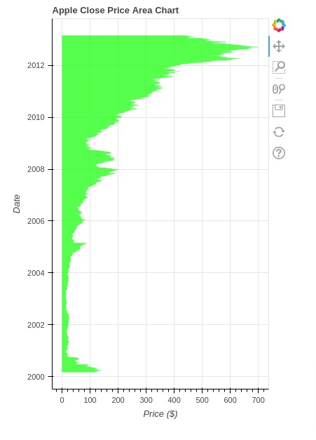
Bokeh provides another method named harea() which can be used to highlight an area between two vertical lines. It has almost the same settings as varea() with little change in parameter names.
from bokeh.io import show
from bokeh.plotting import figure

fig = figure(plot_width=400, plot_height=600, y_axis_type="datetime",
             title="Apple Close Price Area Chart")

fig.harea(y="date", x1=0, x2="close", fill_color="lime", alpha=0.7, source=apple_df)

fig.xaxis.axis_label="Price ($)"
fig.yaxis.axis_label="Date"

show(fig)
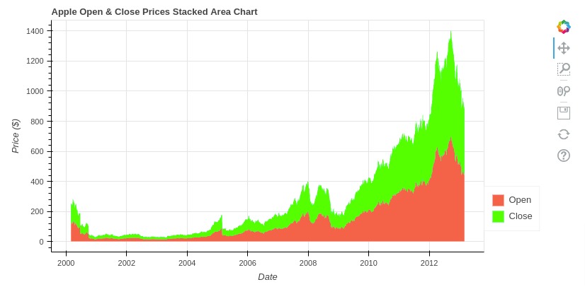
9.1 Stacked Area Chart
In this section, we have explained how to create stacked area chart.
We can create stacked area chart by calling varea_stack() method. The below example explains its usage in a simple way where we are creating stacked area chart of open and close prices of apple stock.
In the same way, we can use harea_stack() to highlight the area below two vertical lines.
from bokeh.io import show
from bokeh.plotting import figure
from bokeh.models import Legend

fig = figure(plot_width=800, plot_height=400, x_axis_type="datetime", title="Apple Open & Close Prices Stacked Area Chart")

v = fig.varea_stack(["open","close"],
                x="date",
                color=("tomato", "lime"),
                source=apple_df)

legend = Legend(items=[
    ("Open",   [v[0]]),
    ("Close",   [v[1]]),
], location=(0, 30))

fig.add_layout(legend, 'right')

fig.xaxis.axis_label="Date"
fig.yaxis.axis_label="Price ($)"

show(fig)
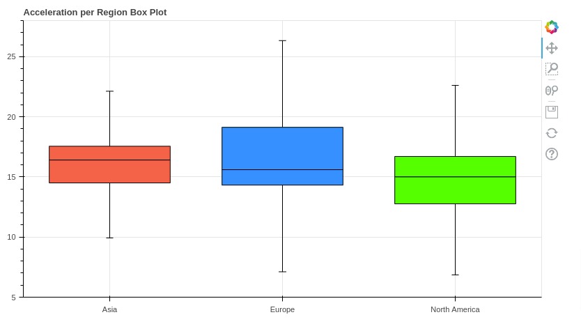
10. Box Plots 
In this section, we have explained how to create box plots using bokeh. We have created box plot showing distribution of acceleration values per origin.
In order to create box plot, we need to calculate quantile ranges first.
Below, we have first grouped autompg entries by origin and then called quantile() function on it to calculate 25%, 50%, and 75% quantiles.
Then, we have calculated upper and lower bounds of boxes using Q1 (25%) and Q3 (75%) values. We'll use these upper and lower values to create boxes for box plots.
We have also added color to boxes.
autompg_accel = autompg_df.groupby(by="origin")[["accel"]].quantile([0.2,0.5,0.75])

autompg_accel = autompg_accel.unstack().reset_index()

autompg_accel.columns = ["origin", "q1", "q2", "q3"]

iqr = autompg_accel.q3 - autompg_accel.q1 ## Interquantile Range
autompg_accel["upper"] = autompg_accel.q3 + 1.5*iqr
autompg_accel["lower"] = autompg_accel.q1 - 1.5*iqr
autompg_accel["color"] = ["tomato", "dodgerblue", "lime"]

autompg_accel
Below, we have created box plot showing distribution of acceleration per origin. The process of creating box plot is little different from other chart types.
We need to create an instance of Whisker and add it to chart using add_layout() method of figure. The Whisker object has details about box plot.
When creating whisker object, we have provided base parameter as origin, lower parameter as lower, upper parameter as upper string, and source parameter as new dataframe we created in previous cell. We have wrapped our dataframe in ColumnDataSource object as required by Whisker() constructor.
from bokeh.io import show
from bokeh.plotting import figure
from bokeh.models import Whisker, ColumnDataSource

fig = figure(plot_width=800, plot_height=450,
             x_range=autompg_accel.origin.unique(), y_range=(5,28),
             title="Acceleration per Region Box Plot")

whisker = Whisker(base="origin", lower="lower", upper="upper", source=ColumnDataSource(autompg_accel))

fig.add_layout(whisker)

fig.vbar("origin", 0.7, "q2", "q3", color="color", source=ColumnDataSource(autompg_accel), line_color="black")
fig.vbar("origin", 0.7, "q1", "q2", color="color", source=ColumnDataSource(autompg_accel), line_color="black")

show(fig)
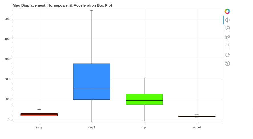
Below, we have created another box whisker plot where we are showing distribution of mpg, displacement, horse power, and acceleration.
We have followed same steps as our previous box plot.
First, we have created dataframe where we have quantile ranges and box bounds (upper, lower).
Then, we have created a box plot from this dataframe.
autompg_quantiles = autompg_df[["mpg", "displ", "hp", "accel"]].quantile([0.2,0.5,0.75])

autompg_quantiles = autompg_quantiles.T.reset_index()

autompg_quantiles.columns = ["Measurements", "q1", "q2", "q3"]

iqr = autompg_quantiles.q3 - autompg_quantiles.q1 ## Interquantile Range
autompg_quantiles["upper"] = autompg_quantiles.q3 + 1.5*iqr
autompg_quantiles["lower"] = autompg_quantiles.q1 - 1.5*iqr
autompg_quantiles["color"] = ["tomato", "dodgerblue", "lime", "orange"]

autompg_quantiles
from bokeh.io import show
from bokeh.plotting import figure
from bokeh.models import Whisker, ColumnDataSource

fig = figure(plot_width=800, plot_height=450,
             x_range=autompg_quantiles.Measurements.unique(), y_range=(-15,550),
             title="Mpg,Displacement, Horsepower & Acceleration Box Plot")

whisker = Whisker(base="Measurements", lower="lower", upper="upper", source=ColumnDataSource(autompg_quantiles))

fig.add_layout(whisker)

fig.vbar("Measurements", 0.7, "q2", "q3", color="color", source=ColumnDataSource(autompg_quantiles), line_color="black")
fig.vbar("Measurements", 0.7, "q1", "q2", color="color", source=ColumnDataSource(autompg_quantiles), line_color="black")

show(fig)
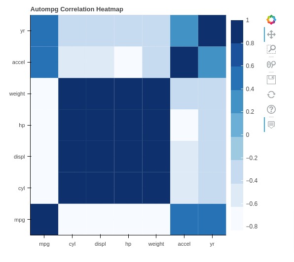
11. Heatmaps 
In this section, we have explained how to heatmap using bokeh. We have created heatmap showing correlation values between various columns of our auto mpg dataset.
Below, we have first created correlation dataframe by calling corr() function on auto mpg dataframe. This will create new dataframe where we have correlation values between various columns of our auto mpg dataset.
After calculating correlation, we have reorganized our correlation dataframe so that in new dataframe we have three columns where first & second column has names and third column has correlation value.
autompg_corr = autompg_df.corr()

autompg_corr
autompg_corr = autompg_corr.stack().reset_index()

autompg_corr.columns = ["Feature1", "Feature2", "Value"]

autompg_corr.head()
Below, we have created a heatmap showing correlation values based on correlation dataframe we created in previous cell.
We have used rect() method of figure object to create heatmap. All the rectangles of heatmap will be of size (1,1) which we have set through height and width attributes. The x and y axis will have column names.
For coloring rectangles of heatmap, we have used LinearColorMapper available from bokeh. It maps correlation values to Blues color map.
We have also included tooltip where we display column names and correlation values.
At last, we have also included color bar next to heat map using ColorBar() constructor.
You should be able to see correlation values between data columns in tooltip.
from bokeh.io import show
from bokeh.plotting import figure
from bokeh.palettes import Blues9 as Blues
from bokeh.models import BasicTicker, ColorBar, LinearColorMapper, PrintfTickFormatter

fig = figure(plot_width=550, plot_height=500,
             x_range=autompg_corr.Feature1.unique(), y_range=autompg_corr.Feature1.unique(),
             tooltips=[('Feature1', '@Feature1'), ('Feature2', '@Feature2'), ('Correlation', '@Value')],
             title="Autompg Correlation Heatmap")

## Map values to color using palette
mapper = LinearColorMapper(palette=Blues[::-1], low=autompg_corr.Value.min(), high=autompg_corr.Value.max())

## Rectangles of Heatmap
fig.rect(x="Feature1",y="Feature2",  width=1, height=1, fill_color={'field': 'Value', 'transform': mapper},
         line_width=0, source=autompg_corr)

## Color Bar
color_bar = ColorBar(color_mapper=mapper, major_label_text_font_size="12px",
                     ticker=BasicTicker(desired_num_ticks=len(Blues)))

fig.add_layout(color_bar, 'right')

show(fig)
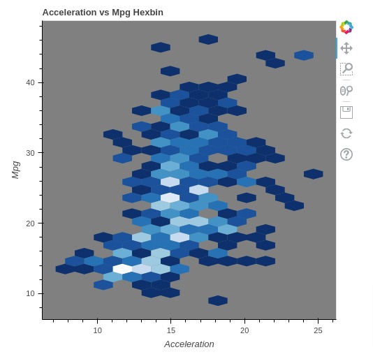
12. Hexbin Plots 
In this section, we have explained how to create hexbin plot using bokeh. We have created a hexbin plot showing relation between acceleration and mpg.
We have created hexbin plot by calling hexbin() method on figure object.
from bokeh.io import show
from bokeh.plotting import figure
from bokeh.palettes import Blues9 as Blues

fig = figure(plot_width=500, plot_height=500, title="Acceleration vs Mpg Hexbin",
             background_fill_color='grey')

fig.hexbin(x=autompg_df["accel"].values, y=autompg_df["mpg"].values, size=0.75, palette=Blues)

fig.grid.visible=False
fig.xaxis.axis_label="Acceleration"
fig.yaxis.axis_label="Mpg"


show(fig)
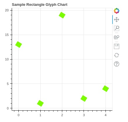
13. Rectangles 
We can also create rectangles on graphs using rect() and quad() methods. We have explained its usage below with examples.
Below we are creating a scatter plot of the rectangle. We need to pass width and height to define the size of rectangles. We can also change the angle of rectangles by setting angle parameter.
from bokeh.io import show
from bokeh.plotting import figure

fig = figure(plot_width=400, plot_height=400, title="Sample Rectangle Glyph Chart")

fig.rect(
         x=range(5), y=np.random.randint(1,25,size=5),
         width=0.2, height=1,
         angle=45,
         color="lawngreen",
        )

show(fig)
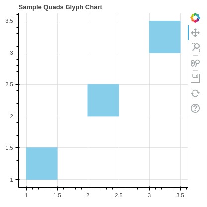
Bokeh provides a method named quad() to create square and rectangle shapes on the chart. We need to pass four lists representing top, bottom, left, and right of the shape. Below we are explaining its usage with simple settings.
from bokeh.io import show
from bokeh.plotting import figure

fig = figure(plot_width=400, plot_height=400, title="Sample Quads Glyph Chart")

fig.quad(top=[1.5, 2.5, 3.5], bottom=[1, 2, 3], left=[1, 2, 3],
       right=[1.5, 2.5, 3.5], color="skyblue")

show(fig)
14. Patches & Polygons 
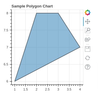
Bokeh let us create a polygon using a method named patch() and patches() which helps us create single and multiple patches respectively.
The below example creates a simple polygon using patch() method. We also have modified the look and feel of a polygon using various common attributes described above.
from bokeh.io import show
from bokeh.plotting import figure

fig = figure(plot_width=300, plot_height=300, title="Sample Polygon Chart")

fig.patch([1, 2, 3, 4], [6, 8, 8, 7],
          alpha=0.5,
          line_width=2, line_color="black")

show(fig)
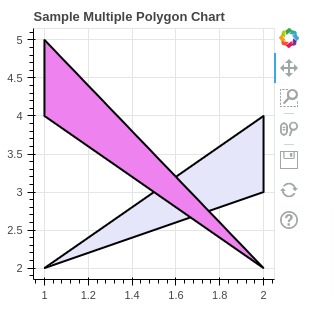
Another method provided by bokeh named patches() can be used to create multiple polygons on the same chart. We need to pass x and y values for each polygon as a list to patches() method. Each list passed to patches represents one polygon which itself consist of two list specifying x and y values of that polygon.
from bokeh.io import show
from bokeh.plotting import figure

fig = figure(plot_width=300, plot_height=300, title="Sample Multiple Polygon Chart")

fig.patches([[1, 2, 2, ], [2, 1, 1, ]],[[2,3,4],[2,4,5]],
             color=["lavender", "violet"],
             line_width=2, line_color="black")

show(fig)
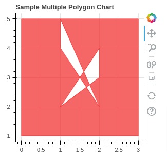
Bokeh provided another method named multi_polygons() which can be used to create polygon shapes as well. Below we have described its usage as well.
from bokeh.io import show
from bokeh.plotting import figure

fig = figure(plot_width=300, plot_height=300, title="Sample Multiple Polygon Chart")

fig.multi_polygons(
                    xs=[[[ [0, 3, 3, 0],[1, 2, 2], [2, 1, 1] ]]],
                    ys=[[[ [1, 1, 5, 5],[2, 3, 4], [2, 4, 5] ]]],
                    color="red", alpha=0.6
                 )

show(fig)
This ends our detailed tutorial on creating various charts using Python data visualization library bokeh.
References 
Bokeh Tutorials
- Bokeh Charts Styling
- Bokeh - Guide to Layout Charts
- Annotate Bokeh Charts
- Candlestick Charts using Bokeh
- Maps (Scatter, Choropleth, etc) using Bokeh
- Link Bokeh Charts with Widgets to Create Interactive GUIs
- Dashboard using Bokeh
- Pandas-Bokeh: Create Bokeh Charts from Pandas DataFrame with One Function Call
Other Python Data Visualization Libraries
 Sunny Solanki
Sunny Solanki
Intro: Software Developer | Youtuber | Bonsai Enthusiast
About: Sunny Solanki holds a bachelor's degree in Information Technology (2006-2010) from L.D. College of Engineering. Post completion of his graduation, he has 8.5+ years of experience (2011-2019) in the IT Industry (TCS). His IT experience involves working on Python & Java Projects with US/Canada banking clients. Since 2020, he’s primarily concentrating on growing CoderzColumn.
His main areas of interest are AI, Machine Learning, Data Visualization, and Concurrent Programming. He has good hands-on with Python and its ecosystem libraries.
Apart from his tech life, he prefers reading biographies and autobiographies. And yes, he spends his leisure time taking care of his plants and a few pre-Bonsai trees.
Contact: sunny.2309@yahoo.in


![YouTube Subscribe]() Comfortable Learning through Video Tutorials?
Comfortable Learning through Video Tutorials?
If you are more comfortable learning through video tutorials then we would recommend that you subscribe to our YouTube channel.
![Need Help]() Stuck Somewhere? Need Help with Coding? Have Doubts About the Topic/Code?
Stuck Somewhere? Need Help with Coding? Have Doubts About the Topic/Code?
 Stuck Somewhere? Need Help with Coding? Have Doubts About the Topic/Code?
When going through coding examples, it's quite common to have doubts and errors.
If you have doubts about some code examples or are stuck somewhere when trying our code, send us an email at coderzcolumn07@gmail.com. We'll help you or point you in the direction where you can find a solution to your problem.
You can even send us a mail if you are trying something new and need guidance regarding coding. We'll try to respond as soon as possible.
![Share Views]() Want to Share Your Views? Have Any Suggestions?
Want to Share Your Views? Have Any Suggestions?
 Want to Share Your Views? Have Any Suggestions?
If you want to
- provide some suggestions on topic
- share your views
- include some details in tutorial
- suggest some new topics on which we should create tutorials/blogs
 bokeh, data-visualization