How to Add Annotations to Bokeh Charts?
Annotation is a piece of extra information that you add to the chart like highlighting some things with arrows, bounding boxes, spans, bounds, labels, etc. When reading a book, we generally take notes by highlighting important text with markers. Annotation is something like that.
Charts can be annotated for different purposes like line chart can be annotated with arrows to show peaks/downfall at some places, some special points in a scatter chart can be labeled to draw attention to them, intervals in a chart can be shown using two vertical or horizontal lines, chart background can be colored in different ranges to show some effect, etc.
What Can You Learn From This Article?
As a part of this tutorial, we have explained how to add annotations of various types to your Python bokeh charts with simple and easy-to-understand examples. Tutorial covers annotations like labels, arrows, bands, bounding boxes, polygons, spans, slopes, etc. Examples of tutorial also cover various styling attributes to change look & feel of annotations.
If you are someone who is new to Python data visualization library bokeh then we would recommend that you check our simple tutorial on it. It'll get you started with a library in less time.
Below, we have listed important sections of tutorial to give an overview of the material covered.
Important Sections Of Tutorial
import bokeh

print("Bokeh Version : {}".format(bokeh.__version__))
We need to call below function to display bokeh charts in jupyter notebook.
from bokeh.io import output_notebook

output_notebook()
Load Datasets
In this section, we have loaded datasets that we'll use for our examples. We have loaded two sample datasets available from bokeh.
- Autompg: The dataframe has information like mpg, cylinders, displacement, horsepower, acceleration, etc for different car models.
- Apple OHLC: Dataset has OHLC data for apple stock.
Both datasets are available as pandas dataframe.
from bokeh.sampledata.autompg import autompg

autompg.head()
import pandas as pd
from bokeh.sampledata.stocks import AAPL, GOOG, FB, MSFT

apple_df = pd.DataFrame(AAPL)
apple_df["date"] = pd.to_datetime(apple_df.date)

apple_df.head()
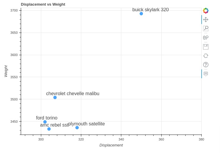
1. Labels Annotation 
The first annotation that we'll introduce is labels annotation which adds text above points in chart.
Below, we have simply created a scatter chart showing a relationship between displacement and weight of first 5 cars from Autompg dataset. Then, we added car names above points on chart.
We can add labels to chart by providing LabelSet object to add_layout() method of figure object. All annotations are available from 'bokeh.models' module.
We can create LabelSet object using LabelSet() constructor. We need to provide position of labels using x and y parameters. The text parameter lets us specify label text that will be displayed. We can move labels around points to prevent overlapping using x_offset and y_offset parameters.
from bokeh.plotting import figure
from bokeh.io import show
from bokeh.models import LabelSet, ColumnDataSource

tooltip_fmt = [("Name", "@{name}"),
               ("Displacement", "@displ"),
               ("Weight", "@{weight}")
              ]

fig = figure(plot_width=700, plot_height=500, title="Displacement vs Weight",
             tooltips=tooltip_fmt, x_range=(290,380))

fig.circle(
            x="displ", y="weight",
            size = 10, alpha=0.8, color="dodgerblue",
            source=autompg[:5]
        )

## Labels Annotation
fig.add_layout(LabelSet(x="displ", y="weight", text="name",
                        x_offset=-30, y_offset=5, source=ColumnDataSource(autompg[:5])))


fig.xaxis.axis_label="Displacement"
fig.yaxis.axis_label="Weight"

show(fig)
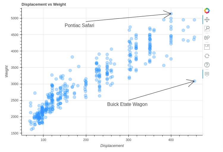
2. Arrow & Labels Annotations 
In this section, we have how we can add arrows and labels to chart.
We have created a scatter chart showing a relationship between displacement and weight of cars. Then, we added two annotations to chart highlighting two car names (Pontiac Safari & Buick Etate Wagon).
We can add arrows to chart using Arrow objects and labels using Label. The arrow object let us specify arrow start coordinates (x_start, y_start) and end coordinates (x_end, y_end) as well as arrowhead type.
The Label object let us specify text to add to location specified using x and y parameter.
from bokeh.plotting import figure
from bokeh.io import show
from bokeh.models import Arrow, NormalHead, OpenHead, VeeHead, TeeHead, Label

tooltip_fmt = [("Name", "@{name}"),
               ("Displacement", "@displ"),
               ("Weight", "@{weight}")
             ]

fig = figure(plot_width=700, plot_height=500,  title="Displacement vs Weight",
             tooltips=tooltip_fmt)

fig.circle(
            x="displ", y="weight",
            size = 10, alpha=0.3, color="dodgerblue",
            source=autompg
        )

## Add Arrows & Labels to Chart
fig.add_layout(Arrow(x_start=200, x_end=400, y_start=4900, y_end=5140))
fig.add_layout(Label(x=150, y=4700, text="Pontiac Safari"))

fig.add_layout(Arrow(x_start=300, x_end=455, y_start=2500, y_end=3086))
fig.add_layout(Label(x=250, y=2300, text="Buick Etate Wagon"))

fig.xaxis.axis_label="Displacement"
fig.yaxis.axis_label="Weight"

show(fig)
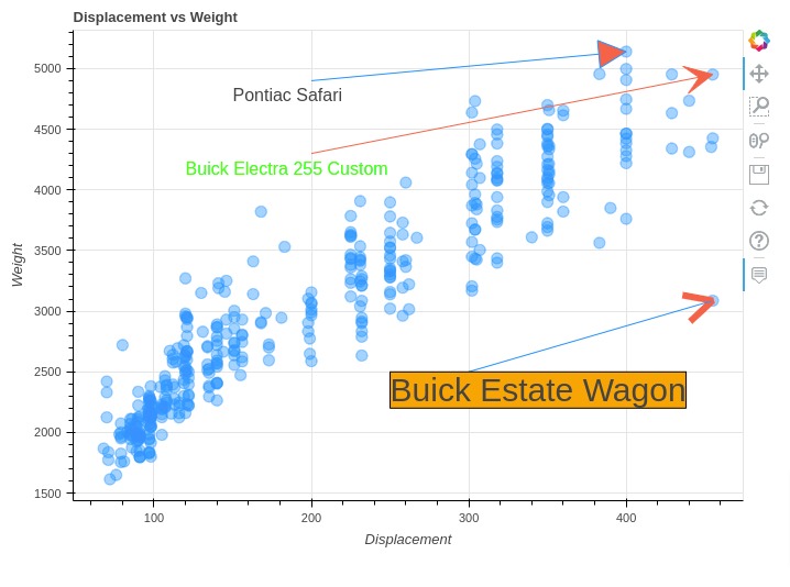
Below, we have created another example demonstrating how to add arrows and label annotations to chart.
We have again created a scatter chart showing a relationship between displacement and weight. We have highlighted three car names this time.
Bokeh let us specify head type of arrow. It supports four different types of arrowheads that we can add to chart.
- NormalHead
- OpenHead
- VeeHead
- TeeHead
We need to create an object of head type mentioned above and give it to end parameter of Arrow() constructor.
In our example below, we have also modified styling of arrows and labels.
from bokeh.plotting import figure
from bokeh.io import show
from bokeh.models import Arrow, NormalHead, OpenHead, VeeHead, TeeHead, Label

tooltip_fmt = [("Name", "@{name}"),
               ("Displacement", "@displ"),
               ("Weight", "@{weight}")
              ]

fig = figure(plot_width=700, plot_height=500,  title="Displacement vs Weight",
             tooltips=tooltip_fmt)

fig.circle(
            x="displ", y="weight",
            size = 10, alpha=0.4, color="dodgerblue",
            source=autompg
        )

## Add Arrows & Labels to Chart
fig.add_layout(Arrow(x_start=200, x_end=400, y_start=4900, y_end=5140,
                     end=NormalHead(fill_color="tomato", line_width=1.0, line_color="dodgerblue"),
                     line_color="dodgerblue"
                    ))
fig.add_layout(Label(x=150, y=4700, text="Pontiac Safari"))

fig.add_layout(Arrow(x_start=200, x_end=455, y_start=4300, y_end=4951,
                     end=VeeHead(line_width=1.0, line_color="tomato", fill_color="tomato"),
                     line_color="tomato"
                    ))
fig.add_layout(Label(x=120, y=4100, text="Buick Electra 255 Custom", text_color="lime"))

fig.add_layout(Arrow(x_start=300, x_end=455, y_start=2500, y_end=3086,
                     end=OpenHead(line_color="tomato", line_width=6.0),
                     line_color="dodgerblue"
                    ))
fig.add_layout(Label(x=250, y=2200, text="Buick Estate Wagon", text_font_size="30px",
                     border_line_color="black", background_fill_color="orange")) ## Label 1

fig.xaxis.axis_label="Displacement"
fig.yaxis.axis_label="Weight"

show(fig)
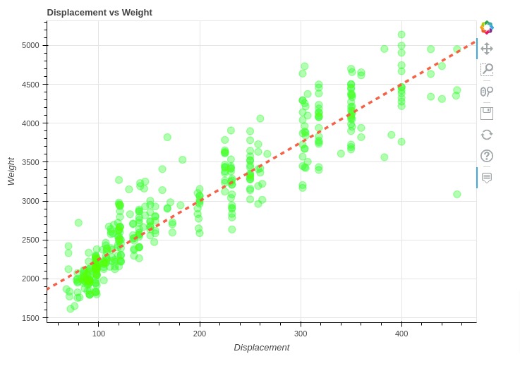
3. Slope Annotation 
In this section, we have explained how we can add slope annotation to chart.
Below, we have first created a scatter chart showing a relationship between displacement and weight. Then, we added a slope to chart that best fits points of chart.
We can add slope annotation by providing Slope object to add_layout() method. We need to provide gradient and intercept parameters to create a slope. We can modify styling of a slope by providing various chart parameters.
from bokeh.plotting import figure
from bokeh.io import show
from bokeh.models import Slope

tooltip_fmt = [("Name", "@{name}"),
               ("Displacement", "@displ"),
               ("Weight", "@{weight}")
              ]

fig = figure(plot_width=700, plot_height=500,  title="Displacement vs Weight",
             tooltips=tooltip_fmt)

fig.circle(
            x="displ", y="weight",
            size = 10, alpha=0.3, color="lime",
            source=autompg
        )

## Slope Annoation
fig.add_layout(Slope(gradient=7.5, y_intercept=1500,
                     line_color='tomato', line_dash='dashed', line_width=3.5
                    ))


fig.xaxis.axis_label="Displacement"
fig.yaxis.axis_label="Weight"

show(fig)
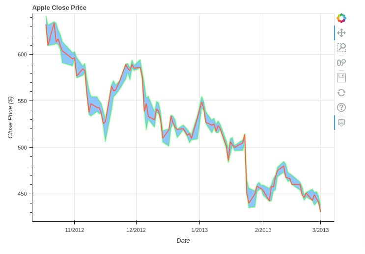
4. Band Annotation 
In this section, we have explained how we can add band annotation around line in bokeh chart.
We have first created a line chart showing close price of apple stock using apple OHLC dataframe. We have included price data for last 90 days from dataframe to make example simple. Then, we added a band around line using low and high prices.
We can add a band around line using Band() constructor. We need to provide column names to use as lower and upper bound. We can provide an x-axis reference using base parameter. Also, level parameter should be set 'underlay' to put band under line (prevent band overriding line).
from bokeh.plotting import figure
from bokeh.io import show
from bokeh.models import Band, ColumnDataSource

tooltip_fmt = [("Close Price ($)", "@{close} $"), ]

fig = figure(plot_width=700, plot_height=500, title="Apple Close Price",
             x_axis_type="datetime",
             tooltips=tooltip_fmt)

fig.line(
            x="date", y="close",
            line_width=2.0, color="tomato",
            source=apple_df[-90:]
        )

## Band Annotation
fig.add_layout(Band(base="date", lower="low", upper="high", level='underlay',
                    fill_alpha=0.5, fill_color="dodgerblue",
                    line_color="lime", line_width=3.,
                    source=ColumnDataSource(apple_df[-90:]),
                   ))

fig.xaxis.axis_label="Date"
fig.yaxis.axis_label="Close Price ($)"

show(fig)
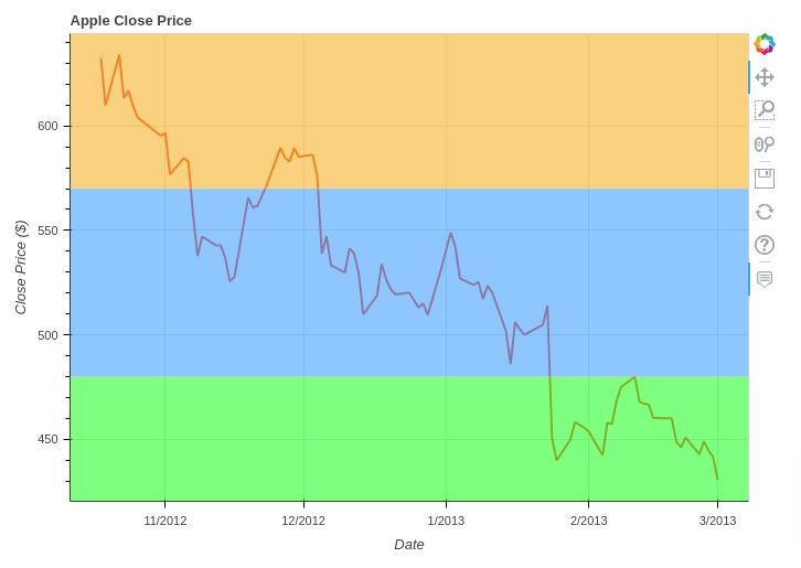
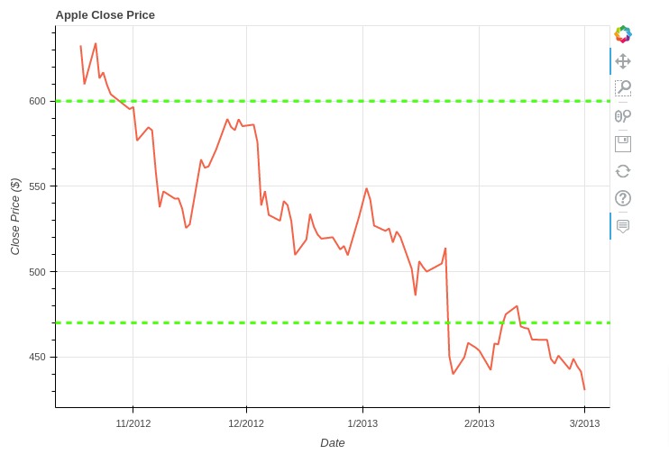
5. Box Annotation 
In this section, we have explained how we can add box annotation to bokeh charts. Box annotation let us change background color in a specified area of chart.
Below, we have first created line chart of apple close price. Then, we have added three box annotations to chart highlighting three different regions of chart with different colors.
The first box annotation covers top horizontal area of chart (prices 570 and above) with light orange color. The second box annotation covers middle horizontal area of chart (prices between 480 & 570) with a light dodgerblue color. The first box annotation covers bottom horizontal area of chart (prices 480 and below) with light lime color.
We can create box annotations using BoxAnnotation() constructor add it to chart using add_layout() method.
from bokeh.plotting import figure
from bokeh.io import show
from bokeh.models import BoxAnnotation

tooltip_fmt = [("Close Price ($)", "@{close} $"), ]

fig = figure(plot_width=700, plot_height=500, title="Apple Close Price",
             x_axis_type="datetime",
             tooltips=tooltip_fmt)

fig.line(
            x="date", y="close",
            line_width=2.0, color="tomato",
            source=apple_df[-90:]
        )

## Box Annotation
fig.add_layout(BoxAnnotation(top=480, fill_alpha=0.5, fill_color="lime")) ## Bottom Band
fig.add_layout(BoxAnnotation(top=480, bottom=570, fill_alpha=0.5, fill_color="dodgerblue")) ## Middle Band
fig.add_layout(BoxAnnotation(bottom=570, fill_alpha=0.5, fill_color="orange")) ## Top Band

fig.xaxis.axis_label="Date"
fig.yaxis.axis_label="Close Price ($)"

show(fig)
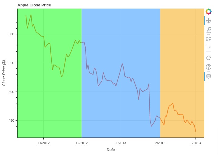
Below, we have created another example demonstrating how to add box annotations to chart. This time, we have colored vertical regions of chart.
We can specify vertical region ranges using left and right parameters of BoxAnnotation() constructor.
In our case, x-axis is date hence we have provided ranges using datetime objects.
from bokeh.plotting import figure
from bokeh.io import show
from bokeh.models import BoxAnnotation
from datetime import datetime

tooltip_fmt = [("Close Price ($)", "@{close} $"), ]

fig = figure(plot_width=700, plot_height=500, title="Apple Close Price",
             x_axis_type="datetime",
             tooltips=tooltip_fmt)

fig.line(
            x="date", y="close",
            line_width=2.0, color="tomato",
            source=apple_df[-90:]
        )

## Box Annotation
fig.add_layout(BoxAnnotation(right=datetime(2012,12,1), fill_alpha=0.5, fill_color="lime")) ## First Band
fig.add_layout(BoxAnnotation(left=datetime(2012,12,1), right=datetime(2013,2,1), fill_alpha=0.5, fill_color="dodgerblue")) ## Second Band
fig.add_layout(BoxAnnotation(left=datetime(2013,2,1), fill_alpha=0.5, fill_color="orange")) ## Third Band

fig.xaxis.axis_label="Date"
fig.yaxis.axis_label="Close Price ($)"

show(fig)
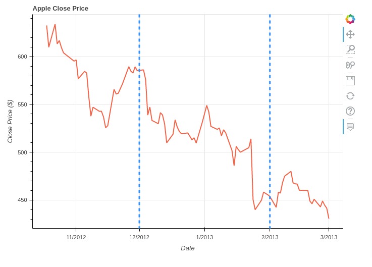
6. Span Annotation 
In this section, we have explained how to add lines (vertical/horizontal) showing a particular range or spans to bokeh chart.
Below, we have created line chart showing close price of apple stock as usual. Then, we have added span to chart highlighting range (470, 600).
We can add span annotation to chart by giving Span object to add_layout() method.
from bokeh.plotting import figure
from bokeh.io import show
from bokeh.models import Span

tooltip_fmt = [("Close Price ($)", "@{close} $"), ]

fig = figure(plot_width=700, plot_height=500, title="Apple Close Price",
             x_axis_type="datetime",
             tooltips=tooltip_fmt)

fig.line(
            x="date", y="close",
            line_width=2.0, color="tomato",
            source=apple_df[-90:]
        )

## Lines/ Span
fig.add_layout(Span(location=600, dimension='width',
                    line_color='lime', line_dash='dashed', line_width=3))
fig.add_layout(Span(location=470, dimension='width',
                    line_color='lime', line_dash='dashed', line_width=3))

fig.xaxis.axis_label="Date"
fig.yaxis.axis_label="Close Price ($)"

show(fig)
Below, we have created another example showing how to add span annotation to chart. This time we have added a vertical span.
from bokeh.plotting import figure
from bokeh.io import show
from bokeh.models import Span
from datetime import datetime

tooltip_fmt = [("Close Price ($)", "@{close} $"), ]

fig = figure(plot_width=700, plot_height=500, title="Apple Close Price",
             x_axis_type="datetime",
             tooltips=tooltip_fmt)

fig.line(
            x="date", y="close",
            line_width=2.0, color="tomato",
            source=apple_df[-90:]
        )

## Lines
fig.add_layout(Span(location=datetime(2012,12,1), dimension='height',
                    line_color='dodgerblue', line_dash='dashed', line_width=3))
fig.add_layout(Span(location=datetime(2013,2,1), dimension='height',
                    line_color='dodgerblue', line_dash='dashed', line_width=3))

fig.xaxis.axis_label="Date"
fig.yaxis.axis_label="Close Price ($)"

show(fig)
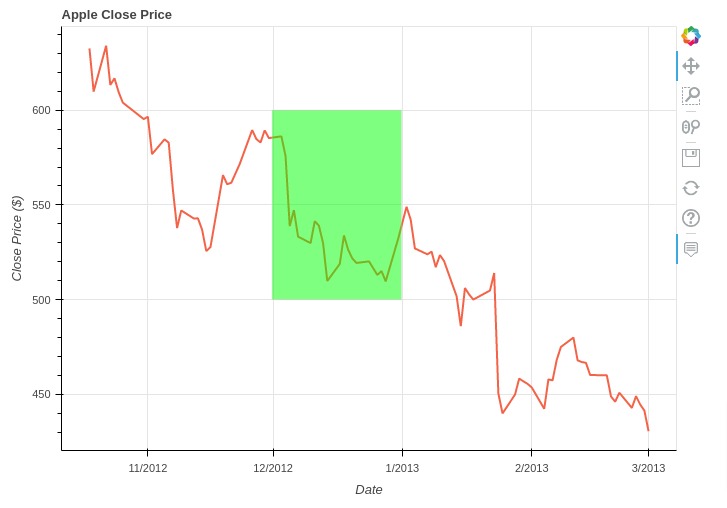
7. Polygon Annotation 
In this section, we have explained how to add polygon annotation to bokeh chart.
We have created a line chart of apple stock close price as usual. Then, we have added a rectangle highlighting a particular area of chart.
We can add polygon to chart by providing PolyAnnotation object to add_layout() method. We need to provide coordinates of polygon through xs and ys parameters of PolyAnnotation() constructor.
from bokeh.plotting import figure
from bokeh.io import show
from bokeh.models import PolyAnnotation
from datetime import datetime

tooltip_fmt = [("Close Price ($)", "@{close} $"), ]

fig = figure(plot_width=700, plot_height=500, title="Apple Close Price",
             x_axis_type="datetime",
             tooltips=tooltip_fmt)

fig.line(
            x="date", y="close",
            line_width=2.0, color="tomato",
            source=apple_df[-90:]
        )

start_date = datetime(2012,12,1).timestamp()*1000
end_date = datetime(2013,1,1).timestamp()*1000

## Polygon Annotation
fig.add_layout(PolyAnnotation(
    xs=[start_date, start_date, end_date, end_date],
    ys=[600,500, 500, 600],
    fill_color="lime", fill_alpha=0.5
))

fig.xaxis.axis_label="Date"
fig.yaxis.axis_label="Close Price ($)"

show(fig)
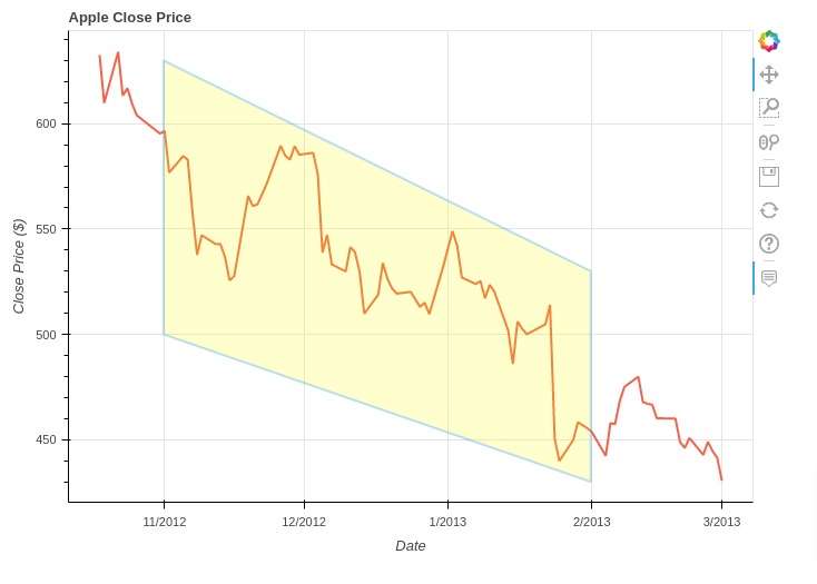
Below, we have created another example of polygon annotation.
from bokeh.plotting import figure
from bokeh.io import show
from bokeh.models import PolyAnnotation
from datetime import datetime

tooltip_fmt = [("Close Price ($)", "@{close} $"), ]

fig = figure(plot_width=700, plot_height=500, title="Apple Close Price",
             x_axis_type="datetime",
             tooltips=tooltip_fmt)

fig.line(
            x="date", y="close",
            line_width=2.0, color="tomato",
            source=apple_df[-90:]
        )

start_date = datetime(2012,11,1).timestamp()*1000
end_date = datetime(2013,2,1).timestamp()*1000

## Polygon Annotation
fig.add_layout(PolyAnnotation(
    xs=[start_date, start_date, end_date, end_date],
    ys=[630,500, 430, 530],
    fill_color="yellow", fill_alpha=0.2,
    line_color="dodgerblue", line_width=2.0,
))

fig.xaxis.axis_label="Date"
fig.yaxis.axis_label="Close Price ($)"

show(fig)
This ends our small tutorial explaining how we can add annotations of different types to bokeh charts.
References
Bokeh Tutorials
- Bokeh:Basic Charts
- Bokeh Layout Guide
- Bokeh Styling Guide
- Bokeh Maps
- Bokeh Dashboard
- Bokeh Charts with Widgets
- Bokeh Candlestick Patterns
Other Python Data Visualization Libraries
 Sunny Solanki
Sunny Solanki
Intro: Software Developer | Youtuber | Bonsai Enthusiast
About: Sunny Solanki holds a bachelor's degree in Information Technology (2006-2010) from L.D. College of Engineering. Post completion of his graduation, he has 8.5+ years of experience (2011-2019) in the IT Industry (TCS). His IT experience involves working on Python & Java Projects with US/Canada banking clients. Since 2020, he’s primarily concentrating on growing CoderzColumn.
His main areas of interest are AI, Machine Learning, Data Visualization, and Concurrent Programming. He has good hands-on with Python and its ecosystem libraries.
Apart from his tech life, he prefers reading biographies and autobiographies. And yes, he spends his leisure time taking care of his plants and a few pre-Bonsai trees.
Contact: sunny.2309@yahoo.in


![YouTube Subscribe]() Comfortable Learning through Video Tutorials?
Comfortable Learning through Video Tutorials?
If you are more comfortable learning through video tutorials then we would recommend that you subscribe to our YouTube channel.
![Need Help]() Stuck Somewhere? Need Help with Coding? Have Doubts About the Topic/Code?
Stuck Somewhere? Need Help with Coding? Have Doubts About the Topic/Code?
 Stuck Somewhere? Need Help with Coding? Have Doubts About the Topic/Code?
When going through coding examples, it's quite common to have doubts and errors.
If you have doubts about some code examples or are stuck somewhere when trying our code, send us an email at coderzcolumn07@gmail.com. We'll help you or point you in the direction where you can find a solution to your problem.
You can even send us a mail if you are trying something new and need guidance regarding coding. We'll try to respond as soon as possible.
![Share Views]() Want to Share Your Views? Have Any Suggestions?
Want to Share Your Views? Have Any Suggestions?
 Want to Share Your Views? Have Any Suggestions?
If you want to
- provide some suggestions on topic
- share your views
- include some details in tutorial
- suggest some new topics on which we should create tutorials/blogs
 bokeh-charts, annotations