hvplot - Interactive Charts from Pandas DataFrame with One Line Of Code
Pandas is a famous python library that provides easy to use interface to maintain tabular data with its efficient data structure dataframe. It is the most preferred python library when working with tabular datasets. Data scientists and researchers worldwide prefer pandas to this date.
Pandas even provide plotting functionality as well but all of the charts are static because Pandas uses matplotlib as a backend for creating charts. The developer who has experience in plotting with pandas knows about its plotting functionality well.
But what if you want your charts to be interactive?
What if you want to use the same interface of pandas for plotting which you are used to but want interactive graphs instead of static?
If the answer to any of the questions is yes then this tutorial is for you. Python has a library named hvplot that let us create interactive charts from pandas dataframe. It has same API as that of pandas plotting API.
What Can You Learn From This Article?
As a part of this tutorial, we have explained how to create interactive charts from pandas dataframe using Python library "hvplot". Tutorial covers many different chart types like scatter charts, bar charts, line charts, histograms, etc. Tutorial also covers how to modify chart properties (axes labels, title, etc) to improve look and feel of it.
Hvplot is built on top of another famous python data visualization library named "holoviews". Please feel free to check below link if you are interested in holoviews.
Important Sections Of Tutorial
- Plotting With Pandas
- Converting Static Plots to Interactive using Hvplot
- Bar Charts
- Grouped Bar Chart
- Stacked Bar Chart
- Horizontal Bar Chart
- Scatter Plots
- Histograms
- Overlapped Histograms
- KDE Graphs
- Overlapped KDEs
- Box Plots
- Line Charts
- Violin Charts
- Area Charts
- Overlapped Area Chart
- Table
- Merging Graphs to Link Meaningful Visualizations
HVPlot Video Tutorial
Please feel free to check below video tutorial if feel comfortable learning through videos. We have covered five different chart types in video. But in this tutorial, we have covered many different chart types.
Below, we have imported "hvplot" and printed the version that we have used in our tutorial.
import hvplot

print("HVPlot Version : {}".format(hvplot.__version__))
Important Information
Please make a note that holoviews library itself is depended on bokeh for plotting. You'll need to have holoviews, hvplot and bokeh installed to continue with this tutorial.
Load Datasets
1. Wine Dataset
We'll start loading the wine dataset available in scikit-learn. It has 13 features and a target variable with 3 different classes of wine. We'll keep the total dataset into pandas dataframe so that it becomes easily available for plotting and manipulation.
import pandas as pd
from sklearn.datasets import load_wine

wine = load_wine()

print("Feature Names : ", wine.feature_names)
print("\nTarget Names : ", wine.target_names)

wine_df = pd.DataFrame(wine.data, columns = wine.feature_names)
wine_df["Target"] = wine.target
wine_df["Target"] = ["Class_1" if typ==0 else "Class_2" if typ==1 else "Class_3"  for typ in wine_df["Target"]]

print("\nDataset Size : ", wine_df.shape)

wine_df.head()
2. Apple OHLC Dataset
The second dataset that we'll use in our tutorial is apple OHLC dataset. We have downloaded dataset from yahoo finance as CSV file and loaded it in memory as pandas dataframe.
import pandas as pd

apple_df = pd.read_csv("~/datasets/AAPL.csv", index_col=0, parse_dates=True)

apple_df = apple_df.reset_index()

apple_df.head()
1. Plotting With Pandas Plotting API 
We'll first plot static graphs to show current pandas API of plotting which makes use of matplotlib for plotting. We'll then convert graphs to interactive using hvplot.
with plt.style.context(("seaborn", "ggplot")):
    wine_df.plot(
                 x="alcohol",
                 y="malic_acid",
                 kind="scatter",
                 s=100, alpha=0.7,
                 title="Alcohol vs Malic Acid Scatter Chart")
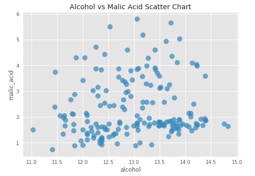
We can see that the above-generated graph is static and does not let us interact with individual points to look at values. We'll now try to convert this graph to an interactive graph and introduce a few other interactive graphs as well for the exploration of hvplot API.
2. Converting Static Plots to Interactive using Hvplot 
It's quite simple to convert static pandas plots to interactive. We just need to import pandas module of hvplot which will provide a wrapper around the existing pandas module and expose hvplot API which we'll be exploring further for plotting purpose.
import hvplot.pandas
After importing pandas module of hvplot, we need to call hvplot() method on pandas dataframe to generate interactive graphs. Please make a note that we have called the method hvplot() with almost the same parameter values as above one.
scat1 = wine_df.hvplot(
                       x="alcohol",
                       y="malic_acid",
                       kind="scatter",
                       size=70,
                       alpha=0.7,
                       title="Alcohol vs Malic Acid Scatter Chart")
scat1
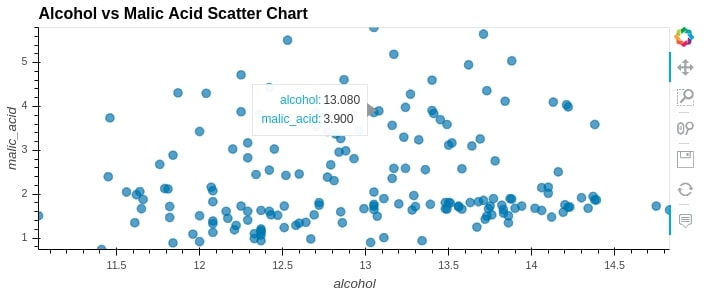
Important Note
Please make a note that hvplot use holoviews for plotting which is based on bokeh hence some of the parameters based on matplotlib won't work with hvplot() method. We'll need to use bokeh parameters for a purpose like a plot figure size and few other things. But the majority of parameter names are almost the same as matplotlib and almost perform the same operations on the graph which we noticed above.
We'll now explore furthermore graphs for explanation purposes. We have grouped wine dataframe by wine class and then taken mean for each column per wine category. We'll use this averaged dataset for plotting few graphs.
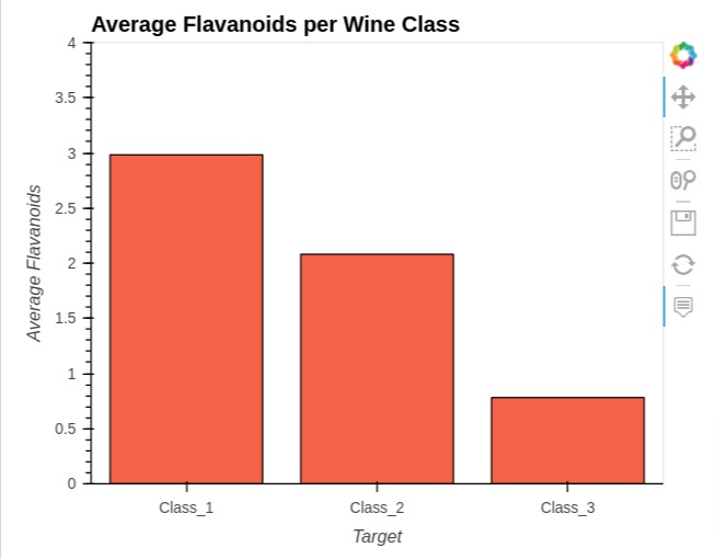
3. Bar Chart 
To create a bar chart, we have first taken an average of all columns of wine dataframe by grouping it according to the wine categories column.
Then, we have created bar chart showing average values of ingredient "flavanoids" per wine type using average wine dataframe.
In order to create bar chart, we need to pass chart type "bar" to kind parameter.
average_wine_df = wine_df.groupby(by="Target").mean().reset_index()

average_wine_df
bar = average_wine_df.hvplot(
                        x="Target",
                        y="flavanoids",
                        kind="bar",
                        color="tomato",
                        height=400, width=500,
                        ylim=(0, 4),
                        ylabel="Average Flavanoids",
                        title="Average Flavanoids per Wine Class", )

bar
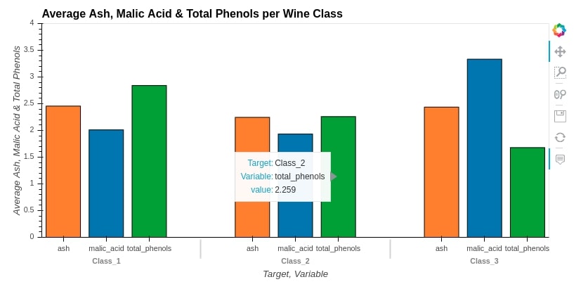
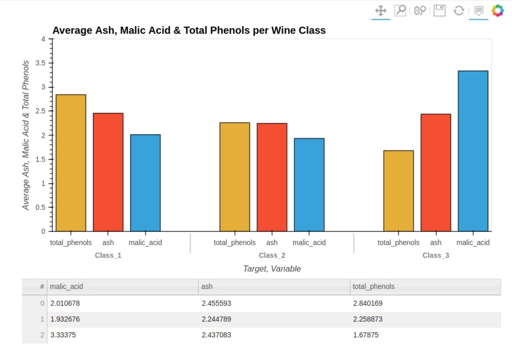
3.1 Grouped Bar Chart
Below, we have created a grouped bar chart by calling hvplot() method and passing it columns ["malic_acid", "ash", "total_phenols"] to compare quantities. We also pass kind=bar to create bar charts.
bar1 = average_wine_df.hvplot(
                        x="Target",
                        y=["malic_acid", "ash", "total_phenols"],
                        kind="bar",
                        height=400, width=800,
                        ylim=(0, 4),
                        ylabel="Average Ash, Malic Acid & Total Phenols",
                        title="Average Ash, Malic Acid & Total Phenols per Wine Class", )

bar1
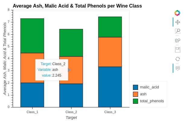
3.2 Stacked Bar Chart
We can easily convert side by side bar chart to a stacked bar chart to see a distribution of ["malic_acid", "ash", "total_phenols"] in all wine categories. We just need to pass parameter stacked=True to convert bar chart to stacked bar chart.
bar2 = average_wine_df.hvplot(
                            x="Target",
                            y=["malic_acid", "ash", "total_phenols"],
                            kind="bar",
                            height=400, width=600,
                            bar_width=0.6,
                            ylim=(0, 8),
                            stacked=True,
                            ylabel="Average Ash, Malic Acid & Total Phenols",
                            title="Average Ash, Malic Acid & Total Phenols per Wine Class")

bar2
We can also call methods on hvplot like we can call on the plot method of pandas. We have explained further through the below example.
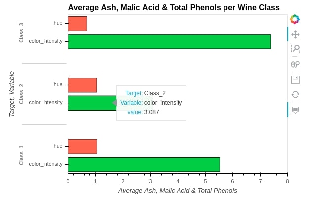
3.2 Horizontal Bar Chart
We can call methods on the hvplot module of pandas dataframe as well. We'll now call barh() method to create bar chart of ["color_intensity", "hue"] by wine categories.
bar3 = average_wine_df.hvplot.barh(
                                x="Target",
                                y=["color_intensity", "hue"],
                                height=400, width=600,
                                ylim=(0.0, 8.0),
                                ylabel="Average Ash, Malic Acid & Total Phenols",
                                color=["limegreen","tomato"],
                                title="Average Ash, Malic Acid & Total Phenols per Wine Class")
bar3
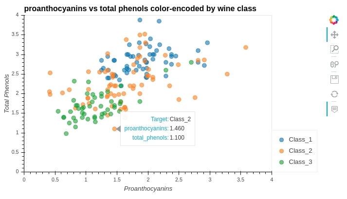
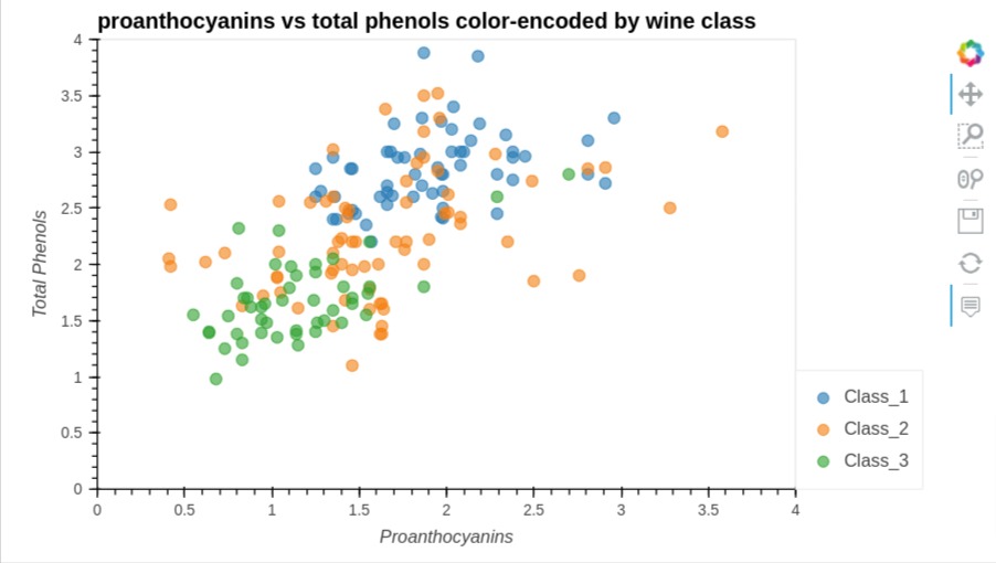
4. Scatter Plot 
We can easily create a scatter plot by calling the scatter() method on the hvplot module by passing x and y values. We even color-encoded points according to wine categories by passing by='Target' or color="Target".
scat = wine_df.hvplot.scatter(
               x="proanthocyanins",
               y="total_phenols",
               by="Target",
               width=700, height=400,
               size=70, alpha=0.6,
               xlim=(0.0, 4.0),
               ylim=(0.0, 4.0),
               xlabel="Proanthocyanins",
               ylabel="Total Phenols",
               title="proanthocyanins vs total phenols color-encoded by wine class")

scat
scat = wine_df.hvplot.scatter(
               x="proanthocyanins",
               y="total_phenols",
               color="Target",
               width=700, height=400,
               size=70, alpha=0.6,
               xlim=(0.0, 4.0),
               ylim=(0.0, 4.0),
               xlabel="Proanthocyanins",
               ylabel="Total Phenols",
               title="proanthocyanins vs total phenols color-encoded by wine class")

scat
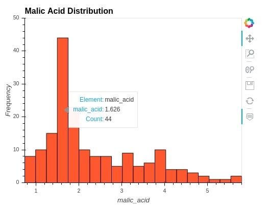
5. Histogram 
We can create histogram by calling hist() method on hvplot by passing malic_acid to plot histogram of malic_acid. We can change bins by passing a number of bins to bins parameter.
wine_df.hvplot.hist(
                    y=["malic_acid"],
                    width=500, height=400,
                    ylim=(0,50),
                    bins=20,
                    alpha=0.9,
                    color="orangered",
                    ylabel="Frequency",
                    title="Malic Acid Distribution")
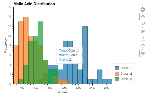
5.1 Overlapped Histograms
We can create overlapped histograms as well to see the distribution of variables by various categories. We are creating overlapped histograms for proline variable per wine category.
wine_df.hvplot.hist(
                    y="proline",
                    by="Target", ## Grouping by Wine Class Type.
                    width=600, height=400,
                    ylim=(0,16),
                    alpha=0.7,
                    bins=20,
                    ylabel="Frequency",
                    title="Malic Acid Distribution")
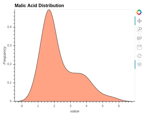
6. KDE Graph 
We can also create Kernel Density Estimation graphs by passing the column for which estimation is needed.
wine_df.hvplot.kde(
                    y=["malic_acid"],
                    width=500, height=400,
                    alpha=0.9,
                    color="orangered",
                    ylabel="Frequency",
                    title="Malic Acid Distribution")
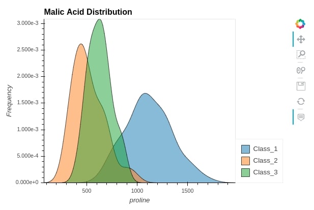
wine_df.hvplot.kde(
                    y="proline",
                    by="Target", ## Grouping by Wine Class Type.
                    width=600, height=400,
                    alpha=0.7,
                    ylabel="Frequency",
                    title="Malic Acid Distribution")
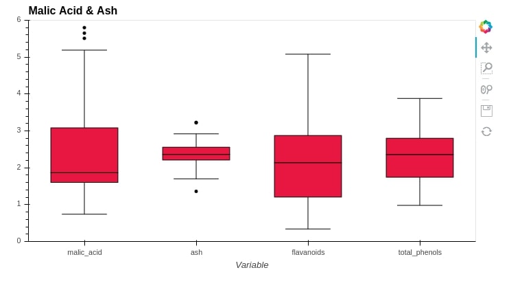
7. Box Plot 
We can create a box plot by passing a list of columns for which box plots are needed as a list. We are creating box plot for ["malic_acid", "ash","flavanoids", "total_phenols"].
wine_df.hvplot.box(
                    y=["malic_acid", "ash","flavanoids", "total_phenols"],
                    ylim=(0,6),
                    height=400,
                    box_width=0.6,
                    color="crimson",
                    title="Malic Acid & Ash")
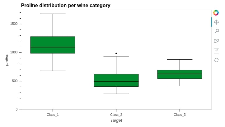
We can also create a box plot for one variable according to different categories. We are creating below proline box plot for its distribution per wine category.
wine_df.hvplot.box(
                    y="proline",
                    by="Target",
                    ylim=(0,1750),
                    height=400,
                    color="forestgreen",
                    title="Proline distribution per wine category")
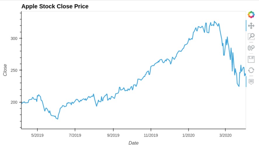
8. Line Chart 
We can easily create bar charts by calling hvplot() method x and y values as it'll create a line chart by default. The line chart is ideal for time-series plots where we use datetime as x axis and other quantities as y axis. We can pass more than one column as a list to y parameter so that it creates a line chart for all of them.
We have created line chart from our apple ohlc dataframe. We have created line chart showing close prices of apple stock over time.
apple_df.hvplot(
                x="Date",
                y = "Close",
                width=700, height=400,
                title="Apple Stock Close Price")
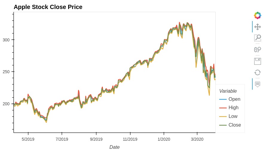
Below, we have created one more line chart where we are displaying more than one lines. We have displayed open, high, low and close prices of apple stock.
apple_df.hvplot(
                x="Date",
                y = ["Open", "High", "Low", "Close"],
                width=700, height=400,
                title="Apple Stock Close Price")
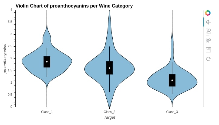
9. Violin Chart 
We can easily create a violin chart by calling violin() method passing it column for which violin is needed. We can either pass more than one column to y parameter to create a violin chart for all columns or we can pass a single column to y parameter and categorical column to by parameter to generate the violin chart for that column according to a categorical variable.
wine_df.hvplot.violin(
                        y="proanthocyanins",
                        by="Target",
                        width=700, height=400,
                        ylim=(0.0,4.0),
                        title="Violin Chart of proanthocyanins per Wine Category")
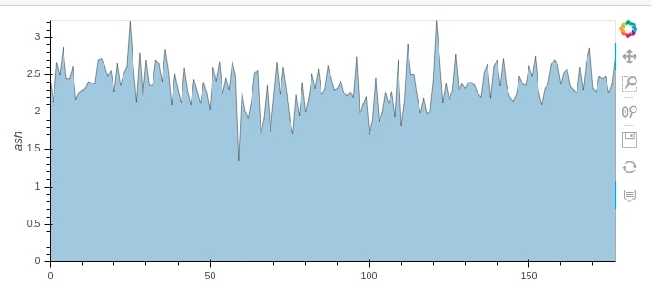
wine_df.hvplot.area(y="ash", alpha=0.4)
10.1 Overlapped Area Chart
We can pass more than one column to area() method to create an overlapped area chart. We can either keep them stacked over one another or prevent them from stacking over one another using stacked parameter.
wine_df.hvplot.area(y=["ash", "malic_acid", "total_phenols"], stacked=False, alpha=0.4)
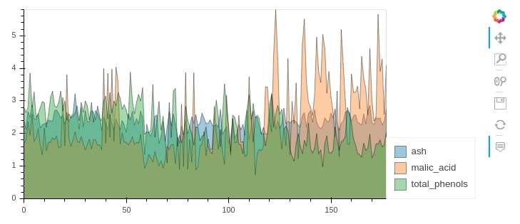
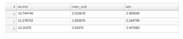
table = average_wine_df.hvplot.table(
                             columns=["alcohol","malic_acid", "ash"],
                             width=600, height=120,)

table
Important Information
If you want to know parameters of any method of hvplot like bar(), barh(), violin(), scatter(),etc then you can press Shift + Tab inside method parenthesis and it'll load list of parameters to explore further. It only works in jupyter notebook.
12. Merging Graphs to Link Meaningful Visualizations 
Hvplot also lets us merge more than related graphs to create a figure of related graphs and it can also let us overlay one graph over another. It supports 2 kinds of operations for this.
+- It'll merge graphs by putting each one next to another.*- It'll let us overlay one graph over another to create combine single graph.
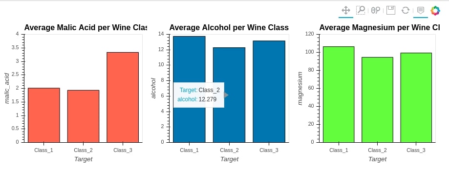
We'll start with '+' operation to merge 3 bar charts. We'll create a bar chart of malic_acid, alcohol and magnesium grouped by wine category. We'll then merge all of them using '+' operation.
avg_malic_acid_per_class = wine_df.groupby(by="Target").mean()[["malic_acid"]]
avg_alcohol_per_class = wine_df.groupby(by="Target").mean()[["alcohol"]]
avg_magnesium_per_class = wine_df.groupby(by="Target").mean()[["magnesium"]]

bar1 = avg_malic_acid_per_class.hvplot.bar(
                                        ylim=(0.0, 4.0),
                                        color="tomato",
                                        width=300,height=300,
                                        title="Average Malic Acid per Wine Class")

bar2 = avg_alcohol_per_class.hvplot.bar(
                                        ylim=(0.0, 14.0),
                                        width=300,height=300,
                                        title="Average Alcohol per Wine Class")

bar3 = avg_magnesium_per_class.hvplot.bar(
                                        ylim=(0.0, 120.0),
                                        color="lawngreen",
                                        width=300,height=300,
                                        title="Average Magnesium per Wine Class")

bar1 + bar2 + bar3
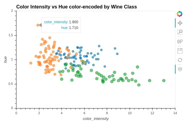
We can overlay one graph over others using * operation. We'll create 3 scatter plots. We'll create 3 scatter plots of color_intensity versus hue for each wine category and then we'll merge these 3 scatter plots using * operation to create a single scatter plot.
scat1 = wine_df[wine_df["Target"] == "Class_1"].hvplot.scatter(x="color_intensity", y="hue",
                                                               width=600, height=400,
                                                               xlim=(0,14),ylim=(0,2.0),
                                                               size=50, alpha=0.6,
                                                               title="Color Intensity vs Hue color-encoded by Wine Class")

scat2 = wine_df[wine_df["Target"] == "Class_2"].hvplot.scatter(x="color_intensity", y="hue", size=70, alpha=0.6)

scat3 = wine_df[wine_df["Target"] == "Class_3"].hvplot.scatter(x="color_intensity", y="hue", size=90, alpha=0.6)

scat1 * scat2 * scat3
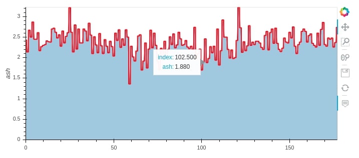
Below we have created another example of * operation by merging area and step graphs of ash attribute.
wine_df.hvplot.area(y="ash", alpha=0.4) * wine_df.hvplot.step(y="ash", color="red")
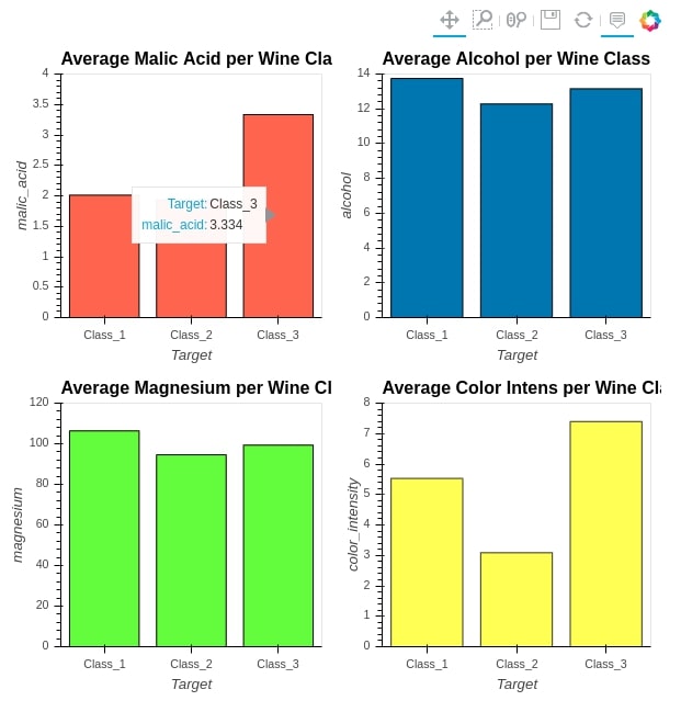
When we merge graphs using + operations, it creates a Layout object consisting of graphs. We can call cols() method on it to reorganize graphs in a different order than putting next to each other. Below we are merging 4 bar plots and rather than putting all 4 next to each other, we are creating 2 columns so that each has 2 plots.
avg_color_intens_per_class = wine_df.groupby(by="Target").mean()[["color_intensity"]]

bar4 = avg_color_intens_per_class.hvplot.bar(
                                        ylim=(0.0, 8.0),
                                        color="yellow",
                                        alpha=0.8,
                                        width=300,height=300,
                                        title="Average Color Intens per Wine Class")


(bar1 + bar2 + bar3 + bar4).cols(2)
Below we have given another example of + operation where we are merging bar chart and table.
bar_1 = average_wine_df.hvplot(x="Target",
                               y=["malic_acid", "ash", "total_phenols"],
                               kind="bar",
                               height=400, width=750,
                               ylim=(0, 4),
                               ylabel="Average Ash, Malic Acid & Total Phenols",
                               title="Average Ash, Malic Acid & Total Phenols per Wine Class", )

table = average_wine_df.hvplot.table(
                             columns=["malic_acid", "ash", "total_phenols"],
                             width=750, height=120,)

(bar_1 + table).cols(1)
This concludes our tutorial on converting static pandas plots to interactive plots. We tried to cover as much material as possible. To summarize, hvplot module which we used to create interactive graphs makes use of holoviews library for plotting which is based on bokeh.
Apart from hvplot, python has two other libraries that let us create interactive charts from pandas dataframe with just one line of code.
Cufflinks is based on python library plotly whereas pandas-bokeh is based on bokeh.
References
Other HVPlot Tutorials
Python Data Visualization Libraries
 Sunny Solanki
Sunny Solanki
Intro: Software Developer | Youtuber | Bonsai Enthusiast
About: Sunny Solanki holds a bachelor's degree in Information Technology (2006-2010) from L.D. College of Engineering. Post completion of his graduation, he has 8.5+ years of experience (2011-2019) in the IT Industry (TCS). His IT experience involves working on Python & Java Projects with US/Canada banking clients. Since 2020, he’s primarily concentrating on growing CoderzColumn.
His main areas of interest are AI, Machine Learning, Data Visualization, and Concurrent Programming. He has good hands-on with Python and its ecosystem libraries.
Apart from his tech life, he prefers reading biographies and autobiographies. And yes, he spends his leisure time taking care of his plants and a few pre-Bonsai trees.
Contact: sunny.2309@yahoo.in


![YouTube Subscribe]() Comfortable Learning through Video Tutorials?
Comfortable Learning through Video Tutorials?
If you are more comfortable learning through video tutorials then we would recommend that you subscribe to our YouTube channel.
![Need Help]() Stuck Somewhere? Need Help with Coding? Have Doubts About the Topic/Code?
Stuck Somewhere? Need Help with Coding? Have Doubts About the Topic/Code?
 Stuck Somewhere? Need Help with Coding? Have Doubts About the Topic/Code?
When going through coding examples, it's quite common to have doubts and errors.
If you have doubts about some code examples or are stuck somewhere when trying our code, send us an email at coderzcolumn07@gmail.com. We'll help you or point you in the direction where you can find a solution to your problem.
You can even send us a mail if you are trying something new and need guidance regarding coding. We'll try to respond as soon as possible.
![Share Views]() Want to Share Your Views? Have Any Suggestions?
Want to Share Your Views? Have Any Suggestions?
 Want to Share Your Views? Have Any Suggestions?
If you want to
- provide some suggestions on topic
- share your views
- include some details in tutorial
- suggest some new topics on which we should create tutorials/blogs
 hvplot, pandas