Altair - Basic Interactive Plotting in Python
Altair is a Python visualization library based on vega and vega-lite javascript libraries.
The vega and vega lite are declarative programming languages where you specify properties of the graph as JSON and it plots graphs based on that using Canvas or SVG.
As Altair is built on top of these libraries, it provides almost the same functionalities as them in python.
Altair's API is simple and easy to use which lets the developer spend more time on data analysis than getting visualizations right.
> What Can You Learn From This Article?
As a part of this tutorial, we have explained how to use Python data visualization library Altair to create simple interactive charts. Tutorial covers many commonly used charts like scatter charts, bar charts, histograms, line charts, area charts, box plots, pie charts, heatmaps, etc with simple and easy-to-understand examples.
> How to install Altair?
- PIP
- pip install -U altair vega_datasets
- Conda
- conda install -c conda-forge altair vega_datasets
Below, we have listed important sections of tutorial to give an overview of the material covered.
Important Sections Of Tutorial
- Load Datasets for Tutorial
- Wine Dataset
- Apple OHLC Dataset
- Starbucks Store Locations Dataset
- Steps to Generate Charts using Altair
- Scatter Plots
- Color-Encoded Scatter Chart
- Marker-Encoded Scatter Chart
- Bar Charts
- Horizontal Bar Chart
- Stacked Bar Chart
- Grouped Bar Chart
- Histograms
- Simple Histogram
- Layered Histogram
- Line Charts
- Area Charts
- Simple Area
- Stacked Area Chart
- Box Plots
- Pie Charts
- Simple Pie Chart
- Donut Chart
- Radial Chart
- Heatmaps
- Scatter Matrix
- Scatter Map
Altair Video Tutorial
Please feel free to check below video tutorial if feel comfortable learning through videos. We have covered four different chart types in video. But in this tutorial, we have covered many different chart types.
We'll first import all the necessary libraries to get started.
import altair as alt

print("Altair Version : {}".format(alt.__version__))
Load Datasets 
We'll be using 3 datasets while explaining how to plot various charts using Altair.
- Wine Dataset
- Apple OHLC Dataset
- Starbucks Store Locations Dataset
We suggest that you download the apple ohlc dataset from yahoo finance and Starbucks store locations dataset from kaggle to continue with the tutorial.
Wine Dataset
import pandas as pd
import numpy as np
from sklearn.datasets import load_wine

wine = load_wine()

wine_df = pd.DataFrame(wine.data, columns=wine.feature_names)

wine_df["Category"] = ["Category_%d"%(cat+1) for cat in wine.target]

wine_df.head()
Apple OHLC Dataset
Apple OHLC dataset is downloaded from Yahoo finance as a CSV file for April 2019 to March 2020.
apple_df = pd.read_csv("~/datasets/AAPL.csv")
apple_df["Date"] = pd.to_datetime(apple_df["Date"])
apple_df = apple_df.set_index("Date")
apple_df.head()
Starbucks Store Locations Dataset
starbucks_locations = pd.read_csv("~/datasets/starbucks_store_locations.csv")
starbucks_locations.head()
Steps to Create Charts using "Altair" 
The generation of charts using Altair is a list of steps that are described below. These steps are commonly used to generate a chart using Altair.
- Create a Chart object passing dataframe to it.
- Call marker type (mark_point(), mark_bar(), mark_area(), mark_circle(), etc) on chart object to select chart type that will be plotted.
- Call encode() method on output from 2nd step passing it encoding details like what data column to use for X-axis, which one for Y-axis, which column for color, etc.
There can be more steps apart from these for further customization but for the majority of simple charts, these will do.
Please make a NOTE that we have created Altair charts in Jupyter notebook with Python version 3.9.1.
Now, we'll explain different chart types one by one using Altair.
1. Scatter Plots 
The first chart type that we'll plot using Altair is a scatter plot.
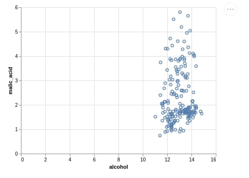
1.1 Simple Scatter Chart
We are plotting below the scatter plot showing the relation between alcohol and malic_acid properties of the wine dataset. This is the simplest way to generate a plot using Altair.
alt.Chart(wine_df).mark_point().encode(x="alcohol", y="malic_acid")
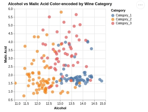
1.2 Color-Encoded Scatter Chart
Below we are again plotting a scatter chart between alcohol and malic_acid, but this time we have color-encoded points by category of wine as well.
Apart from this, we have made few more changes.
We have set scatter point size using size parameter of mark_circle() method.
We have created X and Y axes by creating X and Y axes objects using Altair which gives us more flexibility to modify properties of axes. We have modified the default labels of X and Y axes.
The Altair plots generally start with x and y axes at 0 and we can modify it as explained below by creating Scale() object and setting it as value of scale parameter of axis objects.
We also have introduced tooltip property which accepts a list of columns from the dataset whose value will be displayed when the mouse hovers over a particular point of scatter plot.
We have also used properties() method available with Altair which lets us modify plot size (height & width) and title.
At last, we have also called the interactive() method last which will convert a static plot into an interactive one. This will pop up tooltip when we hover over a point.
alt.Chart(wine_df).mark_circle(
    size=100
).encode(
    x = alt.X("alcohol", title="Alcohol", scale=alt.Scale(zero=False)),
    y = alt.Y("malic_acid", title="Malic Acid", scale=alt.Scale(zero=False)),
    color = "Category",
    tooltip = ["alcohol", "malic_acid"]
).properties(
    height = 400, width = 400,
    title = "Alcohol vs Malic Acid Color-encoded by Wine Category").interactive()
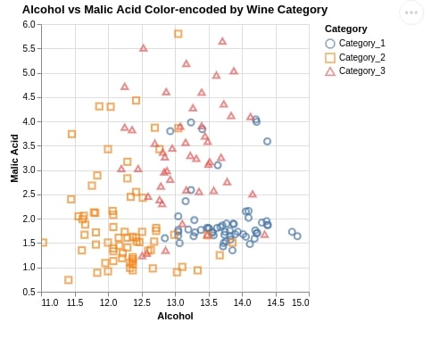
1.3 Marker-Encoded Scatter Chart
We have generated another scatter plot which is almost the same as last time but we have used different markers to show different categories of wine.
We have used the shape attribute for this purpose which accepts the dataframe column name with categorical data.
alt.Chart(wine_df).mark_point(
    size=50
).encode(
    alt.X("alcohol", title="Alcohol", scale=alt.Scale(zero=False)),
    alt.Y("malic_acid", title="Malic Acid", scale=alt.Scale(zero=False)),
    color="Category",
    shape="Category", ## For Markers
    tooltip=["alcohol", "malic_acid"]
).properties(
    height=400, width=400,
    title="Alcohol vs Malic Acid Color-encoded by Wine Category").interactive()
2. Bar Charts 
The second type of chart that we'll introduce is a bar chart using Altair.
We are first creating a dataframe with an average of each wine dataframe column according to wine categories as it'll be used by many successive charts for plotting.
avg_wine_df = wine_df.groupby(by="Category").mean().reset_index()

avg_wine_df
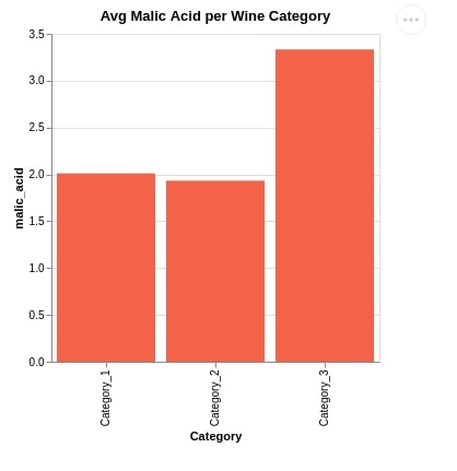
2.1 Simple Bar Chart
Below we have created our first bar chart using the mark_bar() method encoding x-axis as wine category and y-axis as average malic acid. We have also set chart width, height, and title as usual.
alt.Chart(avg_wine_df).mark_bar(
    color='tomato'
).encode(
    x = 'Category', y = 'malic_acid'
).properties(
    width=300, height=300,
    title="Avg Malic Acid per Wine Category"
)
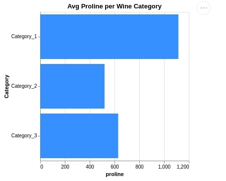
2.2 Horizontal Bar Chart
Below we have created another bar chart that shows the average proline per wine category. We have also changed X and Y-axis in this case to make a bar chart horizontal.
alt.Chart(avg_wine_df).mark_bar(
    color='dodgerblue'
).encode(
    x = 'proline', y = 'Category'
).properties(
    width=300, height=300,
    title="Avg Proline per Wine Category"
)
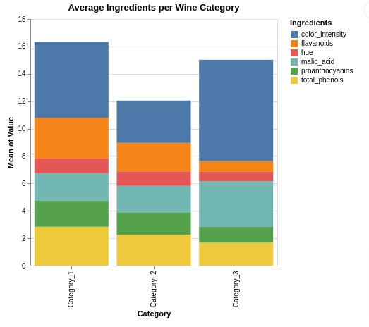
2.3 Stacked Bar Chart
In this section, we have explained how to create a stacked bar chart using Altair.
In order to create a stacked bar chart, we need to organize dataframe as required by Altair. We have reorganized dataframe using pandas melt() function. The returned dataframe has values of ingredients along with ingredient names and wine categories next to them.
We have selected few ingredients from original dataframe.
melted_wine_df = wine_df.melt(id_vars=['Category'],
                              value_vars=["malic_acid", "total_phenols", "flavanoids", "hue", "color_intensity", "proanthocyanins", ],
                              var_name="Ingredients", value_name="Value")

melted_wine_df.head()
Below, we have created a stacked bar chart using melted wine dataframe showing average ingredients values per wine category.
We have kept wine category as x-axis and height of bars is decided based on average ingredients for that category.
We have provided y-axis value as 'mean(Value)' which takes mean of values per category. Stacked bars are colored based on ingredients.
alt.Chart(melted_wine_df).mark_bar().encode(
    x = 'Category', y = 'mean(Value)', color="Ingredients",
).properties(
    height=350, width=350,
    title="Average Ingredients per Wine Category"
)
Below, we have created another example demonstrating how to create an exact stacked chart from previous cell without using 'mean()' string around column name for axis.
We first calculated mean of ingredients per wine category using pandas groupby() function.
Then, we created a stacked bar chart using same code as previous cell with only difference being that we have not wrapped 'Value' in 'mean()' function anymore.
mean_wine_df = melted_wine_df.groupby(["Category", "Ingredients"]).mean().reset_index()

mean_wine_df.head()
alt.Chart(mean_wine_df).mark_bar().encode(
    x = 'Category', y = 'Value:Q', color="Ingredients",
).properties(
    height=350, width=350,
    title="Average Ingredients per Wine Category"
)
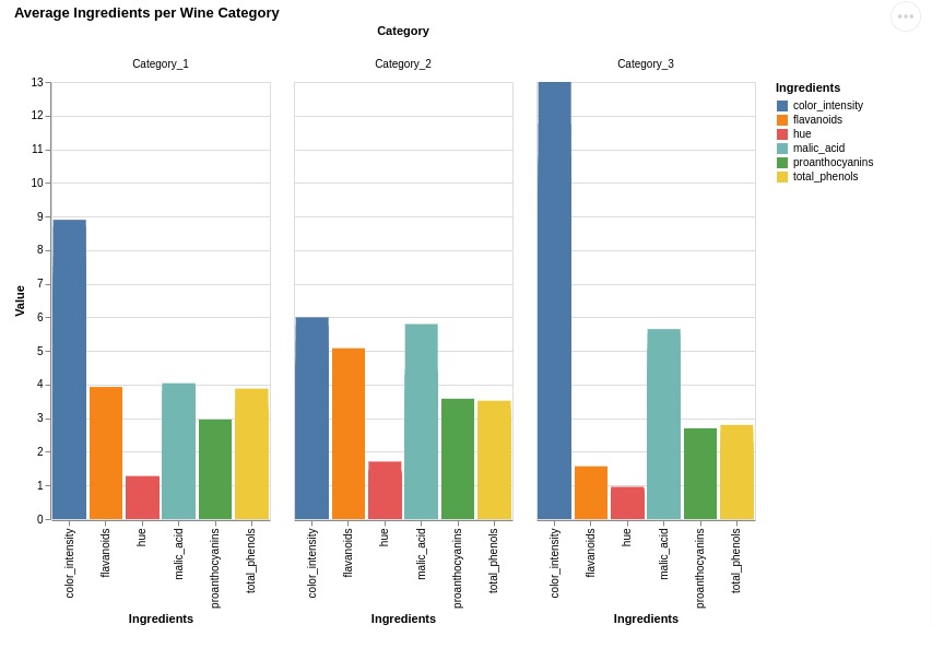
2.4 Grouped Bar Chart
Here, we have explained how to create grouped bar chart.
We have created a bar chart that can be used to compare average ingredient quantity per wine type. We have used same melted wine dataframe as earlier.
We have used column property for creating a grouped bar chart. It'll create many bar charts and put them next to each other.
There is one bar chart per ingredient with average quantity of that ingredient per wine category. Bar charts of all ingredients are put next to each other to create grouped bar chart.
alt.Chart(melted_wine_df).mark_bar().encode(
    x = 'Ingredients', y = 'Value', color="Ingredients", column="Category",
    tooltip=["Ingredients", "Value"]
).properties(
    height=400, width=200,
    title="Average Ingredients per Wine Category"
).interactive()
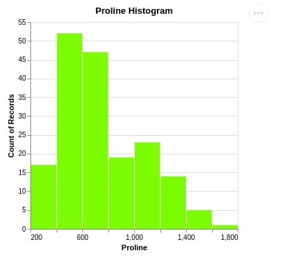
3. Histograms 
The third chart type that we'll be introducing is the histogram.
3.1 Simple Histogram
We have used the mark_bar() method which is used to print bar charts. We have passed the x-axis column as proline along with bin attribute as True to inform Altair that we need to bin values of this column. We have also passed the y-axis value as count() which will be used to count values of proline and then bin them.
alt.Chart(wine_df).mark_bar(
    color='lawngreen'
).encode(
    x =alt.X('proline', bin=True, title="Proline"),
    y="count()"
).properties(
    width=300,
    height=300,
    title="Proline Histogram")
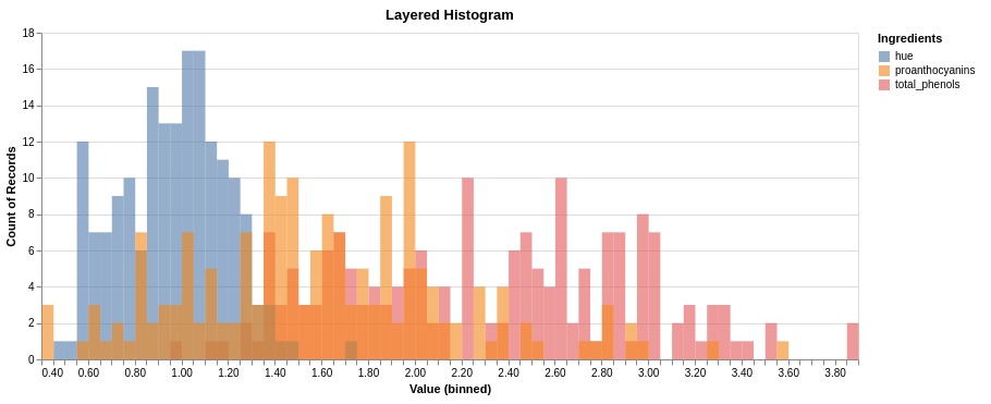
3.2 Layered Histogram
Here, we have explained how to create a layered histogram. We have first created a melted wine dataframe as earlier. We have selected only 3 ingredients for this example.
melted_wine_df = wine_df.melt(id_vars=['Category'],
                              value_vars=["total_phenols", "hue", "proanthocyanins", ],
                              var_name="Ingredients", value_name="Value")

melted_wine_df.head()
Below, we have created a layered histogram using melted wine dataframe. The ingredient values column is set as X axis and count() function as Y axis.
The histogram for individual ingredients is created with different colors.
We have also set the number of bins per ingredient using bin parameter.
We need to set stack parameter to None for Y-axis otherwise it'll stack histograms on one another.
alt.Chart(melted_wine_df).mark_bar(
    color='lawngreen', opacity=0.6, binSpacing=0
).encode(
    x =alt.X("Value",  bin=alt.Bin(maxbins=120)),
    y=alt.Y("count()", stack=None),
    color="Ingredients:N"
).properties(
    width=750,
    height=300,
    title="Layered Histogram")
4. Line Charts 
The fourth chart type that we would like to introduce is a line chart.
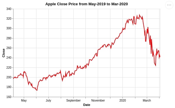
4.1 Single Line Chart
We are using mark_line() to plot a line chart showing the close price of Apple stock from April 2019 to March 2020.
alt.Chart(apple_df.reset_index()).mark_line(
    color='red'
).encode(
    x = 'Date:T', y = alt.Y('Close:Q', scale=alt.Scale(zero=False))
).properties(
    width=500,
    height=300,
    title="Apple Close Price from April-2019 to Mar-2020")
How to Specify Column Type Explicitly in Altair?
When we created the line chart above we specified the column data category with one character after the column name.
We have separated them with one colon (Date:T, Close:Q).
This gives hint to Altair that date column needs to be considered as datetime column and close column has quantitative data.
We can explicitly specify column type like this if Altair is failing to recognize the exact type.
Below we have listed commonly used data category characters in Altair:
- T: Date-time
- Q: Quantitative
- O: Ordered
- N: Nominal
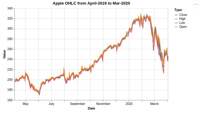
4.2 Multiple Lines Chart
In this section, we have explained how to create a line chart with multiple lines in it.
Below, we have first melted apple stock prices dataframe. This way it'll have an entry for price type as a column.
melted_apple_df = apple_df.reset_index().melt(id_vars=['Date'],
                                              value_vars=["Open", "Close", "Low", "High"],
                                              var_name="Type", value_name="Value")

melted_apple_df.head()
Below, we have created a line chart with multiple lines. The lines for open, close, low, and high prices are included in chart.
alt.Chart(melted_apple_df).mark_line().encode(
    x = 'Date:T', y = alt.Y('Value:Q', scale=alt.Scale(zero=False)),
    color="Type"
).properties(
    width=500,
    height=300,
    title="Apple OHLC from April-2019 to Mar-2020")
5. Area Charts 
The fifth chart type that we have introduced is the Area chart using Altair.
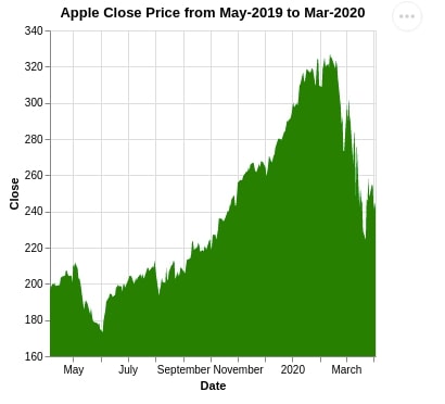
5.1 Simple Area Chart
We can plot an area chart using the mark_area() method of Altair. We are highlighting the area below the close price of Apple stock from April 2019 to March 2020.
alt.Chart(apple_df.reset_index()).mark_area(
    color='green'
).encode(
    x = 'Date:T', y = alt.X('Close:Q', scale=alt.Scale(zero=False))
).properties(
    width=300,
    height=300,
    title="Apple Close Price from May-2019 to Mar-2020")
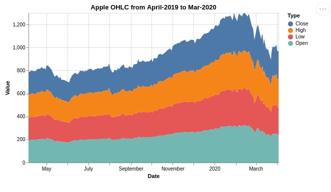
5.2 Stacked Area Chart
Here, we have explained how to create a stacked area chart using Altair.
Below, We have used melted apple prices dataframe for creating a stacked area chart. We can notice from the chart that prices are stacked over one another.
If you don't want a stacked area chart but a chart with an area for multiple variables then you can set stack parameter to None for Y-axis.
alt.Chart(melted_apple_df).mark_area().encode(
    x = 'Date:T', y = 'Value:Q',
    color="Type"
).properties(
    width=500,
    height=300,
    title="Apple OHLC from April-2019 to Mar-2020")
6. Box Plots 
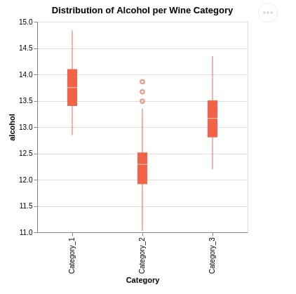
The sixth chart type we would like to introduce using Altair is a box plot. We are plotting a box plot exploring the distribution of alcohol per wine category using the mark_boxplot() method.
alt.Chart(wine_df).mark_boxplot(color="tomato").encode(
    x=alt.X('Category:N'),
    y=alt.Y('alcohol:Q', scale=alt.Scale(zero=False))
).properties(
    width=300,
    height=300,
    title="Distribution of Alcohol per Wine Category")
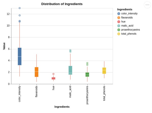
Below, we have created a melted wine dataframe again to create another box plot example.
We have created a box plot showing distribution of values of few ingredients.
melted_wine_df = wine_df.melt(id_vars=['Category'],
                              value_vars=["malic_acid", "total_phenols", "flavanoids", "hue", "color_intensity", "proanthocyanins", ],
                              var_name="Ingredients", value_name="Value")

melted_wine_df.head()
alt.Chart(melted_wine_df).mark_boxplot(color="tomato").encode(
    x=alt.X('Ingredients'),
    y=alt.Y('Value:Q', scale=alt.Scale(zero=False)),
    color="Ingredients"
).properties(
    width=400, height=300,
    title="Distribution of Ingredients")
7. Pie Charts 
In this section, we have explained how to create pie charts and their variants (donut chart, radial chart, etc.) using Altair.
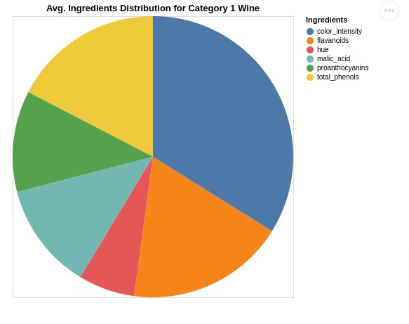
7.1 Simple Pie Chart
First, we'll explain how to create a simple pie chart using Altair.
Below, we have created a dataframe by performing various operations (grouping, transposing, etc) on our wine dataframe.
The final dataframe has average ingredients per wine category in it. Ingredient names are also present in one column of dataframe.
ingredients = ["Category", "malic_acid", "total_phenols", "flavanoids", "hue", "color_intensity", "proanthocyanins", ]
avg_wine_df = wine_df[ingredients].groupby(by="Category").mean().T.reset_index().rename(columns={"index": "Ingredients"})
avg_wine_df = avg_wine_df[:11]

avg_wine_df
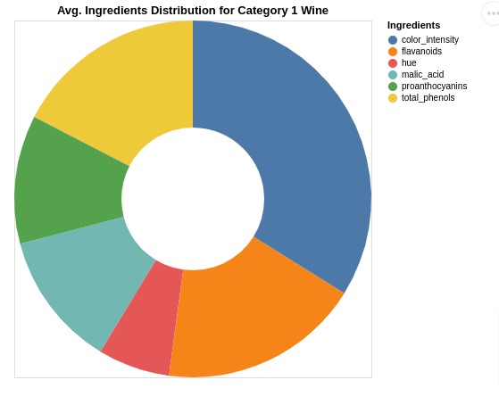
In order to create a pie chart, we need to use mark_arc() marker.
When encoding data, we need to provide two parameters.
- theta
- color
In our case, we have set theta parameter with Category_1 column and color parameter with Ingredients column.
The pie chart shows us average ingredients distribution for category 1 wine.
alt.Chart(avg_wine_df).mark_arc().encode(
    theta=alt.Theta(field="Category_1", type="quantitative"),
    color=alt.Color(field="Ingredients", type="nominal"),
    tooltip=["Ingredients", "Category_1"] ## Displays tooltip
).properties(
    height=400, width=400,
    title="Avg. Ingredients Distribution for Category 1 Wine"
)
7.2 Donut Chart
In this section, we have created donut chart using Altair.
The code for this section is same as earlier with one minor difference. We have set innerRadius parameter of mark_arc() method. This will help us create a donut chart.
alt.Chart(avg_wine_df).mark_arc(innerRadius=80).encode(
    theta=alt.Theta(field="Category_1", type="quantitative"),
    color=alt.Color(field="Ingredients", type="nominal"),
    tooltip=["Ingredients", "Category_1"] ## Displays tooltip
).properties(
    height=400, width=400,
    title="Avg. Ingredients Distribution for Category 1 Wine"
)
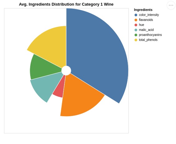
7.3 Radial Chart
In this section, we have explained how to create a radial chart.
The code for this section is almost same as previous example with one addition. We have added radius parameter when specifying encodings.
This parameter will decide radius of each arc and we have asked to use Category 1 ingredient values to decide arc size.
alt.Chart(avg_wine_df).mark_arc(innerRadius=15, stroke="#fff").encode(
    theta=alt.Theta("Category_1", stack=True),
    radius=alt.Radius("Category_1", scale=alt.Scale(type="sqrt", zero=True)),
    color=alt.Color("Ingredients"),
    tooltip=["Ingredients", "Category_1"] ## Displays tooltip
).properties(
    height=400, width=400,
    title="Avg. Ingredients Distribution for Category 1 Wine"
)
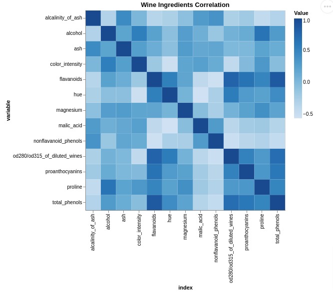
8. Heatmaps 
In this section, we have explained how to create heatmaps using Altair.
We have created a heatmap of correlation between columns of wine dataframe.
First, we have calculated correlation using corr() method of pandas dataframe below.
Then, we melted dataframe to change its format as required by Altair. This way we'll have correlation values between each combination of ingredients next to each other.
corr_df = wine_df.corr().reset_index()

corr_df
columns = wine_df.columns.tolist()
columns.remove("Category")

melted_corr_df = corr_df.melt(id_vars=['index'], value_vars=columns,
                              value_name="Value")

melted_corr_df.head()
Below, we have created a heatmap using a melted correlation dataframe. We have used mark_rect() mark to create heatmap.
The color map can be specified using scale parameter.
alt.Chart(melted_corr_df).mark_rect().encode(
    x='index:O',
    y='variable:O',
    color=alt.Color('Value:Q', scale=alt.Scale(scheme="Blues")),
    tooltip="Value"
).properties(
    width=400, height=400,
    title="Wine Ingredients Correlation"
).interactive()
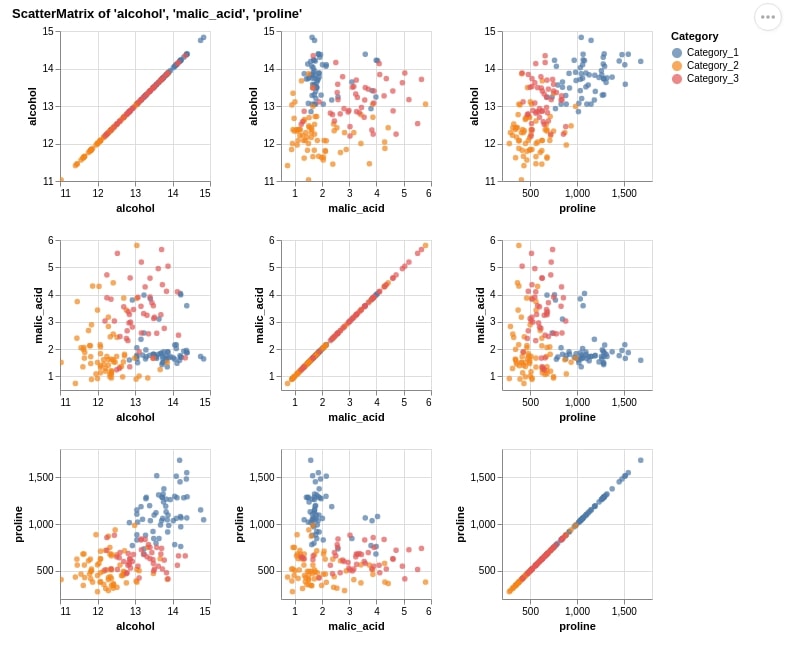
9. Scatter Matrix 
The seventh chart type that we have introduced using Altair is a scatter matrix chart. We are exploring the relationship between three columns (alcohol, malic_acid, and proline).
We have used a method named repeat() which accepts row and column names that will be repeated when plotting charts. It works like a loop inside a loop exploring the relationship between all possible combinations of columns. We have also color-encoded scatter plots according to wine categories.
alt.Chart(wine_df).mark_circle().encode(
    alt.X(alt.repeat("column"), type='quantitative', scale=alt.Scale(zero=False)),
    alt.Y(alt.repeat("row"), type='quantitative', scale=alt.Scale(zero=False)),
    color='Category:N'
).properties(
    width=150,
    height=150,
).repeat(
    row=['alcohol', 'malic_acid', 'proline'],
    column=['alcohol', 'malic_acid', 'proline']
).properties(
    title="ScatterMatrix of 'alcohol', 'malic_acid', 'proline'"
).interactive()
10. Scatter Map 
The last chart type that we would like to introduce is a scatter map. We'll be using the Starbucks store locations dataset for this purpose. We'll also need vega_datasets library installed for this purpose as it holds information about various world maps.
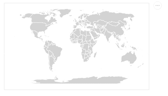
Below we are creating a world map without any markers added on top of it. We are using vega_datasets which provides world countries' information.
We first create a data source using the topo_feature() method passing it URL from which it'll download world map data. We are downloading data with country-wise borders.
We then use this data source to plot the world map using the mark_geoshape() method. The stroke property used in mark_geoshape() refers to the color of country borders.
from vega_datasets import data


source = alt.topo_feature(data.world_110m.url, 'countries')

background = alt.Chart(source).mark_geoshape(
    fill='lightgray',
    stroke='white'
).properties(
    width=500,
    height=300
).project('naturalEarth1')

background
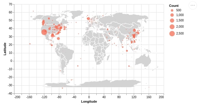
Below we are first creating a dataset for plotting to a scatter map.
We are grouping the original dataset according to the state to get a count of stores per state.
We are then creating another dataframe where we have average latitude and longitude of that state.
We merge both data frames to create the final dataframe where we have information about Starbucks store count per state as well as state latitude and longitude.
We'll use this final dataframe to plot a scatter map.
mean_long_lat = starbucks_locations.groupby(by="State/Province").mean()[["Longitude", "Latitude"]]
count_per_state  = starbucks_locations.groupby(by="State/Province").count()[["Store Number"]].rename(columns={"Store Number":"Count"})

count_per_state = count_per_state.join(mean_long_lat).reset_index()
count_per_state.head()
Below we are creating a scatter plot of longitude versus latitude. We are using the count of the store column of the dataset to show the size of the marker. We then merge this scatter plot with a world map created earlier to create a scatter map.
We can notice from a scatter map easily that California has the highest number of Starbucks stores per stats which is more than 2.5k.
points  = alt.Chart(count_per_state).mark_circle(
    color="tomato"
).encode(
    x="Longitude:Q", y="Latitude:Q", size="Count:Q",
    tooltip = ["State/Province", "Count"]
).interactive()
background + points
This ends our small tutorial introducing the basic API of Altair to plot basic charts using it.
References 
Other Python Plotting Libraries
 Sunny Solanki
Sunny Solanki
Intro: Software Developer | Youtuber | Bonsai Enthusiast
About: Sunny Solanki holds a bachelor's degree in Information Technology (2006-2010) from L.D. College of Engineering. Post completion of his graduation, he has 8.5+ years of experience (2011-2019) in the IT Industry (TCS). His IT experience involves working on Python & Java Projects with US/Canada banking clients. Since 2020, he’s primarily concentrating on growing CoderzColumn.
His main areas of interest are AI, Machine Learning, Data Visualization, and Concurrent Programming. He has good hands-on with Python and its ecosystem libraries.
Apart from his tech life, he prefers reading biographies and autobiographies. And yes, he spends his leisure time taking care of his plants and a few pre-Bonsai trees.
Contact: sunny.2309@yahoo.in


![YouTube Subscribe]() Comfortable Learning through Video Tutorials?
Comfortable Learning through Video Tutorials?
If you are more comfortable learning through video tutorials then we would recommend that you subscribe to our YouTube channel.
![Need Help]() Stuck Somewhere? Need Help with Coding? Have Doubts About the Topic/Code?
Stuck Somewhere? Need Help with Coding? Have Doubts About the Topic/Code?
 Stuck Somewhere? Need Help with Coding? Have Doubts About the Topic/Code?
When going through coding examples, it's quite common to have doubts and errors.
If you have doubts about some code examples or are stuck somewhere when trying our code, send us an email at coderzcolumn07@gmail.com. We'll help you or point you in the direction where you can find a solution to your problem.
You can even send us a mail if you are trying something new and need guidance regarding coding. We'll try to respond as soon as possible.
![Share Views]() Want to Share Your Views? Have Any Suggestions?
Want to Share Your Views? Have Any Suggestions?
 Want to Share Your Views? Have Any Suggestions?
If you want to
- provide some suggestions on topic
- share your views
- include some details in tutorial
- suggest some new topics on which we should create tutorials/blogs
 data-visualizaton, altair