Candlestick Charts in Python (mplfinance, plotly, bokeh, bqplot, and cufflinks)
Candlestick chart is the most commonly used chart type in financial markets to display the movement of security price for a particular time period. It is almost like a bar chart but helps us capture details of all 4 price details (open, high, low, and closing prices of security) in one bar instead of just one like traditional bar charts. A Candlestick chart can be used to show the movement of price for data captured at different time intervals (hourly, daily, monthly, minutely, etc).
> How Candles of Candlestick Pattern are Created?
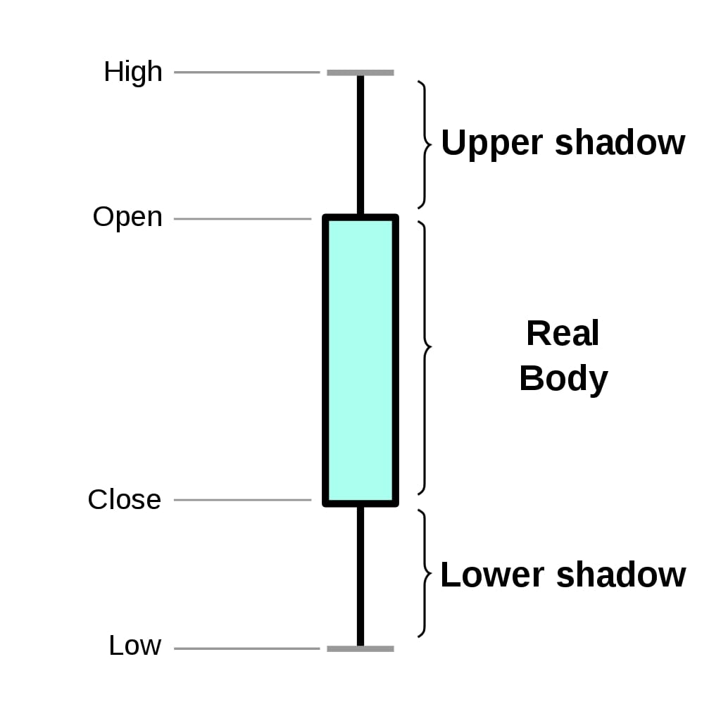
Below we have included two simple images (taken from Wikipedia) explaining how candles of candlestick charts are created based on OHLC (Open, High, Low, and Close Prices) data of security.
As we can see (according to chart 1) the thick bar (also referred to as real body) in the chart is created based on open and close prices. It shows us the variance in price for the specified period (hour, minute, day, etc). Then, we have lines extending above and below that bar that shows how high and the low price went during trading for that time interval.
Chart 1:
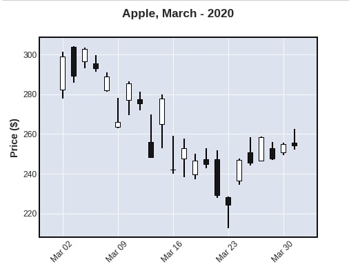
The second chart below shows us how green and red bars are created.
If open price is below close price then green bar is created highlighting that the security price increased (bullish) for that period else red bar is created highlighting a decrease (bearish) (Please take a look how open and close price location changes based on bar color).
The lines extending help us see how much price fluctuated (price change range) during the time interval. It can go well above opening price and can end below it or above it. During this fluctuation, the price can go below close price and cover little from there as well.
Chart 2:

In case, bars are created as black and white then white bars will be for bullish and black bars will be for bearish.
> What Can You Learn From This Article?
As a part of this tutorial, we have explained how to create candlestick charts in python using data visualization libraries mplfinance (matplotlib), plotly, bokeh, bqplot, cufflinks and Altair. The charts created using mplfinance are static whereas charts created using other libraries are interactive.
Apart from creating basic candlestick charts from the dataset, we have also explained things like styling charts, layout management, adding moving average lines (SMA, EMA, RSI, etc), adding sliders to select range, displaying volume bars, adding Bollinger bands, and saving figures, etc.
The dataset used for creating charts is Apple stock price data for one month available from Yahoo finance. The dataset is loaded as pandas dataframe and all charts are created from it.
Below, we have listed essential sections of the Tutorial to give an overview of the material covered.
Important Sections Of Tutorial
- mplfinance (Built on top of Matplotlib)
- 1.1 Simple Candlestick Charts
- 1.2 CandleStick Charts with Volume Bars
- 1.3 Add Your Own Technical Indicators (SMA, EMA, RSI, etc)
- 1.4 CandleStick Layout, Styling, and Moving Average Lines
- 1.5 Save Figure
- Plotly
- 2.1 CandleStick Charts with Slider to Analyze Range
- 2.2 CandleStick Charts without Slider
- 2.3 CandleStick Charts Layout & Styling
- 2.4 Add Technical Indicators (SMA, EMA, etc)
- Bokeh
- 3.1 Simple Candlestick Charts
- 3.2 Candlestick Chart with Volume
- 3.3 Candlestick with Technical Indicators (SMA, EMA, etc)
- Bqplot
- 4.1 CandleStick Charts using bqplot matplotlib-like API
- 4.2 CandleStick Charts using bqplot Internal Object Model API
- 4.3 Candlestick with Volume
- 4.3 Candlestick with Technical Indicators (SMA, EMA, etc)
- Cufflinks
- 5.1 Simple Candlestick Charts
- 5.2 Quant Figure (SMA, RSI, Bollinger Bands, etc)
- Altair
- 6.1 Simple Candlestick Charts
- 6.2 Candlestick Chart with Volume
- 6.3 Candlestick Pattern with Simple Moving Average
- 6.3 Candlestick Pattern with SMA & RSI
Candlestick Chart using Matplotlib (Video Tutorial)
If you are comfortable learning through video then feel free to check our youtube tutorial explaining how to create a candlestick chart using "matplotlib". In the video tutorial, we have explained how to create a candlestick chart using pure "matplotlib". On the other hand in this blog, we have explained candlestick chart creation using Python libraries mplfinance, plotly, bokeh, bqplot, cufflinks, and Altair.
Install Necessary Python Libraries for Tutorial
- pip install --upgrade mplfinance plotly bokeh cufflinks bqplot altair
0. Load Dataset 
We'll be using apple stock price data downloaded from yahoo finance. We'll be loading it using the pandas library as a dataframe.
We'll be filtering data to keep only March-2020 data into dataframe which we'll utilize for plotting.
import pandas as pd
apple_df = pd.read_csv('~/datasets/AAPL.csv', index_col=0, parse_dates=True)
dt_range = pd.date_range(start="2020-03-01", end="2020-03-31")
apple_df = apple_df[apple_df.index.isin(dt_range)]
apple_df.head()
Install Python Library "talib"
- pip install TA-Lib
Below, we have imported Python library talib which is commonly used to calculate various financial indicators like Relative Strength Index (RSI), Simple Moving Average (SMA), Exponential Moving Average (EMA), etc.
We have used talib to calculate SMA, EMA, and RSI indicators on our apple stocks data. We have added these indicators to our dataframe. We'll be plotting these indicators as well in candlestick charts.
import talib

print("TA-Lib Version : {}".format(talib.__version__))
apple_df["SMA"] = talib.SMA(apple_df.Close, timeperiod=3)
apple_df["RSI"] = talib.RSI(apple_df.Close, timeperiod=3)
apple_df["EMA"] = talib.EMA(apple_df.Close, timeperiod=3)

apple_df.head()
1. mplfinance (Built on top of Matplotlib) 
The first library which we'll explore for plotting candlestick charts in Python is mplfinance. It used to be available as a matplotlib module earlier but now it has moved out and has become an independent library. We can generate static candlestick charts using it.
1.1 Simple CandleStick Patterns 
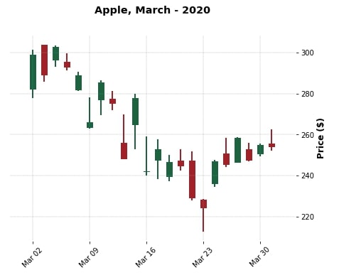
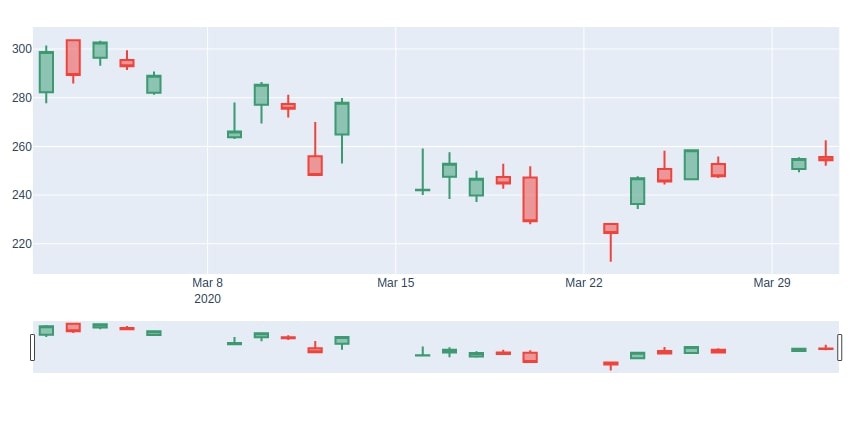
We'll start by generating a simple candlestick chart. First, we'll import mplfinance as fplt and then call the plot method of it passing apple dataframe along with type of the chart as candle. We can also provide title and ylabel.
import mplfinance as fplt

print("MPLFinance Version : {}".format(fplt.__version__))
fplt.plot(
            apple_df,
            type='candle',
            title='Apple, March - 2020',
            ylabel='Price ($)'
        )
We can try various plotting styles by setting a style attribute to various values. Below we are printing list of styles available with mplfinance.
print("Candlestick Chart Styling from MPLFinance : {}".format(fplt.available_styles()))
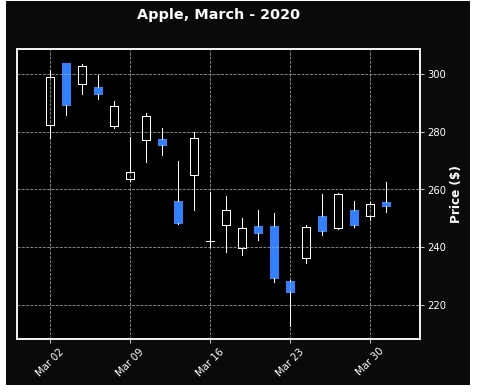
fplt.plot(
apple_df,
type='candle',
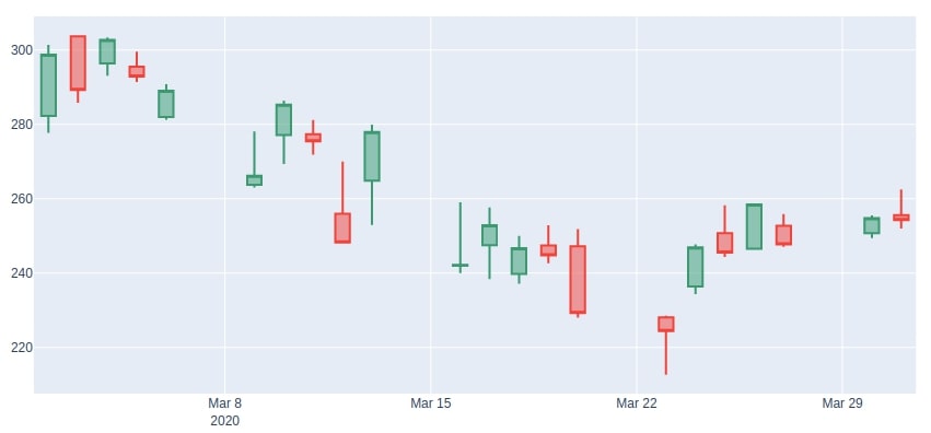
style='charles',
title='Apple, March - 2020',
ylabel='Price ($)',
)
fplt.plot(
            apple_df,
            type='candle',
            style='mike',
            title='Apple, March - 2020',
            ylabel='Price ($)',
        )
1.2 CandleStick with Volume 
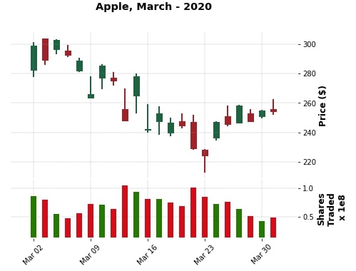
The mplfinance also provides us with functionality to plot the volume of stocks traded during that day. We can simply pass volume=True to plot() method to see the volume plot below the candlestick chart. We need volume information present in the dataframe for it to work. We can also pass ylabel_lower to change label of the y-axis of the volume plot.
fplt.plot(
            apple_df,
            type='candle',
            style='charles',
            title='Apple, March - 2020',
            ylabel='Price ($)',
            volume=True,
            ylabel_lower='Shares\nTraded',
            )
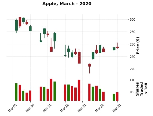
Below we are again plotting the same candlestick as above one but with gaps showing for non-trading days as well. We need to pass show_nontrading=True to be able to show gaps for non-trading days.
fplt.plot(
            apple_df,
            type='candle',
            style='charles',
            title='Apple, March - 2020',
            ylabel='Price ($)',
            volume=True,
            ylabel_lower='Shares\nTraded',
            show_nontrading=True
            )
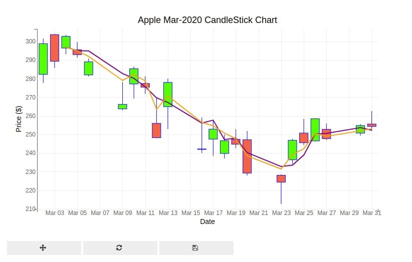
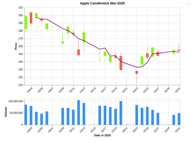
1.3 Add Your Own Technical Indicators (SMA, EMA, RSI, etc)
In this section, we have explained how to add technical indicators that we have calculated to candlestick chart created using mplfinance.
The mplfinance module provides us with method named make_addplot() for adding extra data to chart.
The method accepts pandas series or dataframe that has same index as original dataframe used to plot candlestick. It then adds data from series / dataframe to chart.
By default, it adds data as a line chart. But, we can modify it to display points and other markers as well.
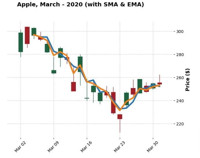
Below, we have called make_addplot() method with our apple dataframe keeping only SMA and EMA columns. The resulting object is stored in sma variable which will be assigned to addplot parameter of plot() method.
The addplot parameter accepts a single such object or list of objects. It adds details represented by all objects to chart.
sma = fplt.make_addplot(apple_df[["SMA", "EMA"]])

fplt.plot(
            apple_df,
            type='candle',
            addplot = sma,
            style='charles',
            title='Apple, March - 2020 (with SMA & EMA)',
            ylabel='Price ($)',
            )
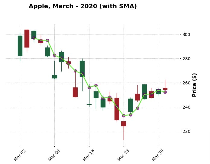
Below, we have created another example where we explain how to add points to a chart along with lines. We have plotted SMA as line and points both.
In order to plot points, we need to set type parameter as 'scatter'. We can specify marker type using marker parameter.
We have also set chart parameters like line / points color, marker size, line width, and opacity of points.
We have then given line and scatter chart as a list to addplot parameter of plot() method.
sma1 = fplt.make_addplot(apple_df["SMA"], color="lime", width=1.5)
sma2 = fplt.make_addplot(apple_df["SMA"], type="scatter", color="purple", marker="o",
                         alpha=0.7, markersize=50)

fplt.plot(
            apple_df,
            type='candle',
            addplot = [sma1, sma2],
            style='charles',
            title='Apple, March - 2020 (with SMA)',
            ylabel='Price ($)',
            )
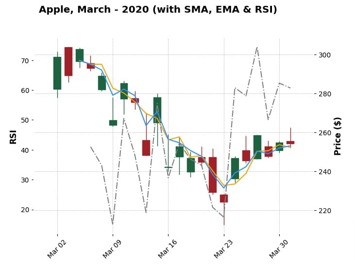
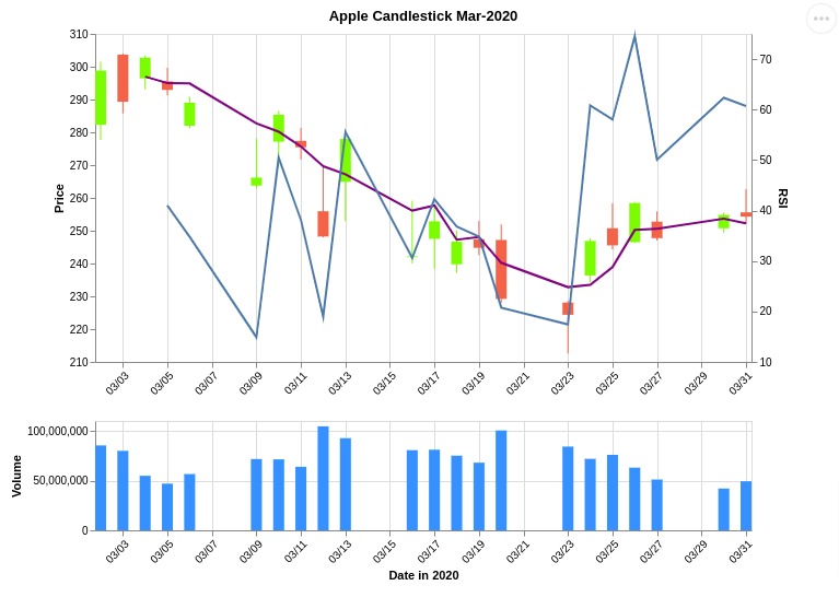
Below, we have created another example demonstrating how to add more than one indicator to our candlestick chart.
This time, we have added SMA, EMA, and RSI to our chart. The values of RSI are generally in the range of 0-80. This can skew our chart if we keep all of the indicators on same y-axis.
To avoid that, we have added a secondary y-axis to chart for RSI.
We can specify whether to create a secondary y-axis for data using secondary_y parameter. It accepts values 'auto', True or False. The default value is 'auto' which determines automatically whether there is a need for a secondary axis.
You can force secondary axis by setting secondary_y parameter to True as we have done for RSI below.
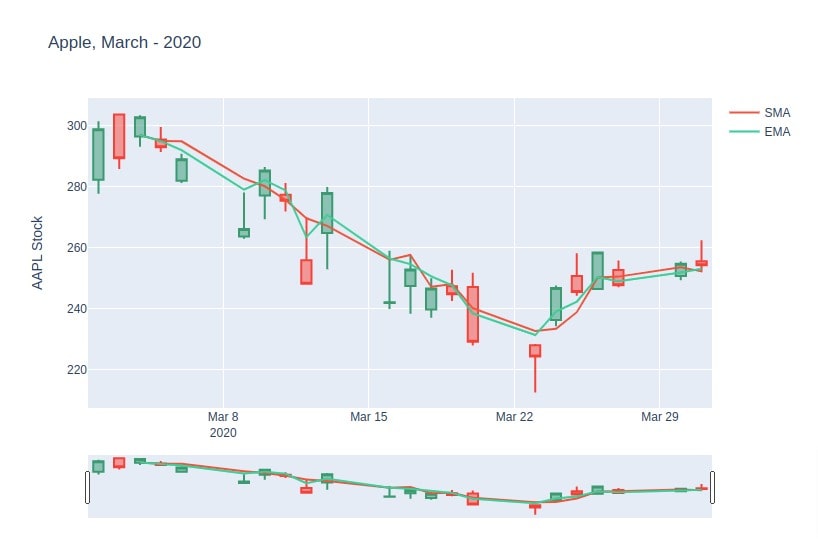
sma = fplt.make_addplot(apple_df["SMA"], color="orange", width=1.5)
ema = fplt.make_addplot(apple_df["EMA"], color="dodgerblue", width=1.5)
rsi = fplt.make_addplot(apple_df["RSI"], color="grey", width=1.5, ylabel="RSI",
                        secondary_y=True, linestyle='dashdot')

fplt.plot(
            apple_df,
            type='candle',
            addplot = [sma, ema, rsi],
            style='charles',
            title='Apple, March - 2020 (with SMA, EMA & RSI)',
            ylabel='Price ($)',
        )
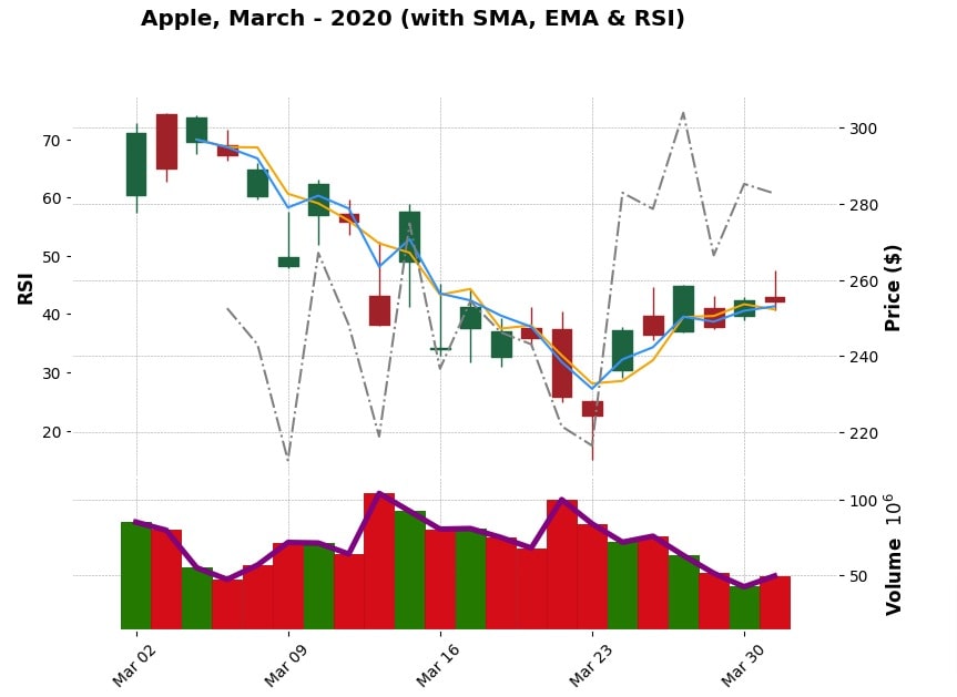
Apart from just main candlestick chart, we can add extra indicators to volume chart as well using same make_addplot() method.
In order to add data to a volume bar chart, we need to set panel parameter to 1 in make_addplot() method.
Below, we have added volume as a line chart to volume bar charts.
## Adding data to candlestick pattern subplot
sma = fplt.make_addplot(apple_df["SMA"], color="orange", width=1.5)
ema = fplt.make_addplot(apple_df["EMA"], color="dodgerblue", width=1.5)
rsi = fplt.make_addplot(apple_df["RSI"], color="grey", width=1.5, ylabel="RSI",
                        secondary_y=True, linestyle='dashdot')

## Adding data to volume subplot
volume = fplt.make_addplot(apple_df["Volume"], color="purple",
                           panel=1
                          )

fplt.plot(
            apple_df,
            type='candle',
            addplot = [sma, ema, rsi, volume],
            style='charles',
            title='Apple, March - 2020 (with SMA, EMA & RSI)',
            ylabel='Price ($)',
            volume=True,
            figscale=1.2,
        )
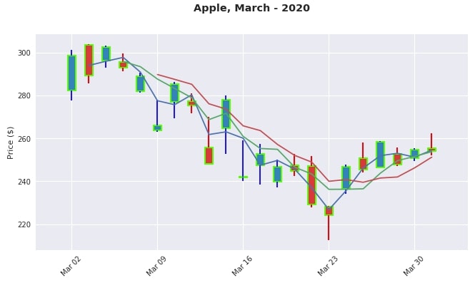
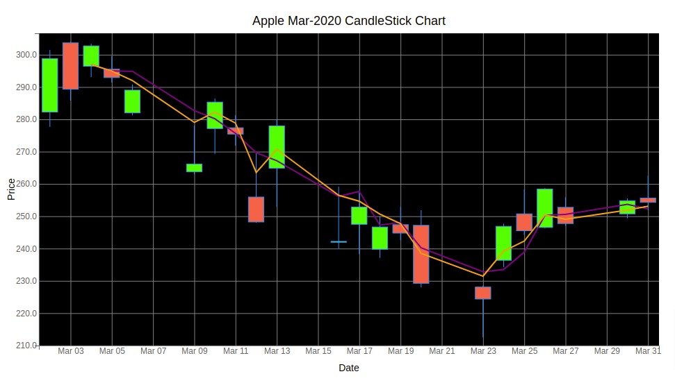
1.4 CandleStick Layout, Styling and Moving Average Lines 
We can try various styling functionalities available with mplfinance. We can pass the color of up, down and volume bar charts as well as the color of edges using the make_marketcolors() method. We need to pass colors binding created with make_marketcolors() to make_mpf_style() method and output of make_mpf_style() to style attribute plot() method. The below examples demonstrate our first styling. We can even pass the figure size using figratio attribute.
mc = fplt.make_marketcolors(
                            up='tab:blue',down='tab:red',
                            edge='lime',
                            wick={'up':'blue','down':'red'},
                            volume='tab:green',
                           )

s  = fplt.make_mpf_style(marketcolors=mc)

fplt.plot(
        apple_df,
        type="candle",
        title='Apple, March - 2020',
        ylabel='Price ($)',
        figratio=(12,8),
        volume=True,
        ylabel_lower='Shares\nTraded',
        show_nontrading=True,
        style=s,
    )
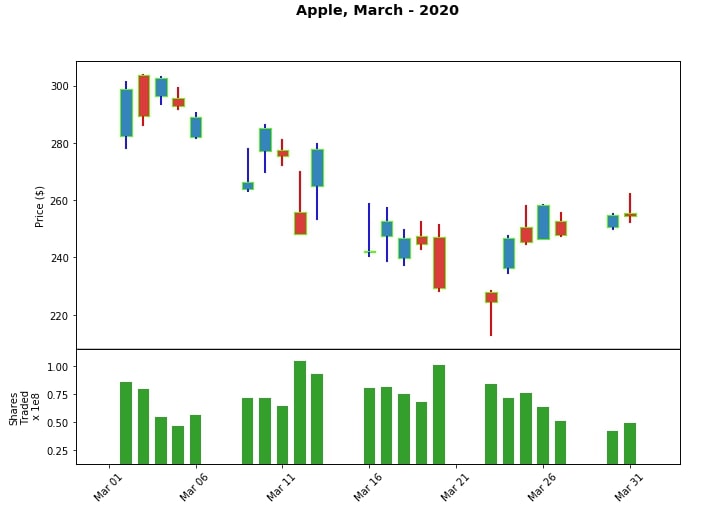
We can also change styling of whole plot by setting value of base_mpl_style parameter of make_mpf_style() method. We can try values like ggplot, seaborn, etc.
mc = fplt.make_marketcolors(
                            up='tab:blue',down='tab:red',
                            edge='lime',
                            wick={'up':'blue','down':'red'},
                            volume='lawngreen',
                           )

s  = fplt.make_mpf_style(base_mpl_style="ggplot", marketcolors=mc)

fplt.plot(
        apple_df,
        type="candle",
        title='Apple, March - 2020',
        ylabel='Price ($)',
        figratio=(12,8),
        volume=True,
        ylabel_lower='Shares\nTraded',
        show_nontrading=True,
        style=s
    )
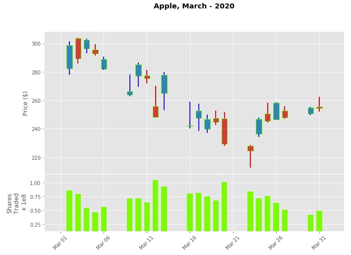
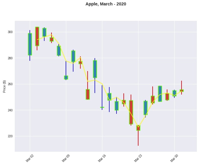
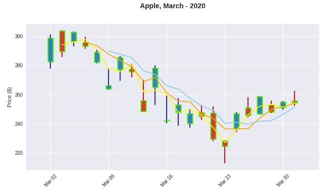
We can also add moving averages of price by passing value to mav parameter of plot() method. We can either pass scaler value for single moving average or tuple/list of integers for multiple moving averages. We'll explain it's usage with below few examples.
mc = fplt.make_marketcolors(
                            up='tab:blue',down='tab:red',
                            edge='lime',
                            wick={'up':'blue','down':'red'},
                            volume='lawngreen',
                           )

s  = fplt.make_mpf_style(base_mpl_style="seaborn", marketcolors=mc, mavcolors=["yellow"])

fplt.plot(
        apple_df,
        type="candle",
        title='Apple, March - 2020',
        ylabel='Price ($)',
        mav=2,
        figscale=1.5,
        style=s
    )
mc = fplt.make_marketcolors(
                            up='tab:blue',down='tab:red',
                            edge='lime',
                            wick={'up':'blue','down':'red'},
                            volume='lawngreen',
                           )

s  = fplt.make_mpf_style(base_mpl_style="seaborn", marketcolors=mc, mavcolors=["yellow","orange","skyblue"])

fplt.plot(
        apple_df,
        type="candle",
        title='Apple, March - 2020',
        ylabel='Price ($)',
        mav=(2,4,6),
        figratio=(12,6),
        style=s
    )
1.5 Save Figure
We can also save figure passing name of a file to savefig attribute.
mc = fplt.make_marketcolors(
                            up='tab:blue',down='tab:red',
                            edge='lime',
                            wick={'up':'blue','down':'red'},
                            volume='lawngreen',
                           )

s  = fplt.make_mpf_style(base_mpl_style="seaborn", marketcolors=mc)

fplt.plot(
        apple_df,
        type="candle",
        title='Apple, March - 2020',
        ylabel='Price ($)',
        figratio=(12,6),
        style=s,
        savefig='apple_march_2020.png'
    )
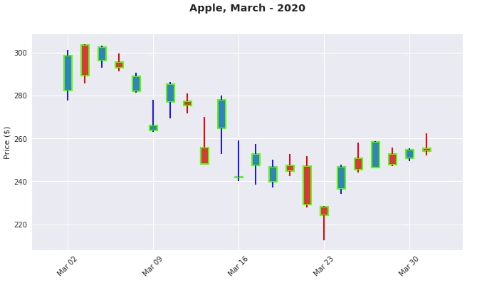
We can further pass information about the size and quality of an image to be saved as well to savefig parameter.
mc = fplt.make_marketcolors(
                            up='tab:blue',down='tab:red',
                            edge='lime',
                            wick={'up':'blue','down':'red'},
                            volume='lawngreen',
                           )

s  = fplt.make_mpf_style(base_mpl_style="seaborn", marketcolors=mc)

fplt.plot(
        apple_df,
        type="candle",
        title='Apple, March - 2020',
        ylabel='Price ($)',
        mav=(2,4,6),
        figratio=(12,6),
        style=s,
        savefig=dict(fname='apple_march_2020.png',dpi=100,pad_inches=0.25)
    )
2. Plotly 
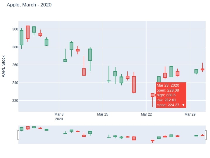
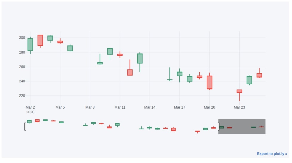
Plotly is another Python library that provides functionality to create candlestick charts. It allows us to create interactive candlestick charts.
2.1 CandleStick with Slider to Analyze Range 
We can create a candlestick chart by calling Candlestick() method of plotly.graph_objects module. We need to pass it a value of x as date as well as open, low, high and close values.
Plotly provides another small summary chart with sliders to let us highlight and view a particular period of a candlestick.
import plotly

print("Plotly Version : {}".format(plotly.__version__))
import plotly.graph_objects as go

candlestick = go.Candlestick(
                            x=apple_df.index,
                            open=apple_df['Open'],
                            high=apple_df['High'],
                            low=apple_df['Low'],
                            close=apple_df['Close']
                            )

fig = go.Figure(data=[candlestick])

fig.show()
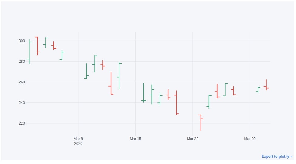
2.2 CandleStick without Slider 
We can only create a candlestick chart without a range slider as well by setting the value of parameter xaxis_rangeslider_visible as False.
candlestick = go.Candlestick(
                            x=apple_df.index,
                            open=apple_df['Open'],
                            high=apple_df['High'],
                            low=apple_df['Low'],
                            close=apple_df['Close']
                            )

fig = go.Figure(data=[candlestick])

fig.update_layout(xaxis_rangeslider_visible=False)
fig.show()
2.3 CandleStick Layout & Styling 
We can change the styling of Plotly graph by setting its width, height, title as well as colors of up and down bars.
candlestick = go.Candlestick(
                            x=apple_df.index,
                            open=apple_df['Open'],
                            high=apple_df['High'],
                            low=apple_df['Low'],
                            close=apple_df['Close']
                            )

fig = go.Figure(data=[candlestick])

fig.update_layout(
    width=800, height=600,
    title="Apple, March - 2020",
    yaxis_title='AAPL Stock'
)

fig.show()
candlestick = go.Candlestick(
x=apple_df.index,
open=apple_df['Open'],
high=apple_df['High'],
low=apple_df['Low'],
close=apple_df['Close'],
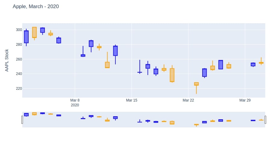
increasing_line_color= 'blue', decreasing_line_color= 'orange',
)
fig = go.Figure(data=[candlestick])
fig.update_layout(
title="Apple, March - 2020",
yaxis_title='AAPL Stock',
)
fig.show()
2.4 Add Technical Indicators (SMA, EMA, etc)
In this section, we have explained how to add technical indicators to plotly candlestick chart.
First, we have created a candlestick chart like previous example.
Then, we have created line charts for SMA and EMA indicators.
Then, we provided both charts to Figure() method along with a candlestick chart to plot them all in same figure.
candlestick = go.Candlestick(
                            x=apple_df.index,
                            open=apple_df['Open'],
                            high=apple_df['High'],
                            low=apple_df['Low'],
                            close=apple_df['Close'],
                            showlegend=False
                            )

sma = go.Scatter(x=apple_df.index,
                 y=apple_df["SMA"],
                 yaxis="y1",
                 name="SMA"
                )
ema = go.Scatter(x=apple_df.index,
                 y=apple_df["EMA"],
                 name="EMA"
                )

fig = go.Figure(data=[candlestick, sma, ema])

fig.update_layout(
    width=800, height=600,
    title="Apple, March - 2020",
    yaxis_title='AAPL Stock',
)

fig.show()
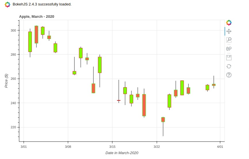
3. Bokeh 
Bokeh is another Python library that can be used to create interactive candlestick charts. We'll be using vbar() and segment() methods of bokeh to create bars and lines to eventually create a candlestick chart. We'll need to do simple calculations to create a candlestick with bokeh.
3.1 Simple CandleStick Charts
import bokeh

print("Bokeh Version : {}".format(bokeh.__version__))
from math import pi
from bokeh.plotting import figure
from bokeh.io import output_notebook,show
from bokeh.resources import INLINE

output_notebook(resources=INLINE)

inc = apple_df.Close > apple_df.Open
dec = apple_df.Open > apple_df.Close

w = 12*60*60*1000

fig = figure(x_axis_type="datetime", plot_width=800, plot_height=500, title = "Apple, March - 2020")

fig.segment(apple_df.index, apple_df.High, apple_df.index, apple_df.Low, color="black")

fig.vbar(apple_df.index[inc], w, apple_df.Open[inc], apple_df.Close[inc],
         fill_color="lawngreen", line_color="red")

fig.vbar(apple_df.index[dec], w, apple_df.Open[dec], apple_df.Close[dec],
         fill_color="tomato", line_color="lime")

fig.xaxis.axis_label="Date in March-2020"
fig.yaxis.axis_label="Price ($)"

show(fig)
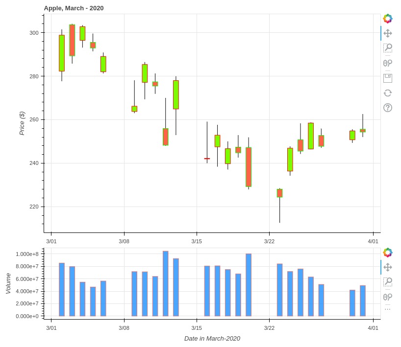
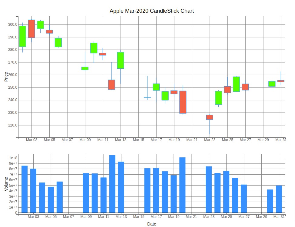
3.2 Candlestick Chart with Volume
Below, we have explained how to add a volume bar chart below candlestick chart.
We have created another figure that has a bar chart showing daily volume.
Then, we combined candlestick and volume bar charts using column() layout method of bokeh. It lays volume bar chart below candlestick chart.
from bokeh.layouts import column

inc = apple_df.Close > apple_df.Open
dec = apple_df.Open > apple_df.Close

w = 12*60*60*1000

## Candlestick chart
candlestick = figure(x_axis_type="datetime", plot_width=800, plot_height=500, title = "Apple, March - 2020")

candlestick.segment(apple_df.index, apple_df.High, apple_df.index, apple_df.Low, color="black")

candlestick.vbar(apple_df.index[inc], w, apple_df.Open[inc], apple_df.Close[inc],
         fill_color="lawngreen", line_color="red")

candlestick.vbar(apple_df.index[dec], w, apple_df.Open[dec], apple_df.Close[dec],
         fill_color="tomato", line_color="lime")

## Volume Chart
volume = figure(x_axis_type="datetime", plot_width=800, plot_height=200)

volume.vbar(apple_df.index, width=w, top=apple_df.Volume,
            fill_color="dodgerblue", line_color="tomato", alpha=0.8)


volume.xaxis.axis_label="Date in March-2020"
volume.yaxis.axis_label="Volume"
candlestick.yaxis.axis_label="Price ($)"

show(column(candlestick, volume))
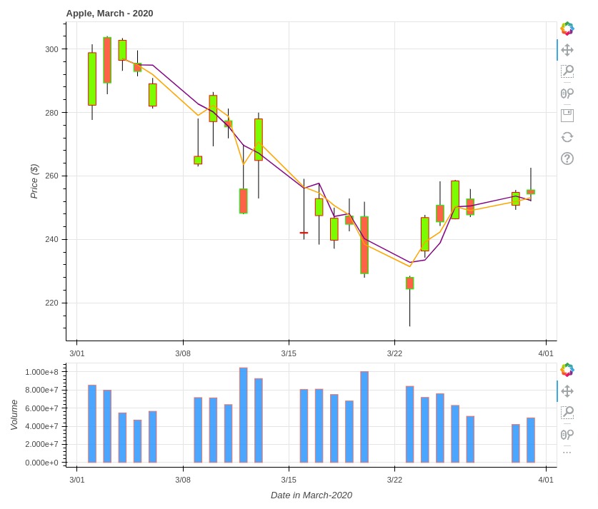
3.3 Candlestick with Technical Indicators (SMA, EMA, etc)
In this section, we have explained how to add financial indicators to our candlestick chart created using bokeh.
We have created a candlestick chart like earlier.
Then, we added SMA and EMA indicators to candlestick chart using line() glyph method of bokeh.
The rest of the code is same as earlier with only addition of code of two indicator lines.
from bokeh.layouts import column

inc = apple_df.Close > apple_df.Open
dec = apple_df.Open > apple_df.Close

w = 12*60*60*1000

## Candlestick chart
candlestick = figure(x_axis_type="datetime", plot_width=800, plot_height=500, title = "Apple, March - 2020")

candlestick.segment(apple_df.index, apple_df.High, apple_df.index, apple_df.Low, color="black")

candlestick.vbar(apple_df.index[inc], w, apple_df.Open[inc], apple_df.Close[inc],
         fill_color="lawngreen", line_color="red")

candlestick.vbar(apple_df.index[dec], w, apple_df.Open[dec], apple_df.Close[dec],
         fill_color="tomato", line_color="lime")

## SMA & EMA
candlestick.line(apple_df.index, apple_df.SMA, line_color="purple", line_width=1.5, name="SMA")
candlestick.line(apple_df.index, apple_df.EMA, line_color="orange", line_width=1.5)

## Volume Chart
volume = figure(x_axis_type="datetime", plot_width=800, plot_height=200)

volume.vbar(apple_df.index, width=w, top=apple_df.Volume,
            fill_color="dodgerblue", line_color="tomato", alpha=0.8)


volume.xaxis.axis_label="Date in March-2020"
volume.yaxis.axis_label="Volume"
candlestick.yaxis.axis_label="Price ($)"

show(column(candlestick, volume))
If you are looking for a guide to style, annotate and change the theme/layout of the candlestick chart then we would recommend you to visit the below links. It'll help you with that.
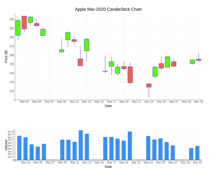
4. Bqplot 
Bqplot is a python library to create interactive visualizations developed by the Bloomberg developers. It also provides us with two different ways to create candlestick charts.
4.1 bqplot matplotlib-like API 
This API is almost the same as that of the matplotlib.pyplot API. It can be very easy for a person with a background in matplotlib to switch to bqplot using this API. We can create a candlestick chart in bqplot by calling the ohlc() method. We need to pass date data for X-axis and OHLC data for creating candles. We have explained below how we can create a candlestick chart using bqplot's pyplot API.
If you are interested in learning about bqplot's this API then please feel free to check our tutorial on the same which can help you to grasp API fast.
import bqplot

print("Bqplot Version : {}".format(bqplot.__version__))
from bqplot import pyplot as plt
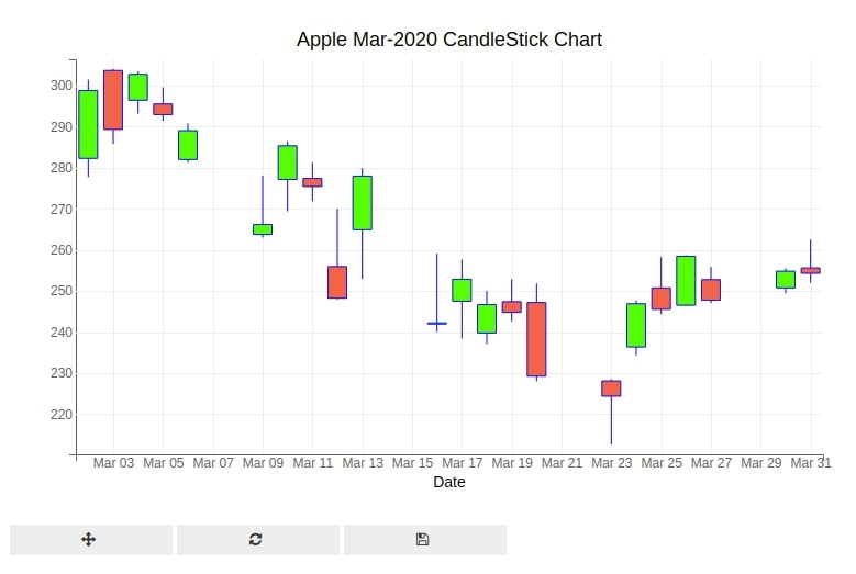
fig = plt.figure(title="Apple Mar-2020 CandleStick Chart")

fig.layout.width="800px"


plt.ohlc(x=apple_df.index, y=apple_df[["Open","High","Low","Close"]],
         colors=["lime", "tomato"],
         marker="candle", stroke="blue")

plt.xlabel("Date")
plt.ylabel("Price ($)")

plt.show()
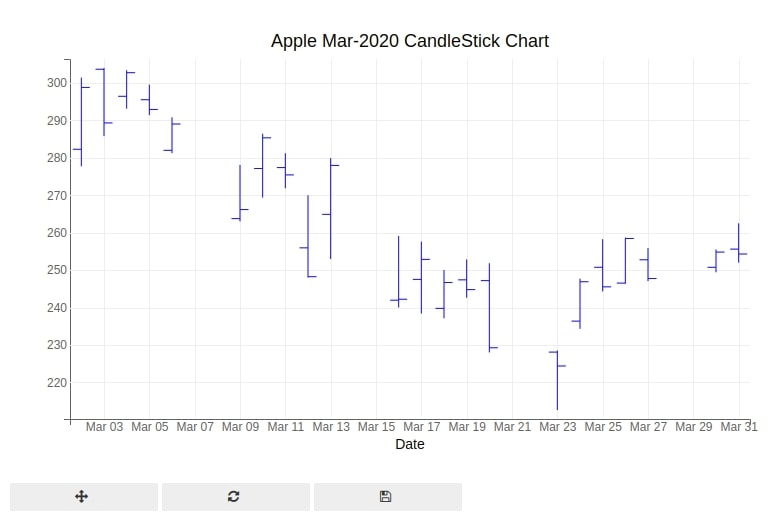
Below we have created the same chart as the above one but with the marker parameter set as bar instead of candle. This chart is also sometimes referred to as the OHLC chart.
fig = plt.figure(title="Apple Mar-2020 CandleStick Chart")

fig.layout.width="800px"

plt.ohlc(x=apple_df.index, y=apple_df[["Open","High","Low","Close"]],
                colors=["lime", "tomato"],
                marker="bar", stroke="blue")

plt.xlabel("Date")
plt.ylabel("Price ($)")

plt.show()
4.2 bqplot - Internal Object Model API 
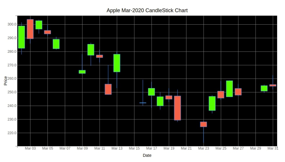
Bqplot also provides their internal object model API to create charts which are very flexible and provide us with lots of options to tweak the look of charts. In order to create a chart using this API, we'll need to create scales, axis, chart, and combine them all into one figure to create a chart.
If you are interested in learning about this API of bqplot in-depth then please feel free to check our tutorial on the same.
from bqplot import OHLC, DateScale, LinearScale, Axis, Figure

x_date = DateScale()
y_linear = LinearScale()

ohlc = OHLC(x=apple_df.index, y=apple_df[["Open","High","Low","Close"]],
            scales={'x':x_date, 'y':y_linear},
            marker="candle",
            stroke="dodgerblue", stroke_width=1.0,
            colors=["lime", "tomato"],
            )

ax_x = Axis(scale=x_date, label="Date",
            label_offset="35px", grid_color="gray",
            )
ax_y = Axis(scale=y_linear, label="Price",
            orientation="vertical", label_offset="35px",
            grid_color="gray",
            tick_format="0.1f")

fig = Figure(marks=[ohlc],
             axes=[ax_x, ax_y],
             title="Apple Mar-2020 CandleStick Chart",
             fig_margin= dict(top=60, bottom=40, left=50, right=20),
             background_style = {"fill":"black"}
      )

fig.layout.height="550px"


fig
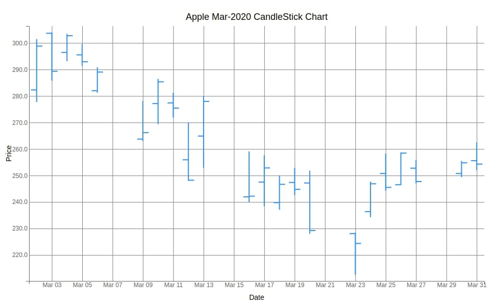
Below we have created an OHLC chart using bqplot's internal object model API. The code is the same as the previous chart with only a difference in the value of the marker parameter which is changed from candle to bar.
x_date = DateScale()
y_linear = LinearScale()

ohlc = OHLC(x=apple_df.index, y=apple_df[["Open","High","Low","Close"]],
            scales={'x':x_date, 'y':y_linear},
            marker="bar",
            stroke="dodgerblue", stroke_width=2.0,
            )

ax_x = Axis(scale=x_date, label="Date",
            label_offset="35px", grid_color="gray",
            )
ax_y = Axis(scale=y_linear, label="Price",
            orientation="vertical", label_offset="35px",
            grid_color="gray",
            tick_format="0.1f")

fig = Figure(marks=[ohlc],
             axes=[ax_x, ax_y],
             title="Apple Mar-2020 CandleStick Chart",
             fig_margin= dict(top=60, bottom=40, left=50, right=20),
      )

fig.layout.height="600px"


fig
4.3 Candlestick with Volume
In this section, we have explained how to add a volume bar chart to a candlestick chart created using bqplot.
We have first created a candlestick chart like in previous example.
Then, we created a volume bar chart.
As we have said earlier, bqplot charts are ipywidgets widgets. Each individual component of chart is a widget.
Hence, we can combine candlestick and bar chart using ipywidgets VBox() class which lays widgets vertically.
Please feel free to check our tutorial on ipywidgets if you are interested in learning it.
from bqplot import OHLC, DateScale, LinearScale, Axis, Figure
import ipywidgets

## Candlestick pattern
candlestick = plt.figure(title="Apple Mar-2020 CandleStick Chart")

candlestick.layout.width="900px"

plt.ohlc(x=apple_df.index, y=apple_df[["Open","High","Low","Close"]],
         colors=["lime", "tomato"],
         marker="candle", stroke="blue")

plt.xlabel("Date")
plt.ylabel("Price ($)")

## Volume Chart
volume = plt.figure()
volume.layout.width="900px"
volume.layout.height="250px"

bars = plt.bar(x=apple_df.index, y=apple_df["Volume"],
               padding=0.5,
               colors=["dodgerblue"],
                )
plt.xlabel("Date")
plt.ylabel("Volume")

ipywidgets.VBox([candlestick, volume])
Below, we have added a volume bar chart to candlestick chart created using the object model API of bqplot.
from bqplot import OHLC, DateScale, LinearScale, Axis, Figure, Bars

x_date = DateScale()
y_linear = LinearScale()

## Candlestick
ohlc = OHLC(x=apple_df.index, y=apple_df[["Open","High","Low","Close"]],
            scales={'x':x_date, 'y':y_linear},
            marker="candle",
            stroke="dodgerblue", stroke_width=1.0,
            colors=["lime", "tomato"],
            )

ax_x = Axis(scale=x_date, label_offset="35px", grid_color="gray")
ax_y = Axis(scale=y_linear, label="Price",
            orientation="vertical", label_offset="35px",
            grid_color="gray",
            tick_format="0.1f")

candlestick = Figure(marks=[ohlc],
             axes=[ax_x, ax_y],
             title="Apple Mar-2020 CandleStick Chart",
             fig_margin= dict(top=60, bottom=40, left=60, right=20),
      )

candlestick.layout.height="500px"

## Volume chart
x_date = DateScale()
y_linear = LinearScale()

bars = Bars(x=apple_df.index, y=apple_df["Volume"],
            scales={'x':x_date, 'y':y_linear},
            stroke="dodgerblue", stroke_width=1.0,
            padding=0.5,
            colors=["dodgerblue"],
            )

ax_x = Axis(scale=x_date, label="Date",
            label_offset="35px", grid_color="gray",
            )
ax_y = Axis(scale=y_linear, label="Volume",
            orientation="vertical", label_offset="35px",
            grid_color="gray")

volume = Figure(marks=[bars],
             axes=[ax_x, ax_y],
             fig_margin= dict(top=10, bottom=40, left=60, right=20),
      )

volume.layout.height="250px"

ipywidgets.VBox([candlestick, volume])
4.4 Candlestick with Technical Indicators (SMA, EMA, etc)
In this section, we have explained how to add financial indicators to candlestick chart created using bqplot.
Below, we have created a candlestick chart, as usual, using pyplot API of bqplot.
Then, we added SMA and EMA indicators to candlestick chart using plot() method.
fig = plt.figure(title="Apple Mar-2020 CandleStick Chart")

fig.layout.width="800px"


plt.ohlc(x=apple_df.index, y=apple_df[["Open","High","Low","Close"]],
         colors=["lime", "tomato"],
         marker="candle", stroke="blue")

plt.plot(x=apple_df.index, y=apple_df["SMA"], colors=["purple"])
plt.plot(x=apple_df.index, y=apple_df["EMA"], colors=["orange"])

plt.xlabel("Date")
plt.ylabel("Price ($)")

plt.show()
Below, we have added technical indicators to candlestick chart created using object model API of bqplot.
from bqplot import OHLC, DateScale, LinearScale, Axis, Figure, Lines

x_date = DateScale()
y_linear = LinearScale()

ohlc = OHLC(x=apple_df.index, y=apple_df[["Open","High","Low","Close"]],
            scales={'x':x_date, 'y':y_linear},
            marker="candle",
            stroke="dodgerblue", stroke_width=1.0,
            colors=["lime", "tomato"],
            )
sma = Lines(x=apple_df.index, y=apple_df["SMA"],
            scales={'x':x_date, 'y':y_linear},
            colors=["purple"]
           )
ema = Lines(x=apple_df.index, y=apple_df["EMA"],
            scales={'x':x_date, 'y':y_linear},
            colors=["orange"]
           )

ax_x = Axis(scale=x_date, label="Date",
            label_offset="35px", grid_color="gray",
            )
ax_y = Axis(scale=y_linear, label="Price",
            orientation="vertical", label_offset="35px",
            grid_color="gray",
            tick_format="0.1f")

fig = Figure(marks=[ohlc, sma, ema],
             axes=[ax_x, ax_y],
             title="Apple Mar-2020 CandleStick Chart",
             fig_margin= dict(top=60, bottom=40, left=50, right=20),
             background_style = {"fill":"black"}
      )

fig.layout.height="550px"


fig
5. Cufflinks 
The fifth library that we'll use to explain how we can create a candlestick chart using Python is cufflinks. Cufflinks is a wrapper library around plotly & pandas and let us create plotly charts directly from the pandas dataframe with just one line of code. As cufflinks is based on plotly, all charts are interactive.
5.1 Simple CandleStick Charts
Below we have explained how we can create a candlestick chart using plotly with just one line of code. We first need to import plotly and set the configuration to get started as explained below. We can call the iplot() method on the dataframe with OHLC data passing kind parameter value as candle to create a candlestick chart using cufflinks. We have even added a range selector to the figure. Please feel free to visit this link to add different types of range selectors to the figure.
If you are interested in learning about cufflinks then please feel free to check our tutorial which can help you to learn many different chart types.
import cufflinks as cf

print("Cufflinks Version : {}".format(cf.__version__))
cf.set_config_file(theme='pearl',sharing='public',offline=True)
apple_df.iplot(kind="candle",
                          keys=["Open", "High", "Low", "Close"],
                          rangeslider=True
                          )
The cufflinks also provide us with an OHLC chart by setting the kind parameter of the iplot() method to ohlc as explained below.
apple_df.iplot(kind="ohlc",
                          keys=["Open", "High", "Low", "Close"])
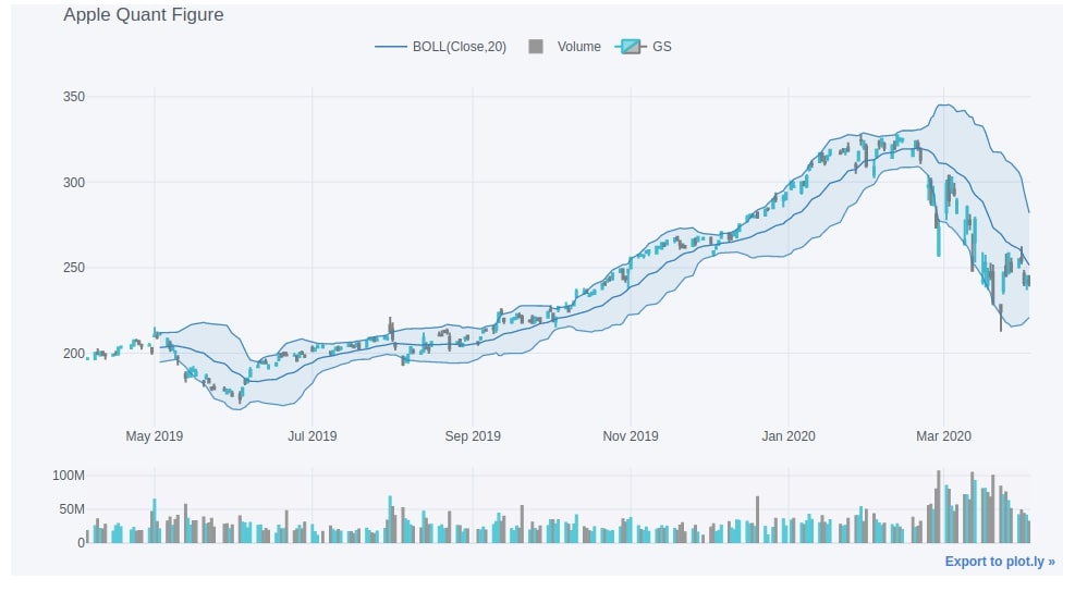
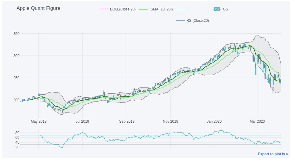
5.2 Quant Figure
Cufflinks also let us add volume, Bollinger bands, exponential moving average, relative strength indicator, moving average convergence divergence, average directional index, commodity channel indicator, directional movement index, parabolic SAR, resistance line, and trend line functionalities to our chart. We first need to create a figure object by calling the QuantFig() method of cufflinks passing it pandas dataframe with OHLC data. We can then call the list of below methods on QuantFig instance to add functionalities one by one to the figure before calling iplot() to finally display the figure.
- add_bollinger_bands() - It adds Bollinger Bands (BOLL) study to the figure.
- add_volume() - It adds volume bar charts to the figure.
- add_sma() - It adds Simple Moving Average (SMA) study to the figure.
- add_rsi() - It adds Relative Strength Indicator (RSI) study to the figure.
- add_adx() - It adds Average Directional Index (ADX) study to the figure.
- add_cci() - It adds Commodity Channel Indicator study to the figure.
- add_dmi() - It adds Directional Movement Index (DMI) study to the figure.
- add_ema() - It adds Exponential Moving Average (EMA) to the figure.
- add_atr() - It adds Average True Range (ATR) study to the figure.
- add_macd() - It adds Moving Average Convergence Divergence (MACD) to the figure.
- add_ptps() - It adds Parabolic SAR (PTPS) study to the figure.
- add_resistance() - It adds resistance line to the figure.
- add_trendline() - It adds trend line to the figure.
- add_support() - It adds support line to the figure.
Please make a note that we have explained below mostly usage of the above methods with default parameters. If you are interested in tweaking the parameters of these methods then please feel free to check the signature of these methods by pressing Shift + Tab in the Jupyter notebook.
Below we have again loaded our apple OHLC dataset. We have then added Bollinger bands and volume to our figure.
apple_df = pd.read_csv('~/datasets/AAPL.csv', index_col=0, parse_dates=True)

qf=cf.QuantFig(apple_df,title='Apple Quant Figure',legend='top',name='GS')
qf.add_bollinger_bands()
qf.add_volume()

qf.iplot()
Below we have explained another example of creating a candlestick chart using cufflinks. We have added Bollinger bands, simple moving average, and relative strength index studies to the chart as well this time.
qf=cf.QuantFig(apple_df,title='Apple Quant Figure',legend='top',name='GS')

qf.add_bollinger_bands(periods=20,boll_std=2,colors=['magenta','grey'],fill=True)
qf.add_sma([10,20],width=2,color=['green','lightgreen'],legendgroup=True)
qf.add_rsi(periods=20,color='java')

qf.iplot()
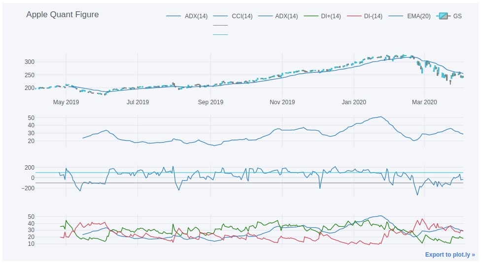
The last candlestick chart that we have created using cufflinks adds average directional index, commodity channel indicator, directional movement index, and exponential moving average studies to the chart.
qf=cf.QuantFig(apple_df,title='Apple Quant Figure',legend='top',name='GS')

qf.add_adx()
qf.add_cci()
qf.add_dmi()
qf.add_ema()

qf.iplot()
6. Altair 
In this section, we have explained how to create candlestick charts using Python library Altair. We have even explained how to add a volume bar chart and financial indicators to chart.
If you are new to Altair then we would recommend that you go through our simple tutorial on it.
Below, we have first imported Altair and printed version that we have used in our tutorial.
import altair as alt

print("Altair Version : {}".format(alt.__version__))
6.1 Simple Candlestick Charts
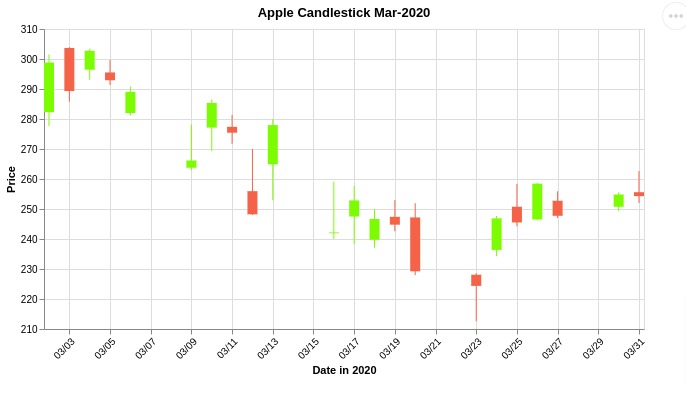
In this section, we have explained how to create simple candlestick charts using Altair. We are plotting a candlestick chart for apple stock prices for the month of March-2020.
The plotting of the candle stick chart is carried out in 3 steps.
In the first step, we create a base plot with proper x and y-axis.
We then create a rule chart based on low and high columns by extending the base chart.
Then we create a bar chart based on open and close columns by extending the base chart.
At last, we merge the bar and rule chart to create a candlestick chart.
## Base
base = alt.Chart(apple_df.reset_index()).encode(
    x = alt.X('Date:T', axis=alt.Axis(format='%m/%d', labelAngle=-45, title='Date in 2020')),
    color=alt.condition("datum.Open <= datum.Close", alt.value("lawngreen"), alt.value("tomato")),
)

## Lines
rule = base.mark_rule().encode(
    y = alt.Y('Low:Q', title='Price',scale = alt.Scale(zero=False)),
    y2 = alt.Y2('High:Q')
)

## Candles
bar = base.mark_bar(width=10.).encode(
    y = alt.Y('Open:Q'),
    y2 = alt.Y2('Close:Q'),
    tooltip = ["Date", "Open", "High", "Low", "Close"]
).properties(
    width=600, height=300,
    title="Apple Candlestick Mar-2020")

candlestick = rule + bar

candlestick
6.2 Candlestick with Volume
In this section, we have explained how to add a volume bar chart below candlestick chart.
We have created a volume bar chart separately below.
Then, we combined candlestick chart and bar chart using '&' operator. The Altair puts charts vertically if we combine charts using '&' operator.
volume = alt.Chart(apple_df.reset_index()).mark_bar(color="dodgerblue", width=10.).encode(
    x = alt.X('Date:T', axis=alt.Axis(format='%m/%d', labelAngle=-45, title='Date in 2020')),
    y = alt.Y("Volume"),
    tooltip = ["Date", "Volume"]
).properties(
    width=600,height=100,
)

volume
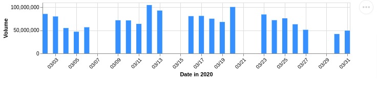
candlestick & volume
6.3 Candlestick Pattern with Simple Moving Average
In this section, we have explained how to add financial indicators to our candlestick chart created using Altair.
We have created a candlestick chart like our earlier examples.
Then, we have created a line chart of SMA indicator.
After creating SMA line chart, we combined it with the candlestick chart using '+' operator.
At last, we have added a volume chart using '&' operator.
base = alt.Chart(apple_df.reset_index()).encode(
    x = alt.X('Date:T', axis=alt.Axis(format='%m/%d', labelAngle=-45, title=None)),
)

## Lines
rule = base.mark_rule().encode(
    y = alt.Y('Low:Q', title='Price', scale = alt.Scale(zero=False)),
    y2 = alt.Y2('High:Q'),
    color=alt.condition("datum.Open <= datum.Close", alt.value("lawngreen"), alt.value("tomato")),

)

## Candles
bar = base.mark_bar(width=10.).encode(
    y = alt.Y('Open:Q'),
    y2 = alt.Y2('Close:Q'),
    color=alt.condition("datum.Open <= datum.Close", alt.value("lawngreen"), alt.value("tomato")),
    tooltip = ["Date", "Open", "High", "Low", "Close"]
).properties(
    width=600, height=300,
    title="Apple Candlestick Mar-2020")

## Simple Moving Average
sma = base.mark_line(color="purple").encode(
    y = alt.Y('SMA:Q'),
    tooltip = ["Date", "SMA"],
)

candlestick = rule + bar + sma

candlestick & volume
6.4 Candlestick Pattern with SMA & RSI
In this section, we have again explained how to add financial indicators to candlestick chart but this time we have created a secondary Y-axis for indicator as it is on a different scale.
As we had mentioned earlier that RSI indicator is generally in the range 0-70 hence adding it as a line chart can skew our candlestick chart.
Hence, we need to create a secondary y-axis for RSI indicator.
Below, we have explained how to add RSI line to a chart with the secondary y-axis.
We have created RSI line chart as usual.
Then, we combined candlestick and RSI line chart using layer() method of Altair. We have called resolve_scale() method on result asking it to set y parameter as 'independent'. This will plot RSI with secondary Y axis.
rsi = base.mark_line().encode(
    y = alt.Y('RSI:Q', scale = alt.Scale(zero=False)),
    tooltip = ["Date", "RSI"]
)

candlestick = alt.layer(candlestick, rsi).resolve_scale(
    y = 'independent'
)

candlestick & volume
 Sunny Solanki
Sunny Solanki
Intro: Software Developer | Youtuber | Bonsai Enthusiast
About: Sunny Solanki holds a bachelor's degree in Information Technology (2006-2010) from L.D. College of Engineering. Post completion of his graduation, he has 8.5+ years of experience (2011-2019) in the IT Industry (TCS). His IT experience involves working on Python & Java Projects with US/Canada banking clients. Since 2020, he’s primarily concentrating on growing CoderzColumn.
His main areas of interest are AI, Machine Learning, Data Visualization, and Concurrent Programming. He has good hands-on with Python and its ecosystem libraries.
Apart from his tech life, he prefers reading biographies and autobiographies. And yes, he spends his leisure time taking care of his plants and a few pre-Bonsai trees.
Contact: sunny.2309@yahoo.in


![YouTube Subscribe]() Comfortable Learning through Video Tutorials?
Comfortable Learning through Video Tutorials?
If you are more comfortable learning through video tutorials then we would recommend that you subscribe to our YouTube channel.
![Need Help]() Stuck Somewhere? Need Help with Coding? Have Doubts About the Topic/Code?
Stuck Somewhere? Need Help with Coding? Have Doubts About the Topic/Code?
 Stuck Somewhere? Need Help with Coding? Have Doubts About the Topic/Code?
When going through coding examples, it's quite common to have doubts and errors.
If you have doubts about some code examples or are stuck somewhere when trying our code, send us an email at coderzcolumn07@gmail.com. We'll help you or point you in the direction where you can find a solution to your problem.
You can even send us a mail if you are trying something new and need guidance regarding coding. We'll try to respond as soon as possible.
![Share Views]() Want to Share Your Views? Have Any Suggestions?
Want to Share Your Views? Have Any Suggestions?
 Want to Share Your Views? Have Any Suggestions?
If you want to
- provide some suggestions on topic
- share your views
- include some details in tutorial
- suggest some new topics on which we should create tutorials/blogs
 candlestick, mplfinance, plotly, bokeh, bqplot, cufflinks