cufflinks - How to create plotly charts from pandas dataframe with one line of code?
Pandas is the most preferred library nowadays by the majority of data scientists worldwide for working (loading, manipulating, etc) with structured datasets (tables).
Besides data management and manipulation functionalities, it provides very convenient data visualization functionality. It let create charts from dataframe directly by simply calling plot() method on it. We can create easily create charts like scatter charts, bar charts, line charts, etc with just a line of code (by calling "plot()" with necessary parameters).
The pandas data visualization uses the matplotlib library behind the scene. All the plots generated by matplotlib are static hence charts generated by pandas dataframe's '.plot()' API will be static as well.
But this is an era of interactivity. Almost everything is interactive nowadays (charts, apps, dashboards, etc).
Python also have many data visualization libraries like Plotly, Bokeh, Holoviews, Bqplot, Altair, etc that can generate interactive charts. It can be very helpful if we can generate interactive charts directly from the pandas dataframe.
To our surprise, there is a Python library named "cufflinks" that is designed with this aim in mind. It let us generate interactive charts based on plotly directly from pandas dataframe with one line of code.
What Can You Learn From This Article?
As a part of this tutorial, we have explained how to use Python library "cufflinks" to create interactive data visualizations. Cufflinks is built on top of another data visualization library named Plotly. The main aim of Cufflinks is to simplify data visualization by providing same API as that of pandas dataframe function "plot()" but generating interactive charts using Plotly. It provides two methods with same API as pandas "plot()".
"iplot()": This method provides the majority of parameters which are almost the same as that of plot() which will make it easier for someone having knowledge on plot() to get used to it.
- Want to Know All Parameters of "iplot()" Function?
- Try help(df.iplot) in Jupyter Notebook or IPython shell to know about all possible arguments of "iplot()" function. It has a lot of arguments because it is a generic function to create many charts.
- Want to Know All Parameters of "iplot()" Function?
"figure()": It is almost same as iplot() with only difference being that it returns Plotly Figure object which we can customize further if we have good knowledge of Plotly.
We'll primarily concentrate on Cufflinks 'iplot()' method as a part of this tutorial to generate various interactive plotly charts from pandas dataframe. All datasets are loaded at the beginning as pandas dataframe.
Apart from simply plotting charts, we have also explained various theming and styling options to improve chart aesthetics (look & feel). The datasets used to create charts are toy datasets available from scikit-learn.
Below, we have listed essential sections of Tutorial to give an overview of the charts covered. Apart from simple chart types, various versions of charts (like stacked bar charts, exploding pie charts, etc) are also covered.
Important Sections Of Tutorial
- Scatter Plots
- Scatter Chart with Regression Line Fitted
- Bar Charts
- Simple Bar Chart
- Horizontal Bar Chart
- Side-by-Side/Grouped Bar Chart
- Stacked Bar Chart
- Figure of Multiple Bar Charts
- Line Charts
- Line Chart with Secondary Y-Axis
- Area Charts
- Pie Charts
- Exploding Pie Chart (Pie Chart with Wedge Sticking Out)
- Histograms
- Box Plots
- Heatmaps
- CandleStick & OHLC Charts
- Bubble Chart
- 3D Bubble Chart
- 3D Scatter Chart
- Spread Chart
- Ratio Chart
Map Charts using "cufflinks"
We have not covered map charts (choropleth maps, bubble maps, scatter maps, etc) as a part of this tutorial. Please check below link if you are looking for it.
Dashboard using "cufflinks" & "streamlit"
We have one more tutorial where we have used "cufflinks" to create a dashboard. Do check it out if it interests you.
Cufflinks Video Tutorial
Please feel free to check below video tutorial if feel comfortable learning through videos. We have covered five different chart types in video. But in this tutorial, we have covered many different chart types.
This ends our small introduction to "cufflinks". Let's get started with the coding part.
Below, we have imported necessary Python libraries for our tutorial and printed the versions that we have used in our tutorial.
import pandas as pd
import numpy as np
Install Cufflinks
- pip install -U cufflinks
import cufflinks as cf

print("Cufflinks Version : {}".format(cf.__version__))
Set Cufflinks Theme
Below, We have set the default configuration for cufflinks using set_config_file() where we have set the default theme as well as other parameters (sharing, margin, etc). We can even set default dimensions of figures using dimension parameter and margin around chart using margin parameter.
We can retrieve a list of themes available with cufflinks using getThemes() method.
print("List of Cufflinks Themes : ", cf.getThemes())

## Setting Pearl Theme
cf.set_config_file(theme='pearl', sharing='public', offline=True) # dimensions=(), margin=(20,20,20,20)
Load Datasets
We'll be using below mentioned three datasets for plotting various charts.
- IRIS Flowers Dataset: It has information about measurements of three different types of IRIS flowers. The dataset is easily available from the scikit-learn library.
- Wine Dataset: It has information about the number of various ingredients used in three different types of wine. The dataset is easily available from the scikit-learn library.
- Apple OHLC Dataset: It has information about Apple OHLC(Open, High, Low & Close) data from Apr 2019 - Mar 2020. The dataset can be easily downloaded from yahoo finance as CSV.
We'll be loading each dataset as a pandas dataframe which will be later used for plotting.
from sklearn.datasets import load_wine, load_iris
iris = load_iris()

iris_df = pd.DataFrame(data=iris.data, columns=iris.feature_names)

iris_df["FlowerType"] = [iris.target_names[t] for t in iris.target]

iris_df.head()
wine = load_wine()

wine_df = pd.DataFrame(data=wine.data, columns=wine.feature_names)

wine_df["WineType"] = [wine.target_names[t] for t in wine.target]

wine_df.head()
apple_df = pd.read_csv("~/datasets/AAPL.csv", index_col=0, parse_dates=True)

apple_df.head()
1. Scatter Plots 
The first chart type that we'll create using cufflinks is a scatter chart.
1.1. Simple Scatter Plot
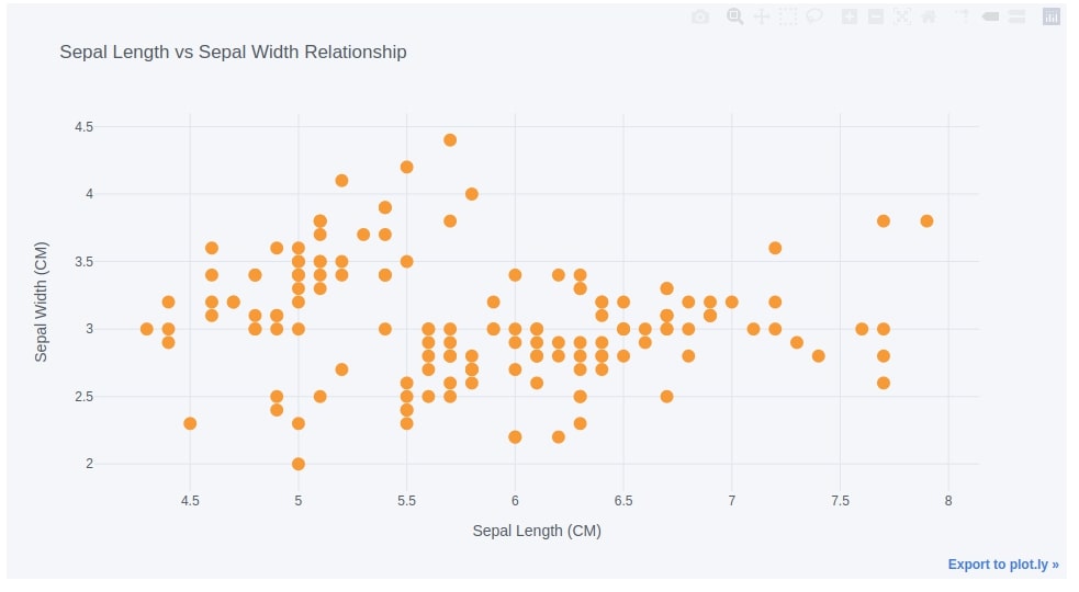
Below we are creating a scatter chart from the IRIS dataframe by calling iplot() method. Cufflinks let us specify chart type using kind parameter of iplot() method. We have set it to 'scatter' to indicate chart type.
In order to create various charts, we need to pass different chart types to the kind parameter.
Apart from chart type, we have passed column names of the dataframe as x and y parameters. This instructs method to use data from those columns to plot a scatter chart.
We also have set mode parameters as 'markers' to indicate the type of chart as scatter else it'll plot line chart by default. Below is a list of supported mode types for scatter charts.
- 'lines'
- 'markers'
- 'lines+markers'
- 'lines+text'
- 'markers+text'
- 'lines+markers+text'
We can also give a title to the plot as well as to x and y-axis.
iris_df.iplot(kind="scatter",
                              x="sepal length (cm)", y='sepal width (cm)',
                              mode='markers',
                              xTitle="Sepal Length (CM)", yTitle="Sepal Width (CM)",
                              title="Sepal Length vs Sepal Width Relationship")
1.2. Scatter Chart Points Colored According to Categories
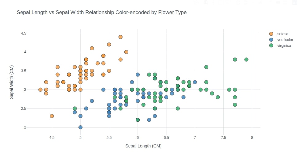
Below we have created another scatter plot that is exactly the same as the previous scatter chart with only one difference which is that we have colored points according to different flower types.
We have used the figure() method to create a chart this time that has the same parameters as iplot(). We have passed the column name to the categories parameter in order to color points on a scatter chart according to their flower type.
How to Override Default "cufflinks" Theme?
We also have overridden the default theme from 'pearl' to 'white' by setting the theme parameter. This will override theme that we set at the beginning by calling set_config_file() method.
fig = iris_df.figure(kind="scatter",
               x="sepal length (cm)", y='sepal width (cm)',
               mode='markers',categories="FlowerType",
               theme="white",
               xTitle="Sepal Length (CM)", yTitle="Sepal Width (CM)",
               title="Sepal Length vs Sepal Width Relationship Color-encoded by Flower Type")

fig
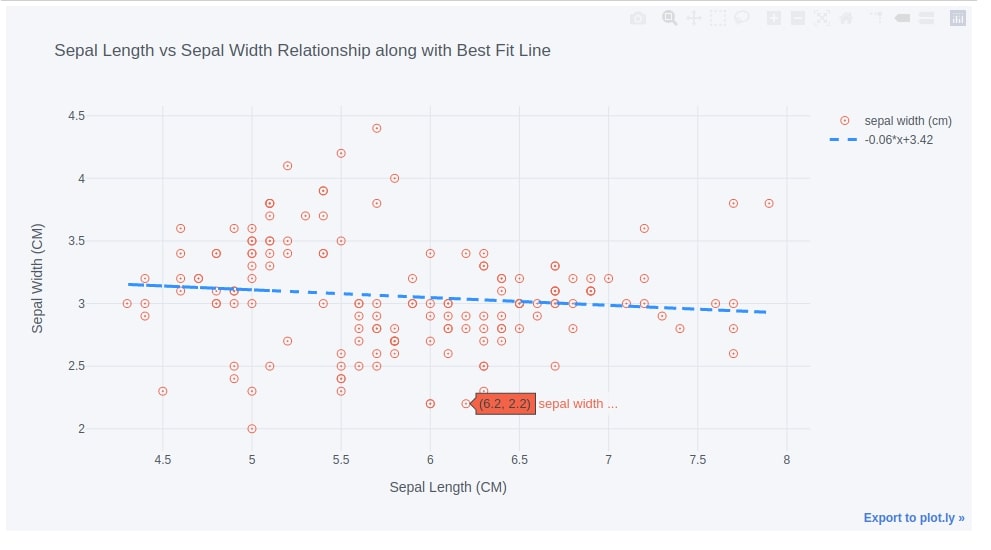
1.3. Scatter Chart with Regression Line Fitted
Below we have again created the same chart as the first scatter chart but have added the regression line to the data as well by setting bestfit parameter to True. We have also changed the point type in a scatter chart.
iris_df.iplot(kind="scatter",
              x="sepal length (cm)", y='sepal width (cm)',
              mode='markers',
              colors="tomato",  size=8, symbol="circle-open-dot",
              bestfit=True, bestfit_colors=["dodgerblue"],
              xTitle="Sepal Length (CM)", yTitle="Sepal Width (CM)",
              title="Sepal Length vs Sepal Width Relationship along with Best Fit Line")
2. Bar Charts 
The second chart type that we'll introduce is a bar chart.
2.1. Simple Bar Chart
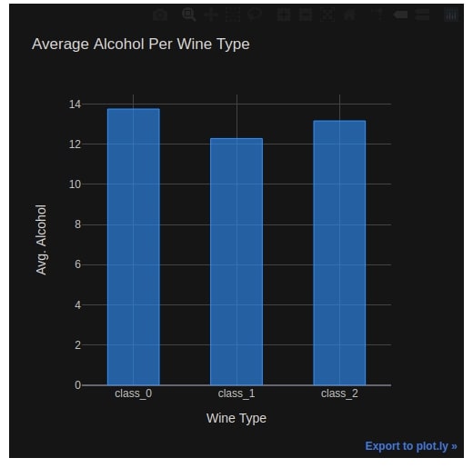
We'll first create a dataframe that has average ingredients per wine type. We can call groupby() method on the wine dataframe to group records according to WineType and then take the mean of that records to get the average of each ingredient per wine type.
We have taken out two columns from the dataset because both have very high values which can skew our charts.
avg_wine_df = wine_df.groupby(by=["WineType"]).mean()

avg_wine_df = avg_wine_df.drop(columns=["magnesium", "proline"])

avg_wine_df
Below we have created our first bar chart by setting kind parameter to 'bar'.
We have passed 'alcohol' as y value in order to plot a bar chart of average alcohol used per wine type.
We have also overridden default 'pearl' theme to 'solar' theme.
avg_wine_df.iplot(kind="bar", y="alcohol",
                  colors=["dodgerblue"],
                  bargap=0.5,
                  dimensions=(500,500),
                  theme="solar",
                  xTitle="Wine Type", yTitle="Avg. Alcohol", title="Average Alcohol Per Wine Type")
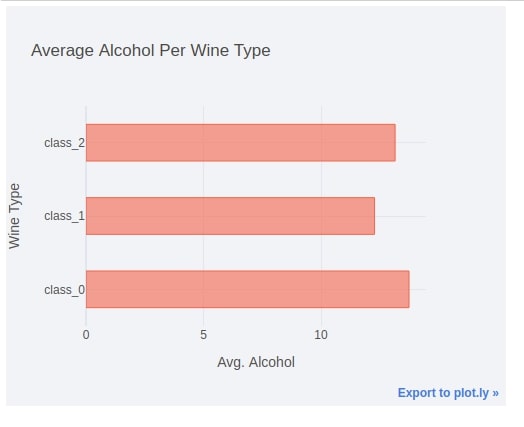
2.2. Horizontal Bar Chart
We have again created same chart as previous step but this time we have laid out bars horizontally. All other parameters are same as previous step.
We can change bars from vertical to horizontal by setting orientation parameter to 'h'.
avg_wine_df.iplot(kind="bar", y="alcohol",
                  yTitle="Wine Type", xTitle="Avg. Alcohol", title="Average Alcohol Per Wine Type",
                  colors=["tomato"], bargap=0.5,
                  sortbars=True,
                  dimensions=(500,400),
                  theme="polar",
                  orientation="h")
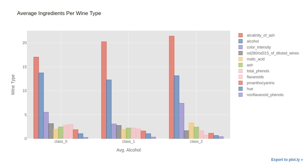
2.3. Side-By-Side/Grouped Bar Chart
Below we have created side by side bar chart by directly calling iplot() on the whole dataframe.
We have set sortbars parameter to True in order to sort bars from the highest quantity to the lowest.
We have also overridden the default chart theme from 'pearl' to 'ggplot'.
avg_wine_df.iplot(kind="bar",
                  sortbars=True,
                  yTitle="Wine Type", xTitle="Avg. Alcohol", title="Average Ingredients Per Wine Type",
                  theme="ggplot"
                  )
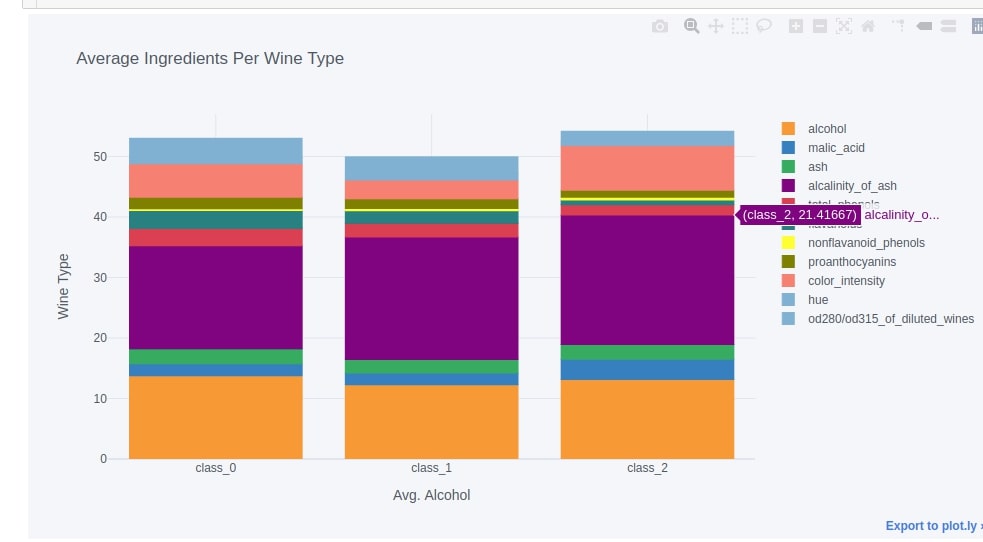
2.4. Stacked Bar Chart
We can create a stacked bar chart easily by setting barmode parameter to 'stack'. Below we have created a stacked bar chart to show the average distribution of ingredients per wine type.
avg_wine_df.iplot(kind="bar",
                  barmode="stack",
                  yTitle="Wine Type", xTitle="Avg. Alcohol", title="Average Ingredients Per Wine Type",
                  opacity=1.0,
                  )
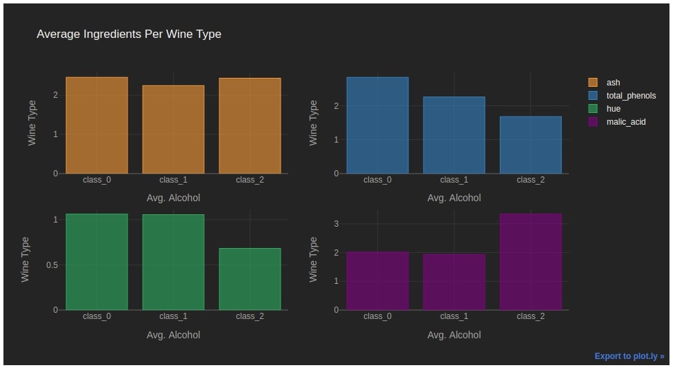
2.5. Figure with Multiple Bar Charts
We can create an individual bar chart for columns of the dataframe by setting the subplots parameter to True. It'll create a different bar chart for each column of the dataframe.
We have set the keys parameter to a list of columns to use from the dataframe so that bar charts will be created for these 4 columns. We can pass a list of columns to use from the dataframe as a list to the keys parameter.
avg_wine_df.iplot(kind="bar",
                  subplots=True,
                  sortbars=True,
                  keys = ["ash", "total_phenols", "hue", "malic_acid"],
                  yTitle="Wine Type", xTitle="Avg. Alcohol", title="Average Ingredients Per Wine Type",
                  theme="henanigans"
                  )
3. Line Charts 
The third chart type that we'll introduce is a line chart.
3.1. Simple Line Chart with One Line
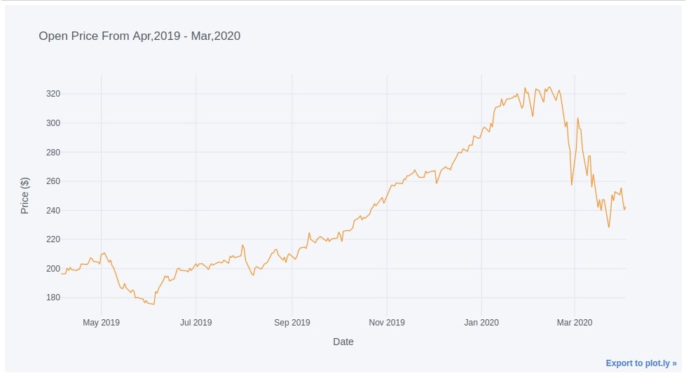
We can easily create a line chart by just calling iplot() method on the dataframe and giving which column to use for the x and y-axis. If we don't give a value for the x-axis then it'll use the index of the dataframe as the x-axis.
In our case, the index of the dataframe is the date for prices. We have plotted below the line chart of Open price over the whole period.
We don't need to give kind parameter for line chart as it is default one.
apple_df.iplot(y="Open",
               xTitle="Date", yTitle="Price ($)", title="Open Price From Apr,2019 - Mar,2020")
3.2. Multiple Lines Per Line Chart
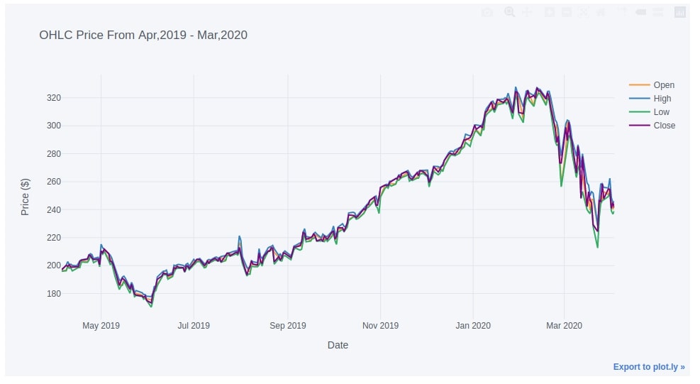
We can plot more than one line on the chart by passing a list of column names from the dataframe as a list to the y parameter and it'll add one line per column to the chart.
apple_df.iplot(y=["Open", "High", "Low", "Close"],
               width=2.0,
               xTitle="Date", yTitle="Price ($)", title="OHLC Price From Apr,2019 - Mar,2020")
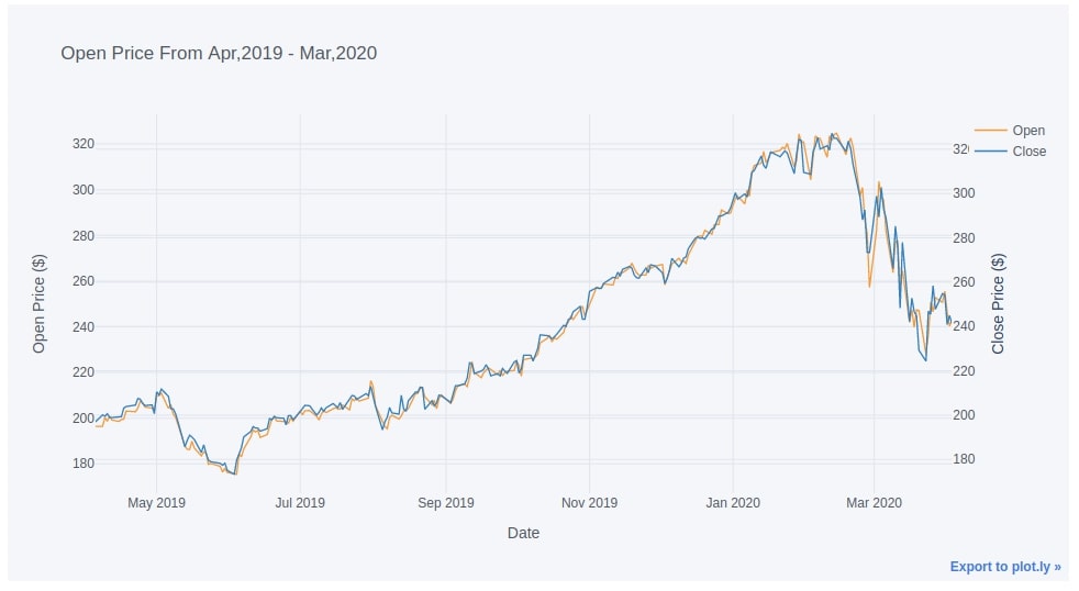
3.3. Line Chart with Secondary Y-Axis
Below we have created a line chart with two-line where 2nd line has a separate y-axis on the right side. We can set the secondary parameter by giving the column name to the secondary_y parameter and the axis title for the secondary y-axis to secondary_y_title.
This can be very useful when the quantities which we want to plot are on a different scale.
apple_df.iplot(y="Open",
               secondary_y="Close", secondary_y_title="Close Price ($)",
               xTitle="Date", yTitle="Open Price ($)", title="Open Price From Apr,2019 - Mar,2020")
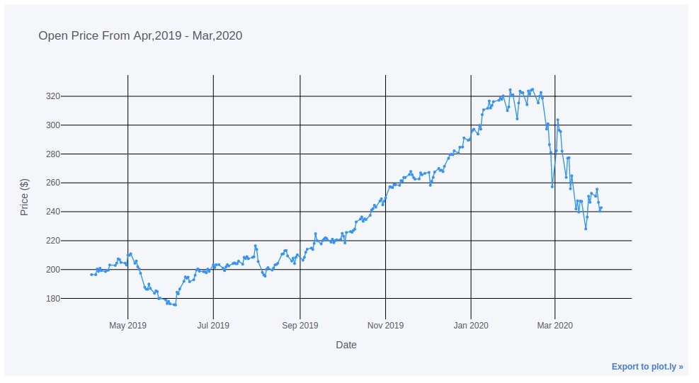
3.4. Line Chart with Point Markers
Below we have again created a line chart but this time using mode as 'lines+markers' which will add both lines and points to the chart. We have also modified the default gridcolor to black from gray.
apple_df.iplot(y="Open",
               mode="lines+markers", size=4.0,
               colors=["dodgerblue"],
               gridcolor="black",
               xTitle="Date", yTitle="Price ($)", title="Open Price From Apr,2019 - Mar,2020")
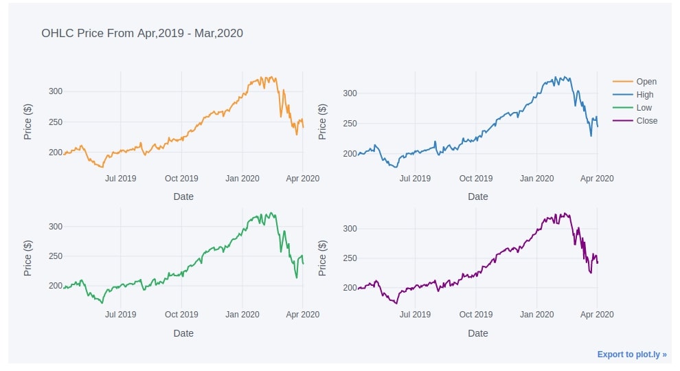
3.5. Figure with Multiple Line Charts
Below we have given another example of using subplots.
apple_df.iplot(y=["Open", "High", "Low", "Close"],
               width=2.0,
               subplots=True,
               xTitle="Date", yTitle="Price ($)", title="OHLC Price From Apr,2019 - Mar,2020")
4. Area Charts 
The fourth chart type that we'll introduce is area charts.
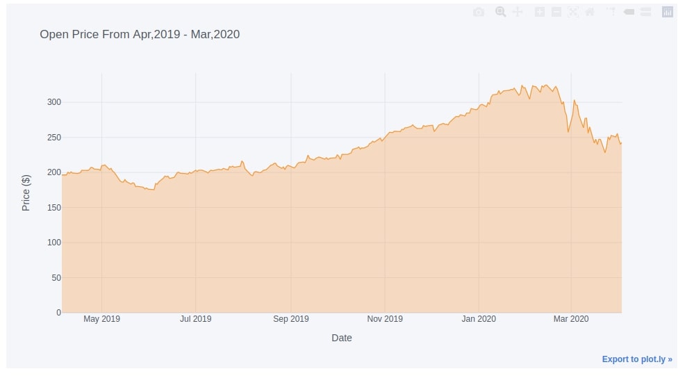
4.1. Simple Area Chart
We can easily create an area chart using the same parameters as that of a line chart with only one change. We need to set the fill parameter to True in order to create an area chart.
Below we have created an area chart covering the area under the open price of Apple stock.
apple_df.iplot(y="Open",
               fill=True,
               xTitle="Date", yTitle="Price ($)", title="Open Price From Apr,2019 - Mar,2020",
               )
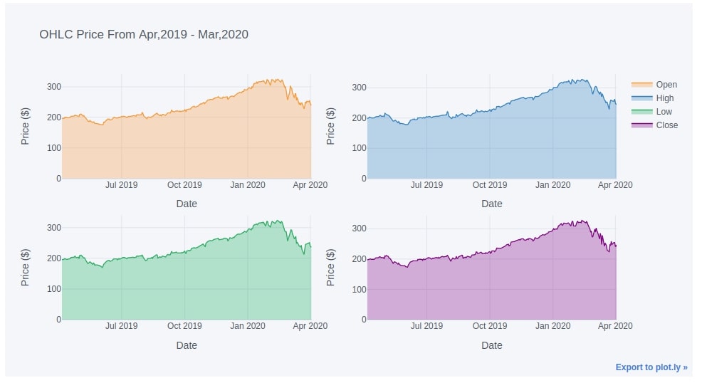
4.2. Figure of Multiple Area Charts
apple_df.iplot(
               keys=["Open", "High", "Low", "Close"],
               subplots=True,
               fill=True,
               xTitle="Date", yTitle="Price ($)", title="OHLC Price From Apr,2019 - Mar,2020")
5. Pie Charts 
The fifth chart type is pie charts.
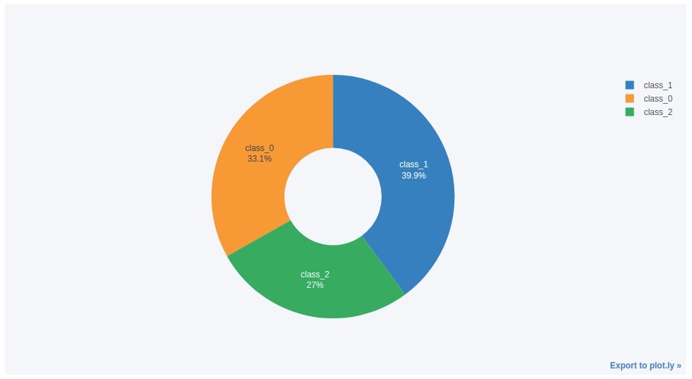
5.1. Simple Pie/Donut Chart
We'll be creating a new dataframe from the wine dataframe which has information about the count of samples per each wine category. We can create this dataframe by grouping the original wine dataframe based on wine type and then calling the count() method on it to get a count of samples per wine type.
wine_cnt = wine_df.groupby(by=["WineType"]).count()[["alcohol"]].rename(columns={"alcohol":"Count"}).reset_index()
wine_cnt
We can easily create a pie chart by calling iplot() method on the dataframe passing it kind parameter as pie. We also need to pass which column to use for labels and which column to use for values.
Below we have created a pie chart from the wine type count dataframe created in the previous cell. We have also modified how labels should be displayed by setting textinfo parameter.
wine_cnt.iplot(kind="pie",
                             labels="WineType",
                             values="Count",
                             textinfo='percent+label', hole=.4,
                             )
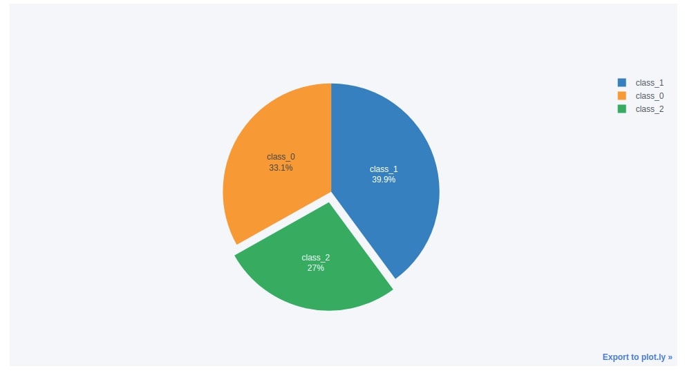
5.2. Exploding Pie Chart (Pie Chart with Wedge Sticking Out)
Below we have created the same pie chart as the previous step with two minor changes.
We have removed the internal circle and we have pulled the class_2 wine type patch a little bit out to highlight it. We need to pass the pull parameter list of floats which is the same size as labels and only one float should be greater than 0.
wine_cnt.reset_index().iplot(kind="pie",
                             labels="WineType",
                             values="Count",
                             textinfo='percent+label',
                             pull=[0, 0, 0.1],
                             )
6. Histograms 
The sixth chart type that we'll introduce is the histogram.
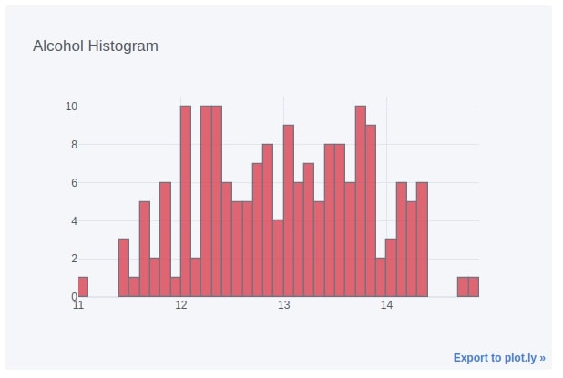
6.1. Histogram of Single Data Variable
We can easily create a histogram by setting the kind parameter to hist. We have passed the column name as the keys parameter in order to create a histogram of that column.
wine_df.iplot(kind="hist",
              bins=50, colors=["red"],
              keys=["alcohol"],
              dimensions=(600, 400),
              title="Alcohol Histogram")
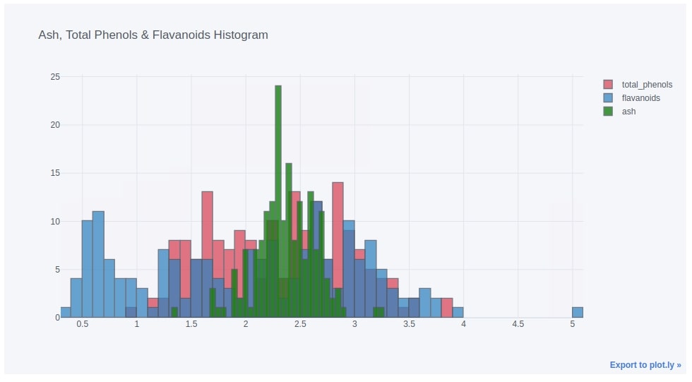
6.1. Histogram of Multiple Data Variables
Below we have created another example of the histogram where we are plotting a histogram of three quantities.
wine_df.iplot(kind="hist",
              bins=50, colors=["red", "blue", "green", "black"],
              keys=["total_phenols", "flavanoids", "ash"],
              title="Ash, Total Phenols & Flavanoids Histogram")
7. Box Plots 
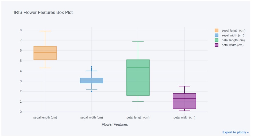
The seventh chart type that we'll introduce is the box plot.
We can easily create a box plot from the pandas dataframe by setting the kind parameter to box in iplot() method. We have below created a box plot of four quantities of iris flowers. We have passed column names of four features of the iris flower to the keys parameter as a list.
iris_df.iplot(kind="box",
              keys=iris.feature_names, boxpoints="outliers",
              xTitle="Flower Features", title="IRIS Flower Features Box Plot")
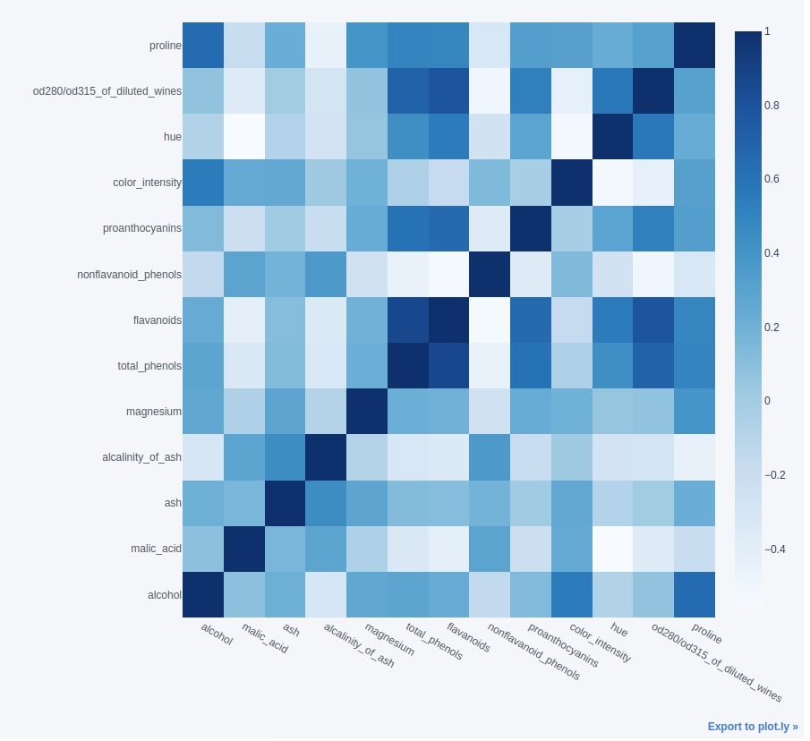
8. Heatmaps 
The eighth chart type is heatmaps.
We'll first create a correlation dataframe for the wine dataset by calling the corr() method on it.
wine_corr_df = wine_df.corr()
wine_corr_df
Once we have the correlation dataframe ready, we can easily create a heatmap by calling iplot() method on it and passing the kind parameter value as heatmap.
We have also provided colormap as Blues.
How to Change "Cufflinks" Chart Dimensions?
We can also set chart dimensions by passing width and height as tuple to the dimensions parameter.
This will override whatever dimensions were set using configuration method set_config_file() at the beginning.
wine_corr_df.iplot(kind="heatmap",
                   colorscale="Blues",
                   dimensions=(900,900))
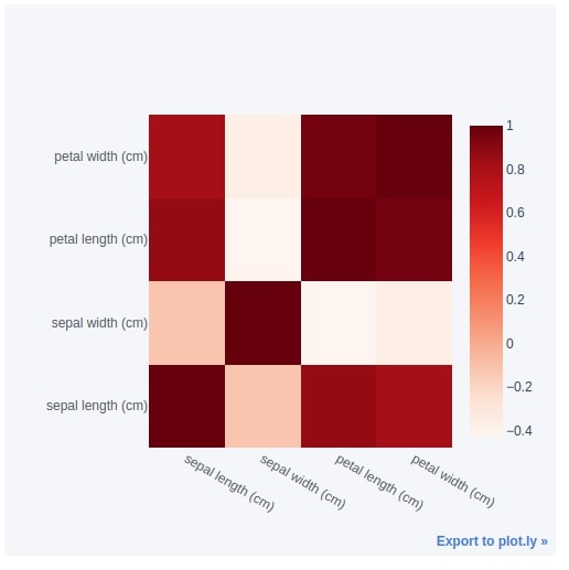
Below we have created another heatmap of the iris flowers dataset showing a correlation between various features.
iris_df.corr().iplot(kind="heatmap",
                   colorscale="Reds",
                   dimensions=(500,500))
9. CandleStick & OHLC Charts 
The ninth chart type that we'll introduce is the candlestick chart.
9.1. CandleStick Chart
We can easily create a candlestick chart from the dataframe by calling iplot() method on it and passing candle as a value to the kind parameter. We also need to have Open, High, Low, and Close columns in the dataframe in that order. Below we have created a candlestick chart of whole apple OHLC data.
apple_df.iplot(kind="candle", keys=["Open", "High", "Low", "Close"])
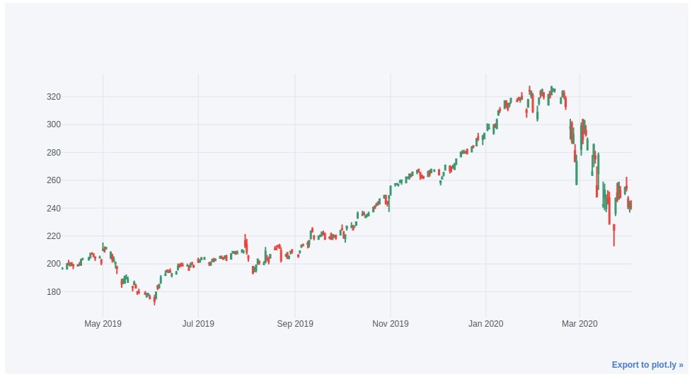
Cufflinks also let us add extra features to Candlestick charts by creating a quant figure. We can add things like Bollinger bands, RSI (Relative Strength Index) line, SMA (Simple Moving Average) line, etc. We have covered it in a separate tutorial.
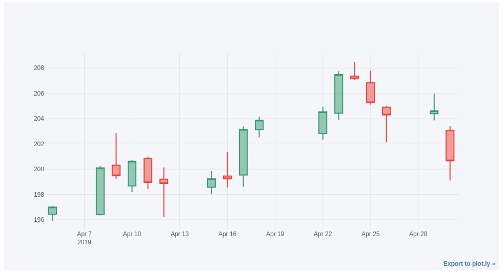
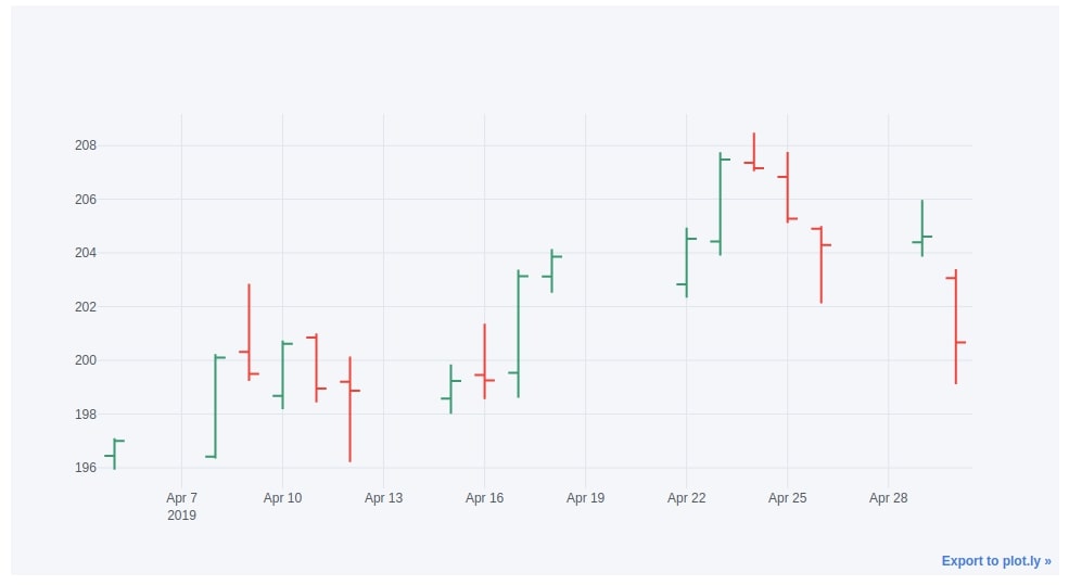
Below we have created another example of a candlestick chart where we are plotting candles for only Apr-2019 data.
apple_df["2019-04"].iplot(kind="candle",
                          keys=["Open", "High", "Low", "Close"],
                          )
9.2. OHLC Chart
We can create an OHLC chart exactly the same way as a candlestick chart with the only difference which is we need to set the kind parameter as ohlc.
apple_df["2019-04"].iplot(kind="ohlc",
                          keys=["Open", "High", "Low", "Close"])
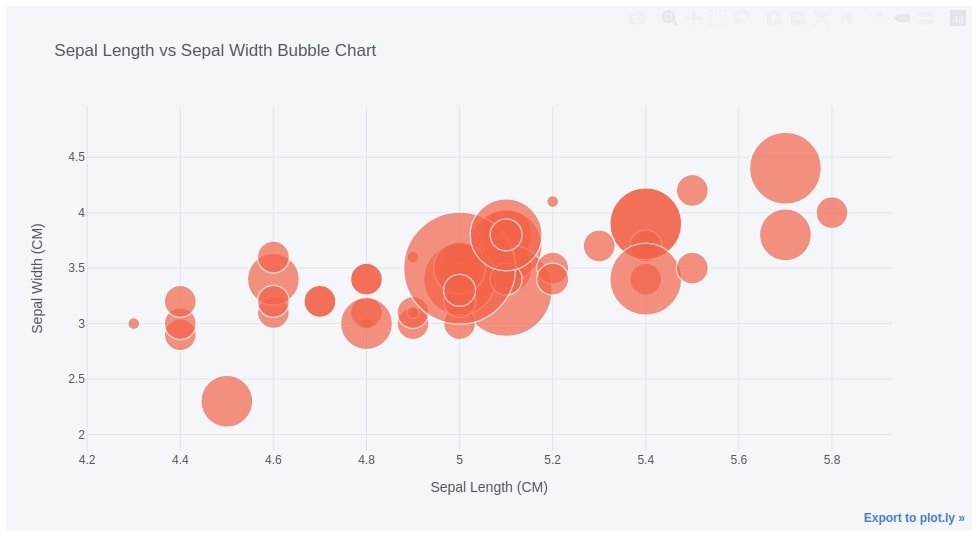
10. Bubble Chart 
The tenth chart type that we'll plot using cufflinks is a bubble chart.
The bubble chart can be used to represent three dimensions of data. The two dimensions are used to create a scatter plot and the third dimension is used to decide the sizes of points in the scatter plot.
Below we have created a bubble chart on the iris dataframe's first 50 samples by setting the kind parameter to bubble. We have used sepal length and sepal width as x and y dimensions and petal width as size dimensions.
iris_df[:50].iplot(kind="bubble", x="sepal length (cm)", y="sepal width (cm)", size="petal width (cm)",
              colors=["tomato"],
              xTitle="Sepal Length (CM)", yTitle="Sepal Width (CM)",
              title="Sepal Length vs Sepal Width Bubble Chart")
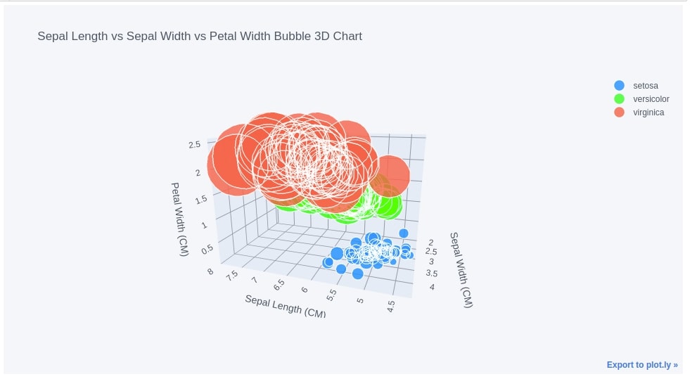
11. 3D Bubble Chart 
We can also create a 3D bubble chart that can be used to represent 4 dimensions of data. The first three dimensions of data will be used to create a 3D scatter chart and 4th dimension will be used to decide the size of the point (bubble) in a scatter plot.
We are creating a 3D bubble chart by setting the kind parameter to bubble3d in iplot() method. We have used sepal length, sepal width, and petal width to create a 3D scatter chart and petal length to decide the sizes of points in a 3D scatter chart. We have also color-encoded points in a scatter plot based on flower types.
iris_df.iplot(kind="bubble3d",
              x="sepal length (cm)", y="sepal width (cm)", z="petal width (cm)",
              size="petal length (cm)",
              colors=["dodgerblue", "lime", "tomato"], categories="FlowerType",
              xTitle="Sepal Length (CM)", yTitle="Sepal Width (CM)", zTitle="Petal Width (CM)",
              title="Sepal Length vs Sepal Width vs Petal Width Bubble 3D Chart")
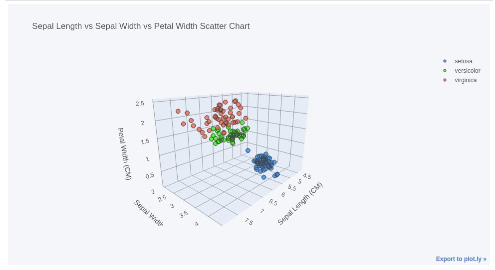
12. 3D Scatter Chart 
We can create 3d scatter charts as well as using cufflinks. We need to set kind parameter to scatter3d in iplot() method. We are creating a 3d scatter chart of sepal length, sepal width, and petal width. We even have color-encoded points in a 3d scatter chart according to flower type.
iris_df.iplot(kind="scatter3d",
              x="sepal length (cm)", y="sepal width (cm)", z="petal width (cm)",
              size=5,
              colors=["dodgerblue", "lime", "tomato"], categories="FlowerType",
              xTitle="Sepal Length (CM)", yTitle="Sepal Width (CM)", zTitle="Petal Width (CM)",
              title="Sepal Length vs Sepal Width vs Petal Width Scatter Chart")
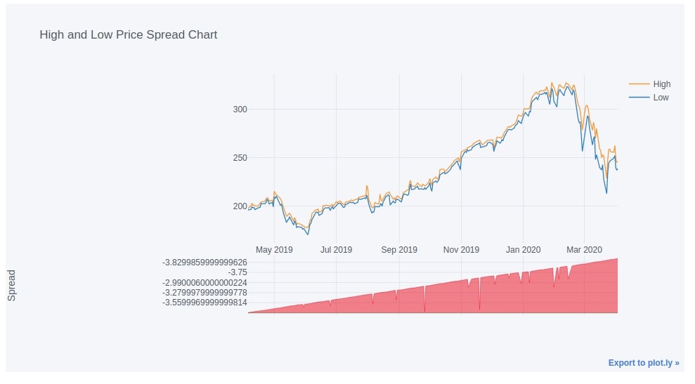
13. Spread Chart 
The thirteenth chart type that we'll introduce is spread chart.
Below we are creating a spread chart of high and low prices by setting the kind parameter to spread.
apple_df.iplot(kind="spread", keys=["High", "Low"],
               title="High and Low Price Spread Chart")
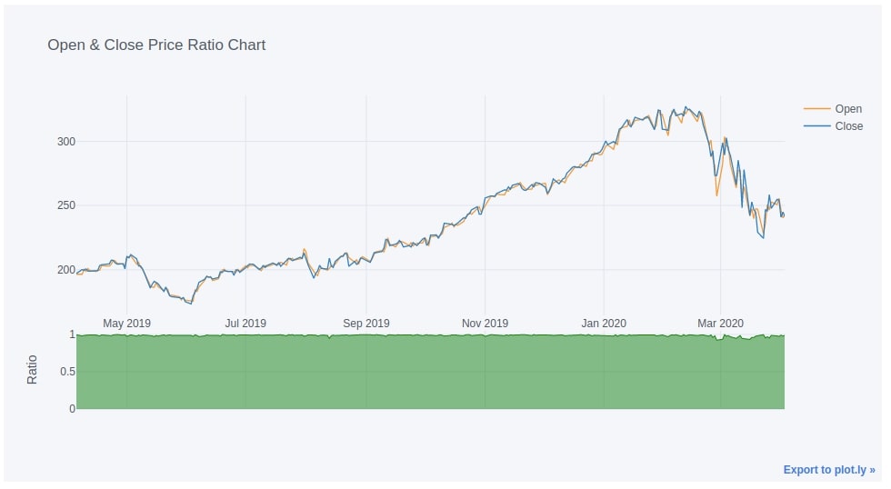
14. Ratio Chart 
The fourteenth and last chart type that we'll introduce is the ratio chart.
We can create a ratio chart by setting the kind parameter to ratio. We are creating a ratio chart of open and close prices of apple OHLC data.
apple_df.iplot(kind="ratio", keys=["Open", "Close",],
               title="Open & Close Price Ratio Chart")
This ends our small tutorial explaining how to use Python library "cufflinks" to create interactive Plotly charts directly from the pandas dataframe.
Alternative to "Cufflinks" for Interactive Charts from Pandas DataFrames
Apart from "cufflinks", there is one more Python library named "hvplot" that let us create interactive charts from Pandas dataframe with just one line of code by calling 'plot()' method.
HvPlot uses Python library Holoviews to create interactive charts behind the scene.
References
Tutorials Using "Cufflinks" Library
- Candlestick Charts using Cufflinks
- Choropleth Maps & Scatter Maps using cufflinks
- Dashboard using Streamlit and Cufflinks (Plotly)?
Other Python Interactive Data Visualization Libraries
 Sunny Solanki
Sunny Solanki
Intro: Software Developer | Youtuber | Bonsai Enthusiast
About: Sunny Solanki holds a bachelor's degree in Information Technology (2006-2010) from L.D. College of Engineering. Post completion of his graduation, he has 8.5+ years of experience (2011-2019) in the IT Industry (TCS). His IT experience involves working on Python & Java Projects with US/Canada banking clients. Since 2020, he’s primarily concentrating on growing CoderzColumn.
His main areas of interest are AI, Machine Learning, Data Visualization, and Concurrent Programming. He has good hands-on with Python and its ecosystem libraries.
Apart from his tech life, he prefers reading biographies and autobiographies. And yes, he spends his leisure time taking care of his plants and a few pre-Bonsai trees.
Contact: sunny.2309@yahoo.in


![YouTube Subscribe]() Comfortable Learning through Video Tutorials?
Comfortable Learning through Video Tutorials?
If you are more comfortable learning through video tutorials then we would recommend that you subscribe to our YouTube channel.
![Need Help]() Stuck Somewhere? Need Help with Coding? Have Doubts About the Topic/Code?
Stuck Somewhere? Need Help with Coding? Have Doubts About the Topic/Code?
 Stuck Somewhere? Need Help with Coding? Have Doubts About the Topic/Code?
When going through coding examples, it's quite common to have doubts and errors.
If you have doubts about some code examples or are stuck somewhere when trying our code, send us an email at coderzcolumn07@gmail.com. We'll help you or point you in the direction where you can find a solution to your problem.
You can even send us a mail if you are trying something new and need guidance regarding coding. We'll try to respond as soon as possible.
![Share Views]() Want to Share Your Views? Have Any Suggestions?
Want to Share Your Views? Have Any Suggestions?
 Want to Share Your Views? Have Any Suggestions?
If you want to
- provide some suggestions on topic
- share your views
- include some details in tutorial
- suggest some new topics on which we should create tutorials/blogs
 cufflinks, plotly, pandas