Choropleth Maps & Scatter Maps using cufflinks
The cufflinks library provides a wrapper around pandas so that we can create an interactive plotly chart directly from it by calling iplot() or figure() method on the dataframe. The iplot() API is almost the same as that of plot() API which generates charts based on matplotlib. We have already covered a tutorial explaining how to generate various charts using cufflinks in a separate tutorial. We recommend that you go through that tutorial if you do not have a background on cufflinks.
As a part of this tutorial, we'll be using the same API to generate scatter maps and choropleth maps. We'll be generating scatter and choropleth maps using one line of code from the pandas dataframe.
We'll start by loading the necessary libraries.
import pandas as pd
import numpy as np

import cufflinks as cf

print("List of Cufflinks Themes : ", cf.getThemes())

cf.set_config_file(theme='ggplot',sharing='public',offline=True)
Load Datasets
We'll be using below mentioned 2 datasets for plotting various maps. Both datasets are easily available from kaggle. We suggest that you download both datasets to follow along with the tutorial.
World Happiness Report Dataset - It has information about attributes like happiness score, GDP per capita, social support, healthy life expectancy, generosity, corruption, and freedom to make life choices for each country of the world.
Starbucks Store Locations Dataset - It has information about Starbucks store locations worldwide. It has information about each store's name, address, city, state, country, latitude, and longitude.
We have loaded both datasets as pandas dataframe.
starbucks_stores = pd.read_csv("datasets/starbucks_store_locations.csv")

starbucks_stores.head()
world_happiness = pd.read_csv("datasets/world_happiness_2019.csv")
world_happiness.head()
Scatter Maps
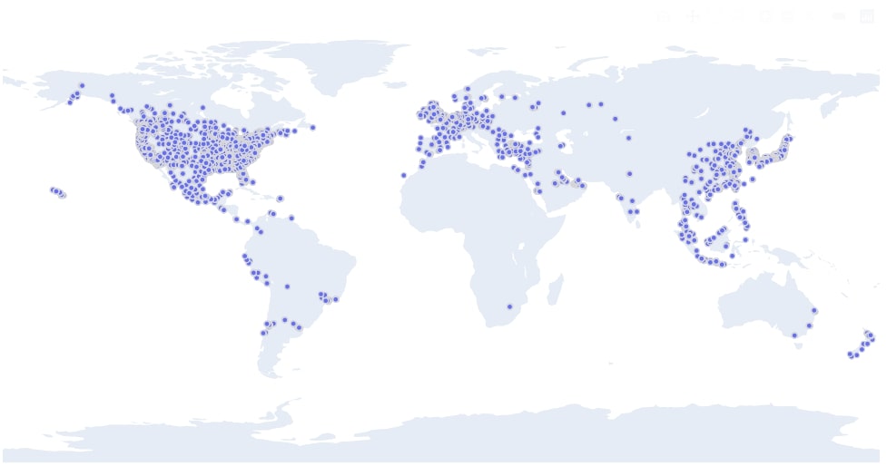
We can plot a scatter map from the pandas dataframe by calling the figure() method on it and passing the kind parameter value as scattergeo. We also need to pass latitude and longitude column names to lat and lon parameters of the figure() method. We have also passed the Store Name column to the text parameter so that when a mouse hovers over any point in the chart, the name of that store will be displayed in a tooltip.
Below we have plotted a scatter chart of Starbucks store locations worldwide. We can clearly see a high amount of store concentration in the US, Europe, and China.
starbucks_stores.figure(kind="scattergeo",
                        size=0.05,
                        margin=(0,0,0,0),
                        colors=["tomato"],
                        lat="Latitude", lon="Longitude", text="Store Name")
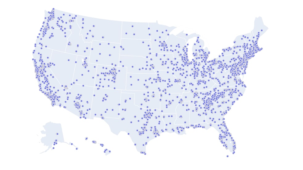
Below we have created another scatter chart exactly the same way as the previous step. We have plotted scatter chart for stores only located in the US. We have added one more parameter which is projection. We need to override the default projection which plots points on the world map to the USA map. We have set albers usa as a projection in order to highlight only the US map.
We can see a high concentration of Starbucks stores in the east and west coast of the US.
us_stores = starbucks_stores[starbucks_stores.Country=="US"]

us_stores.figure(kind="scattergeo",
                        size=0.05,
                        margin=(0,0,0,0),
                        colors="tomato",
                        projection={"type":"albers usa"},
                        lat="Latitude", lon="Longitude", text="Store Name")
Choropleth Maps
The second chart type that we'll introduce is choropleth maps. We'll be using the world happiness dataframe for plotting happiness score, population, and GDP per capita as choropleth maps. The choropleth maps in plotly require country or state names as ISO codes instead of the full name. Our original happiness dataset has a full country name instead of ISO codes for the country. We'll hence use geopandas dataframe to get ISO codes for the country from country name.
We have below loaded geopandas library and data frame which has information about each country of the world as well as their ISO codes.
import geopandas as gpd

gpd.datasets.available
world_geo_df = gpd.read_file(gpd.datasets.get_path("naturalearth_lowres"))
world_geo_df.head()
We are merging the geopandas dataframe with the world happiness dataframe so that the final dataframe will have ISO codes for each country present in it.
world_geo_df = world_geo_df.merge(world_happiness, how="left", left_on="name", right_on="Country or region")
world_geo_df.head()
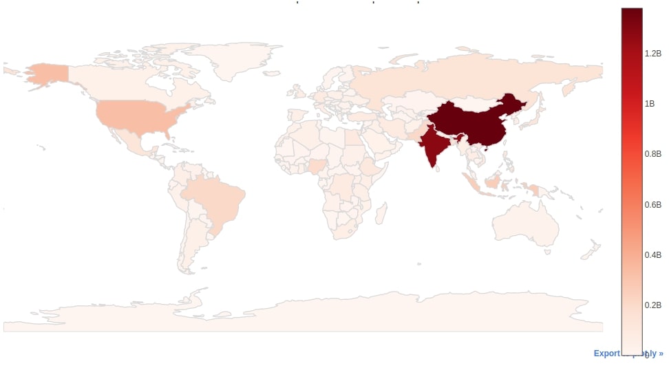
We can easily create a choropleth map from the world dataframe by calling iplot() method on it and passing the kind parameter as choropleth. Apart from chart kind, we also need to pass two other important parameters which are locations and z. The locations parameter will be used to map ISO codes in the choropleth map and the z parameter will be used to map the value for that code. We have used the iso_a3 column as a locations column because it has ISO codes for each country and pop_est as z parameter as it has population data for each country.
We have first created a choropleth map of the world population. We have used Reds as the color palette of the map. We can see from chart high concentration of the population in China and India.
world_geo_df.iplot(kind="choropleth",
                   locations="iso_a3", z="pop_est",
                   colorscale="Reds",
                   margin=(0,0,0,0), title="World Population Choropleth Map")
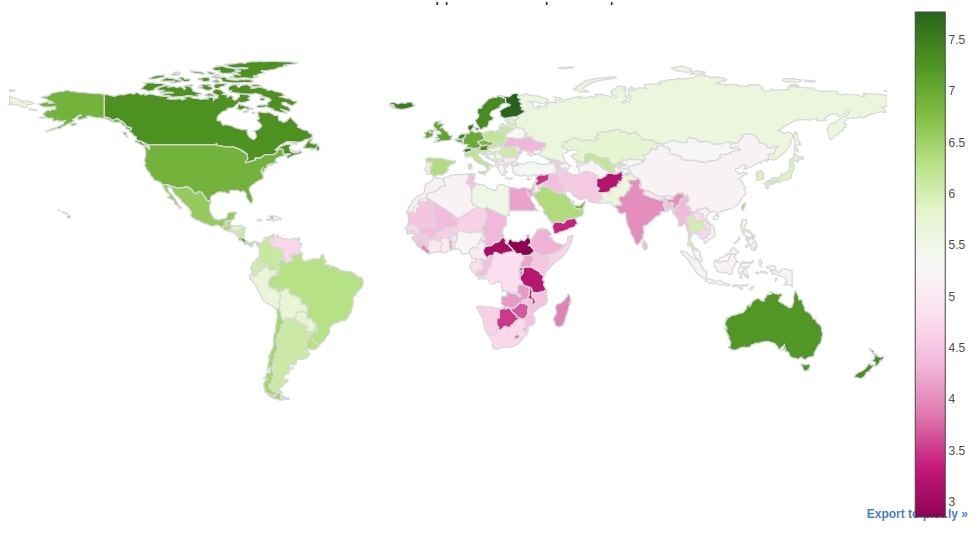
Below we have created another choropleth map which is created with exactly the same code as the previous chart with only difference in the column used for the z parameter and color palette. We have plotted a choropleth map showing happiness for each country of the world.
world_geo_df.iplot(kind="choropleth",
                   locations="iso_a3", z="Score",
                   colorscale="PiYG",
                   margin=(0,0,0,0), title="World Happiness Choropleth Map")
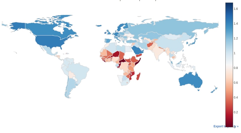
The third choropleth map that we have created is the same way as the previous two choropleth maps. We have created a choropleth map of GDP per capita for each country of the world.
world_geo_df.iplot(kind="choropleth",
                   locations="iso_a3", z="GDP per capita",
                   colorscale="RdBu",
                   margin=(0,0,0,0), title="World GDP Per Capita Choropleth Map")
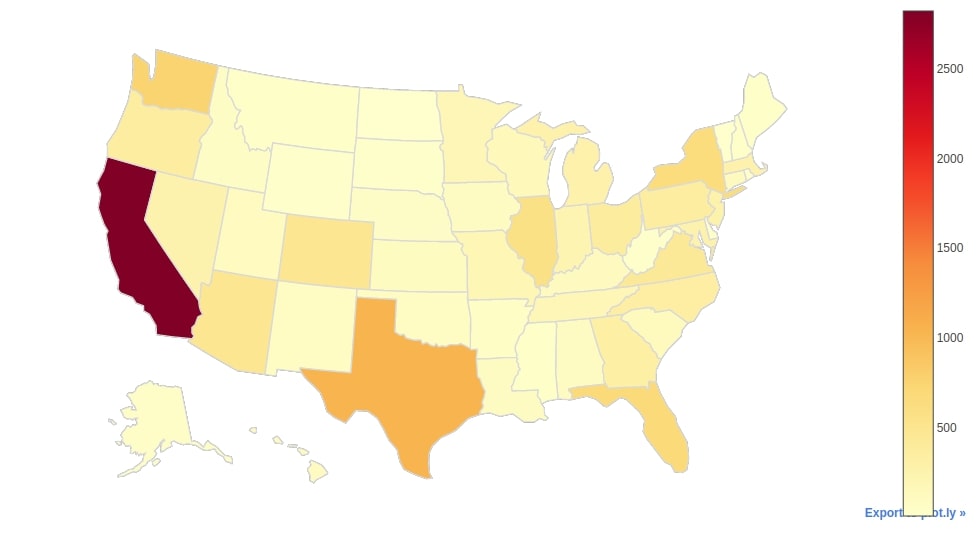
The fourth choropleth map that we'll be creating will show the distribution of Starbucks stores per each US state. We have hence created a new dataframe below which has information about the count of Starbucks store per each state of the US.
us_stores = starbucks_stores[starbucks_stores.Country == "US"]
us_stores = us_stores.groupby(by=['State/Province']).count()[["Store Name"]].rename(columns={"Store Name":"Count"}).reset_index()
us_stores.head()
We can easily create a choropleth map from the us_stores dataframe by calling iplot() method on it. We have used State/Province column as locations column and Count column as z column. We also have introduced two more parameters (locationmode and projection) which are needed in the case of the USA. These two parameters will help us show only the US map. If we don't provide these parameters then it'll show the whole world map which is not needed as we only need to see the US map.
us_stores.iplot(kind="choropleth",
                       locations="State/Province", z="Count",
                       colorscale="YlOrRd",
                       margin=(0,0,0,0), locationmode="USA-states",
                       projection={"type":"albers usa"},
                       title="Starbucks Stores Count Per US State", )
This ends our small tutorial explaining how to create scatter maps and choropleth maps from cufflinks using one line of code. Please feel free to let us know your views in the comments section.
References
- cufflinks - How to create plotly charts from pandas dataframe with one line of code?
- Interactive Maps using Folium
- Plotting Maps using Bokeh
- ipyleaflet - Interactive Maps in Python based on leaflet.js
- Interactive Choropleth Maps using bqplot
- Interactive Choropleth Maps using ipyleaflet
- geopandas - Plotting Static Maps
- hvplot - How to convert static geopandas maps to interactive
- cartopy - Scatter Maps, Bubble Maps and Connection Maps in Python
- How to create connection map in python?
 Sunny Solanki
Sunny Solanki
Intro: Software Developer | Youtuber | Bonsai Enthusiast
About: Sunny Solanki holds a bachelor's degree in Information Technology (2006-2010) from L.D. College of Engineering. Post completion of his graduation, he has 8.5+ years of experience (2011-2019) in the IT Industry (TCS). His IT experience involves working on Python & Java Projects with US/Canada banking clients. Since 2020, he’s primarily concentrating on growing CoderzColumn.
His main areas of interest are AI, Machine Learning, Data Visualization, and Concurrent Programming. He has good hands-on with Python and its ecosystem libraries.
Apart from his tech life, he prefers reading biographies and autobiographies. And yes, he spends his leisure time taking care of his plants and a few pre-Bonsai trees.
Contact: sunny.2309@yahoo.in


![YouTube Subscribe]() Comfortable Learning through Video Tutorials?
Comfortable Learning through Video Tutorials?
If you are more comfortable learning through video tutorials then we would recommend that you subscribe to our YouTube channel.
![Need Help]() Stuck Somewhere? Need Help with Coding? Have Doubts About the Topic/Code?
Stuck Somewhere? Need Help with Coding? Have Doubts About the Topic/Code?
 Stuck Somewhere? Need Help with Coding? Have Doubts About the Topic/Code?
When going through coding examples, it's quite common to have doubts and errors.
If you have doubts about some code examples or are stuck somewhere when trying our code, send us an email at coderzcolumn07@gmail.com. We'll help you or point you in the direction where you can find a solution to your problem.
You can even send us a mail if you are trying something new and need guidance regarding coding. We'll try to respond as soon as possible.
![Share Views]() Want to Share Your Views? Have Any Suggestions?
Want to Share Your Views? Have Any Suggestions?
 Want to Share Your Views? Have Any Suggestions?
If you want to
- provide some suggestions on topic
- share your views
- include some details in tutorial
- suggest some new topics on which we should create tutorials/blogs
 cufflinks, maps, plotly, pandas