Interactive Choropleth Maps using bqplot
The choropleth maps are quite commonly used to show the distribution of any data variable in various areas of the map. Python has a list of libraries like geopandas, folium, bokeh, ipyleaflet, bqplot, etc which provides map plotting functionalities which include functionality for plotting choropleth map as well. We'll be discussing choropleth maps plotting using bqplot as a part of this tutorial. We have already covered tutorials on plotting various charts using bqplot. We have also created tutorials on the creation of choropleth maps using other python libraries. If you are interested in learning about them then please feel free to go through the links of the references section. As a part of this tutorial, we'll be concentrating on bqplot for choropleth maps using various datasets.
We'll start by importing necessary libraries.
import pandas as pd
import numpy as np

import warnings
warnings.filterwarnings("ignore")
Load Datasets
We'll be using below mentioned two datasets for plotting various choropleth maps. Both datasets are easily available from kaggle. We suggest that you download both datasets to follow along.
World happiness dataset - It has information about attributes like happiness score, perception of corruption, healthy life expectancy, social support by govt., freedom to make life choices, generosity, and GDP per capita for various countries of the earth. We'll be loading it as a pandas dataframe.
US States Population - It has information about US states population in 2018.
We have loaded both datasets as pandas dataframe.
happiness_df = pd.read_csv("datasets/world_happiness_2019.csv")
happiness_df.head()
us_state_population_2018 = pd.read_csv("datasets/State Populations.csv")
us_state_population_2018.head()
Below we have loaded geo json files for the world, Europe, US states, and US counties which we'll be using in the future. We'll be using this geo json data for creating a mapping dictionary for mapping from the id of map feature (country, state, country, etc.) to the value of the data variable. We need to pass this mapping from feature id to data variables values to the bqplot plotting method.
#EuropeMap, USCountiesMap, USStatesMap, WorldMap
from bqplot import topo_load

europe = topo_load("map_data/EuropeMap.json")
us_counties = topo_load("map_data/USCountiesMap.json")
us_states = topo_load("map_data/USStatesMap.json")
world_map = topo_load("map_data/WorldMap.json")
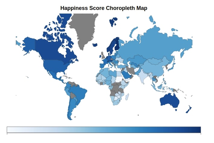
World Happiness Choropleth Map
The first choropleth map that we'll create using bqplot is the world happiness choropleth map which will plot the happiness score of each country on the world map.
Below we have created a method named map_data_to_color_mapping() which accepts map data which is geo json data loaded earlier as the first parameter and column from the dataframe as the second attribute and returns mapping from feature id to dataframe column value.
def map_data_to_color_mapping(map_data, column="Score"):
    """
    Function to Map Country ID to Column Value from Happiness DataFrame
    """
    name_to_id_mapping = []
    for entry in map_data:
        if entry["properties"]["name"] == "Russian Federation":
            name_to_id_mapping.append(("Russia", entry["id"]))
        else:
            name_to_id_mapping.append((entry["properties"]["name"], entry["id"]))

    name_to_id_mapping = dict(name_to_id_mapping)

    color = []
    for name, idx in name_to_id_mapping.items():
        score = happiness_df[happiness_df["Country or region"].str.contains(name)][column].values
        if len(score) > 0:
            color.append((idx,score[0]))
    return dict(color)
The below cell includes the total code for creating a choropleth map using bqplot.
First, we have created a map object using Map() constructor passing it mapping from feature id to data variable, world map geo json data, scales, projection. We have used a Mercator projection for our purpose. We have also provided the default color as grey which will be used when mapping for any feature is not available.
Then we have created a color axis using a color scale. We also have included a tooltip that will highlight the happiness score for each country when the mouse hovers over it.
At last, we have created a figure by combining, map object, and axis. We have also provided the title and title style to the Figure() constructor.
The choropleth created below is based on the bqplot internal object model API. If you are interested in learning about chart creating using it then please feel free to explore our tutorial on the same to get the in-depth ideas.
from bqplot import Map, Mercator, Figure, ColorScale, ColorAxis, Mercator, Tooltip

map_chart = Map(color=map_data_to_color_mapping(world_map["objects"]["subunits"]["geometries"]),
                map_data=world_map,
                colors={'default_color': 'Grey'},
                scales={'color': ColorScale(scheme='Blues'), 'projection':Mercator()})

axes = ColorAxis(scale=ColorScale(scheme='Blues'))

map_chart.tooltip = Tooltip(fields=['color'], labels=["Happiness Score"])

Figure(marks=[map_chart], axes=[axes],
       title_style={"font-weight":"bold"},
       title="Happiness Score Choropleth Map")
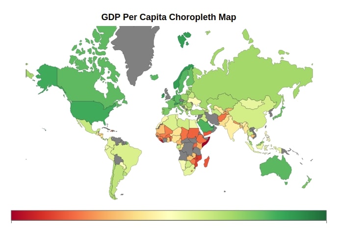
World GDP Per Capita Choropleth Map
The second choropleth map that we have created using bqplot is the world countries’ GDP per capita choropleth map. We have used exactly the same code as the last example with only a change in the column name from the dataframe which is now GDP per capita. We have also used different colormap.
map_chart = Map(color=map_data_to_color_mapping(world_map["objects"]["subunits"]["geometries"], column="GDP per capita"),
                map_data=world_map,
                colors={'default_color': 'Grey'},
                scales={'color': ColorScale(scheme='RdYlGn'), 'projection':Mercator()})

axes = ColorAxis(scale=ColorScale(scheme='RdYlGn'))

map_chart.tooltip = Tooltip(fields=['color'], labels=["GDP Per Capita"])

Figure(marks=[map_chart], axes=[axes],
       title_style={"font-weight":"bold"},
       title="GDP Per Capita Choropleth Map")
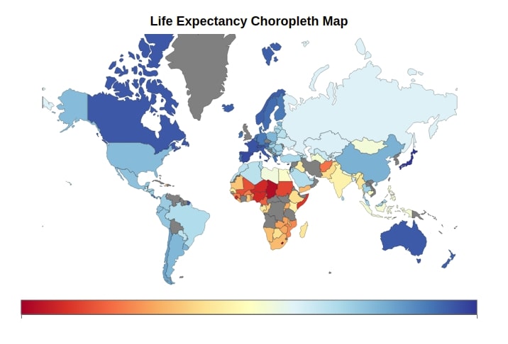
World Life Expectancy Choropleth Map
The third choropleth map depicts the life expectancy of various countries on earth. We have used exactly the same code as previous examples with only change in column name and colormap.
map_chart = Map(color=map_data_to_color_mapping(world_map["objects"]["subunits"]["geometries"], column="Healthy life expectancy"),
                map_data=world_map,
                colors={'default_color': 'Grey'},
                scales={'color': ColorScale(scheme='RdYlBu'), 'projection':Mercator()})

axes = ColorAxis(scale=ColorScale(scheme='RdYlBu'))

map_chart.tooltip = Tooltip(fields=['color'], labels=["Life Expectancy"])

Figure(marks=[map_chart], axes=[axes],
       title_style={"font-weight":"bold"},
       title="Life Expectancy Choropleth Map")
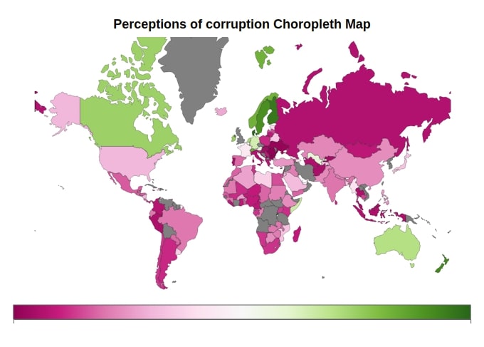
World Perception of Corruption Choropleth Map
The fourth colormap is also a world choropleth map where the perception of corruption for each country is presented with different colors based on corruption values in the world happiness dataframe.
map_chart = Map(color=map_data_to_color_mapping(world_map["objects"]["subunits"]["geometries"], column="Perceptions of corruption"),
                map_data=world_map,
                colors={'default_color': 'Grey'},
                scales={'color': ColorScale(scheme='PiYG'), 'projection':Mercator()})

axes = ColorAxis(scale=ColorScale(scheme='PiYG'))

map_chart.tooltip = Tooltip(fields=['color'], labels=["Perceptions of corruption"])

Figure(marks=[map_chart], axes=[axes],
       title_style={"font-weight":"bold"},
       title="Perceptions of corruption Choropleth Map")
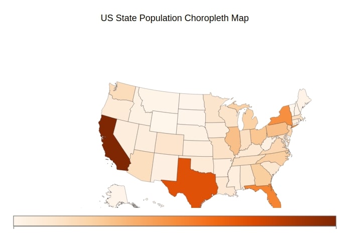
US State-wise Population Choropleth Map
The fifth choropleth map that we have created using bqplot is the US state population choropleth map. We'll be using the US state’s population dataset loaded earlier.
We have created the same method as earlier which takes geo json data and column from the dataframe as input and returns mapping from features id to data variable values.
def map_data_to_color_mapping(map_data, column="2018 Population"):
    """
    Function to Map State ID to Column Value from DataFrame
    """
    name_to_id_mapping = []
    for entry in map_data:
        if entry['properties']:
            name_to_id_mapping.append((entry["properties"]["name"], entry["id"]))

    name_to_id_mapping = dict(name_to_id_mapping)

    color = []
    for name, idx in name_to_id_mapping.items():
        score = us_state_population_2018[us_state_population_2018["State"].str.contains(name)][column].values
        if len(score) > 0:
            color.append((idx,score[0]))
    return dict(color)
Below we have given code to create a choropleth map for US states. Our code is almost the same as the previous example with the only change is a projection which is changed from Mercator() to AlbersUSA(). All other things are almost the same as previous examples.
from bqplot import AlbersUSA

map_chart = Map(color=map_data_to_color_mapping(us_states["objects"]["subunits"]["geometries"]),
                map_data=us_states,
                colors={'default_color': 'Grey'},
                scales={'color': ColorScale(scheme='Oranges'), 'projection':AlbersUSA()})

axes = ColorAxis(scale=ColorScale(scheme='Oranges'))

map_chart.tooltip = Tooltip(fields=['color'], labels=["Population"])

Figure(marks=[map_chart], axes=[axes],
       title="US State Population Choropleth Map")
This ends our small tutorial explaining how to plot choropleth maps using bqplot. Please feel free to let us know your views in the comments section.
References
- Plotting Static Maps with Geopandas[Working with Geospatial Data]
- How to Convert Static Maps (Geopandas) to Interactive Maps (hvplot)?
- How to Create a Connection Map in Python [Plotly & Geopandas]?
- Cartopy - Basic Maps [Scatter Map, Bubble Map & Connection Map]
- Folium - Interactive Maps
- bqplot - Interactive Plotting Python
- ipywidgets - Interactive Widgets in Jupyter Notebook
- traitlets - Eventful Classes in Python
- ipyleaflet - Interactive Maps in Python based on leafletjs
- Plotting Maps using Bokeh
- Choropleth Maps using ipyleaflet
- bqplot - Interactive Charts using Internal Object Model API
- Choropleth Maps and Scatter Maps using Cufflinks
- Altair - Basic Interactive Plotting in Python
 Sunny Solanki
Sunny Solanki
Intro: Software Developer | Youtuber | Bonsai Enthusiast
About: Sunny Solanki holds a bachelor's degree in Information Technology (2006-2010) from L.D. College of Engineering. Post completion of his graduation, he has 8.5+ years of experience (2011-2019) in the IT Industry (TCS). His IT experience involves working on Python & Java Projects with US/Canada banking clients. Since 2020, he’s primarily concentrating on growing CoderzColumn.
His main areas of interest are AI, Machine Learning, Data Visualization, and Concurrent Programming. He has good hands-on with Python and its ecosystem libraries.
Apart from his tech life, he prefers reading biographies and autobiographies. And yes, he spends his leisure time taking care of his plants and a few pre-Bonsai trees.
Contact: sunny.2309@yahoo.in


![YouTube Subscribe]() Comfortable Learning through Video Tutorials?
Comfortable Learning through Video Tutorials?
If you are more comfortable learning through video tutorials then we would recommend that you subscribe to our YouTube channel.
![Need Help]() Stuck Somewhere? Need Help with Coding? Have Doubts About the Topic/Code?
Stuck Somewhere? Need Help with Coding? Have Doubts About the Topic/Code?
 Stuck Somewhere? Need Help with Coding? Have Doubts About the Topic/Code?
When going through coding examples, it's quite common to have doubts and errors.
If you have doubts about some code examples or are stuck somewhere when trying our code, send us an email at coderzcolumn07@gmail.com. We'll help you or point you in the direction where you can find a solution to your problem.
You can even send us a mail if you are trying something new and need guidance regarding coding. We'll try to respond as soon as possible.
![Share Views]() Want to Share Your Views? Have Any Suggestions?
Want to Share Your Views? Have Any Suggestions?
 Want to Share Your Views? Have Any Suggestions?
If you want to
- provide some suggestions on topic
- share your views
- include some details in tutorial
- suggest some new topics on which we should create tutorials/blogs
 bqplot, choropleth-maps