How to Convert Static Maps (Geopandas) to Interactive Maps using hvplot?
Table of Contents
- Introduction
- 1. Plotting With GeoPandas
- 2. Converting Static Plots to Interactive
- 3. Merging Plots
- References
Introduction 
Python library geopandas provides a way to plot geographic spatial data on maps. Geopandas makes use of matplotlib for plotting purposes. All maps generated by geopandas is static. A Scatter plot made with geopandas does not give insights about points if a different size is used for points. We need interactive plots in this kind of situation to look into detail.
If you are a Python developer who has experience plotting maps with geopandas and wants to use the same API for creating interactive maps without learning many new things then this tutorial is for you. Also if you are starting out plotting maps with geopandas then we recommend that you follow this tutorial as it'll guide you about generative interactive graphs from the beginning.
We suggest that you go through our tutorial on plotting maps with geopandas before starting this as it'll help you understand things quicker.
import geopandas
import pandas as pd
import numpy as np
import matplotlib.pyplot as plt

import warnings

warnings.filterwarnings('ignore')

geopandas.datasets.available
geopandas has 3 datasets available. naturalearth_lowres and nybb dataset consist of Polygon shapes whereas naturalearth_cities consist of Points shape. We'll try to load the naturalearth_lowres dataset which has information about each country’s shapes. It also holds information about the estimated country population and continent.
world = geopandas.read_file(geopandas.datasets.get_path("naturalearth_lowres"))
print("Geometry Column Name : ", world.geometry.name)
print("Dataset Size : ", world.shape)
world.head()
1. Plotting With GeoPandas 
We'll now explain plotting various map plots with GeoPandas. We'll also be using world happiness report dataset available from kaggle to include further data for analysis and plotting.
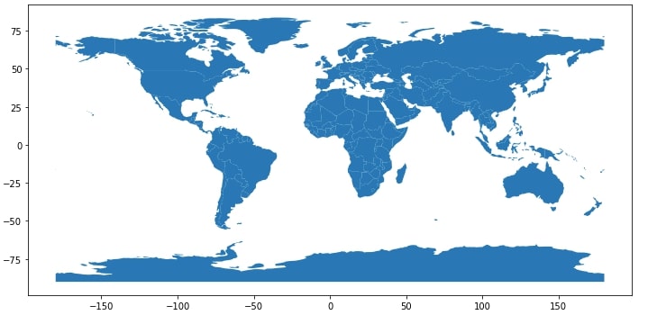
We'll start by just plotting the world dataframe which we loaded above to see results. We can simply call plot() on GeoDataFrame and it'll plot world countries on a map. By default, it'll just print all countries with their borders.
world.plot(figsize=(12,8));
We'll now load our world happiness data. Please feel free to download a dataset from kaggle.
Dataset also holds information about GDP per capita, social support, life expectancy, generosity, and corruption. We'll be merging this dataframe with geopandas world GeoDataFrame which we loaded above to combine data and then use combined data for plotting.
NOTE
Please make a note that the happiness report dataset does not have a happiness report for all countries present on earth. It has data for around 156 countries. We also have manually made changes to the happiness dataset for around 10-15 countries where the country name was mismatching with name present in geopandas geodataframe. We have modified happiness report CSV to have the same country name as that of the geodataframe.
world_happiness = pd.read_csv("datasets/world_happiness_2019.csv")
print("Dataset Size : ",world_happiness.shape)
world_happiness.head()
world_happiness_final = world.merge(world_happiness, how="left", left_on=['name'], right_on=['Country or region'])
#world_happiness_final = world_happiness_final.dropna()
print("Type of DataFrame : ", type(world_happiness_final))
world_happiness_final.head()
NOTE
Please make a note that while combining normal dataframe to geodataframe we have used geodataframe first in "merge" operation. The main reason for doing so is that it'll output GeoDataFrame as output else it'll output normal pandas dataframe as output without geo functionalities. Please make a note that there will be few "NANs" present in the dataframe because we don't have happiness data for all countries of the world.
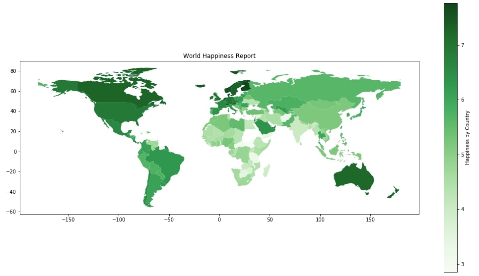
1.1 Happiness Choropleth Map 
Below we are plotting our first choropleth map by simply calling the plot() method on geopandas GeoDataFrame by passing a column name as the first parameter to use for the map. We can pass other arguments like figsize, edgecolor, edgesize, etc for map. As it is a static matplotlib plot, we can call other matplotlib methods like title(), xlabel(), ylabel(), etc will work on it.
world_happiness_final.plot("Score",
                           figsize=(18,10),
                           legend=True,
                           legend_kwds={"label":"Happiness by Country"},
                           cmap=plt.cm.Greens,
                          )
plt.title("World Happiness Report");
1.2 Scatter Maps 
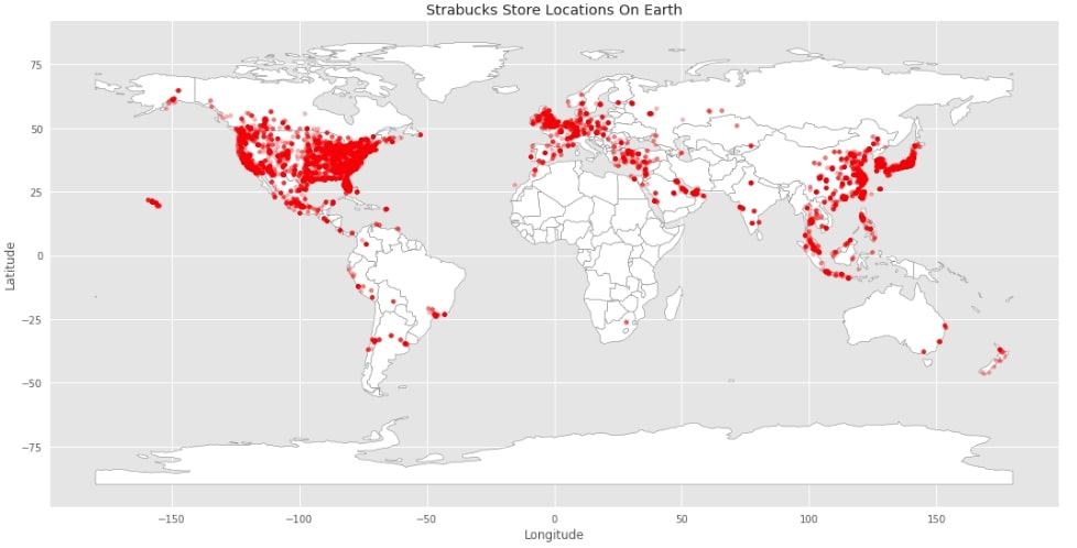
We'll now explain scatter plots on maps with few examples. We'll use starbucks store location data available from kaggle for plotting these graphs. It has information about each Starbucks store locations as well as their address, city, country, phone number, latitude and longitude data.
starbucks_locations = pd.read_csv("datasets/starbucks_store_locations.csv")
starbucks_locations.head()
Below we are plotting a simple map plot first and then using a scatter plot available in matplotlib to plot all Starbucks locations on it. Please make a note that we have longitude and latitude data for each store available in the dataset which we are utilizing in scatter plot.
with plt.style.context(("seaborn", "ggplot")):
    world.plot(figsize=(18,10),
               color="white",
               edgecolor = "grey");

    plt.scatter(starbucks_locations.Longitude, starbucks_locations.Latitude, s=15, color="red", alpha=0.3)
    plt.xlabel("Longitude")
    plt.ylabel("Latitude")
    plt.title("Strabucks Store Locations On Earth");
2. Converting Static Plots to Interactive 
We'll now start converting above static maps to interactive maps using hvplot. We just need to import hvplot's pandas module to start. We then just need to call hvplot() method instead of plot() method on geodatagrame and it'll use holoviews to generate map plots.
import hvplot.pandas
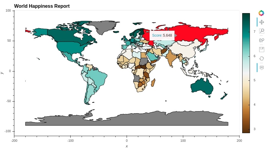
2.1 World Happiness Choropleth Map 
We have below generated simple happiness map which can be generated by just calling hvplot() method passing is column Score to generate an interactive map. We can hover over it to see a score for each country.
world_happiness_final.hvplot(c="Score",
                             cmap="Oranges")
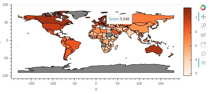
We can pass other attributes to make changes to graphs like height, width, colormap, title and changing color when hovered over any country.
NOTE
Please make a note that entries where NaNs are present are represented with grey color..
happiness = world_happiness_final.hvplot(c="Score",
                             cmap="BrBG",
                             hover_fill_color="red",
                             width=900,height=500,
                             title="World Happiness Report",
                            )
happiness
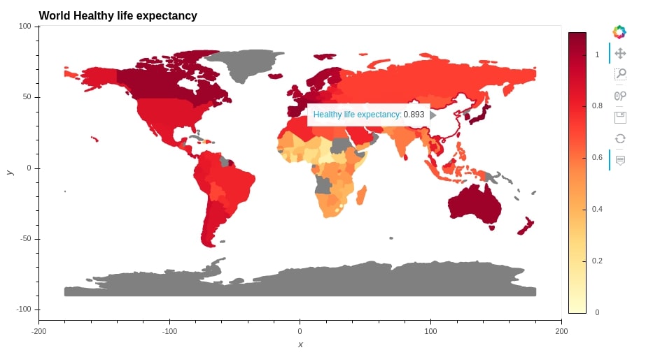
2.2 Healthy Life Expectancy Choropleth Map 
Below we have introduced a few more attributes like hover_fill_color, line_width, etc.
healthy_life = world_happiness_final.hvplot(c= "Healthy life expectancy",
                             width=900,height=500,
                             line_color="Healthy life expectancy",
                             cmap="YlOrRd",
                             hover_fill_color="white",
                             #line_dash="dotted",
                             line_width=2,
                             title="World Healthy life expectancy"
                             )

healthy_life
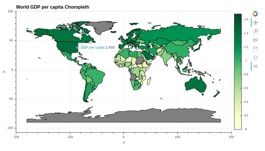
2.3 GDP per Capita Choropleth Map 
gdp_per_capita = world_happiness_final.hvplot(c="GDP per capita",
                             width=900,height=500,
                             grid=True,
                             cmap="YlGn",
                             title="World GDP per capita Choropleth"
                             )
gdp_per_capita
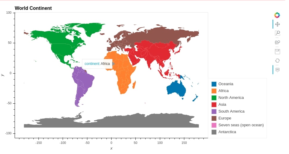
2.4 Continent Choropleth Map 
world_happiness_final.hvplot(c="continent",
                             width=950,height=500,
                             cmap="Category10",
                             title="World Continent",
                             line_color=None
                             )
3. Merging Plots 
We can generate more complicated graphs by merging more than one graph. Holoviews provides 2 operations to merge graphs.
+- It merges graphs by putting them next to each other*- It overlays graphs on one another to create one single graph combining all individuals.
We suggest that you go through our tutorial on basic plotting with holoviews to get an idea about plotting with holoviews.
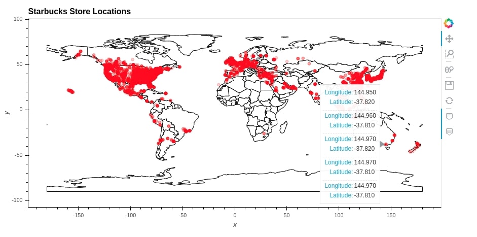
3.1 Starbucks Stores Location Scatter Map 
Below we are creating a scatter map by overlaying scatter plot on a map using * operation.
world_chart = world.hvplot(color="white",
                           width=900,height=450,
                           title="Starbucks Store Locations")

starbucks =  starbucks_locations.hvplot.points('Longitude', 'Latitude',
                                             color='red',
                                             alpha=0.2)

world_chart * starbucks
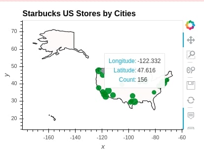
Below we are trying to get a count of Starbucks store for each city by grouping by city. We then take only US cities where a number of Starbucks stores is very high.
cities = ['New York', 'Chicago', 'Seattle', 'Las Vegas', 'Houston', 'San Diego', 'Los Angeles',
          'Portland', 'Phoenix', 'Dallas', 'San Jose', 'Washington', 'San Francisco',
          'San Antonio', 'Denver',  'Richmond', 'Boston', 'Charlotte', 'Austin', 'Boston',
          'Charlotte', 'Austin']

citywise_geo_data = starbucks_locations.groupby("City").mean()[["Longitude","Latitude"]]
citywise_store_cnts = starbucks_locations.groupby("City").count()[["Store Number"]].rename(columns={"Store Number":"Count"})
citywise_store_cnts = citywise_geo_data.join(citywise_store_cnts).sort_values(by=["Count"], ascending=False)
citywise_store_cnts = citywise_store_cnts[citywise_store_cnts.index.isin(cities)]
citywise_store_cnts.head()
3.2. US Cities Starbucks Count Scatter Map 
Below we are creating another scatter map where we are overlaying city-wise store counts scatter plot on a map of US. We can clearly see a big bubble for New York indicating a very high number of stores there.
us_chart = world[world["name"] == "United States of America"].hvplot(
                            color="snow",
                            width=400,height=300,
                            title="Starbucks US Stores by Cities")

us_cities =  citywise_store_cnts.hvplot.points(
                                            x='Longitude', y='Latitude',
                                            color='green',
                                            size="Count",
                                            alpha=0.8)

us_chart * us_cities
3.3. Social Support, Freedom to Make Life Choices and Corruption Choropleth Map 
Below we are merging 3 choropleth using + operations.
world1 = world_happiness_final.hvplot(c="Social support",
                             cmap="Reds",
                             height=350,
                             title="World Social support Report",
                             line_width=0
                            )

world2 = world_happiness_final.hvplot(c="Freedom to make life choices",
                             cmap="Greens",
                             height=350,
                             title="World Freedom to make life choices Report",
                             line_width=0
                            )

world3 = world_happiness_final.hvplot(c="Perceptions of corruption",
                             cmap="Blues",
                             height=350,
                             title="World Perceptions of corruption Report",
                             line_width=0
                            )

(world1 + world2 +world3).cols(1)

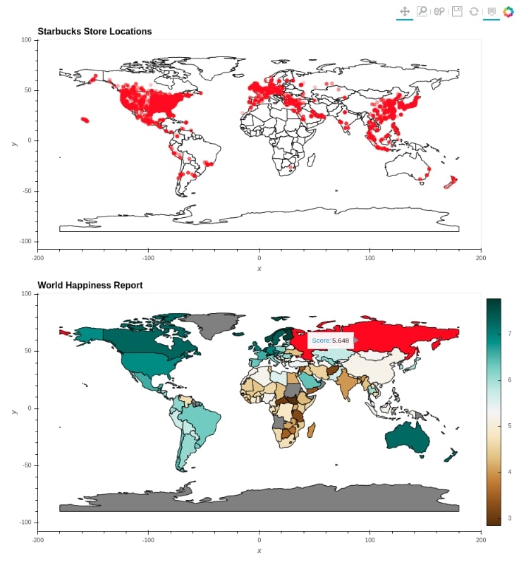
3.4 Starbucks Stores Location Scatter Map & World Happiness Choropleth Map 
Below we have given another example where we are making use of * and + operations both to create a figure of Starbucks stores location scatter map and world happiness choropleth.
((world_chart * starbucks) + happiness).cols(1)
This ends our small tutorial on creating interactive maps using geopandas. Please feel free to let us know your views.
References 
- Geopandas Tutorial
- Hvplot Tutorial
- Cartopy -Basic Maps [Scatter Map, Bubble Map & Connection Map]
- Maps using bqplot
- Choropleth Maps and Scatter Maps using Cufflinks
- Plotting Maps using Bokeh
- ipyleaflet - Interactive Maps in Python based on leaflet.js
- Interactive Choropleth Maps using bqplot
- Interactive Choropleth Maps using ipyleaflet
- Interactive Maps using Folium
- Connection Map in Python using Plotly and Geopandas
 Sunny Solanki
Sunny Solanki
Intro: Software Developer | Youtuber | Bonsai Enthusiast
About: Sunny Solanki holds a bachelor's degree in Information Technology (2006-2010) from L.D. College of Engineering. Post completion of his graduation, he has 8.5+ years of experience (2011-2019) in the IT Industry (TCS). His IT experience involves working on Python & Java Projects with US/Canada banking clients. Since 2020, he’s primarily concentrating on growing CoderzColumn.
His main areas of interest are AI, Machine Learning, Data Visualization, and Concurrent Programming. He has good hands-on with Python and its ecosystem libraries.
Apart from his tech life, he prefers reading biographies and autobiographies. And yes, he spends his leisure time taking care of his plants and a few pre-Bonsai trees.
Contact: sunny.2309@yahoo.in


![YouTube Subscribe]() Comfortable Learning through Video Tutorials?
Comfortable Learning through Video Tutorials?
If you are more comfortable learning through video tutorials then we would recommend that you subscribe to our YouTube channel.
![Need Help]() Stuck Somewhere? Need Help with Coding? Have Doubts About the Topic/Code?
Stuck Somewhere? Need Help with Coding? Have Doubts About the Topic/Code?
 Stuck Somewhere? Need Help with Coding? Have Doubts About the Topic/Code?
When going through coding examples, it's quite common to have doubts and errors.
If you have doubts about some code examples or are stuck somewhere when trying our code, send us an email at coderzcolumn07@gmail.com. We'll help you or point you in the direction where you can find a solution to your problem.
You can even send us a mail if you are trying something new and need guidance regarding coding. We'll try to respond as soon as possible.
![Share Views]() Want to Share Your Views? Have Any Suggestions?
Want to Share Your Views? Have Any Suggestions?
 Want to Share Your Views? Have Any Suggestions?
If you want to
- provide some suggestions on topic
- share your views
- include some details in tutorial
- suggest some new topics on which we should create tutorials/blogs
 hvplot, geopandas