Getting Started with Holoviews - Basic Plotting
Data Visualization is one of the best ways to present and analyze data. Python has many useful data visualization libraries like matplotlib, seaborn, bokeh, plotly, Altair, bqplot, plotnine, etc.
Charts created using libraries like matplotlib and seaborn are static whereas libraries like bokeh and plotly generate interactive charts.
All of these libraries require little learning curves to start working with them.
Holoviews is an open-source python plotting library designed to make plotting easy and intuitive. Holoviews is designed on top of matplotlib, bokeh, and plotly. It reduces the number of lines of code required for plotting.
It provides a high-level interface on matplotlib, bokeh, and plotly that makes plotting interactive plots quite an easy task. This frees us from worrying about getting charts right and lets us concentrate on actual analysis.
What Can You Learn From This Article?
As a part of this tutorial, we have explained how you can create interactive charts using Python data viz library holoviews in Jupyter notebook. Tutorial covers basic charts like scatter plots, bar charts, histograms, etc. Tutorial even explains how we can switch between plotting backends (bokeh, matplotlib & plotly) and how to combine charts.
Below, we have listed important sections of Tutorial to give an overview of the material covered.
Important Sections Of Tutorial
- Basic Charts with One Line of Code
- Loading Holoviews (Bokeh Backend)
- Scatter Plot
- Bar Chart
- Histogram
- BoxWhisker
- Elements
- How to Change Plotting Backend?
- Matplotlib Backend
- Plotly Backend
- Modify Charts by Providing Options
- Merge Charts
- More Charts
- Stacked Bar Chart
- Grouped Bar Chart
- Heatmap
- Multiple Lines Chart
- Area Chart
- Box Whisker Plot
- Violin Chart
- Histograms
- Hexbin Plot
Holoviews Video Tutorial
Please feel free to check below video tutorial if feel comfortable learning through videos. We have covered three different chart types in video. But in this tutorial, we have covered many different chart types.
Below, we have imported necessary Python libraries that we'll use in our tutorial. We have also printed the versions of those libraries that we have used.
import pandas as pd
import numpy as np

pd.set_option("display.max_columns", 30)
import holoviews as hv

print("Holoviews Version : {}".format(hv.__version__))
Load Datasets
Below, we have loaded two datasets that we'll use in our tutorial.
- Wine Dataset: The wine dataset is available from scikit-learn. It has 13 features and a target variable with 3 different classes of wine.
- Apple OHLC Dataset: It has OHLC data about apple stock for 1 year downloaded from Yahoo finance as a CSV file.
We'll keep both datasets in pandas dataframe so that it becomes easily available for plotting and manipulation.
Wine Dataset
from sklearn.datasets import load_wine

wine = load_wine()

wine_df = pd.DataFrame(wine.data, columns = wine.feature_names)
wine_df["Target"] = wine.target
wine_df["Target"] = ["Class_1" if typ==0 else "Class_2" if typ==1 else "Class_3"  for typ in wine_df["Target"]]

wine_df.head()
Apple OHLC Dataset
apple_df = pd.read_csv("~/datasets/AAPL.csv")
apple_df["Date"] = pd.to_datetime(apple_df["Date"])

apple_df.head()
1. Basic Plots 
We'll start plotting a few basic plots like scatter plots, bar charts, histograms, etc. We'll then further explore holoviews options.
1.1 Loading Holoviews [Bokeh Backend] 
We'll start importing holoviews and then set its backend using the hv.extension() method.
We'll be using bokeh and matplotlib backends interchangeably to explain how the same holoviews code can be used for both(matplotlib & bokeh).
Important Information
Holoviews maintains metadata about your plot and it does not do any plotting by itself. It just organizes metadata about how to plot data and uses its underlying back-end library like bokeh, matplotlib, or plotly to actually plot data.
hv.extension("bokeh")

We can provide more than one backend (e.g, hv.extension("bokeh", "matplotlib")) separated by comma as well. Later on, we can use backend parameter of opts() method (used to set chart options) to create chart using that particular backend.
Note
Please make a note that if you don't provide any back-end then it selects bokeh by default.
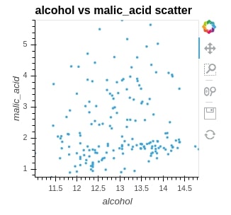
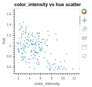
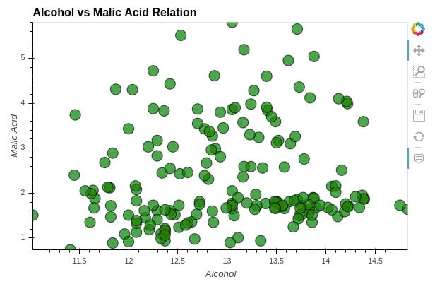
1.2 Scatter Plot 
We are plotting the scatter plot below to show the relationship between alcohol and malic_acid values in wine. We can see that just one line of code is enough to create a simple interactive graph. We need to pass the first argument as a dataframe that maintains data and then kdims and vdims to represent x and y of a graph.
scat = hv.Scatter(wine_df, kdims="alcohol", vdims="malic_acid", label="alcohol vs malic_acid scatter")

scat
Below, we have printed holoviews object (scatter plot) which we created above to see their structure further which can give us meaningful insights.
print(scat)

We can see that all of the plot object printed kdims (key dimensions) in square brackets and all vdims (value dimensions) in parenthesis.
Holoviews sees kdims as primary dimensions which is must to generate plot and vdims as additional secondary dimensions which can add further to primary dimensions.
Holoviews plots need just primary dimensions for plotting purposes and if secondary dimensions do not provide meaningful plotting information then it ignores it.
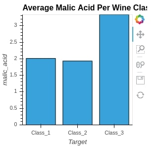
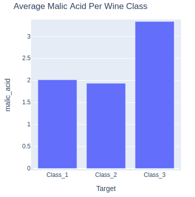
1.3 Bar Chart 
To plot the bar chart, we are grouping dataframe by Target variable, taking an average of all columns, and then filtering dataframe with only one column named malic_acid. We then just pass that to the Bars method to generate a bar chart.
avg_wine_df = wine_df.groupby("Target").mean()

avg_wine_df
bar = hv.Bars(avg_wine_df[["malic_acid"]], label="Average Malic Acid Per Wine Class")

bar
print(bar)

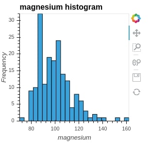
1.4 Histogram 
We are using a numpy histogram method to generate histogram entries. We pass it values of column magnesium and it returns and position of bins and value for each bin. We then pass it to the Histogram method of holoviews to generate a histogram.
hist = hv.Histogram(np.histogram(wine_df['magnesium'], bins=24), kdims="magnesium", label="magnesium histogram")

hist
print(hist)

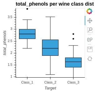
1.5 BoxWhisker 
We can generate box whisker plot easily by passing kdims=Target and vdims=total_pheonols. It'll generate distribution of total_phenols values per each wine class.
box_whisker = hv.BoxWhisker(wine_df, kdims="Target", vdims="total_phenols" , label="total_phenols per wine class distribution")

box_whisker
print(box_whisker)

1.6 Elements 
We can also generate basic line charts and points chart using holoviews as described below.
curve = hv.Curve(apple_df, kdims="Date", vdims="Close")

curve
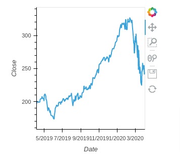
print(curve)
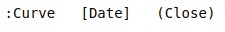
points = hv.Points(wine_df, kdims=["color_intensity", "hue"], label="color_intensity vs hue scatter")

points
print(points)

We can notice by looking at all the above graphs is generated using bokeh. It shows the bokeh symbol as well in the toolbar to confirm it.
2. How to Change Ploting Backend? 
As we already discussed above that holoviews just maintains plotting metadata and uses underlying back-end python library for plotting, we'll now explain below on how can we change different back-ends according to our needs. It won't require any code change in plotting graphs to change back-end.
2.1 Matplotlib Backend 
We can change backend by simply calling the extension() method and passing it a new backend. It'll then start using that backend for plotting. Below we have initialized holoviews with matplotlib backend.
hv.extension("matplotlib")

Scatter Plot
We can see that we have clearly used the same code for generating a matplotlib graph without changing code even a little bit. We might need to sometime change some argument of code as parameters might be different for the different backend but in the majority of cases, it'll be almost the same.
scat = hv.Scatter(wine_df, kdims="alcohol", vdims="malic_acid", label="alcohol vs malic_acid scatter")

scat
NOTE
We can inform holoviews to create chart using particular backend by using "opts()" method as well which is discussed in next section. When we have set more than one backends using "hv.extension("bokeh", "matplotlib")", we can select backend using "opts()" method backend parameter.
2.2 Plotly Backend 
We'll now initialize holoviews using plotly backend and plot various graphs.
hv.extension("plotly")

Bar Chart
bar = hv.Bars(wine_df.groupby("Target").mean()[["malic_acid"]], label="Average Malic Acid Per Wine Class")

bar
Note
Please make a note that plotly graphs won't be interactive on our website page. It'll load properly interactive graph when you run it in a notebook.
3. Modify Charts by Providing Options 
We can notice from the majority of the above graphs that the majority of plotting options like height, width, axes labels, ticks limits, colors, etc. are default selected by holoviews.
But what if a person needs control over it and needs to change various options according to it needs?
Holoviews provided two very easy ways to provide configuration options that will be passed to underlying libraries.
- opts() Method
- %%opts Magic Command
It'll also ignore options which do not available in the underlying library by giving warnings.
We'll start setting our extension as bokeh again.
hv.extension("bokeh")
3.1 Specify Chart Options using "%%opts" Magic Command
The first way of providing configuration options to graph is by using jupyter notebook magic command %%opts.
We need to give a plot object to which we need to apply the configuration options followed by a magic command.
Holoviews has divided configuration options into two categories primary and secondary here as well.
All primary options are about to look of a graph like xlabel, ylabel, height, width, etc.
All secondary options are about actual data plotting options like the size of points, alpha, color, width of the bar, etc.
If you are someone new to concept of magic commands in Jupyter notebook then please check below link. We have a small tutorial explaining majority of magic commands available in Jupyter notebook.
%%opts Scatter [tools=["hover"] xlabel="Alcohol" ylabel="Malic Acid" height=400 width=600](alpha=0.7 size=15 color="green" line_color="black")

scat = hv.Scatter(wine_df, kdims="alcohol", vdims="malic_acid", label="Alcohol vs Malic Acid Relation")

scat
The below graph makes use of a hover color option which changes bar color when the mouse pointer is hovered over it and highlights it.
%%opts Bars [height=400 width=600 tools=["hover"] bgcolor="grey" xlabel="Wine Class" ylabel="Malic Acid" ylim=(0.0, 3.5)]
%%opts Bars (color="black" hover_color="red" bar_width=0.5)

bar = hv.Bars(wine_df.groupby("Target").mean()[["malic_acid"]], label="Average Malic Acid Per Wine Class")

bar
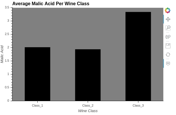
Important Information
If you don't remember configuration options when trying %%opts jupyter magic command then you can press tab inside of brackets and parenthesis. It'll display list of available options. You can then try various values for that configuration option.
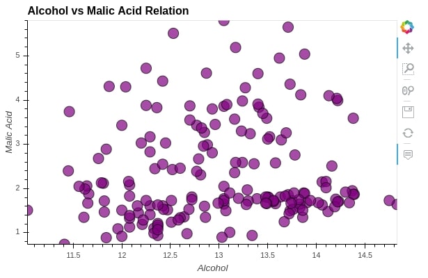
3.2 Specify Chart Options using "opts()" Method
Below, we have explained another way of passing configuration options. We can also call opts() or options() method on graph object and pass it all parameters as per need.
scat = hv.Scatter(wine_df, kdims="alcohol", vdims="malic_acid", label="Alcohol vs Malic Acid Relation")

scat.opts(xlabel="Alcohol",
          ylabel="Malic Acid",
          height=400, width=600,
          tools=["hover"],
          alpha=0.7, size=15,
          color="purple", line_color="black")
4. Merge Charts 
We have explained how to create basic graphs. We'll now explain how can we merge more than one graph into holoviews.
Holoviews lets us merge graph objects using 2 operations
+- It merges graphs by putting them next to each other*- It overlays graphs on one another to create one single graph combining all individuals.
We'll start merging three bar charts with + operation.
%%opts Bars (color="limegreen")

bar1 = hv.Bars(avg_wine_df[["malic_acid"]], label="Average Malic Acid Per Class")
bar2 = hv.Bars(avg_wine_df[["ash"]], label="Average Ash Per Class")
bar3 = hv.Bars(avg_wine_df[["alcohol"]], label="Average Alcohol Per Class")

bars = bar1 + bar2 + bar3

bars
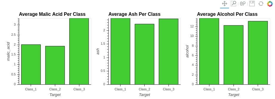
print(bars)
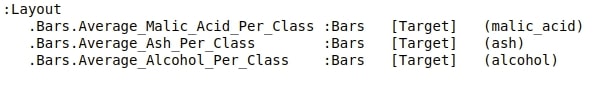
By printing bars object, we can see that it’s of type Layout.
Layout objects are responsible for maintaining the layout of the charts. The above layout is set out as a grid of 1 row and 3 columns(1x3).
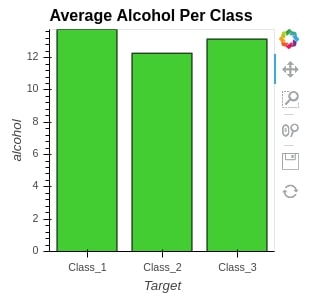
We can even access individual elements as well by simply following dot notation.
bars.Bars.Average_Alcohol_Per_Class
We'll now explain another merge operation using *.
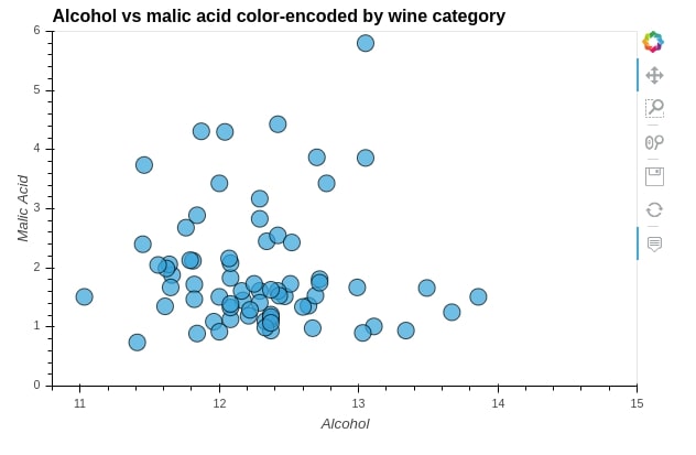
We'll be using * to overlay 3 scatter plots over one another. We are creating 3 scatter plot of alcohol vs malic_acid for 3 different wine categories.
We'll then overlay them on each other to create a single scatter plot.
%%opts Scatter [tools=["hover"] xlabel="Alcohol" ylabel="Malic Acid" height=400 width=600 xlim=(10.8, 15.0) ylim=(0.0,6.0) title="Alcohol vs malic acid color-encoded by wine category"]
%%opts Scatter (alpha=0.7 size=15 line_color="black")

scat1 = hv.Scatter(wine_df[wine_df["Target"] == "Class_1"], kdims="alcohol", vdims="malic_acid")
scat2 = hv.Scatter(wine_df[wine_df["Target"] == "Class_2"], kdims="alcohol", vdims="malic_acid")
scat3 = hv.Scatter(wine_df[wine_df["Target"] == "Class_3"], kdims="alcohol", vdims="malic_acid")

scatters = (scat1 * scat2 * scat3)

scatters
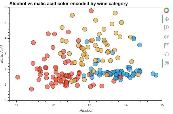
print(scatters)
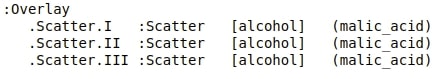
By printing the scatters object, we can see that its type is Overlay.
We can access individual elements of Overlay by simply following dot notation.
scatters.Scatter.II
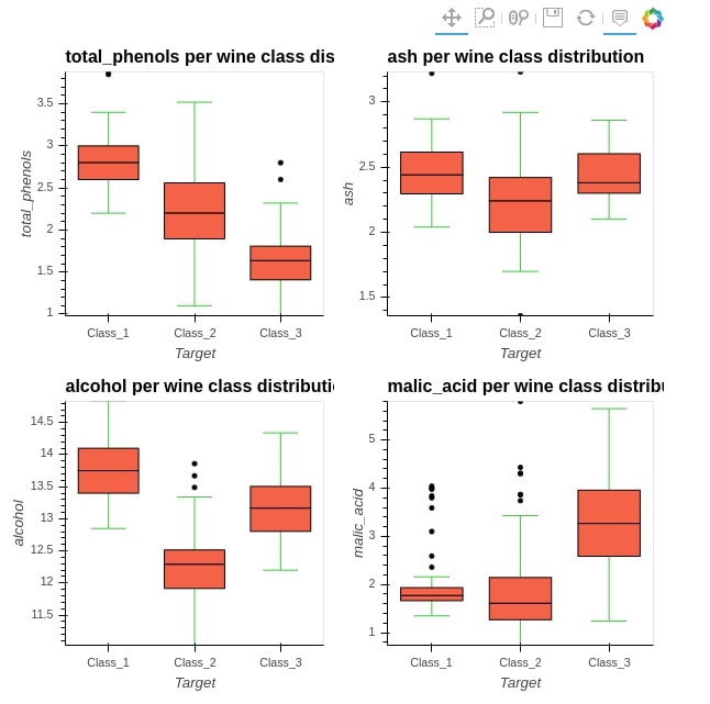
The below example explains, how can we organize a Layout object created when we merge more than one graph using + operation.
We'll be using it's cols() method passing it a number of columns to organize graphs.
We have below created 4 graphs and passed 2 as cols value which will organize graphs into 2 columns instead of just putting them next to each other.
%%opts BoxWhisker [tools=["hover"]] (box_fill_color="tomato" whisker_color="limegreen")

box_whisker1 = hv.BoxWhisker(wine_df, kdims="Target", vdims="total_phenols" , label="total_phenols per wine class distribution")
box_whisker2 = hv.BoxWhisker(wine_df, kdims="Target", vdims="ash" , label="ash per wine class distribution")
box_whisker3 = hv.BoxWhisker(wine_df, kdims="Target", vdims="alcohol" , label="alcohol per wine class distribution")
box_whisker4 = hv.BoxWhisker(wine_df, kdims="Target", vdims="malic_acid" , label="malic_acid per wine class distribution")

(box_whisker1 + box_whisker2 + box_whisker3 + box_whisker4).cols(2)
The simple process of merging more than 1 graph explained above reduced a lot of coding from the developer side. We can even mix + and * operations into one expression to create a complicated figure.
5. More Charts 
In this section, we'll explain few more charts that are commonly used when doing data analysis. We'll be creating those charts using various concepts we discussed till now.
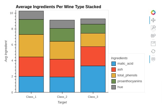
5.1 Stacked Bar Chart
Here, we have explained how to create stacked bar chart using holoviews. We have created a stacked bar chart showing average ingredients used per wine type.
Below, we have first melted our average wine dataframe to create new dataframe that we'll use for creating stacked bar chart.
In the next cell, we have created a stacked bar chart using Bars() method of holoviews. We have selected 5 ingredients to be kept in chart instead of all of them. We have provided wine type and ingredient names as kdims and average ingredient value as vdims.
We have set various chart attributes as well using %%opts magic command. In order to create stacked bar chart, we have set stacked option to True.
melted_avg_wine_df = avg_wine_df.reset_index().melt(id_vars=["Target"], var_name="Ingredients", value_name="Avg Value")

melted_avg_wine_df.head()
%%opts Bars [stacked=True  width=600 height=400 tools=["hover"] title="Average Ingredients Per Wine Type Stacked"]
%%opts Bars [show_legend=True legend_position="right" legend_opts={"title": "Ingredients"}]
%%opts Bars [ylabel="Avg Ingredient"]

ingredients = ["malic_acid", "ash", "total_phenols", "hue", "proanthocyanins"]

bar = hv.Bars(melted_avg_wine_df[melted_avg_wine_df["Ingredients"].isin(ingredients)],
               kdims=["Target", "Ingredients"],
               vdims=["Avg Value"])

bar
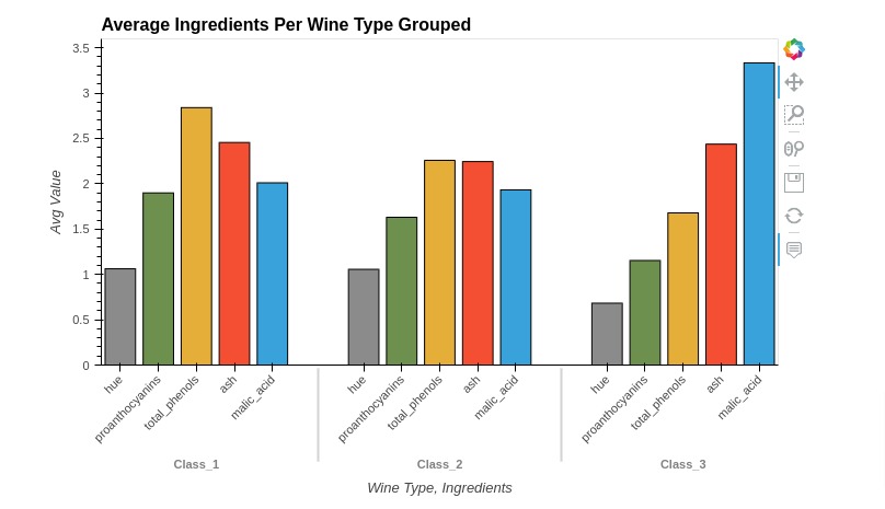
5.2 Grouped Bar Chart
Below, we have created a grouped bar chart showing average ingredients used per wine type using holoviews. The code is exactly same as previous example with only one change.
We have not set stacked option to True in this case. By default, holoviews will create grouped bar charts. We need to tell it to stack bars if we want to explicitly.
%%opts Bars [width=700 height=450 tools=["hover"] title="Average Ingredients Per Wine Type Grouped"]
%%opts Bars [show_legend=True legend_position="top" legend_opts={"title": "Ingredients"}]
%%opts Bars [xrotation=45 xlabel="Wine Type, Ingredients"]

ingredients = ["malic_acid", "ash", "total_phenols", "hue", "proanthocyanins"]

bar = hv.Bars(melted_avg_wine_df[melted_avg_wine_df["Ingredients"].isin(ingredients)],
               kdims=["Target", "Ingredients"],
               vdims=["Avg Value"])

bar
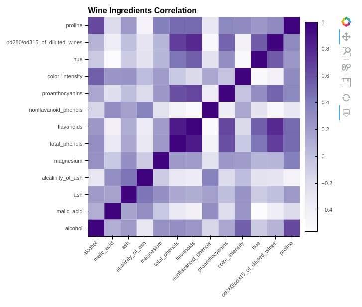
5.3 Heatmap
In this section, we have explained how to create heatmap using holoviews. We have created a heatmap showing correlation between ingredients of wine dataset.
Below, we have first calculated correlation by calling corr() method on wine dataframe.
Then, in the next cell, we have melted correlation dataframe for using it with holoviews.
In the cell below, we have created a heatmap using the Heatmap() method of holoviews. We have provided ingredient names as kdims and correlation values as vdims.
wine_corr = wine_df.corr().reset_index().rename(columns={"index": "Ingredients1"})

wine_corr
melted_wine_corr = wine_corr.melt(id_vars=["Ingredients1"],
                                  var_name="Ingredients2", value_name="Ingredient Value")

melted_wine_corr.head()
%%opts HeatMap [height=600 width=700 title="Wine Ingredients Correlation" tools=["hover"]]
%%opts HeatMap [xrotation=45 colorbar=True xlabel="" ylabel="" ]
%%opts HeatMap (cmap="Purples")

hv.HeatMap(melted_wine_corr, kdims=["Ingredients1", "Ingredients2"], vdims="Ingredient Value")
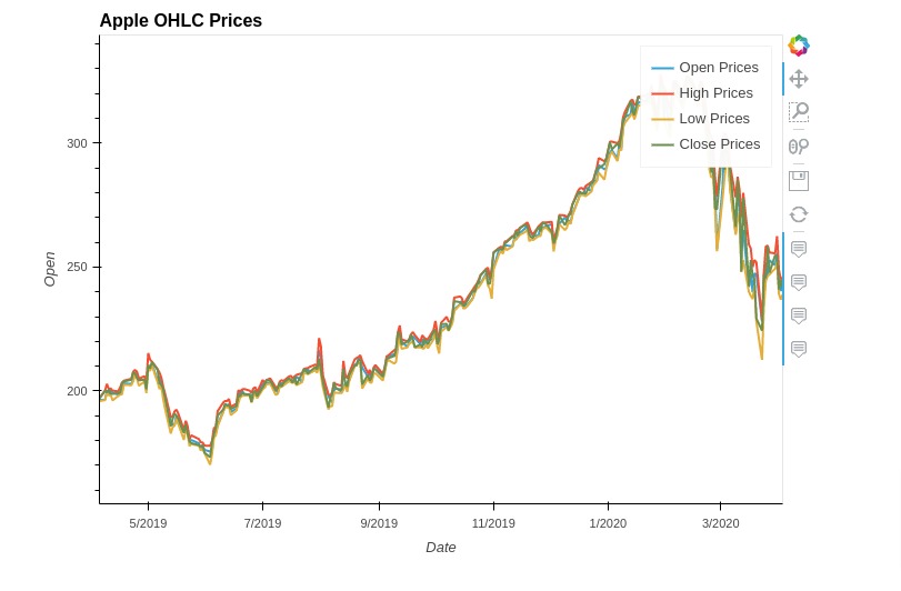
5.4 Multiple Lines Chart
In this section, we have explained how to create line chart with multiple lines using holoviews. We have created a line chart showing open, high, low, and close prices of apple stock dataframe we loaded earlier.
We created line chart for all 4 lines separately and merged them.
%%opts Curve [height=500 width=700 tools=["hover"] title="Apple OHLC Prices"]

line1 = hv.Curve(apple_df, kdims="Date", vdims="Open", label="Open Prices")
line2 = hv.Curve(apple_df, kdims="Date", vdims="High", label="High Prices")
line3 = hv.Curve(apple_df, kdims="Date", vdims="Low", label="Low Prices")
line4 = hv.Curve(apple_df, kdims="Date", vdims="Close", label="Close Prices")

line1 * line2 * line3 * line4
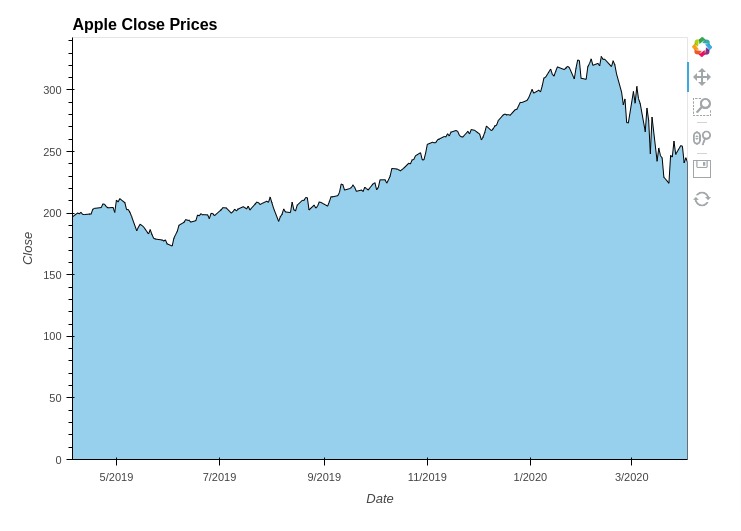
5.5 Area Charts
In this section, we have explained how you can create an area chart using holoviews. We have created an area chart showing the area covered by close price of apple stock.
The area chart is created using Area() method of holoviews. You can create more than one area chart and merge them like line chart we explained in previous section.
%%opts Area [height=500 width=700 title="Apple Close Prices" ]
%%opts Area (fill_alpha=0.5)

area = hv.Area(apple_df, kdims="Date", vdims="Close", label="Close Prices")

area
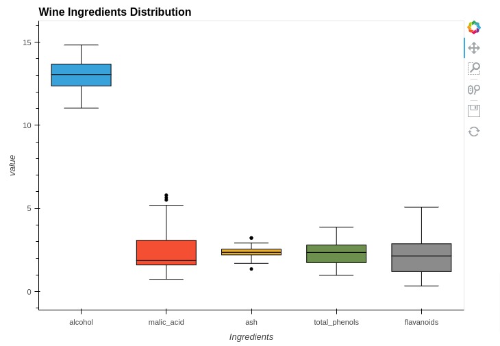
5.6 Box Whisker Plots
In this section, we have explained how you can create box whisker plot using holoviews. We have created first box whisker plot showing concentration of values of few ingredients.
In order to create a box whisker plot, we have first melted our original wine dataframe below. Then, we have created box plot for ingredients separately by calling BoxWhisker() method of holoviews.
At last, we have merged box whisker plots of all ingredients to create one box whisker plot.
melted_wine_df = wine_df.melt(id_vars=["Target"], var_name="Ingredients")

melted_wine_df = melted_wine_df[melted_wine_df["Ingredients"].isin(["alcohol", "malic_acid", "ash", "total_phenols", "flavanoids"])]

melted_wine_df.head()
%%opts BoxWhisker [height=500 width=700 title="Wine Ingredients Distribution"]

box1 = hv.BoxWhisker(melted_wine_df[melted_wine_df["Ingredients"]=="alcohol"], kdims="Ingredients", vdims="value")
box2 = hv.BoxWhisker(melted_wine_df[melted_wine_df["Ingredients"]=="malic_acid"], kdims="Ingredients", vdims="value")
box3 = hv.BoxWhisker(melted_wine_df[melted_wine_df["Ingredients"]=="ash"], kdims="Ingredients", vdims="value")
box4 = hv.BoxWhisker(melted_wine_df[melted_wine_df["Ingredients"]=="total_phenols"], kdims="Ingredients", vdims="value")
box5 = hv.BoxWhisker(melted_wine_df[melted_wine_df["Ingredients"]=="flavanoids"], kdims="Ingredients", vdims="value")

box1 * box2 * box3 * box4 * box5
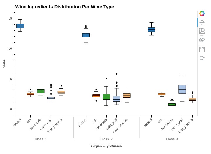
Below, we have created another example showing how we can create box whisker plot showing ingredients concentration based on wine type. You can notice that kdims is set differently in this case.
%%opts BoxWhisker [height=500 width=700 title="Wine Ingredients Distribution Per Wine Type"]
%%opts BoxWhisker [xrotation=45]
%%opts BoxWhisker (box_color="Ingredients" box_cmap="Category20")

box1 = hv.BoxWhisker(melted_wine_df, kdims=["Target", "Ingredients"], vdims="value")

box1
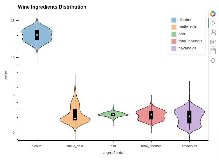
5.7 Violin Charts
In this section, we have explained how to create violin plots using holoviews. We have created violin chart showing concentration of ingredients.
In order to create a violin chart, we have used the same melted dataframe that we created in box whisker plots. We have created violin chart by providing melted dataframe to Violin() method of holoviews.
%%opts Violin [height=500 width=700 title="Wine Ingredients Distribution" show_legend=True]
%%opts Violin (violin_color="Ingredients")

violin1 = hv.Violin(melted_wine_df, kdims="Ingredients", vdims="value")

violin1
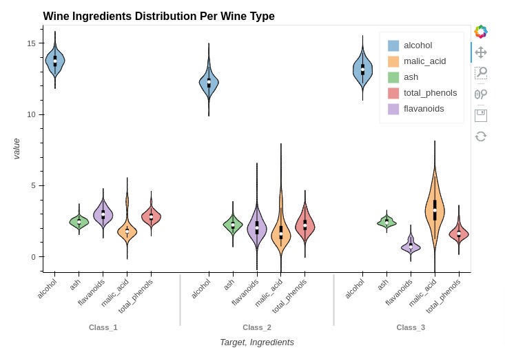
Below, we have created another example of violin chart showing the concentration of ingredients based on wine type.
%%opts Violin [height=500 width=700 title="Wine Ingredients Distribution Per Wine Type" show_legend=True]
%%opts Violin [xrotation=45]
%%opts Violin (violin_color="Ingredients")

violin = hv.Violin(melted_wine_df, kdims=["Target", "Ingredients"], vdims="value")

violin
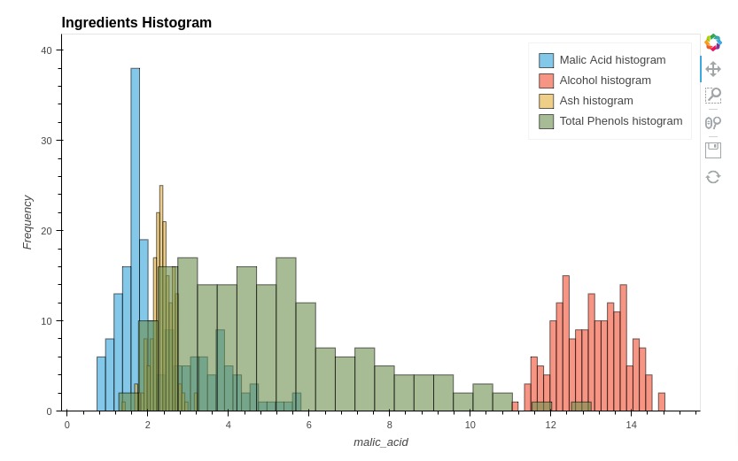
5.8 Histograms
In this section, we have explained how we can create histograms of more than one data variable using holoviews. We have created a histogram of few ingredients.
We have created histogram of ingredients separately as we had explained in the basic charts section and then combined them to create a single histogram.
%%opts Histogram [height=500 width=800 title="Ingredients Histogram" show_legend=True]
%%opts Histogram (alpha=0.6)

hist1 = hv.Histogram(np.histogram(wine_df['malic_acid'], bins=24), kdims="malic_acid", label="Malic Acid histogram")
hist2 = hv.Histogram(np.histogram(wine_df['alcohol'], bins=24), kdims="magnesium", label="Alcohol histogram")
hist3 = hv.Histogram(np.histogram(wine_df['ash'], bins=24), kdims="ash", label="Ash histogram")
hist4 = hv.Histogram(np.histogram(wine_df['color_intensity'], bins=24), kdims="color_intensity", label="Total Phenols histogram")

hist1 * hist2 * hist3 * hist4
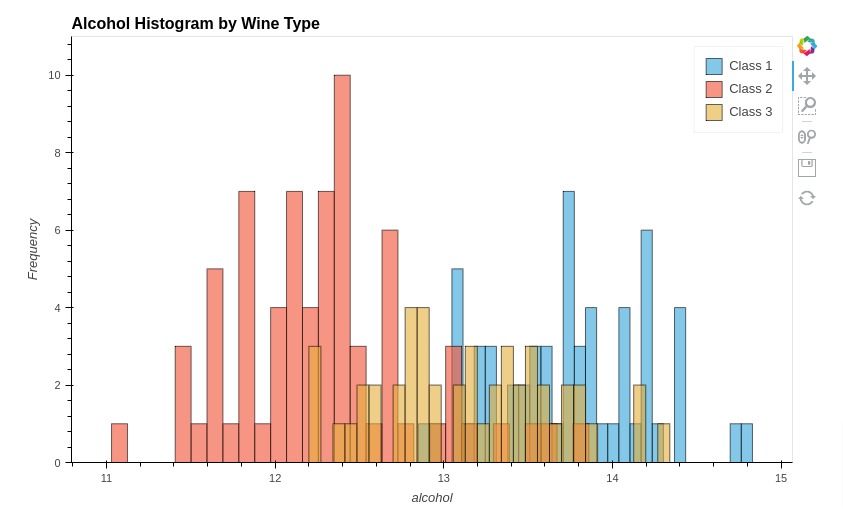
Below, we have created another histogram showing distribution of alcohol per wine type.
%%opts Histogram [height=500 width=800 title="Alcohol Histogram by Wine Type" show_legend=True]
%%opts Histogram (alpha=0.6)

hist1 = hv.Histogram(np.histogram(wine_df[wine_df["Target"]=="Class_1"]['alcohol'], bins=30), kdims="alcohol", label="Class 1")
hist2 = hv.Histogram(np.histogram(wine_df[wine_df["Target"]=="Class_2"]['alcohol'], bins=30), kdims="alcohol", label="Class 2")
hist3 = hv.Histogram(np.histogram(wine_df[wine_df["Target"]=="Class_3"]['alcohol'], bins=30), kdims="alcohol", label="Class 3")

hist1 * hist2 * hist3
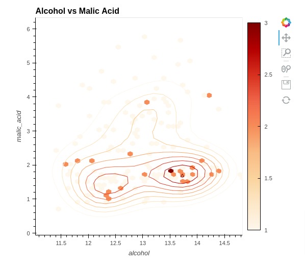
5.9 Hexagonal Binning Plot (Hexbin Plot)
In this section, we have explained how to create a hexagonal binning plot commonly referred to as a hexbin plot using holoviews. We have created hexbin chart to show relationship between alcohol and malic acid. The Hexbin plot shows the count of samples that matches values of ingredients per each hex.
We have created a hexbin plot using HexTiles() method of holoviews. We have also included kernel density estimate using Bivariate() method.
%%opts HexTiles [width=550 height=500 title="Alcohol vs Malic Acid" colorbar=True]
%%opts HexTiles (cmap="OrRd")
%%opts Bivariate [show_legend=False]
%%opts Bivariate (cmap="OrRd")

hextiles = hv.HexTiles(data=wine_df, kdims=["alcohol", "malic_acid"])

bivariate = hv.Bivariate(data=wine_df, kdims=["alcohol", "malic_acid"])

hextiles * bivariate
This ends our detailed tutorial explaining how to create charts using Python data visualization library Holoviews.
Want to Create Holoviews Chart from Pandas Dataframe with Just One Line Of Code?
We already saw above that how easy it is to create charts using holoviews.
But what if we can make it even easier?
Many of us use pandas dataframes for maintaining our tabular datasets. Pandas provide a simple plotting API to create charts through "plot()" method of dataframe. But charts created are static as it uses matplotlib as plotting backend.
What if we want to create interactive charts using same simple plotting API of pandas dataframe?
To our surprise, there is a library named hvplot that let us create interactive charts from pandas dataframe by calling plot() method. It uses holoviews as a backend to create charts.
Please feel free to check below link if you are interested in it.
References 
Other Holoviews Tutorials
Other Python Data Visualization Libraries
 Sunny Solanki
Sunny Solanki
Intro: Software Developer | Youtuber | Bonsai Enthusiast
About: Sunny Solanki holds a bachelor's degree in Information Technology (2006-2010) from L.D. College of Engineering. Post completion of his graduation, he has 8.5+ years of experience (2011-2019) in the IT Industry (TCS). His IT experience involves working on Python & Java Projects with US/Canada banking clients. Since 2020, he’s primarily concentrating on growing CoderzColumn.
His main areas of interest are AI, Machine Learning, Data Visualization, and Concurrent Programming. He has good hands-on with Python and its ecosystem libraries.
Apart from his tech life, he prefers reading biographies and autobiographies. And yes, he spends his leisure time taking care of his plants and a few pre-Bonsai trees.
Contact: sunny.2309@yahoo.in


![YouTube Subscribe]() Comfortable Learning through Video Tutorials?
Comfortable Learning through Video Tutorials?
If you are more comfortable learning through video tutorials then we would recommend that you subscribe to our YouTube channel.
![Need Help]() Stuck Somewhere? Need Help with Coding? Have Doubts About the Topic/Code?
Stuck Somewhere? Need Help with Coding? Have Doubts About the Topic/Code?
 Stuck Somewhere? Need Help with Coding? Have Doubts About the Topic/Code?
When going through coding examples, it's quite common to have doubts and errors.
If you have doubts about some code examples or are stuck somewhere when trying our code, send us an email at coderzcolumn07@gmail.com. We'll help you or point you in the direction where you can find a solution to your problem.
You can even send us a mail if you are trying something new and need guidance regarding coding. We'll try to respond as soon as possible.
![Share Views]() Want to Share Your Views? Have Any Suggestions?
Want to Share Your Views? Have Any Suggestions?
 Want to Share Your Views? Have Any Suggestions?
If you want to
- provide some suggestions on topic
- share your views
- include some details in tutorial
- suggest some new topics on which we should create tutorials/blogs
 holoviews, basic-plots