Seaborn: Using relplot() API to Understand Statistical Relations Between Multiple Data Variables
Table of Contents
- Introduction
- 1. Load Dataset
- 2. Visualizing Relations as Scatter Plots
- 3. Visualizing Relations as a Line Plots
- 4. Visualizing Relations with Multiple Plots Based on Categorical Variable.
- References
Introduction 
Python has a list of libraries for data visualization each one offering a different set of functionalities. Seaborn is one of such famous data visualization library which is preferred by many data scientist and visualization expert for plotting statistical visualizations. Seaborn is developed keeping statistical analysis of data and visualizing it. Seaborn is built on top of matplotlib and frees the developer from coding many mundane things required by matplotlib. It lets us concentrate on analysis more than getting visualizations right. Seaborn also has close integration with python library pandas which is preferred by many developers for maintaining structured data.
As a part of this tutorial, we'll be exploring seaborn functionalities for understanding the statistical relationship between multiple variables. We'll be using various datasets available by default with seaborn for understanding usage of the library.
So without further delay, let’s get started with coding to understand seaborn usage better.
We'll start by importing necessary libraries.
import seaborn as sns

import pandas as pd
import numpy as np
1. Load Dataset 
The first dataset that we'll load is dots dataset available from seaborn. We'll load it and print its size and first few rows to better understand its contents.
dots = sns.load_dataset("dots")
print("Dataset Size : ", dots.shape)
dots.head()
Our second dataset is a famous auto mpg dataset that has information about car models generated over years from various manufactures. We'll load it, display its size and first few rows to check its contents.
auto_mpg = sns.load_dataset("mpg")
print("Dataset Size : ", auto_mpg.shape)
auto_mpg.head()
The third dataset that we'll load is apple OHLC data downloaded from yahoo finance. We suggest that you download it as well from the yahoo finance website as CSV file to follow this step.
apple_df = pd.read_csv("datasets/AAPL.csv")
apple_df["Date"] = pd.to_datetime(apple_df.Date)
apple_df = apple_df.set_index("Date")
print("Dataset Size : ", apple_df.shape)
apple_df.head()
2. Visualizing Relations as Scatter Plots 
We'll be using seaborn's relplot() method for visualizing the relationship between multiple variables as either scatter plot or as line plot. Seaborn also provides separate methods named scatterplot() for scatter plots and lineplot() for plotting line plots. We'll be using relplot() with most of our examples as it provides very easy to use interface to plot relationships and explore data further.
Below is a list of important parameters of relplot() method which we'll be exploring further:
x- Data Variable Representing X-axis. We need to pass the column name of the pandas dataframe.y- Data Variable Representing Y-axis. We need to pass the column name of the pandas dataframe.kind-scatterfor scatter plot andlinefor line plot. The default value isscatter.data- Pandas dataframe containing total data.hue- The categorical column from the dataframe will be used to color points of scatter plot and lines of line plots according to different categories. We need to pass the column name of the pandas dataframe.style- The categorical column from the dataframe which will use different markers (+, ^,o, etc) for different categories of scatter plot and line plot. We need to pass the column name of the pandas dataframe.size- The categorical column from the dataframe will used to decide the size of various points of scatter plot. We need to pass the column name of the pandas dataframe.sizes- This parameter accepts range to decide in which range size of points on scatter plot will be.palette- It's used to decide which color coding scheme to use to color different points/lines of data.alpha- It represents the opacity of points/lines of the chart. The less value represents light and more value represents dark colors.
We'll now plot various scatter plots below explaining the usage of the above-mentioned parameters of replot() method.
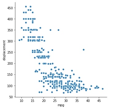
2.1 Mpg vs Displacement Scatter Plot
sns.relplot(x="mpg", y="displacement", data=auto_mpg);
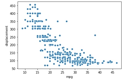
Below we are plotting the same plot as above one but with using scatterplot() method instead of replot() as both have almost the same API.
sns.scatterplot(x="mpg", y="displacement", data=auto_mpg);
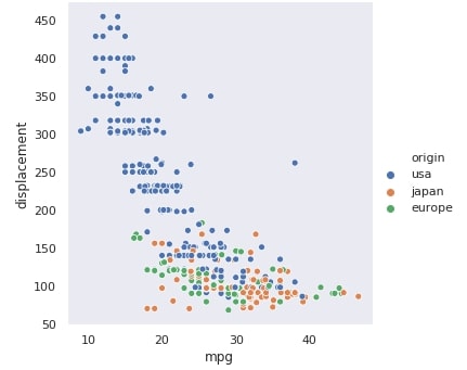
2.2 Mpg vs Displacement Scatter Plot Color-Encoded by Origin.
We can also change plot style in seaborn using set() method available with seaborn passing is the style name available.
Below is a list of styles available with seaborn
- dark
- darkgrid
- white
- whitegrid
- ticks
# white, dark, whitegrid, darkgrid, ticks
sns.set(style="dark")
We can see from below plot that different color is used for different origin of cars.
sns.relplot(x="mpg", y="displacement", hue="origin", data=auto_mpg);
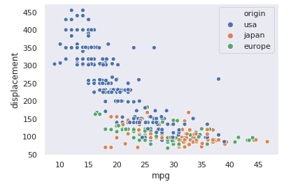
sns.scatterplot(x="mpg", y="displacement", hue="origin", data=auto_mpg);
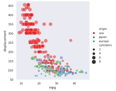
2.3 Mpg vs Displacement Scatter Plot Color-encoded by Origin and Marker-encoded by Cylinders.
Below we are plotting mpg vs displacement scatter plot where we have used a different color for different categories of origin of cars. We have further used the fourth variable named cylinders whose categorical values are used for different marker styles for points according to different cylinder numbers present per car.
sns.relplot(x="mpg", y="displacement", hue="origin", style="cylinders", data=auto_mpg);
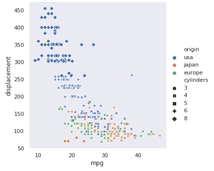
sns.scatterplot(x="mpg", y="displacement", hue="origin", style="cylinders", data=auto_mpg);
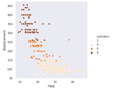
2.4 Mpg vs Displacement Scatter Plot Color-encoded by Cylinders [Different Palette for Colors]
sns.relplot(x="mpg", y="displacement", hue="cylinders", palette="Oranges", data=auto_mpg);
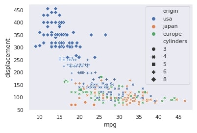
2.5 Mpg vs Displacement Scatter Plot Color-encoded by Origin and Size-encoded by Cylinders [Dark2 Palette for Colors]
Below we have used cylinders categorical variable to use a different sizes for various points of scatter plot.
sns.relplot(x="mpg", y="displacement",
            hue="origin", size="cylinders",
            palette="Dark2",
            data=auto_mpg);
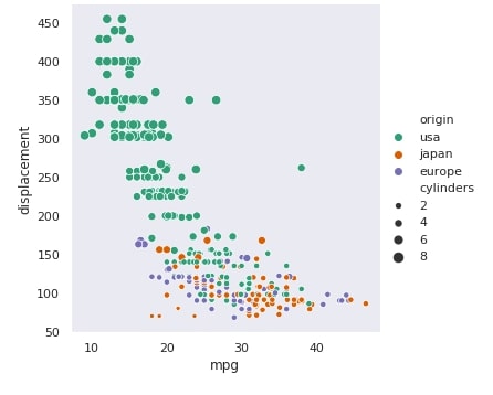
2.6 Mpg vs Displacement Scatter Plot Color-encoded by Origin and Size-encoded by Cylinders [Different Size Settings for Points]
sns.relplot(x="mpg", y="displacement",
            hue="origin", size="cylinders", sizes=(50,200),
            palette="Set1", alpha=0.5,
            data=auto_mpg);
3. Visualizing Relations as a Line Plots 
We'll now use relplot() API for plotting various line chart. We need to pass kind="line" in order for it to plotline the plot instead of a scatter plot. The kind attribute has a default value as scatter which will force it to plot scatter plot.
We'll first set our plot styling to darkgrid which is the same as dark style but with grids present.
sns.set(style="darkgrid")
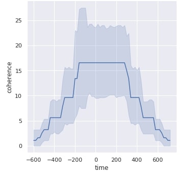
3.1 Time vs Coherence Line Plot
Below we are plotting time vs coherence line plot whose value is shown aggregated in the below plot. Lighter blue area represents till how much part line values are spread and the actual line represents aggregated data line.
sns.relplot(x= "time", y="coherence", kind="line", data=dots);
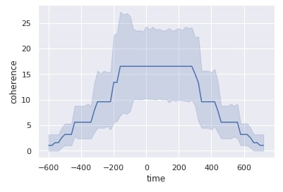
Below we are plotting exactly the same plot as above one but with using lineplot() method instead of relplot().
sns.lineplot(x= "time", y="coherence", data=dots);
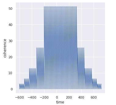
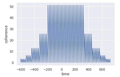
3.2 Time vs Coherence Line Plot without Aggregating Line Data
Below we are plotting above mentioned line without aggregating its data hence it looks wiggly.
sns.relplot(x= "time", y="coherence", kind="line", estimator=None, data=dots);
sns.lineplot(x= "time", y="coherence", estimator=None, data=dots);
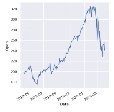
3.3 Date vs Open Price Line Plot of Apple Stocks.
line = sns.relplot(x= "Date", y="Open", kind="line", data=apple_df.reset_index());
line.fig.autofmt_xdate()
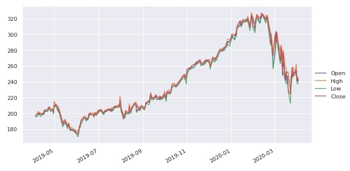
3.4 Multi-line Plot of Date vs Open, High, Low and Close Prices of Apple Stock.
line = sns.relplot(kind="line",
            dashes=False,
            aspect=1.77,
            data=apple_df[["Open", "High", "Low", "Close"]]);

line.fig.autofmt_xdate()
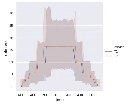
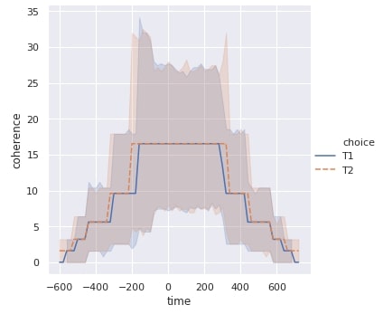
3.5 Time vs Coherence Line Plot with Different Lines for Choice Variable of Data.
sns.relplot(x= "time", y="coherence", hue="choice", kind="line", data=dots);
3.6 Time vs Coherence Line Plot with Different Lines for Each Choice Category and Different Line Style per Choice Category.
sns.relplot(x= "time", y="coherence", hue="choice", style="choice", kind="line", data=dots);
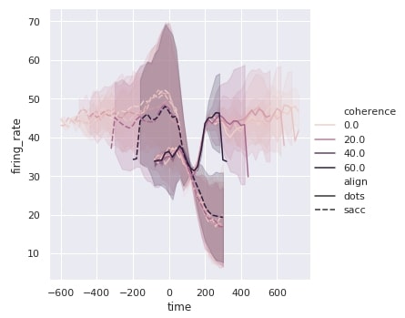
3.7 Time vs Firing Rate with Different Line for Coherence Categories and Different Line Style for Align Categories.
We have used below coherence for different line colors and align for different line styles.
sns.relplot(x= "time", y="firing_rate", hue="coherence", style="align", kind="line", data=dots);
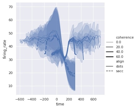
3.8 Time vs Firing Rate with Different Line Size for Coherence Categories and Different Line Style for Align Categories.
We have used below coherence for different line sizes and align for different line styles.
sns.relplot(x= "time", y="firing_rate", size="coherence", style="align", kind="line", data=dots);
4. Visualizing Relations with Multiple Plots Based on Categorical Variable. 
Till now we have analyzed the relationship between multiple variables within one plot only. We can add one more facet of exploration to our data by plotting different plots for the categorical variables. We can plot multiple charts depicting the relationship between multiple variables with each chart representing one category of a categorical variable. We'll explain it below with few examples where we'll be plotting multiple scatter and line charts per figure.
As a part of this exploration, we'll explore a few more parameters of replot() which we had not discussed above:
col- It represents categorical variable for whose one category one plot will be created. Total data will be divided into multiple datasets based on categories of this column and then that divided dataset will be used in each plot.row- It represents categorical variable for whose one category one plot will be created. It has the same interpretation ascol. If bothcolandroware present then for each combinations of categories of bothrowandcolcolumns will be one plot in the figure. We'll explain it below further with an example to clarify if it’s not clear from the textual description.col_wrap- It's an integer representing how many figures to keep per row.
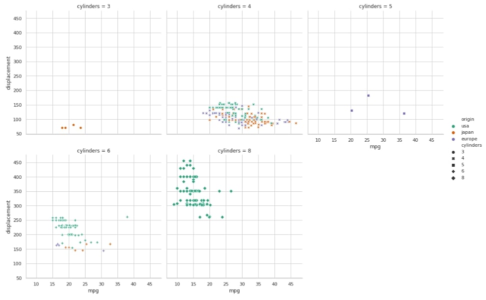
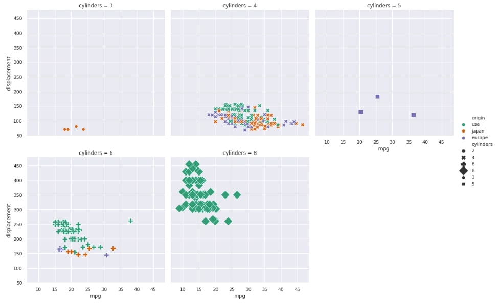
4.1 Mpg vs Displacement Scatter Plot Color-encoded by Origin with One Plot per Cylinder Category.
In the below figure, we have one plot per cylinder count. We then plot mpg vs displacement scatter plot with different markers for different points according to cylinders.
sns.set(style="whitegrid")

sns.relplot(x="mpg", y="displacement",
            hue="origin", style="cylinders",
            col="cylinders",
            sizes=(50,200), palette="Dark2",
            col_wrap=3, data=auto_mpg);
4.2 Mpg vs Displacement Scatter Plot Color-encoded by Origin, Different Markers per Cylinder Categories, Different Marker Size per Cylinder Categories with One Plot per Cylinder Category.
sns.set(style="darkgrid")

sns.relplot(x="mpg", y="displacement",
            hue="origin", style="cylinders", size="cylinders",
            col="cylinders",
            sizes=(50,200), palette="Dark2",
            col_wrap=3, data=auto_mpg);
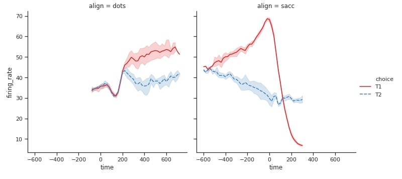
4.3 Time vs Firing Rate Line Plot Having Different Color and Line Style Per Choice Categories with One Plot per Align Category.
sns.set(style="ticks")

sns.relplot(x="time", y="firing_rate",
            hue="choice", style="choice",
            kind="line",
            col="align",
            palette="Set1",
            data=dots);
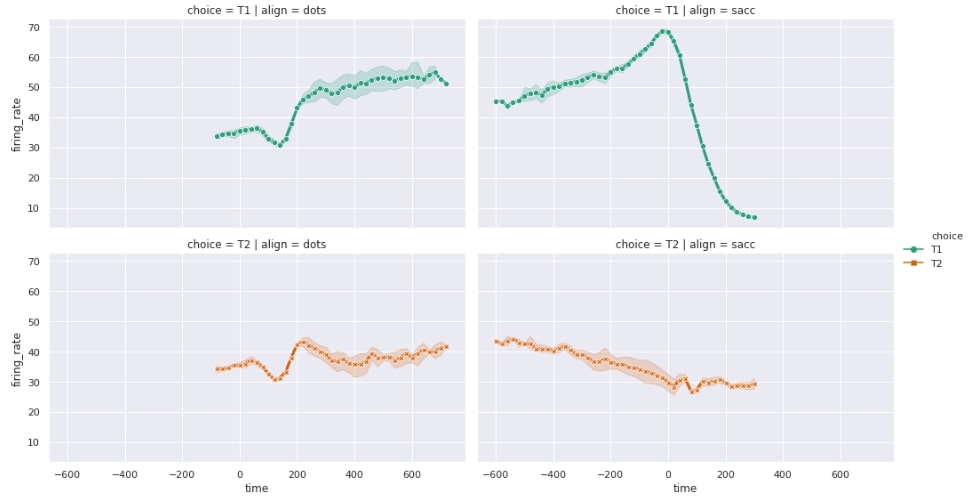
4.4 Time vs Firing Rate Line Plot Having Different Color and Line Style Per Choice Categories with One Plot per different Align and Choice Category combinations.
The below example demonstrates the usage of col and row parameters at the same time. We have two values per choice column and two values per align column hence resulting in 4 (2x2) charts in the figure.
sns.set(style="darkgrid")

sns.relplot(x="time", y="firing_rate",
            hue="choice", style="choice",
            dashes=False, markers=True,
            kind="line", linewidth=3, height=4, aspect=1.77,
            col="align", row="choice",
            palette="Dark2",
            data=dots);
This ends our small tutorial on exploring replot() API of seaborn to understand the statistical relationship between multiple variables of a dataset. Please feel free to let us know your views in the comments section.
References 
 Sunny Solanki
Sunny Solanki
Intro: Software Developer | Youtuber | Bonsai Enthusiast
About: Sunny Solanki holds a bachelor's degree in Information Technology (2006-2010) from L.D. College of Engineering. Post completion of his graduation, he has 8.5+ years of experience (2011-2019) in the IT Industry (TCS). His IT experience involves working on Python & Java Projects with US/Canada banking clients. Since 2020, he’s primarily concentrating on growing CoderzColumn.
His main areas of interest are AI, Machine Learning, Data Visualization, and Concurrent Programming. He has good hands-on with Python and its ecosystem libraries.
Apart from his tech life, he prefers reading biographies and autobiographies. And yes, he spends his leisure time taking care of his plants and a few pre-Bonsai trees.
Contact: sunny.2309@yahoo.in


![YouTube Subscribe]() Comfortable Learning through Video Tutorials?
Comfortable Learning through Video Tutorials?
If you are more comfortable learning through video tutorials then we would recommend that you subscribe to our YouTube channel.
![Need Help]() Stuck Somewhere? Need Help with Coding? Have Doubts About the Topic/Code?
Stuck Somewhere? Need Help with Coding? Have Doubts About the Topic/Code?
 Stuck Somewhere? Need Help with Coding? Have Doubts About the Topic/Code?
When going through coding examples, it's quite common to have doubts and errors.
If you have doubts about some code examples or are stuck somewhere when trying our code, send us an email at coderzcolumn07@gmail.com. We'll help you or point you in the direction where you can find a solution to your problem.
You can even send us a mail if you are trying something new and need guidance regarding coding. We'll try to respond as soon as possible.
![Share Views]() Want to Share Your Views? Have Any Suggestions?
Want to Share Your Views? Have Any Suggestions?
 Want to Share Your Views? Have Any Suggestions?
If you want to
- provide some suggestions on topic
- share your views
- include some details in tutorial
- suggest some new topics on which we should create tutorials/blogs
 seaborn, statistical-analysis