Pandas-Bokeh: Create Bokeh Charts from Pandas DataFrame with One Line of Code
Pandas is the best library when working with structured tabular datasets in Python. Majority of data scientists use it for loading and manipulating tabular datasets as it has wide API for performing different kinds of operations on datasets.
Apart from manipulation, it provides simple plotting API as well. All pandas dataframe has a method named plot() that lets us create basic charts like bar charts, scatter plots, line charts, etc. It makes charts using matplotlib as backend.
We can create charts directly from pandas dataframe with just one line of code calling this function.
But the charts created using default plotting backend matplotlib are static
What if we want interactive charts? Python has many libraries that provide interactive data visualizations.
To our surprise, there is a library named pandas_bokeh that let us create charts directly from pandas data frame.
We just need to call method plot_bokeh() to create charts. We can even set pandas_bokeh as plotting backend of pandas and then we can call same plot() method to create bokeh charts from dataframes.
What Can You Learn From This Article?
As a part of this tutorial, we have explained how to create interactive bokeh charts from pandas dataframe using Python library pandas_bokeh. It let us create charts with just one function call. Tutorial covers majority of charts provided by pandas_bokeh library with simple and easy-to-understand examples. Charts like scatter plots, bar charts, line charts, histograms, area charts, pie charts, scatter maps, etc are covered in tutorial.
Below, we have listed important sections of tutorial to give an overview of the material covered.
Important Sections Of Tutorial
- Scatter Plots
- Set "Pandas_Bokeh" as Plotting Backend of Pandas
- Modify Important Attributes Of Chart
- 2.1 Modify Styling Attributes
- 2.2 Modify Font Sizes
- 2.3 Modify Tools Visibility
- 2.4 Add Colormap
- Bar Charts
- Horizontal Bar Chart
- Stacked Bar Chart
- Grouped Bar Chart
- Line Charts
- Area Charts
- Histograms
- Pie Charts
- Step Charts
- Scatter Maps
- Bubble Maps
Pandas-Bokeh Video Tutorial
Please feel free to check below video tutorial if feel comfortable learning through videos.
Below, we have imported necessary Python libraries that we have used in our tutorial. We have also printed the versions of those libraries.
import pandas as pd

print("Pandas Version : {}".format(pd.__version__))
import pandas_bokeh

print("Pandas-Bokeh Version : {}".format(pandas_bokeh.__version__))
Set Pandas_Bokeh to Output Charts in Notebook
We need to call below function in order to display charts in notebook. If we don't call it then it'll save charts to an HTML file and open it in new browser window.
pandas_bokeh.output_notebook()
Load Datasets
In this section, we have loaded datasets that we'll be using for plotting various charts using Pandas-bokeh library. We'll be using three different datasets for different types of charts.
- Wine Dataset - The dataset is available from scikit-learn and has details about ingredients used in preparation of three different types of wines.
- Apple OHLC Dataset - The dataset is downloaded as a CSV file from Yahoo finance.
- Starbucks Store Locations Dataset - The dataset has details about Starbucks store locations worldwide. It has longitude and latitude details as well which can be useful for map charts.
We have loaded all three datasets as pandas dataframe.
from sklearn import datasets

wine = datasets.load_wine(as_frame=True)
wine_df = wine["data"]
wine_df["WineType"] = [wine["target_names"][t] for t in wine["target"]]

wine_df.head()
apple_df = pd.read_csv("~/datasets/AAPL.csv")
apple_df["Date"] = pd.to_datetime(apple_df["Date"])

apple_df.head()
store_locations_df = pd.read_csv("~/datasets/starbucks_store_locations.csv")
store_locations_df = store_locations_df.dropna()

store_locations_df.head()
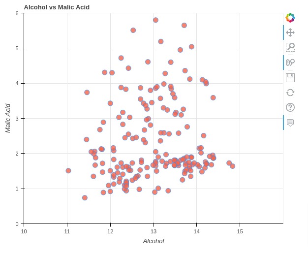
1. Scatter Plots 
The first chart type that we'll explain is a scatter plot.
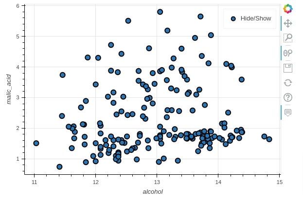
Below, we have created a simple scatter plot from wine dataframe showing relationship between alcohol (X-axis) and malic acid (Y-axis).
We have called scatter() on top of plot_bokeh attribute of dataframe to create interactive bokeh scatter chart.
The method by default plots chart in notebook as well returns Figure object as well.
Please make NOTE that pandas_bokeh() method will only be available from dataframe after you import pandas_bokeh library.
scatter_fig = wine_df.plot_bokeh.scatter(x="alcohol", y="malic_acid")
Below, we have created the same chart as previous cell but this time using plot_bokeh() as a method.
As plot_bokeh() is a generic method, we need to provide kind parameter specifying chart type.
We can create charts either using plot_bokeh() method or we can call chart methods (scatter(), line(), area(), etc) on plot_bokeh attribute of pandas dataframe.
We'll be calling method names on plot_bokeh attribute in our tutorial as it makes things clear to understand.
scatter_fig = wine_df.plot_bokeh(x="alcohol", y="malic_acid", kind="scatter")
Set "Pandas_Bokeh" as Plotting Backend of Pandas
By default, the plotting backend for pandas is matplotlib as we discussed earlier. We can call plot() method on dataframe and it'll create static charts using matplotlib.
We can replace matplotlib backend with pandas_bokeh backend as explained below.
pd.get_option("plotting.backend")
pd.set_option('plotting.backend', 'pandas_bokeh')
pd.get_option("plotting.backend")
Once we have replaced pandas_bokeh as plotting backend, we can now call plot() method to create charts using it. The plot() method will now create charts using pandas_bokeh instead of matplotlib.
scatter_fig = wine_df.plot.scatter(x="alcohol", y="malic_acid")
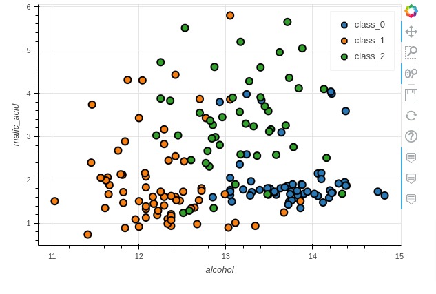
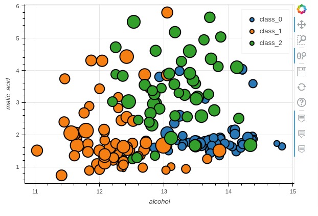
Returning Figure Object & Color Points By Category
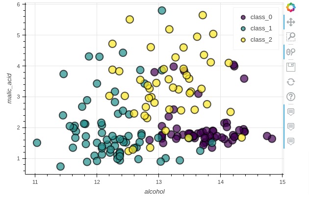
Below, we have again created a scatter plot showing relationship between alcohol and malic acid but this time we have modified two chart attributes.
We have colored chart scatter points by setting WineType as category parameter.
Also, we have asked not to show figure in notebook output cell by setting show_figure to False. This can be useful in situations when you want to combine different figures created from different dataframes to create GUIs.
You can combine these figures using different layout creation options available from Bokeh.
Please check below link to understand how you can lay out different figure objects to create a dashboard-like GUI.
scatter_fig = wine_df.plot_bokeh.scatter(x="alcohol", y="malic_acid", category="WineType",
                                         show_figure=False
                                        )
from bokeh.io import show

show(scatter_fig)
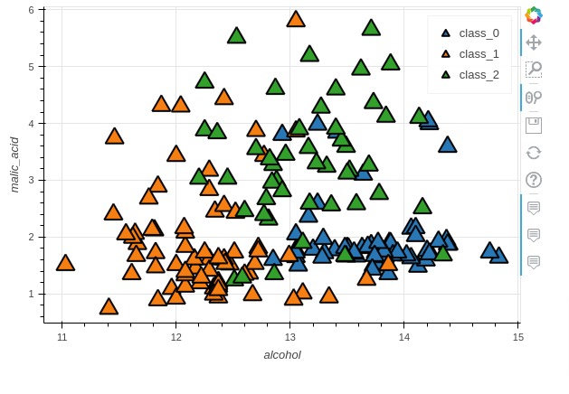
Modifying Default Marker
In this section, we have explained how to modify default marker type and size for scatter plots.
We have again created scatter plot showing relationship between alcohol and malic acid. We have specified triangle marker type and marker size of 20. We can specify many other marker types like points, circles, squares, diamonds, etc.
The full list of marker types is available at Bokeh Docs
scatter_fig = wine_df.plot_bokeh.scatter(x="alcohol", y="malic_acid",
                                         category="WineType",
                                         marker="triangle", size=20)
Modifying Point Sizes
In this section, we have again modified size of marker but this time, we have provided dataframe column name alcalinity_of_ash to be used for marker size. The points in chart will be sized according to values of this column.
scatter_fig = wine_df.plot_bokeh.scatter(x="alcohol", y="malic_acid",
                                         category="WineType",
                                         size="alcalinity_of_ash")
2. Modify Important Attributes Of Chart 
In this section, we have specified how we can modify various styling attributes, modify font sizes of labels/titles, modify tools visibility, etc. We have tried to cover majority of attributes that can be used to modify charts in some way.
2.1 Modify Styling Attributes
In this section, we have again created an alcohol vs malic acid scatter plot but this time we have modified many visual properties of the chart.
We have explained how to modify below chart attributes in this example.
- fill_color - Let us specify fill color of marker / glyph.
- fill_alpha - Accepts float values in the range 0-1 specifying marker fill color opacity.
- line_color - Let us specify outer line color of marker / glyph.
- line_width - Let us specify line width as float.
- line_alpha - Let us specify line opacity.
- legend - We can turn legend on or off by setting this parameter to True or False.
- xticks - Accepts a list of values specifying X-axis ticks.
- yticks - Accepts a list of values specifying Y-axis ticks.
- xlabel - Accepts string specifying X-axis label.
- ylabel - Accepts string specifying Y-axis label.
- title - Accepts string specifying chart title.
- figsize - Accepts tuple specifying figure size (width, height).
scatter_fig = wine_df.plot_bokeh.scatter(x="alcohol", y="malic_acid",
                                         fill_color="tomato", fill_alpha=0.8, ## Circle color and opacity
                                         line_color="dodgerblue", line_width=1., line_alpha=.7, ## Circle line color and width
                                         legend=False, ## Hide Legend
                                         xticks = range(10,16), yticks=range(0, 7), ## Setting Axes Ticks
                                         xlim=[10, 16], ylim=[0,6], ## Setting Axes Limits
                                         xlabel="Alcohol", ylabel="Malic Acid", ## Setting Axes labels
                                         title = "Alcohol vs Malic Acid", ## Chart Title
                                         figsize = (600, 500), ## Figure Size,
                                        )
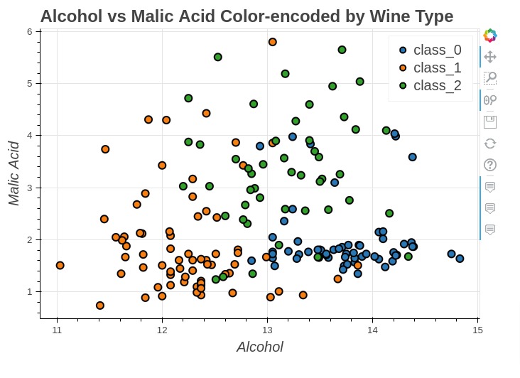
2.2 Modify Font Sizes
In this section, we have recreated our earlier scatter chart showing relationship between alcohol and malic acid color-encoded by wine type.
Here, we have explained how to modify font size of various labels like title, ticks, axes labels, etc. We have provided below parameters for it.
- fontsize_title
- fontsize_ticks
- fontsize_label
- fontsize_legend
scatter_fig = wine_df.plot_bokeh.scatter(x="alcohol", y="malic_acid", category="WineType",
                                         xlabel="Alcohol", ylabel="Malic Acid", ## Setting Axes labels
                                         title = "Alcohol vs Malic Acid Color-encoded by Wine Type", ## Chart Title
                                         figsize = (700, 500), ## Figure Size
                                         fontsize_title=18, fontsize_label=15,
                                         fontsize_ticks=10, fontsize_legend=15,
                                        )
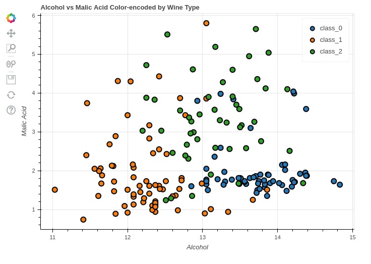
2.3 Modify Tools Visibility
In this section, we have explained how we can change toolbar location as well as enable/disable various tools.
We have recreated scatter chart showing relationship between alcohol and malic acid color-encoded by wine type. We have provided below parameters to modify tool configurations.
- toolbar_location - It accepts string value specifying toolbar location.
- 'right'
- 'left'
- 'top'
- 'bottom'
- hovertool - It accepts a boolean parameter specifying whether to enable hover tool for tooltip or not.
- panning - It accepts a boolean parameter specifying whether to enable panning tool or not.
- zooming - It accepts a boolean parameter specifying whether to enable zoom facility tool or not.
- rangetool - It accepts a boolean parameter specifying whether to enable range selection tool or not.
scatter_fig = wine_df.plot_bokeh.scatter(x="alcohol", y="malic_acid", category="WineType",
                                         xlabel="Alcohol", ylabel="Malic Acid", ## Setting Axes labels
                                         title = "Alcohol vs Malic Acid Color-encoded by Wine Type", ## Chart Title
                                         figsize = (700, 500), ## Figure Size
                                         hovertool= False,
                                         panning = False,
                                         zooming = False,
                                         rangetool = False,
                                         toolbar_location = "left"
                                        )
2.4 Add Colormap
In this example, we have explained how to provide a color map to chart using colormap parameter. It accepts commonly used colormap names as string.
scatter_fig = wine_df.plot_bokeh.scatter(x="alcohol", y="malic_acid",
                                         category="WineType",
                                         size=15, alpha=0.7,
                                         colormap="Viridis"
                                        )
2.5 Few More Important Attributes Of Chart
Below, we have listed few more parameters of chart that can be modified based on need.
- vertical_xlabel - It accepts a boolean value specifying whether to align ticks vertically or not.
- x_axis_location - It accepts a string specifying whether to display x-axis above or below.
- "above"
- "below"
- return_html - It accepts boolean value specifying whether to return chart as HTML or not.
- logx - It accepts a boolean value specifying whether to display x-axis as a log of it or not.
- logy - It accepts a boolean value specifying whether to display y-axis as a log of it or not.
- hovertool_string - It accepts string specifying format of tooltip. We need to specify formatting strings using bokeh rules. We have explained the usage in our upcoming examples.
3. Bar Charts 
In this section, we have explained different ways to create bar charts using pandas_bokeh.
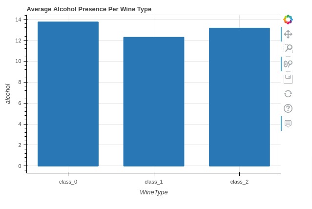
Below, we have first retrieved average ingredients per wine type using pandas grouping functionality. We'll be reusing this dataframe for many of our examples.
avg_wine_df = wine_df.groupby(by="WineType").mean().reset_index()

avg_wine_df
3.1 Simple Bar Chart
Here, we have created a simple bar chart showing average alcohol used in preparation of each wine type. We have created a bar chart by calling bar() method on plot_bokeh attribute of average wine dataframe.
We have specified x-axis as wine type and y-axis as alcohol. We have disabled legend as we are displaying only one property.
bar_chart = avg_wine_df.plot_bokeh.bar(x="WineType", y="alcohol", legend=False,
                                       title="Average Alcohol Presence Per Wine Type")
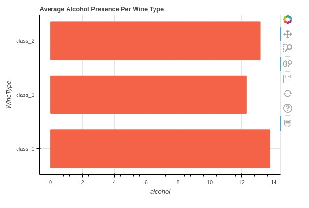
3.2 Horizontal Bar Chart
Below, we have created a horizontal bar chart showing average alcohol per wine type.
bar_chart = avg_wine_df.plot_bokeh.barh(x="WineType", y="alcohol",
                                        color="tomato", legend=False,
                                        title="Average Alcohol Presence Per Wine Type")
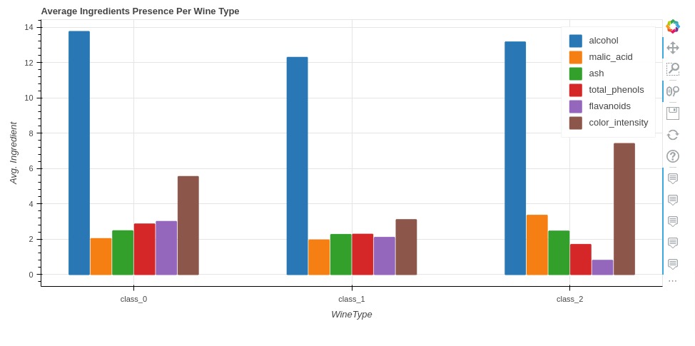
3.3 Grouped Bar Chart
In this section, we have created a grouped bar chart showing an average of various wine ingredients per wine type.
We have provided list of ingredient names to 'y' parameter of method.
bar_chart = avg_wine_df.plot_bokeh.bar(x="WineType", y=["alcohol", "malic_acid", "ash", "total_phenols", "flavanoids", "color_intensity"],
                                       ylabel="Avg. Ingredient", figsize=(950, 450),
                                       title="Average Ingredients Presence Per Wine Type")
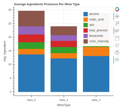
3.4 Stacked Bar Chart
In this section, we have created a stacked bar chart using pandas_bokeh. We have displayed average ingredient quantity per wine type as a stacked bar chart.
We have specified list of ingredients to 'y' parameters like previous chart.
In order to stack bars, we have set 'stacked' parameter to True.
bar_chart = avg_wine_df.plot_bokeh.bar(x="WineType", y=["alcohol", "malic_acid", "ash", "total_phenols", "flavanoids", "color_intensity"],
                                       stacked=True,
                                       ylabel="Avg. Ingredient", figsize=(500, 450),
                                       title="Average Ingredients Presence Per Wine Type")
4. Line Charts 
In this section, we have explained how to create line charts using pandas_bokeh.
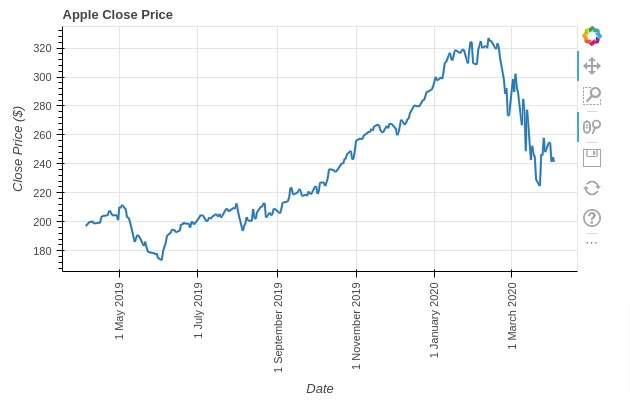
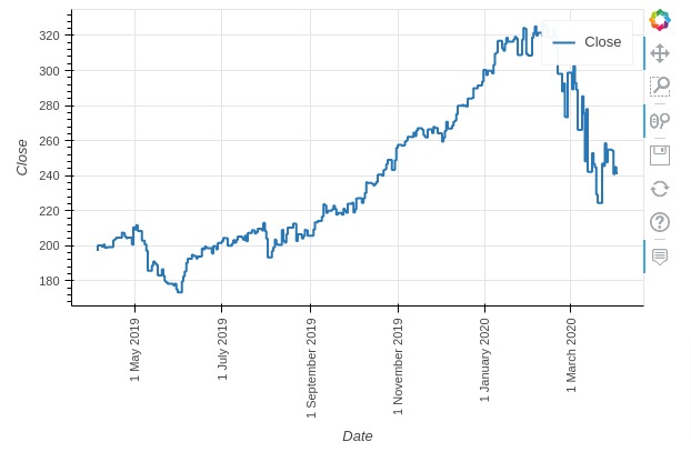
Below, we have created a line chart showing close price of apple stock. We have created line chart by calling line() method on plot_bokeh attribute of apple OHLC dataframe.
We have specified to use date column values for X-axis and close price values for Y-axis. We have also set 'vertical_xlabel' parameter to True to arrange x ticks vertically otherwise they'll override one another.
line_chart = apple_df.plot_bokeh.line(x="Date", y="Close",
                                      legend=False, ylabel="Close Price ($)",
                                      vertical_xlabel=True,
                                      title="Apple Close Price")
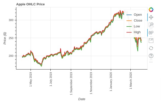
Below, we have explained how to create a line chart with multiple lines.
We have created line chart using apple data frame showing open, close, low, and high prices. We have specified column names to 'y' parameter.
line_chart = apple_df.plot_bokeh.line(x="Date", y=["Open", "Close", "Low", "High"],
                                      ylabel="Price ($)", vertical_xlabel=True,
                                      title="Apple OHLC Price")
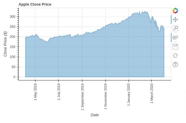
5. Area Charts 
In this section, we have explained how to create area charts using pandas_bokeh.
Below, we have created an area chart by calling area() method on pandas_bokeh attribute of apple dataframe. We have highlighted area below close price.
area_chart = apple_df.plot_bokeh.area(x="Date", y="Close",
                                      legend=False, ylabel="Close Price ($)",
                                      vertical_xlabel=True,
                                      title="Apple Close Price")
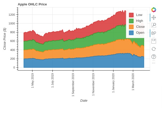
Below, we have explained how we can create area charts with multiple columns.
We have created a stacked area chart by setting stacked parameter to True.
If you don't want stacked area chart then please set it to False.
area_chart = apple_df.plot_bokeh.area(x="Date", y=["Open", "Close", "High", "Low"],
                                      ylabel="Close Price ($)",
                                      vertical_xlabel=True, stacked=True,
                                      title="Apple OHLC Price")
6. Histograms 
In this section, we have explained how to create histograms using Python data viz library pandas_bokeh.
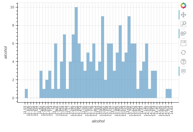
Below, we have created a histogram showing distribution of alcohol by calling hist() method on pandas_bokeh attribute of wine dataframe.
We can specify bin size using 'bins' parameter.
histogram = wine_df.plot_bokeh.hist(y="alcohol", bins=50,
                                    legend=False, vertical_xlabel=True,)
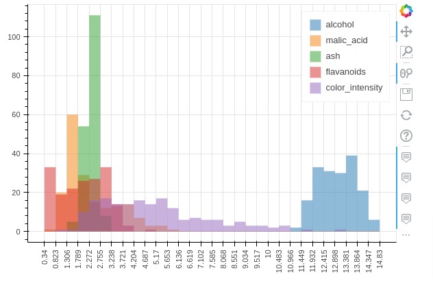
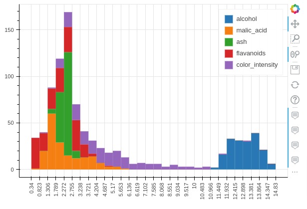
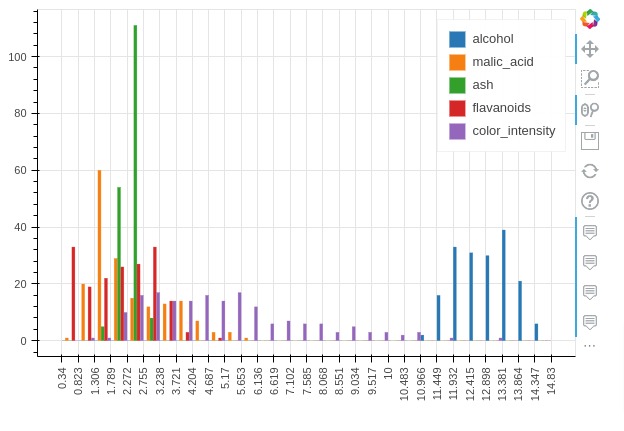
Below, we have created a histogram showing distribution of multiple ingredients.
histogram = wine_df.plot_bokeh.hist(y=["alcohol", "malic_acid", "ash", "flavanoids", "color_intensity"],
                                    bins=30,
                                    vertical_xlabel=True,)
Pandas_bokeh let us specify histogram type using 'histogram_type' parameter. It accepts one of the below strings specifying how to layout histograms of multiple variables.
- "sidebyside"
- "topontop"
- "stacked"
Below, we have created a stacked historgram of multiple wine ingredients.
histogram = wine_df.plot_bokeh.hist(y=["alcohol", "malic_acid", "ash", "flavanoids", "color_intensity"],
                                    bins=30, histogram_type="stacked",
                                    vertical_xlabel=True,)
Below, we have created a histogram of multiple ingredients laid side by side.
histogram = wine_df.plot_bokeh.hist(y=["alcohol", "malic_acid", "ash", "flavanoids", "color_intensity"],
                                    bins=30, histogram_type="sidebyside",
                                    vertical_xlabel=True,)
7. Pie Charts 
In this section, we have explained how to create pie charts using Python data viz library pandas_bokeh.
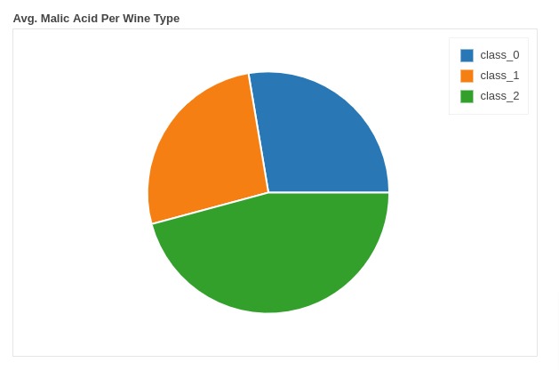
Below, we have created a pie chart showing distribution of average malic acid per wine type. We have created a pie chart by calling pie() method on plot_bokeh attribute of average wine dataframe.
pie_chart = avg_wine_df.plot_bokeh.pie(y="malic_acid", x="WineType", title="Avg. Malic Acid Per Wine Type");
8. Step Charts 
In this section, we have explained how to create step charts using Python data viz library Pandas_bokeh.
Below, we have created step chart of apple close price by calling step() method on pandas_bokeh attribute of apple OHLC dataframe.
step_chart = apple_df.plot_bokeh.step(x="Date", y="Close",
                                      vertical_xlabel=True,
                                     )
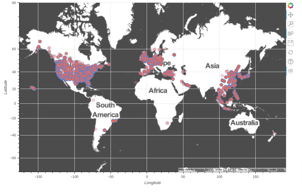
9. Scatter Maps 
In this section, we have explained how to create scatter maps using pandas_bokeh.
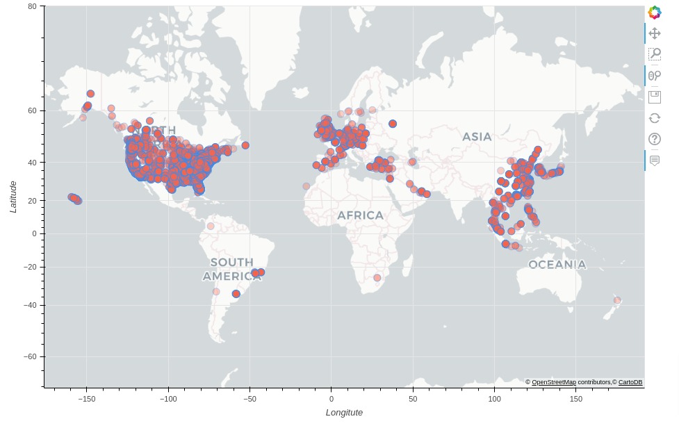
Below, we have created a scatter map showing location of Starbucks stores worldwide. We have called map() method on plot_bokeh attribute of Starbucks store locations dataframe.
We have asked method to use Longitude column for X-axis and Latitude column for Y-axis.
We have also specified hovertool_string with column name Store Name which will display store name when hovered over the point on map.
We can color chart points with different colors by setting category attribute.
scatter_map = store_locations_df.plot_bokeh.map(x="Longitude", y="Latitude",
                                  size=10, alpha=0.3, color="tomato",
                                  line_color="dodgerblue",
                                  legend=False, figsize=(950, 600),
                                  hovertool_string="@{Store Name}"
                                 );
Below, we have recreated chart from previous section but this time with different tile.
Below are some commonly used tile values.
- 'CARTODBPOSITRON'
- 'CARTODBPOSITRON_RETINA'
- 'STAMEN_TERRAIN'
- 'STAMEN_TERRAIN_RETINA'
- 'STAMEN_TONER'
- 'STAMEN_TONER_BACKGROUND'
- 'STAMEN_TONER_LABELS'
- 'OSM'
- 'WIKIMEDIA'
- 'ESRI_IMAGERY'
scatter_map = store_locations_df.plot_bokeh.map(x="Longitude", y="Latitude",
                                  size=10, alpha=0.3, color="tomato", line_color="dodgerblue",
                                  legend=False, figsize=(950, 600),
                                  hovertool_string="@{Store Name}",
                                  tile_provider="STAMEN_TONER", tile_alpha=0.7
                                 );
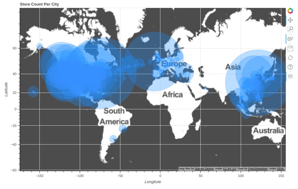
10. Bubble Maps 
In this section, we have explained how to create bubble maps using Python data vis library pandas_bokeh.
Below, we have first created a new dataframe that we'll use to create a bubble chart. The dataframe has a count of stores per city. We have created below dataframe using grouping functionality of pandas dataframe.
store_count_per_city = store_locations_df.groupby("City").count()[["Store Number"]].rename(columns={"Store Number": "Count"})
mean_locations = store_locations_df.groupby("City").mean()[["Longitude", "Latitude"]]

store_count_per_city = store_count_per_city.join(mean_locations)

store_count_per_city.head()
Below, we have created a bubble map using our data frame created in previous cell. We have called map() method for creation of a bubble map.
In order to create circles of different sizes, we have set Count column as value of size parameter. We can also specify category parameter if we want to color circles based on some category.
bubble_maps = store_count_per_city.plot_bokeh.map(x="Longitude", y="Latitude",
                                                  size="Count", alpha=0.3, color="dodgerblue",
                                                  hovertool_string="@{City} : @{Count}",
                                                  legend=False, figsize=(950, 600),
                                                  title="Store Count Per City",
                                                  tile_provider="STAMEN_TONER", tile_alpha=0.7
                                                )
This ends our small tutorial explaining how to create interactive bokeh charts from pandas dataframe using Python data visualization library pandas_bokeh.
Other Python Libraries to Create Charts from Pandas DataFrame
- Cufflinks: Create Plotly Charts from Pandas Dataframe with One Line of Code
- hvplot: Create Holoviews Charts from Pandas Dataframe with One Line of Code
References
Useful Bokeh Tutorials
- Bokeh
- Bokeh: Layout Charts to Create GUI
- Bokeh: Styling of Charts
- Link Bokeh Charts with Widgets to Create Interactive GUI
- Candlestick Charts using Bokeh
- Maps using Bokeh
- Dashboard using Bokeh
Other Python Data Visualization Libraries
 Sunny Solanki
Sunny Solanki
Intro: Software Developer | Youtuber | Bonsai Enthusiast
About: Sunny Solanki holds a bachelor's degree in Information Technology (2006-2010) from L.D. College of Engineering. Post completion of his graduation, he has 8.5+ years of experience (2011-2019) in the IT Industry (TCS). His IT experience involves working on Python & Java Projects with US/Canada banking clients. Since 2020, he’s primarily concentrating on growing CoderzColumn.
His main areas of interest are AI, Machine Learning, Data Visualization, and Concurrent Programming. He has good hands-on with Python and its ecosystem libraries.
Apart from his tech life, he prefers reading biographies and autobiographies. And yes, he spends his leisure time taking care of his plants and a few pre-Bonsai trees.
Contact: sunny.2309@yahoo.in


![YouTube Subscribe]() Comfortable Learning through Video Tutorials?
Comfortable Learning through Video Tutorials?
If you are more comfortable learning through video tutorials then we would recommend that you subscribe to our YouTube channel.
![Need Help]() Stuck Somewhere? Need Help with Coding? Have Doubts About the Topic/Code?
Stuck Somewhere? Need Help with Coding? Have Doubts About the Topic/Code?
 Stuck Somewhere? Need Help with Coding? Have Doubts About the Topic/Code?
When going through coding examples, it's quite common to have doubts and errors.
If you have doubts about some code examples or are stuck somewhere when trying our code, send us an email at coderzcolumn07@gmail.com. We'll help you or point you in the direction where you can find a solution to your problem.
You can even send us a mail if you are trying something new and need guidance regarding coding. We'll try to respond as soon as possible.
![Share Views]() Want to Share Your Views? Have Any Suggestions?
Want to Share Your Views? Have Any Suggestions?
 Want to Share Your Views? Have Any Suggestions?
If you want to
- provide some suggestions on topic
- share your views
- include some details in tutorial
- suggest some new topics on which we should create tutorials/blogs
 Pandas-Bokeh, interactive-charts