How to Link Bokeh Charts with IPywidgets widgets to Dynamically Update Charts?
Data Visualizations created using Python library bokeh are interactive. Bokeh adds simple interactivity features like tooltip, zooming, panning, box zoom, etc.
Majority of the time this basic interactivity can be enough. But we might need more interactivity when we want to analyze data from a different perspective. We might need to add widgets to charts to look at data from a different perspective.
For example, we might need to analyze relationship between various columns of dataframe as a scatter chart. The single scatter chart shows relationship between selected two columns. If we want to see relationship between other two columns then we need to change code.
We can solve this by creating two dropdowns to select columns of data and then update chart based on selected columns. This gives us freedom from changing code for every column changes.
Thanks to Python widgets library ipywidgets, we can now link bokeh charts with widgets like dropdown, checkbox, radio buttons, date selectors, sliders, etc in Jupyter Notebooks to create interactive GUIs. Linking charts with widgets can let us add next level of interactivity to chart
What Can You Learn From This Article?
As a part of this tutorial, we have explained how to link ipywidgets widgets (dropdown, sliders, checkboxes, etc) with Bokeh charts to dynamically update charts as widget state changes in Jupyter Notebooks. We have linked widgets with different types of charts like bar chart, scatter plot, candlestick chart, etc. Also, we have explained different types of widgets like dropdowns, sliders, date selectors, checkboxes, etc. Tutorial can be considered a simple guide to creating interactive GUIs using Bokeh and ipywidgets.
If you don't have background on Bokeh and ipywidgets then don't worry. We have simple tutorials on both libraries. Please feel free to check them from below links.
Below, we have listed important sections of tutorial to give an overview of the material covered.
Important Sections Of Tutorial
- Example 1: Dynamic Bar Chart using ipywidgets "interact()"
- Example 2: Change GUI Layout using "interactive_output()"
- Example 3: Explore Variables Relationship using Scatter Chart
- Example 4: Candlestick Chart with Date Range Filter
- Example 5: Explore Line Formula by Changing Slider Values
Below, we have imported necessary Python libraries and printed version that we used in our tutorial.
import bokeh

print("Bokeh Version : {}".format(bokeh.__version__))
We need to execute below line in order to display bokeh charts in Jupyter notebooks.
from bokeh.plotting import output_notebook

output_notebook()

import ipywidgets

print("IPywidgets Version : {}".format(ipywidgets.__version__))
Load Datasets
In this section, we have loaded datasets that we'll be using for our tutorial.
Below, we have loaded wine dataset available from scikit-learn. The dataset has details about ingredients used in preparation of three different types of wines.
We have loaded dataset as pandas dataframe.
import numpy as np
import pandas as pd
from sklearn import datasets

wine = datasets.load_wine()

wine_df = pd.DataFrame(wine.data, columns=wine.feature_names)
wine_df["WineType"] = [wine.target_names[t] for t in wine.target]

wine_df.head()
Below, we have loaded apple OHLC data downloaded from Yahoo finance as a CSV file.
The dataset has OHLC price details for apple stock from Apr-2019 to Mar-2020.
apple_df = pd.read_csv("~/datasets/AAPL.csv")
apple_df["Date"] = pd.to_datetime(apple_df.Date)
apple_df = apple_df.set_index("Date")

apple_df.head()
Example 1: Dynamic Bar Chart using ipywidgets "interact()" 
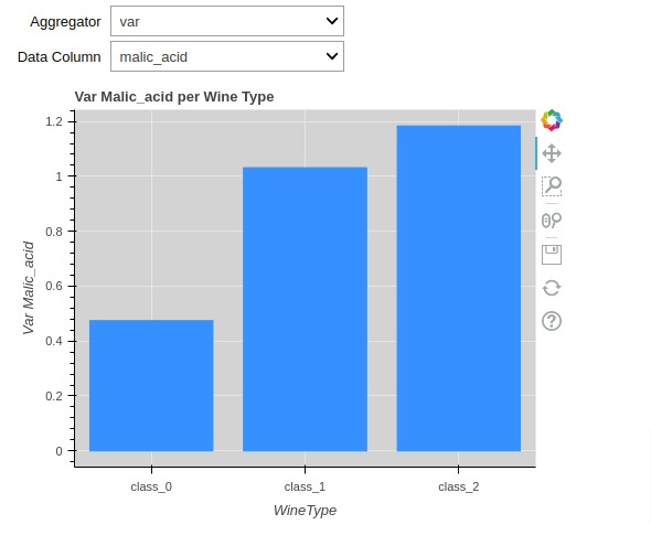
As a part of our first example, we have created a simple interactive visualization involving a bar chart and dropdowns that let us analyze aggregate ingredient per wine type.
First, we have created a simple function that takes dataframe, column name, and aggregate function name as input. The function then creates a bar chart using dataframe.
The dataframe has aggregate values of ingredients per wine type based on aggregate operation selected. We allow performing three aggregate operations on dataframe.
- Average (mean)
- Standard Deviation (std)
- Variance (var)
The function creates a bar chart with selected column data using bokeh and returns it. The bar chart has each bar representing aggregate operation value (mean, std or var) of selected ingredient per wine type.
from bokeh.plotting import figure, show

columns = wine_df.columns.tolist() ## Retrieve all ingredient names
columns.remove("WineType")

### Create Bokeh bar Chart
def create_bar_chart(df, agg_func, sel_col):
    chart = figure(
                    x_range=df.WineType.values,
                    width=500, height=400,
                    title="{} {} per Wine Type".format(agg_func.capitalize(), sel_col.capitalize()),
                    background_fill_color="lightgray"
                  )

    bars = chart.vbar(
                x="WineType",
                top=sel_col,
                width=0.8, color="dodgerblue",
                source=df
              )

    chart.xaxis.axis_label="WineType"
    chart.yaxis.axis_label="{} {}".format(agg_func.capitalize(), sel_col.capitalize())

    return chart
Below, we have linked bar chart with ipywidgets widgets using method named interact().
We have created a simple function that takes as input aggregate function name and selected column name. It then performs an aggregate operation on wine dataframe and creates a chart using that dataframe by calling function from previous cell.
In order to add widgets, we have decorated function with ipywidgets function interact(). We have created two dropdowns inside of interact() decorator.
The resulting visualization has two dropdowns at the top that let us select aggregate function and column name. We can select different combinations of aggregate function and column names to see the bar chart of aggregate operation values for selected ingredient.
## Create GUI with Dropdown and Chart
@ipywidgets.interact(
    agg_func = ipywidgets.Dropdown(options=["mean", "std", "var"], description="Aggregator"),
    sel_col = ipywidgets.Dropdown(options=columns, description="Data Column")
)
def create_gui(agg_func, sel_col):
    if agg_func == "var":
        agg_wine_df = wine_df.groupby(by="WineType").var().reset_index()
    elif agg_func == "std":
        agg_wine_df = wine_df.groupby(by="WineType").std().reset_index()
    else:
        agg_wine_df = wine_df.groupby(by="WineType").mean().reset_index()


    chart = create_bar_chart(agg_wine_df, agg_func, sel_col)

    show(chart)
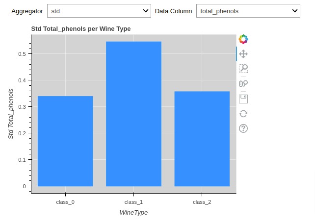
Example 2: Change GUI Layout using "interactive_output()" 
In this example, we have created same chart as our previous visualization but we have tried to modify the way widgets are laid out.
The interact() method lays out widgets one after another which can make visualization look messy if there are many widgets present.
We can avoid that by using interactive_output() method.
Below, we have recreated GUI creation function that displays bokeh chart first.
Then, we created two dropdown widgets using ipywidgets.
Then, we have called interactive_output() function with our GUI creation function and dropdown objects given as a dictionary. The output of this call is ipywidgets Output widget which has bokeh chart. It'll be updated each time we change values in dropdown.
Then, we created GUI using HBox() and VBox() utilities of ipywidgets. We have put two dropdowns next to each other using horizontal layout creation function HBox(). The chart and dropdowns are put in vertical layout using VBox() function.
Using interactive_output() function gives us more flexibility in creating GUI.
If you want to learn about creating layout using ipywidgets then we would recommend that you check out below tutorial. We have covered details about layout creation over there in detail.
def create_gui(agg_func, sel_col):
    if agg_func == "var":
        agg_wine_df = wine_df.groupby(by="WineType").var().reset_index()
    elif agg_func == "std":
        agg_wine_df = wine_df.groupby(by="WineType").std().reset_index()
    else:
        agg_wine_df = wine_df.groupby(by="WineType").mean().reset_index()

    chart = create_bar_chart(agg_wine_df, agg_func, sel_col)

    show(chart)

agg_func = ipywidgets.Dropdown(options=["mean", "std", "var"], description="Aggregator")
sel_col  = ipywidgets.Dropdown(options=columns, description="Data Column")


out = ipywidgets.interactive_output(
    create_gui,
    {"agg_func": agg_func,
     "sel_col": sel_col
    }
)

controllers = ipywidgets.HBox([agg_func, sel_col])
ipywidgets.VBox([controllers, out])
Example 3: Explore Variables Relationship using Scatter Chart 
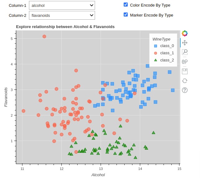
As a part of our third example, we have created a GUI that let us explore relationship between two ingredients as a scatter chart.
Below, we have created a function that will take data frame, ingredient names, and few other flags as input.
It then creates a scatter plot showing relationship between two columns. We have color-encoded and marker-encoded scatter chart points based on wine type.
columns = wine_df.columns.tolist()  ## Retrieve all ingredient names
columns.remove("WineType")

## Color mapping for wine type
color_mapping = {"class_0": "dodgerblue", "class_1": "tomato", "class_2": "green"}
wine_df["Color"] = [color_mapping[w_typ] for w_typ in wine_df.WineType.values]

## Marker mapping for wine type
marker_mapping = {"class_0": "square", "class_1": "circle", "class_2": "triangle"}
wine_df["Marker"] = [marker_mapping[m_typ] for m_typ in wine_df.WineType.values]
from bokeh.plotting import figure, show

### Create bokeh scatter Chart
def create_scatter_chart(df, col1, col2, color_encode_type, marker_encode_type):
    chart = figure(
                    width=600, height=500,
                    title="Explore relationship between {} & {}".format(col1.capitalize(), col2.capitalize()),
                    background_fill_color="lightgray"
                  )

    chart.scatter(
                x=col1, y=col2,
                color="Color" if color_encode_type else "tomato",
                marker = "Marker" if marker_encode_type else "circle",
                size=10,  fill_alpha=0.6,
                legend_group = "WineType",
                source=df
              )

    chart.xaxis.axis_label=col1.capitalize()
    chart.yaxis.axis_label=col2.capitalize()
    chart.legend.title = "WineType"

    return chart
Below, we have created a GUI that let us explore relationship between ingredients as a scatter chart.
We have created four widgets this time.
- Dropdown1 - For selecting ingredient
- Dropdown2 - For selecting another ingredient
- Checkbox1 - Boolean flag specifying whether to color-encode chart points or not.
- Checkbox2 - Boolean flag specifying whether to marker-encode chart points or not.
When creating a layout, we have put two dropdowns and checkboxes one below another. The layout is created using HBox() and VBox() functions of ipywidgets like our previous example.
## Create GuI
def create_gui(col1, col2, color_encode_type, marker_encode_type):
    chart = create_scatter_chart(wine_df, col1, col2, color_encode_type, marker_encode_type)

    show(chart)

## Define Widgets
col1_dd = ipywidgets.Dropdown(options=columns, value="alcohol", description="Column-1")
col2_dd  = ipywidgets.Dropdown(options=columns, value="malic_acid", description="Column-2")
color_encode_type = ipywidgets.Checkbox(value=True, description="Color Encode By Type")
marker_encode_type = ipywidgets.Checkbox(value=True, description="Marker Encode By Type")

out = ipywidgets.interactive_output(
    create_gui,
    {"col1": col1_dd,
     "col2": col2_dd,
     "color_encode_type": color_encode_type,
     "marker_encode_type": marker_encode_type
    }
)

## Create Layout
controllers = ipywidgets.HBox([ipywidgets.VBox([col1_dd, col2_dd]),
                               ipywidgets.VBox([color_encode_type, marker_encode_type])])
ipywidgets.VBox([controllers, out])
Example 4: Candlestick Chart with Date Range Filter 
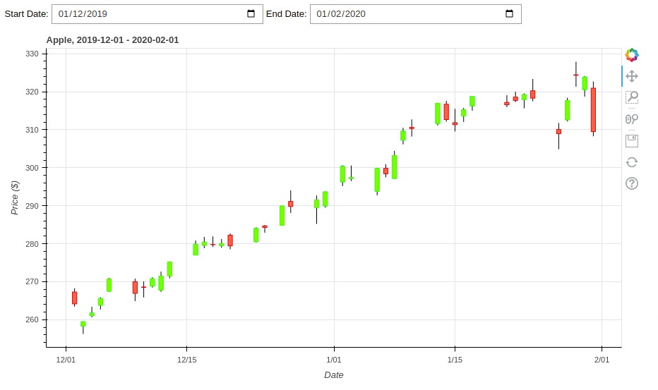
As a part of our fourth example, we have explained how we can use date selector widgets from ipywidgets to create date range filter that filters candlestick chart to show candles in a specified date range.
Below, we have created a simple function that takes OHLC dataframe, start date, and end date as input. It then creates candlestick chart using bokeh and returns it.
If you want to learn how to create a candlestick chart using Python then please feel free to check our tutorial. It covers different Python libraries for creating candlestick charts.
from bokeh.plotting import figure, show
import datetime

## Create Bokeh Candlestick Chart
def create_candlestick_chart(df, start_date, end_date):
    inc = df.Close > df.Open
    dec = df.Open > df.Close

    w = 12*60*60*1000

    candlestick = figure(x_axis_type="datetime",
                         plot_width=900, plot_height=500,
                         title = "Apple, {} - {}".format(start_date, end_date))

    candlestick.segment(df.index, df.High, df.index, df.Low, color="black")

    candlestick.vbar(df.index[inc], w, df.Open[inc], df.Close[inc], fill_color="lawngreen", line_color="lime")

    candlestick.vbar(df.index[dec], w, df.Open[dec], df.Close[dec], fill_color="tomato", line_color="red")

    candlestick.yaxis.axis_label = "Price ($)"
    candlestick.xaxis.axis_label = "Date"

    return candlestick
Below, we have created a GUI with two date selectors with a candlestick chart. The candlestick chart gets updated as we selected start and end dates.
## Create GUI
def create_gui(start_date, end_date):
    st_date, en_date = start_date.strftime("%Y-%m-%d"), end_date.strftime("%Y-%m-%d")

    filtered_df = apple_df[st_date: en_date] ## Filter Main dataframe

    chart = create_candlestick_chart(filtered_df, st_date, en_date)

    show(chart)

## Define Widgets
start_date = apple_df.index[0].date()
end_date = apple_df.index[-1].date()

start_date_picker = ipywidgets.DatePicker(value=start_date)
end_date_picker = ipywidgets.DatePicker(value=end_date)


out = ipywidgets.interactive_output(
    create_gui,
    {"start_date": start_date_picker,
     "end_date": end_date_picker,
    }
)

## Create Layout
controllers = ipywidgets.HBox([ipywidgets.Label("Start Date: "), start_date_picker,
                               ipywidgets.Label("End Date: "), end_date_picker
                              ])
ipywidgets.VBox([controllers, out])
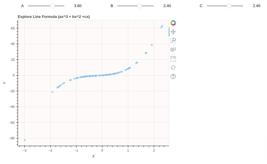
Example 5: Explore Line Formula by Changing Slider Values 
As a part of our fifth example, we have created GUI to explore mathematical formula using slider widgets.
Below, we have created a function that creates a simple scatter plot. The x-axis values are random and y-axis values are created using formula ax^3+bx^2+cx. The formula variables a, b & c are provided through function input parameters.
from bokeh.plotting import figure, show

## Create X Points
x = np.random.randn(100)

## Create bokeh line chart
def create_line_chart(a, b, c):
    chart = figure(
                    width=600, height=500,
                    title="Explore Line Formula (ax^3 + bx^2 +cx)",
                    background_fill_color="snow"
                  )

    ## Evaluate Line Formula
    y = a*x**3 + b*x**2 + c*x

    chart.circle(x=x, y=y, fill_color="white", color="dodgerblue")

    chart.xaxis.axis_label="X"
    chart.yaxis.axis_label="Y"

    return chart
Below, we have created a GUI with 3 sliders created using ipywidgets and a scatter chart showing line formula.
## Create GuI
def create_gui(a, b, c):
    chart = create_line_chart(a, b, c)

    show(chart)


## Define Widgets
a_slider = ipywidgets.FloatSlider(min=-10., max=10.0, step=.1, value=0,
                                  description="A", continuous_update=False)
b_slider = ipywidgets.FloatSlider(min=-10., max=10.0, step=.1, value=0,
                                  description="B", continuous_update=False)
c_slider = ipywidgets.FloatSlider(min=-10., max=10.0, step=.1, value=0,
                                  description="C", continuous_update=False)

out = ipywidgets.interactive_output(
    create_gui,
    {
     "a": a_slider,
     "b": b_slider,
     "c": c_slider
    }
)

## Create Layout
controllers = ipywidgets.HBox([a_slider, b_slider, c_slider])
ipywidgets.VBox([controllers, out])
This ends our small tutorial explaining how we can link ipywidgets widgets with Bokeh chart to create interactive GUIs for analyzing data from different perspectives.
References
 Sunny Solanki
Sunny Solanki
Intro: Software Developer | Youtuber | Bonsai Enthusiast
About: Sunny Solanki holds a bachelor's degree in Information Technology (2006-2010) from L.D. College of Engineering. Post completion of his graduation, he has 8.5+ years of experience (2011-2019) in the IT Industry (TCS). His IT experience involves working on Python & Java Projects with US/Canada banking clients. Since 2020, he’s primarily concentrating on growing CoderzColumn.
His main areas of interest are AI, Machine Learning, Data Visualization, and Concurrent Programming. He has good hands-on with Python and its ecosystem libraries.
Apart from his tech life, he prefers reading biographies and autobiographies. And yes, he spends his leisure time taking care of his plants and a few pre-Bonsai trees.
Contact: sunny.2309@yahoo.in


![YouTube Subscribe]() Comfortable Learning through Video Tutorials?
Comfortable Learning through Video Tutorials?
If you are more comfortable learning through video tutorials then we would recommend that you subscribe to our YouTube channel.
![Need Help]() Stuck Somewhere? Need Help with Coding? Have Doubts About the Topic/Code?
Stuck Somewhere? Need Help with Coding? Have Doubts About the Topic/Code?
 Stuck Somewhere? Need Help with Coding? Have Doubts About the Topic/Code?
When going through coding examples, it's quite common to have doubts and errors.
If you have doubts about some code examples or are stuck somewhere when trying our code, send us an email at coderzcolumn07@gmail.com. We'll help you or point you in the direction where you can find a solution to your problem.
You can even send us a mail if you are trying something new and need guidance regarding coding. We'll try to respond as soon as possible.
![Share Views]() Want to Share Your Views? Have Any Suggestions?
Want to Share Your Views? Have Any Suggestions?
 Want to Share Your Views? Have Any Suggestions?
If you want to
- provide some suggestions on topic
- share your views
- include some details in tutorial
- suggest some new topics on which we should create tutorials/blogs
 bokeh, ipywidgets, widgets