How to link ipywidgets widget with bqplot chart to dynamically update charts?
When performing exploratory data analysis, it’s quite common to analyze data from various angles to understand it better. Various data visualization libraries will need to generate different charts of the same type if need to analyze different attributes of data using the same chart. Fortunately, python has a library called ipywidgets which lets us include widgets like dropdown, slider, button, etc into our code and lets us link these widgets with charts to dynamically change charts. This will result in utilizing the same chart to analyze data using different attributes. We'll be explaining how to link these ipywidgets widgets with the bqplot chart as a part of this tutorial. We'll explain how we can introduce widgets along with the chart which gives us the flexibility to analyze data from a different perspective.
We have already covered various tutorials on bqplot. If you are interested in learning in-depth about bqplot then we suggest that you go through those tutorials:
- bqplot - Interactive Charts using matplotlib's pyplot like API
- bqplot - Interactive Charts using Internal Object Model API
- Interactive Choropleth Maps using bqplot
We have even covered a detailed tutorial on ipywidgets as well. Please feel free to check it out if you interested in learning about it in detail:
We'll start by importing necessary libraries.
import pandas as pd
import numpy as np

import bqplot.pyplot as plt
import ipywidgets as widgets
Load Datasets
We'll be using the IRIS dataset and apple OHLC dataset for creating various examples.
- IRIS Dataset: It has information about the measurement of three different types of IRIS flowers. The dataset is easily available from scikit-learn.
- Apple OHLC Dataset: It has information about apple OHLC price data from Apr 2019 - Mar 2020.
We'll be loading both datasets as pandas dataframe.
from sklearn.datasets import load_iris
iris = load_iris()

iris_df = pd.DataFrame(data=iris.data, columns=iris.feature_names)
iris_df["FlowerType"] = iris.target #[iris.target_names[t] for t in iris.target]

iris_df.head()
apple_df = pd.read_csv("datasets/AAPL.csv", parse_dates=["Date"])

apple_df.head()
Example 1
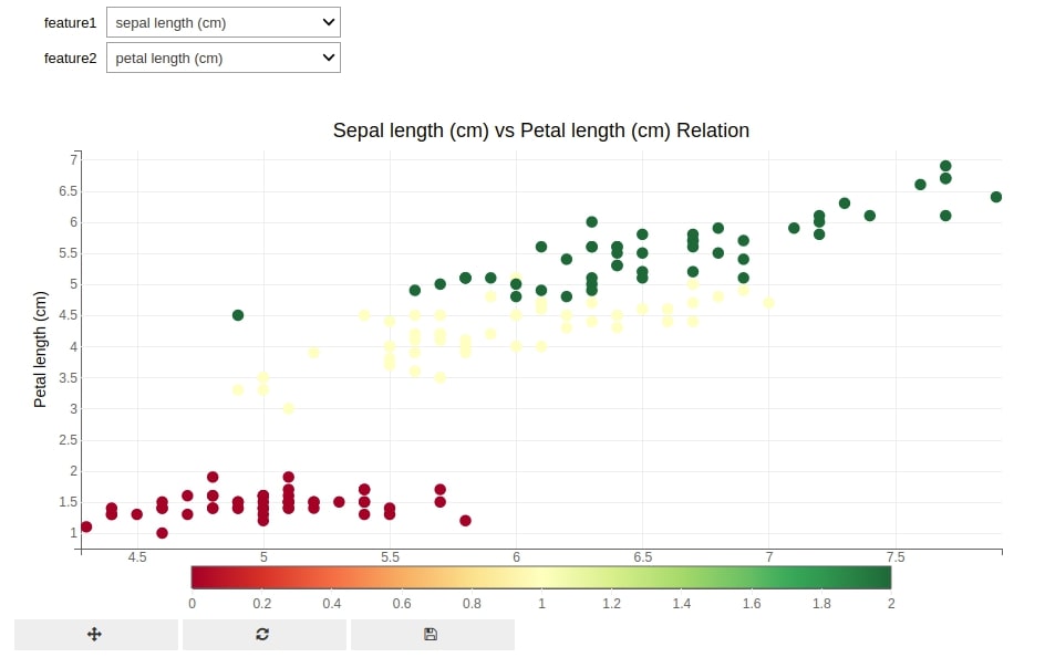
The first example that we'll use to demonstrate linking between bqplot and ipywidgets consists of scatter plot and dropdowns. We have created a method named create_scatter() which takes two string parameters specifying two features of the IRIS flowers dataset. IRIS flowers dataset has four features (sepal width, sepal length, petal width, and petal length) in total. We can repeatedly call this method with different feature combinations and it'll generate a bqplot scatter plot for these parameters.
def create_scatter(feature1, feature2):
    fig = plt.figure(title="%s vs %s Relation"%(feature1.capitalize(), feature2.capitalize()))

    scat = plt.scatter(x=iris_df[feature1],
                       y=iris_df[feature2],
                       color=iris_df["FlowerType"],
                      )

    plt.xlabel(feature1.capitalize())
    plt.ylabel(feature2.capitalize())

    plt.show()
The easiest way to convert any function into interactive UI with widgets is by passing that function to the interact() method of ipywidgets. We have passed create_scatter function to interact() as well as list of possible values for two-parameter (feature1, feature2) of function. The interact() function will automatically create two dropdowns for two parameters and also generate UI consisting of widgets and a scatter plot.
widgets.interact(create_scatter, feature1=iris.feature_names, feature2=iris.feature_names);
Example 2
Our second example is the same as the previous example with only a change in the way we are using interact(). In this example, we have put interact() function as decorator around our original create_scatter() function. It'll work exactly the same like the previous example.
@widgets.interact(feature1=iris.feature_names, feature2=iris.feature_names)
def create_scatter(feature1, feature2):
    fig = plt.figure(title="%s vs %s Relation"%(feature1.capitalize(), feature2.capitalize()))

    scat = plt.scatter(x=iris_df[feature1],
                       y=iris_df[feature2],
                       color=iris_df["FlowerType"],
                      )

    plt.xlabel(feature1.capitalize())
    plt.ylabel(feature2.capitalize())

    plt.show()
Example 3
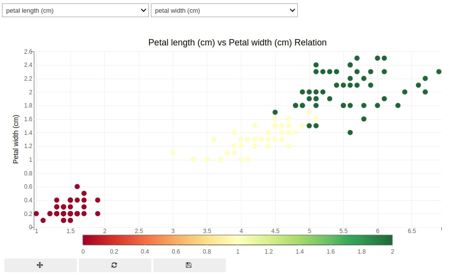
Our third example is almost the same as our previous two examples with only a change in the ways widgets are laid out. The interact() method used in the previous example does not let us design UI and prepares layout by itself. In many situations, we need to design UI by ourself and need to layout widgets and charts according to our need.
The ipywidgets provide another method named interactive_output which can be used for that purpose. Below we have again declared the create_scatter() method like previous examples.
def create_scatter(feature1, feature2):
    fig = plt.figure(title="%s vs %s Relation"%(feature1.capitalize(), feature2.capitalize()))

    scat = plt.scatter(x=iris_df[feature1],
                       y=iris_df[feature2],
                       color=iris_df["FlowerType"],
                      )

    plt.xlabel(feature1.capitalize())
    plt.ylabel(feature2.capitalize())

    plt.show()
We have then created two dropdowns using ipywidgets with options as four features of IRIS flowers.
feature1_drop = widgets.Dropdown(options=iris.feature_names, value = iris.feature_names[0])
feature1_drop
feature2_drop = widgets.Dropdown(options=iris.feature_names, value = iris.feature_names[1])
feature2_drop
Below we have called the interactive_output function passing it create_scatter function and dictionary of mapping from function parameter names and widgets. The output of the interactive_output function is not a figure but its ipywidgets Output widget. We can now use this widget and merge it with other dropdown widgets to create full UI.
out = widgets.interactive_output(create_scatter, {'feature1': feature1_drop, 'feature2':feature2_drop})
Below we have created first UI using ipywidgets. We have laid out two dropdowns horizontally using HBox() constructor of ipywidgets. We have then laid out dropdowns and output widget from previous cell vertically using VBox() constructor of ipywidgets.
If you are interested in learning about various ways to layout widgets using ipywidgets then we suggest that you go through out tutorial on ipywidgets.
widgets.VBox([widgets.HBox([feature1_drop, feature2_drop]), out])
Example 4
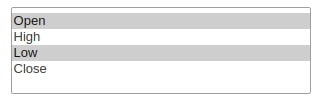
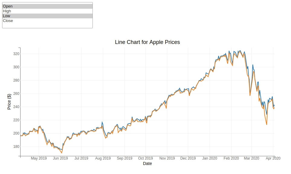
The fourth example consists of a multi-select and line chart. We'll be plotting line chart for each price type (Open, High, Low & Close) of apple data.
We have first designed multi-select using ipywidgets with four options. The Open option will be selected by default.
multi_select = widgets.SelectMultiple(options=["Open", "High", "Low", "Close"], value=["Open",])
multi_select
Below we have created a bqplot line chart for the Open price of apple data.
fig = plt.figure(title="Line Chart for Apple Prices")

line_chart = plt.plot(x=apple_df["Date"], y=apple_df["Open"])

plt.xlabel("Date")
plt.ylabel("Price ($)")
We have then created the change_line_chart callback function which will be called each time change in the state of multi-select happens. Whenever any values are selected/de-selected change_line_chart function will be called passing it a dictionary of new selected values as well as old selected values. In order for this callback function to be called each time change in the state of the multi-select widget happens, we have registered callback with the widget by using the observe() method. We have called the observe() method on the widget passing it a callback function reference and list of attributes of the widget to monitor as a list to names parameter.
The change_line_chart function simple changes y attribute data of line chart and as bqplot is also based on ipywidgets internally, it'll update the chart immediately as we change data.
def change_line_chart(selected_vals):
    line_chart.y = [apple_df[val] for val in selected_vals["new"]]

multi_select.observe(change_line_chart, names="value")
Below we have created a simple UI using multi-select and fig object. We can now try various combinations of values from multi-select and it'll update the chart accordingly.
widgets.VBox([multi_select, fig])
Example 5
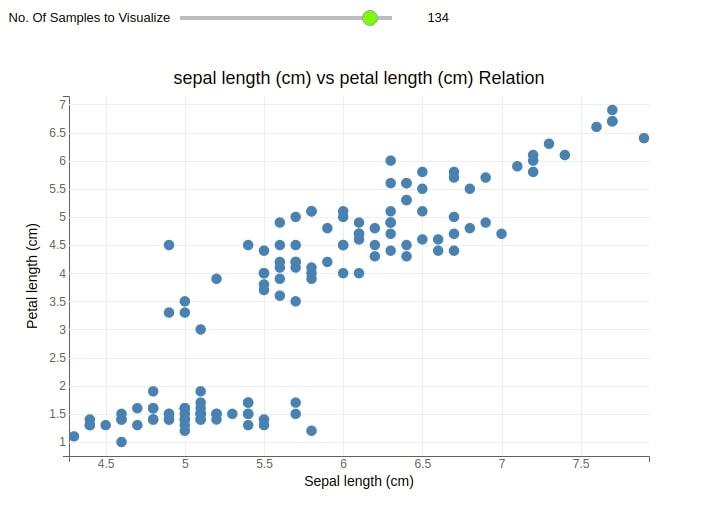
Our fifth example consists of a slider widget and scatter chart from example 1. We'll be using the slider in this example to limit the number of points that will be displayed on a scatter plot. This can be useful when you have a lot of data points and you want to randomly sample a few to see the relation.
Below we have created a slider widget with a default value of 50 with min and max values of 0 and 150 respectively. This means that the chart will display 50 points by default and a maximum of 150 (no of samples in the dataset).
slider = widgets.IntSlider(value=50, min=1, max=iris_df.shape[0])
slider.style.handle_color="lawngreen"
slider

fig = plt.figure(title="sepal length (cm) vs petal length (cm) Relation")
fig.layout.width="700px"

scat = plt.scatter(x=iris_df[:50]['sepal length (cm)'],
                   y=iris_df[:50]['petal length (cm)'],                  )

plt.xlabel("sepal length (cm)".capitalize())
plt.ylabel("petal length (cm)".capitalize())
Below we have created the change_scatter_chart callback function which will update the chart each time the slider value changes. We'll get a new number from the slider and that many points will be displayed on the chart. We have registered callback with the widget as explained earlier.
def change_scatter_chart(selected_vals):
    samples = selected_vals["new"]
    scat.x = iris_df[:samples]['sepal length (cm)']
    scat.y = iris_df[:samples]['petal length (cm)']

slider.observe(change_scatter_chart, names="value")
Below we have created simple UI where we are laying out the slider and scatter chart vertically. We have also introduced a label widget which is added before the slider in UI.
slider_label = widgets.Label("No. Of Samples to Visualize")
slider_comp = widgets.HBox([slider_label, slider])
widgets.VBox([slider_comp, fig])
Example 6
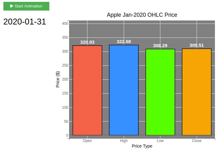
Our sixth example works as a simple animation. We'll be plotting a bar chart showing OHLC prices of apple data for Jan-2020 for each day. We'll be pausing for half a second between each day for plotting a bar chart. We'll be using the button widget to start a simple animation.
Below we have filtered the original apple dataframe and have kept data for Jan-2020 in a new dataframe.
apple_jan = apple_df.set_index("Date")["2020-01"]
apple_jan
Below we have included logic for plotting bar chart for apple OHLC prices for the first day of January.
fig = plt.figure(title="Apple Jan-2020 OHLC Price",
                 fig_margin= dict(top=60, bottom=40, left=60, right=70),
                 background_style = {"fill":"gray"})

fig.layout.width="600px"

bar_chart = plt.bar(x=["Open", "High", "Low", "Close"],
                     y=apple_jan.loc["2020-01-02"][["Open", "High", "Low", "Close"]],
                     colors=["tomato", "dodgerblue", "lime", "orange"],
                     stroke_width=1.5, stroke="black", padding=0.2,
                     label_display=True, label_display_vertical_offset=-20,
                     label_font_style={"font-weight":"bold", "font-size":"15px", "fill": "white"},
                     restrict_y=(0, 400))

plt.xlabel("Price Type")
plt.ylabel("Price ($)")
plt.ylim(0,400);
We have then created button and label widgets which will be used in the final UI. The animation will start when the button is clicked and the label will be updated with a new date each time the date changes.
button = widgets.Button(description="Start Animation", button_style="success", icon="play")
button

label = widgets.HTML("<h2>2020-01-02</h2>")
label
Below we have defined a simple callback function which will loop through each day of January-2020 and filter the dataframe to get the OHLC price for that day. It'll then update the chart with these new values. The loop will stop for half a second between each iteration. We have registered callback using the on_click() method of the button widget.
def update_bar_chart(val):
    import time
    for dt in apple_jan.index:
        time.sleep(0.5)
        bar_chart.y = apple_jan.loc[dt][["Open", "High", "Low", "Close"]]
        label.value = "<h2>"+str(dt.date())+"</h2>"

button.on_click(update_bar_chart)
Our final UI consist of a button label and chart. As soon as we click on the button, it'll start updating the chart with new values pausing half a second between each iteration. It'll also update the label with a date for which values are displayed in a bar chart.
widgets.HBox([widgets.VBox([button, label]), fig])
Example 7
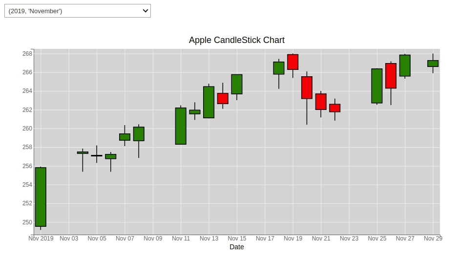
The seventh example that we'll use for explanation consist of a candlestick chart and dropdown. Our apple OHLC dataset has data from Apr-2019 to Mar 2020. We'll be creating a dropdown which will let us select one month at a time from the dataset.
Below we have created a dropdown that will let us select month and year combinations for which OHLC data is available in the dataframe.
year_months_idx = list(zip([2019,]*9 + [2020]*3,[ 4, 5, 6, 7, 8, 9, 10, 11, 12, 1, 2, 3]))
year_months_names = list(zip([2019,]*9 + [2020]*3,['April', 'May', 'June', 'July', 'August', 'September', 'October',
'November', 'December', 'January', 'February', 'March']))
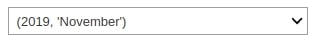
month_dropdown = widgets.Dropdown(options=list(zip(year_months_names, year_months_idx)), value=year_months_idx[0])
month_dropdown
Below we have created a candlestick chart for Apr-2020 using bqplot. We'll be updating this figure wherever change in dropdown happens to see candlestick chart for some other month.
fig = plt.figure(title="Apple CandleStick Chart",
                 fig_margin= dict(top=60, bottom=40, left=60, right=70),
                 background_style = {"fill":"lightgray"})

candle_stick = plt.ohlc(x=apple_df.set_index("Date")["2019-04"].index,
                        y=apple_df.set_index("Date")["2019-04"][["Open", "High", "Low", "Close"]],
                        marker="candle",
                        stroke_width=1.5, stroke="black", padding=0.2,
                        label_display=True, label_display_vertical_offset=-20,
                        label_font_style={"font-weight":"bold", "font-size":"15px", "fill": "white"},
                        )

plt.xlabel("Date")
Below we have created a callback function which will be called each time someone selects a different values in the dropdown. We are taking new values from the dictionary and updating the candlestick chart with that selection. We have registered a callback function with the widget as explained earlier.
def update_candle_stick(year_month):
    dt = "%d-%d"%(year_month["new"][0], year_month["new"][1])
    temp_df = apple_df.set_index("Date")[dt]
    candle_stick.x = temp_df.index
    candle_stick.y = temp_df[["Open", "High", "Low", "Close"]]

month_dropdown.observe(update_candle_stick, names=["value"])
widgets.VBox([month_dropdown, fig])
This ends our small tutorial explaining how to connect ipywidget widgets with a bpplot chart to create interactive charts. Please feel free to let us know your views in the comments section.
References
- Interactive Widgets in Jupyter Notebook using ipywidgets
- bqplot - Interactive Charts using matplotlib's pyplot like API
- bqplot - Interactive Charts using Internal Object Model API
- Interactive Choropleth Maps using bqplot
- How to link ipywidgets widget with matplotlib chart to dynamically update charts?
 Sunny Solanki
Sunny Solanki
Intro: Software Developer | Youtuber | Bonsai Enthusiast
About: Sunny Solanki holds a bachelor's degree in Information Technology (2006-2010) from L.D. College of Engineering. Post completion of his graduation, he has 8.5+ years of experience (2011-2019) in the IT Industry (TCS). His IT experience involves working on Python & Java Projects with US/Canada banking clients. Since 2020, he’s primarily concentrating on growing CoderzColumn.
His main areas of interest are AI, Machine Learning, Data Visualization, and Concurrent Programming. He has good hands-on with Python and its ecosystem libraries.
Apart from his tech life, he prefers reading biographies and autobiographies. And yes, he spends his leisure time taking care of his plants and a few pre-Bonsai trees.
Contact: sunny.2309@yahoo.in


![YouTube Subscribe]() Comfortable Learning through Video Tutorials?
Comfortable Learning through Video Tutorials?
If you are more comfortable learning through video tutorials then we would recommend that you subscribe to our YouTube channel.
![Need Help]() Stuck Somewhere? Need Help with Coding? Have Doubts About the Topic/Code?
Stuck Somewhere? Need Help with Coding? Have Doubts About the Topic/Code?
 Stuck Somewhere? Need Help with Coding? Have Doubts About the Topic/Code?
When going through coding examples, it's quite common to have doubts and errors.
If you have doubts about some code examples or are stuck somewhere when trying our code, send us an email at coderzcolumn07@gmail.com. We'll help you or point you in the direction where you can find a solution to your problem.
You can even send us a mail if you are trying something new and need guidance regarding coding. We'll try to respond as soon as possible.
![Share Views]() Want to Share Your Views? Have Any Suggestions?
Want to Share Your Views? Have Any Suggestions?
 Want to Share Your Views? Have Any Suggestions?
If you want to
- provide some suggestions on topic
- share your views
- include some details in tutorial
- suggest some new topics on which we should create tutorials/blogs
 bqplot, ipywidgets