How to Create Connection Map Chart in Python Jupyter Notebook [Plotly & Geopandas]
Table of Contents
- Introduction
- 1. Connection Maps using Plotly
- 1.1 Connection Map Depicting Flights from Brazil to All Other Countries.
- 1.2 Connection Map Depicting Flights from Brazil to All Other Countries With Airport Locations as Scatter Plot.
- 1.3 Connection Map Depicting Flights from Brazil to All Other Countries with Airport Locations as Scatter Plot [Orthographic Projection].
- 1.4 Connection Map Depicting Flights between Cities of Brazil.
- 2. Connection Maps using Geopandas & Matplotlib
- 2.1 Connection Map Depicting Flights from Brazil to All Other Countries.
- 2.2 Connection Map Depicting Flights from Brazil to All Other Countries With Airport Locations as Scatter Plot.
- 2.3 Connection Map Depicting Flights from Brazil to All Other Countries With Airport Locations as Scatter Plot [Destination Cities Labeled].
- 2.4 Connection Map Depicting Flights between Cities of Brazil.
- 2.5 Connection Map Depicting Flights between Cities of Brazil.
- References
Introduction 
Connection Maps are kind of map charts where you draw lines connecting two points on a map to show some kind of connections between those two points. These connections can be flights, Facebook friends, taxi routes, train routes, etc. We need a way to represent this kind of connection between two points on a map to analyze the relationship between them where the size of the edge between them can also carry some kind of information. We'll be explaining below how to create these kinds of connection maps using python in a jupyter notebook. We'll be using python libraries Plotly, Geopandas, and matplotlib to create connection maps.
To get started with our tutorial, we need to import all the necessary libraries. We'll be importing pandas, geopandas, maptlotlib.pyplot and plotly.graph_objects.
import pandas as pd
import geopandas as gpd

import matplotlib.pyplot as plt
import plotly.graph_objects as go

pd.set_option("max.columns", 30)

print("Available Pandas Datasets", gpd.datasets.available)
Load Dataset
We'll be using flight data for a number of flights from and to Brazil. The dataset is available at kaggle.
We suggest that you download the dataset and follow along with us using the same dataset to better understand the material and get an in-depth idea about the whole process. We'll first load the dataset as pandas dataframe and then subset it to keep only columns that we'll be using for plotting.
NOTE
Please make a note that original dataset is quite big with size of 600+ MB and nearly 2.5 Mn rows. If you have low RAM then you can use nrows attribute of read_csv() method to load only first few thousand entries to follow along with tutorial without getting stuck. We have loaded only 100k entries for making things simple for explanation purpose.
df = pd.read_csv("brazil_flights_data.csv", nrows=50000, encoding="latin1")
df = df[["Voos", "Companhia.Aerea","LongDest","LatDest","LongOrig","LatOrig", "Cidade.Origem", "Cidade.Destino", "Pais.Origem", "Pais.Destino"]]
print("Dataset Size : ",df.shape)
df.head()
We'll be creating two datasets from our original dataset by cleaning it and filtering entries that we don't need.
- International Travel Dataset: To create this dataset, we are filtering the original dataframe by removing entries where source and destination country is Brazil. We are also removing entries where the destination is also Brazil because we want to consider only want flights from Brazil to other countries.
- Domestic Travel Dataset: To create this dataset, we are filtering the original dataframe by keeping only entries where source and destination country is Brazil. We want to consider only travel between various countries in Brazil.
overseas_df = df[(df["Pais.Origem"] != df["Pais.Destino"]) & (df["Pais.Destino"] != "Brasil")]
overseas_cnt_df = overseas_df.groupby(["LongDest","LatDest","LongOrig","LatOrig"]).count()[["Voos"]].rename(columns={"Voos":"Num_Of_Flights"}).reset_index()
overseas_cnt_df = overseas_cnt_df.merge(df, how="left", left_on=["LongDest","LatDest","LongOrig","LatOrig"], right_on=["LongDest","LatDest","LongOrig","LatOrig"])

print("International Travel Dataset Size : ", overseas_cnt_df.shape)

## Please make a note that we are only taking first 1k to make run easy.
overseas_cnt_df = overseas_cnt_df.sample(frac=1.0).head(1000)

print("International Travel Dataset Size After Filtering : ", overseas_cnt_df.shape)

overseas_cnt_df.head()
brazil_df = df[df["Pais.Origem"] == df["Pais.Destino"]]
brazil_cnt_df = brazil_df.groupby(["LongDest","LatDest","LongOrig","LatOrig"]).count()[["Voos"]].rename(columns={"Voos":"Num_Of_Flights"}).reset_index()
brazil_cnt_df = brazil_cnt_df.merge(df, how="left", left_on=["LongDest","LatDest","LongOrig","LatOrig"], right_on=["LongDest","LatDest","LongOrig","LatOrig"])

print("Domestic Travel Dataset : ", brazil_cnt_df.shape)

## Please make a note that we are only taking first 2k to make run easy.
brazil_cnt_df = brazil_cnt_df.sample(frac=1.0).head(2000)

print("Domestic Travel Dataset After Filtering: ", brazil_cnt_df.shape)

brazil_cnt_df.head()
1. Connection Maps using Plotly 
We'll be first creating various connection maps using Plotly as our primary library. Plotly is a python library to create interactive plots.
1.1 Connection Map Depicting Flights from Brazil to All Other Countries. 
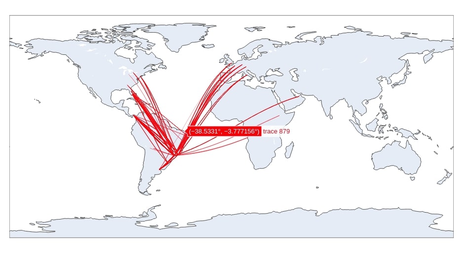
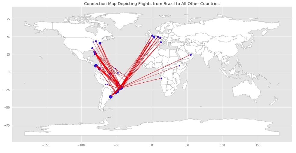
The first connection map that we'll create will depict flights from brazil to all other countries in the world. We would like to know where Brazilians are traveling more often. We'll be using plotly Scattergeo() method available from plotly.graph_objects module. To create a connection map, we'll loop through all source and destination latitudes/longitudes to plot scatter plot on the world map with a marker as lines. We'll first merge all source and destination latitudes/longitudes into one list and then loop through it adding one line at a time to connection map.
fig = go.Figure()

source_to_dest = zip(overseas_cnt_df["LatOrig"], overseas_cnt_df["LatDest"],
                     overseas_cnt_df["LongOrig"], overseas_cnt_df["LongDest"],
                     overseas_cnt_df["Num_Of_Flights"])

## Loop thorugh each flight entry
for slat,dlat, slon, dlon, num_flights in source_to_dest:
    fig.add_trace(go.Scattergeo(
                        lat = [slat,dlat],
                        lon = [slon, dlon],
                        mode = 'lines',
                        line = dict(width = num_flights/100, color="red")
                        ))

fig.update_layout(title_text = 'Connection Map Depicting Flights from Brazil to All Other Countries',
                  height=700, width=900,
                  margin={"t":0,"b":0,"l":0, "r":0, "pad":0},
                  showlegend=False)

fig.show()
NOTE
Please make a note that all plotly graphs won't be interactive on this web-page but they'll be interactive when you run code in a notebook.
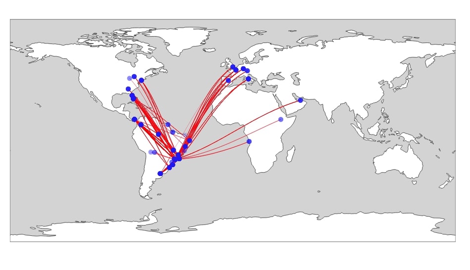
1.2 Connection Map Depicting Flights from Brazil to All Other Countries With Airport Locations as Scatter Plot. 
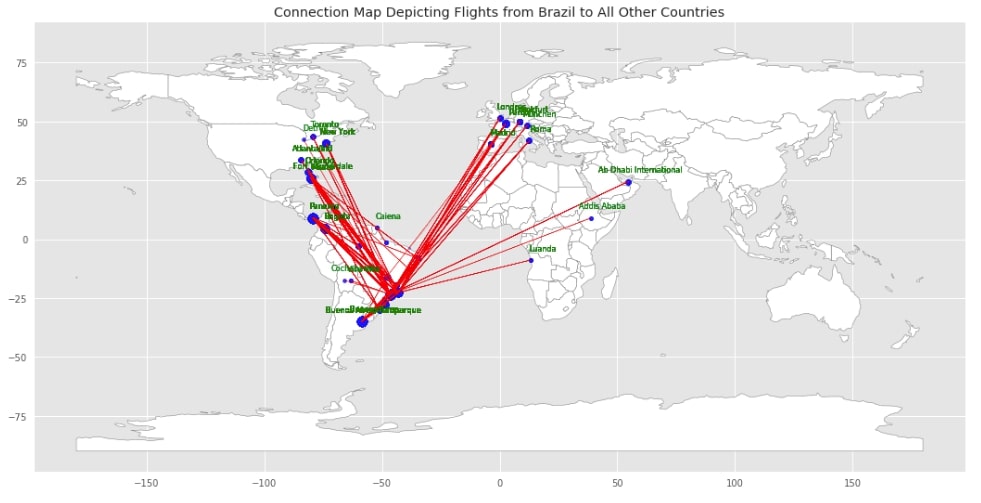
The second connection map that we'll be creating will be depicting flights from brazil to all other countries of the world like the previous connection map. Apart from lines, we have added points in graph highlighting source and destination locations for each flight which will display source and destination country & city in a tooltip when hovered over that point.
fig = go.Figure()

source_to_dest = zip(overseas_cnt_df["LatOrig"], overseas_cnt_df["LatDest"],
                     overseas_cnt_df["LongOrig"], overseas_cnt_df["LongDest"],
                     overseas_cnt_df["Num_Of_Flights"])

## Loop thorugh each flight entry to add line between source and destination
for slat,dlat, slon, dlon, num_flights in source_to_dest:
    fig.add_trace(go.Scattergeo(
                        lat = [slat,dlat],
                        lon = [slon, dlon],
                        mode = 'lines',
                        line = dict(width = num_flights/100, color="red")
                        ))

## Logic to create labels of source and destination cities of flights
cities = overseas_cnt_df["Cidade.Origem"].values.tolist()+overseas_cnt_df["Cidade.Destino"].values.tolist()
countries = overseas_cnt_df["Pais.Origem"].values.tolist()+overseas_cnt_df["Pais.Destino"].values.tolist()
scatter_hover_data = [country + " : "+ city for city, country in zip(cities, countries)]

## Loop thorugh each flight entry to plot source and destination as points.
fig.add_trace(
    go.Scattergeo(
                lon = overseas_cnt_df["LongOrig"].values.tolist()+overseas_cnt_df["LongDest"].values.tolist(),
                lat = overseas_cnt_df["LatOrig"].values.tolist()+overseas_cnt_df["LatDest"].values.tolist(),
                hoverinfo = 'text',
                text = scatter_hover_data,
                mode = 'markers',
                marker = dict(size = 10, color = 'blue', opacity=0.1))
    )

## Update graph layout to improve graph styling.
fig.update_layout(title_text="Connection Map Depicting Flights from Brazil to All Other Countries",
                  height=700, width=900,
                  margin={"t":0,"b":0,"l":0, "r":0, "pad":0},
                  showlegend=False,
                  geo= dict(showland = True, landcolor = 'white', countrycolor = 'grey', bgcolor="lightgrey"))

fig.show()
1.3 Connection Map Depicting Flights from Brazil to All Other Countries with Airport Locations as Scatter Plot [Orthographic Projection]. 
Our third connection map is exactly the same as the previous connection map with only a change in the projection of the graph. We have used the orthographic projection to allow the user to look at the graph from a different perspective.
fig = go.Figure()

source_to_dest = zip(overseas_cnt_df["LatOrig"], overseas_cnt_df["LatDest"],
                     overseas_cnt_df["LongOrig"], overseas_cnt_df["LongDest"],
                     overseas_cnt_df["Num_Of_Flights"])

## Loop thorugh each flight entry to add line between source and destination
for slat,dlat, slon, dlon, num_flights in source_to_dest:
    fig.add_trace(go.Scattergeo(
                        lat = [slat,dlat],
                        lon = [slon, dlon],
                        mode = 'lines',
                        line = dict(width = num_flights/100, color="red")
                        ))

## Logic to create labels of source and destination cities of flights
cities = overseas_cnt_df["Cidade.Origem"].values.tolist()+overseas_cnt_df["Cidade.Destino"].values.tolist()
countries = overseas_cnt_df["Pais.Origem"].values.tolist()+overseas_cnt_df["Pais.Destino"].values.tolist()
scatter_hover_data = [country + " : "+ city for city, country in zip(cities, countries)]

## Loop thorugh each flight entry to plot source and destination as points.
fig.add_trace(
    go.Scattergeo(
                lon = overseas_cnt_df["LongOrig"].values.tolist()+overseas_cnt_df["LongDest"].values.tolist(),
                lat = overseas_cnt_df["LatOrig"].values.tolist()+overseas_cnt_df["LatDest"].values.tolist(),
                hoverinfo = 'text',
                text = scatter_hover_data,
                mode = 'markers',
                marker = dict(size = 10, color = 'blue', opacity=0.1,))
    )

## Update graph layout to improve graph styling.
fig.update_layout(title_text="Connection Map Depicting Flights from Brazil to All Other Countries (Orthographic Projection)",
                  height=500, width=500,
                  margin={"t":0,"b":0,"l":0, "r":0, "pad":0},
                  showlegend=False,
                  geo= dict(projection_type = 'orthographic', showland = True, landcolor = 'lightgrey', countrycolor = 'grey'))

fig.show()
![Connection Map Depicting Flights from Brazil to All Other Countries with Airport Locations as Scatter Plot [Orthographic Projection]](/static/tutorials/data_science/connection-map-plotly-3.jpg)
1.4 Connection Map Depicting Flights between Cities of Brazil. 
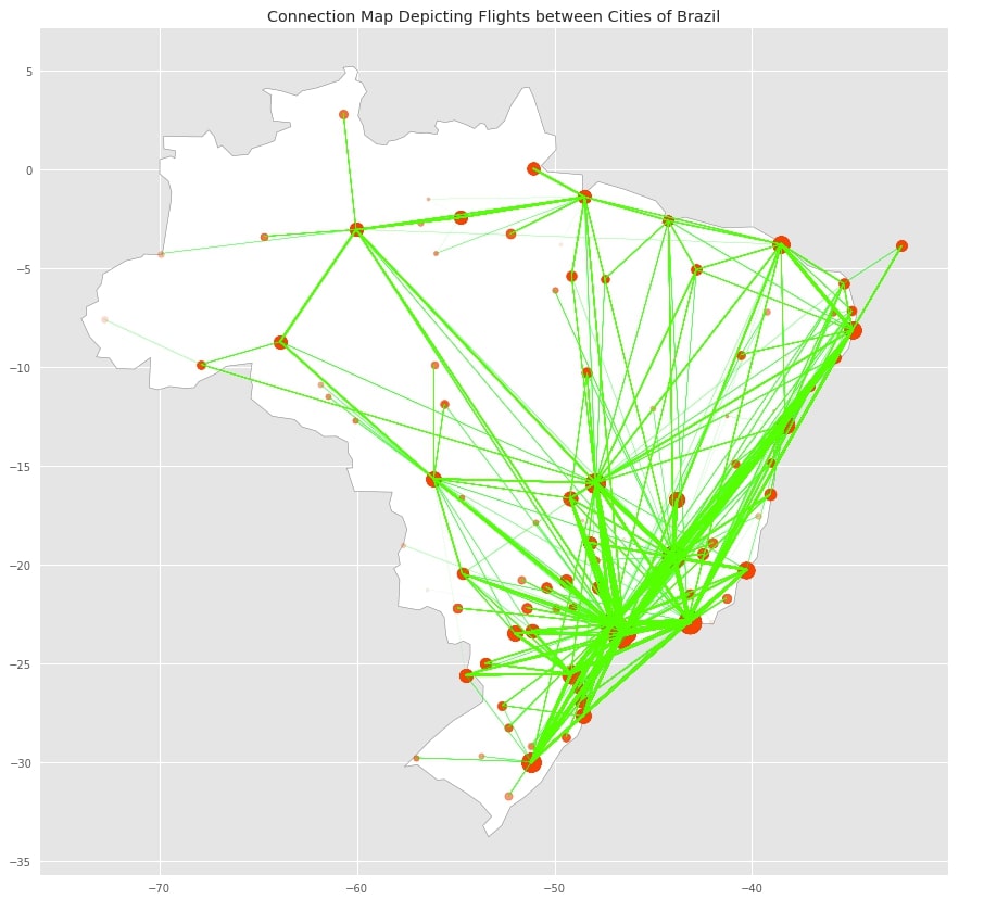
The fourth connection map that we'll be plotting will be showing all domestic flights of Brazil. We'll be using the domestic flight dataset that we created earlier to create a connection map. We'll use the same logic as that of previous maps to plot this connection map as well. Apart from that, we are also plotting only the South American continent as a part of this map.
fig = go.Figure()

source_to_dest = zip(brazil_cnt_df["LatOrig"], brazil_cnt_df["LatDest"],
                     brazil_cnt_df["LongOrig"], brazil_cnt_df["LongDest"],
                     brazil_cnt_df["Num_Of_Flights"])


## Loop thorugh each flight entry to add line between source and destination
for slat,dlat, slon, dlon, num_flights in source_to_dest:
    fig.add_trace(go.Scattergeo(
                        lat = [slat,dlat],
                        lon = [slon, dlon],
                        mode = 'lines',
                        line = dict(width = num_flights/100, color="lime")
                        ))

## Logic to create labels of source and destination cities of flights
cities = brazil_cnt_df["Cidade.Origem"].values.tolist()+brazil_cnt_df["Cidade.Destino"].values.tolist()
countries = brazil_cnt_df["Pais.Origem"].values.tolist()+brazil_cnt_df["Pais.Destino"].values.tolist()
scatter_hover_data = [country + " : "+ city for city, country in zip(cities, countries)]

## Loop thorugh each flight entry to plot source and destination as points.
fig.add_trace(
    go.Scattergeo(
                lon = brazil_cnt_df["LongOrig"].values.tolist()+brazil_cnt_df["LongDest"].values.tolist(),
                lat = brazil_cnt_df["LatOrig"].values.tolist()+brazil_cnt_df["LatDest"].values.tolist(),
                hoverinfo = 'text',
                text = scatter_hover_data,
                mode = 'markers',
                marker = dict(size = 10, color = 'orangered', opacity=0.1,))
    )

## Update graph layout to improve graph styling.
fig.update_layout(
                  height=500, width=800, margin={"t":0,"b":0,"l":0, "r":0, "pad":0},
                  showlegend=False,
                  title_text = 'Connection Map Depicting Flights between Cities of Brazil',
                  geo = dict(projection_type = 'natural earth',scope = 'south america'),
                )

fig.show()
2. Connection Maps using Geopandas & Matplotlib 
All of our previous connection maps were interactive. We can even create static connection maps using geopandas and matplotlib. We'll now create the same plots depicted as above one but using geopandas and matplotlib as our plotting libraries. So let’s get started with it.
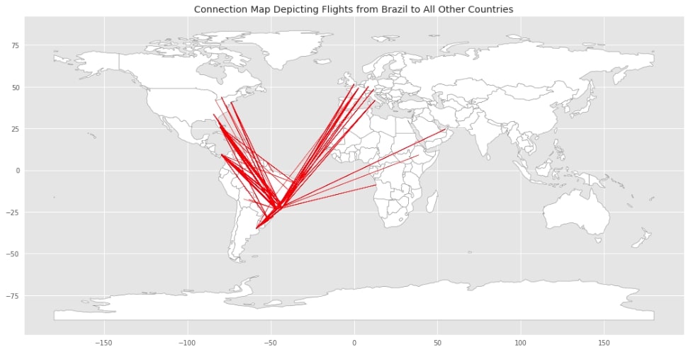
2.1 Connection Map Depicting Flights from Brazil to All Other Countries. 
We first need to load geopandas dataframe which has data about each country of the world with polygon representing each country's boundaries. We can simply plot this dataframe and it'll depict the world with each country highlighting their boundaries.
world = gpd.read_file(gpd.datasets.get_path("naturalearth_lowres"))
world.head()
The below plot is exactly the same as the plot depicted in section 1.1 of this tutorial. The only difference between this graph and the previous graph is that lines were bit curved in projection to give the rounded look of earth.
Plotting a connection map with geopandas and matplotlib is a very easy task. We first need to plot world map by simply calling plot() on world geopandas dataframe which we had loaded earlier. We then need to loop through each flight entry plotting lines from source to destination of that flight.
If you do not have a background that we suggest that you go through our tutorial on geopandas to get a grasp on its usage.
with plt.style.context(("seaborn", "ggplot")):
    ## Plot world
    world.plot(figsize=(18,10), edgecolor="grey", color="white");

    ## Loop through each flight plotting line depicting flight between source and destination
    for slat,dlat, slon, dlon, num_flights in zip(overseas_cnt_df["LatOrig"], overseas_cnt_df["LatDest"], overseas_cnt_df["LongOrig"], overseas_cnt_df["LongDest"], overseas_cnt_df["Num_Of_Flights"]):
        plt.plot([slon , dlon], [slat, dlat], linewidth=num_flights/100, color="red", alpha=0.5)

    plt.title("Connection Map Depicting Flights from Brazil to All Other Countries")

    plt.savefig("connection-map-geopandas-1.png", dpi=100)
2.2 Connection Map Depicting Flights from Brazil to All Other Countries With Airport Locations as Scatter Plot. 
Our second connection map using geopandas and matplotlib is exactly the same as that of a previous plot but we have also added points depicting source and destination cities by blue color. We have used the matplotlib scatter() method for this purpose specifying the size and color of each point in a map.
with plt.style.context(("seaborn", "ggplot")):
    ## Plot world
    world.plot(figsize=(18,10), edgecolor="grey", color="white");

    ## Loop through each flight plotting line depicting flight between source and destination
    ## We are also plotting scatter points depicting source and destinations
    for slat,dlat, slon, dlon, num_flights, src_city, dest_city in zip(overseas_cnt_df["LatOrig"], overseas_cnt_df["LatDest"], overseas_cnt_df["LongOrig"], overseas_cnt_df["LongDest"], overseas_cnt_df["Num_Of_Flights"], overseas_cnt_df["Cidade.Origem"], overseas_cnt_df["Cidade.Destino"]):
        plt.plot([slon , dlon], [slat, dlat], linewidth=num_flights/100, color="red", alpha=0.5)
        plt.scatter( [slon, dlon], [slat, dlat], color="blue", alpha=0.1, s=num_flights)

    plt.title("Connection Map Depicting Flights from Brazil to All Other Countries")

    plt.savefig("connection-map-geopandas-2.png", dpi=100)
2.3 Connection Map Depicting Flights from Brazil to All Other Countries With Airport Locations as Scatter Plot [Destination Cities Labeled]. 
Our third connection map plot is exactly the same as our previous connection plot with added functionalities. We have added labels of city names where Brazilian flights are landing. We have not added labels of source cities as it'll make the graph look very cluttered.
with plt.style.context(("seaborn", "ggplot")):
    ## Plot world
    world.plot(figsize=(18,10), edgecolor="grey", color="white");

    ## Loop through each flight plotting line depicting flight between source and destination
    ## We are also plotting scatter points depicting source and destinations
    ## Aprt from that we also have added logic for labels to destination cities.
    for slat,dlat, slon, dlon, num_flights, src_city, dest_city in zip(overseas_cnt_df["LatOrig"], overseas_cnt_df["LatDest"], overseas_cnt_df["LongOrig"], overseas_cnt_df["LongDest"], overseas_cnt_df["Num_Of_Flights"], overseas_cnt_df["Cidade.Origem"], overseas_cnt_df["Cidade.Destino"]):
        plt.plot([slon , dlon], [slat, dlat], linewidth=num_flights/100, color="red", alpha=0.5)
        plt.scatter( [slon, dlon], [slat, dlat], color="blue", alpha=0.1, s=num_flights)

        #plt.text(slon+5, slat+5, src_city, fontsize=8, color="black", bbox=dict(facecolor='lightgrey', alpha=0.1), alpha=1.0, horizontalalignment='center', verticalalignment='center')
        plt.text(dlon+5, dlat+5, dest_city, fontsize=8, color="green", alpha=0.2, horizontalalignment='center', verticalalignment='center')

    plt.title("Connection Map Depicting Flights from Brazil to All Other Countries")

    plt.savefig("connection-map-geopandas-3.png", dpi=100)
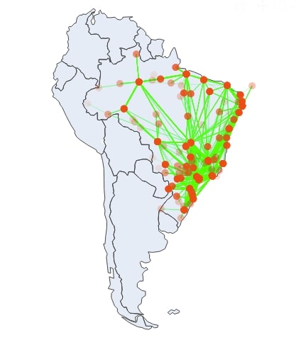
2.4 Connection Map Depicting Flights between Cities of Brazil. 
The fourth connection map that we'll be plotting using geopandas and matplotlib depicts flight travels between various cities of Brazil. We also have used a scatter plot to display various cities.
with plt.style.context(("seaborn", "ggplot")):
    ## Plot world
    world[world.name == "Brazil"].plot(figsize=(15,15), edgecolor="grey", color="white");

    ## Loop through each flight plotting line depicting flight between source and destination
    ## We are also plotting scatter points depicting source and destinations
    for slat,dlat, slon, dlon, num_flights in zip(brazil_cnt_df["LatOrig"], brazil_cnt_df["LatDest"], brazil_cnt_df["LongOrig"], brazil_cnt_df["LongDest"], brazil_cnt_df["Num_Of_Flights"]):
        plt.plot([slon , dlon], [slat, dlat], linewidth=num_flights/100, color="lime", alpha=0.5)
        plt.scatter( [slon, dlon], [slat, dlat], color="orangered", alpha=0.1, s=num_flights)

    plt.title("Connection Map Depicting Flights between Cities of Brazil")

    plt.savefig("connection-map-geopandas-4.png", dpi=100)
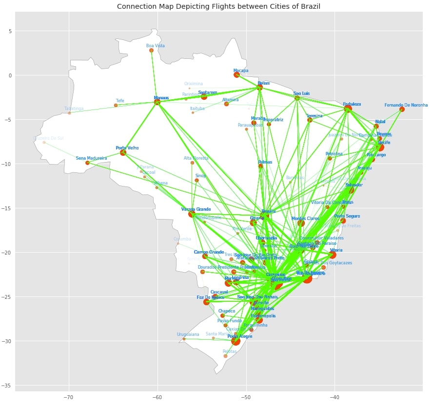
2.5 Connection Map Depicting Flights between Cities of Brazil. 
Our fifth connection map is exactly the same as the previous connection map but we also have added labels for each source and destination cities to map.
with plt.style.context(("seaborn", "ggplot")):
    ## Plot world
    world[world.name == "Brazil"].plot(figsize=(15,15), edgecolor="grey", color="white");

    ## Loop through each flight plotting line depicting flight between source and destination
    ## We are also plotting scatter points depicting source and destinations.
    ## Aprt from that we also have added logic for labels of source and destination cities.
    for slat,dlat, slon, dlon, num_flights, src_city, dest_city in zip(brazil_cnt_df["LatOrig"], brazil_cnt_df["LatDest"], brazil_cnt_df["LongOrig"], brazil_cnt_df["LongDest"], brazil_cnt_df["Num_Of_Flights"], brazil_cnt_df["Cidade.Origem"], brazil_cnt_df["Cidade.Destino"] ):
        plt.plot([slon , dlon], [slat, dlat], linewidth=num_flights/100, color="lime", alpha=0.5)
        plt.scatter( [slon, dlon], [slat, dlat], color="orangered", alpha=0.1, s=num_flights)

        plt.text(slon+0.5, slat+0.5, src_city, fontsize=8, color="dodgerblue", alpha=0.1, horizontalalignment='center', verticalalignment='center')
        plt.text(dlon+0.5, dlat+0.5, dest_city, fontsize=8, color="dodgerblue", alpha=0.1, horizontalalignment='center', verticalalignment='center')

    plt.title("Connection Map Depicting Flights between Cities of Brazil")

    plt.savefig("connection-map-geopandas-5.png", dpi=100)
This ends our small tutorial explaining how to plot connection maps in python jupyter notebook using Plotly, Geopandas, and Matplotlib. Please feel free to let us know your views in the comments section.
References 
- Cartopy - Basic Maps [Scatter Map, Bubble Map & Connection Map]
- CoderzColumn Geopandas Tutorial
- Plotly Docs
- Choropleth Maps and Scatter Maps using Cufflinks
- Plotting Maps using Bokeh
- ipyleaflet - Interactive Maps in Python based on leaflet.js
- Interactive Choropleth Maps using bqplot
- Interactive Choropleth Maps using ipyleaflet
- Interactive Maps using Folium
- Convert Static Geopandas Maps to Interactive Maps using hvplot
 Sunny Solanki
Sunny Solanki
Intro: Software Developer | Youtuber | Bonsai Enthusiast
About: Sunny Solanki holds a bachelor's degree in Information Technology (2006-2010) from L.D. College of Engineering. Post completion of his graduation, he has 8.5+ years of experience (2011-2019) in the IT Industry (TCS). His IT experience involves working on Python & Java Projects with US/Canada banking clients. Since 2020, he’s primarily concentrating on growing CoderzColumn.
His main areas of interest are AI, Machine Learning, Data Visualization, and Concurrent Programming. He has good hands-on with Python and its ecosystem libraries.
Apart from his tech life, he prefers reading biographies and autobiographies. And yes, he spends his leisure time taking care of his plants and a few pre-Bonsai trees.
Contact: sunny.2309@yahoo.in


![YouTube Subscribe]() Comfortable Learning through Video Tutorials?
Comfortable Learning through Video Tutorials?
If you are more comfortable learning through video tutorials then we would recommend that you subscribe to our YouTube channel.
![Need Help]() Stuck Somewhere? Need Help with Coding? Have Doubts About the Topic/Code?
Stuck Somewhere? Need Help with Coding? Have Doubts About the Topic/Code?
 Stuck Somewhere? Need Help with Coding? Have Doubts About the Topic/Code?
When going through coding examples, it's quite common to have doubts and errors.
If you have doubts about some code examples or are stuck somewhere when trying our code, send us an email at coderzcolumn07@gmail.com. We'll help you or point you in the direction where you can find a solution to your problem.
You can even send us a mail if you are trying something new and need guidance regarding coding. We'll try to respond as soon as possible.
![Share Views]() Want to Share Your Views? Have Any Suggestions?
Want to Share Your Views? Have Any Suggestions?
 Want to Share Your Views? Have Any Suggestions?
If you want to
- provide some suggestions on topic
- share your views
- include some details in tutorial
- suggest some new topics on which we should create tutorials/blogs
 connection-map, plotly, geopandas