How to Create Basic Dashboard using Streamlit & Cufflinks (Plotly)?
Recently the field of data visualization has been on rising due to more emphasis on retrieving important and hidden information from data. The information which might not be easily visible by just looking at data can be visible through visualizations. People with different knowledge, different professions, different designations want to see and analyze data in a different way. This has given rise to interactive visualizations and dashboards. Dashboards are generally groups of visualization giving good knowledge about an underlying topic. Dashboards generally have widgets as well like dropdowns, multi-select, radio buttons, etc which lets people tweak visualizations to look at it from different perspectives as well as try different combinations to find out more information. Dashboards can be used for many purposes like website traffic analysis, production jobs monitoring, stock market movement monitoring, ML process analysis, and many more.
Python has a list of libraries that let us create dashboards. The most famous ones are dash from plotly, panel from anaconda, voila from quantstack, bokeh from numfocus & anaconda, and streamlit which is open source. Dash lets us create a dashboard with plotly charts whereas Panel lets us create a chart using bokeh, holoviews, matplotlib, and plotly. The voila lets us convert our jupyter notebook into the dashboard. Streamlit which is the library that we are going to cover in this tutorial lets us create a dashboard by using visualizations from matplotlib, plotly, Altair, vega lite, bokeh, pydeck, and graphviz. As a part of this tutorial, we'll try to explain with a simple example how to create a basic dashboard using streamlit. We'll embed plotly charts into the dashboard.
We'll now start with our dashboard without wasting much time.
Important Sections
- Load Dataset
- Create Individual Charts
- Scatter Plot
- Stacked Bar Chart
- Histogram
- Pie Chart
- Introducing Other Components (Widgets, Text, etc.) of Dashboard
- Putting It All Together
We have first imported all necessary libraries. We'll be using cufflinks for creating plotly charts. Cufflinks is a library that lets us create plotly charts from pandas dataframe with just one line of code. If you are interested in learning about it then please feel free to check our tutorial on the same.
import streamlit as st

import pandas as pd

import cufflinks as cf

import warnings
warnings.filterwarnings("ignore")

print("Streamlit Version : {}".format(st.__version__))
Load Dataset 
We'll be using the wine dataset available from scikit-learn. The dataset has information about different ingredients used in three different types of wines. We have loaded the dataset as a pandas dataframe from which we'll be creating plotly charts.
from sklearn.datasets import load_wine

wine = load_wine()

wine_df = pd.DataFrame(data=wine.data, columns=wine.feature_names)

wine_df["WineType"] = [wine.target_names[t] for t in wine.target ]

wine_df.head()
Create Individual Charts 
We'll now introduce individual charts that will be displayed in our dashboard. We'll be creating these charts here with few default values. Later on, we'll link these charts to various widgets in order to update them based on selected values. Our dashboard will consist of 4 charts.
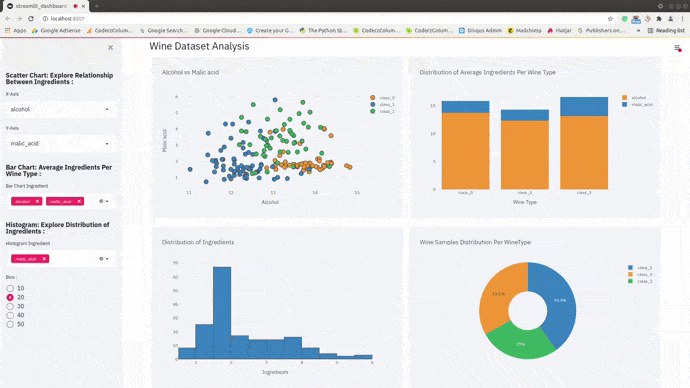
- Scatter Plot showing the relationship between ingredients color-encoded by wine type.
- Stacked Bar Chart showing average ingredients per wine type.
- Histogram showing distribution of ingredients
- Pie Chart showing wine samples distribution per wine type
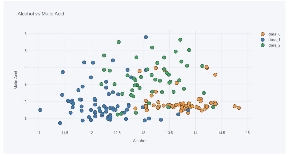
Scatter Plot
Below we have created a scatter plot showing the relationship between alcohol and malic_acid using iplot() method of pandas dataframe which we get by importing cufflinks. We have color-encoded each point based on wine type to analyze the relationship based on it. We have instructed iplot() method to return Figure object containing scatter chart.
We'll be later using this figure object when we create the layout of the dashboard. Here, we have displayed a scatter chart for explanation purposes.
Later on, we'll create two dropdowns (one for the x-axis and one for the y-axis) which will have a list of ingredients. We'll be linking those dropdowns with the x and y values of iplot() method and use them to explore the relationship between different combinations of ingredients.
scatter_fig = wine_df.iplot(kind="scatter", x="alcohol", y="malic_acid",
                    mode="markers",
                    categories="WineType",
                    asFigure=True, opacity=1.0,
                    xTitle="Alcohol", yTitle="Malic Acid",
                    title="Alcohol vs Malic Acid",
                    )

scatter_fig
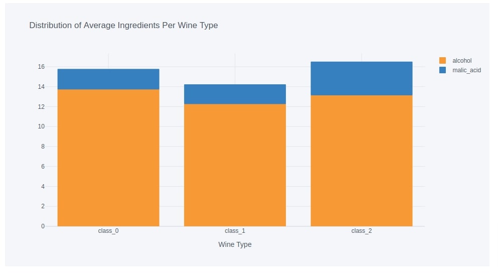
Bar Chart
Below we have created a dataframe that has an average of ingredients per wine type. We have created this data frame by grouping entries in the original data frame based on wine type and then taking an average across all columns to get the average for ingredients for each wine type. We'll be using this data frame to create our second chart.
avg_wine_df = wine_df.groupby(by=["WineType"]).mean()

avg_wine_df
Below we have created a stacked bar chart showing the average value of alcohol and malic_acid used in each wine type. We have used iplot() method to create bar chart by providing kind as bar and barmode as stack to stack bars.
We have taken a subset of the original dataframe from the previous cell by keeping only two columns in it (alcohol and malic acid). This time also we have returned Figure object which will be used later on in the dashboard layout.
Later on, we'll create a multi-select which we'll use to subset average ingredients dataframe to select ingredients that we want to see in our bar chart.
bar_fig = avg_wine_df[["alcohol", "malic_acid"]].iplot(kind="bar",
                        barmode="stack",
                        xTitle="Wine Type",
                        title="Distribution of Average Ingredients Per Wine Type",
                        asFigure=True,
                        opacity=1.0
                        );

bar_fig
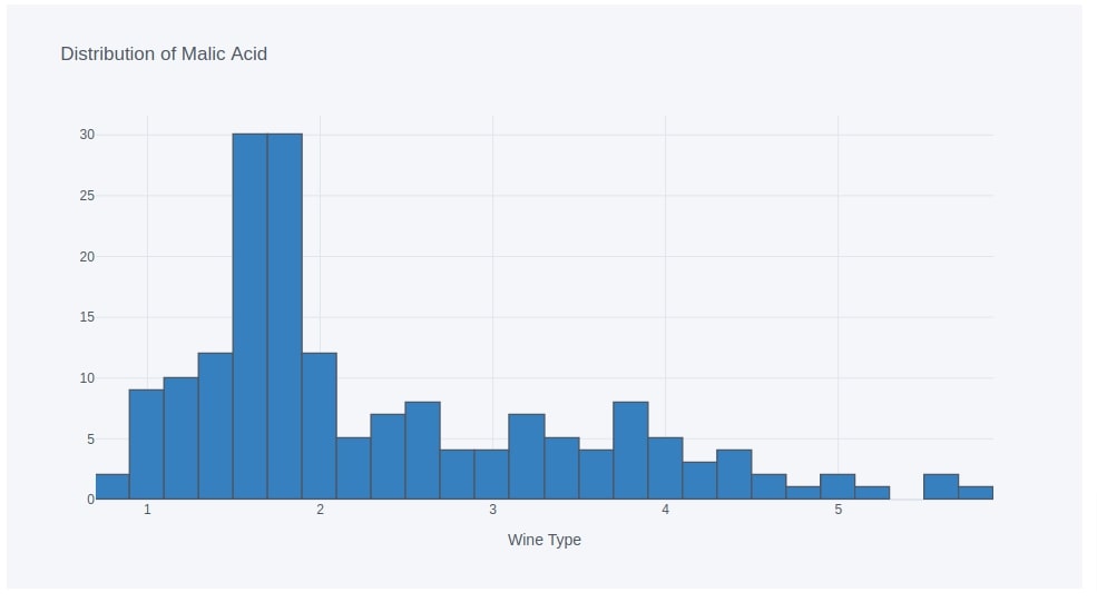
Histogram
Below we have created our third chart which is a histogram showing the distribution of values of ingredients. We have created a histogram by using iplot() method on our original pandas dataframe directly. We have provided a list of ingredients for which we want to see distribution to keys parameter of iplot() method. Here, we have created a histogram of malic_acid.
Later on, we'll create one multi-select and link it to keys parameter of iplot() method. We'll be using it to see a distribution of one or more ingredients. We'll also create a radio button with different values for bins parameter.
hist_fig = wine_df.iplot(kind="hist",
                         keys=["malic_acid"],
                         xTitle="Wine Type",
                         bins=30,
                         title="Distribution of Malic Acid",
                         asFigure=True,
                         opacity=1.0
                        );

hist_fig
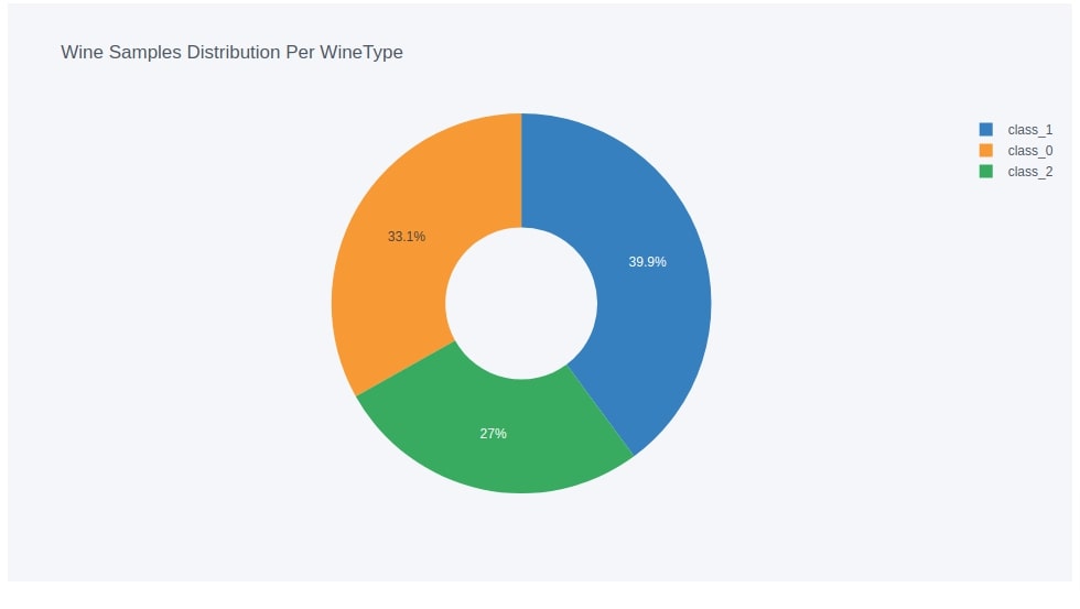
Pie Chart
Below we have created a pie chart that shows the distribution of number of samples for each wine type. As usual, we have created it using iplot() method by setting kind parameter to pie.
We have first created a data frame that has a count of samples for each wine type by grouping functionality of the data frame.
Below we have displayed a pie chart for explanation purposes.
wine_cnt = wine_df.groupby(by=["WineType"]).count()[['alcohol']].rename(columns={"alcohol":"Count"}).reset_index()

pie_fig = wine_cnt.iplot(kind="pie", labels="WineType", values="Count",
                         title="Wine Samples Distribution Per WineType",
                         asFigure=True,
                        hole=0.4)

pie_fig
Introducing Other Components (Widgets, Text, Containers, etc.) of Dashboard 
As a part of this section, we'll introduce various widgets and container components that we'll be using in our dashboard. We'll introduce various methods provided by streamlit for showing text, markdown, creating widgets, creating containers, etc. Below is a list of components that we'll be using in our dashboard.
- Markdown. - Guide for Markdown
- Dropdowns.
- Multi-Selects.
- Radio Buttons.
- Containers and Columns for wrapping charts.
Below is a list of methods that will be used to create the components that we listed above.
- markdown(body) - This method accepts string specifying markdown that we want to include in our web app. Markdown is a simple language for styling the text of our data in an easy way. We'll be using it to introduce HTML H1/H2/H3 texts in our dashboard.
- selectbox(label,options,index=0) - This method takes as input label and list of options to display in dropdown. The label will be shown before the dropdown. The index accepts integer specifying which value should be selected by default. It's 0 by default which means that the first value from options will be selected.
- This method returns immediately which selected option.
- We can use this method directly from streamlit which will add it in the main container of the dashboard or we can call it on sidebar attribute of streamlit which will add widgets to a sidebar.
- multiselect(label,options,default=None) - This method takes as input label and list of options to display in multi-select. The label will be shown before multi-select. The default accepts a list of ints or strings specifying options to select by default from total options.
- This method returns immediately which selected option.
- This method can also be used directly from streamlit or from sidebar attribute of streamlit.
- radio(label,options,index=0) - This method takes as input label and list of options for radio buttons. The index accepts integer specifying which radio button should be selected by default.
- container() - This method creates a container in which we can insert elements of a dashboard like columns, charts, widgets, etc. The container generally spans the whole page. The elements will be added to the container in the order in which they are inserted.
- We can add components to the container by just calling them or by calling write() method.
- Container can be used as a context manager (Python with statement).
- columns(spec) - This method creates a list of columns in which we can add components based on spec provided. The spec takes as input int or list of ints.
- If we provide int then it'll create that many columns inside of parent container.
- If we provide a list of ints then the size of columns will be decided based on a list of ints. Ex:- If we provide [1,2,3] then it'll create three columns where the second column will be twice the size of the first column and the third column will be thrice the size of the first column.
- This method returns a list of column objects to which we can add elements like we add elements to the container.
- We can also use columns object as a context manager (Python with statement).
Please do not worry if you don't understand the exact working of methods from the theoretical explanations above. Things will become clear when we explain the code of the dashboard where we have actually used it.
Please make a NOTE that we'll be adding all our widgets in the sidebar and the main container of the dashboard will only have charts. The charts will update as we change the values of our widgets.
Putting It All Together 
As a part of this section, we'll explain how we have put together all charts and other components to create a final dashboard. We have divided code explanation into sections to make things easier to understand and faster to grasp.
Code Explanation
Our code for the dashboard starts by importing all necessary libraries. It also loads the wine dataset from scikit-learn and stores it in pandas dataframe. We have also added the title of a dashboard using markdown() method which displays the title as an HTML H2 element.
Scatter Chart Logic - Our chart for scatter chart starts with the creation of a heading for scatter chart dropdowns. It then creates two dropdowns with a list of ingredients in the sidebar. The first dropdown selects alcohol by default and second dropdown selects malic_acid by default using index parameter. Both dropdown returns with selected values. We have then put if condition to check that values are selected. We create a scatter figure using values selected. We are using values returned by dropdowns to create a scatter chart. Each time, we make a change to any dropdown, streamlit will rerun the file again from the top and it'll recreate the chart.
- Bar Chart Logic - The logic for the bar chart section starts by creating a heading about the bar chart in a sidebar using markdown() method. It then creates an average ingredients per wine type dataset which we had explained earlier how to create. It then creates a multi-select with ingredients of wine in the sidebar. By default, alcohol and malic_acid are selected by setting default parameter of multiselect() method. The multi-select returns with a list of selected values which we have stored in a variable bar_axis. We have then put an if-else condition which checks whether options are selected or not. It'll go in the if-section if one or more options are selected else it'll go in the else-section. We have created our stacked bar chart with selected values if one or more values are selected from multi-select. It'll go in the else-section if none of the options are selected and we create a bar chart of average alcohol if no option is selected. Each time a value of multi-select changes, the code will be executed from the top and it'll update the chart based on condition.
- Histogram Logic - The histogram logic section like other sections starts with the creation of a heading for it using markdown() method. It then creates a multi-select with a list of wine ingredients. It sets malic_acid as default value. It then creates a radio button for bins of a histogram with values between 10-50. We have set a default value of bins to 20 by setting index parameter to 1. We have stored values returned by both multi-select and radio buttons in variables hist_axis and bins respectively. We have then created an if-else condition based on the value of hist_axis variable. The condition executes code in if-section if one or more options are selected from multi-select else it goes to else-section if no even a single option is selected. The if-section creates a histogram by using the values selected using multi-select. We have provided selected values stored in hist_axis variable to keys parameter of code for plotting histogram. The else-section creates a histogram of alcohol if no option is selected.
- Pie Chart Logic - The logic for the pie chart first creates a dataframe where there is an entry for each wine type and count for samples of each wine type. We then create a pie chart using this data frame.
- Logic to Layout Components of Dashboard - This section will layout charts that we created earlier to create a whole dashboard. We had stored figures returned by each chart in different variables but we had not plotted them earlier. Our code for layout starts by creating a container object first. We then create two columns containers using columns() method which will be used to hold one chart each. The columns are also a kind of container but it'll divide a container into space based on their settings. We'll be adding a scatter chart to the first column container and a bar chart to the second column container. We have then used a container object as a context manager and inside of it, we have used column objects as a context manager. Inside of the context of the first column, we have simply called scatter figure object and inside the context of the second column, we have simply called bar figure object. This part of the code will first create a container which will be of a width of the page and then create two columns container inside of it of equal size. Then it'll plot two charts in two different column containers. We have then followed the same code logic for histogram and pie chart.
Please make a note that each time you make a change to dashboard file, it'll show a button named Rerun on top-right corner of dashboard. Clicking on this button will rerun original file again to create dashboard with new changes.
How to Run Dashboard?
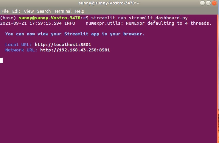
You can execute the below command in shell/command prompt and it'll start the dashboard on port 8501 by default.
- streamlit run streamlit_dashboard.py
You can access the dashboard by going to link localhost:8501. The above command also will start the dashboard in the browser.
Record a Screencast using Streamlit
You can also record a screencast by clicking on a button with three lines in the top-right corner of the page and selecting the option Record a screencast. Once the record is complete, it'll ask you to save a file on a local computer. The file will be saved in webm format. This can be useful if you want to create a video for explanation purposes. We have included a GIF file created using a screencast of our dashboard below.
streamlit_dashboard.py
import streamlit as st

import pandas as pd

import cufflinks as cf

from sklearn.datasets import load_wine

import warnings
warnings.filterwarnings("ignore")

####### Load Dataset #####################

wine = load_wine()

wine_df = pd.DataFrame(data=wine.data, columns=wine.feature_names)

wine_df["WineType"] = [wine.target_names[t] for t in wine.target ]

st.set_page_config(layout="wide")

st.markdown("## Wine Dataset Analysis")   ## Main Title

################# Scatter Chart Logic #################

st.sidebar.markdown("### Scatter Chart: Explore Relationship Between Ingredients :")

ingredients = wine_df.drop(labels=["WineType"], axis=1).columns.tolist()

x_axis = st.sidebar.selectbox("X-Axis", ingredients)
y_axis = st.sidebar.selectbox("Y-Axis", ingredients, index=1)

if x_axis and y_axis:
    scatter_fig = wine_df.iplot(kind="scatter", x=x_axis, y=y_axis,
                    mode="markers",
                    categories="WineType",
                    asFigure=True, opacity=1.0,
                    xTitle=x_axis.replace("_"," ").capitalize(), yTitle=y_axis.replace("_"," ").capitalize(),
                    title="{} vs {}".format(x_axis.replace("_"," ").capitalize(), y_axis.replace("_"," ").capitalize()),
                    )


########## Bar Chart Logic ##################

st.sidebar.markdown("### Bar Chart: Average Ingredients Per Wine Type : ")

avg_wine_df = wine_df.groupby(by=["WineType"]).mean()

bar_axis = st.sidebar.multiselect(label="Bar Chart Ingredient", options=avg_wine_df.columns.tolist(), default=["alcohol","malic_acid"])

if bar_axis:
    bar_fig = avg_wine_df[bar_axis].iplot(kind="bar",
                        barmode="stack",
                        xTitle="Wine Type",
                        title="Distribution of Average Ingredients Per Wine Type",
                        asFigure=True,
                        opacity=1.0,
                        );
else:
    bar_fig = avg_wine_df[["alcohol"]].iplot(kind="bar",
                        barmode="stack",
                        xTitle="Wine Type",
                        title="Distribution of Average Alcohol Per Wine Type",
                        asFigure=True,
                        opacity=1.0,
                        );

################# Histogram Logic ########################

st.sidebar.markdown("### Histogram: Explore Distribution of Ingredients : ")

hist_axis = st.sidebar.multiselect(label="Histogram Ingredient", options=ingredients, default=["malic_acid"])
bins = st.sidebar.radio(label="Bins :", options=[10,20,30,40,50], index=1)

if hist_axis:
    hist_fig = wine_df.iplot(kind="hist",
                             keys=hist_axis,
                             xTitle="Ingredients",
                             bins=bins,
                             title="Distribution of Ingredients",
                             asFigure=True,
                             opacity=1.0
                            );
else:
    hist_fig = wine_df.iplot(kind="hist",
                             keys=["alcohol"],
                             xTitle="Alcohol",
                             bins=bins,
                             title="Distribution of Alcohol",
                             asFigure=True,
                             opacity=1.0
                            );


#################### Pie Chart Logic ##################################

wine_cnt = wine_df.groupby(by=["WineType"]).count()[['alcohol']].rename(columns={"alcohol":"Count"}).reset_index()

pie_fig = wine_cnt.iplot(kind="pie", labels="WineType", values="Count",
                         title="Wine Samples Distribution Per WineType",
                         hole=0.4,
                         asFigure=True)


##################### Layout Application ##################

container1 = st.container()
col1, col2 = st.columns(2)

with container1:
    with col1:
        scatter_fig
    with col2:
        bar_fig


container2 = st.container()
col3, col4 = st.columns(2)

with container2:
    with col3:
        hist_fig
    with col4:
        pie_fig
Dashboard
This ends our small tutorial explaining how to create a simple dashboard with widgets using streamlit and cufflinks (plotly). Please feel free to let us know your views in the comments section.
References
- Turn Python Scripts into Beautiful ML Tools
- How to build dashboard using Python (Dash & Plotly) and deploy online (pythonanywhere.com)?
- How to create interactive dashboard using Python(Matplotlib and Panel)?
- How to Create Simple Dashboard with Widgets in Python [Bokeh]?
- How to Create Basic Dashboard in Python with Widgets [plotly & Dash]?
- Mastering Markdown
 Sunny Solanki
Sunny Solanki
Intro: Software Developer | Youtuber | Bonsai Enthusiast
About: Sunny Solanki holds a bachelor's degree in Information Technology (2006-2010) from L.D. College of Engineering. Post completion of his graduation, he has 8.5+ years of experience (2011-2019) in the IT Industry (TCS). His IT experience involves working on Python & Java Projects with US/Canada banking clients. Since 2020, he’s primarily concentrating on growing CoderzColumn.
His main areas of interest are AI, Machine Learning, Data Visualization, and Concurrent Programming. He has good hands-on with Python and its ecosystem libraries.
Apart from his tech life, he prefers reading biographies and autobiographies. And yes, he spends his leisure time taking care of his plants and a few pre-Bonsai trees.
Contact: sunny.2309@yahoo.in


![YouTube Subscribe]() Comfortable Learning through Video Tutorials?
Comfortable Learning through Video Tutorials?
If you are more comfortable learning through video tutorials then we would recommend that you subscribe to our YouTube channel.
![Need Help]() Stuck Somewhere? Need Help with Coding? Have Doubts About the Topic/Code?
Stuck Somewhere? Need Help with Coding? Have Doubts About the Topic/Code?
 Stuck Somewhere? Need Help with Coding? Have Doubts About the Topic/Code?
When going through coding examples, it's quite common to have doubts and errors.
If you have doubts about some code examples or are stuck somewhere when trying our code, send us an email at coderzcolumn07@gmail.com. We'll help you or point you in the direction where you can find a solution to your problem.
You can even send us a mail if you are trying something new and need guidance regarding coding. We'll try to respond as soon as possible.
![Share Views]() Want to Share Your Views? Have Any Suggestions?
Want to Share Your Views? Have Any Suggestions?
 Want to Share Your Views? Have Any Suggestions?
If you want to
- provide some suggestions on topic
- share your views
- include some details in tutorial
- suggest some new topics on which we should create tutorials/blogs
 dashboard, streamlit, cufflinks, plotly