Plotnine: Quick Plots with One Function Call
Plotnine is a python data visualization library based on the concept of the grammar of the graphics. The grammar of the graphics concept divides visualization into layers and lets us provide information for each layer. At last, we add up all layers to create the final visualization. It gives us the flexibility of declaring details about visualization parts separately like giving axis labels separately, giving figure size details separately, giving mapping details about X/Y axis separately, giving data details separately, etc. R Programming has a library named ggplot2 which also implements the concept of the grammar of graphics for creating visualizations. Plotnine has API almost the same as that of ggplot2. The code created in python using plotnine will most probably work with ggplot2 as well with minor changes if needed. As a part of this tutorial, we are going to introduce one function of plotnine and how to use it to create simple charts with just one line of code. We have already covered a tutorial on plotnine where we explore the API of it with simple examples and explain the concept of the grammar of graphics. We recommend that readers check that tutorial as well if they want to know about it.
We'll be using function qplot() from plotnine to create charts quickly as a part of this tutorial. It takes care of all internal layers of creating a visualization.
Definition of qplot()
- qplot(x=None,y=None,data=None,facets=None,geom='auto',xlim=None,ylim=None,main=None,xlab=None,ylab=None,asp=None,**kwargs) - This method takes as input X axis column name, Y axis column name and data to create visualization from it. It accepts few more parameters to create different visualizations which we have explained below.
- The parameter x accepts string (dataframe column name) or array for X-axis of the chart.
- The parameter y accepts string (dataframe column name) or array for Y-axis of the chart.
- The parameter data accepts the dataframe as input.
- The parameter geom accepts string or list of strings as input specifying geometric objects that will be plotted in the chart. The geometric objects are points, bars, histogram, cols, etc. The default value if 'auto' which plots scatter chart if x and y are provided else plots histogram if only 'x' is provided. The value provided here will be used internally to call method geom_*() corresponding to it. If we provide a list of strings then it'll create all geometric objects on the chart.
- The facets parameter accepts a string column name from data based on which subplots will be created. This is a categorical column of data based on whose different values, we want to see the relationship between other data columns.
- The xlim and ylim parameters accepts tuple of length two specifying limits for X and Y-axis.
- The main parameter accepts string specifying the title of the chart.
- The xlab and ylab parameters accepts string specifying labels for the X and Y-axis.
- The asp parameter accepts float specifying aspect ratio of height and width of visualization.
- All extra parameters provided to this method call will be passed to geom_*() method based on geom parameter.
We'll now start with our tutorial by importing all necessary modules. We'll be using datasets available from data module of plotnine for the creation of various visualizations.
import plotnine

from plotnine import qplot

from plotnine.data import mpg, presidential, economics
Load Datasets
We'll be using 2 different datasets as a part of our tutorial. All of them are available as pandas dataframe from plotnine.data module.
- mpg - This dataset has information about different car models manufactured by different manufacturers. It has information like model's manufacturer, model name, engine displacement, launch year, cylinders, city MPG, highway mpg, class, etc.
- economics - This dataset has time-series information about the united states from 1967 to 2015 on a monthly basis. It has attributes like population, personal savings rate, unemployment rate, etc.
mpg.head()
economics.head()
economics.tail()
Scatter Plots
As a part of this section, we'll explain how to create scatter plots using qplot().
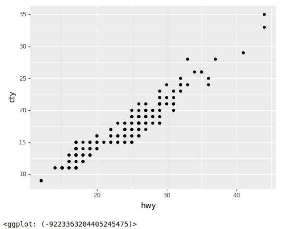
Below we have created our first scatter plot with simply one line of code. We have given mpg dataset as input and instructed to use hwy column's data for X-axis and cty columns data as Y-axis. The qplot() method then creates a scatter chart from details.
qplot(data=mpg, x="hwy", y="cty")
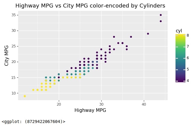
Below we have created another scatter plot that has the same X and Y-axis as our previous chart but we have asked to color points of a chart based on the number of cylinders in the model of the car. We have set color parameter to value cyl for color encoding. We have also provided labels for X/Y axes and a title for the chart using xlab,ylab, and main parameters. We have set the aspect ratio of the chart to 0.6 to make it a rectangle where width is more than height. The extra color parameter that we provided will be passed to geom_point() method internally.
qplot(data=mpg, x="hwy", y="cty",
      color="cyl",
      xlab="Highway MPG", ylab="City MPG",
      main="Highway MPG vs City MPG color-encoded by Cylinders",
      asp=0.6
     )
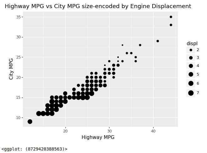
Below we have created another scatter plot that has the same X and Y axis as previous charts but this time we have used an engine displacement column to decide the size of points in the chart. We have done that by providing string 'displ' to size parameter of the chart. The extra parameter size that we provided in the method call will be passed to geom_point() method internally.
qplot(data=mpg,
      x="hwy", y="cty",
      size="displ",
      xlab="Highway MPG", ylab="City MPG",
      main="Highway MPG vs City MPG size-encoded by Engine Displacement")
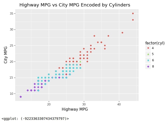
Below we have created another scatter chart with the same X and Y-axis as our previous charts. But this time we have color encoded and shape encoded points of a chart based on a number of cylinders. We have done that by providing parameters color and shape with value cyl. The string cyl is surrounded with factor() to inform that its value should be used as categorical values. Parameters color and shape that we provided will be passed to geom_point() method internally for encoding purposes.
qplot(data=mpg,
      x="hwy", y="cty",
      color="factor(cyl)", shape="factor(cyl)",
      xlab="Highway MPG", ylab="City MPG",
      main="Highway MPG vs City MPG Encoded by Cylinders")
Bar Charts
As a part of this section, we'll explain how to create bar charts using qplot() method. There are two different ways to create a bar chart based on the value of parameter geom.
- 'bar' - It'll call geom_bar() method internally which will create bar chart based on counts only. It only lets us provide X value and the height of bars will be decided based on counts of X-axis values. It does not let us specify the height of bars separately.
- 'col' - It'll call geom_col() method internally which will create bar chart. It let us provide both X and Y axis values. The value provided as Y-axis will be used to decide the height of the bar chart.
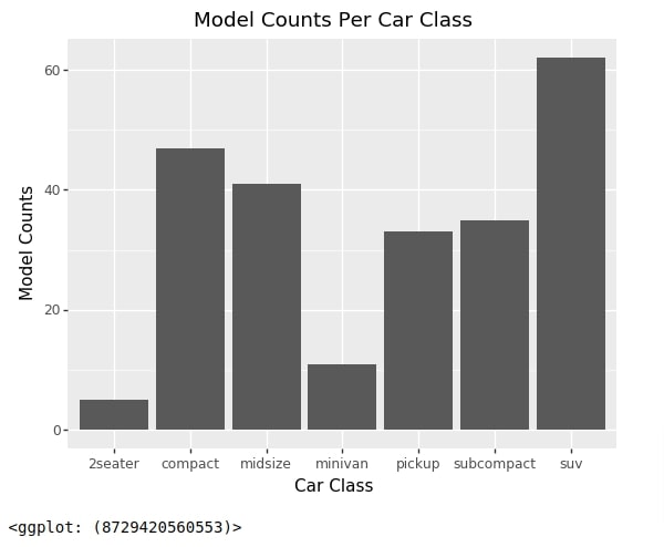
Below we have created our first bar chart showing model counts per class. We have provided mpg data, class string to x parameter and bar string to geom parameter for creating this chart. The bar geom internally calls geom_bar() function to create bar chart of counts.
qplot(data=mpg,
      x="class",
      geom="bar",
      xlab="Car Class", ylab="Model Counts",
      main="Model Counts Per Car Class"
     )
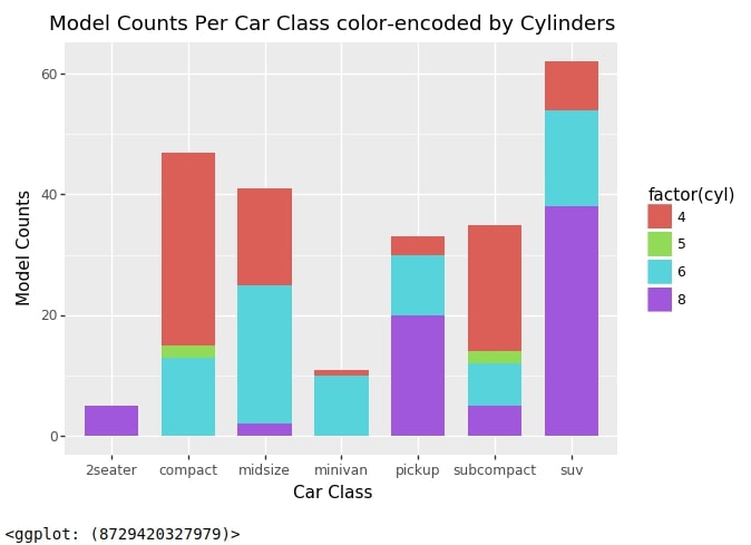
Below we have created another bar chart using bar geom which uses the same combinations as our previous chart with only one difference. We have provided fill parameter with a number of cylinders. This way it'll color each bar based on the distribution of cylinders for each class.
We can also provide position parameter with value 'dodge' if we want side by side bar chart instead of a stacked bar chart.
qplot(data=mpg,
      x="class", fill="factor(cyl)",
      width=0.7,
      geom="bar",
      xlab="Car Class", ylab="Model Counts",
      main="Model Counts Per Car Class color-encoded by Cylinders"
     )
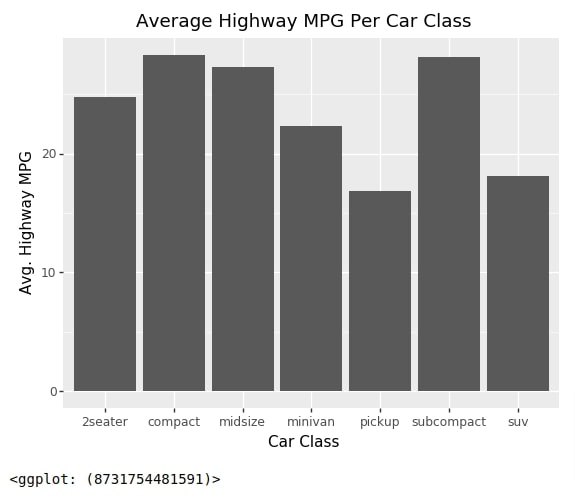
We'll now explain how to create bar charts where we can provide height for bars. We'll be using 'col' string for geom parameter for creating bar charts.
We have first created an intermediate data frame where we have an average value of mpg dataframe columns based on car class. We have created this dataframe by grouping the original mpg dataframe based on class column and then taken the mean of entries to get the average of each column per car class.
mpg_by_class = mpg.groupby(by="class").mean().reset_index()

mpg_by_class
We have now created a bar chart using the dataframe created in the previous cell. We have provided values for x and y parameters. The height of the bar will be decided based on values from the column provided through parameter y.
qplot(data=mpg_by_class,
      x="class", y="hwy",
      xlab="Car Class", ylab="Avg. Highway MPG",
      geom="col",
      main="Average Highway MPG Per Car Class")
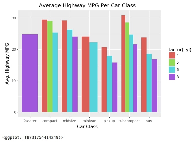
We'll now explain one more example of creating a bar chart where we'll be creating a side-by-side bar chart. We'll be modifying our original mpg dataframe to create an intermediate dataframe that we'll use for our purpose.
Below we have created a dataframe that has an average for each column of dataframe for each combination of class and cyl. We have created this dataframe by first grouping the original mpg dataframe based on class and cyl columns and then taking an average of entries that falls in each combination of both to get the average for each combination.
mpg_by_class_cyl = mpg.groupby(by=["class","cyl"]).mean().dropna().reset_index()

mpg_by_class_cyl
Below we have created a bar chart where the x-axis represents a class of car models and the y-axis represents the average highway MPG for the car models. We have instructed the method to use different colors based on the number of cylinders. This will show the average highway MPG for each combination of car class and cylinders. The main difference in this chart is position parameter which is set to string 'dodge'. This will instruct plotnine to create side by the side bar chart. If we don't provide this parameter then it'll stack bars on one another for each car class and we'll have one bar per class colored by cylinders.
If we need to create side by side bar chart then we need to set position parameter with value 'dodge'.
qplot(data=mpg_by_class_cyl,
      x="class", y="hwy", fill="factor(cyl)", position="dodge",
      xlab="Car Class", ylab="Avg. Highway MPG",
      geom="col", width=0.8,
      main="Average Highway MPG Per Car Class")
Line Charts
As a part of this section, we'll explain how to create line charts using qplot() function.
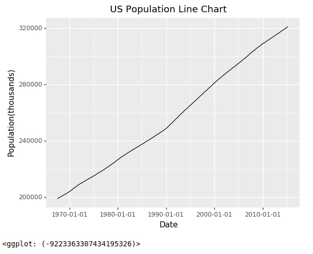
Below we have created the first line chart using economics dataset. We have used date column as X-axis and pop column as the Y axis of a line chart. We have provided 'line' string to geom parameter to instruct plotnine for creating line chart. It'll call geom_line() method to create line chart internally.
qplot(data=economics,
      x="date", y="pop", #color="'tomato'",
      geom="line",
      xlab="Date", ylab="Population(thousands)", margins=True,
      main="US Population Line Chart")
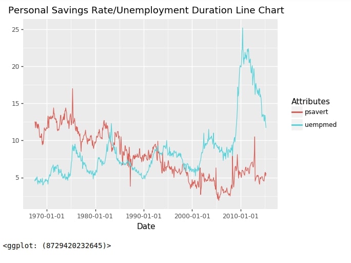
We generally need to include more than one line in our line chart. We can do that as well. We'll be modifying our original dataframe and create one intermediate dataframe in order to create a line chart with 2 lines. The first line will show the personal savings rate over time and the second line will show the unemployment rate.
Below we have created an intermediate dataframe where we have the first column with an entry for the date, the second column represents the name of the columns from the original dataframe and the third column represents the value of the column provided in the second column for that date. We have created this dataframe using melt() function of pandas. The second column will have values psavert and uempmed for each date.
import pandas as pd

economics2 = pd.melt(economics, id_vars=["date"], value_vars=["psavert", "uempmed"], var_name="Attributes", value_name="Attr_Value")

economics2.head()
We have now created a line chart with 2 lines using the dataframe created in the previous cell. The first line represents the personal savings rate and the second line represents the unemployment rate.
qplot(data=economics2,
      x="date", y="Attr_Value",  color="Attributes",
      geom="line",
      xlab="Date", ylab="",
      main="Personal Savings Rate/Unemployment Duration Line Chart")
Area Charts
As a part of this section, we'll explain how to create area charts using qplot() function.
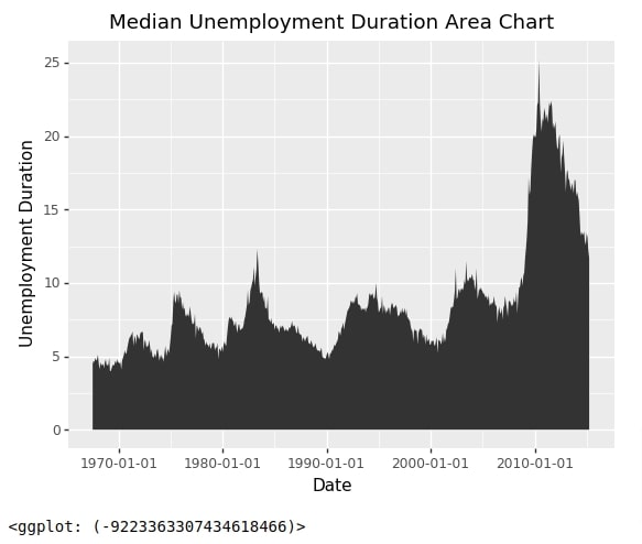
Below we have created an area chart using the same parameter settings as our first line chart. The only difference is that we have provided string 'area' to geom parameter to instruct plotnine to create an area chart. The x-axis represents a date and the y-axis represents the unemployment rate. The area below the line is filled. This method internally calls geom_area() method to create an area chart.
qplot(data=economics,
      x="date", y="uempmed", #fill="'tomato'",
      geom="area",
      xlab="Date", ylab="Unemployment Duration",
      main="Median Unemployment Duration Area Chart")
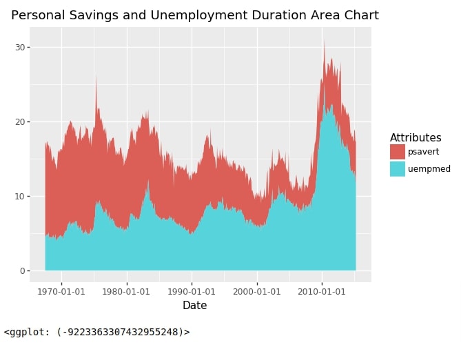
Below we have created another area chart using an intermediate economics dataframe created when explaining line charts. The parameter settings are exactly the same as that of the line chart with only one difference which is using 'area' string for geom parameter for the area chart.
qplot(data=economics2,
      x="date", y="Attr_Value", fill="Attributes",
      geom="area",
      xlab="Date", ylab="",
      main="Personal Savings and Unemployment Duration Area Chart")
Histogram
In this section, we'll explain how to create histograms using qplot() function.
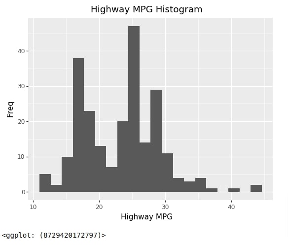
Below we have created a histogram showing the distribution of highway MPG. We have provided geom parameter with value 'histogram' for instructing plotnine to create histogram based on data. Histogram only needs us to provide x parameter value. We can also provide a number of bins using bins parameter. It'll pass bins parameter to geom_histogram() method internally.
qplot(data=mpg,
      x="hwy", bins=20,
      geom="histogram",
      xlab="Highway MPG", ylab="Freq",
      main="Highway MPG Histogram")
Box Plot
In this section, we'll explain how to create a boxplot using qplot() function.
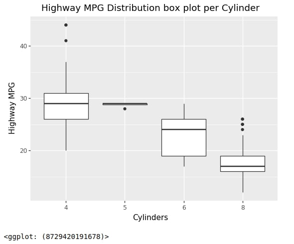
Below we have created the first boxplot showing the distribution of highway MPG for each cylinder’s count. We have set x parameter with value cyl and y parameter with value hwy for creating this chart. The geom parameter is set with string value 'boxplot'. This will instruct plotnine internally to call geom_boxplot() method to create boxplot.
qplot(data=mpg,
      x="factor(cyl)", y="hwy",
      geom="boxplot",
      xlab="Cylinders", ylab="Highway MPG",
      main="Highway MPG Distribution box plot per Cylinder")
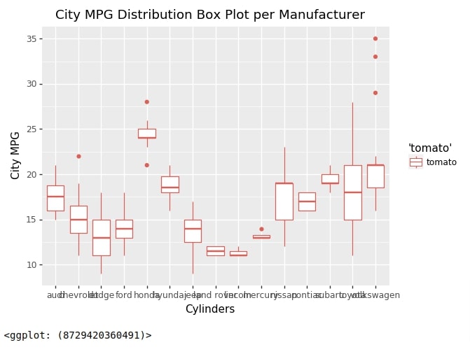
Below we have created another box plot showing the distribution of city MPG for each manufacturer.
qplot(data=mpg,
      x="manufacturer", y="cty", color="'tomato'",
      geom="boxplot",
      xlab="Cylinders", ylab="City MPG",
      main="City MPG Distribution Box Plot per Manufacturer")
Heatmap
In this section, we'll explain steps to create a heatmap using qplot() function.
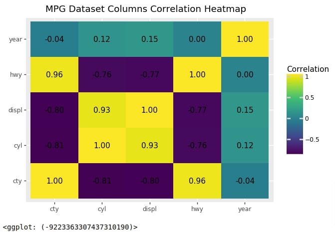
The first heatmap that we'll create will show a correlation between columns of mpg dataset.
We have first created a dataset that has correlation data for mpg dataset using corr() method of pandas dataframe. We have then modified the structure of the correlation dataframe so that the new dataframe has only 3 columns. The first column and second column represent a combination of mpg column names and the third column represents the correlation between that combination. We'll be using this modified dataframe for creating a heatmap.
mpg_corr = mpg.corr()

data = []
for val1 in mpg_corr.index:
    for val2 in mpg_corr.columns:
        data.append([val1, val2, mpg_corr.loc[val1, val2]])

mpg_corr = pd.DataFrame(data=data, columns=["Val1", "Val2", "Correlation"])

mpg_corr
Below we have created our first heatmap using qplot() function. We have provided the first column of the dataframe to x parameter, the second column name to y parameter, and the third correlation column name to label parameter. The fill parameter will inform the color of the rectangles based on correlation values. The label parameter will inform to use the value of correlation as a label. The value of geom parameter is set with a list of strings. The first string is 'tile' which will be responsible for creating rectangles for each combination with colors in them and the second string is 'text' which will show actual correlation values inside of each rectangle. We have also provided format_string parameter with string format that we want to use for labels inside of rectangles.
Please make a NOTE that this is the first time we have set geom parameter with more than one string. This example demonstrates how we can combine more than one geometric object.
qplot(data=mpg_corr,
      x="Val1", y="Val2", fill="Correlation", label="Correlation",
      format_string='{:.2f}',
      geom=["tile", "text"],
      xlab="", ylab="",
      main="MPG Dataset Columns Correlation Heatmap",
     )
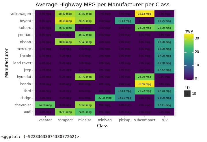
We'll now create one more heatmap where we'll show the average highway MPG for each manufacturer and car class combination.
To do that, we have created an intermediate dataframe that has an entry for average values of dataframe columns for each combination of manufacturer and car class. We have created this dataframe by using the grouping functionality of pandas. We'll use this dataframe to create our second heatmap.
mpg2 = mpg.groupby(["manufacturer", "class"]).mean().fillna(0).reset_index()

mpg2
Below we have created our second heatmap using the intermediate dataframe which we created in the previous cell. We have provided class column as x parameter, manufacturer column as y parameter and hwy column as fill & label parameters. We have also modified format_string to include text mpg in it.
heatmap2 = qplot(data=mpg2,
                  x="class", y="manufacturer", fill="hwy", label="hwy",
                  format_string='{:.2f} mpg', size=10,
                  geom=["tile", "text"],
                  xlab="Class", ylab="Manufacturer",
                  main="Average Highway MPG per Manufacturer per Class",
                 )

heatmap2
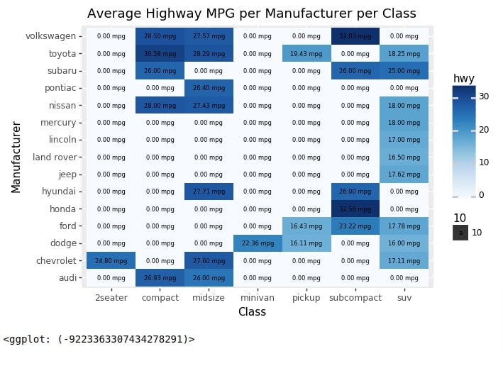
Below we have explained how we can change the default colormap of the heatmap. We can call scale_fill_cmap() method with the appropriate colormap name and then add it to the chart to change the default colormap.
from plotnine import scale_fill_cmap

heatmap2 + scale_fill_cmap(cmap_name="Blues")
Subplots
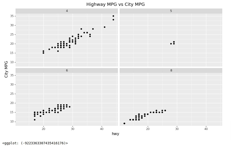
As a part of this section, we'll explain how we can use facets parameter of qplot() method to create subplots based on a categorical column of data. We have imported theme function from plotnine which we'll use to modify the default figure size. As we had explained earlier, the facets parameter accepts the categorical column name of the dataset. The dataset will be divided based on individual values of a categorical column and one chart will be created for each categorical value using other parameters settings of qplot() method.
from plotnine import theme
Below we have created our first faceted chart using mpg dataset showing the relationship between highway MPG and city MPG for each value of cyl column.
qplot(data=mpg, x="hwy", y="cty", #color="displ",
      facets="cyl",
      xlabe="Highway MPG", ylab="City MPG",
      main="Highway MPG vs City MPG")\
+ \
theme(figure_size=(11,6))
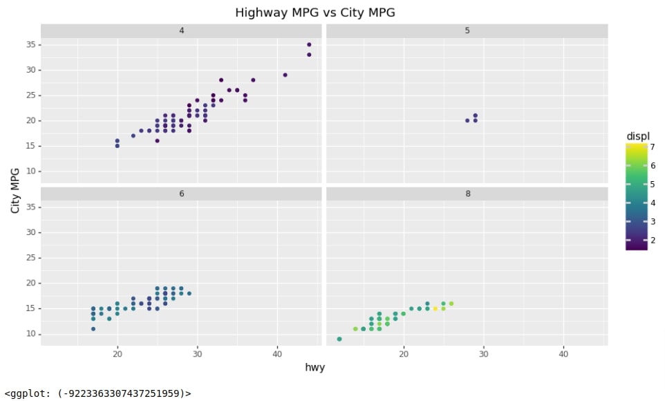
Below we have created one more faceted plot which has almost the same code as the previous cell with only one addition. We have color-encoded points of charts based on engine displacement.
qplot(data=mpg, x="hwy", y="cty", color="displ",
      facets="cyl",
      xlabe="Highway MPG", ylab="City MPG",
      main="Highway MPG vs City MPG")\
+ \
theme(figure_size=(11,6))
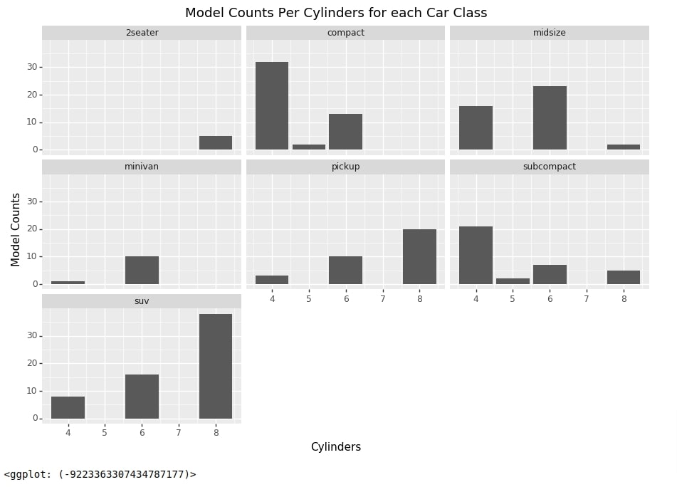
Below we have created another faceted chart where each individual chart is a bar chart representing model counts per cylinders for each car class.
qplot(data=mpg,
      x="cyl",
      geom="bar", facets="class",
      xlab="Cylinders", ylab="Model Counts",
      main="Model Counts Per Cylinders for each Car Class"
     )\
+ \
theme(figure_size=(11,7))
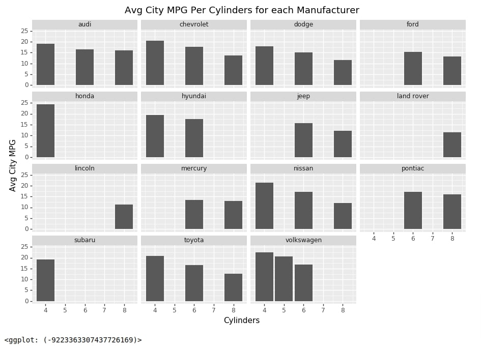
We'll now explain another example of creating a faceted chart of bar charts. We have first created an intermediate dataframe for our purpose which has average values of dataframe columns for each combination of manufacturer and cylinders. We'll be using this column to create our faceted chart.
mpg_avg = mpg.groupby(["manufacturer", "cyl"]).mean().fillna(0).reset_index()

mpg_avg.head()
Below we have created a faceted chart where each individual bar chart represents the average city MPG for car cylinders per manufacturer.
qplot(data=mpg_avg,
      x="cyl", y="cty",
      geom="col", facets="manufacturer",
      xlab="Cylinders", ylab="Avg City MPG",
      main="Avg City MPG Per Cylinders for each Manufacturer"
     )\
+ \
theme(figure_size=(11,7))
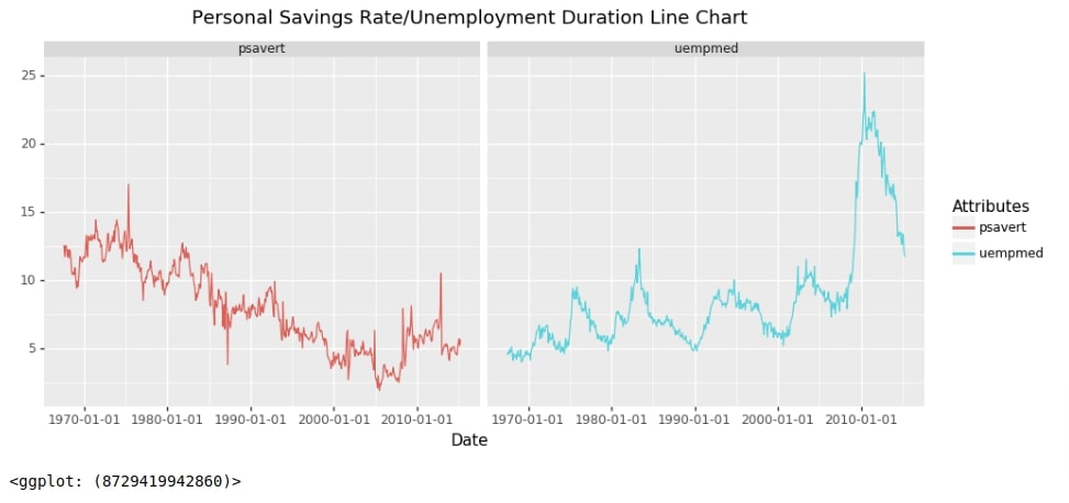
Below we have created a faceted chart where an individual chart is a line chart. The first line chart represents personal savings over time and the second chart represents the unemployment rate over time. We have used one intermediate dataframe that we had created during our line charts section.
qplot(data=economics2,
      x="date", y="Attr_Value",  facets="Attributes", color="Attributes",
      geom="line", asp=0.8, margins=True,
      xlab="Date", ylab="",
      main="Personal Savings Rate/Unemployment Duration Line Chart",)\
+ \
theme(figure_size=(11,6))
This ends our small tutorial explaining how we can use qplot() method to quickly create a chart with just one function call and one line of code. Please feel free to let us know your views in the comments section.
References
 Sunny Solanki
Sunny Solanki
Intro: Software Developer | Youtuber | Bonsai Enthusiast
About: Sunny Solanki holds a bachelor's degree in Information Technology (2006-2010) from L.D. College of Engineering. Post completion of his graduation, he has 8.5+ years of experience (2011-2019) in the IT Industry (TCS). His IT experience involves working on Python & Java Projects with US/Canada banking clients. Since 2020, he’s primarily concentrating on growing CoderzColumn.
His main areas of interest are AI, Machine Learning, Data Visualization, and Concurrent Programming. He has good hands-on with Python and its ecosystem libraries.
Apart from his tech life, he prefers reading biographies and autobiographies. And yes, he spends his leisure time taking care of his plants and a few pre-Bonsai trees.
Contact: sunny.2309@yahoo.in


![YouTube Subscribe]() Comfortable Learning through Video Tutorials?
Comfortable Learning through Video Tutorials?
If you are more comfortable learning through video tutorials then we would recommend that you subscribe to our YouTube channel.
![Need Help]() Stuck Somewhere? Need Help with Coding? Have Doubts About the Topic/Code?
Stuck Somewhere? Need Help with Coding? Have Doubts About the Topic/Code?
 Stuck Somewhere? Need Help with Coding? Have Doubts About the Topic/Code?
When going through coding examples, it's quite common to have doubts and errors.
If you have doubts about some code examples or are stuck somewhere when trying our code, send us an email at coderzcolumn07@gmail.com. We'll help you or point you in the direction where you can find a solution to your problem.
You can even send us a mail if you are trying something new and need guidance regarding coding. We'll try to respond as soon as possible.
![Share Views]() Want to Share Your Views? Have Any Suggestions?
Want to Share Your Views? Have Any Suggestions?
 Want to Share Your Views? Have Any Suggestions?
If you want to
- provide some suggestions on topic
- share your views
- include some details in tutorial
- suggest some new topics on which we should create tutorials/blogs
 plotnine, quick-plots