Maps using Plotnine (Choropleth, Scatter, and Bubble Maps)
Datasets nowadays generally have location-related information present in them. Accurately plotting location-related information on maps can give useful insights which can help make a better decision during data analysis. Location information can be present in the form of exact location name (Country, city, etc), location id, or longitude & latitude information. Other information can be presented on a map by merging it with geospatial data. Map charts like choropleth maps, scatter maps, bubble maps and connection maps are commonly used to represents information on maps. Python provides a list of libraries (geopandas, bokeh, plotly, folium, ipyleaflet, etc.) to deal with geospatial data and present information on a map. Some of them provide static maps whereas some provide interactive maps.
As a part of this tutorial, we'll be concentrating on library name Plotnine to create maps in python. We'll be creating choropleth maps and scatter maps with simple examples. Plotnine is a python library that is based on the concept of the grammar of graphics. The plotnine has almost the same interface as that of ggplot2 library of R Programming. The grammar of the graphics concept defines the chart into a list of layers, creates layers individually, and then combines them to create a full chart. We have covered in detail how Plotnine works and how to get started with it in a separate tutorial. If you are interested in learning about it then please feel free to check it.
We won't be covered in details about the inner workings of plotnine or other details as it has already been covered in that tutorial. In this tutorial, we'll start directly with chart creation as we expect that the individual reading this tutorial has a little background of plotnine. If you are just starting out with plotnine then we recommend that you take some time and read our tutorial about it linked above as it'll help you get started with the library.
We'll start by importing the necessary libraries for our tutorial. We have imported geopandas as it provides a dataframe that has geospatial data for the world. We'll be using the data frames available from it for our tutorial.
import plotnine
import geopandas as gpd
import pandas as pd

print("Plotnine Version : {}".format(plotnine.__version__))
print("Geopandas Version : {}".format(gpd.__version__))

gpd.datasets.available
Below we have loaded naturalearth_lowres dataset which has geospatial data about the whole world. We'll be using it to plot a world map and other information on it. We have loaded it as a geopandas dataframe and printed the first few rows to give an idea about the contents of the dataset.
world = gpd.read_file(gpd.datasets.get_path("naturalearth_lowres"))
print("Geometry Column Name : ", world.geometry.name)
print("Dataset Size : ", world.shape)
world.head()
Below we have loaded another geo JSON dataset that has geospatial information about US states. It has geometry information (polygon representing the state) about each state of the US. We'll be using this dataset to represent on US map.
The dataset can be downloaded from the below link.
us_states_geo = gpd.read_file("datasets/us-states.json")

us_states_geo.head()
The third dataset that we have loaded is world happiness data which has information for each country about attributes like happiness, GDP, social support, healthy life expectancy, etc. We'll be merging this dataset with the geopandas world dataset loaded earlier to create maps with information present from this dataset.
world_happiness = pd.read_csv("datasets/world_happiness_2019.csv")
print("Dataset Size : ",world_happiness.shape)
world_happiness.head()
Below we have merged the world happiness dataset loaded in the previous cell with the geopandas world dataset based on the country name. We have printed the first few rows of the dataset to show data present in the dataframe.
world_total_data = world.merge(world_happiness, left_on="name", right_on="Country or region")

world_total_data.head()
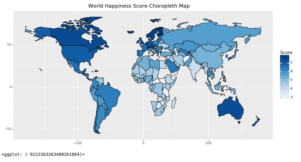
World Happiness Choropleth Map
As a part of this section, we have created a choropleth map of the world happiness score. The country is colored based on the happiness score of that country. The score ranges from 0-10.
Our code for this example creates individual layers of the map and then adds them all to create the final map. We have first created a chart with data and mapping information. The mapping information (aes function call) states that fill color should be based on Score column. We have then created a map using geom_map() method. Then we have created a title for the chart. We have also created theme details and colormap details objects separately. At last, we have added all individual layers to create the final choropleth map. This is the same format, we'll be following to create all maps.
Please make a note that data provided for plotnine for plotting maps requires column named geometry in them which should have information about map objects (polygons representing country, states, city, etc.).
from plotnine import ggplot, geom_map, aes, scale_fill_cmap, theme, labs

chart = ggplot(data=world_total_data, mapping=aes(fill="Score"))
map_proj = geom_map()
labels = labs(title="World Happiness Score Choropleth Map")
theme_details = theme(figure_size=(12,6))
colormap = scale_fill_cmap(cmap_name="Blues")

world_happiness_choropleth = chart + map_proj + labels + theme_details + colormap

world_happiness_choropleth
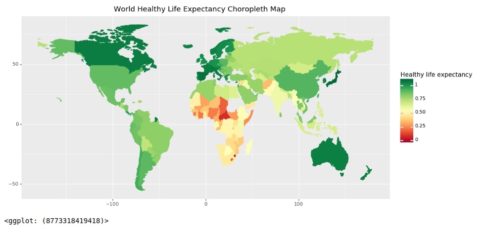
World Healthy Life Expectancy Choropleth Map
Below we have created another choropleth map which shows information about healthy life expectancy for countries worldwide. We have used the same approach to create a chart like our previous example. The code for this example is almost the same as the previous example with few minor changes.
We have added color attribute in mapping to inform it what color of the line should be in each country. We have set it the same as fill attribute so that it blends in with fill color, unlike the previous map chart. We have also used different colormap in this example.
from plotnine import scale_color_cmap

chart = ggplot(data=world_total_data, mapping=aes(fill="Healthy life expectancy", color="Healthy life expectancy"))
map_proj = geom_map()
labels = labs(title="World Healthy Life Expectancy Choropleth Map")
theme_details = theme(figure_size=(12,6))
fill_colormap = scale_fill_cmap(cmap_name="RdYlGn")
color_colormap = scale_color_cmap(cmap_name="RdYlGn")

world_happiness_choropleth = chart + map_proj + labels + theme_details + fill_colormap + color_colormap

world_happiness_choropleth
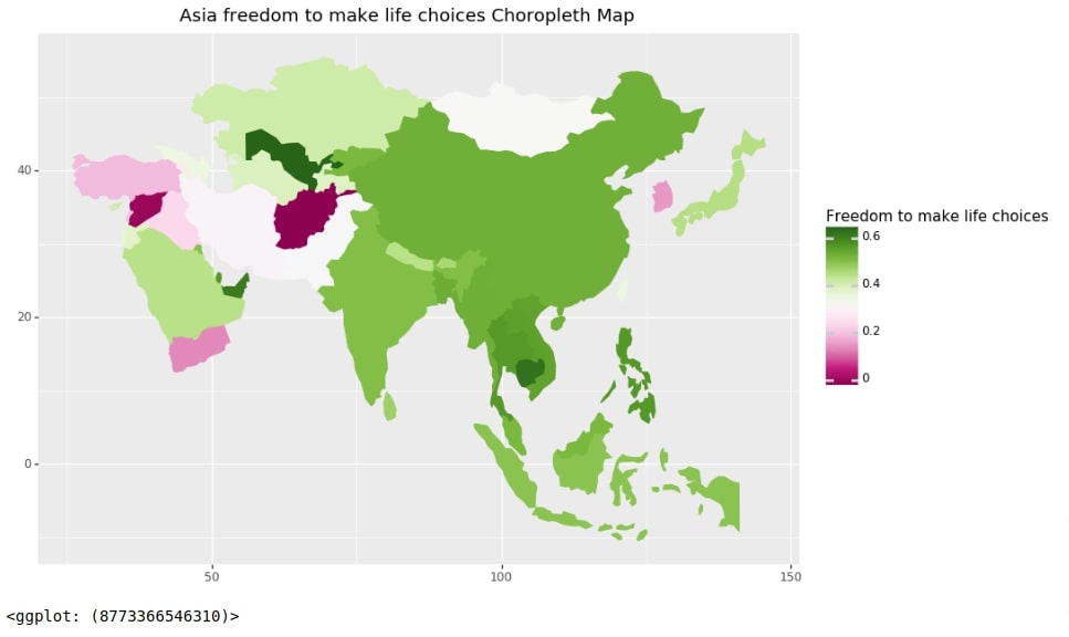
Freedom to Make Life Choices in Asian Countries
As a part of this section, we have created a choropleth map representing freedom to make life choices in Asian countries.
To create this map, we have filtered our world dataset to keep only entries where continent is Asia. We have then followed the same steps as the previous example to create a choropleth map.
asia_data = world_total_data[world_total_data["continent"] == 'Asia']

chart = ggplot(data=asia_data, mapping=aes(fill="Freedom to make life choices", color="Freedom to make life choices"))
map_proj = geom_map()
labels = labs(title="Asia freedom to make life choices Choropleth Map")
theme_details = theme(figure_size=(10,7))
fill_colormap = scale_fill_cmap(cmap_name="PiYG")
color_colormap = scale_color_cmap(cmap_name="PiYG")

asia_happiness_choropleth = chart + map_proj + labels + theme_details + fill_colormap + color_colormap

asia_happiness_choropleth
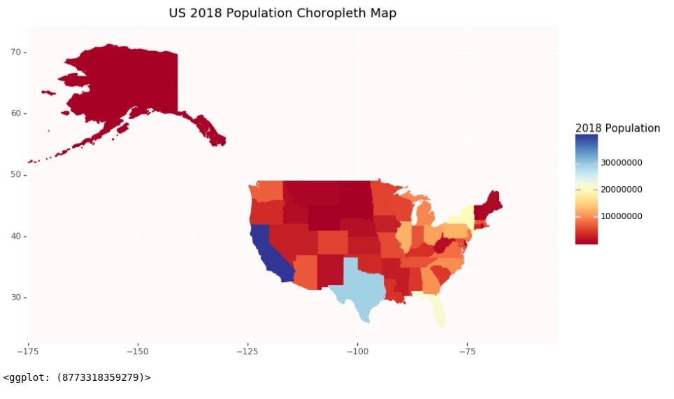
US States Population 2018 Choropleth Map
As a part of this example, we'll create a choropleth map showing a population of US states in 2018. We have loaded the dataset first as a pandas data frame.
us_state_pop = pd.read_csv("datasets/State Populations.csv")
us_state_pop.head()
Below we have created a dataset by merging the US states geo dataframe and the US states population dataset. We'll be using this merged dataset which has both geospatial and population details for each state to plot a choropleth map.
us_states_pop = us_states_geo.merge(us_state_pop, left_on="name", right_on="State")

us_states_pop.head()
Below we have created a choropleth map using a dataframe from the previous step representing the US states population. Our code follows the same approach that we have followed in our previous examples. We have added few extra lines of code to improve the aesthetics of the chart. We have put x/y axes limits and modified the chart background color.
from plotnine import scale_color_cmap, xlim, ylim, element_rect

chart = ggplot()
map_proj = geom_map(data=us_states_pop, mapping=aes(fill="2018 Population", color="2018 Population"))
labels = labs(title="US 2018 Population Choropleth Map")
theme_details = theme(figure_size=(10,6), panel_background=element_rect(fill="snow"))
fill_colormap = scale_fill_cmap(cmap_name="RdYlBu")
color_colormap = scale_color_cmap(cmap_name="RdYlBu")
xlimit = xlim(-170,-60)
ylimit = ylim(25, 72)

us_pop_choropleth = chart + map_proj + labels + theme_details + fill_colormap + color_colormap + xlimit + ylimit

us_pop_choropleth
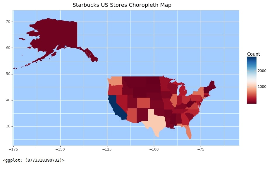
Starbucks Store Count Per US States
In this example, we'll be plotting the Starbucks store count for each state of the US. We have downloaded the Starbucks stores information dataset from the below link and loaded it as a pandas dataframe. We have printed the first few lines to show the contents of the dataset.
starbucks_stores = pd.read_csv("datasets/starbucks_store_locations.csv")

starbucks_stores.head()
Below we have filtered the Starbucks dataset to keep only rows where a country is the US. We have then grouped the filtered dataset based on state and calculated the count of entries per state. The final dataset will have a count of Starbucks stores for each state.
us_stores = starbucks_stores[starbucks_stores.Country=="US"]
us_stores_statewise_cnt = us_stores.groupby("State/Province").count()[["Store Name"]].rename(columns={"Store Name":"Count"})
us_stores_statewise_cnt = us_stores_statewise_cnt.reset_index()
us_stores_statewise_cnt.head()
Below we have merged the Starbucks US stores count dataset from the previous cell with the US states geo dataset from earlier. The final merged dataset will have information about geographical data of US states and Starbucks stores count per state.
us_stores_statewise = us_states_geo.merge(us_stores_statewise_cnt, left_on="id", right_on="State/Province")

us_stores_statewise.head()
Below we have created a choropleth map which shows Starbucks stores count for each state of the united states. We can use it to analyze where Starbucks stores are concentrated more and where it's less.
from plotnine import scale_color_cmap, xlim, ylim, element_rect

chart = ggplot()
map_proj = geom_map(data=us_stores_statewise, mapping=aes(fill="Count", color="Count"))
labels = labs(title="Starbucks US Stores Choropleth Map")
theme_details = theme(figure_size=(10,6), panel_background=element_rect(fill="#a3ccff"))
fill_colormap = scale_fill_cmap(cmap_name="RdBu")
color_colormap = scale_color_cmap(cmap_name="RdBu")
xlimit = xlim(-170,-60)
ylimit = ylim(25, 72)

us_stores_choropleth = chart + map_proj + labels + theme_details + fill_colormap + color_colormap + xlimit + ylimit

us_stores_choropleth
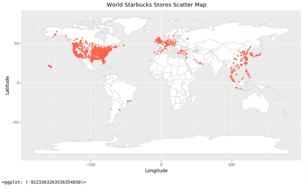
Starbucks Store Locations Across World
In this example, we'll explain how we can put points on a map to create a scatter map. We'll show locations of stores worldwide using a scatter map. This can be used to analyze the concentration of stores.
Our code for this example starts by creating a chart with the world dataset that we had loaded earlier from geopandas. We then add mapping to the chart as a part of geom_map() method. We have this time not provided the column name of the dataset in mapping. Instead, we have provided a single value to color all countries and their border using one color.
We have added points on the chart using geom_point() method. We have provided the Starbucks stores dataset that we had loaded earlier and mapping details to it. The mapping details instructs to use Longitude columns as X-axis and Latitude column as Y-axis. We have instructed to color points with tomato color.
At last, we have created the final scatter map by adding up all individual layers.
from plotnine import geom_point

chart = ggplot(data=world)
map_proj = geom_map(fill="white", color="lightgrey")
labels = labs(title="World Starbucks Stores Scatter Map")
theme_details = theme(figure_size=(12,6.5))

scatter_points = geom_point(data=starbucks_stores.dropna(),
                            mapping=aes(x="Longitude", y="Latitude"),
                            color="tomato", alpha=0.3, size=1)

world_starbucks_stores = chart + map_proj + labels + theme_details + scatter_points

world_starbucks_stores
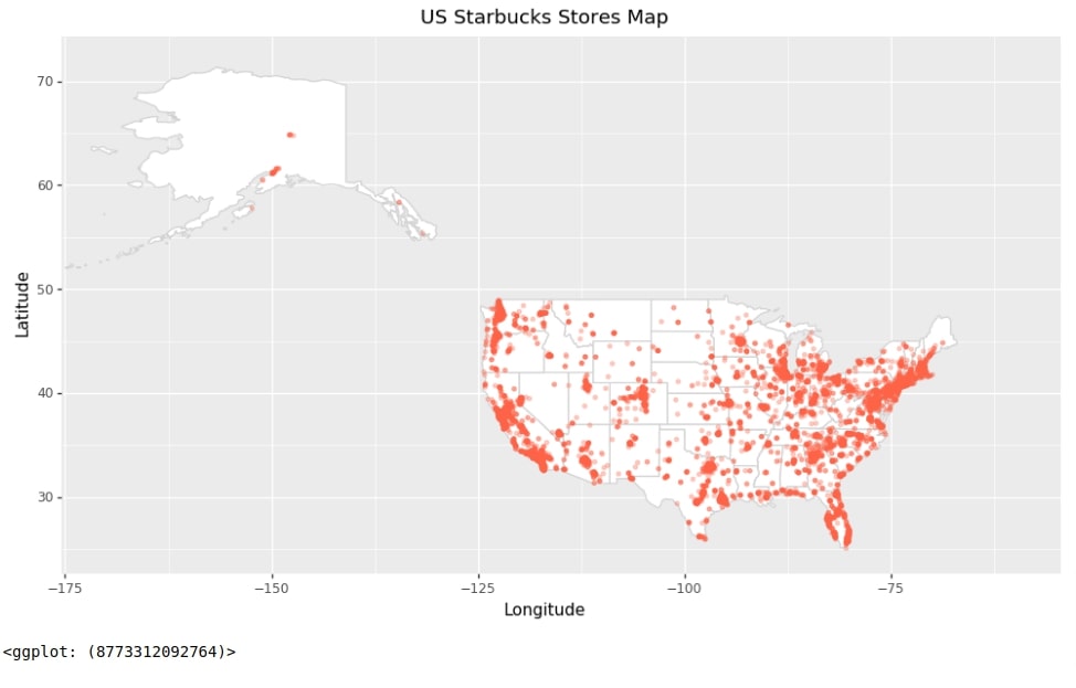
Starbucks Store Locations Across US
In this example, we have created a scatter map showing store locations across the US. The code is almost exactly the same as our previous example with few minor changes. It uses the US state geo dataset for plotting the US chart and us stores dataset to plot points showing store locations on a map.
chart = ggplot(data=us_states_geo)
map_proj = geom_map(fill="white", color="lightgrey")
labels = labs(title="US Starbucks Stores Map")
theme_details = theme(figure_size=(12,6.5))
xlimit = xlim(-170,-60)
ylimit = ylim(25, 72)

scatter_points = geom_point(data=us_stores.dropna(),
                            mapping=aes(x="Longitude", y="Latitude"),
                            color="tomato", alpha=0.3, size=1)

us_starbucks_stores = chart + map_proj + labels + theme_details + xlimit + ylimit + scatter_points

us_starbucks_stores
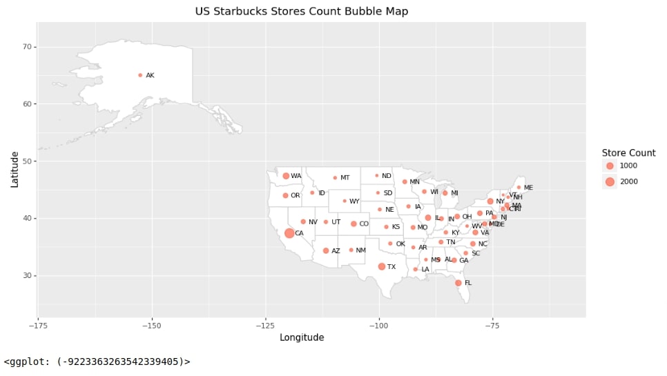
Store Count per US States Bubble Map
As a part of this example, we'll create a bubble map that shows bubbles on the US chart for each state where bubble size will be based on a count of Starbucks stores in that state.
We have created a helpful method named calculate_center() which takes as input pandas dataframe which has one column with geodata and returns center of the region represented by each individual geographic region. We'll be using this method to find the center of each region which is an individual US state in our case and will be plotting bubbles on the map at those center locations.
We have introduced extra columns center, x, x2, and y for our purpose in our US Starbucks stores count dataset. The x2 column is column x shifted by value of 2.2. This is done to prevent labels from overlapping on bubbles. We'll be using this final modified dataset for plotting a bubble map.
def calculate_center(df):
    """
    Calculate the centre of a geometry

    This method first converts to a planar crs, gets the centroid
    then converts back to the original crs. This gives a more
    accurate
    """
    original_crs = df.crs
    planar_crs = 'EPSG:3857'
    return df['geometry'].to_crs(planar_crs).centroid.to_crs(original_crs)

us_stores_statewise["center"] = calculate_center(us_stores_statewise)
us_stores_statewise["x"] = [val.x for val in us_stores_statewise.center]
us_stores_statewise["x2"] = [val.x+2.2 for val in us_stores_statewise.center]
us_stores_statewise["y"] = [val.y for val in us_stores_statewise.center]

us_stores_statewise.head()
Below we have created a bubble map showing Starbucks stores count for each state. The code starts by creating a map of US states.
Points are added to chart using geom_point() method. We have provided a dataset created in the previous cell to this method. The mapping information provided to geom_point() instructs to use x column for X-axis, y column for Y-axis and Count column for size of points/bubbles.
Text annotation of US states abbreviations are added to map using geom_text() method. The mapping information provided to geom_text() instructs to use x2 column for X-axis, y column for Y-axis and State/Province column for each label.
At last, we have added individual layers that we created to create a final bubble map.
from plotnine import geom_text

chart = ggplot(data=us_states_geo)
map_proj = geom_map(fill="white", color="lightgrey")
labels = labs(x="Longitude", y="Latitude", title="US Starbucks Stores Count Bubble Map", size="Store Count")
theme_details = theme(figure_size=(12,6.5))
xlimit = xlim(-170,-60)
ylimit = ylim(25, 72)

scatter_points = geom_point(data=us_stores_statewise.dropna(),
                            mapping=aes(x="x", y="y", size="Count"),
                            color="tomato", alpha=0.7)

texts = geom_text(data=us_stores_statewise.dropna(),
                            mapping=aes(x="x2", y="y", label="State/Province"),
                            color="black", size=8)

us_starbucks_stores = chart + map_proj + labels + theme_details + xlimit + ylimit + scatter_points + texts

us_starbucks_stores
This ends our small tutorial explaining how we can create choropleth maps, scatter maps, and bubble maps using Plotnine. Please feel free to let us know your views in the comments section. If you want to create maps using other libraries then please check our References section which has more tutorials.
Reference
- Choropleth Maps using ipyleaflet [Python]
- Choropleth Maps & Scatter Maps using cufflinks [Python]
- Interactive Choropleth Maps using bqplot [Python]
- Cartopy - Basic Maps [Scatter Map, Bubble Map and Connection Map]
- Plotting Maps using Bokeh [Python]
- ipyleaflet [Python] - Interactive Maps in Python based on leafletjs
- Folium - Interactive Maps [Python]
- How to Create Connection Map Chart in Python Jupyter Notebook [Plotly & Geopandas]?
- hvplot - How to Convert Static Python Maps (Geopandas) to Interactive Maps?
 Sunny Solanki
Sunny Solanki
Intro: Software Developer | Youtuber | Bonsai Enthusiast
About: Sunny Solanki holds a bachelor's degree in Information Technology (2006-2010) from L.D. College of Engineering. Post completion of his graduation, he has 8.5+ years of experience (2011-2019) in the IT Industry (TCS). His IT experience involves working on Python & Java Projects with US/Canada banking clients. Since 2020, he’s primarily concentrating on growing CoderzColumn.
His main areas of interest are AI, Machine Learning, Data Visualization, and Concurrent Programming. He has good hands-on with Python and its ecosystem libraries.
Apart from his tech life, he prefers reading biographies and autobiographies. And yes, he spends his leisure time taking care of his plants and a few pre-Bonsai trees.
Contact: sunny.2309@yahoo.in


![YouTube Subscribe]() Comfortable Learning through Video Tutorials?
Comfortable Learning through Video Tutorials?
If you are more comfortable learning through video tutorials then we would recommend that you subscribe to our YouTube channel.
![Need Help]() Stuck Somewhere? Need Help with Coding? Have Doubts About the Topic/Code?
Stuck Somewhere? Need Help with Coding? Have Doubts About the Topic/Code?
 Stuck Somewhere? Need Help with Coding? Have Doubts About the Topic/Code?
When going through coding examples, it's quite common to have doubts and errors.
If you have doubts about some code examples or are stuck somewhere when trying our code, send us an email at coderzcolumn07@gmail.com. We'll help you or point you in the direction where you can find a solution to your problem.
You can even send us a mail if you are trying something new and need guidance regarding coding. We'll try to respond as soon as possible.
![Share Views]() Want to Share Your Views? Have Any Suggestions?
Want to Share Your Views? Have Any Suggestions?
 Want to Share Your Views? Have Any Suggestions?
If you want to
- provide some suggestions on topic
- share your views
- include some details in tutorial
- suggest some new topics on which we should create tutorials/blogs
 maps, plotnine, choropleth