Simple Guide to Create Animation using Bokeh
Nowadays, It's quite common to use animation to depict changes in some measure over time on social media platforms and various dashboards.
You might have seen an animation of bar charts on Twitter or LinkedIn showing things like world GDP over time, an approval rating of presidents over time, COVID deaths / cases over time, etc. The stock market has a moving candlestick chart for every second price change.
Python is the most preferred library to analyze data and it has a bunch of libraries that let us create interactive visualizations as well as animations.
Bokeh is one such library that has a rich set of features and lets us create aesthetically pleasing interactive charts.
What Can You Learn From This Article?
As a part of this tutorial, we have explained how to create animation using Python data visualization library bokeh. Tutorial explains simple animation like moving candlestick chart, line chart, bar chart, etc. Tutorial uses widgets available from bokeh to control animation. We'll be running animation as an independent server.
If you are new to Bokeh, we recommend you go through the link below, which covers basic charts and will get you started with library fast.
One more tutorial that we recommend can be beneficial for this tutorial is our simple guide on using bokeh widgets. Please feel free to explore it in your free time.
Below, we have listed important sections of tutorial to give an overview of the material covered.
Important Sections Of Tutorial
Below, we have imported Python library bokeh and printed version of it that we have used in our tutorial.
import bokeh

print("Bokeh Version : {}".format(bokeh.__version__))
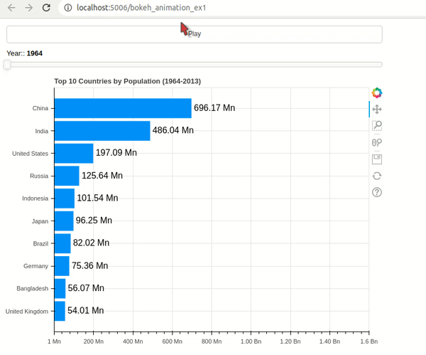
Example 1: Bar Chart Animation 
As a part of our first example, we have explained how we can create bar chart animation using Bokeh. We'll be using gapminder dataset available from bokeh sample data for our purpose. The dataset has population details of countries of world from 1964 to 2013.
We have created a simple animation that shows top 10 countries by population as a bar chart. The bar height changes as year changes.
Below, we have imported dataset and displayed few rows to give an overview of the content.
from bokeh.sampledata.gapminder import population, fertility, life_expectancy

population.head()
Initially, we have created a bar chart showing the top 10 countries by population for year 1964. We have created a horizontal bar chart for our purpose. We have filtered original dataframe to create a dataframe of top 10 countries by population which we have used to create a bar chart.
After creating chart, we have created two widgets that we'll use for our purpose.
- Button
- Slider
The button widget will be used to play and pause animation.
The slider widget can be used to explore population during any particular year.
After defining widgets, we have created callbacks that will be called each time value of widget changes.
The callback linked to button widget simply adds a callback to current document using add_periodic_callback(). This method calls callback named update_chart() every 200 milliseconds. Based on current value of button, it adds (Play) and removes callback (Pause).
Once we click button, this callback will be executed every 200 milliseconds. These function simply updates current year which we have stored as a global variable and assigns it to slider value. As slider value changes, the callback linked to it'll be called which updates chart.
The callback linked to slider creates an intermediate dataframe of the top 10 countries by population based on current slider year and then assigns this dataframe to chart which updates chart.
After defining callbacks, we have registered them with widgets.
At last, we have created a GUI by calling add_root() method on currdoc(). We have organized widgets and chart in a column using column() function.
## bokeh_animation_ex1.py

from bokeh.sampledata.gapminder import population, fertility, life_expectancy
from bokeh.models import Button, Slider
from bokeh.plotting import figure, column, row
from bokeh.models.ranges import FactorRange
from bokeh.io import curdoc

import time

## Prepare Data
def convert_population(population):
    if population > 1e9:
        pop = "{:.2f} Bn".format(population / 1e9)
    else:
        pop = "{:.2f} Mn".format(population / 1e6)
    return pop

top_10 = population[["1964"]].dropna().sort_values(by=["1964"], ascending=False).reset_index()
top_10 = top_10.rename(columns={"1964": "Population"}).head(10).reset_index()
top_10["index"] = top_10["index"] + 1
top_10["index"] = top_10["index"].values[::-1]
top_10 = top_10.sort_values(by="Population")
top_10["Population_Text"] = top_10["Population"].apply(convert_population)


## Create Chart
fig = figure(width=700, height=500, title="Top 10 Countries by Population (1964-2013)",
             x_range=(0, 1.6e9))

bars = fig.hbar(y="index", right="Population", color="dodgerblue",
                height=0.85, source=top_10)
text = fig.text(x="Population", y="index", text="Population_Text", x_offset=5,
                text_baseline="middle", source=top_10)

x_range = list(map(int, [0, 200e6, 400e6, 600e6, 800e6, 1e9, 1.2e9, 1.4e9, 1.6e9]))
x_range_ticks = ["1 Mn", "200 Mn", "400 Mn", "600 Mn", "800 Mn", "1.00 Bn", "1.20 Bn", "1.40 Bn", "1.6 Bn"]
#fig.xaxis.ticker = x_range
fig.xaxis.major_label_overrides = dict(zip(x_range, x_range_ticks))

fig.yaxis.ticker = list(range(1,11))
fig.yaxis.major_label_overrides = dict(zip(list(range(1,11)), top_10.Country.values))

## Define Widgets
slider = Slider(start=1964, end=2013, value=1964, step=1, title="Year:")
btn = Button(label="Play")

## Define Callbacks
curr_year = 1964
def update_chart():
    global curr_year
    curr_year += 1
    slider.value = curr_year
    if curr_year == 2013:
        curr_year = 1964

callback = None
def execute_animation():
    global callback
    if btn.label == "Play":
        btn.label = "Pause"
        callback = curdoc().add_periodic_callback(update_chart, 100)
    else:
        btn.label = "Play"
        curdoc().remove_periodic_callback(callback)


def modify_chart(attr, old, new):
    idx = "{}".format(slider.value)
    top_10 = population[[idx]].dropna().sort_values(by=[idx], ascending=False).reset_index()
    top_10 = top_10.rename(columns={idx: "Population"}).head(10).reset_index()
    top_10["index"] = top_10["index"] + 1
    top_10["index"] = top_10["index"].values[::-1]
    top_10 = top_10.sort_values(by="Population")
    top_10["Population_Text"] = top_10["Population"].apply(convert_population)

    bars.data_source.data = top_10
    text.data_source.data = top_10

    fig.yaxis.major_label_overrides = dict(zip(list(range(1,10)), top_10.Country.values))


## Register Callbacks
btn.on_click(execute_animation)
slider.on_change("value", modify_chart)

## GUI
curdoc().add_root(column(btn, slider, fig))
We have saved code for our animation to a file named bokeh_animation_ex1.py. We can execute file using below command from command line. It'll start bokeh server at port 5006 and open animation in browser. We can access animation using URL (http://localhost:5006/bokeh_animation_ex1) as well.
bokeh serve --show bokeh_animation_ex1.py
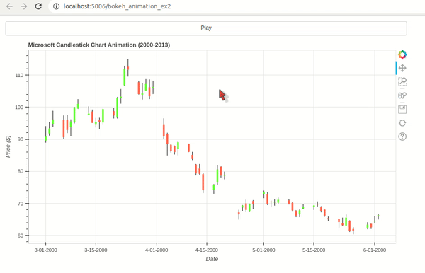
Example 2: Candlestick Chart Animation 
As a part of our second example, we have explained how to create candlestick chart animation using Python data viz bokeh. We have used Microsoft stock data available from bokeh which has data from 2000-2013.
The example starts by creating candlestick chart for first 22 days. It then adds new candle every 200 milliseconds.
This time, we have used only button widget to start and pause animation. The callback registered with button simply adds / removes a callback function to /from current doc using add_periodic_callback() function.
The function registered using add_periodic_callback() simply adds one day's OHLC data to chart on each call.
The animation displays 3 months of data at a time in chart and then removes one entry from start and adds a new one at the end.
If you want to learn how to create candlestick charts using bokeh then please feel free to check below link.
from bokeh.sampledata.stocks import MSFT
from bokeh.models import Button, Slider, DatetimeTickFormatter
from bokeh.plotting import figure, column, row
from bokeh.models.ranges import FactorRange
from bokeh.io import curdoc

import time
import pandas as pd

## Prepare Data
msft_df = pd.DataFrame(MSFT)
msft_df["date"] = pd.to_datetime(msft_df["date"])

## Create Candlestick Charts
days = 22*3 ## 3 Months

inc = msft_df[:days].close > msft_df[:days].open
dec = msft_df[:days].open > msft_df[:days].close

w = 12*60*60*1000

fig = figure(x_axis_type="datetime", plot_width=900, plot_height=500,
             #y_range=(20,120),
             title = "Microsoft Candlestick Chart Animation (2000-2013)")

segments = fig.segment("date", "high", "date", "low", color="black", source=msft_df[:days])

green_patterns = fig.vbar("date", w, "open", "close", fill_color="lawngreen", line_width=0,
                          source=msft_df[:days][inc])

red_patterns = fig.vbar("date", w, "open", "close", fill_color="tomato", line_width=0,
                        source=msft_df[:days][dec])

fig.xaxis.axis_label="Date"
fig.yaxis.axis_label="Price ($)"

fig.xaxis.formatter = DatetimeTickFormatter(days="%m-%d-%Y")

## Define Widgets
btn = Button(label="Play")

## Define Callbacks
curr_cnt = days
def update_chart():
    global curr_cnt
    curr_cnt += 1
    if curr_cnt == len(msft_df):
        curr_cnt = days

    inc = msft_df[curr_cnt-days:curr_cnt].close > msft_df[curr_cnt-days:curr_cnt].open
    dec = msft_df[curr_cnt-days:curr_cnt].open > msft_df[curr_cnt-days:curr_cnt].close

    segments.data_source.data = msft_df[curr_cnt-days:curr_cnt]
    green_patterns.data_source.data = msft_df[curr_cnt-days:curr_cnt][inc]
    red_patterns.data_source.data = msft_df[curr_cnt-days:curr_cnt][dec]

callback = None
def execute_animation():
    global callback
    if btn.label == "Play":
        btn.label = "Pause"
        callback = curdoc().add_periodic_callback(update_chart, 200)
    else:
        btn.label = "Play"
        curdoc().remove_periodic_callback(callback)


## Register Callbacks
btn.on_click(execute_animation)

## GUI
curdoc().add_root(column(btn, fig))
bokeh serve --show bokeh_animation_ex2.py
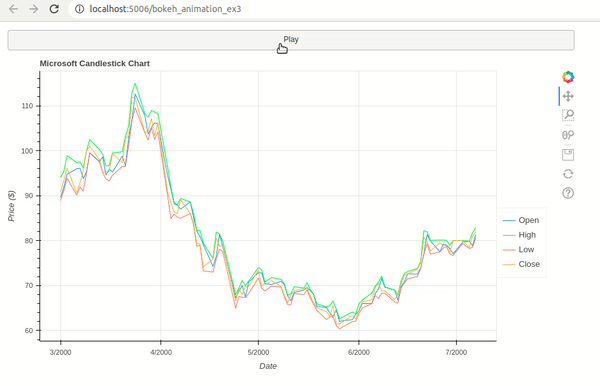
Example 3: Line Chart Animation 
As a part of our third example, we have explained how to create line animation using Python data viz bokeh. We'll reuse Microsoft OHLC dataset available from bokeh for our purpose. The animation displays 4 lines for open, high, low, and close prices of Microsoft stock.
The example starts by creating a line chart for first 90 days. It then adds one new day's OHLC data and removes one old entry.
We have used button widget this time as well to start and stop animation.
from bokeh.sampledata.stocks import MSFT
from bokeh.models import Button, Slider, DatetimeTickFormatter, Legend
from bokeh.plotting import figure, column, row
from bokeh.models.ranges import FactorRange
from bokeh.io import curdoc

import time
from functools import partial
import pandas as pd

## Prepare Data
msft_df = pd.DataFrame(MSFT)
msft_df["date"] = pd.to_datetime(msft_df["date"])

## Create Chart
days = 90


fig = figure(x_axis_type="datetime", plot_width=900, plot_height=500,
             title = "Microsoft Candlestick Chart")

line1 = fig.line(x="date", y="open", color="dodgerblue", source=msft_df[:days])
line2 = fig.line(x="date", y="high", color="lime", source=msft_df[:days])
line3 = fig.line(x="date", y="low", color="tomato", source=msft_df[:days])
line4 = fig.line(x="date", y="close", color="orange", source=msft_df[:days])

fig.xaxis.axis_label="Date"
fig.yaxis.axis_label="Price ($)"

fig.xaxis.formatter = DatetimeTickFormatter(days="%m-%d-%Y")

legend = Legend(items=[
    ("Open",   [line1]),
    ("High",   [line2]),
    ("Low",   [line3]),
    ("Close",   [line4]),
], location=(0, 100))

fig.add_layout(legend, 'right')

## Define Widgets
btn = Button(label="Play")

## Define Callbacks
curr_cnt = days
def update_chart():
    global curr_cnt
    curr_cnt += 1
    if curr_cnt == len(msft_df):
        curr_cnt = days

    line1.data_source.data = msft_df[curr_cnt-days:curr_cnt]
    line2.data_source.data = msft_df[curr_cnt-days:curr_cnt]
    line3.data_source.data = msft_df[curr_cnt-days:curr_cnt]
    line4.data_source.data = msft_df[curr_cnt-days:curr_cnt]

callback = None
def execute_animation():
    global callback
    if btn.label == "Play":
        btn.label = "Pause"
        callback = curdoc().add_periodic_callback(update_chart, 200)
    else:
        btn.label = "Play"
        curdoc().remove_periodic_callback(callback)


## Register Callbacks
btn.on_click(execute_animation)

## GUI
curdoc().add_root(column(btn, fig))
bokeh serve --show bokeh_animation_ex3.py
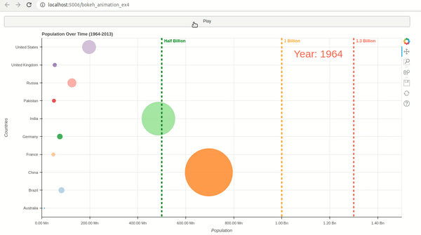
Example 4: Bubble / Scatter Chart Animation 
As a part of our fourth example, we have explained how to create bubble chart animation using bokeh. We have reused our Gapminder population dataset for this example as well. The animation shows changes in population of 10 selected countries over a period starting from 1964 to 2013.
The example starts by creating a bubble chart showing population of 10 selected countries during year 1964. The x-axis is used for year and y-axis displays country names. The size of country bubble changes over time as population increases.
Apart from bubble animation, we have added few annotations to chart to look it more interesting.
We have added a label at top right which displays current year during animation. We have added three line annotations to chart showing 500 Mn, 1 Bn and 1.3 Bn marks so we can know countries crossing them.
If you are interested in learning various annotations available from bokeh then do check our small tutorial that explains them in detail.
## bokeh_animation_ex4.py

from bokeh.sampledata.gapminder import population
from bokeh.models import Button, Slider, DatetimeTickFormatter, Legend, Label, Span
from bokeh.plotting import figure, column, row
from bokeh.models.ranges import FactorRange
from bokeh.palettes import Category20_10
from bokeh.transform import factor_cmap
from bokeh.io import curdoc

import time
import numpy as np
import pandas as pd

def create_tick_label(pop):
    if pop >= 1e9:
        return "{:.2f} Bn".format(pop/1e9)
    else:
        return "{:.2f} Mn".format(pop/1e6)

## Prepare Data
countries = ["China", "United States", "India", "Germany", "United Kingdom", "Russia", "France",
             "Australia", "Brazil", "Pakistan"]
countries = sorted(countries)
population = population[population.index.isin(countries)]


## Create Candlestick Charts
fig = figure(plot_width=1200, plot_height=600,
             y_range= countries, x_range=(0, 1.5e9),
             title = "Population Over Time (1964-2013)")

initial_df = population[["1964"]].reset_index().rename(columns={"1964": "Population"})
initial_df["size"] = initial_df["Population"] / 5e6

points = fig.scatter(x="Population", y="Country", size="size", alpha=0.8,
                     color=factor_cmap("Country", Category20_10, countries),
                     source=initial_df)

label = Label(x=1.05e9, y=8.8, text="Year: 1964", text_font_size="30px", text_color="tomato")
fig.add_layout(label)

## Span Lines & Labels
## Half billion line
fig.add_layout(Span(location=0.5e9, dimension='height', line_color='green', line_dash='dashed', line_width=4, name="Half Billion"))
fig.add_layout(Label(x=0.51e9, y=9.7, text="Half Billion", text_font_size="12px", text_color="green", text_font_style="bold"))
## 1 billion line
fig.add_layout(Span(location=1e9, dimension='height', line_color='orange', line_dash='dashed', line_width=4, name="1 Billion"))
fig.add_layout(Label(x=1.01e9, y=9.7, text="1 Billion", text_font_size="12px", text_color="orange", text_font_style="bold"))
## 1.3 billion line
fig.add_layout(Span(location=1.3e9, dimension='height', line_color='tomato', line_dash='dashed', line_width=4, name="1.3 Billion"))
fig.add_layout(Label(x=1.31e9, y=9.7, text="1.3 Billion", text_font_size="12px", text_color="tomato", text_font_style="bold"))

fig.xaxis.axis_label="Population"
fig.yaxis.axis_label="Countries"

fig.xaxis.ticker = list(map(int, np.arange(0,1.6e9,0.2e9)))
fig.xaxis.major_label_overrides = dict(list(zip(map(int,np.arange(0,1.6e9,0.2e9)), [create_tick_label(pop) for pop in np.arange(0,1.6e9,0.2e9)])))

## Define Widgets
btn = Button(label="Play")

## Define Callbacks
curr_year = 1964
def update_chart():
    global curr_year
    curr_year += 1
    if curr_year == 2014:
        curr_year = 1964

    intermediate_df = population[[str(curr_year)]].reset_index().rename(columns={str(curr_year): "Population"})
    intermediate_df["size"] = intermediate_df["Population"] / 5e6
    points.data_source.data = intermediate_df

    label.text = "Year: {}".format(curr_year)

callback = None
def execute_animation():
    global callback
    if btn.label == "Play":
        btn.label = "Pause"
        callback = curdoc().add_periodic_callback(update_chart, 200)
    else:
        btn.label = "Play"
        curdoc().remove_periodic_callback(callback)


## Register Callbacks
btn.on_click(execute_animation)

## GUI
curdoc().add_root(column(btn, fig))
bokeh serve --show bokeh_animation_ex4.py
This ends our small tutorial explaining how we can create animation using Bokeh.
References
Useful Bokeh Resources
Bokeh Charts
- Bokeh: Interactive Charts
- Pandas-Bokeh: Create Bokeh Charts from Pandas Dataframe with One Line Of Code
Bokeh Chart Styling, Theming, Annotating, and Layout Guide
Maps using Bokeh
Link Bokeh Charts with Widgets
- Guide to Create Interactive GUI using Bokeh Widgets
- Link Bokeh Charts with Ipywidgets widgets to Create Interactive GUIs
Dashboards
Candlestick Charts using Bokeh
Python Data Visualization Libraries
 Sunny Solanki
Sunny Solanki
Intro: Software Developer | Youtuber | Bonsai Enthusiast
About: Sunny Solanki holds a bachelor's degree in Information Technology (2006-2010) from L.D. College of Engineering. Post completion of his graduation, he has 8.5+ years of experience (2011-2019) in the IT Industry (TCS). His IT experience involves working on Python & Java Projects with US/Canada banking clients. Since 2020, he’s primarily concentrating on growing CoderzColumn.
His main areas of interest are AI, Machine Learning, Data Visualization, and Concurrent Programming. He has good hands-on with Python and its ecosystem libraries.
Apart from his tech life, he prefers reading biographies and autobiographies. And yes, he spends his leisure time taking care of his plants and a few pre-Bonsai trees.
Contact: sunny.2309@yahoo.in


![YouTube Subscribe]() Comfortable Learning through Video Tutorials?
Comfortable Learning through Video Tutorials?
If you are more comfortable learning through video tutorials then we would recommend that you subscribe to our YouTube channel.
![Need Help]() Stuck Somewhere? Need Help with Coding? Have Doubts About the Topic/Code?
Stuck Somewhere? Need Help with Coding? Have Doubts About the Topic/Code?
 Stuck Somewhere? Need Help with Coding? Have Doubts About the Topic/Code?
When going through coding examples, it's quite common to have doubts and errors.
If you have doubts about some code examples or are stuck somewhere when trying our code, send us an email at coderzcolumn07@gmail.com. We'll help you or point you in the direction where you can find a solution to your problem.
You can even send us a mail if you are trying something new and need guidance regarding coding. We'll try to respond as soon as possible.
![Share Views]() Want to Share Your Views? Have Any Suggestions?
Want to Share Your Views? Have Any Suggestions?
 Want to Share Your Views? Have Any Suggestions?
If you want to
- provide some suggestions on topic
- share your views
- include some details in tutorial
- suggest some new topics on which we should create tutorials/blogs
 bokeh, animation