Animation using Matplotlib | Python
Matplotlib is the oldest, most stable, and most developed Python data visualization library. It has vast API that let us create many different types of charts. The API of matplotlib is very flexible and lets us make many customizations to chart.
Matplotlib also provides support for animations. We can create many different types of animations using it.
What Can You Learn From This Article?
As a part of this tutorial, we have explained how to create animation using Python library matplotlib. Tutorial explains matplotlib animation API. It covers line chart animation, bar chart animation, and bubble chart animation. Concepts learned through tutorial can be easily extended to create other types of animation. Tutorial can be a very good starting point for someone new to creating animation using matplotlib.
Below, we have listed essential sections of tutorial to give an overview of the material covered.
Important Sections Of Tutorial
import matplotlib

print("Matplotlib Version : {}".format(matplotlib.__version__))
1. Simple Single Line Animation 
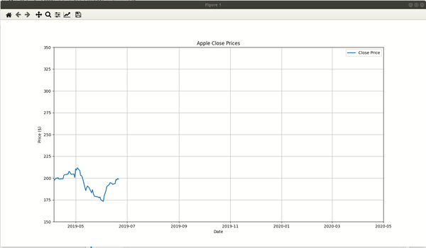
As a part of our first example, we have explained how to create line animation. The animation starts with small line and then keeps adding more points to line as time passes. We have used Apple OHLC dataset we downloaded from Yahoo Finance. It has open, high, low, and close prices of stock from Apr 2019 to Mar 2020.
Matplotlib provides a function named FuncAnimation() in order to create animation. The function is available from animation sub-module and has few important parameters.
- FuncAnimation(fig, func, frames=None, init_func=None, interval=200,**kwargs) - The function to create animation
- The fig parameter accepts matplotlib Figure object. The object can be an empty canvas or may have an initial chart plotted from where to start.
- The func parameter accepts a function to call continuously after a specified time interval. This function is generally responsible for updating chart data. The function takes one argument which is data to add to chart.
- The interval parameter accepts an integer specifying time in milliseconds. The function specified through func parameter is called continuously at every millisecond specified through this parameter.
- The frames parameter accepts an iterable or generator function that returns next data points each time it is called. The new data generated by this iterable or generator is given to function specified through func parameter to add to chart.
- The init_func parameter accepts a function that gets called initially before animation starts. You can do initialization work like creating an initial chart or initializing data or anything else.
- The fargs parameter accepts tuples specifying more arguments to function specified through func parameter. If you want to give more arguments to function other than data then you can do it using this parameter.
Our code starts by reading data from a CSV file using pandas function. The Apple close prices data is loaded as pandas dataframe.
Then, we have created list for X and Y axis data. For X-axis, we have converted dates which are in string format to date format from Python datetime module. We have created data for first 22 rows from dataframe only. Here, we are assuming that you have good background with matplotlib. Please feel free to check below tutorial on matplotlib which explains guide to creating various charts.
Then, we have created line chart using first 22 points (1 month) of our dataset.
We have then declared our data generator function. The generator simply loops through data from 23rd point onward till the end. It returns new date and close price on each call. This generator function will be given to frames parameter.
The next function that we have declared is the one that will be called every 50 milliseconds and responsible for adding new data to chart. The function takes new data generated by generator function, add it to chart using set_data() method, and returns modified line.
At last, we have created animation by calling FuncAnimation() function and giving it parameter values.
## matplotlib_animation_ex1.py

import matplotlib.pyplot as plt
import matplotlib.animation as animation

import numpy as np
import pandas as pd

from datetime import datetime, date

apple_df = pd.read_csv("~/datasets/AAPL.csv")

 ## Convert date from string to datetime.date object.
xdata = [date.fromisoformat(dt) for dt in apple_df[:22]["Date"].values.tolist()]
ydata = apple_df[:22]["Close"].values.tolist()

## Create Initial Chart
fig, ax = plt.subplots()
fig.set_figheight(8)
fig.set_figwidth(15)
ax.set_title("Apple Close Prices")

line, = ax.plot(xdata, ydata, lw=2, label="Close Price")

ax.set_ylim(150, 350)
ax.set_xlim(date(2019,4,5), date(2020,5,1))
ax.grid()
ax.set_xlabel("Date")
ax.set_ylabel("Price ($)")
plt.legend(loc="best")

## Data Generator Function
def data_gen():
    dates, prices = apple_df[22:]["Date"].values.tolist(),apple_df[22:]["Close"].values.tolist()
    for dt, close in zip(dates, prices):
        yield date.fromisoformat(dt), close ## Convert date from string to datetime.date object.

## Animation Function
def run(data):
    # update the data
    date, close = data
    xdata.append(date)
    ydata.append(close)

    line.set_data(xdata, ydata) ## Update Line

    return line,

anim = animation.FuncAnimation(fig, run, data_gen, interval=50, repeat=False)

plt.show()
Below, we have created one more example which again creates same line animation as our previous cell but this time, we have moved logic to create an initial chart with 22 points to initialization function.
We have created a new function named init() which initializes prices for initial chart and creates initial chart. We have given this function to init_func parameter of FuncAnimation() function. This function will create initial chart with 22 points, the logic that we had outside in our previous cell example.
The output of this code is same animation as our previous cell.
## matplotlib_animation_ex2.py

import matplotlib.pyplot as plt
import matplotlib.animation as animation

import numpy as np
import pandas as pd

from datetime import datetime, date

apple_df = pd.read_csv("~/datasets/AAPL.csv")

## Create Initial Chart
xdata, ydata = [],[]

fig, ax = plt.subplots()
fig.set_figheight(8)
fig.set_figwidth(15)
ax.set_title("Apple Close Prices")

line, = ax.plot([], [], lw=2, label="Close Price")

ax.set_xlabel("Date")
ax.set_ylabel("Price ($)")

ax.grid()

plt.legend(loc="best")

## Data Generator Function
def data_gen():
    dates, prices = apple_df[22:]["Date"].values.tolist(),apple_df[22:]["Close"].values.tolist()
    for dt, close in zip(dates, prices):
        yield date.fromisoformat(dt), close

## Initialization
def init():
    global xdata, ydata
    xdata = [date.fromisoformat(dt) for dt in apple_df[:22]["Date"].values.tolist()]
    ydata = apple_df[:22]["Close"].values.tolist()

    ax.set_ylim(150, 350)
    ax.set_xlim(date(2019,4,5), date(2020,5,1))

    line.set_data(xdata, ydata)

    return line,

## Animation Function
def run(data):
    # update the data
    date, close = data
    xdata.append(date)
    ydata.append(close)

    line.set_data(xdata, ydata) ## Update Line

    return line,

anim = animation.FuncAnimation(fig, run, data_gen, interval=50, init_func=init, repeat=False)

plt.show()
2. Multiple Chart Animation 
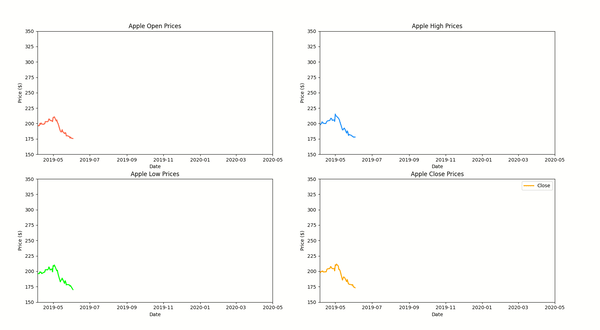
As a part of our second example, we have explained how to create animation with multiple charts. We have created a figure with 4 charts in it. Each of them is a line chart and represents one of the open, high, low, and close prices of our apple stock.
We have created an initial chart with 22 data points and then added new data to chart every 15 milliseconds.
The data generator function returns date and OHLC prices on each call.
The main animation function adds data to all 4 charts and returns new modified lines on each call.
This example demonstrates that we can create an animation of more than one chart as well.
## matplotlib_animation_ex3.py

import matplotlib.pyplot as plt
import matplotlib.animation as animation

import numpy as np
import pandas as pd

from datetime import datetime, date

apple_df = pd.read_csv("~/datasets/AAPL.csv")

## Convert date from string to datetime.date object.
xdata = [date.fromisoformat(dt) for dt in apple_df[:22]["Date"].values.tolist()]
y1data = apple_df[:22]["Open"].values.tolist()
y2data = apple_df[:22]["High"].values.tolist()
y3data = apple_df[:22]["Low"].values.tolist()
y4data = apple_df[:22]["Close"].values.tolist()

## Create Initial Chart
fig, ax = plt.subplots(2,2)

fig.set_figheight(15)
fig.set_figwidth(15)

ax[0][0].set_title("Apple Open Prices")
ax[0][1].set_title("Apple High Prices")
ax[1][0].set_title("Apple Low Prices")
ax[1][1].set_title("Apple Close Prices")

line1, = ax[0][0].plot(xdata, y1data, lw=2, label="Open", color="tomato")
line2, = ax[0][1].plot(xdata, y2data, lw=2, label="High", color="dodgerblue")
line3, = ax[1][0].plot(xdata, y3data, lw=2, label="Low", color="lime")
line4, = ax[1][1].plot(xdata, y4data, lw=2, label="Close", color="orange")

for ax_row in ax:
    for axes in ax_row:
        axes.set_ylim(150, 350)
        axes.set_xlim(date(2019,4,5), date(2020,5,1))

for ax_row in ax:
    for axes in ax_row:
        axes.set_xlabel("Date")
        axes.set_ylabel("Price ($)")

plt.legend(loc="best")

## Data Generator
def data_gen():
    dates = apple_df[22:]["Date"].values.tolist()
    os, hs, ls, cs = apple_df[22:]["Open"], apple_df[22:]["High"], apple_df[22:]["Low"], apple_df[22:]["Close"]
    for dt, o,h,l,c in zip(dates, os, hs, ls, cs):
        yield date.fromisoformat(dt), o,h,l,c ## Convert date from string to datetime.date object.

## Animation Function
def run(data):
    # update the data
    date, o,h,l,c = data
    xdata.append(date)
    y1data.append(o)
    y2data.append(h)
    y3data.append(l)
    y4data.append(c)

    line1.set_data(xdata, y1data) ## Update Line
    line2.set_data(xdata, y2data) ## Update Line
    line3.set_data(xdata, y3data) ## Update Line
    line4.set_data(xdata, y4data) ## Update Line

    return line1, line2, line3, line4

anim = animation.FuncAnimation(fig, run, data_gen, interval=15, repeat=False)

plt.show()
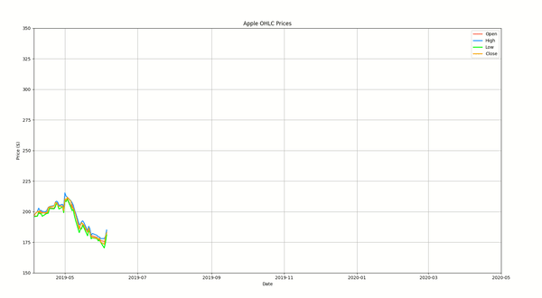
3. Multiple Line Animation 
As a part of our third example, we have demonstrated how to create multiple-line animation. We have created line animation where four lines are moving together which are open, high, low, and close prices of apple stock.
This example builds on our first example where we had just one line. The example simply introduces 4 lines for different prices.
## matplotlib_animation_ex4.py

import matplotlib.pyplot as plt
import matplotlib.animation as animation

import numpy as np
import pandas as pd

from datetime import datetime, date

apple_df = pd.read_csv("~/datasets/AAPL.csv")

## Convert date from string to datetime.date object.
xdata = [date.fromisoformat(dt) for dt in apple_df[:22]["Date"].values.tolist()]
y1data = apple_df[:22]["Open"].values.tolist()
y2data = apple_df[:22]["High"].values.tolist()
y3data = apple_df[:22]["Low"].values.tolist()
y4data = apple_df[:22]["Close"].values.tolist()

## Create Initial Chart
fig, ax = plt.subplots()

fig.set_figheight(10)
fig.set_figwidth(15)

ax.set_title("Apple OHLC Prices")

line1, = ax.plot(xdata, y1data, lw=2, label="Open", color="tomato")
line2, = ax.plot(xdata, y2data, lw=2, label="High", color="dodgerblue")
line3, = ax.plot(xdata, y3data, lw=2, label="Low", color="lime")
line4, = ax.plot(xdata, y4data, lw=2, label="Close", color="orange")

ax.set_ylim(150, 350)
ax.set_xlim(date(2019,4,5), date(2020,5,1))

ax.set_xlabel("Date")
ax.set_ylabel("Price ($)")

ax.grid()

plt.legend(loc="best")

## Data Generator
def data_gen():
    dates = apple_df[22:]["Date"].values.tolist()
    os, hs, ls, cs = apple_df[22:]["Open"], apple_df[22:]["High"], apple_df[22:]["Low"], apple_df[22:]["Close"]
    for dt, o,h,l,c in zip(dates, os, hs, ls, cs):
        yield date.fromisoformat(dt), o,h,l,c ## Convert date from string to datetime.date object.

## Animation Function
def run(data):
    # update the data
    date, o,h,l,c = data
    xdata.append(date)
    y1data.append(o)
    y2data.append(h)
    y3data.append(l)
    y4data.append(c)

    line1.set_data(xdata, y1data) ## Update Line
    line2.set_data(xdata, y2data) ## Update Line
    line3.set_data(xdata, y3data) ## Update Line
    line4.set_data(xdata, y4data) ## Update Line

    return line1, line2, line3, line4

anim = animation.FuncAnimation(fig, run, data_gen, interval=15, repeat=False)

plt.show()
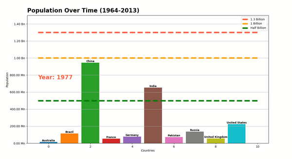
4. Bar Chart Animation 
As a part of our fourth example, we have created a bar chart animation. We have used gapminder dataset available from Python data viz Libary bokeh. The dataset has information (population, GDP, life expectancy, etc) about various countries of the world from 1964-2013.
The animation shows movement in population of 10 selected countries from 1964-2010.
The code starts by filtering original data frame to keep entries of selected 10 countries only.
Then, it creates an initial bar chart showing population of selected countries in 1964. We have also added text specifying country names above them.
The data generator returns new population for countries every time it is called.
The main animation function (run()) modifies bar height on each call using set_height() function of bars. It even modifies position of text labels above bars using set_position() function so that labels also move with bar heights.
We have also added horizontal line annotations to show milestones like half billion, 1 billion and 1.3 billion. If you want to learn more about matplotlib annotations then check below link which covers it in detail.
## matplotlib_animation_ex5.py

import matplotlib.pyplot as plt
import matplotlib.animation as animation
from bokeh.sampledata.gapminder import population

import numpy as np
import pandas as pd

countries = ["China", "United States", "India", "Germany", "United Kingdom", "Russia", "France",
             "Australia", "Brazil", "Pakistan"]
countries = sorted(countries)
population = population[population.index.isin(countries)]

def create_tick_label(pop):
    if pop >= 1e9:
        return "{:.2f} Bn".format(pop/1e9)
    else:
        return "{:.2f} Mn".format(pop/1e6)

## Create Initial Chart
xdata, ydata = range(10), population[["1964"]].values.flatten()

fig, ax = plt.subplots()
fig.set_figheight(8)
fig.set_figwidth(15)

ax.set_title("Population Over Time (1964-2013)", loc="left", fontdict=dict(fontsize=20, fontweight="bold"), pad=10)

bars = ax.bar(x=list(xdata), height=ydata, width=0.85, color=plt.cm.tab10.colors)

ax.set_ylim(0, 1.5e9)

ax.set_xlabel("Countries")
ax.set_ylabel("Population")

ax.set_yticks(np.arange(0,1.6e9,0.2e9), [create_tick_label(pop) for pop in np.arange(0,1.6e9,0.2e9)])

ax.hlines(1.3e9,-0.5,10, linewidth=5.0, color="tomato", linestyle="dashed", label="1.3 Billion")
ax.hlines(1e9,-0.5,10, linewidth=5.0, color="orange", linestyle="dashed", label="1 Billion")
ax.hlines(0.5e9,-0.5,10, linewidth=5.0, color="green", linestyle="dashed", label="Half Billion")

ax.grid(axis="y")

year_label = ax.text(-0.5, 750e6, "Year: 1964", fontsize=20, color="tomato", fontweight="bold")

country_labels = []
for country, i, pop in zip(countries, xdata, ydata):
    label = ax.text(i, pop, country, color="black", fontsize=9, ha="center", va="bottom", fontweight="bold")
    country_labels.append(label)

plt.legend(loc="best")

## Data Generator
def data_gen():
    for year in range(1965,2014):
        yield year, population[[str(year)]].values.flatten()


## Animation Function
def run(data):
    year, bar_heights = data
    for i, bar in enumerate(bars.patches):
        bar.set_height(bar_heights[i]) ## Update Line

    year_label.set_text("Year: {}".format(year))

    for i, height in enumerate(bar_heights):
        country_labels[i].set_position((i, height))

    return bars

anim = animation.FuncAnimation(fig, run, data_gen, interval=100, repeat=False)

plt.show()
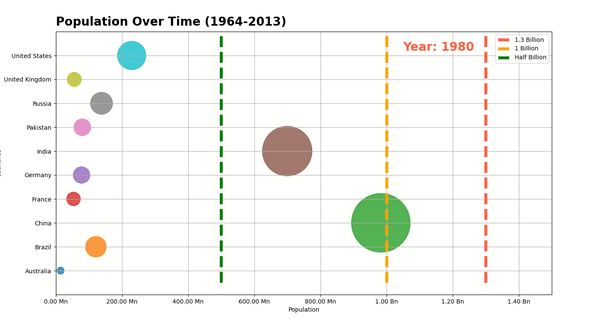
5. Bubble Chart Animation 
The fifth and last animation that we have created is bubble chart animation. The animation again uses gapminder dataset from our previous animation. The animation shows changes in population of 10 selected countries from 196-2013 as bubble chart. The bubble size is based on population of country. It increases as population increases over time.
We have first created initial chart showing population of countries in 1964. The X-axis represents time which is from 1964 to 2013. The Y axis represents 10 countries and bubbles move horizontally.
Then, the data generator function returns new population for each year.
The main animation function (run()) modifies sizes and position of bubbles using set_sizes() and set_offsets() functions on each call. It even modifies year label displayed on top using set_text() function.
## matplotlib_animation_ex6.py

import matplotlib.pyplot as plt
import matplotlib.animation as animation
from bokeh.sampledata.gapminder import population

import numpy as np
import pandas as pd

countries = ["China", "United States", "India", "Germany", "United Kingdom", "Russia", "France",
             "Australia", "Brazil", "Pakistan"]
countries = sorted(countries)
population = population[population.index.isin(countries)]

def create_tick_label(pop):
    if pop >= 1e9:
        return "{:.2f} Bn".format(pop/1e9)
    else:
        return "{:.2f} Mn".format(pop/1e6)

## Create Initial Chart
xdata, ydata = [1964,]*10, population[["1964"]].values.flatten()

fig, ax = plt.subplots()
fig.set_figheight(8)
fig.set_figwidth(15)

ax.set_title("Population Over Time (1964-2013)", loc="left", fontdict=dict(fontsize=20, fontweight="bold"), pad=10)

points = ax.scatter(x=ydata, y=range(10), s=ydata/1e5, alpha=0.8, color=plt.cm.tab10.colors)

ax.set_xlabel("Population")
ax.set_ylabel("Countries")

ax.set_xlim(0, 1.5e9)
ax.set_ylim(-1,10)

ax.set_yticks(range(10), countries)
ax.set_xticks(np.arange(0,1.6e9,0.2e9), [create_tick_label(pop) for pop in np.arange(0,1.6e9,0.2e9)])

ax.vlines(1.3e9,-0.5,10, linewidth=5.0, color="tomato", linestyle="dashed", label="1.3 Billion")
ax.vlines(1e9,-0.5,10, linewidth=5.0, color="orange", linestyle="dashed", label="1 Billion")
ax.vlines(0.5e9,-0.5,10, linewidth=5.0, color="green", linestyle="dashed", label="Half Billion")

ax.grid(axis="both")

plt.legend(loc="best")

year_label = ax.text(1.05e9, 9.2, "Year: 1964", fontsize=20, color="tomato", fontweight="bold")

## Data Generator
def data_gen():
    for year in range(1965,2014):
        yield year, population[[str(year)]].values.flatten()

## Animation Function
def run(data):
    year, point_sizes = data
    points.set_sizes(point_sizes/1e5)
    points.set_offsets(list(zip(point_sizes, range(10))))

    year_label.set_text("Year: {}".format(year))

    return points

anim = animation.FuncAnimation(fig, run, data_gen, interval=100, repeat=False)

plt.show()
This ends our small tutorial explaining how to create animations using Python library matplotlib.
References
Useful Matplotlib Tutorials
- Matplotlib.pyplot
- Guide to Annotate Matplotlib Charts
- Link Matplotlib Charts with Widgets to Create Interactive GUIs
- Connection Line between Two Matplotlib Charts
- Matplotlib Dashboard using Streamlit
- Matplotlib Dashboard using Panel
Python Data Visualization Libraries
 Sunny Solanki
Sunny Solanki
Intro: Software Developer | Youtuber | Bonsai Enthusiast
About: Sunny Solanki holds a bachelor's degree in Information Technology (2006-2010) from L.D. College of Engineering. Post completion of his graduation, he has 8.5+ years of experience (2011-2019) in the IT Industry (TCS). His IT experience involves working on Python & Java Projects with US/Canada banking clients. Since 2020, he’s primarily concentrating on growing CoderzColumn.
His main areas of interest are AI, Machine Learning, Data Visualization, and Concurrent Programming. He has good hands-on with Python and its ecosystem libraries.
Apart from his tech life, he prefers reading biographies and autobiographies. And yes, he spends his leisure time taking care of his plants and a few pre-Bonsai trees.
Contact: sunny.2309@yahoo.in


![YouTube Subscribe]() Comfortable Learning through Video Tutorials?
Comfortable Learning through Video Tutorials?
If you are more comfortable learning through video tutorials then we would recommend that you subscribe to our YouTube channel.
![Need Help]() Stuck Somewhere? Need Help with Coding? Have Doubts About the Topic/Code?
Stuck Somewhere? Need Help with Coding? Have Doubts About the Topic/Code?
 Stuck Somewhere? Need Help with Coding? Have Doubts About the Topic/Code?
When going through coding examples, it's quite common to have doubts and errors.
If you have doubts about some code examples or are stuck somewhere when trying our code, send us an email at coderzcolumn07@gmail.com. We'll help you or point you in the direction where you can find a solution to your problem.
You can even send us a mail if you are trying something new and need guidance regarding coding. We'll try to respond as soon as possible.
![Share Views]() Want to Share Your Views? Have Any Suggestions?
Want to Share Your Views? Have Any Suggestions?
 Want to Share Your Views? Have Any Suggestions?
If you want to
- provide some suggestions on topic
- share your views
- include some details in tutorial
- suggest some new topics on which we should create tutorials/blogs
 matplotlib, animations