How to show the connection line between the two charts in matplotlib?
The matplotlib has been a go-to library for a long for plotting static maps in python. It lets us create a variety of static charts and is quite a flexible library. It happens many times that we have more than one chart in our figure and charts are related to one another by some means. The second chart can be an extension of the first chart or it can provide more information on a particular part of the first chart. We can show a connection line between two charts in matplotlib to show the relation between particular parts for a better explanation of data. As a part of this tutorial, we'll explain how we can draw a connection line between two charts of matplotlib.
We'll start by loading important libraries.
import pandas as pd
import numpy as np

import matplotlib.pyplot as plt
Load Wine Dataset
We'll be using the wine dataset which is available as a part of the scikit-learn library. We'll load the dataset as pandas dataframe. The wine dataset has a measurement of ingredients of wine for three different types of wines. We'll be using this dataset from various angles to draw charts and show a connection between them.
from sklearn.datasets import load_wine

wine = load_wine()

wine_df = pd.DataFrame(data=wine.data, columns = wine.feature_names)

wine_df["WineType"] = [wine.target_names[typ] for typ in wine.target]

wine_df.head()
Below we have created a dataset with average ingredient measurement per wine type. We grouped the dataset first on wine type and then have taken an average of each row to get it.
avg_wine_df = wine_df.groupby(by=["WineType"]).mean()
avg_wine_df
Below we have created another dataframe that simply has sample count per wine type data.
wine_cnt = wine_df.groupby(by=["WineType"]).count()[["alcohol"]].rename(columns={"alcohol":"Count"})
wine_cnt
Example 1
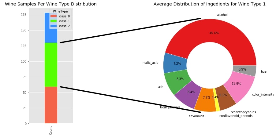
The first example that we'll use to demonstrate connection is a group of bar and a pie chart.
The stacked bar chart shows the distribution of samples per wine category. The pie chart shows the distribution of important ingredients for the selected wine category which is Wine class 1 in this case.
We have used GridSpec to divide the figure into 1 row and 5 columns. We have then used the first column to plot a stacked bar chart and the other 4 columns to plot the pie chart.
The class which is used to show a connection between two charts who are on different axes is ConnectionPatch from matplotlib.patches. We need to pass it axes of the second chart as axesA and the axes of the first chart as axesB. We then need to pass tuple representing points on the second chart and the first chart to draw line between them to parameters xyA and xyB. We have set coordsA and coordsB parameter to data to refer that tuple which we passed earlier is the point in data on the chart.
We can also pass other line attributes like line color, line width, alpha (opacity), etc.
We have first created the top line between two charts where xyA refers to the point on the pie chart and xyB refers to the point on the stacked bar chart. Please make a note that the pie chart has a default center at (0,0) and a radius of 1. We could have used xyA like (0,1) but we instead used (-0.2, 1.01) to move line little bit away from the pie chart so that it does not touch it. The same goes for xyB coordinates. We have added a connection line to the figure by calling the add_artist() method on ax2 passing it connection line object.
We have followed the same format for creating the bottom line then. The main trick about drawing line between two charts is to learn about points on charts where to connect them.
from matplotlib.patches import ConnectionPatch
from matplotlib.gridspec import GridSpec

with plt.style.context("ggplot"):
    fig = plt.figure(figsize=(15,7))

    gs = GridSpec(nrows=1, ncols=5)

    ## Bar Chart Logic
    ax1 = fig.add_subplot(gs[:1])

    wine_cnt.T.plot.bar(y=[0,1,2],
                        stacked=True,
                        color=["tomato", "lime", "dodgerblue"],
                        width=0.2, ax=ax1)

    plt.title("Wine Samples Per Wine Type Distribution")

    ## Pie Chart Logic
    ax2 = fig.add_subplot(gs[2:])
    cols = avg_wine_df.drop(columns=["proline", "magnesium", "alcalinity_of_ash", "od280/od315_of_diluted_wines"]).columns

    ax2.pie(x=avg_wine_df[cols].loc["class_1"], labels=avg_wine_df[cols].columns,
            wedgeprops=dict(width=0.5, edgecolor="w"),
            colors=plt.cm.Set1.colors,
            autopct="%.1f%%", pctdistance=0.7,
            )

    plt.title("Average Distribution of Ingedients for Wine Type 1")

    ## Top Connection line between Charts

    con_top = ConnectionPatch(xyA=(-0.2, 1.01),
                          xyB=(0.15, wine_cnt.loc["class_0"].Count+wine_cnt.loc["class_1"].Count),
                          coordsA="data", coordsB="data",
                          axesA=ax2, axesB=ax1,
                          color="black", linewidth=4)

    ax2.add_artist(con_top)

    ## Bottom Connection line between Charts

    con_bottom = ConnectionPatch(xyA=(-0.2, -1.01),
                          xyB=(0.15, wine_cnt.loc["class_0"].Count),
                          coordsA="data", coordsB="data",
                          axesA=ax2, axesB=ax1,
                          color="black", linewidth=4)

    ax2.add_artist(con_bottom)
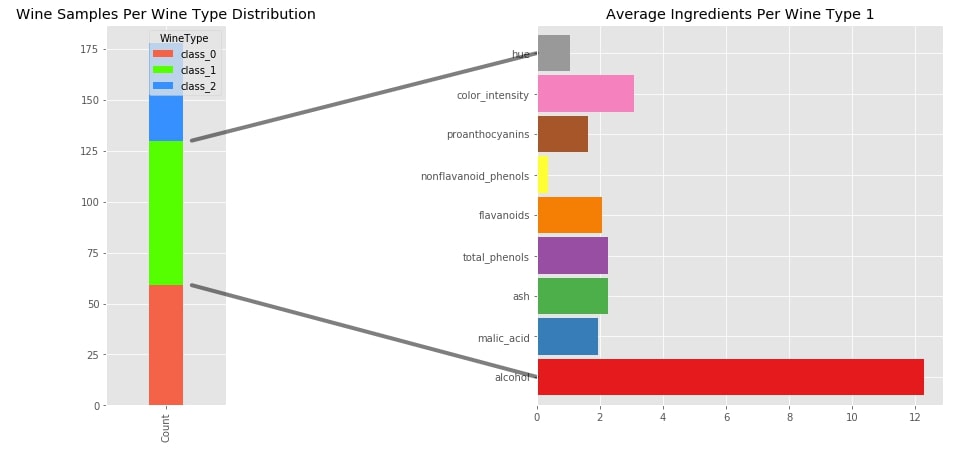
Example 2
The second example that we have created for an explanation of the connection line consists of a stacked bar chart and a horizontal bar chart. The stacked bar chart is created the same way as the previous step. The second horizontal bar chart is created using the same data as that of the pie chart from the previous step. It depicts the average ingredients per wine class 1.
We have followed the same steps as the previous example to create a connection line between two charts. The only difference this time is the selection of points on the second horizontal bar chart.
with plt.style.context("ggplot"):
    fig = plt.figure(figsize=(15,7))

    gs = GridSpec(nrows=1, ncols=6)

    ## Bar Chart Logic
    ax1 = fig.add_subplot(gs[:1])

    wine_cnt.T.plot.bar(y=[0,1,2],
                        stacked=True,
                        color=["tomato", "lime", "dodgerblue"],
                        width=0.2, ax=ax1)

    plt.title("Wine Samples Per Wine Type Distribution")

    ## 2nd Bar Chart
    ax2 = fig.add_subplot(gs[3:])

    cols = avg_wine_df.drop(columns=["proline", "magnesium", "alcalinity_of_ash", "od280/od315_of_diluted_wines"]).columns
    avg_wine_df[cols].loc["class_1"].plot.barh(ax=ax2,
                                      width=0.9,
                                      color=plt.cm.Set1.colors,
                                      title="Average Ingredients Per Wine Type 1")


    ## Top Connection line between Charts

    con_top = ConnectionPatch(xyA=(0, 8),
                          xyB=(0.15, wine_cnt.loc["class_0"].Count+wine_cnt.loc["class_1"].Count),
                          coordsA="data", coordsB="data",
                          axesA=ax2, axesB=ax1,
                          color="black", linewidth=4, alpha=0.5)

    ax2.add_artist(con_top)

    ## Bottom Connection line between Charts

    con_bottom = ConnectionPatch(xyA=(0, 0),
                          xyB=(0.15, wine_cnt.loc["class_0"].Count),
                          coordsA="data", coordsB="data",
                          axesA=ax2, axesB=ax1,
                          color="black", linewidth=4, alpha=0.5)

    ax2.add_artist(con_bottom)
Example 3
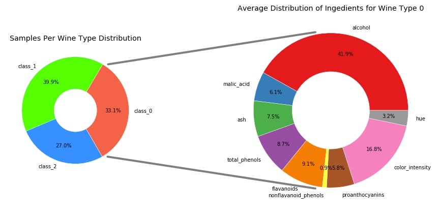
The third example that we'll be using for demonstrating the connection line between the two chart consist of two pie chart. The first pie chart represents the distribution of samples per wine category in the total dataset. We have modified the first pie chart so that it starts the first patch of the pie chart from angle 360 which generally starts from 0. This is done in order to bring the class 0 patch to the front. The second pie chart is the same as our first example which shows the average ingredient distribution per wine class 0.
The tricky part this time lies in finding out points in the first pie chart to start line from endpoints of a patch of wine class 0. In order to find out the starting point for a first and second line from the first pie chart, we have access to the 0th patch of a pie chart which refers to a patch of wine class 0 in a pie chart. We have then retrieved attributes theta1, theta2, center, and r of the chart. The theta1 and theta2 refer to the starting and ending angle of the wine class 0 patch. The center and r refer to the center and radius of the pie chart. We have then used these values to retrieve x and y coordinates of points.
All other things are almost the same as the previous charts. The main trick lies in calculating the starting points of lines from the first pier chart.
with plt.style.context("ggplot"):
    fig = plt.figure(figsize=(15,7))

    gs = GridSpec(nrows=1, ncols=6)

    ## First Pie Chart Logic
    ax1 = fig.add_subplot(gs[:2])
    ax1.pie(x=wine_cnt["Count"], labels=wine_cnt.index,
            colors=["tomato", "lime", "dodgerblue"],
            wedgeprops=dict(width=0.6, edgecolor="w"),
            autopct="%.1f%%", pctdistance=0.7,
            startangle=300
            )

    plt.title("Samples Per Wine Type Distribution")

    ## 2nd Pie Chart Logic
    ax2 = fig.add_subplot(gs[3:])
    cols = avg_wine_df.drop(columns=["proline", "magnesium", "alcalinity_of_ash", "od280/od315_of_diluted_wines"]).columns

    ax2.pie(x=avg_wine_df[cols].loc["class_0"], labels=avg_wine_df[cols].columns,
            wedgeprops=dict(width=0.5, edgecolor="w"),
            colors=plt.cm.Set1.colors,
            autopct="%.1f%%", pctdistance=0.75,
            )

    plt.title("Average Distribution of Ingedients for Wine Type 0")


    ## Top Connection line between Charts
    ## Logic to calculate x,y coord of 0 wine class wedge
    theta1, theta2 = ax1.patches[0].theta1, ax1.patches[0].theta2
    center, r = ax1.patches[0].center, ax1.patches[0].r
    x = r * np.cos(np.pi / 180 * theta2) + center[0]
    y = np.sin(np.pi / 180 * theta2) + center[1]

    con_top = ConnectionPatch(xyA=(-0.2, 1.01),
                          xyB=(x+0.1, y),
                          coordsA="data", coordsB="data",
                          axesA=ax2, axesB=ax1,
                          color="black", linewidth=4, alpha=0.5)

    ax2.add_artist(con_top)

    ## Bottom Connection line between Charts
    x = r * np.cos(np.pi / 180 * theta1) + center[0]
    y = np.sin(np.pi / 180 * theta1) + center[1]

    con_bottom = ConnectionPatch(xyA=(-0.2, -1.01),
                          xyB=(x+0.1, y),
                          coordsA="data", coordsB="data",
                          axesA=ax2, axesB=ax1,
                          color="black", linewidth=4, alpha=0.5)

    ax2.add_artist(con_bottom)
Example 4
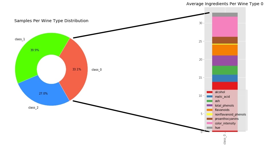
The fourth example that we have used for explaining a connection line between two chart consist of a pie chart and a stacked bar chart. The pie chart is the same as that of the previous step explaining sample distribution per wine type in the dataset. The stacked bar chart represents the average distribution of ingredients per wine class 0.
The calculation of the starting points of both lines is the same as that of the previous step. The ending point of both lines is also self-explanatory.
with plt.style.context("ggplot"):
    fig = plt.figure(figsize=(15,8))

    gs = GridSpec(nrows=1, ncols=5)

    ## Pie Chart Logic
    ax1 = fig.add_subplot(gs[:2])
    ax1.pie(x=wine_cnt["Count"], labels=wine_cnt.index,
            colors=["tomato", "lime", "dodgerblue"],
            wedgeprops=dict(width=0.6, edgecolor="w"),
            autopct="%.1f%%", pctdistance=0.7,
            startangle=300
            )

    plt.title("Samples Per Wine Type Distribution")

    ## Stacked Bar Chart
    ax2 = fig.add_subplot(gs[4:])

    cols = avg_wine_df.drop(columns=["proline", "magnesium", "alcalinity_of_ash", "od280/od315_of_diluted_wines"]).columns
    intermediate_df = pd.DataFrame(avg_wine_df[cols].loc["class_0"]).T
    intermediate_df.plot.bar(ax=ax2,
                              width=0.8,
                              color=plt.cm.Set1.colors,
                              stacked=True,
                              title="Average Ingredients Per Wine Type 0")


     ## Top Connection line between Charts
    ## Logic to calculate x,y coord of 0 wine class wedge
    theta1, theta2 = ax1.patches[0].theta1, ax1.patches[0].theta2
    center, r = ax1.patches[0].center, ax1.patches[0].r
    x = r * np.cos(np.pi / 180 * theta2) + center[0]
    y = np.sin(np.pi / 180 * theta2) + center[1]

    con_top = ConnectionPatch(xyA=(-0.5, intermediate_df.loc["class_0"].sum()),
                          xyB=(x+0.1, y),
                          coordsA="data", coordsB="data",
                          axesA=ax2, axesB=ax1,
                          color="black", linewidth=4)

    ax2.add_artist(con_top)

    ## Bottom Connection line between Charts
    x = r * np.cos(np.pi / 180 * theta1) + center[0]
    y = np.sin(np.pi / 180 * theta1) + center[1]

    con_bottom = ConnectionPatch(xyA=(-0.5, 0),
                          xyB=(x+0.1, y),
                          coordsA="data", coordsB="data",
                          axesA=ax2, axesB=ax1,
                          color="black", linewidth=4)

    ax2.add_artist(con_bottom)
Example 5
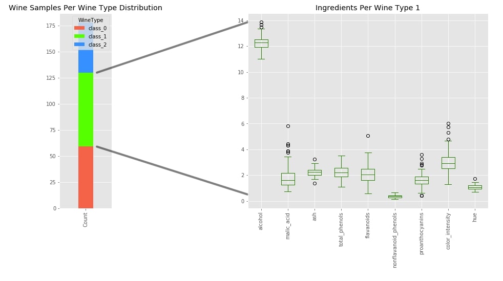
The fifth example that we'll be using for demonstrating a connection line between two chart consist of stacked bar chart from example 1 and box plot showing the concentration of value for various ingredients of wine class 1.
The logic for drawing a connection line between two charts is inspired by previous examples and self-explanatory.
with plt.style.context("ggplot"):
    fig = plt.figure(figsize=(15,7))

    gs = GridSpec(nrows=1, ncols=7)

    ## Bar Chart Logic
    ax1 = fig.add_subplot(gs[:1])

    wine_cnt.T.plot.bar(y=[0,1,2],
                        stacked=True,
                        color=["tomato", "lime", "dodgerblue"],
                        width=0.2, ax=ax1)

    plt.title("Wine Samples Per Wine Type Distribution")

    ## Box Plot
    ax2 = fig.add_subplot(gs[3:])

    cols = avg_wine_df.drop(columns=["proline", "magnesium", "alcalinity_of_ash", "od280/od315_of_diluted_wines"]).columns
    wine_df[wine_df.WineType=="class_1"][cols].plot.box(ax=ax2, color="green",
                                                        title="Ingredients Per Wine Type 1")
    plt.xticks(rotation=90)

    ## Top Connection line between Charts

    con_top = ConnectionPatch(xyA=(0.5, wine_df[wine_df.WineType=="class_1"][cols].values.max()),
                          xyB=(0.15, wine_cnt.loc["class_0"].Count+wine_cnt.loc["class_1"].Count),
                          coordsA="data", coordsB="data",
                          axesA=ax2, axesB=ax1,
                          color="black", linewidth=4, alpha=0.5)

    ax2.add_artist(con_top)

    ## Bottom Connection line between Charts

    con_bottom = ConnectionPatch(xyA=(0.5, 0.5),
                          xyB=(0.15, wine_cnt.loc["class_0"].Count),
                          coordsA="data", coordsB="data",
                          axesA=ax2, axesB=ax1,
                          color="black", linewidth=4, alpha=0.5)

    ax2.add_artist(con_bottom)
Example 6
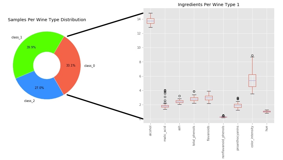
The sixth example for demonstrating a connection line between two charts consists of a pie chart from example 3 and a box plot from example 5.
The logic for drawing the connection line is inspired by example 3 for finding out the starting points of the line and example 5 for finding out ending points of the line.
with plt.style.context("ggplot"):
    fig = plt.figure(figsize=(16,7))

    gs = GridSpec(nrows=1, ncols=6)

    ## First Pie Chart Logic
    ax1 = fig.add_subplot(gs[:2])
    ax1.pie(x=wine_cnt["Count"], labels=wine_cnt.index,
            colors=["tomato", "lime", "dodgerblue"],
            wedgeprops=dict(width=0.6, edgecolor="w"),
            autopct="%.1f%%", pctdistance=0.7,
            startangle=300
            )

    plt.title("Samples Per Wine Type Distribution")

    ## Box plot logic
    ax2 = fig.add_subplot(gs[3:])

    cols = avg_wine_df.drop(columns=["proline", "magnesium", "alcalinity_of_ash", "od280/od315_of_diluted_wines"]).columns
    wine_df[wine_df.WineType=="class_0"][cols].plot.box(ax=ax2,
                           title="Ingredients Per Wine Type 1")
    plt.xticks(rotation=90)


    ## Top Connection line between Charts
    ## Logic to calculate x,y coord of 0 wine class wedge
    theta1, theta2 = ax1.patches[0].theta1, ax1.patches[0].theta2
    center, r = ax1.patches[0].center, ax1.patches[0].r
    x = r * np.cos(np.pi / 180 * theta2) + center[0]
    y = np.sin(np.pi / 180 * theta2) + center[1]

    con_top = ConnectionPatch(xyA=(0.5, wine_df[wine_df.WineType=="class_0"][cols].values.max()),
                          xyB=(x+0.1, y),
                          coordsA="data", coordsB="data",
                          axesA=ax2, axesB=ax1,
                          color="black", linewidth=4)

    ax2.add_artist(con_top)

    ## Bottom Connection line between Charts
    x = r * np.cos(np.pi / 180 * theta1) + center[0]
    y = np.sin(np.pi / 180 * theta1) + center[1]

    con_bottom = ConnectionPatch(xyA=(0.5, 0.0),
                          xyB=(x+0.1, y),
                          coordsA="data", coordsB="data",
                          axesA=ax2, axesB=ax1,
                          color="black", linewidth=4)

    ax2.add_artist(con_bottom)
This ends our small tutorial explaining how to draw a connection line between two charts to show a connection between them. Please feel free to let us know your views in the comments section.
References
 Sunny Solanki
Sunny Solanki
Intro: Software Developer | Youtuber | Bonsai Enthusiast
About: Sunny Solanki holds a bachelor's degree in Information Technology (2006-2010) from L.D. College of Engineering. Post completion of his graduation, he has 8.5+ years of experience (2011-2019) in the IT Industry (TCS). His IT experience involves working on Python & Java Projects with US/Canada banking clients. Since 2020, he’s primarily concentrating on growing CoderzColumn.
His main areas of interest are AI, Machine Learning, Data Visualization, and Concurrent Programming. He has good hands-on with Python and its ecosystem libraries.
Apart from his tech life, he prefers reading biographies and autobiographies. And yes, he spends his leisure time taking care of his plants and a few pre-Bonsai trees.
Contact: sunny.2309@yahoo.in


![YouTube Subscribe]() Comfortable Learning through Video Tutorials?
Comfortable Learning through Video Tutorials?
If you are more comfortable learning through video tutorials then we would recommend that you subscribe to our YouTube channel.
![Need Help]() Stuck Somewhere? Need Help with Coding? Have Doubts About the Topic/Code?
Stuck Somewhere? Need Help with Coding? Have Doubts About the Topic/Code?
 Stuck Somewhere? Need Help with Coding? Have Doubts About the Topic/Code?
When going through coding examples, it's quite common to have doubts and errors.
If you have doubts about some code examples or are stuck somewhere when trying our code, send us an email at coderzcolumn07@gmail.com. We'll help you or point you in the direction where you can find a solution to your problem.
You can even send us a mail if you are trying something new and need guidance regarding coding. We'll try to respond as soon as possible.
![Share Views]() Want to Share Your Views? Have Any Suggestions?
Want to Share Your Views? Have Any Suggestions?
 Want to Share Your Views? Have Any Suggestions?
If you want to
- provide some suggestions on topic
- share your views
- include some details in tutorial
- suggest some new topics on which we should create tutorials/blogs
 matplotlib