Add Annotations to Matplotlib Charts
Many of us have a habit of highlighting things with markers when reading books to remember some important part or to bring attention to that part when we next time read it again. This is commonly referred to as annotation.
This practice has been carried over to data visualization world as well. We try to annotate charts using various annotations (like arrows, text, boxes, polygons, bounds, etc) to highlight important parts of the chart. It'll draw readers' attention to that part.
Python is the go-to language nowadays to do data analysis and create visualizations. Python has a bunch of libraries that let us create all types of charts. The oldest library of all is matplotlib which let us create publication-ready static charts in Python.
What Can You Learn From This Article?
As a part of this tutorial, we have explained how to annotate matplotlib charts with simple and easy-to-understand examples. We have explained various annotations like text annotations, text & arrow annotations, span annotations, box annotations, etc. Tutorial expects that reader has a little background with matplotlib.
If you are someone who is new to matplotlib and want to get started with it then we'll recommend that you go through below link which covers basic charts with simple examples.
Important Sections Of Tutorial
Matplotlib Annotations Video Tutorial
Please feel free to check below video tutorial if feel comfortable learning through videos.
Below, we have imported and printed the version of matplotlib that we have used in our tutorial.
import matplotlib

print("Matplotlib Version : {}".format(matplotlib.__version__))
%matplotlib inline
1. Text Annotations 
In this section, we have explained various ways to add text / labels annotations to our charts. We can add text annotation using text() function available from pyplot module of matplotlib.
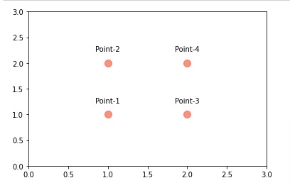
Below, we have created a simple scatter plot with 4 points first. Points are laid out in rectangular manner.
Then, we have added text labels above them using text() function. We have given location coordinates (x, y) and point label text to function. We have added small amount to y coordinate in order to prevent label from overriding text.
The parameter ha and va are used to specify horizontal and vertical alignment of text labels. The parameter ha accepts values 'center', 'left', and 'right'. The parameter va accepts values 'center', 'top', and 'bottom'.
import matplotlib.pyplot as plt

plt.scatter(x=[1,1,2,2], y=[1,2,1,2], c="tomato", s=100, alpha=0.7);
plt.xlim(0,3);
plt.ylim(0,3);

for i, (x, y) in enumerate(zip([1,1,2,2], [1,2,1,2])):
    plt.text(x=x, y=y+0.2, s="Point-{}".format(i+1), ha="center", va="bottom")
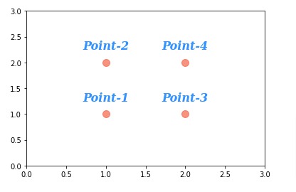
Below, we have created one more example demonstrating usage of text annotations.
This time, we have modified text properties like fontfamiliy, fontsize, fontstyle, fontweight and color using fontdict parameter.
import matplotlib.pyplot as plt

plt.scatter(x=[1,1,2,2], y=[1,2,1,2], c="tomato", s=100, alpha=0.7);
plt.xlim(0,3);
plt.ylim(0,3);

for i, (x, y) in enumerate(zip([1,1,2,2], [1,2,1,2])):
    plt.text(x=x, y=y+0.2, s="Point-{}".format(i+1),
             fontdict=dict(fontfamily="serif", fontsize=16, fontstyle="italic",
                           fontweight="bold", color="dodgerblue",),
             ha="center", va="bottom", )
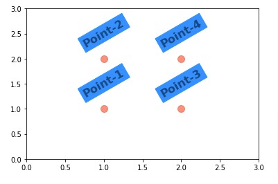
Below, we have created one more example explaining text annotations. This time, we have introduced bounding box around text and rotated text as well.
We have rotated text using rotation parameter and introduced bounding box by setting backgroundcolor parameter.
import matplotlib.pyplot as plt

plt.scatter(x=[1,1,2,2], y=[1,2,1,2], c="tomato", s=100, alpha=0.7);
plt.xlim(0,3);
plt.ylim(0,3);

for i, (x, y) in enumerate(zip([1,1,2,2], [1,2,1,2])):
    plt.text(x=x, y=y+0.2, s="Point-{}".format(i+1),
             fontdict=dict(fontsize=16, fontweight="bold"), ## Font settings
             rotation=30, backgroundcolor="dodgerblue", alpha=0.5,
             ha="center", va="bottom", )
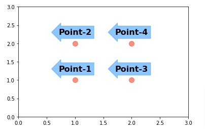
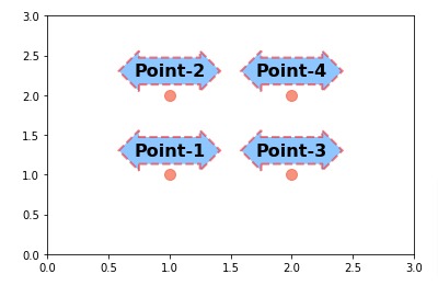
Below, we have created one more example explaining how to add text annotations to chart. This time, we have modified look of bounding box to look like arrow.
We can modify bounding box look by setting bbox parameter. It accepts dictionary specifying box properties. We can specify box style using boxstyle parameter. Below, we have listed values accepted by boxstyle parameter.
| Class | Name |
|---|---|
| Square | square |
| Circle | circle |
| LArrow | larrow |
| RArrow | rarrow |
| DArrow | darrow |
| Round | round |
| Round4 | round4 |
| Sawtooth | sawtooth |
| Roundtooth | roundtooth |
import matplotlib.pyplot as plt

plt.scatter(x=[1,1,2,2], y=[1,2,1,2], c="tomato", s=100, alpha=0.7);
plt.xlim(0,3);
plt.ylim(0,3);

for i, (x, y) in enumerate(zip([1,1,2,2], [1,2,1,2])):
    plt.text(x=x, y=y+0.2, s="Point-{}".format(i+1),
             fontdict=dict(fontsize=16, fontweight="bold"), ## Font settings
             bbox=dict(boxstyle="larrow", color="dodgerblue", alpha=0.5), ## Bounding box settings
             ha="center", va="bottom", )
Below, we have created one more example demonstrating usage of text annotation. This time, we have modified edge properties of bounding box. We have modified edgecolor, linewidth, and linestyle.
import matplotlib.pyplot as plt

plt.scatter(x=[1,1,2,2], y=[1,2,1,2], c="tomato", s=100, alpha=0.7);
plt.xlim(0,3);
plt.ylim(0,3);

for i, (x, y) in enumerate(zip([1,1,2,2], [1,2,1,2])):
    plt.text(x=x, y=y+0.2, s="Point-{}".format(i+1),
             fontdict=dict(fontsize=16, fontweight="bold"), ## Font settings
             bbox=dict(boxstyle="darrow",   ## Bounding box settings
                       facecolor="dodgerblue", edgecolor="red",
                       linewidth=2.0, linestyle="--",
                       alpha=0.5),
             ha="center", va="bottom",)
Below, we have created sample example as our previous example but using annotate() function of pyplot module. The function is most commonly used to add annotations to chart. It also lets us add arrows to our chart which we'll be explaining in next section.
The annotate() function accepts string first and then coordinates using xy parameter. Other parameters like ha, va and bbox has same meaning as that of text() function.
import matplotlib.pyplot as plt

plt.scatter(x=[1,1,2,2], y=[1,2,1,2], c="tomato", s=100, alpha=0.7);
plt.xlim(0,3);
plt.ylim(0,3);

for i, (x, y) in enumerate(zip([1,1,2,2], [1,2,1,2])):
    plt.annotate("Point-{}".format(i+1), xy=(x,y+0.2),
                 ha="center", va="bottom",
                 fontsize=16, fontweight="bold", ## Font settings
                 bbox=dict(boxstyle="darrow",   ## Bounding box settings
                       facecolor="dodgerblue", edgecolor="red",
                       linewidth=2.0, linestyle="--",
                       alpha=0.5),
                )
2. Text & Arrow Annotations 
In this section, we have explained how to add text and arrow annotations to our matplotlib charts. We can add text and arrow annotations using annotate() function of pyplot sub-module.
Below, we have first created a simple scatter chart of 4 points. The points are laid out in rectangular fashion.
Then, we have added text and arrow annotations to chart by calling annotate() function 4 times.
We can specify arrow start and end points using xy and xytext parameters. Both accept (x,y) coordinates.
We can specify arrow properties using arrowprops parameter. It accepts dictionary specifying various arrow properties. We can create two kinds of arrows using arrowprops parameter.
- Simple Arrow - If we don't specify arrowstyle then simple arrow will be created which is straight arrow. We can specify parameters like width, headwidth, headlength and shrink to modify arrow width, arrowhead width, arrowhead length, and fraction of length to shrink on both sides to avoid overlapping with text and glyphs.
- Fancy Arrow - If we specify arrowstyle then fancy arrow will be created which takes many different parameters.
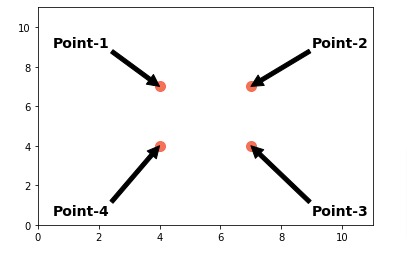
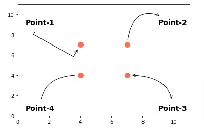
Below, we have added simple arrows to chart.
import matplotlib.pyplot as plt

plt.scatter(x=[4,4,7,7], y=[4,7,4,7], c="tomato", s=100, alpha=0.9);
plt.xlim(0,11);
plt.ylim(0,11);

plt.annotate("Point-1", xy=(4,7), xytext=(0.5, 9),
                 fontsize=14, fontweight="bold", ## Font settings,
                 arrowprops=dict(facecolor="black")
                );
plt.annotate("Point-2", xy=(7,7), xytext=(9, 9),
             fontsize=14, fontweight="bold", ## Font settings
             arrowprops=dict(facecolor="black")
             );
plt.annotate("Point-3", xy=(7,4), xytext=(9, 0.5),
             fontsize=14, fontweight="bold", ## Font settings
             arrowprops=dict(facecolor="black")
             );
plt.annotate("Point-4", xy=(4,4), xytext=(0.5, 0.5),
             fontsize=14, fontweight="bold", ## Font settings
             arrowprops=dict(facecolor="black")
            );
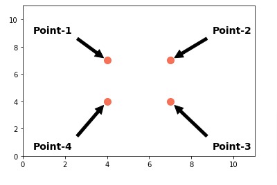
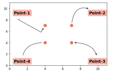
Below, we have recreated our previous example with only one modification which is that we have added shrink parameter to each arrow. This has prevented arrow from overlapping on text and points. It shrinks arrow by an amount of 0.1 from both sides.
import matplotlib.pyplot as plt

plt.scatter(x=[4,4,7,7], y=[4,7,4,7], c="tomato", s=100, alpha=0.9);
plt.xlim(0,11);
plt.ylim(0,11);

plt.annotate("Point-1", xy=(4,7), xytext=(0.5, 9),
             fontsize=14, fontweight="bold", ## Font settings,
             arrowprops=dict(facecolor="black", shrink=0.1)
             );
plt.annotate("Point-2", xy=(7,7), xytext=(9, 9),
             fontsize=14, fontweight="bold", ## Font settings
             arrowprops=dict(facecolor="black", shrink=0.1)
             );
plt.annotate("Point-3", xy=(7,4), xytext=(9, 0.5),
             fontsize=14, fontweight="bold", ## Font settings
             arrowprops=dict(facecolor="black", shrink=0.1)
             );
plt.annotate("Point-4", xy=(4,4), xytext=(0.5, 0.5),
             fontsize=14, fontweight="bold", ## Font settings
             arrowprops=dict(facecolor="black", shrink=0.1)
            );
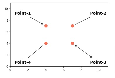
Below, we have created one more example demonstrating arrow annotations where we have created fancy arrows.
This time, we have specified arrowstyle property of arrowprops with different values specifying different types of arrows. We have single-direction arrow, both-direction arrow, and no-direction arrow. Below are list of accepted arrow styles.
-->-[|-|-|><-<-><|-<|-|>fancysimple- Defaultwedge
With fancy arrow, we can shrink arrow from either side using shrinkA and shrinkB parameters.
import matplotlib.pyplot as plt

plt.scatter(x=[4,4,7,7], y=[4,7,4,7], c="tomato", s=100, alpha=0.9);
plt.xlim(0,11);
plt.ylim(0,11);

plt.annotate("Point-1", xy=(4,7), xytext=(0.5, 9),
                 fontsize=14, fontweight="bold", ## Font settings,
                 arrowprops=dict(arrowstyle="->", facecolor="black", shrinkA=10, shrinkB=10)
                );
plt.annotate("Point-2", xy=(7,7), xytext=(9, 9),
             fontsize=14, fontweight="bold", ## Font settings
             arrowprops=dict(arrowstyle="<-", facecolor="black", shrinkA=10, shrinkB=10)
             );
plt.annotate("Point-3", xy=(7,4), xytext=(9, 0.5),
             fontsize=14, fontweight="bold", ## Font settings
             arrowprops=dict(arrowstyle="<->", facecolor="black", shrinkA=10, shrinkB=10)
             );
plt.annotate("Point-4", xy=(4,4), xytext=(0.5, 0.5),
             fontsize=14, fontweight="bold", ## Font settings
             arrowprops=dict(arrowstyle="-", facecolor="black",
                             shrinkA=10, shrinkB=10)
            );
Below, we have created one more example demonstrating ways to modify arrow style like adding curve.
In order to modify arrow style further, we need to use connectionstyle parameter. This parameter accepts many different values which are given to specified class based on string provided to it. We provide list of string values separated by comma to this parameter.
The first value is type of connection which can be bar, arc, arc3, angle or angle3. Based on first string value, it'll create connection of type Bar, Arc, Arc3, Angle or Angle3. All these are subclasses of ConnectionStyle class.
The list of strings followed to it will be parameters of these classes. Please feel free to look below link to understand parameters of these classes.
import matplotlib.pyplot as plt

plt.scatter(x=[4,4,7,7], y=[4,7,4,7], c="tomato", s=100, alpha=0.9);
plt.xlim(0,11);
plt.ylim(0,11);

plt.annotate("Point-1", xy=(4,7), xytext=(0.5, 9),
                 fontsize=14, fontweight="bold", ## Font settings,
                 arrowprops=dict(arrowstyle="->", facecolor="black", connectionstyle="bar",
                                 shrinkA=10, shrinkB=10)
                );
plt.annotate("Point-2", xy=(7,7), xytext=(9, 9),
             fontsize=14, fontweight="bold", ## Font settings
             arrowprops=dict(arrowstyle="<-", facecolor="black", connectionstyle="arc3, rad=0.8",
                             shrinkA=10, shrinkB=10)
             );
plt.annotate("Point-3", xy=(7,4), xytext=(9, 0.5),
             fontsize=14, fontweight="bold", ## Font settings
             arrowprops=dict(arrowstyle="<->", facecolor="black", connectionstyle="angle3, angleA=90, angleB=0",
                             shrinkA=10, shrinkB=10)
             );
plt.annotate("Point-4", xy=(4,4), xytext=(0.5, 0.5),
             fontsize=14, fontweight="bold", ## Font settings
             arrowprops=dict(arrowstyle="-", facecolor="black", connectionstyle="angle3, angleA=90, angleB=0",
                             shrinkA=10, shrinkB=10)
            );
Below, we have recreated our previous example with minor changes. We have added bounding boxes around text labels.
import matplotlib.pyplot as plt

plt.scatter(x=[4,4,7,7], y=[4,7,4,7], c="tomato", s=100, alpha=0.9);
plt.xlim(0,11);
plt.ylim(0,11);

plt.annotate("Point-1", xy=(4,7), xytext=(0.5, 9),
                 fontsize=14, fontweight="bold", ## Font settings,
                 arrowprops=dict(arrowstyle="->", facecolor="black", connectionstyle="bar",
                                 shrinkA=10, shrinkB=10),
                 bbox=dict(boxstyle="round",   ## Bounding box settings
                           facecolor="tomato", alpha=0.5, linewidth=0),
                );
plt.annotate("Point-2", xy=(7,7), xytext=(9, 9),
             fontsize=14, fontweight="bold", ## Font settings
             arrowprops=dict(arrowstyle="<-", facecolor="black", connectionstyle="arc3, rad=0.8",
                             shrinkA=10, shrinkB=10),
             bbox=dict(boxstyle="round",   ## Bounding box settings
                           facecolor="tomato", alpha=0.5, linewidth=0),
             );
plt.annotate("Point-3", xy=(7,4), xytext=(9, 0.5),
             fontsize=14, fontweight="bold", ## Font settings
             arrowprops=dict(arrowstyle="<->", facecolor="black", connectionstyle="angle3, angleA=90, angleB=0",
                             shrinkA=10, shrinkB=10),
             bbox=dict(boxstyle="round",   ## Bounding box settings
                           facecolor="tomato", alpha=0.5, linewidth=0),
             );
plt.annotate("Point-4", xy=(4,4), xytext=(0.5, 0.5),
             fontsize=14, fontweight="bold", ## Font settings
             arrowprops=dict(arrowstyle="-", facecolor="black", connectionstyle="angle3, angleA=90, angleB=0",
                             shrinkA=10, shrinkB=10),
             bbox=dict(boxstyle="round",   ## Bounding box settings
                           facecolor="tomato", alpha=0.5, linewidth=0),
            );
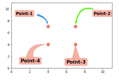
Below, we have created one more example demonstrating how to add arrow annotations to chart. We have added various fancy arrows to chart and modified their properties as well.
import matplotlib.pyplot as plt

plt.scatter(x=[4,4,7,7], y=[4,7,4,7], c="tomato", s=100, alpha=0.9);
plt.xlim(0,11);
plt.ylim(0,11);

plt.annotate("Point-1", xy=(4,7), xytext=(0.5, 9),
                 fontsize=14, fontweight="bold", ## Font settings,
                 arrowprops=dict(arrowstyle="fancy", color="dodgerblue",
                                 connectionstyle="angle3,angleA=0,angleB=-90",
                                 shrinkA=10, shrinkB=10),
                 bbox=dict(boxstyle="round",   ## Bounding box settings
                           facecolor="tomato", alpha=0.5, linewidth=0),
                );
plt.annotate("Point-2", xy=(7,7), xytext=(9, 9),
             fontsize=14, fontweight="bold", ## Font settings
             arrowprops=dict(arrowstyle="simple", color="lime", connectionstyle="arc3, rad=0.8",
                             shrinkA=10, shrinkB=10),
             bbox=dict(boxstyle="round",   ## Bounding box settings
                           facecolor="tomato", alpha=0.5, linewidth=0),
             );
plt.annotate("Point-3", xy=(7,4), xytext=(6, 0.8),
             fontsize=16, fontweight="bold", ## Font settings
             arrowprops=dict(arrowstyle="wedge, tail_width=1.5", color="tomato", alpha=0.5, shrinkA=0),
             bbox=dict(boxstyle="round",   ## Bounding box settings
                       color="tomato", alpha=0.5),
             );
plt.annotate("Point-4", xy=(4,4), xytext=(1, 1),
             fontsize=16, fontweight="bold", ## Font settings
             arrowprops=dict(arrowstyle="wedge, tail_width=1.5", color="tomato",
                             connectionstyle="angle3, angleA=100, angleB=0",
                             alpha=0.5,
                             shrinkA=0, shrinkB=10),
             bbox=dict(boxstyle="round",   ## Bounding box settings
                           facecolor="tomato", alpha=0.5, linewidth=0),
            );
3. Span Annotations 
In this section, we have explained how to add span annotations (two vertical / horizontal lines specifying span) using matplotlib.
Below, we have imported Apple OHLC data that we downloaded from yahoo finance as a CSV file and loaded it in memory as pandas dataframe. We'll create chart using this dataframe and then add span annotation to it.
import pandas as pd

apple_df = pd.read_csv("datasets/AAPL.csv")
apple_df["Date"] = pd.to_datetime(apple_df["Date"])

apple_df.head()
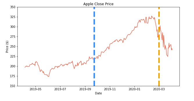
Below, we have first created line chart showing movement of apple stock's close price over time.
Then, we have added two vertical lines showing span of area where price was constantly rising. We added vertical lines to chart using vlines() function of pyplot.
For x-axis locations, we have provided values as date object available from Python datetime module. Then, next two values are y-axis values specifying their start and endpoints.
We have also modified vertical line properties like line width, line style, color, etc to make it look good.
import matplotlib.pyplot as plt
from datetime import date

plt.figure(figsize=(10,5))

plt.plot(apple_df["Date"], apple_df["Close"], c="tomato")

plt.vlines(date(2019,9,23), 150, 350, colors="dodgerblue", linewidth=5.0, linestyle="dashed", label="Rise")
plt.vlines(date(2020,3,1), 150, 350, colors="orange", linewidth=5.0, linestyle="dashed", label="Fall")

plt.ylim(150,350)

plt.xlabel("Date")
plt.ylabel("Price ($)")

plt.title("Apple Close Price")

plt.show()
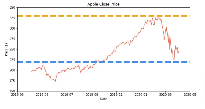
Below, we have created another example demonstrating how to add span annotation to chart. This time, we have added horizontal lines showing horizontal span.
We have added horizontal lines using hlines() function available from pyplot. The first value is Y axis values and next two values are min & max x-axis values specified as date object.
import matplotlib.pyplot as plt
from datetime import date

plt.figure(figsize=(10,5))

plt.plot(apple_df["Date"], apple_df["Close"], c="tomato")

plt.hlines(220, date(2019,3,1), date(2020,5,1), colors="dodgerblue", linewidth=5.0, linestyle="dashed", label="Rise1")
plt.hlines(330, date(2019,3,1), date(2020,5,1), colors="orange", linewidth=5.0, linestyle="dashed", label="Rise2")

plt.xlim(date(2019,3,1), date(2020,5,1))
plt.ylim(150,350)

plt.xlabel("Date")
plt.ylabel("Price ($)")

plt.title("Apple Close Price")

plt.show()
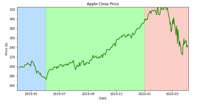
4. Box Annotations 
In this section, we have explained how to add box annotation to matplotlib charts. Box annotation colors particular background areas of chart to specify some important sections.
Below, we have first created our line chart showing close prices of apple stock.
Then, we have added box annotation to chart by dividing background area of chart into 3 different boxes and coloring them with a different color to highlight their importance. This section could mean different things like blue can highlight stagnant period, green can highlight bull and red can highlight bear period. Box annotations can be used for many different purposes.
We have created box annotations by calling fill_betweenx() function of pyplot three times. The function takes y-axis values (y) as range and min & max x-axis values (x1, x2) to cover area. We can provide color and alpha parameters as well.
For x-axis, we have provided values of are date object because we have dates on X axis.
import matplotlib.pyplot as plt
from datetime import date

plt.figure(figsize=(10,5))

plt.plot(apple_df["Date"], apple_df["Close"], c="green", linewidth=2.0)

plt.fill_betweenx(y=[150,325], x1=date(2019,4,1), x2=date(2019,6,1),
                  alpha=0.3, color="dodgerblue")
plt.fill_betweenx(y=[150,325], x1=date(2019,6,1), x2=date(2020,1,1),
                  alpha=0.3, color="lime")
plt.fill_betweenx(y=[150,325], x1=date(2020,1,1), x2=date(2020,4,5),
                  alpha=0.3, color="tomato")

plt.xlabel("Date")
plt.ylabel("Price ($)")

plt.xlim(date(2019,4,1), date(2020,4,5))
plt.ylim(150,325)

plt.title("Apple Close Price")

plt.show()
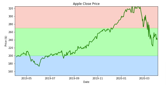
Below, we have created another example demonstrating how to add box annotations to matplotlib charts. This time, we have added horizontal boxes to chart.
We can add horizontal boxes using fill_between() function of pyplot which is different from fill_betweenx() we used in previous cell. For this one, we are giving x-axis values (x) as range and min & max values (y1, y2) for Y axis.
import matplotlib.pyplot as plt
from datetime import date

plt.figure(figsize=(10,5))

plt.plot(apple_df["Date"], apple_df["Close"], c="green", linewidth=2.0)

plt.fill_between(x=[date(2019,4,1), date(2020,4,5)], y1=150, y2=200, alpha=0.3, color="dodgerblue")
plt.fill_between(x=[date(2019,4,1), date(2020,4,5)], y1=200, y2=270, alpha=0.3, color="lime")
plt.fill_between(x=[date(2019,4,1), date(2020,4,5)], y1=270, y2=325, alpha=0.3, color="tomato")

plt.xlabel("Date")
plt.ylabel("Price ($)")

plt.xlim(date(2019,4,1), date(2020,4,5))
plt.ylim(150,325)

plt.title("Apple Close Price")

plt.show()
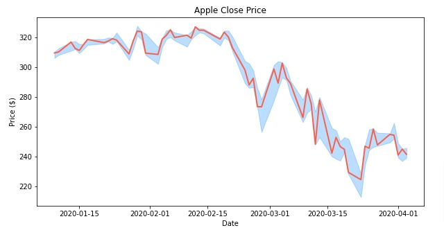
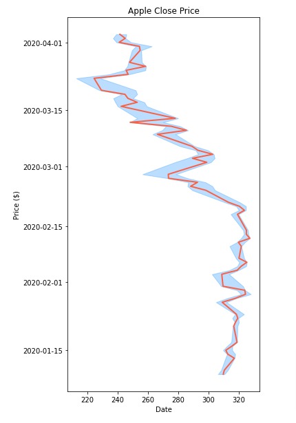
5. Bound Annotations 
In this section, we have introduced how to add bound annotation to our chart. Bound annotation generally highlights area around line in line chart. It can be used to highlight range, confidence interval, etc.
Below, we have first created a simple line chart showing close prices of apple stock. We have used last 60 points from our dataset to make chart easy.
Then, we have added bound around it based on low and high prices during those days.
To add bound, we have used fill_between() function which we used in previous section as well. We can provide list of values to parameters of this function. For x-axis, we have provided dates (x), and for y-axis min & max, we have provided low prices and high prices (y1, y2).
We can see from resulting chart that it creates a bound around line based on low and high prices for each day.
import matplotlib.pyplot as plt
from datetime import date

plt.figure(figsize=(10,5))

plt.plot(apple_df[-60:]["Date"], apple_df[-60:]["Close"], c="tomato", linewidth=2.0)

plt.fill_between(x=apple_df[-60:]["Date"], y1=apple_df[-60:]["Low"], y2=apple_df[-60:]["High"],
                 alpha=0.3, color="dodgerblue")

plt.xlabel("Date")
plt.ylabel("Price ($)")

plt.title("Apple Close Price")

plt.show()
Below, we have created another example demonstrating how to add bound annotation to chart.
We have again created a line chart but exchanged x and y-axis values so that we have dates on y-axis and close prices on x-axis.
Then, we have added bound using fill_betweenx() function.
import matplotlib.pyplot as plt
from datetime import date

plt.figure(figsize=(5,10))

plt.plot(apple_df[-60:]["Close"],apple_df[-60:]["Date"], c="tomato", linewidth=2.0)

plt.fill_betweenx(y=apple_df[-60:]["Date"], x1=apple_df[-60:]["Low"], x2=apple_df[-60:]["High"],
                 alpha=0.3, color="dodgerblue")

plt.xlabel("Date")
plt.ylabel("Price ($)")

plt.title("Apple Close Price")

plt.show()
This ends our small tutorial explaining how to add annotations to matplotlib charts. We explained various annotations in our tutorial with simple examples.
References
 Sunny Solanki
Sunny Solanki
Intro: Software Developer | Youtuber | Bonsai Enthusiast
About: Sunny Solanki holds a bachelor's degree in Information Technology (2006-2010) from L.D. College of Engineering. Post completion of his graduation, he has 8.5+ years of experience (2011-2019) in the IT Industry (TCS). His IT experience involves working on Python & Java Projects with US/Canada banking clients. Since 2020, he’s primarily concentrating on growing CoderzColumn.
His main areas of interest are AI, Machine Learning, Data Visualization, and Concurrent Programming. He has good hands-on with Python and its ecosystem libraries.
Apart from his tech life, he prefers reading biographies and autobiographies. And yes, he spends his leisure time taking care of his plants and a few pre-Bonsai trees.
Contact: sunny.2309@yahoo.in


![YouTube Subscribe]() Comfortable Learning through Video Tutorials?
Comfortable Learning through Video Tutorials?
If you are more comfortable learning through video tutorials then we would recommend that you subscribe to our YouTube channel.
![Need Help]() Stuck Somewhere? Need Help with Coding? Have Doubts About the Topic/Code?
Stuck Somewhere? Need Help with Coding? Have Doubts About the Topic/Code?
 Stuck Somewhere? Need Help with Coding? Have Doubts About the Topic/Code?
When going through coding examples, it's quite common to have doubts and errors.
If you have doubts about some code examples or are stuck somewhere when trying our code, send us an email at coderzcolumn07@gmail.com. We'll help you or point you in the direction where you can find a solution to your problem.
You can even send us a mail if you are trying something new and need guidance regarding coding. We'll try to respond as soon as possible.
![Share Views]() Want to Share Your Views? Have Any Suggestions?
Want to Share Your Views? Have Any Suggestions?
 Want to Share Your Views? Have Any Suggestions?
If you want to
- provide some suggestions on topic
- share your views
- include some details in tutorial
- suggest some new topics on which we should create tutorials/blogs
 matplotlib, annotations