Waterfall Chart using Matplotlib | Python
Waterfall charts are commonly used to understand how an initial value (for example net revenue) is impacted by a series of positive or negative values. It helps understand the cumulative effect.
The most common use cases of waterfall charts are financial analysis and quantitative analysis (inventory analysis and performance analysis).
What Can You Learn From This Article?
As a part of this tutorial, we have explained how to create waterfall charts using Python library "matplotlib". Tutorial covers a guide to creating simple waterfall chart and then improving its looks & feel as well. Apart from normal waterfall charts with vertical bars, tutorial also covers how to create waterfall charts with horizontal bars. We have created waterfall charts using "pyplot" API of matplotlib.
If you are new to matplotlib and want to learn about it from basic then please feel free to check our detailed tutorial on it.
Video Tutorial
If you are comfortable learning through videos then please feel free to check our video tutorial on waterfall charts.
Below, we have imported matplotlib and printed the version that we have used in our tutorial.
import matplotlib

print("Matplotlib Version : {}".format(matplotlib.__version__))
Chart 1
In this section, we have explained our first waterfall chart.
Load Dataset
Below, we have created a sample dataset that we'll use for our purpose. The dataset has 3 types of entries:
- Positive values (earnings/revenues)
- 0s - Location where we want cumulative of all previous values
- Negative values (Cost / Purchases)
import pandas as pd

labels = ["Sales", "Consulting", "Net Revenue", "Purchases", "Other Expenses", "Profit"]
values = [60000, 80000, 0, -40000, -30000, 0]

df = pd.DataFrame({"Labels": labels, "Vals": values})

df
Below, we have calculated cumulative values and then modified cumulative where original values are negative. These modified cumulative values will be used in future for other logic and text annotation purposes.
Apart from this, we have also added a color column to dataframe specifying colors of bars of waterfall chart. The green color is used for positive values, red for negative values, and dodgerblue when we want cumulative of all previous values.
df["Cumulative"] = df["Vals"].cumsum()
df["Cumulative"] = [cum-val if val<0 else cum for cum, val in df[["Cumulative", "Vals"]].values]

## Bar Colors
df["Color"] = ["green" if val>0 else "red" if val<0 else "dodgerblue" for val in df["Vals"]]

df
Below, we have included logic that calculated bottom and height values for bars of our waterfall charts. The logic takes into consideration current value and previous values to calculate these values. The bottom values are values of Y-axis from where bar will start and height is height of bar from bottom location.
Once, we have calculated bottom and height values of bars, we can easily create a waterfall chart.
bottom = [0,]
height = [values[0],]

for i, val in enumerate(values[1:], start=1):
    if val==0: ## Current Value equal to 0
        bottom.append(0)
        height.append(df["Cumulative"][i])
    elif val > 0: ## Current Value greater than 0
        if values[i-1] >=0:
            bottom.append(df["Cumulative"][i-1])
        else:
            bottom.append(bottom[i-1])
        height.append(val)
    elif val < 0: ## Current Value less than 0
        if values[i-1] >=0:
            bottom.append(df["Cumulative"][i-1]+val)
        else:
            bottom.append(bottom[i-1]+val)
        height.append(-val)

df["Bottom"] = bottom
df["Height"] = height

df
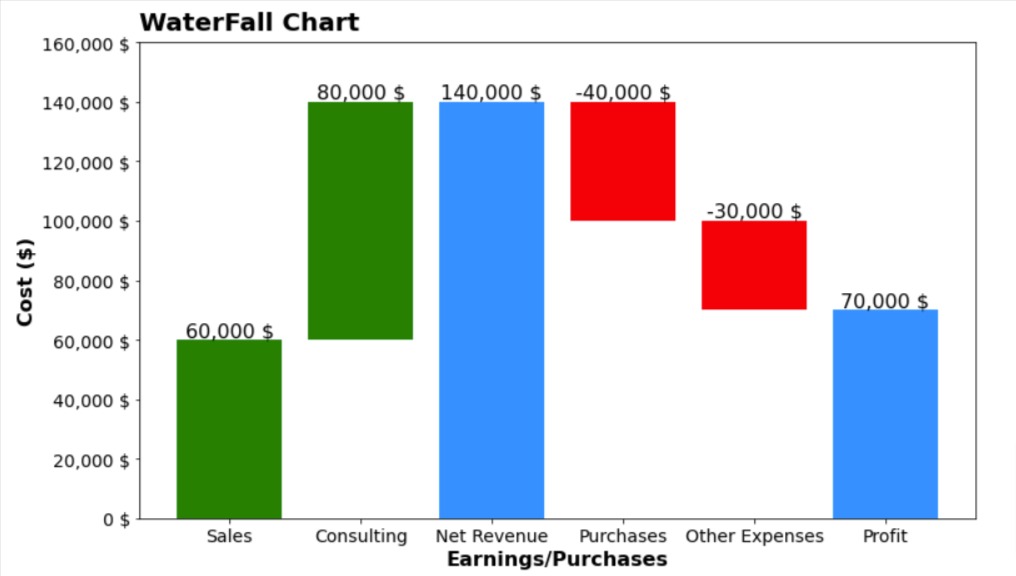
Below, we have created our first waterfall chart using various columns of our modified dataset.
First of all, we have created a figure object.
Then, we have plotted bars of waterfall chart using height, bottom, and color columns of our dataframe.
Then, we have modified X and Y axes' tick labels.
After that, we have added annotation on top of bar.
At last, we have added X axis label, Y-axis label, and title of chart.
If you want to add line connecting bars which is sometimes used by some examples then you can uncomment code call to plt.step() method.
import matplotlib.pyplot as plt

fig = plt.figure(figsize=(12,7))

plt.bar(x=df.index, height=df["Height"], bottom=df["Bottom"], color=df["Color"]);
#plt.step(df.index, df["Cumulative"], where="mid", color="black");

plt.xticks(df.index, df["Labels"], fontdict=dict(fontsize=14));
plt.yticks(range(0, 160001, 20000), ["{:,} $".format(val) for val in range(0, 160001, 20000)],
           fontdict=dict(fontsize=14)
          );

for idx in range(len(df)):
    plt.text(x=df.index[idx], y=df["Cumulative"][idx],
             s="{:,} $".format(df["Vals"][idx] if df["Vals"][idx]!=0 else df["Cumulative"][idx]),
             ha="center", va="bottom", fontdict=dict(fontsize=16)
            );

plt.xlabel("Earnings/Purchases", fontdict=dict(fontsize=16, fontweight="bold"))
plt.ylabel("Cost ($)", fontdict=dict(fontsize=16, fontweight="bold"))
plt.title("WaterFall Chart", loc="left", pad=10, fontdict=dict(fontsize=20, fontweight="bold"));
Add Theme to Improve Look of Chart
Our previous chart has a default matplotlib theme which is not that attractive. Matplotlib let us add theme of famous libraries and blogs to our charts with just one line of code.
Below, we have used "fivethirtyeight" theme which is based on fivethirtyeight blog website.
Now, we can see that our charts look has improved. It modifies things like chart background, label fonts, and so on. It even added grid to chart.
If you want to learn more about how to improve look and feel of your matplotlib charts by adding theme to them then please feel free to check below video tutorial. We have covered topic in detail over there.
plt.style.use("fivethirtyeight");
import matplotlib.pyplot as plt

fig = plt.figure(figsize=(12,7))

plt.bar(x=df.index, height=df["Height"], bottom=df["Bottom"], color=df["Color"]);
#plt.step(df.index, df["Cumulative"], where="mid", color="black");

plt.xticks(df.index, df["Labels"], fontdict=dict(fontsize=14));
plt.yticks(range(0, 160001, 20000), ["{:,} $".format(val) for val in range(0, 160001, 20000)],
           fontdict=dict(fontsize=14)
          );

for idx in range(len(df)):
    plt.text(x=df.index[idx], y=df["Cumulative"][idx],
             s="{:,} $".format(df["Vals"][idx] if df["Vals"][idx]!=0 else df["Cumulative"][idx]),
             ha="center", va="bottom", fontdict=dict(fontsize=16)
            );

plt.xlabel("Earnings/Purchases", fontdict=dict(fontsize=16, fontweight="bold"))
plt.ylabel("Cost ($)", fontdict=dict(fontsize=16, fontweight="bold"))
plt.title("WaterFall Chart", loc="left", pad=10, fontdict=dict(fontsize=20, fontweight="bold"));
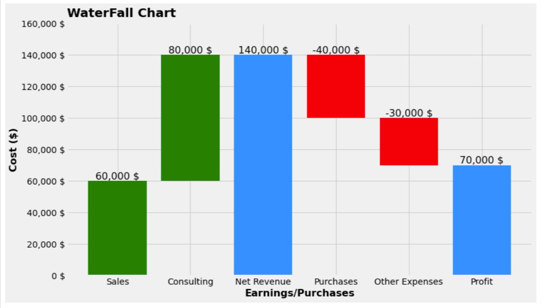
Chart 2
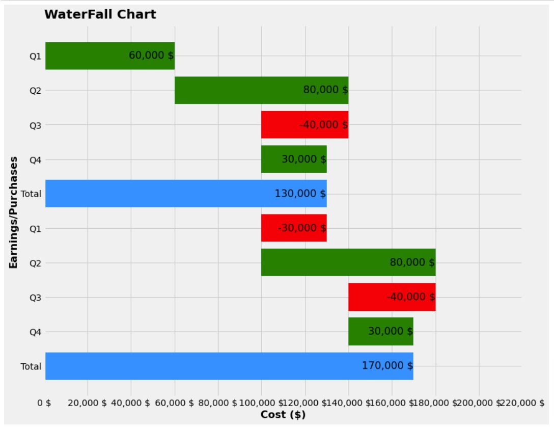
Our previous example of a waterfall chart had all green and red bars together. They were not interleaving. There can be situations where we have red and green bars interleaving.
Hence, we have created one more example to check our logic for calculating height and bottom values.
Below, we have created a new dataset and calculated cumulative values in it. We have also added color column for color of bars.
import pandas as pd

labels = ["Q1", "Q2", "Q3", "Q4", "Total", "Q1", "Q2", "Q3", "Q4", "Total"]
values = [60000, 80000, -40000, 30000, 0, -30000, 80000, -40000, 30000, 0]

df = pd.DataFrame({"Labels": labels, "Vals": values})

df["Cumulative"] = df["Vals"].cumsum()
df["Cumulative"] =[cum-val if val<0 else cum for cum, val in df[["Cumulative", "Vals"]].values]

df["Color"] = ["green" if val>0 else "red" if val<0 else "dodgerblue" for val in df["Vals"]]

df
Below, we have included exactly same logic that we used for our first chart to calculate bottom and height values.
bottom = [0,]
height = [values[0],]

for i, val in enumerate(values[1:], start=1):
    if val==0:
        bottom.append(0)
        height.append(df["Cumulative"][i])
    elif val > 0:
        if values[i-1] >=0:
            bottom.append(df["Cumulative"][i-1])
        else:
            bottom.append(bottom[i-1])
        height.append(val)
    elif val < 0:
        if values[i-1] >=0:
            bottom.append(df["Cumulative"][i-1]+val)
        else:
            bottom.append(bottom[i-1]+val)
        height.append(-val)

df["Bottom"] = bottom
df["Height"] = height

df
The code below creates our second waterfall chart which uses the new dataset. We can see that our logic to calculate bottom and height seems to be working fine. The code is exactly same as our previous chart.
import matplotlib.pyplot as plt

fig = plt.figure(figsize=(15,8))

plt.bar(x=df.index, height=df["Height"], bottom=df["Bottom"], color=df["Color"]);
#plt.step(df.index, df["Cumulative"], where="mid", color="black");

plt.xticks(df.index, df["Labels"], fontdict=dict(fontsize=14));
plt.yticks(range(0, 220001, 20000), ["{:,} $".format(val) for val in range(0, 220001, 20000)],
           fontdict=dict(fontsize=14)
          );

for idx in range(len(df)):
    plt.text(x=df.index[idx], y=df["Cumulative"][idx],
             s="{:,} $".format(df["Vals"][idx] if df["Vals"][idx]!=0 else df["Cumulative"][idx]),
             ha="center", va="bottom", fontdict=dict(fontsize=16)
            );

plt.xlabel("Earnings/Purchases", fontdict=dict(fontsize=16, fontweight="bold"))
plt.ylabel("Cost ($)", fontdict=dict(fontsize=16, fontweight="bold"))
plt.title("WaterFall Chart", loc="left", pad=10, fontdict=dict(fontsize=20, fontweight="bold"));
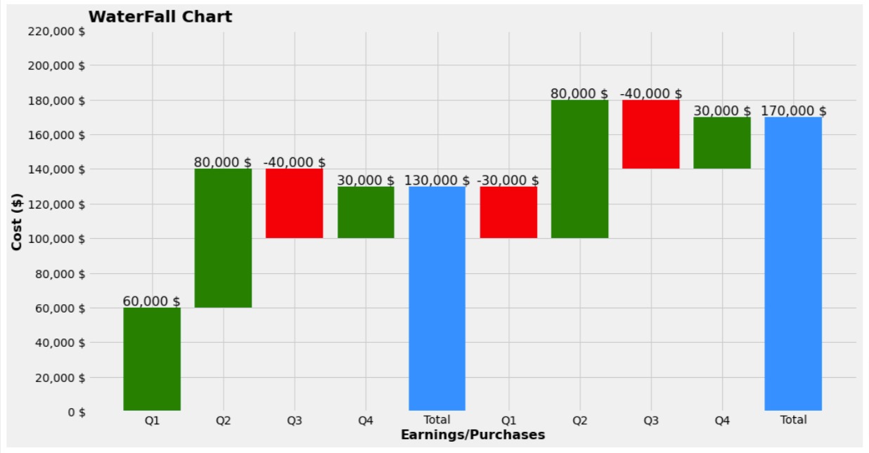
Chart 3
In this section, we have created a variety of waterfall chart where all charts are laid out horizontally. We have done it by using barh() method instead of bar() method.
The code is almost same as our previous example with minor changes in method name. We have also reversed labels and ticks of axes.
import matplotlib.pyplot as plt

fig = plt.figure(figsize=(12,10))

plt.barh(y=df.index, width=df["Height"], left=df["Bottom"], color=df["Color"]);
#plt.step(df.index, df["Cumulative"], where="mid", color="black");

plt.yticks(df.index, df["Labels"], fontdict=dict(fontsize=14));
plt.xticks(range(0, 220001, 20000), ["{:,} $".format(val) for val in range(0, 220001, 20000)],
           fontdict=dict(fontsize=14)
          );

for idx in range(len(df)):
    plt.text(y=df.index[idx], x=df["Cumulative"][idx],
             s="{:,} $".format(df["Vals"][idx] if df["Vals"][idx]!=0 else df["Cumulative"][idx]),
             ha="right", va="center", fontdict=dict(fontsize=16)
            );

plt.ylabel("Earnings/Purchases", fontdict=dict(fontsize=16, fontweight="bold"))
plt.xlabel("Cost ($)", fontdict=dict(fontsize=16, fontweight="bold"))
plt.title("WaterFall Chart", loc="left", pad=10, fontdict=dict(fontsize=20, fontweight="bold"));
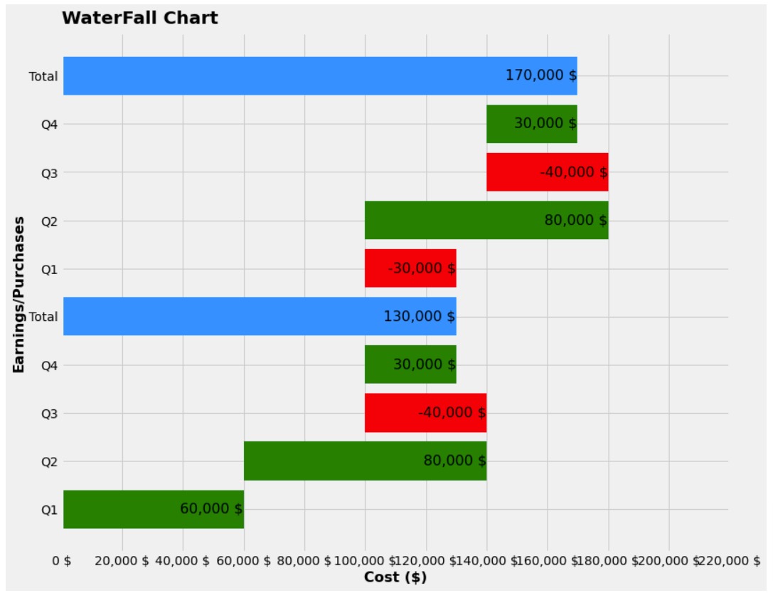
Chart 4
Below, we have created our fourth and last waterfall chart. Our waterfall chart in this example also has horizontal bars like our previous example.
But there is one change.
In our previous examples, bars started from bottom whereas, in this example, it starts from top. We have done it by reversing list of values.
import matplotlib.pyplot as plt

fig = plt.figure(figsize=(12,10))

plt.barh(y=df.index, width=df["Height"][::-1], left=df["Bottom"][::-1], color=df["Color"][::-1]);
#plt.step(df.index, df["Cumulative"], where="mid", color="black");

plt.yticks(df.index, df["Labels"][::-1], fontdict=dict(fontsize=14));
plt.xticks(range(0, 220001, 20000), ["{:,} $".format(val) for val in range(0, 220001, 20000)],
           fontdict=dict(fontsize=14)
          );

for idx in range(len(df)):
    plt.text(y=df.index[idx], x=df["Cumulative"].values[::-1][idx],
             s="{:,} $".format(df["Vals"].values[::-1][idx] if df["Vals"].values[::-1][idx]!=0 else df["Cumulative"].values[::-1][idx]),
             ha="right", va="center", fontdict=dict(fontsize=16)
            );

plt.ylabel("Earnings/Purchases", fontdict=dict(fontsize=16, fontweight="bold"))
plt.xlabel("Cost ($)", fontdict=dict(fontsize=16, fontweight="bold"))
plt.title("WaterFall Chart", loc="left", pad=10, fontdict=dict(fontsize=20, fontweight="bold"));
 Sunny Solanki
Sunny Solanki
Intro: Software Developer | Youtuber | Bonsai Enthusiast
About: Sunny Solanki holds a bachelor's degree in Information Technology (2006-2010) from L.D. College of Engineering. Post completion of his graduation, he has 8.5+ years of experience (2011-2019) in the IT Industry (TCS). His IT experience involves working on Python & Java Projects with US/Canada banking clients. Since 2020, he’s primarily concentrating on growing CoderzColumn.
His main areas of interest are AI, Machine Learning, Data Visualization, and Concurrent Programming. He has good hands-on with Python and its ecosystem libraries.
Apart from his tech life, he prefers reading biographies and autobiographies. And yes, he spends his leisure time taking care of his plants and a few pre-Bonsai trees.
Contact: sunny.2309@yahoo.in


![YouTube Subscribe]() Comfortable Learning through Video Tutorials?
Comfortable Learning through Video Tutorials?
If you are more comfortable learning through video tutorials then we would recommend that you subscribe to our YouTube channel.
![Need Help]() Stuck Somewhere? Need Help with Coding? Have Doubts About the Topic/Code?
Stuck Somewhere? Need Help with Coding? Have Doubts About the Topic/Code?
 Stuck Somewhere? Need Help with Coding? Have Doubts About the Topic/Code?
When going through coding examples, it's quite common to have doubts and errors.
If you have doubts about some code examples or are stuck somewhere when trying our code, send us an email at coderzcolumn07@gmail.com. We'll help you or point you in the direction where you can find a solution to your problem.
You can even send us a mail if you are trying something new and need guidance regarding coding. We'll try to respond as soon as possible.
![Share Views]() Want to Share Your Views? Have Any Suggestions?
Want to Share Your Views? Have Any Suggestions?
 Want to Share Your Views? Have Any Suggestions?
If you want to
- provide some suggestions on topic
- share your views
- include some details in tutorial
- suggest some new topics on which we should create tutorials/blogs
 waterfall-charts, matplotlib