SHAP Values - Interpret Predictions Of ML Models using Game-Theoretic Approach
Machine learning models are commonly getting used to solving many problems nowadays and it has become quite important to understand the performance of these models. The classic ML metrics like accuracy, mean squared error, r2 score, etc do not give detailed insight into the performance of the model. We can have a machine learning model which gives more than 90% accuracy for classification tasks but fails to recognize some classes properly due to imbalanced data or the model is actually detecting features that do not make sense to be used to predict a particular class. There are many python libraries (eli5, LIME, SHAP, interpret,treeinterpreter, captum etc) available which can be used to debug models to better understand a model and its performance on any sample of the data. These libraries can help us better understand how each feature is contributing to prediction. A deep understanding of our ML models can help us decide the reliability of our ML models and whether they fit to be put into production.
As a part of this tutorial, we'll be concentrating on how to use Python library SHAP to analyze the performance of machine learning models by interpreting predictions on individual examples. We'll be trying various machine learning tasks (classification & regression) and then interpret predictions made by those models using SHAP Values to further understand the performance of the model in-depth.
1. What does SHAP Stand for?
The SHAP stands for SHapley Additive exPlanations and uses the approach of game theory to explain model predictions.
2. How does SHAP Library Works?, What are SHAP values?, How SHAP Values are generated?
SHAP starts with some base value for prediction based on prior knowledge and then tries features of data one by one to understand the impact of the introduction of that feature on our base value to make the final prediction. It even takes into account orders of feature introduction as well as the interaction between features helping us better understand model performance. During this process, it records SHAP values which will be later used for plotting and explaining predictions.
These SHAP values are generated for each feature of data and generally show how much it impacts prediction. SHAP has many explainer objects which use different approaches to generate SHAP values based on the algorithm used behind them. We have listed them later giving a few line explanations about them.
3. How to Interpret Predictions using SHAP?
- Load shap library (import and initialize it).
- Create any Explainer object.
- Generate SHAP values for data examples using the explainer object.
- Create various visualizations using those shap values explaining prediction.
Below, we have listed important sections of the tutorial to give an overview of the material covered.
Important Sections Of Tutorial
- SHAP - SHapley Additive exPlanations
- 1.1 SHAP Explainers
- 1.2 SHAP Values Visualization Charts
- Structured Data : Regression
- 2.1 Load Dataset
- 2.2 Divide Dataset Into Train/Test Sets, Train Model, and Evaluate Model
- 2.3 Explain Predictions using SHAP Values
- 2.3.1 Create Explainer Object (LinearExplainer)
- 2.3.2 Bar Plot
- 2.3.3 Waterfall Plot
- 2.3.4 Decision Plot
- 2.3.5 Dependence Plot
- 2.3.6 Embedding Plot
- 2.3.7 Force Plot
- 2.3.8 Summary Plot
- 2.3.9 Partial Dependence Plot
- Structured Data : Classification
- 3.1 Load Dataset
- 3.2 Divide Dataset Into Train/Test Sets, Train Model, and Evaluate Model
- 3.3 Explain Predictions using SHAP Values
- 3.3.1 Create Explainer Object (LinearExplainer)
- Various Charts like Regression Section
Please make a NOTE that this tutorial primarily concentrates on using SHAP values for models (scikit-learn) working on tabular datasets. If you are looking for a guide to use SHAP with unstructured datasets (image, text, etc) then please feel free to check the below links. If you are new to SHAP then we'll recommend that you continue with this tutorial.
Text Datasets:
- Explain Keras Text Classification Models using SHAP Values
- SHAP Values for Text Classification Tasks
Image Datasets:
We'll start by importing the necessary Python libraries.
import pandas as pd
import numpy as np

import warnings
warnings.filterwarnings("ignore")
import sklearn

print("Scikit-Learn Version : {}".format(sklearn.__version__))
import shap

print("SHAP Version : {}".format(shap.__version__))
1. SHAP - SHapley Additive exPlanations 
Please feel free to skip this theoretical section if you are in hurry. You can refer to it later in your free time.
The SHAP has a list of classes that can help us understand different kinds of machine learning models from many python libraries. These classes are commonly referred to as explainers. This explainer generally takes the ML model and data as input and returns an explainer object which has SHAP values that will be used to plot various charts explained later on. Below is a list of available explainers with SHAP.
1.1 SHAP Explainers
Commonly Used Explainers
- LinearExplainer - This explainer is used for linear models available from sklearn. It can account for the relationship between features as well.
- DeepExplainer - This explainer is designed for deep learning models created using Keras, TensorFlow, and PyTorch. It’s an enhanced version of the DeepLIFT algorithm where we measure conditional expectations of SHAP values based on a number of background samples. It's advisable to keep reasonable samples as background because too many samples will give more accurate results but will take a lot of time to compute SHAP values. Generally, 100 random samples are a good choice.
- PartitionExplainer - This explainer calculates shap values recursively through trying a hierarchy of feature combinations. It can capture the relationship between a group of related features.
- PermutationExplainer - This explainer iterates through all permutations of features in both forward and reverse directions. This explainer can take more time if tried with many samples.
- GradientExplainer - This explainer is used for differentiable models which are based on the concept of expected gradients which itself is an extension of the integrated gradients method.
Other Available Explainers
- AdditiveExplainer - This explainer is used to explain Generalized Additive Models.
- BruteForceExplainer - This explainer uses the brute force approach to find shap values which will try all possible parameter sequences.
- KernelExplainer - This explainer uses special weighted linear regression to compute the importance of each feature and the same values are used as SHAP values.
- SamplingExplainer - This explainer generates shap values based on assumption that features are independent and is an extension of an algorithm proposed in the paper "An Efficient Explanation of Individual Classifications using Game Theory".
- TreeExplainer - This explainer is used for models that are based on a tree-like decision tree, random forest, and gradient boosting.
- CoefficentExplainer - This explainer returns model coefficients as shap values. It does not do any actual shap values calculation.
- LimeTabularExplainer - This explainer simply wrap around LimeTabularExplainer from lime library. If you are interested in learning about lime then please feel free to check our tutorial on the same from references section.
- MapleExplainer - This explainer simply wraps MAPLE into the shap interface.
- RandomExplainer - This explainer simply returns random feature shap values.
- TreeGainExplainer - This explainer returns global gain/Gini feature importances for tree models as shap values.
- TreeMapleExplainer - This explainer provides a wrapper around tree MAPLE into the shap interface.
We'll be primarily concentrating on LinearExplainer as a part of this tutorial which will be used to explain LinearRegression and LogisticRegression model predictions.
1.2 SHAP Values Visualization Charts
Below is a list of available charts with SHAP:
- summary_plot - It creates a bee swarm plot of the shap values distribution of each feature of the dataset.
- decision_plot - It shows the path of how the model reached a particular decision based on the shap values of individual features. The individual plotted line represents one sample of data and how it reached a particular prediction.
- multioutput_decision_plot - Its decision plot for multi-output models (multi-class classification).
- dependence_plot - It shows the relationship between feature value (X-axis) and its shape values (Y-axis).
- force_plot - It plots shap values using additive force layout. It can help us see which features most positively or negatively contributed to prediction.
- image_plot - It plots shape values for images.
- monitoring_plot - It helps in monitoring the behavior of the model over time. It monitors the loss of the model over time.
- embedding_plot - It projects shap values using PCA for 2D visualization.
- partial_dependence_plot - It shows a basic partial dependence plot for a feature.
- bar_plot - It shows a bar plot of shap values' impact on the prediction of a particular sample.
- waterfall_plot - It shows a waterfall plot explaining a particular prediction of the model based on shap values. It kind of shows the path of how shap values were added to the base value to come to a particular prediction.
- text_plot - It plots an explanation of text samples coloring text based on their shap values.
We'll be explaining the majority of charts that are possible with a structured dataset as a part of this tutorial. The two charts (text_plot() and image_plot()) are covered in separate tutorials (deep learning tutorials) which we have listed earlier and are also mentioned in the references section.
2. Structured Data : Regression 
The first example that we'll use for explaining the usage of SHAP is the regression task on structured data.
2.1 Load Dataset
The dataset that we'll use for this task is the Boston housing dataset which is easily available from scikit-learn. We'll be loading the dataset and printing its description explaining various features present in the dataset. We have also loaded the dataset as a pandas dataframe. The target value that we'll predict is the median value of the owner-occupied home in 1000's dollar.
from sklearn.datasets import load_boston

boston = load_boston()

for line in boston.DESCR.split("\n")[5:28]:
    print(line)

boston_df = pd.DataFrame(data=boston.data, columns = boston.feature_names)
boston_df["Price"] = boston.target

boston_df.head()
2.2 Divide Dataset Into Train/Test Sets, Train Model, and Evaluate Model
We'll first divide dataset into train (85%) and test (15%) sets using train_test_split() method available from scikit-learn. We'll then fit a simple linear regression model on train data. Once training is completed, we'll print the R2 score of the model on the train and test dataset. If you are interested in learning about various machine learning metrics and models then please feel free to check our tutorials on sklearn in the Machine Learning section of the website. Here's a link for a tutorial on ML metrics for easy review.
from sklearn.model_selection import train_test_split
from sklearn.linear_model import LinearRegression

X, Y = boston.data, boston.target

print("Total Data Size : ", X.shape, Y.shape)

X_train, X_test, Y_train, Y_test = train_test_split(X, Y, train_size=0.85, test_size=0.15, random_state=123, shuffle=True)

print("Train/Test Sizes : ",X_train.shape, X_test.shape, Y_train.shape, Y_test.shape)

lin_reg = LinearRegression()
lin_reg.fit(X_train, Y_train)

print()
print("Test  R^2 Score : ", lin_reg.score(X_test, Y_test))
print("Train R^2 Score : ", lin_reg.score(X_train, Y_train))
We can notice from the above R2 values that our linear regression model is performing decent (though not that good). We'll now look at various charts provided by SHAP to understand model performance better by choosing a random sample from the test dataset.
2.3 Explain Predictions using SHAP Values 
The SHAP has been designed to generate charts using javascript as well as matplotlib. We'll be generating all charts using javascript backend. In order to do that, we'll need to call initjs() method on shap in order to initialize it.
import shap

shap.initjs()

2.3.1 Create Explainer Object (LinearExplainer)
At first, we'll need to create an explainer object in order to plot various charts explaining a particular prediction.
We'll start by creating LinearExplainer which is commonly used for the linear model. It has the below-mentioned arguments:
- model - It accepts the model which we trained with train data. It can even accept tuple of (coef, intercept) instead.
- data - It accepts data based on which it'll generate SHAP values. We can provide a numpy array, pandas dataframe, scipy sparse matrix, etc. It can also accept tuple with (mean, cov).
- feature_perturbation - It accepts one of the below strings.
- interventional - It lets us compute SHAP values discarding the relationship between features.
- correlation_dependent - It lets us compute SHAP values considering relationship between features.
- nsamples - It accepts integer specifying a number of samples to use for calculating transformation matrix used to account for feature correlation when feature_perturbation is set to correlation_dependent.
Below we have created LinearExplainer by giving model and train data as input. This will create an explainer which does not take the relationship between features considering the correlation between features.
lin_reg_explainer1 = shap.LinearExplainer(lin_reg, X_train)
Below we have used explainer to generate shape value for the 0th sample from the test dataset using the shap_values() method of explainer. The explainer object has a base value to which it adds shape values for a particular sample in order to generate a final prediction. The base value is stored in the expected_value attribute of the explainer object. All model predictions will be generated by adding shap values generated for a particular sample to this expected value. Below we have printed the base value and then generated prediction by adding shape values to this base value in order to compare prediction with the one generated by linear regression.
sample_idx = 0

shap_vals = lin_reg_explainer1.shap_values(X_test[sample_idx])

print("Expected/Base Value : ", lin_reg_explainer1.expected_value)
print()
print("Shap Values for Sample %d : "%sample_idx, shap_vals)
print("\n")
print("Prediction From Model                            : ", lin_reg.predict(X_test[sample_idx].reshape(1,-1))[0])
print("Prediction From Adding SHAP Values to Base Value : ", lin_reg_explainer1.expected_value + shap_vals.sum())
Below we have created another LinearExplainer by giving model and train data as input. We have also set feature_perturbation to correlation_dependent. This will create an explainer which takes into account the relationship between features.
lin_reg_explainer2 = shap.LinearExplainer(lin_reg, X_train, feature_perturbation="correlation_dependent")
sample_idx = 0

shap_vals = lin_reg_explainer2.shap_values(X_test[sample_idx].reshape(1,-1))[0]

print("Base Value : ", lin_reg_explainer2.expected_value)
print()
print("Shap Values for Sample %d : "%sample_idx, shap_vals)
print("\n")
print("Prediction From Model                            : ", lin_reg.predict(X_test[sample_idx].reshape(1,-1))[0])
print("Prediction From Adding SHAP Values to Base Value : ", lin_reg_explainer2.expected_value + shap_vals.sum())
We'll now explain how to plot various charts explained above one by one using both explainers created above.
2.3.2 Bar Plot
The bar plot shows the shap values of each feature for a particular sample of data. Below is a list of important parameters of the bar_plot() method of shap.
- shap_values - It accepts an array of shap values for an individual sample of data.
- feature_names - It accepts a list of feature names.
- max_display - It accepts integer specifying how many features to display in a bar chart.
We can generate shap values by calling the shap_values() method of explainer object passing it samples for which we want to generate shap values. It'll return a list where each entry is a list of shap values for individual samples passed as data.
Below we are generating a bar chart of shap values from our first explainer.
shap.bar_plot(lin_reg_explainer1.shap_values(X_test[0]),
              feature_names=boston.feature_names,
              max_display=len(boston.feature_names))
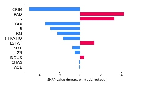
We can see from the above bar chart that for this sample of data features (CRIM, TAX, B, RM, PRATIO, NOX, ZN, CHAS, and AGE) contribute negatively and features (RAD, DIS, LSTAT, ZN) contributes positively for final prediction.
Below we have generated another bar plot of shap values for our second explainer which was based on the relationship between features.
shap.bar_plot(lin_reg_explainer2.shap_values(X_test[0].reshape(1,-1))[0],
              feature_names=boston.feature_names,
              max_display=len(boston.feature_names))
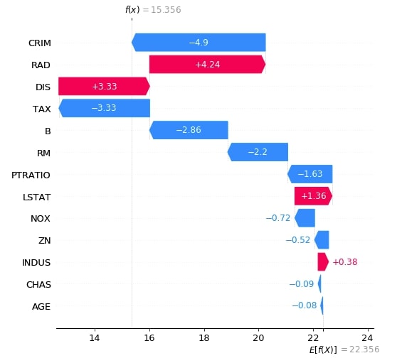
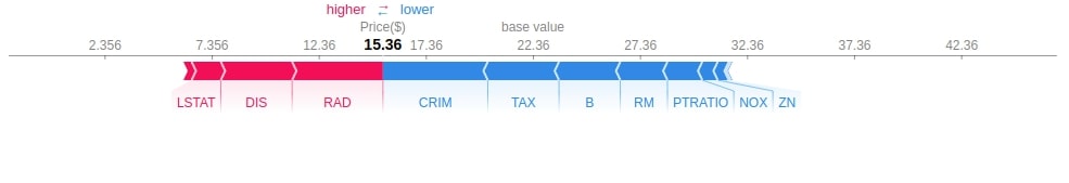
2.3.3 Waterfall Plot
The second chart that we'll explain is a waterfall chart which shows how shap values of individual features are added to the base value in order to generate a final prediction. Below is a list of important parameters of the waterfall_plot() method.
- shap_values - It accepts shap values object for an individual sample of data.
- max_display -It accepts integer specifying how many features to display in a bar chart.
Below we have generated a waterfall plot for the first explainer object which does not consider the interaction between objects.
shap_values = lin_reg_explainer1(X_test[:1])
shap_values.feature_names = boston.feature_names.tolist()

shap.waterfall_plot(shap_values[0], max_display=len(boston.feature_names))
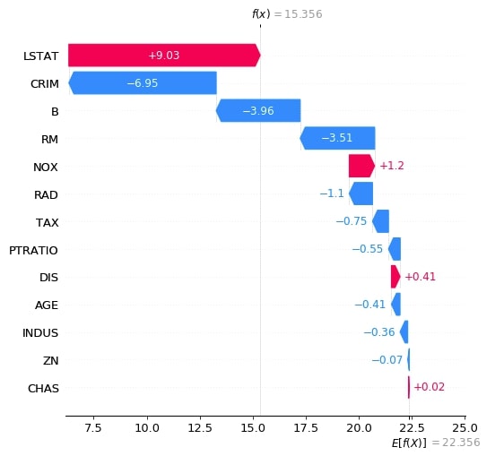
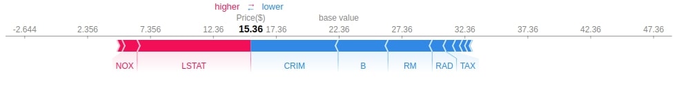
Below we have generated a waterfall plot for the second explainer object which does consider the interaction between objects. We can notice in shap values generated by both explainers as one considers relationship and one does not.
shap_values = lin_reg_explainer2(X_test[:1])
shap_values.feature_names = boston.feature_names.tolist()

shap.waterfall_plot(shap_values[0], max_display=len(boston.feature_names))
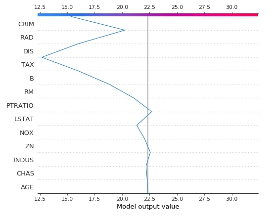
2.3.4 Decision Plot
The decision plot shows like the waterfall chart show the decision path followed by applying the shap values of individual features one by one to the expected value in order to generate predicted value as a line chart.
The decision plot can be used to show a decision path followed for more than one sample as well. Below is a list of important parameters of the decision_plot() method.
- expected_value - It accepts base value on which shap values will be added. The explainer object has a property named expected_value which needs to be passed to this parameter.
- shap_values - It accepts an array of shap values for an individual sample of data.
- feature_names - It accepts a list of feature names.
- feature_order - It accepts a list of below values as input and orders feature accordingly.
- importance - Default Value. Orders feature according to the importance
- hcluse - Hierarchical Clustering
- none
- list of array of indices
- highlight - It accepts a list of indexes specifying which samples to highlight from the list of samples.
- link - It accepts string specifying type of transformation used for the x-axis. It accepts one of the below values.
- identity
- logit
- plot_color - It accepts matplotlib colormap to use to the color plot.
- color_bar - It accepts boolean value specifying whether to display color bar or not.
Below we have drawn the decision plot of a single sample from the test dataset using the first linear explainer.
shap.decision_plot(lin_reg_explainer1.expected_value,
                   lin_reg_explainer1.shap_values(X_test[0]),
                   feature_names=boston.feature_names.tolist(),
                   )
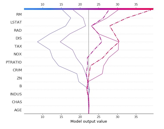
Below we have created another decision plot of 5 samples from the test dataset using the first linear explainer. We have also highlighted 2nd and 3rd samples from a dataset with different line styles.
shap.decision_plot(lin_reg_explainer1.expected_value,
                   lin_reg_explainer1.shap_values(X_test[0:5]),
                   feature_names=boston.feature_names.tolist(),
                   highlight=[1, 2],
                   )
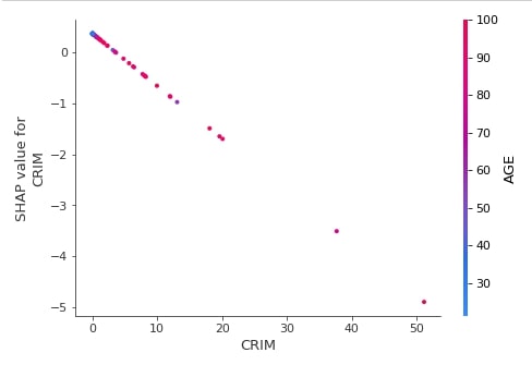
2.3.5 Dependence Plot
The dependence plot shows the relation between actual feature value and shap values for a particular feature of the dataset. We can generate a dependence plot using the dependence_plot() method. Below is a list of important parameters of the dependence_plot() method.
- ind - It accepts either integer specifying the index of feature from data or string specifying the name of the feature. For future names given as a string, we need to provide feature names as a list to parameter feature_names.
- shap_values - It accepts an array of shap values for an individual sample of data.
- features - It accepts dataset which was used to generate shap values given to the shap_values parameter.
- feature_names - It accepts a list of feature names.
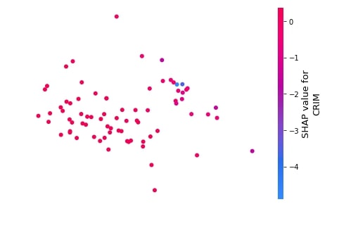
Below we have generated a dependence plot for the CRIM feature using our first linear explainer. It's also showing the interaction of feature with feature AGE whose values are shown as a color bar.
shap.dependence_plot("CRIM",
                     lin_reg_explainer1.shap_values(X_test),
                     features=X_test,
                     feature_names=boston.feature_names,
                     )
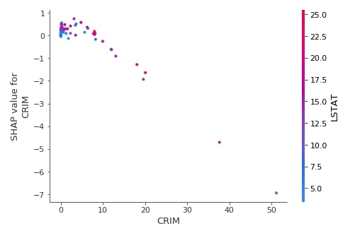
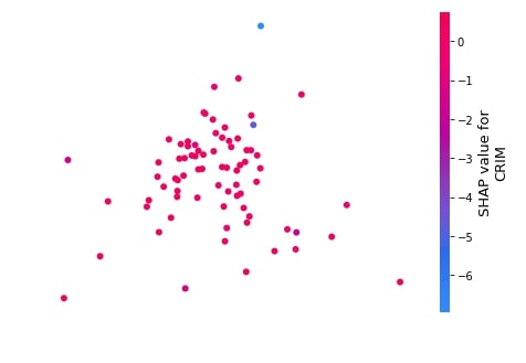
Below we have generated a dependence plot of feature CRIM using the test dataset and second linear explainer created earlier.
shap.dependence_plot("CRIM",
                     lin_reg_explainer2.shap_values(X_test),
                     features=X_test,
                     feature_names=boston.feature_names,
                     )
2.3.6 Embedding Plot
The embedding plot projects shap values to 2D projection using PCA for visualization. This can help us see the spread of different shap values for a particular feature.
We can generate an embedding plot using the embedding_plot() method. Below is a list of important parameters of the embedding_plot() method.
- ind - It accepts either integer specifying the index of feature from data or string specifying the name of the feature. For future names given as a string, we need to provide feature names as a list to parameter feature_names.
- shap_values - It accepts an array of shap values for an individual sample of data.
- feature_names - It accepts a list of feature names.
- method - It accepts string pca or numpy array as input. If pca is given then use PCA to generate 2D projection. If a numpy array is given then its size should be (no_of_sample x 2) and will be considered embedding values.
Below we have generated an embedding plot for the CRIM feature on test data using our first linear explainer.
shap.embedding_plot("CRIM",
                    lin_reg_explainer1.shap_values(X_test),
                    feature_names=boston.feature_names)
Below we have generated an embedding plot for the CRIM feature on test data using our second linear explainer.
shap.embedding_plot("CRIM",
                    lin_reg_explainer2.shap_values(X_test),
                    feature_names=boston.feature_names)
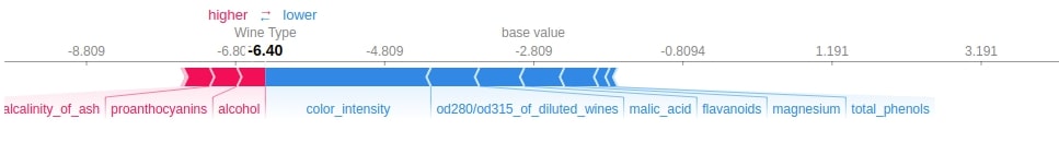
2.3.7 Force Plot
The force plot shows shap values contributions in generating final prediction using an additive force layout. It shows which features contributed to how much positively or negatively to base value to generate a prediction.
We can generate force plot using force_plot() method. Below are list of important parameters for force_plot() method.
- expected_value - It accepts base value on which shap values will be added. The explainer object has a property named expected_value which needs to be passed to this parameter.
- shap_values - It accepts an array of shap values for an individual sample of data.
- feature_names - It accepts a list of feature names.
- out_names - It accepts string specifying target variable name.
Below we have generated a force plot of the first test sample using the first linear explainer. We can see the magnitude of positivity and negativity of features in the chart.
shap.force_plot(lin_reg_explainer1.expected_value,
                lin_reg_explainer1.shap_values(X_test[0]),
                feature_names=boston.feature_names,
                out_names="Price($)")
Below we have generated a force plot of the first test sample using the second linear explainer. We can see that the above RAD feature was contributing more negatively to prediction and here LSTAT is contributing more negatively whereas RAD is contributing positively. The second linear explainer considers the relation between features hence results are different.
shap.force_plot(lin_reg_explainer2.expected_value,
                lin_reg_explainer2.shap_values(X_test[0].reshape(1,-1))[0],
                feature_names=boston.feature_names,
                out_names="Price($)")
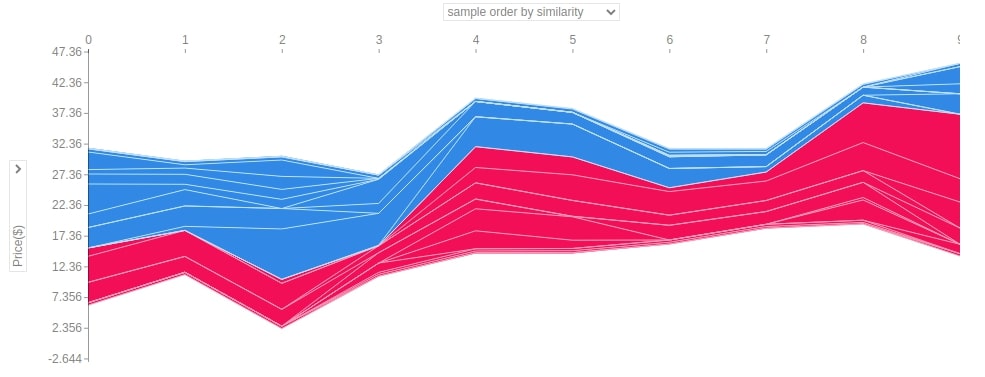
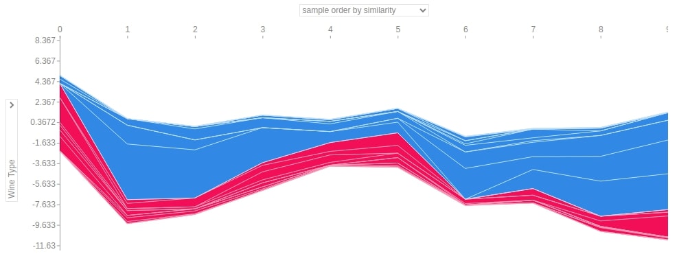
Below we have generated a force plot of 10 samples of the dataset using the first linear explainer. It also provides us with a dropdown on Y-axis which we can change to see the impact of the individual feature on all 10 predictions. In this chart, y-axis values represent predicted values for each sample and the x-axis represents 10 samples from 0-9.
shap.force_plot(lin_reg_explainer1.expected_value,
                lin_reg_explainer1.shap_values(X_test[0:10]),
                feature_names=boston.feature_names,
                out_names="Price($)", figsize=(25,3),
                link="identity")
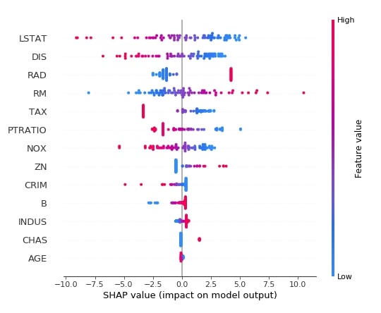
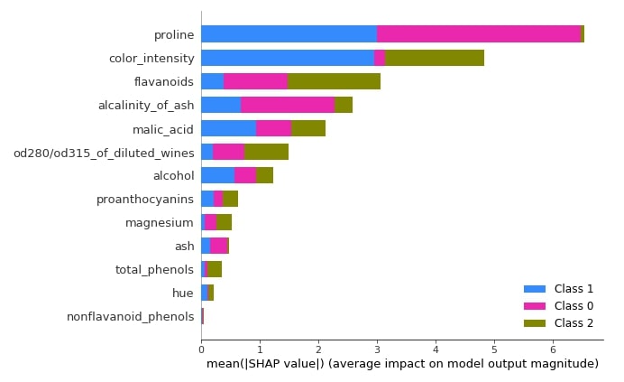
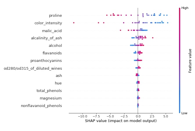
2.3.8 Summary Plot
The summary plot shows the beeswarm plot showing shap values distribution for all features of data. We can also show the relationship between the shap values and the original values of all features.
We can generate summary plot using summary_plot() method. Below are list of important parameters of summary_plot() method.
- shap_values - It accepts array of shap values for individual sample of data.
- features - It accepts dataset which was used to generate shap values given to shap_values parameter.
- feature_names - It accepts list of feature names.
- max_display -It accepts integer specifying how many features to display in bar chart.
- plot_type - It accepts one of the below strings as input.
- dot (default for single output)
- bar - (default for multiple output)
- violin
Below we have generated a summary plot of shap values generated from the test dataset using the first linear explainer. We can see a distribution of shap values and their relation with actual feature values based on the color bar on the right side.
shap.summary_plot(lin_reg_explainer1.shap_values(X_test),
                  features = X_test,
                  feature_names=boston.feature_names)
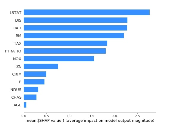
Below we have generated a summary plot with plot type as bar based on shape values generated from test data using the first linear explainer. The bar chart shows the average impact of each feature on the final prediction. This also highlights feature importance based on shap values.
shap.summary_plot(lin_reg_explainer1.shap_values(X_test),
                  feature_names=boston.feature_names,
                  plot_type="bar",
                  color="dodgerblue"
                  )
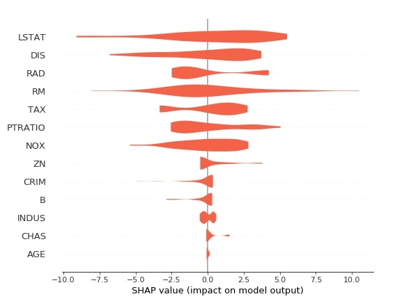
Below we have generated a summary plot with plot type as violin based on shape values generated from test data using the first linear explainer.
shap.summary_plot(lin_reg_explainer1.shap_values(X_test),
                  feature_names=boston.feature_names,
                  plot_type="violin",
                  color="tomato")
2.3.9 Partial Dependence Plot
The shap also provides us with a method named partial_dependence_plot() which can be used to generate a partial dependence plot. Below are list of important parameters of partial_dependence_plot() method.
- ind - It accepts either integer specifying the index of feature from data or string specifying the name of the feature. For future names given as a string, we need to provide feature names as a list to parameter feature_names.
- model - It expects a method that predicts the output of the model.
- data - It's data that will be used for generating the plot.
- feature_names - It accepts a list of feature names.
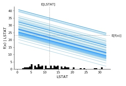
Below we have generated a partial dependence plot of the LSTAT feature based on test data.
shap.partial_dependence_plot("LSTAT",
                             lin_reg.predict,
                             data=X_test,
                             feature_names=boston.feature_names,
                             model_expected_value=True,
                             feature_expected_value=True,
                             ice=True
                             )
3. Structured Data : Classification 
The second example that we'll use for explaining linear explainer is a classification task on structured data.
3.1 Load Dataset
The dataset that we'll use for this task is the wine classification dataset which is easily available from scikit-learn. We'll be loading the dataset and printing its description explaining various features present in the dataset. We have also loaded the dataset as a pandas dataframe. The target value that we'll predict is a class of wine. The dataset has information about three different types of wines.
from sklearn.datasets import load_wine

wine = load_wine()

for line in wine.DESCR.split("\n")[5:28]:
    print(line)

boston_df = pd.DataFrame(data=wine.data, columns = wine.feature_names)
boston_df["WineType"] = wine.target

boston_df.head()
3.2 Divide Dataset Into Train/Test Sets, Train Model, and Evaluate Model
Below we have divided the wine dataset into train & test sets, trained logistic regression model on train data and then evaluated on test data by printing accuracy of it.
from sklearn.model_selection import train_test_split
from sklearn.linear_model import LogisticRegression

X, Y = wine.data, wine.target

print("Total Data Size : ", X.shape, Y.shape)

X_train, X_test, Y_train, Y_test = train_test_split(X, Y, train_size=0.85, test_size=0.15, stratify=Y, random_state=123, shuffle=True)

print("Train/Test Sizes : ",X_train.shape, X_test.shape, Y_train.shape, Y_test.shape)

log_reg = LogisticRegression()
log_reg.fit(X_train, Y_train)

print()
print("Test  Accuracy : ", log_reg.score(X_test, Y_test))
print("Train Accuracy : ", log_reg.score(X_train, Y_train))
3.3 Explain Predictions using SHAP Values 
3.3.1 Create Explainer Object (LinearExplainer)
Below we have created the LinearExplainer object by passing the logistic regression model and train data as input. Please make a note that we are not taking the relation between features this time by not setting the feature_perturbation attribute. The default value for feature_perturbation is interventional.
log_reg_explainer = shap.LinearExplainer(log_reg, X_train)
Below we are generating shap values for the 0th sample of test data. As this is a multi-class classification task the base value will be three different values which are the same as a number of classes in data. The shape values generated by the explainer will also be a list of three arrays which will have shape values for each class. We are again adding shap values for each class to the expected (base) value of each class which will generate three different values, unlike the regression task which only generates one. We then take an index of value which is highest to be a class prediction.
sample_idx = 0

shap_vals = log_reg_explainer.shap_values(X_test[sample_idx])

val1 = log_reg_explainer.expected_value[0] + shap_vals[0].sum()
val2 = log_reg_explainer.expected_value[1] + shap_vals[1].sum()
val3 = log_reg_explainer.expected_value[2] + shap_vals[2].sum()

print("Expected/Base Values : ", log_reg_explainer.expected_value)
print()
print("Shap Values for Sample %d : "%sample_idx, shap_vals)
print("\n")
print("Prediction From Model                            : ", \
                      wine.target_names[log_reg.predict(X_test[sample_idx].reshape(1, -1))[0]])
print("Prediction From Adding SHAP Values to Base Value : ", wine.target_names[np.argmax([val1, val2, val3])])
We'll now explain how to plot various charts for the classification tasks.
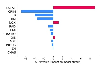
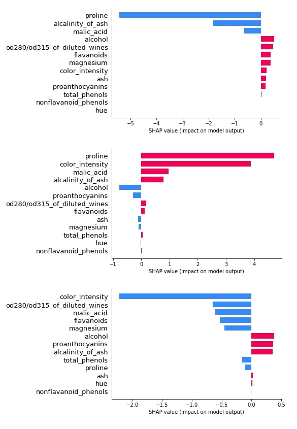
3.3.2 Bar Plot
Below we have plotted 3 bar plot of shap values of the 0th test sample. As we explained earlier, its a multi-class classification problem hence the shap_values() method will return shap values for each class of data. We have plotted shap value for all class types to show how different feature's shap values contribute to each class type differently.
shap.bar_plot(log_reg_explainer.shap_values(X_test[0])[0], feature_names=wine.feature_names, max_display=len(wine.feature_names))
shap.bar_plot(log_reg_explainer.shap_values(X_test[0])[1], feature_names=wine.feature_names, max_display=len(wine.feature_names))
shap.bar_plot(log_reg_explainer.shap_values(X_test[0])[2], feature_names=wine.feature_names, max_display=len(wine.feature_names))
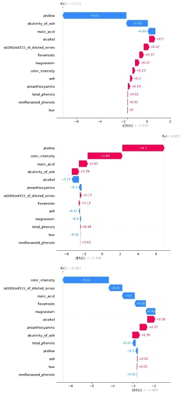
3.3.3 Waterfall Plot
Below we have generated 3 waterfall charts for the 0th sample of test data. We can see that the second chart has the highest value after adding shap values to the expected base value hence prediction is class_1.
shap_values = log_reg_explainer(X_test[:1])
shap_values.feature_names = wine.feature_names

shap_values
shap.waterfall_plot(shap_values[0][:, 0], max_display=len(wine.feature_names))

shap.waterfall_plot(shap_values[0][:, 1], max_display=len(wine.feature_names))

shap.waterfall_plot(shap_values[0][:, 2], max_display=len(wine.feature_names))
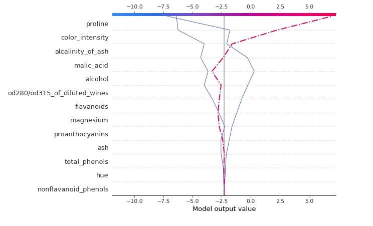
3.3.4 Decision Plot
Below we have generated a decision plot for 0th sample of test data. We have also highlighted the actual prediction. Please make a note that we have used the multioutput_decision_plot() method for generating a plot for this case instead of decision_plot().
shap.multioutput_decision_plot(log_reg_explainer.expected_value.tolist(),
                               log_reg_explainer.shap_values(X_test),
                               row_index=0,
                               feature_names=wine.feature_names,
                               highlight = [1]
                               )
3.3.5 Dependence Plot
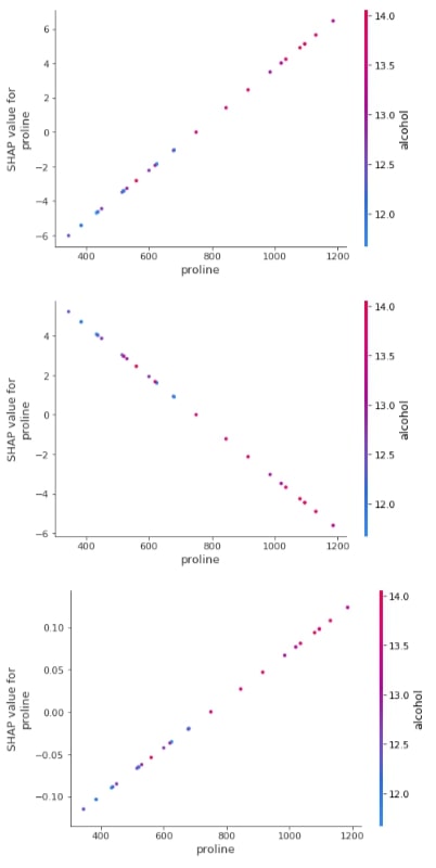
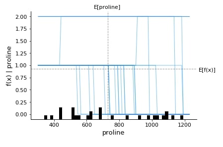
Below we have generated a dependence plot for the proline feature. We have generated 3 dependence plots using 3 different shap values based on a different classes.
shap.dependence_plot("proline",
                     log_reg_explainer.shap_values(X_test)[0],
                     features=X_test,
                     feature_names=wine.feature_names,
                     )

shap.dependence_plot("proline",
                     log_reg_explainer.shap_values(X_test)[1],
                     features=X_test,
                     feature_names=wine.feature_names,
                     )

shap.dependence_plot("proline",
                     log_reg_explainer.shap_values(X_test)[2],
                     features=X_test,
                     feature_names=wine.feature_names,
                     )
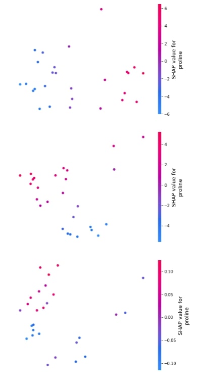
3.3.6 Embedding Plot
Below we have generated 3 different embedding plots for the proline feature based on test data.
shap.embedding_plot("proline", log_reg_explainer.shap_values(X_test)[0], feature_names=wine.feature_names),
shap.embedding_plot("proline", log_reg_explainer.shap_values(X_test)[1], feature_names=wine.feature_names),
shap.embedding_plot("proline", log_reg_explainer.shap_values(X_test)[2], feature_names=wine.feature_names)
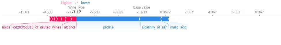
3.3.7 Force Plot
Below we have generated 3 different force plots based on 3 different shape values and base values for sample 0 of the test dataset. We can see which features contributed how much to the final prediction.
shap.force_plot(log_reg_explainer.expected_value[0],
                log_reg_explainer.shap_values(X_test[0])[0],
                feature_names=wine.feature_names,
                out_names="Wine Type")
shap.force_plot(log_reg_explainer.expected_value[1],
                log_reg_explainer.shap_values(X_test[0])[1],
                feature_names=wine.feature_names,
                out_names="Wine Type")
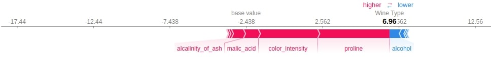
shap.force_plot(log_reg_explainer.expected_value[2],
                log_reg_explainer.shap_values(X_test[0])[2],
                feature_names=wine.feature_names,
                out_names="Wine Type")
Below we have generated a force plot for 10 samples of test dataset and have used the shap and the expected value of the only first class.
shap.force_plot(log_reg_explainer.expected_value[0],
                log_reg_explainer.shap_values(X_test[:10])[0],
                feature_names=wine.feature_names,
                out_names="Wine Type", figsize=(25,3),
                link="identity")
3.3.8 Summary Plot
The summary plot can handle multi-class shap values. Below we have generated a summary plot of test data and it defaults to a bar chart for multi-class problems. We can see how much each attribute contributes on average for each class type.
shap.summary_plot(log_reg_explainer.shap_values(X_test),
                  feature_names=wine.feature_names)
Below we have generated a summary plot from the shap values generated for class 1 from test data.
shap.summary_plot(log_reg_explainer.shap_values(X_test)[1],
                  features=X_test,
                  feature_names=wine.feature_names)
3.3.9 Partial Dependence Plot
Below we have generated a partial dependence plot of the proline feature based on test data.
shap.partial_dependence_plot("proline",
                             log_reg.predict,
                             data=X_test,
                             feature_names=wine.feature_names,
                             model_expected_value=True,
                             feature_expected_value=True,
                             ice=True,
                             )
This ends our small tutorial explaining Python library SHAP usage along with different chart types available with the library.
References 
Tutorials on using SHAP Values with Neural Networks
- Explain Keras Text Classification Models using SHAP Values
- SHAP Values for Text Classification Tasks
- Explain Flax (JAX) text classification Networks using SHAP Values
- Keras: SHAP Values for Image Classification Tasks
- Explain Flax (JAX) Image Classification Network Predictions using SHAP Values
Other Interpretation Libraries
- Scikit-Plot: Visualizing Machine Learning Algorithm Results and Performance
- How to Use LIME to Understand sklearn Models Predictions?
- How to Use eli5 to Understand sklearn Models, their Performance, and their Predictions?
- CAPTUM: Interpret Predictions of PyTorch Networks
- Yellowbrick - Visualize Sklearn's Classification & Regression Metrics in Python
- Treeinterpreter - Interpreting Tree-Based Model's Prediction of Individual Sample
- Yellowbrick - Text Data Visualizations
- interpret-text - Interpret NLP Models and Their Predictions
- dice-ml - Diverse Counterfactual Explanations for ML Models
- interpret-ml - Explain Machine Learning Models and Their Predictions
 Sunny Solanki
Sunny Solanki
Intro: Software Developer | Youtuber | Bonsai Enthusiast
About: Sunny Solanki holds a bachelor's degree in Information Technology (2006-2010) from L.D. College of Engineering. Post completion of his graduation, he has 8.5+ years of experience (2011-2019) in the IT Industry (TCS). His IT experience involves working on Python & Java Projects with US/Canada banking clients. Since 2020, he’s primarily concentrating on growing CoderzColumn.
His main areas of interest are AI, Machine Learning, Data Visualization, and Concurrent Programming. He has good hands-on with Python and its ecosystem libraries.
Apart from his tech life, he prefers reading biographies and autobiographies. And yes, he spends his leisure time taking care of his plants and a few pre-Bonsai trees.
Contact: sunny.2309@yahoo.in


![YouTube Subscribe]() Comfortable Learning through Video Tutorials?
Comfortable Learning through Video Tutorials?
If you are more comfortable learning through video tutorials then we would recommend that you subscribe to our YouTube channel.
![Need Help]() Stuck Somewhere? Need Help with Coding? Have Doubts About the Topic/Code?
Stuck Somewhere? Need Help with Coding? Have Doubts About the Topic/Code?
 Stuck Somewhere? Need Help with Coding? Have Doubts About the Topic/Code?
When going through coding examples, it's quite common to have doubts and errors.
If you have doubts about some code examples or are stuck somewhere when trying our code, send us an email at coderzcolumn07@gmail.com. We'll help you or point you in the direction where you can find a solution to your problem.
You can even send us a mail if you are trying something new and need guidance regarding coding. We'll try to respond as soon as possible.
![Share Views]() Want to Share Your Views? Have Any Suggestions?
Want to Share Your Views? Have Any Suggestions?
 Want to Share Your Views? Have Any Suggestions?
If you want to
- provide some suggestions on topic
- share your views
- include some details in tutorial
- suggest some new topics on which we should create tutorials/blogs
 shap, interpret-ml-models