Yellowbrick - Visualize Sklearn's Classification & Regression Metrics in Python
Table of Contents
- Yellowbrick
- Classification Metrics Visualizations
- Regression Metrics Visualizations
- References
Yellowbrick 
Python has many libraries that let us build machine learning models easily with a few lines of code. A library like scikit-learn has earned a reputation of the go-to library for ML models by the majority of data scientists and machine learning practitioners. Scikit-learn provides a very easy-to-use interface which lets us build an ML model using python with few lines of codes. Apart from that scikit-learn even provides functionalities related to feature selection, feature extraction, dimensionality reduction, grid searching hyper-parameters, etc. Though scikit-learn provides extensive models and metrics to evaluate those models, it does not provide functionalities to visualize that model evaluation metrics. Yellowbrick is a python library that provides various modules to visualize model evaluation metrics. Yellowbrick has different modules for tasks like feature visualizations, classification task metrics visualizations, regression task metrics visualizations, clustering task metrics visualizations, model selection visualizations, text data related visualizations, etc. We'll be explaining how to use yellowbrick API as a part of this tutorial with primarily concentrating on visualizing classification and regression task metrics.
- Classification Metrics Visualizations
- Confusion Matrix
- Classification Report
- ROC AUC Curve
- Precision Recall Curve
- Discrimination Threshold
- Class Prediction Error
- Regression Metrics Visualizations
- Residual Plot
- Prediction Error Plot
- Alpha Selection
- Cook's Distance
We'll start by importing the necessary libraries.
import pandas as pd
import numpy as np

import matplotlib.pyplot as plt
import sklearn
import yellowbrick

pd.set_option("display.max_columns", 35)

import warnings
warnings.filterwarnings("ignore")
Classification Metrics Visualizations
In this section, we'll be exploring classification metrics visualizations available with yellowbrick. We'll be using different datasets along with different sklearn estimators for this. We'll then print classification metrics visualizations explaining the performance of models on that dataset.
Load Datasets
We'll be using below mentioned three datasets for our purpose of explaining classification metrics visualizations which are easily available from sklearn:
- Wine Dataset - It has information about ingredients used in three different types of wine.
- Breast Cancer Dataset - It has information about tumor of breast cancer.
- Digits Dataset - It has images of size
8x8of digits0-9.
Below we have loaded all datasets one by one and printed their descriptions explaining features of data. We have also kept datasets into pandas dataframe and displayed the first few data samples.
from sklearn.datasets import load_breast_cancer, load_wine, load_digits

wine = load_wine()

for line in wine.DESCR.split("\n")[5:29]:
    print(line)

wine_df = pd.DataFrame(data=wine.data, columns=wine.feature_names)
wine_df["WineType"] = wine.target

wine_df.head()
breast_cancer = load_breast_cancer()

for line in breast_cancer.DESCR.split("\n")[5:31]:
    print(line)

breast_cancer_df = pd.DataFrame(data=breast_cancer.data, columns=breast_cancer.feature_names)
breast_cancer_df["CancerType"] = breast_cancer.target

breast_cancer_df.head()
digits = load_digits()

for line in digits.DESCR.split("\n")[5:29]:
    print(line)
Split Datasets into Train/Test Sets
We have now split all three datasets mentioned above into train (80%) and test (20%) sets using the train_test_split() method of sklearn. We'll be using these train/test sets for training models and evaluating performance.
from sklearn.model_selection import train_test_split

X_wine, Y_wine = wine.data, wine.target

print("Wine Dataset Size : ", X_wine.shape, Y_wine.shape)

X_train_wine, X_test_wine, Y_train_wine, Y_test_wine = train_test_split(X_wine, Y_wine, train_size=0.80, stratify=Y_wine, random_state=123)

print("Wine Train/Test Sizes : ", X_train_wine.shape, X_test_wine.shape, Y_train_wine.shape, Y_test_wine.shape)

print()

X_breast_can, Y_breast_can = breast_cancer.data, breast_cancer.target

print("Breast Cancer Dataset Size : ", X_breast_can.shape, Y_breast_can.shape)

X_train_breast_can, X_test_breast_can, Y_train_breast_can, Y_test_breast_can = train_test_split(X_breast_can, Y_breast_can, train_size=0.80, stratify=Y_breast_can, random_state=123)

print("Breast Cancer Train/Test Sizes : ", X_train_breast_can.shape, X_test_breast_can.shape, Y_train_breast_can.shape, Y_test_breast_can.shape)

print()

X_digits, Y_digits = digits.data, digits.target

print("Digits Dataset Size : ", X_breast_can.shape, Y_breast_can.shape)

X_train_digits, X_test_digits, Y_train_digits, Y_test_digits = train_test_split(X_digits, Y_digits, train_size=0.80, stratify=Y_digits, random_state=123)

print("Digits Train/Test Sizes : ", X_train_digits.shape, X_test_digits.shape, Y_train_digits.shape, Y_test_digits.shape)
Confusion Matrix 
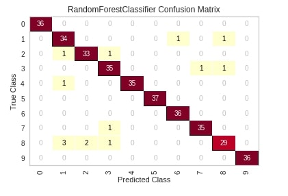
The first chart that we'll introduce is a confusion matrix plot. The classifier module of yellowbrick has a class named ConfusionMatrix which lets us create a confusion matrix chart. We'll first need to create an object of this class passing it machine learning model. We can then call the fit() and score() method on the object of class ConfusionMatrix which will train model passed to it on train data and evaluate it on test data. We can then simply call the show() method on this object and it'll create a confusion matrix of test data. We have generated a confusion matrix of digits test data and used a random forest sklearn estimator.
Please make a note that the show() method will always show charts based on the data set on which the score() method was called. Below we have called the score() method with the test dataset. If we want to generate a confusion matrix for train data then we need to call the score() method with train data.
The show method has a parameter named output_path where we can path and image name if we want to store image to disk.
from yellowbrick.classifier import ConfusionMatrix
from sklearn.ensemble import RandomForestClassifier

visualizer = ConfusionMatrix(RandomForestClassifier(random_state=1), classes=digits.target_names)

visualizer.fit(X_train_digits, Y_train_digits)

visualizer.score(X_test_digits, Y_test_digits)

visualizer.show();
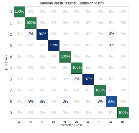
Below we have created another example explaining the usage of the confusion matrix. We have also modified a few important parameters of the ConfusionMatrix.
percent- It accepts boolean specifying whether to show count or percent in the matrix.cmap- It accepts a string of matplotlib colormap object specifying matplotlib color.fontsize- It accepts integer specifying the size of the font in the chart.ax- It accepts matplotlib axes on which to draw the chart.
fig = plt.figure(figsize=(7,7))
ax = fig.add_subplot(111)

visualizer = ConfusionMatrix(RandomForestClassifier(random_state=123),
                             classes=digits.target_names,
                             percent=True,
                             cmap="Blues",
                             fontsize=13,
                             ax=ax)

visualizer.fit(X_train_digits, Y_train_digits)

visualizer.score(X_test_digits, Y_test_digits)

visualizer.show();
The yellowbrick also provides another way of creating a chart by using methods if we don't want to create a class object. Below we have created a confusion matrix by using the confusion_matrix() method available.
Please make a note that we have passed the sklearn estimator, train data, test data, and few other parameters to the method. The passing of test data is optional. If we don't pass test data then it'll create a matrix based on train data.
from yellowbrick.classifier.confusion_matrix import confusion_matrix

fig = plt.figure(figsize=(7,7))
ax = fig.add_subplot(111)

confusion_matrix(RandomForestClassifier(random_state=123),
                                          X_train_digits, Y_train_digits,
                                          X_test_digits, Y_test_digits,
                                          percent=True,
                                          classes=digits.target_names,
                                          fontsize=13,
                                          ax=ax,
                                          cmap="Blues",
                                         );
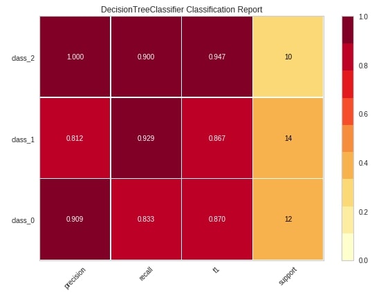
Classification Report 
The second chart type that we'll explain using yellowbrick is a classification report which shows precision, recall, support, and f1-score for each individual class of classification problem.
We'll be following the same process to create a visualization that we followed in the previous example. We'll first create an object of class ClassificationReport passing it sklearn estimator and list of class names. We'll then fit that object with train data and evaluate using test data. We'll then call the show() method to generate the figure. We have generated a classification report of digits test data and used a sklearn decision tree estimator for training data.
from yellowbrick.classifier import ClassificationReport
from sklearn.tree import DecisionTreeClassifier

viz = ClassificationReport(DecisionTreeClassifier(random_state=123),
                           classes=wine.target_names,
                           support=True,
                           fig=plt.figure(figsize=(8,6)))

viz.fit(X_train_wine, Y_train_wine)

viz.score(X_test_wine, Y_test_wine)

viz.show();
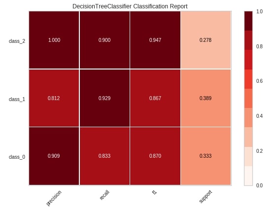
Below we have explained another way of creating a classification report chart using the classification_report() method of yellowbrick.
from yellowbrick.classifier.classification_report import classification_report

classification_report(DecisionTreeClassifier(random_state=123),
                      X_train_wine, Y_train_wine,
                      X_test_wine, Y_test_wine,
                      classes=wine.target_names,
                      support="percent",
                      cmap="Reds",
                      font_size=16,
                      fig=plt.figure(figsize=(8,6))
                     );
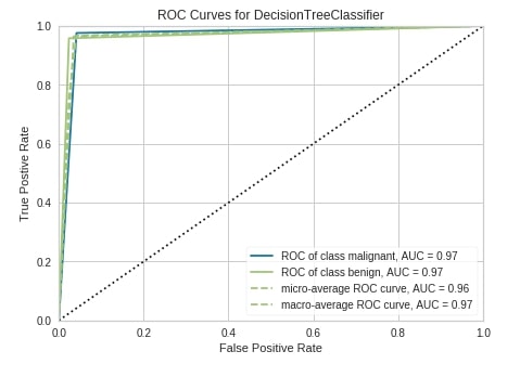
ROC AUC Curve 
The third chart type that we'll explain is the ROC AUC curve chart. We have followed the same step of creating a chart as earlier examples. We have first created an object of class ROCAUC passing it sklearn decision tree estimator, fir object to train data, evaluated it on test data and plotted figure of test data by calling show() method.
Below are some important parameters of the ROCAUC class:
micro- It accepts boolean value specifying whether to include micro-averages ROC curve or not. It’s computed from the sum of all true positives and all false positives across all classes of data. The default is True.macro- It accepts boolean value specifying whether to include macro-averages ROC curve or not. It’s computed by taking an average of all individual class ROC curves. The default is True.per_class- It accepts boolean value specifying whether to plot ROC curve for an individual class or not. It’s True by default. If set to False then only micro and macro ROC curves are displayed.
from yellowbrick.classifier import ROCAUC

viz = ROCAUC(DecisionTreeClassifier(random_state=123),
             classes=breast_cancer.target_names,
             fig=plt.figure(figsize=(7,5)))

viz.fit(X_train_breast_can, Y_train_breast_can)

viz.score(X_test_breast_can, Y_test_breast_can)

viz.show();
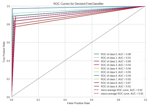
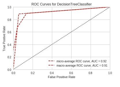
Below we have created the ROC AUC curve using the roc_auc() method of yellowbrick.
from yellowbrick.classifier.rocauc import roc_auc, roc_curve

fig = plt.figure(figsize=(10,7))
ax1 = fig.add_subplot(111)

roc_auc(DecisionTreeClassifier(random_state=2),
        X_train_digits, Y_train_digits,
        X_test_digits, Y_test_digits,
        classes=digits.target_names,
        ax=ax1
        );
roc_auc(DecisionTreeClassifier(random_state=2),
        X_train_wine, Y_train_wine,
        X_test_wine, Y_test_wine,
        classes=wine.target_names,
        per_class=False,
        );
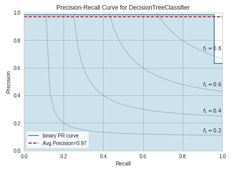
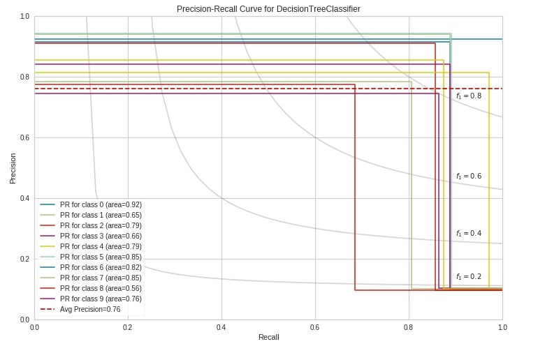
Precision Recall Curve 
The fourth chart type that we'll explain is precision-recall curves. We have followed the same process as previous examples to create this chart. We have created an object of class PrecisionRecallCurve with a sklearn decision tree estimator, the trained object on breast cancer train data, and evaluated it on test data. We have then called the show() method to display the chart.
Below is a list of some important parameters of class PrecisionRecallCurve:
fill_area- It accepts boolean specifying whether to fill the area under the curve. The default is True.ap_score- It accepts boolean specifying whether to annotate the graph with an average precision score or not. The default is True.micro- It accepts boolean value specifying whether to include micro-averages ROC curve or not. It’s computed from the sum of all true positives and all false positives across all classes of data. The default is True.per_class- It accepts boolean value specifying whether to plot ROC curve for an individual class or not. It’s True by default. If set to False then only micro and macro ROC curves are displayed. The default is False.iso_f1_curves- It accepts boolean value specifying whether to include ISO F1-curves on a chart or not. The default is False.iso_f1_values- It accepts tuple specifying values of f1 score for which to draw ISO F1-curves. The default is(0.2, 0.4, 0.6, 0.8).
from yellowbrick.classifier import PrecisionRecallCurve

viz = PrecisionRecallCurve(DecisionTreeClassifier(random_state=123),
             classes=breast_cancer.target_names,
             ap_score=True,
             iso_f1_curves=True,
             fig=plt.figure(figsize=(7,5)))

viz.fit(X_train_breast_can, Y_train_breast_can)

viz.score(X_test_breast_can, Y_test_breast_can)

viz.show();
Below we have created a precision-recall curve using the precision_recall_curve() method of yellowbrick on digits test data.
from yellowbrick.classifier.prcurve import precision_recall_curve

precision_recall_curve(DecisionTreeClassifier(random_state=123),
                       X_train_digits, Y_train_digits,
                       X_test_digits, Y_test_digits,
                       classes=digits.target_names,
                       per_class=True,
                       fill_area=False,
                       iso_f1_curves=True,
                       fig=plt.figure(figsize=(12,8))
                       );
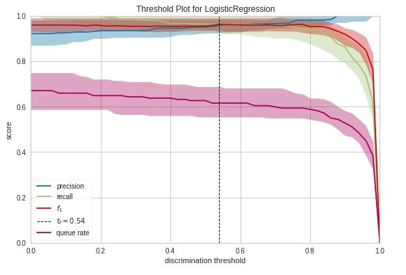
Discrimination Threshold 
The fifth chart type that we'll introduce is the discrimination threshold. It displays how precision, recall, f1 score, and queue rate change as we change the threshold at which we decide class prediction. The output of the machine learning model for classification problems is generally probability and we decide class based on some threshold on probability. The sklearn has put the threshold generally at 0.5 which means that if the probability is greater than 0.5 then we take the class as positive class else negative class.
Below we have created a discrimination threshold chart by creating an object of class DiscriminationThreshold passing it sklearn logistic regression estimator. We have then fitted object on breast cancer train data and evaluated it on test data before generating a chart.
from sklearn.linear_model import LogisticRegression
from yellowbrick.classifier import DiscriminationThreshold


viz = DiscriminationThreshold(LogisticRegression(random_state=123),
             classes=breast_cancer.target_names,
             cv=0.2,
             fig=plt.figure(figsize=(9,6)))

viz.fit(X_train_breast_can, Y_train_breast_can)

viz.score(X_test_breast_can, Y_test_breast_can)

viz.show();
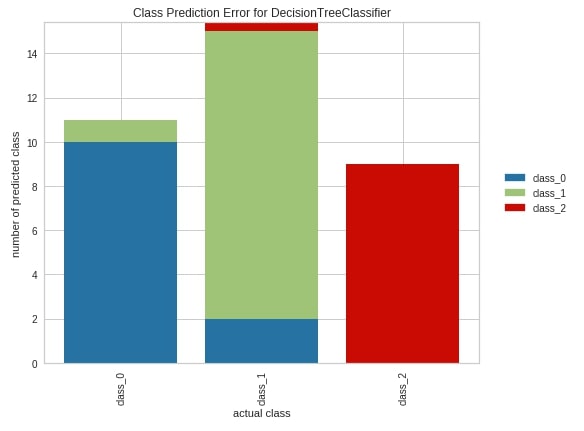
Class Prediction Error 
The sixth and last chart type that we'll introduce for classification metrics visualizations is class prediction error. It’s a bar chart showing how many samples are correctly classified and how many wrongly along with a class in which they were wrongly classified.
We have created a chart exactly the same way as earlier. We have created an object of class ClassPredictionError passing it a sklearn decision tree classifier. We have then fitted object on wine train data and evaluated it on test data. We have then plotted the class prediction error chart of test data. We can see from the below chart that few class_1 confused with class_0 from the first bar. Few class_2 samples and few class_0 samples are confused with class_1 from the second bar. The third bar tells us that other classes are not confused with class_2 at least.
from yellowbrick.classifier import ClassPredictionError

viz = ClassPredictionError(DecisionTreeClassifier(random_state=123),
                           classes=wine.target_names,
                           fig=plt.figure(figsize=(9,6)))

viz.fit(X_train_wine, Y_train_wine)

viz.score(X_test_wine, Y_test_wine)

viz.show();
Regression Metrics Visualizations
As a part of this section, we'll be explaining various regression metrics visualizations. We'll be loading different datasets and using different sklearn regression estimators for this.
Load Datasets
We'll be using below mentioned two datasets which are easily available from scikit-learn for the creation of various regression metrics visualizations:
- Boston Housing Price - It has information about various house attributes for houses in Boston.
- California Housing - It has information about various house attributes for houses in California.
Below we have loaded all datasets one by one and printed their descriptions explaining features of data. We have also kept datasets into pandas dataframe and displayed the first few data samples.
from sklearn.datasets import load_boston

boston = load_boston()

for line in boston.DESCR.split("\n")[5:26]:
    print(line)

boston_df = pd.DataFrame(data=boston.data, columns=boston.feature_names)
boston_df["Price($)"] = boston.target

boston_df.head()
from sklearn.datasets import fetch_california_housing

calif_housing = fetch_california_housing()

for line in calif_housing.DESCR.split("\n")[5:26]:
    print(line)

calif_housing_df = pd.DataFrame(data=calif_housing.data, columns=calif_housing.feature_names)
calif_housing_df["Price($)"] = calif_housing.target

calif_housing_df.head()
Split Datasets into Train/Test Sets
Below we have split both datasets loaded earlier into the train (80%) and test (20%) sets.
from sklearn.model_selection import train_test_split

X_boston, Y_boston = boston.data, boston.target

print("Boston Dataset Size : ", X_boston.shape, Y_boston.shape)

X_train_boston, X_test_boston, Y_train_boston, Y_test_boston = train_test_split(X_boston, Y_boston, train_size=0.80, random_state=123)

print("Boston Train/Test Sizes : ", X_train_boston.shape, X_test_boston.shape, Y_train_boston.shape, Y_test_boston.shape)

print()

X_calif_housing, Y_calif_housing = calif_housing.data, calif_housing.target

print("California Housing Dataset Size : ", X_calif_housing.shape, Y_calif_housing.shape)

X_train_calif_housing, X_test_calif_housing, Y_train_calif_housing, Y_test_calif_housing = train_test_split(X_calif_housing, Y_calif_housing, train_size=0.80, random_state=123)

print("California Housing Train/Test Sizes : ", X_train_calif_housing.shape, X_test_calif_housing.shape, Y_train_calif_housing.shape, Y_test_calif_housing.shape)
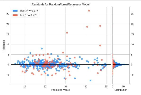
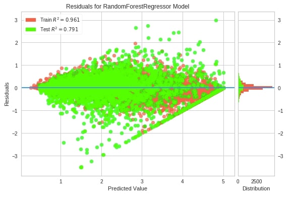
Residual Plot 
The first chart type that we'll introduce for explaining regression metrics visualizations is the residual plot. The residual plots show a scatter plot between the predicted value on x-axis and residual on the y-axis. It points that if points are randomly distributed across the horizontal axis then it’s advisable to choose linear regression for it else a non-linear model will be an appropriate choice.
We have followed the same process as previous examples to create this chart. We have created an object of class ResidualsPlot, fitted it on Boston housing train data, and evaluated it on test data.
from yellowbrick.regressor import ResidualsPlot
from sklearn.ensemble import RandomForestRegressor

viz = ResidualsPlot(RandomForestRegressor(random_state=123),
                    train_color="dodgerblue",
                    test_color="tomato",
                    fig=plt.figure(figsize=(9,6))
                    )

viz.fit(X_train_boston, Y_train_boston)
viz.score(X_test_boston, Y_test_boston)
viz.show();
Below we have created a residuals plot using the residuals_plot() method on California housing data. We have used a sklearn random forest regressor this time.
from yellowbrick.regressor.residuals import residuals_plot

residuals_plot(RandomForestRegressor(random_state=123),
               X_train_calif_housing, Y_train_calif_housing,
               X_test_calif_housing, Y_test_calif_housing,
               train_color="tomato",
               test_color="lime",
               line_color="dodgerblue",
               fig=plt.figure(figsize=(9,6)));
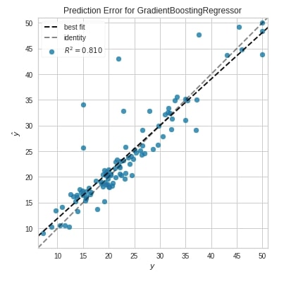
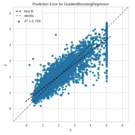
Prediction Error Plot 
The second chart type that we'll introduce is the prediction error plot which is a scatter plot of actual target values on the x-axis and model predicted values on the y-axis.
We have created a chart by first creating an object of class PredictionError. We have then fitted Boston train data and evaluated test data. The chart also has boolean parameters named bestfit and identity which specifies whether to include the best fit line and identity line in the chart or not.
from yellowbrick.regressor import PredictionError
from sklearn.ensemble import GradientBoostingRegressor

viz = PredictionError(GradientBoostingRegressor(random_state=123),
                      fig=plt.figure(figsize=(6,6))
                      )

viz.fit(X_train_boston, Y_train_boston)
viz.score(X_test_boston, Y_test_boston)
viz.show();
Below we have created a prediction error plot using the prediction_error() method.
from yellowbrick.regressor.prediction_error import prediction_error

prediction_error(GradientBoostingRegressor(random_state=123),
                 X_train_calif_housing, Y_train_calif_housing,
                 X_test_calif_housing, Y_test_calif_housing,
                 fig=plt.figure(figsize=(7,7))
                 );
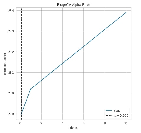
Alpha Selection 
The third chart type that we'll explain for regression tasks is the alpha selection chart which demonstrates how different values of alpha influence model selection during regularization. It shows the impact of regularization on the model. This will work on RegressionCV models of sklearn which are RidgeCV and LassoCV. We can try different alpha values.
We have created a chart by using an object of class AlphaSelection using the same process as previous examples.
from yellowbrick.regressor import AlphaSelection
from sklearn.linear_model import RidgeCV

viz = AlphaSelection(RidgeCV(),
                     fig=plt.figure(figsize=(7,7))
                    )

viz.fit(X_train_boston, Y_train_boston)
viz.score(X_test_boston, Y_test_boston)
viz.show();
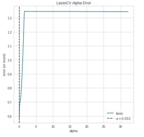
Below we have created the alpha selection chart using the alphas() method of yellowbrick.
from yellowbrick.regressor.alphas import alphas
from sklearn.linear_model import LassoCV

alphas(LassoCV(),
       X_calif_housing, Y_calif_housing,
       fig=plt.figure(figsize=(7,7))
       );
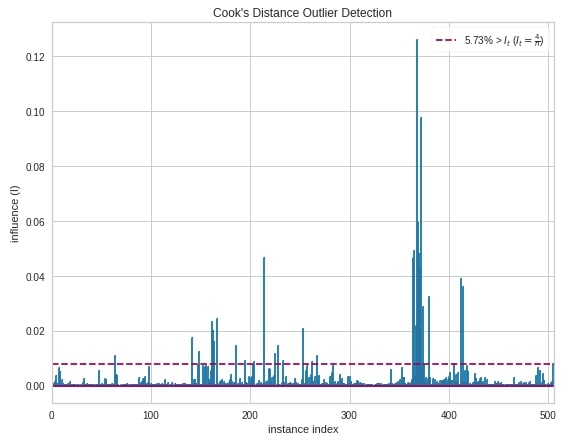
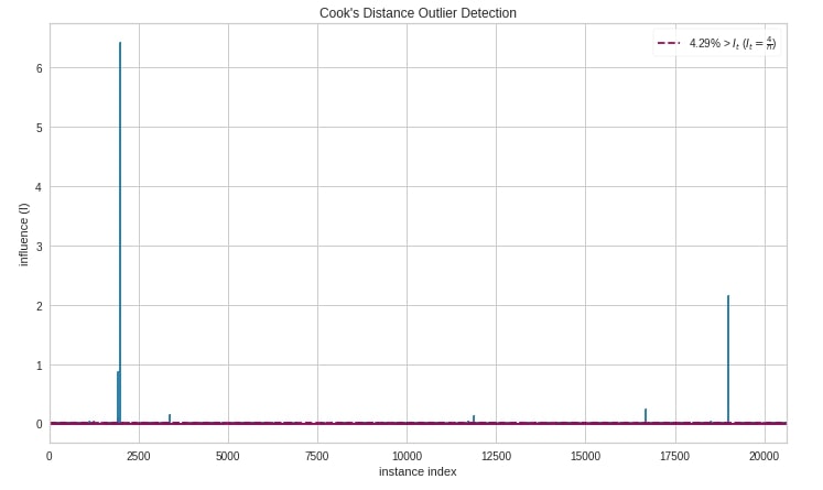
Cook's Distance 
The fourth and last chart type that we'll introduce is the cook's distance chart which displays the importance of individual features on the model. The removal of high influential samples from data might change model coefficients hence performance. Its generally used to detect outliers that can influence the model in a particular direction with the presence of just a few samples.
Below we have created a cook's distance chart using CooksDistance object. We have created it on the Boston housing dataset.
from yellowbrick.regressor import CooksDistance

viz = CooksDistance(fig=plt.figure(figsize=(9,7)))

viz.fit(X_boston, Y_boston)

viz.show();
Below we have created a cook's distance chart using the cooks_distance() method of yellowbrick.
from yellowbrick.regressor import cooks_distance

cooks_distance(
    X_calif_housing, Y_calif_housing,
    draw_threshold=True,
    linefmt="C0-", markerfmt=",",
    fig = plt.figure(figsize=(12,7))
);
This ends our small tutorial explaining classification and regression metrics visualizations available with yellowbrick. Please feel free to let us know your views in the comments section.
References 
- Scikit-Plot: Visualizing Machine Learning Algorithm Results and Performance
- Yellowbrick - Text Data Visualizations
- Treeinterpreter - Interpreting Tree-Based Model's Prediction of Individual Sample
- SHAP - Explain Machine Learning Model Predictions using Game Theoretic Approach
- How to Use LIME to Understand sklearn Models Predictions?
- How to Use eli5 to Understand sklearn Models, their Performance, and their Predictions?
- interpret-text - Interpret NLP Models and Their Predictions
- dice-ml - Diverse Counterfactual Explanations for ML Models
- interpret-ml - Explain Machine Learning Models and Their Predictions
 Sunny Solanki
Sunny Solanki
Intro: Software Developer | Youtuber | Bonsai Enthusiast
About: Sunny Solanki holds a bachelor's degree in Information Technology (2006-2010) from L.D. College of Engineering. Post completion of his graduation, he has 8.5+ years of experience (2011-2019) in the IT Industry (TCS). His IT experience involves working on Python & Java Projects with US/Canada banking clients. Since 2020, he’s primarily concentrating on growing CoderzColumn.
His main areas of interest are AI, Machine Learning, Data Visualization, and Concurrent Programming. He has good hands-on with Python and its ecosystem libraries.
Apart from his tech life, he prefers reading biographies and autobiographies. And yes, he spends his leisure time taking care of his plants and a few pre-Bonsai trees.
Contact: sunny.2309@yahoo.in


![YouTube Subscribe]() Comfortable Learning through Video Tutorials?
Comfortable Learning through Video Tutorials?
If you are more comfortable learning through video tutorials then we would recommend that you subscribe to our YouTube channel.
![Need Help]() Stuck Somewhere? Need Help with Coding? Have Doubts About the Topic/Code?
Stuck Somewhere? Need Help with Coding? Have Doubts About the Topic/Code?
 Stuck Somewhere? Need Help with Coding? Have Doubts About the Topic/Code?
When going through coding examples, it's quite common to have doubts and errors.
If you have doubts about some code examples or are stuck somewhere when trying our code, send us an email at coderzcolumn07@gmail.com. We'll help you or point you in the direction where you can find a solution to your problem.
You can even send us a mail if you are trying something new and need guidance regarding coding. We'll try to respond as soon as possible.
![Share Views]() Want to Share Your Views? Have Any Suggestions?
Want to Share Your Views? Have Any Suggestions?
 Want to Share Your Views? Have Any Suggestions?
If you want to
- provide some suggestions on topic
- share your views
- include some details in tutorial
- suggest some new topics on which we should create tutorials/blogs
 yellobrick, ml-metrics, visualization