Scikit-Plot: Visualize ML Model Performance Evaluation Metrics
Scikit learn is a very commonly used library for trying machine learning algorithms on our datasets. Once we have trained ML Model, we need the right way to understand performance of the model by visualizing various ML Metrics. We need to understand whether our model has generalized or not.
Matplotlib is a very commonly used data visualization library for plotting results of ML algorithms.
But plotting with matplotlib requires quite a learning curve. One minor mistake when implementing visualizations can result in interpreting results totally wrong way. This can even slow down the process of testing various algorithms if data scientist is involved in getting visualizations right.
In short, it can even slow down whole train-test process and experimentation cycle.
But what if you have a Python library that is ready-made for plotting ML Metrics?
It'll fasten your whole experimentation cycle a lot as you won't be involved in getting visualizations right. The data scientist can then peacefully concentrate on his/her machine learning algorithm's performance and try many different experiments.
Python has a library called Scikit-Plot which provides visualizations for many machine learning metrics related to regression, classification, and clustering. Scikit-Plot is built on top of matplotlib. So if you have some background on matplotlib then you can customize charts created using scikit-plot further.
> What Can You Learn From This Article?
As a part of this tutorial, We have explained how to use Python library scikit-plot to visualize ML metrics evaluating performance of ML Model. We have explained how to create charts to visualize ML Metrics for Classification, Dimensionality Reduction, and Clustering tasks. Apart from metrics, we have also explained training progress chart and features importances charts available from scikit-plot. We have trained scikit-learn models on toy datasets for our purposes. Tutorial tries to cover the whole API of scikit-plot.
Below, we have listed important sections of tutorial to give an overview of material covered.
Important Sections Of Tutorial
- Load Datasets for Tutorial
- Digits Dataset
- Breast Cancer Dataset
- Boston Housing Dataset
- Scikit-Plot API Overview
- Scikit-Learn Estimator Performance Visualization
- 3.1 Cross Validation Performance Plot
- 3.2 Visualize Features Importance
- 3.3 Calibration Curve (Reliability Curves)
- Visualize Classification Metrics
- 4.1 Confusion Matrix
- 4.2 ROC AUC Curve
- 4.3 Precision-Recall Curve
- 4.4 KS Statistics Plot
- 4.5 Cumulative Gains Curve
- 4.6 Lift Curve
- Visualize Clustering Metrics
- 5.1 Elbow Method
- 5.2 Silhouette Analysis
- Dimensionality Reduction Plots
- 6.1 PCA Components Explained Variance
- 6.2 2-D Projection
We'll start by importing the necessary Python libraries for our tutorial. We have also printed the versions that we used in our tutorial.
import scikitplot as skplt

import sklearn
from sklearn.datasets import load_digits, load_boston, load_breast_cancer
from sklearn.model_selection import train_test_split

from sklearn.ensemble import RandomForestClassifier, RandomForestRegressor, GradientBoostingClassifier, ExtraTreesClassifier
from sklearn.linear_model import LinearRegression, LogisticRegression
from sklearn.cluster import KMeans
from sklearn.decomposition import PCA

import matplotlib.pyplot as plt

import sys
import warnings
warnings.filterwarnings("ignore")

print("Scikit Plot Version : ", skplt.__version__)
print("Scikit Learn Version : ", sklearn.__version__)
print("Python Version : ", sys.version)

%matplotlib inline
1. Load Datasets 
We'll be loading three different datasets which we'll be using to train various machine learning models. We'll then visualize the results of these models.
1.1 Digits Dataset
The first dataset that we'll load is digits dataset which is 8x8 images of numbers. It's readily available in scikit-learn for our usage.
We'll then divide the dataset into the train (80%) and test sets(20%).
digits = load_digits()
X_digits, Y_digits = digits.data, digits.target

print("Digits Dataset Size : ", X_digits.shape, Y_digits.shape)
X_digits_train, X_digits_test, Y_digits_train, Y_digits_test = train_test_split(X_digits, Y_digits,
                                                                                train_size=0.8,
                                                                                stratify=Y_digits,
                                                                                random_state=1)

print("Digits Train/Test Sizes : ",X_digits_train.shape, X_digits_test.shape, Y_digits_train.shape, Y_digits_test.shape)
1.2 Malignant/Benign Tumor Dataset
The second dataset that we'll use if a cancer dataset which has information about the malignant and benign tumor. It's also readily available in scikit-learn for our use.
We'll divide it as well in train (80%) and test sets (20%). We have also printed features available with the dataset.
cancer = load_breast_cancer()
X_cancer, Y_cancer = cancer.data, cancer.target

print("Feautre Names : ", cancer.feature_names)
print("Cancer Dataset Size : ", X_cancer.shape, Y_cancer.shape)
X_cancer_train, X_cancer_test, Y_cancer_train, Y_cancer_test = train_test_split(X_cancer, Y_cancer,
                                                                                train_size=0.8,
                                                                                stratify=Y_cancer,
                                                                                random_state=1)

print("Cancer Train/Test Sizes : ",X_cancer_train.shape, X_cancer_test.shape, Y_cancer_train.shape, Y_cancer_test.shape)
1.3 Boston Housing Price Dataset
The third dataset that we'll use is the Boston housing price dataset. It has information about various houses of Boston and the price at which they were sold. We'll divide it as well in train and test sets with the same proportion as above mentioned datasets.
boston = load_boston()
X_boston, Y_boston = boston.data, boston.target

print("Boston Dataset Size : ", X_boston.shape, Y_boston.shape)

print("Boston Dataset Features : ", boston.feature_names)
X_boston_train, X_boston_test, Y_boston_train, Y_boston_test = train_test_split(X_boston, Y_boston,
                                                                                train_size=0.8,
                                                                                random_state=1)

print("Boston Train/Test Sizes : ",X_boston_train.shape, X_boston_test.shape, Y_boston_train.shape, Y_boston_test.shape)
2. Scikit-Plot API Overview 
Scikit-plot has 4 main modules which are used for different visualizations as described below.
- estimators - It has methods for plotting the performance of various machine learning algorithms.
- metrics - It has methods for plotting various machine learning metrics like confusion matrix, ROC AUC curves, precision-recall curves, etc.
- cluster - It currently has one method for plotting elbow method plot for clustering to find out the best number of clusters for data.
- decomposition - It has methods for plotting results of PCA decomposition.
3. Scikit-Learn Estimator Performance Visualization 
The module that we'll be exploring is the estimators module. We'll be plotting various plots after training ML models.

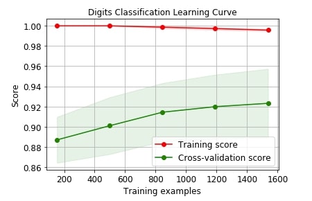
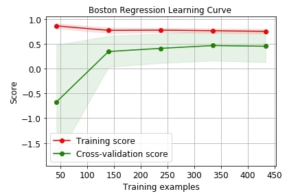
3.1 Cross Validation Performance Plot 
We can plot the cross-validation performance of models by passing it whole dataset. Scikit-plot provides a method named plot_learning_curve() as a part of the estimators module which accepts estimator, X, Y, cross-validation info, and scoring metric for plotting performance of cross-validation on the dataset.
Below we are plotting the performance of logistic regression on digits dataset with cross-validation.
skplt.estimators.plot_learning_curve(LogisticRegression(), X_digits, Y_digits,
                                     cv=7, shuffle=True, scoring="accuracy",
                                     n_jobs=-1, figsize=(6,4), title_fontsize="large", text_fontsize="large",
                                     title="Digits Classification Learning Curve");
Below we are plotting the performance of linear regression on the Boston dataset with cross-validation.
skplt.estimators.plot_learning_curve(LinearRegression(), X_boston, Y_boston,
                                     cv=7, shuffle=True, scoring="r2", n_jobs=-1,
                                     figsize=(6,4), title_fontsize="large", text_fontsize="large",
                                     title="Boston Regression Learning Curve ");
We can use many other scoring metrics for plotting purposes. Below is a list of scoring metrics available with scikit-learn.
sklearn.metrics.SCORERS.keys()
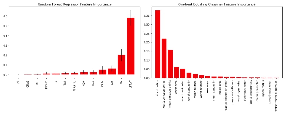
3.2 Visualize Features Importance 
The second chart that we'll be plotting is a bar chart depicting the importance of features for various ML models. We'll first train random forest on the Boston dataset and gradient boosting on the cancer dataset. We'll then plot feature importance available from both models as a bar chart using plot_feature_importances() method of estimators module of scikit-plot.
rf_reg = RandomForestRegressor()
rf_reg.fit(X_boston_train, Y_boston_train)
rf_reg.score(X_boston_test, Y_boston_test)
gb_classif = GradientBoostingClassifier()
gb_classif.fit(X_cancer_train, Y_cancer_train)
gb_classif.score(X_cancer_test, Y_cancer_test)
Below we have a combined chart of both random forest and gradient boosting into one figure because scikit-plot is based on matplotlib and lets us include more details on graphs using matplotlib.
fig = plt.figure(figsize=(15,6))

ax1 = fig.add_subplot(121)
skplt.estimators.plot_feature_importances(rf_reg, feature_names=boston.feature_names,
                                         title="Random Forest Regressor Feature Importance",
                                         x_tick_rotation=90, order="ascending",
                                         ax=ax1);

ax2 = fig.add_subplot(122)
skplt.estimators.plot_feature_importances(gb_classif, feature_names=cancer.feature_names,
                                         title="Gradient Boosting Classifier Feature Importance",
                                         x_tick_rotation=90,
                                         ax=ax2);

plt.tight_layout()
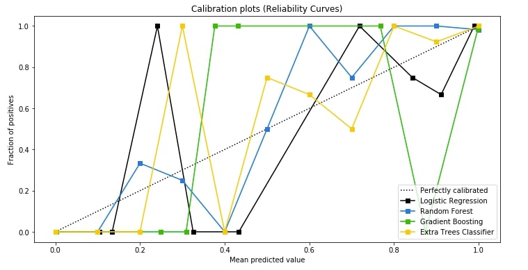
3.3 Calibration Curve (Reliability Curves) 
The third chart that we'll plot is the calibration curve also known as reliability curve. Scikit-plot provides a method named plot_calibration_curve() as a part of the metrics module for this purpose.
The calibration curve is suitable for comparing the performance of various models as well as understanding which threshold value for deciding class label is leading to model overfit or underfit. The points in various model lines which are above way above-dashed line have overfitted and one below the dashed line has under fitted. We need a model where points are mostly near the dashed line.
We are first training logistic regression random forest, gradient boosting, and extra trees classifier on cancer train data and then predicting the probability of test data generated by each model. We then pass actual test labels and a list of predicted test probabilities by each model to plot_calibration_curve() to plot calibration curve. We also pass a list of classifier names for having legends in the graph.
lr_probas = LogisticRegression().fit(X_cancer_train, Y_cancer_train).predict_proba(X_cancer_test)
rf_probas = RandomForestClassifier().fit(X_cancer_train, Y_cancer_train).predict_proba(X_cancer_test)
gb_probas = GradientBoostingClassifier().fit(X_cancer_train, Y_cancer_train).predict_proba(X_cancer_test)
et_scores = ExtraTreesClassifier().fit(X_cancer_train, Y_cancer_train).predict_proba(X_cancer_test)

probas_list = [lr_probas, rf_probas, gb_probas, et_scores]
clf_names = ['Logistic Regression', 'Random Forest', 'Gradient Boosting', 'Extra Trees Classifier']
skplt.metrics.plot_calibration_curve(Y_cancer_test,
                                     probas_list,
                                     clf_names, n_bins=15,
                                     figsize=(12,6)
                                     );
4. Visualize Classification ML Metrics 
We'll now explore various plotting methods available as a part of the metrics module of scikit-plot.
To start with it, we'll first train logistic regression on the digits dataset. We'll then use this trained model for various plotting methods.
log_reg = LogisticRegression()
log_reg.fit(X_digits_train, Y_digits_train)
log_reg.score(X_digits_test, Y_digits_test)
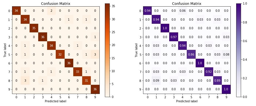
4.1 Confusion Matrix 
The first metric that we'll plot is a confusion matrix. The confusion matrix let us analyze how our classification algorithm is doing for various classes of data.
Below we are plotting confusion matrix using plot_confusion_matrix() method of metrics module. We are plotting two confusion matrix where the second one has normalized its values before plotting.
We need to pass original values and predicted values in order to plot a confusion matrix.
Y_test_pred = log_reg.predict(X_digits_test)

fig = plt.figure(figsize=(15,6))

ax1 = fig.add_subplot(121)
skplt.metrics.plot_confusion_matrix(Y_digits_test, Y_test_pred,
                                    title="Confusion Matrix",
                                    cmap="Oranges",
                                    ax=ax1)

ax2 = fig.add_subplot(122)
skplt.metrics.plot_confusion_matrix(Y_digits_test, Y_test_pred,
                                    normalize=True,
                                    title="Confusion Matrix",
                                    cmap="Purples",
                                    ax=ax2);
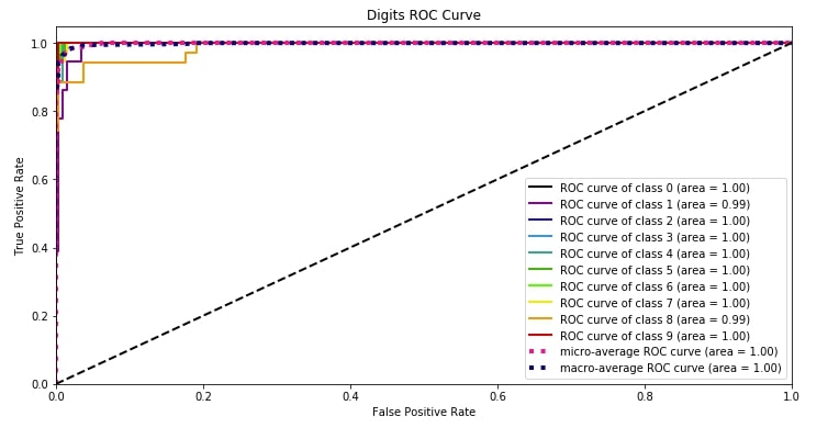
4.2 ROC AUC Curve 
The second metric that we'll plot is the ROC AUC curve. Scikit-plot provides methods named plot_roc() and plot_roc_curve() as a part of metrics module for plotting roc AUC curves. We need to pass original values and predicted probability to methods in order to plot the ROC AUC plot for each class of classification dataset.
It also plots the dashed line which depicts the random guess model covering 50% area of ROC AUC curve.
We can notice from the below plot that the area covered by the ROC AUC curve line of each class is more than 95% which is good. We want a line of each class to cover more than 90% area so that we can be sure that our model is doing well predicting each class even in an imbalanced dataset situation.
Y_test_probs = log_reg.predict_proba(X_digits_test)

skplt.metrics.plot_roc_curve(Y_digits_test, Y_test_probs,
                       title="Digits ROC Curve", figsize=(12,6));
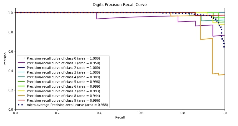
4.3 Precision-Recall Curve 
The third metric is the precision-recall curve which has almost the same usage as that of the ROC AUC curve. Both the ROC AUC curve and precision-recall curves are useful when you have an imbalanced dataset.
Scikit-plot provides methods named plot_precision_recall() and plot_precision_recall_curve() for plotting precision-recall curve. We need to pass original target values as well as predicted probabilities of that target values by our model to plot the precision-recall curve.
We can notice from the below plot that the area covered by the precision-recall curve line of each class is more than 95% which is good. We want a line of each class to cover more than 90% area so that we can be sure that our model is doing well predicting each class even in an imbalanced dataset situation.
skplt.metrics.plot_precision_recall_curve(Y_digits_test, Y_test_probs,
                       title="Digits Precision-Recall Curve", figsize=(12,6));
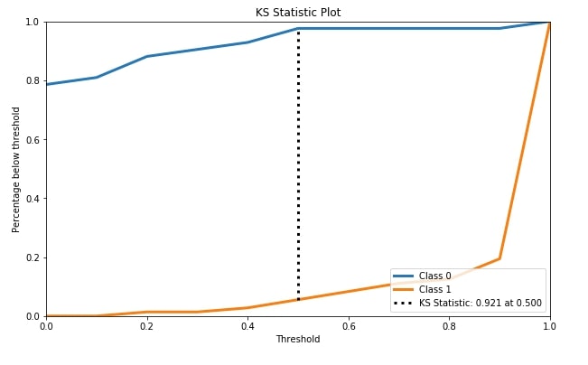
4.4 KS Statistics Plot 
The fourth metric that we'll be plotting is the KS statistics plot. Scikit-plot module metrics has method named plot_ks_statistic() for this purpose.
KS Statistics is for binary classification problems only. The KS statistic (Kolmogorov-Smirnov statistic) is the maximum difference between the cumulative true positive and cumulative false-positive rate. It captures the model's power of discriminating positive labels from negative labels. KS Statistics Plot is for binary classification problems only.
We have first trained random forest classifier on cancer train data. We then passed original cancer test labels and predicted test probabilities by random forest trained model to plot_ks_statistic() in order to plot the KS Statistics chart.
rf = RandomForestClassifier()
rf.fit(X_cancer_train, Y_cancer_train)
Y_cancer_probas = rf.predict_proba(X_cancer_test)

skplt.metrics.plot_ks_statistic(Y_cancer_test, Y_cancer_probas, figsize=(10,6));
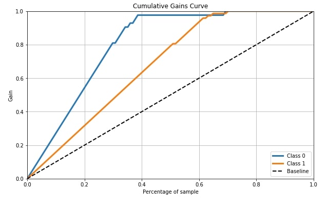
4.5 Cumulative Gains Curve 
Cumulative Gains Curve is the fifth metric that we'll be plotting using scikit-plot. It provides a method named plot_cumulative_gain() as a part of the metrics module for plotting this metric.
Cumulative gains chart tells us the percentage of samples in a given category that were truly predicted by targeting a percentage of the total number of samples. It means when we took that many percentages of samples from the total percentage that we get from the curve for y-axis are labels which were truly guessed by model from a total number of samples of that class in that many samples. The dashed line in the chart is the baseline curve (random guess model) and our model should perform better than it and both class curves should be above it ideally. Cumulative Gains Curve is for binary classification problems only.
We need to pass its original labels of data and predicted probabilities by the trained model in order to plot the cumulative gains curve.
skplt.metrics.plot_cumulative_gain(Y_cancer_test, Y_cancer_probas, figsize=(10,6));
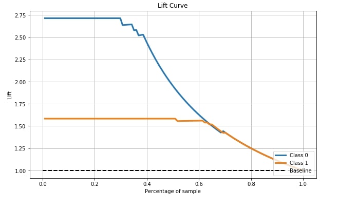
4.6 Lift Curve 
The sixth and last metric that's available with scikit-plot is the Lift curve. Scikit-plot has a method named plot_lift_curve() as a part of the metrics module for plotting this curve.
The lift chart is derived from the cumulative chart by taking a ratio of cumulative gains for each curve to the baseline and showing this ratio on the y-axis. The x-axis has the same meaning as the above chart. The lift curve is for binary classification problems only.
We need to pass its original labels of data and predicted probabilities by the trained model in order to plot the lift curve.
skplt.metrics.plot_lift_curve(Y_cancer_test, Y_cancer_probas, figsize=(10,6));
5. Visualize Clustering ML Metrics 
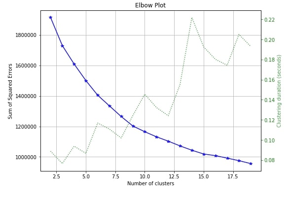
5.1 Elbow Method 
The only clustering plot that is available with scikit-plot is the elbow method plot. Scikit-plot provides method named plot_elbow_curve() as a part of cluster module for plotting elbow method curve.
The elbow method is useful in deciding the right number of clusters to be used to divide data into. If you are not aware of number of clusters beforehand then the elbow method can help you decide number of clusters to use.
Elbow method plots the number of clusters versus squared error for each sample with that many clusters. The plot generally looks like a human hand and elbow is a place where you select a number of clusters. It means that more clusters than that are not improving squared errors hence it's best number of clusters to choose to divide samples.
We need to pass the clustering algorithm and original data along with an array of cluster sizes to plotting method in order to plot the elbow method curve.
skplt.cluster.plot_elbow_curve(KMeans(random_state=1),
                               X_digits,
                               cluster_ranges=range(2, 20),
                               figsize=(8,6));
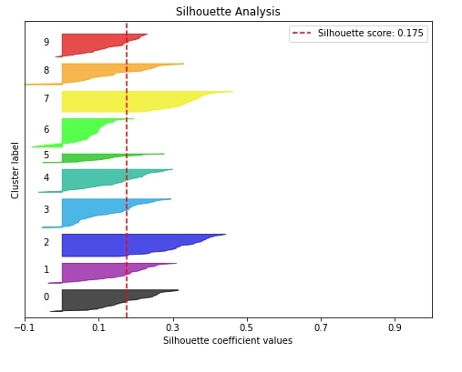
5.2 Silhouette Analysis 
The second metric that we'll like to plot is the silhouette analysis plot for clustering machine learning problems.
The silhouette analysis lets us know how our clustering algorithm did in clustering various samples. It gives us results in the range of -1 to 1 and if the majority of our values are high towards 1 then it means that our clustering algorithm did well in clustering similar samples together.
The silhouette score of the sample is between -1 to 1 where score 1 means that sample is far away from its neighboring clusters and score of -1 means that sample is near to its neighboring cluster than cluster it's assigned. The value of 0 means that it's on the boundary between two clusters. We need value for samples on the higher side(>0) to consider our model a good model.
Scikit-plot provides a method named plot_silhouette() as a part of the metrics module to plot the silhouette analysis plot though it is a clustering metric. We need to pass is original data and labels predicted by our clustering algorithm in order to plot silhouette analysis.
Below we are first training our KMeans model on digits train data and then we are passing predicted test labels along with original test data to plot_silhouette() method for plotting silhouette analysis.
kmeans = KMeans(n_clusters=10, random_state=1)
kmeans.fit(X_digits_train, Y_digits_train)
cluster_labels = kmeans.predict(X_digits_test)
skplt.metrics.plot_silhouette(X_digits_test, cluster_labels,
                              figsize=(8,6));
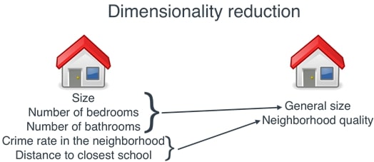
6. Dimensionality Reduction Plots 
There are two plots available with dimensionality reduction module of scikit-plot.
6.1 PCA Components Explained Variance 
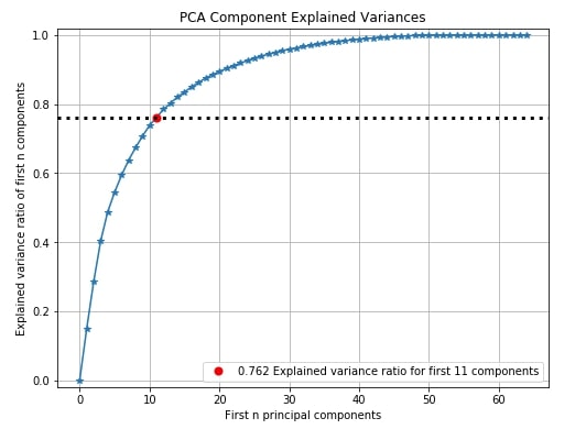
The first dimensionality reduction plot that we'll explore is the PCA component explained variance. Scikit-plot has a method named plot_pca_component_variance() as a part of the decomposition module for this.
The PCA components explained variance chart let us know how much of the original data variance is contained within first n components.
Below we can see from red dot that 76.2% of digits data variance is present in 11 components. We can see that nearly 45 components have nearly a 100% variance of data. We can decide from this graph how much the percentage of original data's variance is enough for better model performance and take components accordingly which will result in reducing the dimension of original data.
We need to pass trained PCA on the dataset to method plot_pca_component_variance() in order to plot this chart.
pca = PCA(random_state=1)
pca.fit(X_digits)

skplt.decomposition.plot_pca_component_variance(pca, figsize=(8,6));
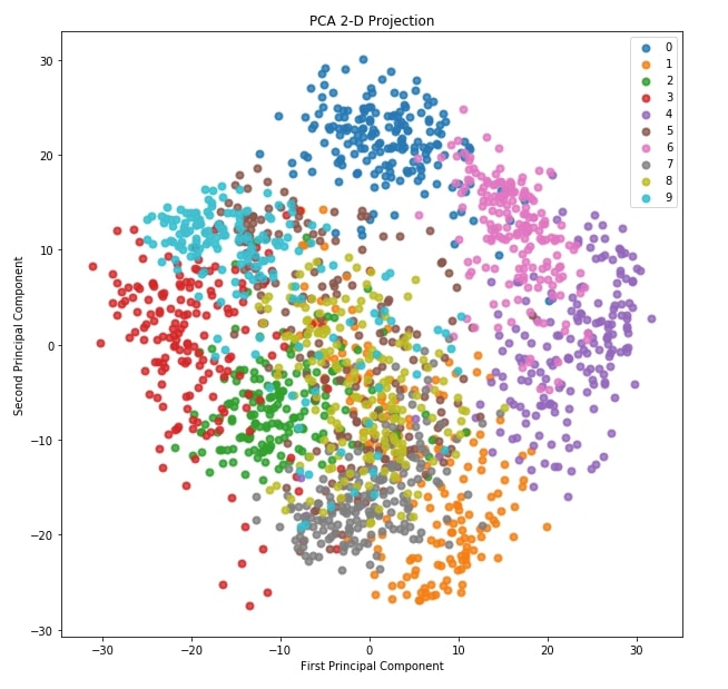
6.2 2-D Projection 
The second plot for dimensionality reduction that we'll plot is a 2D projection of data transformed through PCA. Scikit-plot provides method named plot_pca_2d_projection() as a part of decomposition module for this purpose.
We need to pass it trained PCA model along with dataset and its labels for plotting purposes.
skplt.decomposition.plot_pca_2d_projection(pca, X_digits, Y_digits,
                                           figsize=(10,10),
                                           cmap="tab10");
This ends our small tutorial explaining various plotting functionalities available with scikit-plot to visualize ML Metrics evaluating performance of ML Models.
> Is Calculating and Visualizing ML Metrics Enough for Evaluating Model Performance?
Evaluating ML Metrics is generally a good starting point for checking performance of ML models. It can give us an idea of whether model has generalized or not. But there can be situations where ML metrics are not enough. The results of our metrics are quite good but our model is not generalizing. E.g., A simple cat vs dog image classifier can be using background pixels to classify images instead of actual object pixels.
In those situations, we need to look at predictions made by models on individual examples.
> Why Should We Interpret Predictions Of ML Models?
To interpret individual predictions, many algorithms have been developed. Different Python libraries (lime, shap, eli5, captum, treeinterpreter, etc.) provide an implementation of these algorithms. It can help us dig deeper to understand our model better at individual example levels.
We would suggest that you read about interpreting predictions of ML Models in your free time. Below we have listed tutorials providing guidance on topic.
References 
Other Libraries Like Scikit-Plot
- Yellowbrick - Visualize Sklearn Classification and Regression Metrics in Python
- Yellowbrick - Text Data Visualizations
- interpret-text - Interpret NLP Models and Their Predictions
- interpret-ml - Explain Machine Learning Models and Their Predictions
Python Libraries to Interpret Predictions ML Models
- How to use LIME to Understand Sklearn Model's Predictions
- How to use eli5 to Understand Sklearn Models, their Performance, and their Predictions
- SHAP - Explain Machine Learning Model Predictions using Game Theoretic Approach
- treeinterpreter - Interpreting Tree-based Model's Prediction of Individual Sample
- dice-ml - Diverse Counterfactual Explanations for ML Models
- Captum - Interpret Predictions of PyTorch Networks
Scikit-Plot Docs
 Sunny Solanki
Sunny Solanki
Intro: Software Developer | Youtuber | Bonsai Enthusiast
About: Sunny Solanki holds a bachelor's degree in Information Technology (2006-2010) from L.D. College of Engineering. Post completion of his graduation, he has 8.5+ years of experience (2011-2019) in the IT Industry (TCS). His IT experience involves working on Python & Java Projects with US/Canada banking clients. Since 2020, he’s primarily concentrating on growing CoderzColumn.
His main areas of interest are AI, Machine Learning, Data Visualization, and Concurrent Programming. He has good hands-on with Python and its ecosystem libraries.
Apart from his tech life, he prefers reading biographies and autobiographies. And yes, he spends his leisure time taking care of his plants and a few pre-Bonsai trees.
Contact: sunny.2309@yahoo.in


![YouTube Subscribe]() Comfortable Learning through Video Tutorials?
Comfortable Learning through Video Tutorials?
If you are more comfortable learning through video tutorials then we would recommend that you subscribe to our YouTube channel.
![Need Help]() Stuck Somewhere? Need Help with Coding? Have Doubts About the Topic/Code?
Stuck Somewhere? Need Help with Coding? Have Doubts About the Topic/Code?
 Stuck Somewhere? Need Help with Coding? Have Doubts About the Topic/Code?
When going through coding examples, it's quite common to have doubts and errors.
If you have doubts about some code examples or are stuck somewhere when trying our code, send us an email at coderzcolumn07@gmail.com. We'll help you or point you in the direction where you can find a solution to your problem.
You can even send us a mail if you are trying something new and need guidance regarding coding. We'll try to respond as soon as possible.
![Share Views]() Want to Share Your Views? Have Any Suggestions?
Want to Share Your Views? Have Any Suggestions?
 Want to Share Your Views? Have Any Suggestions?
If you want to
- provide some suggestions on topic
- share your views
- include some details in tutorial
- suggest some new topics on which we should create tutorials/blogs
 metrics, visualizations