missingno - Visualize Missing Values (NaNs/Null Values) Distribution in Datasets
Python has a long list of data visualization libraries (matplotlib, bokeh, plotly, Altair, cufflinks, bqplot, etc) for analyzing data from different perspectives. All of these data analysis tasks concentrate on the relationship between various attributes, distribution of attributes, etc. But many real-world datasets encountered by data scientists often have a lot of missing values (NaNs/NULLs/None) present in them. This can happen due to reasons like like data not available, data lost in the process, data corrupted during transfer/processing, invalid data, etc. The missing data needs special handling before feeding it to machine learning algorithms as they can not handle missing data. In order to better handle missing data, we need a way to better understand the distribution of missing data as well in our datasets.
To our surprise, Python has a library named missingno which provides different visualizations that let us visualize and analyze missing values (NaNs/NULLs/None) present in our dataset from different angles. This can help us a lot in the handling of missing data. The missingno library is built on top of matplotlib hence all charts generated by it'll be static. It even gives us free hand to add more things to the chart using our matplotlib knowledge.
What can you learn from this Article?
As a part of this tutorial, we have provided a guide on how to use Python library missingno to analyze the presence of missing values in our datasets. We have provided a simple guide on using all charts available from the library. All charts are created from pandas dataframe as that is the only data structure it accepts currently. Currently, missingno library provides 4 plots for the understanding distribution of missing data in our dataset which we have listed below.
List Of Chart Types Available with "missingno"
- Bar Chart: It displays a count of values present per columns ignoring missing values. It also shows percentages on the Y-axis that let us understand the amount of proper/missing values per column.
- Matrix: The nullity matrix chart lets us understand the distribution of data within the whole dataset in all columns at the same time. This can help us better understand the distribution of missing values in data. It also displays sparkline which highlights rows with maximum and minimum nullity in a dataset.
- Heatmap: The chart displays nullity correlation between columns of the dataset. It lets us understand how the missing value of one column is related to missing values in other columns. The spark line helps us better understand where in our dataset a lot of missing values are present as it'll show high current there.
- Dendrogram: The dendrogram like heatmap groups columns based on nullity relation between them. It groups columns together where there is more nullity relation. It works almost like hierarchical clustering but uses nullity correlation for clustering which keeps columns with the same missing values distribution in one cluster.
This ends our small introduction to the library. Below, we have listed important sections of the tutorial to give an overview of the material covered.
Important Sections Of Tutorial
- 1. Load Datasets
- 1.1 London Housing Dataset
- 1.2 Starbucks Locations Dataset
- 2. Bar Charts
- 2.1 London Housing Dataset Missing Data Bar Chart
- 2.2 London Housing Dataset Missing Data Bar Chart (Sorted)
- 2.3 Starbucks Locations Dataset Missing Data Bar Chart (Normal and Logarithmic Y-Axis)
- 3. Matrix Chrts
- 3.1 Starbucks Locations Dataset Missing Data Matrix Chart
- 3.2 London Housing Dataset Missing Data Matrix Chart
- 3.3 London Housing Dataset Missing Data Matrix Chart (Without Sparkline)
- 4. Heatmaps
- 4.1 Starbucks Locations Dataset Missing Data Heatmap
- 4.2 London Housing Dataset Missing Data Heatmap
- 5 Dendrogram
- 5.1 London Housing Dataset Missing Data Dendrogram
- 5.2 London Housing Dataset & Starbucks Locations Dataset Missing Data Dendrogram
Let’s get started with the coding part without further delay.
Below, we have imported the necessary Python libraries that we have used in our tutorial and printed the versions of them.
import missingno

print("Missingno Version : {}".format(missingno.__version__))
import pandas as pd
import matplotlib
import matplotlib.pyplot as plt

%matplotlib inline
1. Load Datasets 
We'll start loading the datasets that we'll be using as our dataset for analyzing the distribution of missing data first. We'll be loading below mentioned 2 datasets as pandas dataframe, to begin with.
- Starbucks Store Locations Dataset: The dataset has information about Starbucks locations worldwide.
- London Housing Dataset: The dataset has information about London housing prices along with other information like crimes, sales, salaries, etc which are collected monthly and yearly.
Both of the datasets are available from kaggle. We suggest that you download datasets to follow along with our tutorial.
starbucks_locations = pd.read_csv("datasets/starbucks_store_locations.csv")

starbucks_locations.head()
london_housing = pd.read_csv("datasets/housing_in_london_yearly_variables.csv")

london_housing.head()
We'll now explain each graph type one by one with examples.
2. Bar Charts 
2.1 London Housing Dataset Missing Data Bar Chart
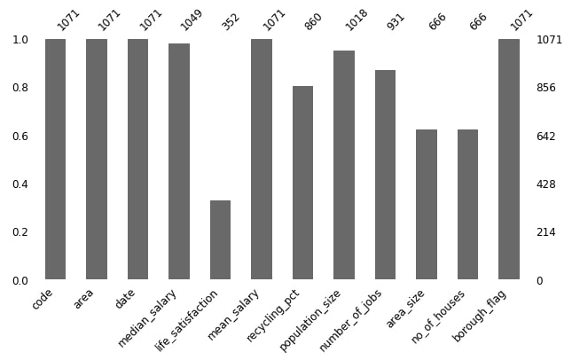
Below we are plotting count of values per columns ignoring missing values for London housing dataset with default settings of missingno.
missingno.bar(london_housing, figsize=(10,5), fontsize=12);
2.2 London Housing Dataset Missing Data Bar Chart (Sorted)
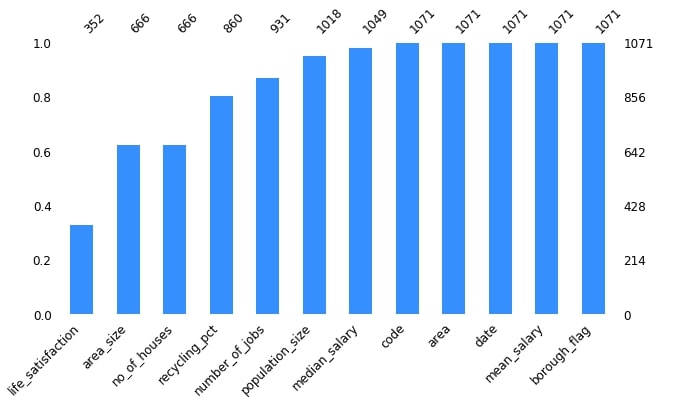
Below we are plotting count of values per columns ignoring missing values for the London housing dataset. We also have sorted columns based on missing values.
missingno.bar(london_housing, color="dodgerblue", sort="ascending", figsize=(10,5), fontsize=12);
2.3 Starbucks Locations Dataset Missing Data Bar Chart (Normal and Logarithmic Y-Axis)
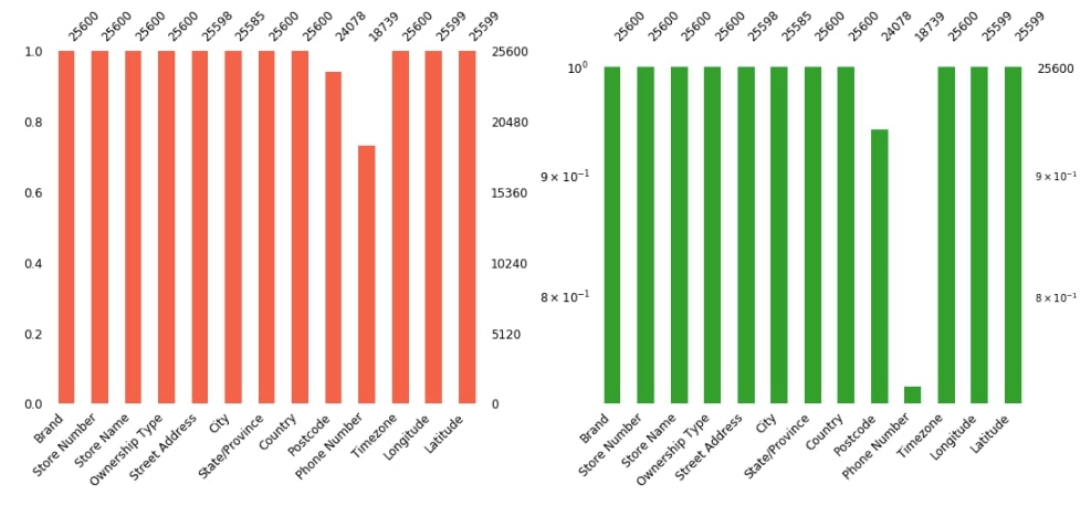
Below we are plotting count of values per columns ignoring missing values as well as a log of that counts for Starbucks locations dataset. We have combined both charts into one figure using a matplotlib axes configuration. We have changed bar color, figure size, and font size of the chart as well to improve graph aesthetics.
fig = plt.figure(figsize=(15,7))

ax1 = fig.add_subplot(1,2,1)
missingno.bar(starbucks_locations, color="tomato", fontsize=12, ax=ax1);

ax2 = fig.add_subplot(1,2,2)
missingno.bar(starbucks_locations, log=True, color="tab:green", fontsize=12, ax=ax2);

plt.tight_layout()
3. Missing Data Matrix 
3.1 Starbucks Locations Dataset Missing Data Matrix Chart
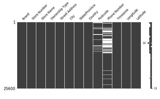
Below we are plotting the first matrix plot showing the distribution of missing values for Starbucks locations dataset. We can see that all columns except Postcode and Phone Number has data present into them.
missingno.matrix(starbucks_locations,figsize=(10,5), fontsize=12);
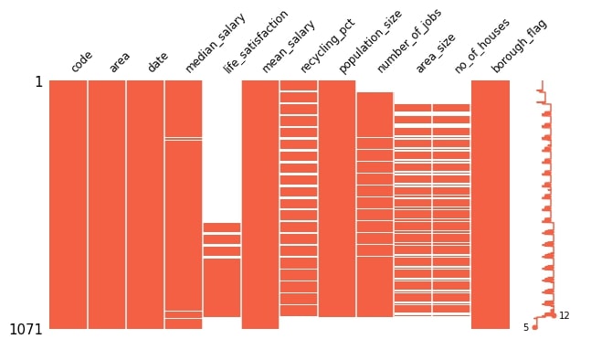
3.2 London Housing Dataset Missing Data Matrix Chart
Below we are plotting the first matrix plot showing the distribution of missing values for Starbucks locations dataset. We can notice that columns median_salary, life_satisfaction, recycling_pct, population_size, number_of_jobs, area_size and no_of_houses has missing values. We can also see that area_size and no_of_houses has almost the same distribution of missing values.
From sparkline we can also see that, a minimum of 5 columns has values present always and a maximum of 12 columns has values present less often.
missingno.matrix(london_housing, figsize=(10,5), fontsize=12, color=(1, 0.38, 0.27));
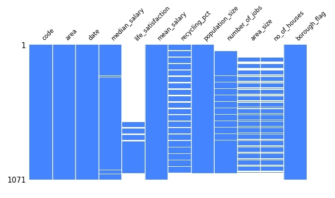
3.3 London Housing Dataset Missing Data Matrix Chart (Without Sparkline)
Below we are plotting the first matrix plot showing the distribution of missing values for Starbucks locations dataset but without sparkline. We also have changed the color of the plot along with figures size and font size of the chart.
missingno.matrix(london_housing, sparkline=False, figsize=(10,5), fontsize=12, color=(0.27, 0.52, 1.0));
4. Missing Data Heatmap 
4.1 Starbucks Locations Dataset Missing Data Heatmap
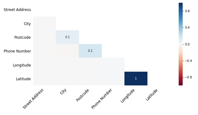
Below we have plotted a heatmap showing nullity correlation between various columns of Starbucks locations dataset. The majority of entries are empty in the heatmap because Starbucks locations dataset has fewer missing values.
The nullity correlation ranges from -1 to 1.
- -1 - Exact Negative correlation represents that if the value of one variable is present then the value of other variables is definitely absent.
- 0 - No correlation represents that variables' values present or absent do not have any effect on one another.
- 1 - Exact Positive correlation represents that if the value of one variable is present then the value of the other is definitely present.
We can see from the dataset that Longitude and Latitude have a correlation of 1.0 which highlights that if the Longitude value is missing then the Latitude value will be missing as well. There is little correlation between Postcode and Phone Number as well which we had noticed above when visualizing the matrix chart.
missingno.heatmap(starbucks_locations, figsize=(10,5), fontsize=12);
4.2 London Housing Dataset Missing Data Heatmap
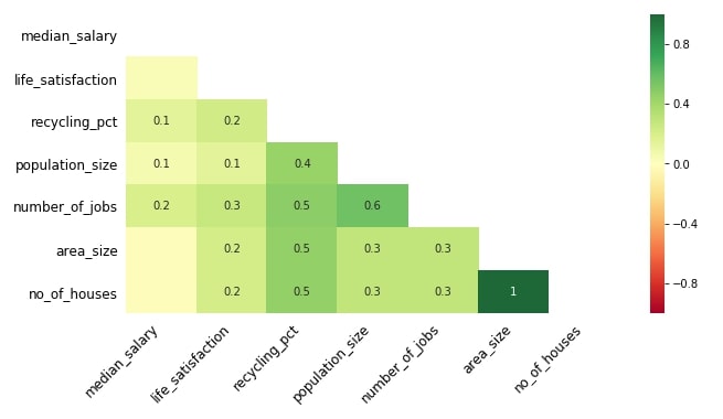
Below we are plotting a Heatmap showing nullity correlation between various columns of the London housing dataset. We have made changes to graph colormap, figure size, and font size as well this time.
We can notice from this heatmap that area_size and no_of_houses have a correlation of 1.0 which means that if the value from one column is missing then the value in another column will be missing as well. We can notice a good correlation of 0.6 between population_size and number_of_jobs which depicts the same missing value relationship. There are few other nullity correlations present in the heatmap which we can notice based on the missing value matrix plotted above for this dataset.
missingno.heatmap(london_housing, cmap="RdYlGn", figsize=(10,5), fontsize=12);
5 Missing Data Dendrogram 
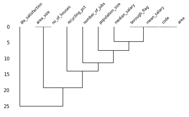
5.1 London Housing Dataset Missing Data Dendrogram
Below we are plotting dendrogram which shows hierarchical cluster creation based on missing values correlation between various datasets. The columns of the dataset which have a deep connection in missing values between them will be kept in the same cluster.
The dendrogram displays clusters with a tree-like structure that displays the hierarchy of clusters.
Below we are creating the dendrogram of the London housing dataset. We can notice that area_size and no_of_houses form one cluster. We noticed above in the nullity correlation heatmap as well that area_size and no_of_houses have a nullity correlation of 1.0. The borough_flag, mean_salary, code and area creates another cluster. The next cluster is created by adding the median_salary cluster to cluster of borough_flag, mean_salary, code, and area. The cluster after that is created by adding population_size to cluster of median_salary, borough_flag, mean_salary, code and area.It proceeds like that and keeps on creating a bigger cluster until we have all columns in one cluster.
The dendrogram method uses scipy.hierarchy module for the creation of clusters based on data. It uses the average method of that module by default to create clusters. We can also pass other methods present in that scipy module like ward, centroid, etc for creating clusters.
missingno.dendrogram(london_housing, figsize=(10,5), fontsize=12);
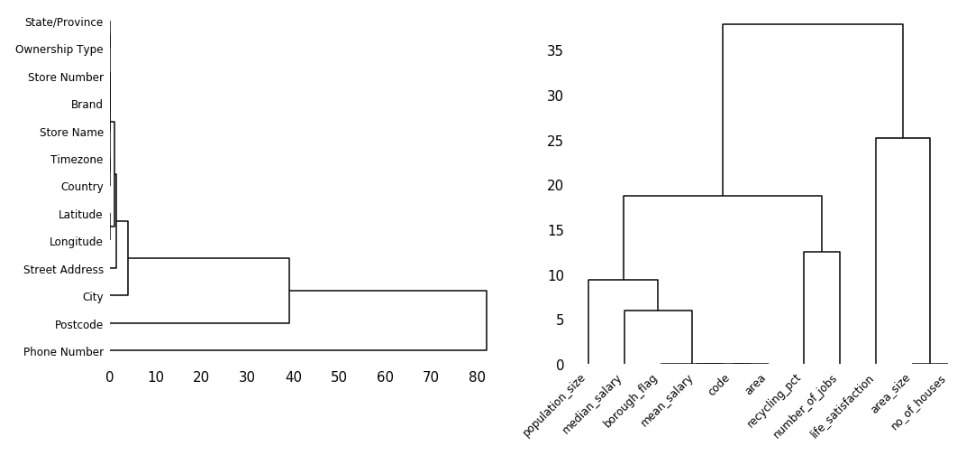
5.2 London Housing Dataset & Starbucks Locations Dataset Missing Data Dendrogram
Below we are plotting the dendrogram of London housing and Starbucks locations datasets. We have used different methods for creating clusters this time. We have used a centroid method for creating clusters of columns for the Starbucks locations dataset and the ward method for the London housing dataset. We suggest that you try various clustering algorithms available from scipy using this link.
We can notice from the below graph that Longitude and Latitude are kept in one cluster. We had noticed in the above heatmap as well that they had a nullity correlation of 1.0. We can notice that State/Province, Ownership Type, Store Number, Brand, Store Name, Time Zone, and Country are kept together because they don't have any missing value.
fig = plt.figure(figsize=(15,7))

ax1 = fig.add_subplot(1,2,1)
missingno.dendrogram(starbucks_locations, orientation="right", method="centroid", fontsize=12, ax=ax1);

ax2 = fig.add_subplot(1,2,2)
missingno.dendrogram(london_housing, orientation="top", method="ward", fontsize=12, ax=ax2);

plt.tight_layout()
This ends our small tutorial on explaining the usage of missingno library for plotting various visualization to understand the distribution of missing data in our datasets.
References 
 Sunny Solanki
Sunny Solanki
Intro: Software Developer | Youtuber | Bonsai Enthusiast
About: Sunny Solanki holds a bachelor's degree in Information Technology (2006-2010) from L.D. College of Engineering. Post completion of his graduation, he has 8.5+ years of experience (2011-2019) in the IT Industry (TCS). His IT experience involves working on Python & Java Projects with US/Canada banking clients. Since 2020, he’s primarily concentrating on growing CoderzColumn.
His main areas of interest are AI, Machine Learning, Data Visualization, and Concurrent Programming. He has good hands-on with Python and its ecosystem libraries.
Apart from his tech life, he prefers reading biographies and autobiographies. And yes, he spends his leisure time taking care of his plants and a few pre-Bonsai trees.
Contact: sunny.2309@yahoo.in


![YouTube Subscribe]() Comfortable Learning through Video Tutorials?
Comfortable Learning through Video Tutorials?
If you are more comfortable learning through video tutorials then we would recommend that you subscribe to our YouTube channel.
![Need Help]() Stuck Somewhere? Need Help with Coding? Have Doubts About the Topic/Code?
Stuck Somewhere? Need Help with Coding? Have Doubts About the Topic/Code?
 Stuck Somewhere? Need Help with Coding? Have Doubts About the Topic/Code?
When going through coding examples, it's quite common to have doubts and errors.
If you have doubts about some code examples or are stuck somewhere when trying our code, send us an email at coderzcolumn07@gmail.com. We'll help you or point you in the direction where you can find a solution to your problem.
You can even send us a mail if you are trying something new and need guidance regarding coding. We'll try to respond as soon as possible.
![Share Views]() Want to Share Your Views? Have Any Suggestions?
Want to Share Your Views? Have Any Suggestions?
 Want to Share Your Views? Have Any Suggestions?
If you want to
- provide some suggestions on topic
- share your views
- include some details in tutorial
- suggest some new topics on which we should create tutorials/blogs
 missing-data, visualization