Venn Diagram using Matplotlib | Python
Data visualization is an essential tool for data scientists and analysts to better understand the relationships and overlaps between different data sets. One way to visually represent these relationships is by using a Venn diagram, which is a graphical representation of all possible logical relations between a finite collection of sets. Venn diagrams can be useful for comparing the properties of different datasets, identifying shared or unique elements, and visualizing the extent of overlap between different groups.
What Can You Learn From This Article?
In this tutorial, we will explore how to create a Venn diagram using Matplotlib, one of the most widely used data visualization libraries in Python. Matplotlib provides a range of plotting functions and tools that can be used to create a wide range of visualizations, including Venn diagrams.
This tutorial will guide you through the process of creating a Venn diagram step-by-step, using examples and code snippets to illustrate each step. By the end of this tutorial, you will have a solid understanding of how to create Venn diagrams using Matplotlib, and how to customize and adapt them to your specific needs. This knowledge can be applied to a wide range of fields, including data science, biology, and social sciences, where Venn diagrams are commonly used to visualize data and identify patterns and relationships.
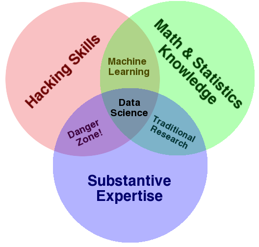
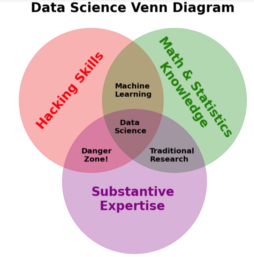
We will be explaining how to create the below data science Venn diagram using Matplotlib.
Video Tutorial
Please feel free to check below video tutorial if feel comfortable learning through videos.
First, we have imported matplotlib and printed the version that we have used in our tutorial.
import matplotlib

print("Matplotlib Version : {}".format(matplotlib.__version__))
The below code generates a custom Venn diagram using the Matplotlib library in Python. The diagram shows the relationships between three different areas: Hacking Skills, Math & Statistics Knowledge, and Substantive Expertise. The diagram is created using a scatter plot and text annotations, which are positioned using the text function.
The fig variable creates a figure object with a specified size of 12x12 inches using the figsize parameter. The ax variable creates a subplot within the figure using the add_subplot() function.
The scatter plot is created using the scatter() function, which takes in two lists of x and y coordinates, the size of the markers (s), and the colors and transparency of the markers (color and alpha). In this case, the scatter plot has three markers with different colors and transparency, positioned at (0,0), (0.25,0), and (0.13,-0.2).
The text() function is then used to add text annotations to the plot, specifying the x and y coordinates of the text, the text content (s), the rotation angle, the font size and weight, and the color of the text. The text annotations are positioned in different areas of the plot to represent the different areas of expertise, and some of them are rotated to align with the marker positions.
The xlim() and ylim() functions set the limits of the x and y axes to adjust the plot's size and aspect ratio. The spines function hides the top, bottom, left, and right axes lines and ticks, and the y-axis and x-axis functions hide the remaining axis lines and ticks.
Finally, the title function adds a title to the plot, specifying the title text, padding, font size, and weight.
Overall, the code generates a visually appealing data science Venn diagram that can be customized by changing the text, marker colors, and other properties to represent different areas of expertise or data relationships.
import matplotlib.pyplot as plt

fig = plt.figure(figsize=(12,12))

ax = fig.add_subplot(1,1,1)

plt.scatter(x=[0, 0.25, 0.13], y=[0,0, -0.2], s=150000, color=["red", "green", "purple"], alpha=0.3);

plt.text(x=-0.17, y=-0.07, s="Hacking Skills", rotation=50, fontsize=33, fontweight="bold", color="red");
plt.text(x=0.16, y=-0.11, s="Math & Statistics\n     Knowledge", rotation=-55, fontsize=33, fontweight="bold",
         color="green");
plt.text(x=0.0, y=-0.27, s="Substantive\n  Expertise", fontsize=33, fontweight="bold",
         color="purple");
plt.text(x=0.07, y=0.01, s="Machine\nLearning", fontsize=20, fontweight="bold");
plt.text(x=0.07, y=-0.08, s="  Data\nScience", fontsize=20, fontweight="bold");
plt.text(x=-0.03, y=-0.15, s="Danger\n Zone!", fontsize=20, fontweight="bold");
plt.text(x=0.175, y=-0.15, s="Traditional\nResearch", fontsize=20, fontweight="bold");

plt.xlim(-0.25,0.5);
plt.ylim(-0.4, 0.2);

ax.spines[["top", "bottom", "left", "right"]].set_visible(False);
ax.yaxis.set_visible(False);
ax.xaxis.set_visible(False);

plt.title('Data Science Venn Diagram', pad=20, fontsize=35, fontweight="bold");
 Sunny Solanki
Sunny Solanki
Intro: Software Developer | Youtuber | Bonsai Enthusiast
About: Sunny Solanki holds a bachelor's degree in Information Technology (2006-2010) from L.D. College of Engineering. Post completion of his graduation, he has 8.5+ years of experience (2011-2019) in the IT Industry (TCS). His IT experience involves working on Python & Java Projects with US/Canada banking clients. Since 2020, he’s primarily concentrating on growing CoderzColumn.
His main areas of interest are AI, Machine Learning, Data Visualization, and Concurrent Programming. He has good hands-on with Python and its ecosystem libraries.
Apart from his tech life, he prefers reading biographies and autobiographies. And yes, he spends his leisure time taking care of his plants and a few pre-Bonsai trees.
Contact: sunny.2309@yahoo.in


![YouTube Subscribe]() Comfortable Learning through Video Tutorials?
Comfortable Learning through Video Tutorials?
If you are more comfortable learning through video tutorials then we would recommend that you subscribe to our YouTube channel.
![Need Help]() Stuck Somewhere? Need Help with Coding? Have Doubts About the Topic/Code?
Stuck Somewhere? Need Help with Coding? Have Doubts About the Topic/Code?
 Stuck Somewhere? Need Help with Coding? Have Doubts About the Topic/Code?
When going through coding examples, it's quite common to have doubts and errors.
If you have doubts about some code examples or are stuck somewhere when trying our code, send us an email at coderzcolumn07@gmail.com. We'll help you or point you in the direction where you can find a solution to your problem.
You can even send us a mail if you are trying something new and need guidance regarding coding. We'll try to respond as soon as possible.
![Share Views]() Want to Share Your Views? Have Any Suggestions?
Want to Share Your Views? Have Any Suggestions?
 Want to Share Your Views? Have Any Suggestions?
If you want to
- provide some suggestions on topic
- share your views
- include some details in tutorial
- suggest some new topics on which we should create tutorials/blogs
 venn-diagram, matplotlib