Style Matplotlib Charts | Change Theme of Matplotlib Charts | Python
Matplotlib is a widely used plotting library in Python for creating high-quality visualizations for data analysis and presentation.
While Matplotlib offers a wide range of customization options to create visually appealing and informative plots, its default styling may not always be suitable for every use case. In such cases, it is useful to change the theme or style of Matplotlib charts to enhance their appearance and readability.
The Matplotlib library includes several predefined styles, such as "classic", "ggplot", "seaborn", and "fivethirtyeight", that can be easily applied to charts. These styles are designed to provide a consistent look and feel across all elements of the chart, including colors, fonts, and backgrounds.
What Can You Learn From This Article?
In this tutorial, we have explained how to apply predefined styles to "Matplotlib charts" using the "plt.style.use()" and "plt.style.context()" functions. With these functions, users can enhance the visual appeal and readability of their Matplotlib charts and create stunning visualizations for data analysis and presentation.
By the end of this tutorial, readers will have a better understanding of how to customize the appearance of Matplotlib charts to make them more visually appealing and effective at conveying the information in the data. They will also have a good grasp of the different styles and themes available in Matplotlib and how to use them to create charts that meet their specific needs. Whether you are a data analyst, data scientist, or just someone interested in data visualization, this article will provide you with valuable insights into how to style Matplotlib charts.
Video Tutorial
Please feel free to check below video tutorial if feel comfortable learning through videos.
First, we have imported matplotlib and printed the version that we have used in our tutorial.
import matplotlib

print("Matplotlib Version : {}".format(matplotlib.__version__))
Load Dataset
In this section, we have loaded a wine dataset available from Python ML library scikit-learn. The dataset has measurements of various ingredients used to prepare 3 different types of wine. We have loaded dataset as pandas dataframe.
After loading dataset as dataframe, we have grouped entries by wine type and calculated average values of ingredients per wine type in the next cell. It's another dataframe that we'll use to create charts.
import pandas as pd
from sklearn.datasets import load_wine

wine  = load_wine()

print("Dataset Size : ", wine.data.shape)

wine_df = pd.DataFrame(data=wine.data, columns=wine.feature_names)
wine_df["WineType"] = [wine.target_names[typ] for typ in wine.target]

wine_df.head()
avg_wine_df = wine_df.groupby("WineType").mean().reset_index()

avg_wine_df
1. Set Style Permanently for All Matplotlib Charts
In this section, we have first created charts without any themes. Then, we have explained how to introduce themes to charts to improve their look.
1.1 Scatter Chart
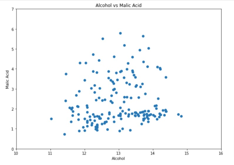
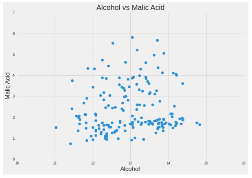
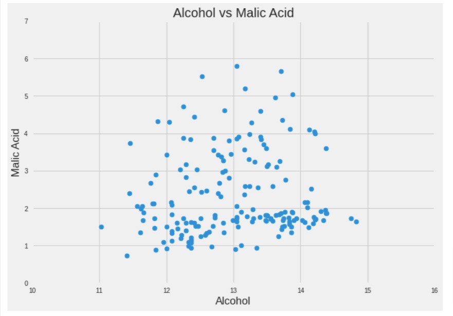
The below code creates a simple scatter chart showing the relationship between ingredients "alcohol" and "malic_acid" of our wine dataset.
The code starts by creating a new figure with the plt.figure() function and sets the size of the figure using the figsize parameter. In this case, the size of the figure is set to 10 inches by 7 inches.
Then, the code creates a scatter plot using the plt.scatter() function. The scatter plot is created using two variables from the wine_df DataFrame, namely alcohol and malic_acid. The x and y parameters of the scatter() function correspond to these two variables respectively.
Next, the code sets the labels of the x-axis and y-axis using the plt.xlabel() and plt.ylabel() functions respectively.
Then, the code sets the limits of the x-axis and y-axis using the plt.xlim() and plt.ylim() functions respectively.
Next, the code sets the tick labels of the x-axis and y-axis using the plt.xticks() and plt.yticks() functions respectively. The ticks parameter specifies the positions of the ticks and the labels parameter specifies the labels of the ticks.
Finally, the code sets the title of the plot using the plt.title() function and displays the plot using the plt.show() function.
import matplotlib.pyplot as plt

plt.figure(figsize=(10,7))

plt.scatter(x=wine_df["alcohol"], y=wine_df["malic_acid"],)

plt.xlabel("Alcohol")
plt.ylabel("Malic Acid")

plt.xlim(10,16)
plt.ylim(0, 7)

plt.xticks(ticks=range(10,17), labels=range(10,17))
plt.yticks(ticks=range(0,8), labels=range(0,8))

plt.title("Alcohol vs Malic Acid")

plt.show()
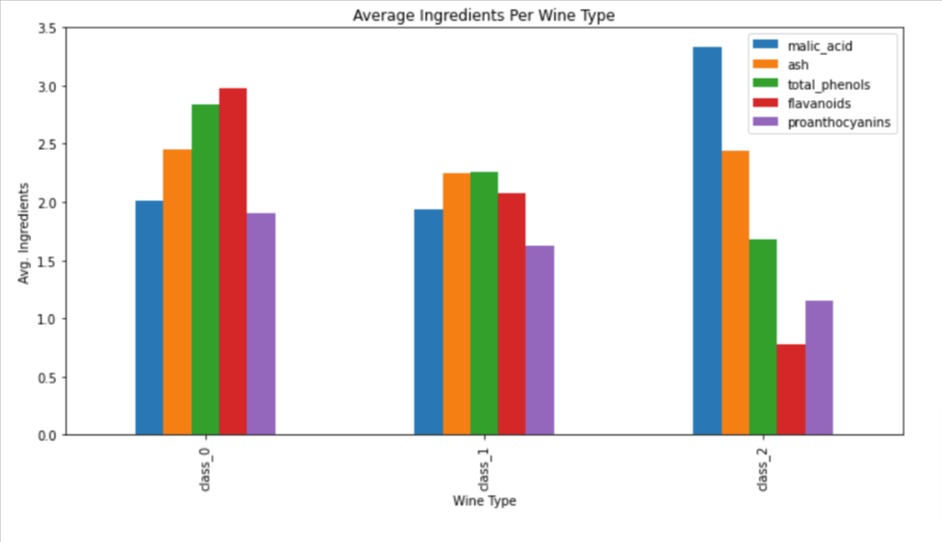
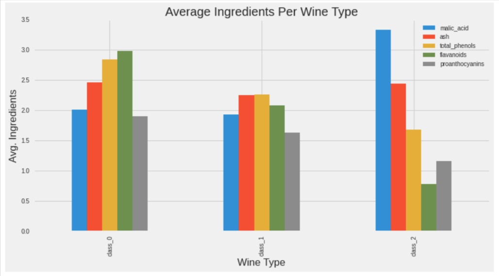
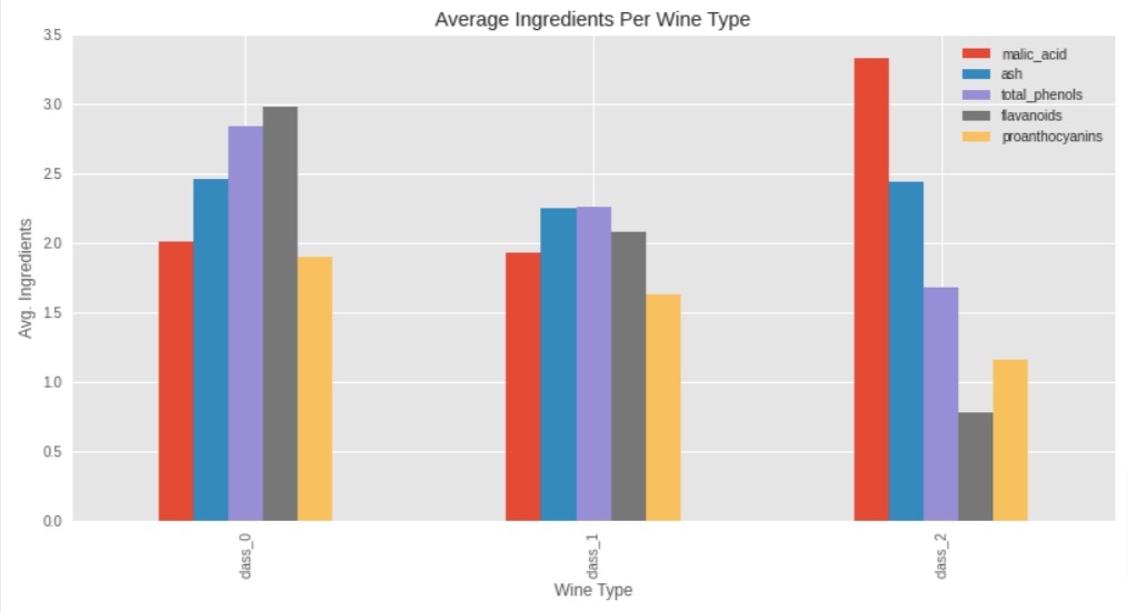
1.2 Grouped Bar Chart
The code creates a grouped bar chart of the average values of five wine ingredients for each type of wine.
The list ingredients contains the names of the five ingredients to be plotted.
The avg_wine_df DataFrame contains the average values of these five ingredients for each type of wine.
The plot.bar() function creates a bar chart with x and y parameters. Here, the x parameter is set to "WineType", which specifies the column in avg_wine_df that contains the type of wine, and the y parameter is set to ingredients, which specifies the list of ingredient columns to be plotted.
The function also takes additional parameters such as xlabel, ylabel, title, and figsize which set the x-axis label, y-axis label, the title of the plot, and the size of the figure respectively.
In this case, the x-axis label is set to "Wine Type", the y-axis label is set to "Avg. Ingredients", the title of the plot is set to "Average Ingredients Per Wine Type", and the size of the figure is set to 12 inches by 6 inches using the figsize parameter.
ingredients = ["malic_acid", "ash", "total_phenols", "flavanoids", "proanthocyanins"]

avg_wine_df.plot.bar(x="WineType", y=ingredients,
                     xlabel="Wine Type", ylabel="Avg. Ingredients",
                     title="Average Ingredients Per Wine Type",
                     figsize=(12,6)
                    );
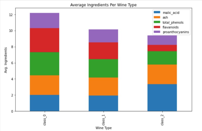
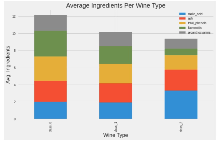
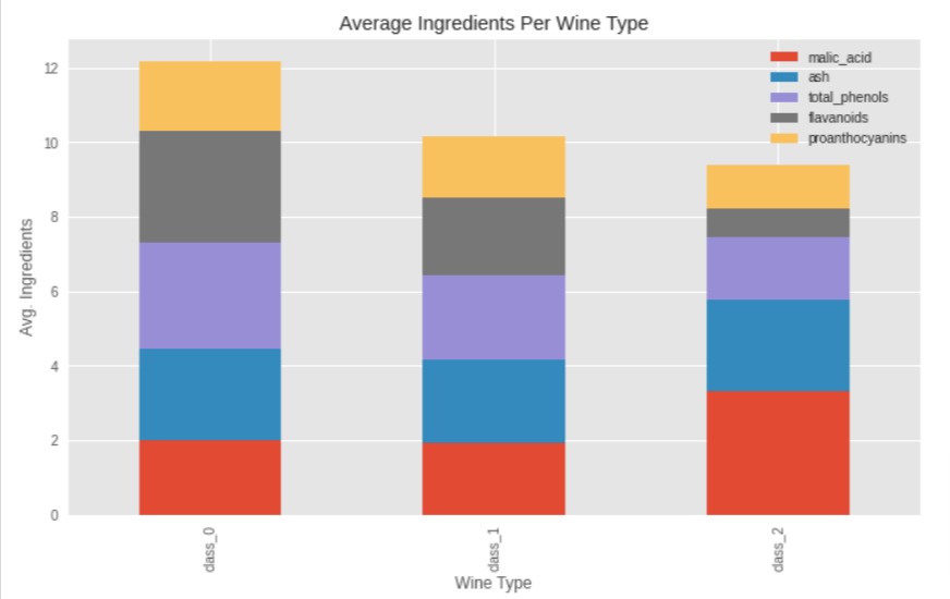
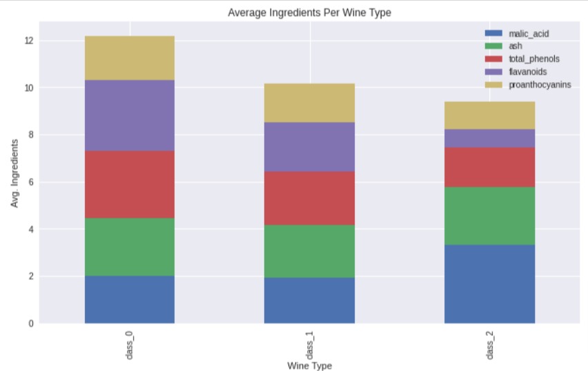
1.3 Stacked Bar Chart
The below code creates a stacked bar chart of the average values of five wine ingredients for each type of wine.
ingredients = ["malic_acid", "ash", "total_phenols", "flavanoids", "proanthocyanins"]

avg_wine_df.plot.bar(x="WineType", y=ingredients, stacked=True,
                     xlabel="Wine Type", ylabel="Avg. Ingredients",
                     title="Average Ingredients Per Wine Type",
                     figsize=(10,6)
                    );
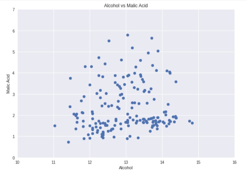
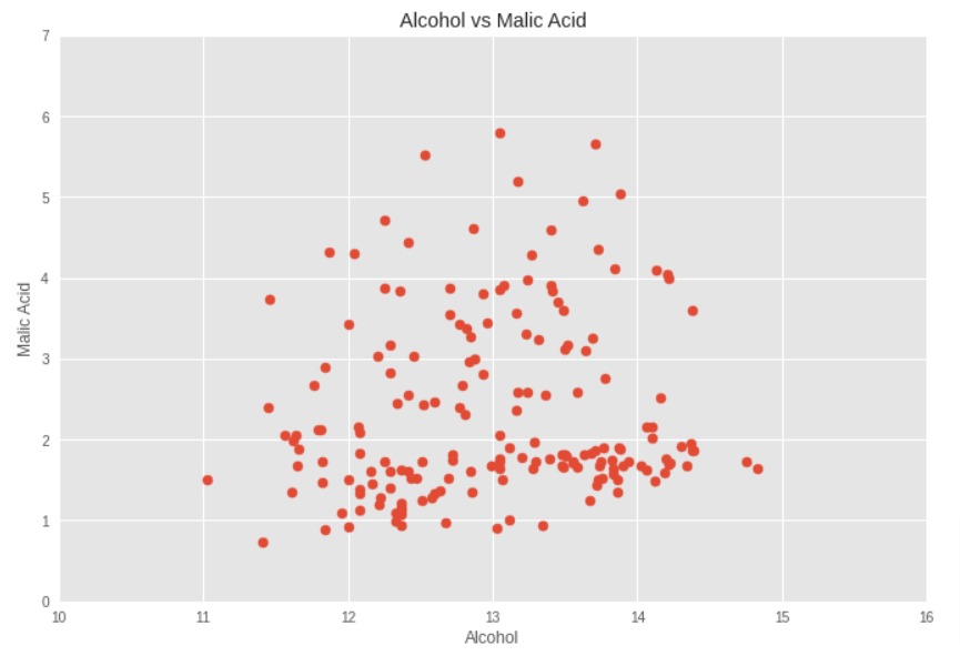
We can notice from the output that all three charts created till now had default theme which has simple white background and same font size for all text in the chart. There is no grid. Let's improve the look by adding a theme using just one line of code.
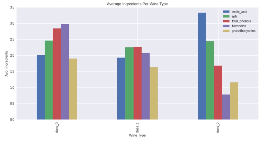
1.4 Styled Charts
The below line of code sets the plotting style of Matplotlib to "seaborn".
Matplotlib provides several plotting styles to choose from, each with a distinct look and feel. The default style is "classic", but other options include "ggplot", "dark_background", "bmh", "seaborn", and more.
The plt.style.use() function is used to set the plot style. Here, seaborn is the style being used. Seaborn is a popular plotting library built on top of Matplotlib and provides a set of customized themes and color palettes for creating attractive statistical graphics.
Once the style is set using this code, all subsequent plots created using Matplotlib will use the specified style until another style is set.
After setting the style, we have again executed our scatter chart creation code and we can see how it has improved the look of the chart.
plt.style.use("seaborn");
import matplotlib.pyplot as plt

plt.figure(figsize=(10,7))

plt.scatter(x=wine_df["alcohol"], y=wine_df["malic_acid"],)

plt.xlabel("Alcohol")
plt.ylabel("Malic Acid")

plt.xlim(10,16)
plt.ylim(0, 7)

plt.xticks(ticks=range(10,17), labels=range(10,17))
plt.yticks(ticks=range(0,8), labels=range(0,8))

plt.title("Alcohol vs Malic Acid")

plt.show()
We can retrieve a list of available styles by calling available attribute from plt.style module.
print("List of Available Styles : {}".format(plt.style.available))
The below code sets the plotting style of Matplotlib to "fivethirtyeight". This style is designed to mimic the style of plots and visualizations used by the news website FiveThirtyEight. The style is characterized by bold lines, large fonts, and a distinctive color scheme.
plt.style.use("fivethirtyeight");
After setting the theme, we have re-executed the code of all 3 charts that we had created earlier and we can notice how the look of the charts is improved.
import matplotlib.pyplot as plt

plt.figure(figsize=(10,7))

plt.scatter(x=wine_df["alcohol"], y=wine_df["malic_acid"],)

plt.xlabel("Alcohol")
plt.ylabel("Malic Acid")

plt.xlim(10,16)
plt.ylim(0, 7)

plt.xticks(ticks=range(10,17), labels=range(10,17))
plt.yticks(ticks=range(0,8), labels=range(0,8))

plt.title("Alcohol vs Malic Acid")

plt.show()
ingredients = ["malic_acid", "ash", "total_phenols", "flavanoids", "proanthocyanins"]

avg_wine_df.plot.bar(x="WineType", y=ingredients,
                     xlabel="Wine Type", ylabel="Avg. Ingredients",
                     title="Average Ingredients Per Wine Type",
                     figsize=(12,6)
                    );
ingredients = ["malic_acid", "ash", "total_phenols", "flavanoids", "proanthocyanins"]

avg_wine_df.plot.bar(x="WineType", y=ingredients, stacked=True,
                     xlabel="Wine Type", ylabel="Avg. Ingredients",
                     title="Average Ingredients Per Wine Type",
                     figsize=(10,6)
                    );
2. Use Style as a Context Manager
In this section, we have explained how to set a theme temporary for one chart using context manager.
The with plt.style.context("ggplot") line temporarily sets the Matplotlib style to "ggplot" within the indented code block that follows.
This is an alternative way of setting the style for a specific plot, rather than using plt.style.use("ggplot") to set it globally.
with plt.style.context("ggplot"):
    import matplotlib.pyplot as plt

    plt.figure(figsize=(10,7))

    plt.scatter(x=wine_df["alcohol"], y=wine_df["malic_acid"],)

    plt.xlabel("Alcohol")
    plt.ylabel("Malic Acid")

    plt.xlim(10,16)
    plt.ylim(0, 7)

    plt.xticks(ticks=range(10,17), labels=range(10,17))
    plt.yticks(ticks=range(0,8), labels=range(0,8))

    plt.title("Alcohol vs Malic Acid")

    plt.show()
As you can see below, outside of context, again fivethirtyeight theme is applied.
import matplotlib.pyplot as plt

plt.figure(figsize=(10,7))

plt.scatter(x=wine_df["alcohol"], y=wine_df["malic_acid"],)

plt.xlabel("Alcohol")
plt.ylabel("Malic Acid")

plt.xlim(10,16)
plt.ylim(0, 7)

plt.xticks(ticks=range(10,17), labels=range(10,17))
plt.yticks(ticks=range(0,8), labels=range(0,8))

plt.title("Alcohol vs Malic Acid")

plt.show()
Below, we have applied ggplot theme to our grouped bar chart.
ingredients = ["malic_acid", "ash", "total_phenols", "flavanoids", "proanthocyanins"]

with plt.style.context("ggplot"):
    avg_wine_df.plot.bar(x="WineType", y=ingredients,
                         xlabel="Wine Type", ylabel="Avg. Ingredients",
                         title="Average Ingredients Per Wine Type",
                         figsize=(12,6)
                        );
Below, we have applied ggplot theme to our stacked bar chart.
ingredients = ["malic_acid", "ash", "total_phenols", "flavanoids", "proanthocyanins"]

with plt.style.context("ggplot"):
    avg_wine_df.plot.bar(x="WineType", y=ingredients, stacked=True,
                         xlabel="Wine Type", ylabel="Avg. Ingredients",
                         title="Average Ingredients Per Wine Type",
                         figsize=(10,6)
                        );
ingredients = ["malic_acid", "ash", "total_phenols", "flavanoids", "proanthocyanins"]

with plt.style.context("seaborn"):
    avg_wine_df.plot.bar(x="WineType", y=ingredients,
                         xlabel="Wine Type", ylabel="Avg. Ingredients",
                         title="Average Ingredients Per Wine Type",
                         figsize=(12,6)
                        );
Below, we have applied seaborn theme to our stacked bar chart.
ingredients = ["malic_acid", "ash", "total_phenols", "flavanoids", "proanthocyanins"]

with plt.style.context("seaborn"):
    avg_wine_df.plot.bar(x="WineType", y=ingredients, stacked=True,
                         xlabel="Wine Type", ylabel="Avg. Ingredients",
                         title="Average Ingredients Per Wine Type",
                         figsize=(10,6)
                        );
We discussed two different ways of changing the style of matplotlib charts.
- plt.style.use() - Set style permanently for charts.
- plt.style.context() - Set style for a particular context.
References
 Sunny Solanki
Sunny Solanki
Intro: Software Developer | Youtuber | Bonsai Enthusiast
About: Sunny Solanki holds a bachelor's degree in Information Technology (2006-2010) from L.D. College of Engineering. Post completion of his graduation, he has 8.5+ years of experience (2011-2019) in the IT Industry (TCS). His IT experience involves working on Python & Java Projects with US/Canada banking clients. Since 2020, he’s primarily concentrating on growing CoderzColumn.
His main areas of interest are AI, Machine Learning, Data Visualization, and Concurrent Programming. He has good hands-on with Python and its ecosystem libraries.
Apart from his tech life, he prefers reading biographies and autobiographies. And yes, he spends his leisure time taking care of his plants and a few pre-Bonsai trees.
Contact: sunny.2309@yahoo.in


![YouTube Subscribe]() Comfortable Learning through Video Tutorials?
Comfortable Learning through Video Tutorials?
If you are more comfortable learning through video tutorials then we would recommend that you subscribe to our YouTube channel.
![Need Help]() Stuck Somewhere? Need Help with Coding? Have Doubts About the Topic/Code?
Stuck Somewhere? Need Help with Coding? Have Doubts About the Topic/Code?
 Stuck Somewhere? Need Help with Coding? Have Doubts About the Topic/Code?
When going through coding examples, it's quite common to have doubts and errors.
If you have doubts about some code examples or are stuck somewhere when trying our code, send us an email at coderzcolumn07@gmail.com. We'll help you or point you in the direction where you can find a solution to your problem.
You can even send us a mail if you are trying something new and need guidance regarding coding. We'll try to respond as soon as possible.
![Share Views]() Want to Share Your Views? Have Any Suggestions?
Want to Share Your Views? Have Any Suggestions?
 Want to Share Your Views? Have Any Suggestions?
If you want to
- provide some suggestions on topic
- share your views
- include some details in tutorial
- suggest some new topics on which we should create tutorials/blogs
 style-charts, modify-theme, add-theme