Create Simple Dashboard Faster using Streamlit (<50 Lines of Code)
Welcome to this tutorial on how to create a simple dashboard faster using Streamlit! If you're new to Streamlit, it is a popular Python library that allows you to build beautiful, interactive web applications with minimal effort.
Streamlit makes it easy to create custom data visualizations, interactive charts, and tables and allows you to share your work with others via a web browser. It provides a simple and intuitive way to build your web application without the need for any HTML, CSS, or JavaScript.
What Can You Learn From This Article?
In this tutorial, we'll take a deep dive into how to create a simple dashboard using Streamlit, step by step. We'll create a simple dashboard consisting of just 2 charts and a few widgets to change those charts as a part of this tutorial.
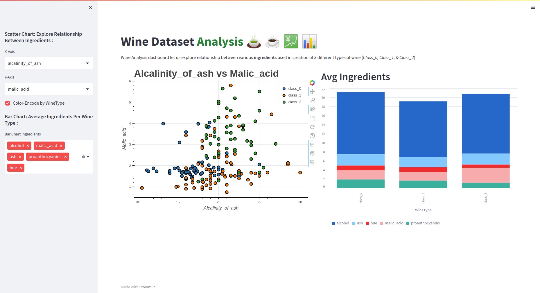
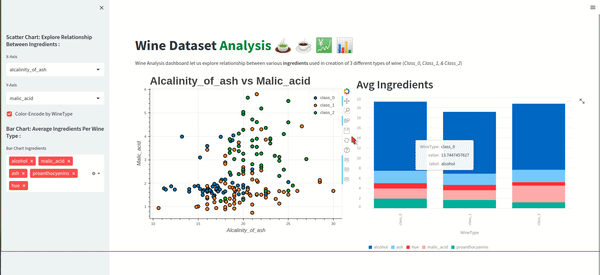
The below image shows the dashboard that we are going to create as a part of this tutorial. We'll be creating a scatter chart using the pandas_bokeh library.
This tutorial is a good starting point for someone who is new to "streamlit" and wants to get started with dashboard creation using it. By the end of this tutorial, you'll have a solid understanding of how to create a custom dashboard using Streamlit and will be well on your way to creating your own impressive web applications.
So, whether you're a data scientist looking to showcase your latest findings, a developer wanting to build a quick prototype, or anyone who wants to build an interactive dashboard with ease, this tutorial is for you. Let's get started!
Video Tutorial
Please feel free to check below video tutorial if feel comfortable learning through videos.
Streamlit Dashboard
Below, we have included code for our dashboard.
The code starts by setting the layout of the page to "wide" using the set_page_config() function.
Then, it loads the wine dataset using the load_wine() function from the 'sklearn.datasets' module and converts it into a Pandas DataFrame. The data is then cached using the "@st.cache_data" decorator, which allows for faster loading of data on subsequent runs of the app.
Next, the code creates a sidebar with widgets that allow the user to select the x and y axes for a scatter chart and whether to color-encode the points by wine type. It also includes a multi-select widget to select which ingredients to include in a bar chart of the average ingredient values for each wine type.
The main body of the dashboard is split into two columns using the columns() function from the streamlit.container module.
In the left column, a scatter chart is displayed using the plot_bokeh.scatter() function from the pandas_bokeh module, which generates an interactive scatter plot. The chart is based on the user's selection of the x and y axes, and the points can be color-encoded by wine type if selected.
The right column displays a bar chart of the average ingredient values for each wine type, based on the user's selection of which ingredients to include.
Finally, the code uses the st.bokeh_chart() and st.bar_chart() functions from the Streamlit library to display the charts in the left and right columns, respectively. The streamlit method st.bar_chart() creates chart using data viz library Altair. The use_container_width=True parameter ensures that the charts fill the available space in their respective columns.
import streamlit as st
import pandas as pd
import pandas_bokeh
from sklearn.datasets import load_wine

st.set_page_config(layout="wide") ## Set layout wide to cover whole page.

## Load Data
@st.cache_data
def load_data():
    wine = load_wine()
    wine_df = pd.DataFrame(wine.data, columns=wine.feature_names)
    wine_df["WineType"] = [wine.target_names[t] for t in wine.target]
    return wine_df

wine_df = load_data()
ingredients = wine_df.drop(columns=["WineType"]).columns

avg_wine_df = wine_df.groupby("WineType").mean().reset_index()

## Title
st.title("Wine Dataset :green[Analysis] :tea: :coffee: :chart: :bar_chart:")
st.markdown("Wine Analysis dashboard let us explore relationship between various **ingredients** used in creation of 3 different types of wine (*Class_0, Class_1, & Class_2*)")

## Add Widgets
st.sidebar.markdown("### Scatter Chart: Explore Relationship Between Ingredients :")

x_axis = st.sidebar.selectbox("X-Axis", ingredients, )
y_axis = st.sidebar.selectbox("Y-Axis", ingredients, index=1)
color_encode = st.sidebar.checkbox(label="Color-Encode by WineType")

st.sidebar.markdown("### Bar Chart: Average Ingredients Per Wine Type : ")

bar_multiselect = st.sidebar.multiselect(label="Bar Chart Ingredients", options=ingredients, default=["alcohol", "malic_acid", "ash"])

## Widgets State Change Actions & Layout Adjustments.
container = st.container()
chart1, chart2 = container.columns(2)

with chart1:
    if x_axis and y_axis:
        scatter_fig = wine_df.plot_bokeh.scatter(x=x_axis, y=y_axis, category="WineType" if color_encode else None,
                                                 xlabel=x_axis.capitalize(), ylabel=y_axis.capitalize(),
                                                 title="{} vs {}".format(x_axis.capitalize(), y_axis.capitalize()),
                                                 figsize=(650,500),
                                                 fontsize_title= 25, fontsize_label=12, show_figure=False)
        st.bokeh_chart(scatter_fig, use_container_width=True)

with chart2:
    if bar_multiselect:
        st.header("Avg Ingredients")
        st.bar_chart(avg_wine_df, x="WineType", y=bar_multiselect, height=500, use_container_width=True)
 Sunny Solanki
Sunny Solanki
Intro: Software Developer | Youtuber | Bonsai Enthusiast
About: Sunny Solanki holds a bachelor's degree in Information Technology (2006-2010) from L.D. College of Engineering. Post completion of his graduation, he has 8.5+ years of experience (2011-2019) in the IT Industry (TCS). His IT experience involves working on Python & Java Projects with US/Canada banking clients. Since 2020, he’s primarily concentrating on growing CoderzColumn.
His main areas of interest are AI, Machine Learning, Data Visualization, and Concurrent Programming. He has good hands-on with Python and its ecosystem libraries.
Apart from his tech life, he prefers reading biographies and autobiographies. And yes, he spends his leisure time taking care of his plants and a few pre-Bonsai trees.
Contact: sunny.2309@yahoo.in


![YouTube Subscribe]() Comfortable Learning through Video Tutorials?
Comfortable Learning through Video Tutorials?
If you are more comfortable learning through video tutorials then we would recommend that you subscribe to our YouTube channel.
![Need Help]() Stuck Somewhere? Need Help with Coding? Have Doubts About the Topic/Code?
Stuck Somewhere? Need Help with Coding? Have Doubts About the Topic/Code?
 Stuck Somewhere? Need Help with Coding? Have Doubts About the Topic/Code?
When going through coding examples, it's quite common to have doubts and errors.
If you have doubts about some code examples or are stuck somewhere when trying our code, send us an email at coderzcolumn07@gmail.com. We'll help you or point you in the direction where you can find a solution to your problem.
You can even send us a mail if you are trying something new and need guidance regarding coding. We'll try to respond as soon as possible.
![Share Views]() Want to Share Your Views? Have Any Suggestions?
Want to Share Your Views? Have Any Suggestions?
 Want to Share Your Views? Have Any Suggestions?
If you want to
- provide some suggestions on topic
- share your views
- include some details in tutorial
- suggest some new topics on which we should create tutorials/blogs
 dashboard, streamlit