Simple 2D Animation in Python using bqplot & ipywidgets
The bqplot has become a very convenient library for plotting data visualizations in python as it’s built on top of ipywidgets. Each component of the bqplot chart is an ipywidgets widget and the whole chart itself is a widget as well. This provides a very flexible framework that lets us update the data of the chart even after the chart is plotted and changes will reflect immediately on the chart. The ipywidgets library itself is built on traitlets frameworks which provides a framework to monitor attribute of classes and let us take actions by implementing callbacks. As a part of this tutorial, we'll be making simple 2D visualizations using bqplot and ipywidgets libraries.
We have already published a list of tutorials which can provide a base for this tutorial if the reader does not have a background on bqplot or ipywidgets:
- bqplot - Interactive Plotting in Python using bqplot
- How to link bqplot with ipywidgets to dynamically update charts?
- bqplot - Interactive Plotting using Internal Object Model API
- Interactive Widgets in Jupyter Notebook using ipywidgets
We suggest that you go through these tutorials if you do not have a background on bqplot or ipywidgets as it'll help you grasp code fast.
We'll start the tutorial by importing the necessary libraries.
import numpy as np
import pandas as pd

import bqplot.pyplot as bplt
import ipywidgets as widgets

import time

pd.set_option("display.max_columns", 50)
We'll now explain simple 2d animations with few examples. All our examples consist of below mentioned common steps:
- Create bqplot Chart
- Create ipywidgets Button
- Create callback function for the button which will update chart data
- Register callback with button using
on_click() - Create UI combining button and bqplot figure using ipywidgets layout options.
Example 1
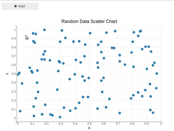
Our first example consists of simple animation based on a scatter plot in bqplot. We'll be creating a simple scatter plot consisting of 100 random points. We have used bqplot's pyplot API to create a scatter chart of 100 random points below.
## Chart Creation Logic
colors= ["red", "green", "blue", "orangered", "tomato", "lawngreen", "lime", "pink", "gray", "black"]

fig = bplt.figure(animation_duration=1000, title="Random Data Scatter Chart")
fig.layout.width="700px"
fig.layout.height="500px"

x = np.random.rand(100)
y = np.random.rand(100)
scat = bplt.scatter(x,y)

bplt.xlabel("X")
bplt.ylabel("Y")

bplt.xlim(0,1)
bplt.ylim(0,1);
Below we have created a simple ipywidgets button.
btn = widgets.Button(description="Start", icon="play")
Below we have created a callback function which will be called each time a button is clicked. In the logic of the callback function, we are looping 10 times, generating 100 new random points, and updating chart data with this new 100 points. We then stop for 1 second before proceeding with the next iteration. This loop of 10 iterations with a pause of 1 second between each iteration will give us simple animation.
Please make a note that we are updating scatter data using the hold_sync() context of the scatter chart. The main reason for this is that it'll update data at the same time synchronously.
## Callback to Update Chart
def update_scatter_chart(btn):
    for i in range(10):
        x = np.random.rand(100)
        y = np.random.rand(100)
        idx = np.random.choice(np.arange(len(colors)))
        with scat.hold_sync():
            scat.x = x
            scat.y = y
            scat.colors = [colors[idx]]
        time.sleep(1)

btn.on_click(update_scatter_chart)
Below we have combined button and scatter chart figure into one UI using ipywidgets VBox() layout which will layout widgets passed to it vertically. We can click the button and it'll start the animation by calling the callback function.
## UI Combining Button & Chart
widgets.VBox([btn, fig])
Example 2
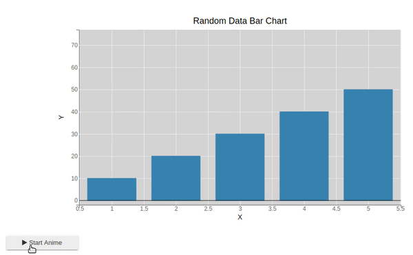
Our second example consists of the animation of the bar chart. We have created a simple bar chart of 7 bars each having a different lengths. We have first created a simple bar chart using default heights and colors.
We have then created a button widget and a callback function as usual. The callback function will again loop 15 iterations and each time, it'll shuffle the heights of the bar chart and update new heights into the chart. It'll pause for 1 second between each iteration to give us simple animation.
## Chart Creation Logic
colors= ["red", "green", "blue", "orangered", "tomato", "lawngreen", "lime", "black"]
heights = [10, 20, 30, 40, 50, 60, 70]

fig = bplt.figure(animation_duration=1000,
                  title="Random Data Bar Chart",
                  fig_margin={'top':60, 'bottom':60, 'left':150, 'right':150},
                  background_style={'fill':"lightgray"})

bar = bplt.bar(x=[1,2,3,4,5],y=heights)

bplt.xlabel("X")
bplt.ylabel("Y")

bplt.ylim(0,75);

## Callback to Update Chart
def update_bar_chart(btn):
    for i in range(15):
        idx = np.random.choice(np.arange(len(colors)))
        np.random.shuffle(heights)
        with bar.hold_sync():
            bar.y = heights
            bar.colors = [colors[idx]]
        time.sleep(1)

btn = widgets.Button(description="Start Anime", icon="play")

btn.on_click(update_bar_chart)

widgets.VBox([fig, btn])
Example 3
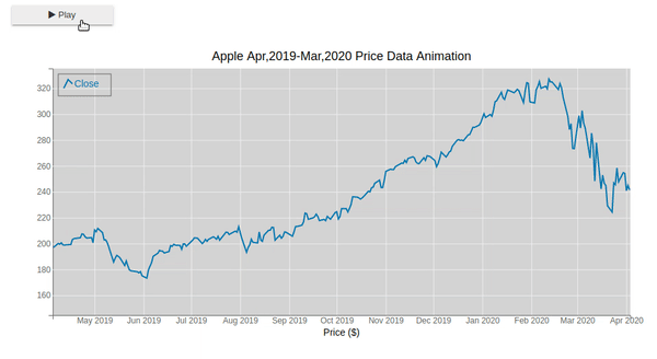
Our third example of creating simple animation using bqplot consist of a line chart. We'll be loading the apple OHLC dataset for the same. The apple OHLC dataset is easily available from yahoo finance. We'll be plotting the first line chart with prices of the close price of the stock. We have then created a callback function that will loop 10 times and each time chooses between Open, Close, High, Low and Adj Close prices to update the line chart. The steps followed to create this animation are the same as previous examples.
apple_df = pd.read_csv("~/datasets/AAPL.csv", index_col=0, parse_dates=True)
apple_df.head()
## Chart Creation Logic
cols = ["Open","High","Low","Close","Adj Close"]

colors= ["red", "green", "blue", "orangered", "tomato", "lawngreen", "lime", "black"]

fig = bplt.figure(animation_duration=1000, background_style={'fill':"lightgray"},
                  legend_location = "top-left",
                  title="Apple Apr,2019-Mar,2020 Price Data Animation ")

line = bplt.plot(x=apple_df.index,y=apple_df["Close"],
                 display_legend=True, labels=["Close"])

bplt.xlabel("Date")
bplt.xlabel("Price ($)")

bplt.ylim(150, 330)

## Callback to Update Chart
def update_line_chart(btn):
    for i in range(10):
        time.sleep(1)
        idx1 = np.random.choice(np.arange(len(colors)))
        idx2 = np.random.choice(np.arange(len(cols)))
        line.y = apple_df[cols[idx2]]
        line.colors = [colors[idx1]]
        line.labels=[cols[idx2]]

btn = widgets.Button(description="Play", icon='play')

btn.on_click(update_line_chart)

widgets.VBox([btn, fig])
Example 4
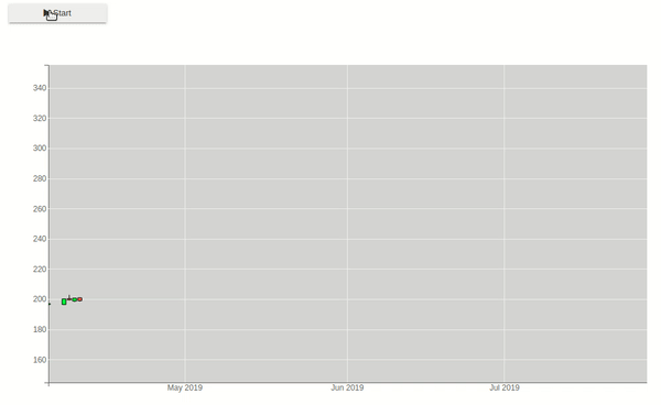
Our fourth example for explaining simple animation consist of a candle stick chart of apple data that we loaded as a part of the previous example. We'll first plot a simple candlestick chart for the first 5 days. We have then created a callback function which will loop through all other prices and keep on adding candlestick chart values for them by pausing for 0.2 seconds between each iteration to create animation.
## Chart Creation Logic
rng = pd.date_range(start="2019-4-5", periods=5, freq="B")
int_df = apple_df[apple_df.index.isin(rng)]

fig = bplt.figure(animation_duration=200,
                  background_style={'fill':"lightgray"},
                  title="Apple Apr,2019- Mar,2020 Candlestick")

fig.layout.height="600px"

fig.layout.width="3000px"

ohlc = bplt.ohlc(x=int_df.index, y = int_df[["Open", "High", "Low", "Close"]].values,
                 colors=["lime", "tomato"],)

bplt.xlim(apple_df.index[0], apple_df.index[-1])
bplt.ylim(150, 350)

bplt.xlabel("Date");

## Callback to Update Chart
def update_candlestick(btn):
    for i in range(apple_df.shape[0]):
        time.sleep(0.2)
        rng = pd.date_range(start="2019-4-5", periods=5+i, freq="B")
        int_df = apple_df[apple_df.index.isin(rng)]

        with ohlc.hold_sync():
            ohlc.x = rng
            ohlc.y = int_df[["Open", "High", "Low", "Close"]].values

btn = widgets.Button(description="Start", icon="play")

btn.on_click(update_candlestick)

widgets.VBox([btn, fig])
Example 5
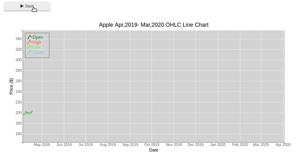
Our fifth example of simple 2D animation consists of a line chart of Apple OHLC prices. We are first plotting a simple line chart that shows Apple OHLC prices for the first 10 days. We then loop through the remaining price data one by one updating the chart by adding these new price lines using for-loop iteration when the button is clicked. This will give us an animation of moving lines.
## Chart Creation Logic
rng = pd.date_range(start="2019-4-5", periods=10, freq="B")
int_df = apple_df[apple_df.index.isin(rng)]

fig = bplt.figure(animation_duration=100, legend_location="top-left",
                  background_style={'fill':"lightgray"},
                  title="Apple Apr,2019- Mar,2020 OHLC Line Chart")

line1 = bplt.plot(x=int_df.index, y = int_df["Open"].values, colors=["green"], labels=["Open"], display_legend=True)
line2 = bplt.plot(x=int_df.index, y = int_df["High"].values, colors=["tomato"], labels=["High"], display_legend=True)
line3 = bplt.plot(x=int_df.index, y = int_df["Low"].values, colors=["lawngreen"], labels=["Low"], display_legend=True)
line4 = bplt.plot(x=int_df.index, y = int_df["Close"].values, colors=["skyblue"], labels=["Close"], display_legend=True)

bplt.xlim(apple_df.index[0], apple_df.index[-1])
bplt.ylim(150, 350)

bplt.xlabel("Date")
bplt.ylabel("Price ($)")

## Callback to Update Chart
def update_line_charts(btn):
    for i in range(apple_df.shape[0]):
        time.sleep(0.1)
        rng = pd.date_range(start="2019-4-5", periods=10+i+1, freq="B")
        int_df = apple_df[apple_df.index.isin(rng)]

        with line1.hold_sync():
            line1.x = rng
            line1.y = int_df["Open"].values

        with line2.hold_sync():
            line2.x = rng
            line2.y = int_df["High"].values

        with line3.hold_sync():
            line3.x = rng
            line3.y = int_df["Low"].values

        with line4.hold_sync():
            line4.x = rng
            line4.y = int_df["Close"].values

btn = widgets.Button(description="Start", icon="play")

btn.on_click(update_line_charts)

widgets.VBox([btn, fig])
Example 6
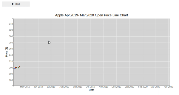
Our last animation consists of a line and a scatter chart. We'll plot a simple line and scatter chart for the first 10 days of apple open prices. We'll then loop through the remaining prices and add them one by one to the chart pausing between each iteration for 0.1 second each time callback is called by clicking on the button. This will give us animation which will show us the moving line and points getting added to the chart.
## Chart Creation Logic
rng = pd.date_range(start="2019-4-5", periods=10, freq="B")
int_df = apple_df[apple_df.index.isin(rng)]

fig = bplt.figure(animation_duration=100, legend_location="top-left",
                  background_style={'fill':"lightgray"},
                  title="Apple Apr,2019- Mar,2020 Open Price Line Chart")

line = bplt.plot(x=int_df.index, y = int_df["Open"].values, colors=["blue"])

scat = bplt.scatter(x=int_df.index, y = int_df["Open"].values,
                    colors=["red"],
                    default_size=10,
                    opacity=[0.1],
                    stroke="green", stroke_width=1
                    )

bplt.xlim(apple_df.index[0], apple_df.index[-1])
bplt.ylim(150, 350)

bplt.xlabel("Date")
bplt.ylabel("Price ($)");

## Callback to Update Chart
def update_line_scatter_chart(btn):
    for i in range(apple_df.shape[0]-10):
        time.sleep(0.1)
        rng = pd.date_range(start="2019-4-5", periods=10+(i+1), freq="B")
        int_df = apple_df[apple_df.index.isin(rng)]

        with line.hold_sync():
            line.x = rng
            line.y = int_df["Open"].values

        with scat.hold_sync():
            scat.x = rng
            scat.y = int_df["Open"].values

btn = widgets.Button(description="Start", icon='play')

btn.on_click(update_line_scatter_chart)

widgets.VBox([btn, fig])
This ends our simple tutorial explaining how we can create simple 2D animation using bqplot and ipywidgets. Please feel free to let us know your views in the comments section.
References
 Sunny Solanki
Sunny Solanki
Intro: Software Developer | Youtuber | Bonsai Enthusiast
About: Sunny Solanki holds a bachelor's degree in Information Technology (2006-2010) from L.D. College of Engineering. Post completion of his graduation, he has 8.5+ years of experience (2011-2019) in the IT Industry (TCS). His IT experience involves working on Python & Java Projects with US/Canada banking clients. Since 2020, he’s primarily concentrating on growing CoderzColumn.
His main areas of interest are AI, Machine Learning, Data Visualization, and Concurrent Programming. He has good hands-on with Python and its ecosystem libraries.
Apart from his tech life, he prefers reading biographies and autobiographies. And yes, he spends his leisure time taking care of his plants and a few pre-Bonsai trees.
Contact: sunny.2309@yahoo.in


![YouTube Subscribe]() Comfortable Learning through Video Tutorials?
Comfortable Learning through Video Tutorials?
If you are more comfortable learning through video tutorials then we would recommend that you subscribe to our YouTube channel.
![Need Help]() Stuck Somewhere? Need Help with Coding? Have Doubts About the Topic/Code?
Stuck Somewhere? Need Help with Coding? Have Doubts About the Topic/Code?
 Stuck Somewhere? Need Help with Coding? Have Doubts About the Topic/Code?
When going through coding examples, it's quite common to have doubts and errors.
If you have doubts about some code examples or are stuck somewhere when trying our code, send us an email at coderzcolumn07@gmail.com. We'll help you or point you in the direction where you can find a solution to your problem.
You can even send us a mail if you are trying something new and need guidance regarding coding. We'll try to respond as soon as possible.
![Share Views]() Want to Share Your Views? Have Any Suggestions?
Want to Share Your Views? Have Any Suggestions?
 Want to Share Your Views? Have Any Suggestions?
If you want to
- provide some suggestions on topic
- share your views
- include some details in tutorial
- suggest some new topics on which we should create tutorials/blogs
 animation, bqplot