Population Pyramid Chart using Matplotlib | Python
Population pyramid charts are an important tool in demographic analysis that allow us to visualize the age and gender distribution of a population. These charts typically display two sets of horizontal bars, one for each gender, with each bar representing a different age group. The length of each bar corresponds to the proportion of the population in that age and gender group. This allows us to easily identify trends in population growth, aging, and gender imbalances.
Matplotlib is a powerful data visualization library in Python that can be used to create population pyramid charts. With its extensive range of plotting functions and customization options, Matplotlib provides a flexible and intuitive way to create informative and visually appealing population pyramid charts.
What Can You Learn From This Article?
In this tutorial, we will explore how to create population pyramid charts using Matplotlib. We'll provide a step-by-step guide on how to create these charts using Matplotlib. We will also cover various customization options and techniques to make our charts more informative and visually appealing.
By the end of this tutorial, you will have a thorough understanding of how to create population pyramid charts using Matplotlib, and be equipped with the skills to apply these techniques to your own data analysis and visualization projects. Whether you are a data analyst, researcher, or simply interested in visualizing population data, this tutorial will provide you with a valuable tool for your data visualization toolbox.
Video Tutorial
Please feel free to check below video tutorial if feel comfortable learning through videos.
First, we have imported matplotlib and printed the version that we have used in our tutorial.
import matplotlib

print("Matplotlib Version : {}".format(matplotlib.__version__))
Load Data
Below code creates a dataset that we are going to use for creating pyramid chart.
The creates three lists of data: age groups, male population percentages for each age group, and female population percentages for each age group. It then creates a pandas DataFrame called "population_df" by passing in a dictionary containing the three lists of data.
The code then adds four new columns to the DataFrame called "Female_Left", "Female_Width", "Male_Left", and "Male_Width". The "Female_Left" column is initially set to 0 for all rows, while the "Female_Width" column is set to the corresponding female population percentage for each age group. The "Male_Left" column is set to the negative of the corresponding male population percentage for each age group (this is because male population percentages will be plotted to the left of the y-axis), and the "Male_Width" column is set to the corresponding male population percentage for each age group. These columns will be used to create horizontal bars for pyramid chart.
import pandas as pd

age = ["0-4", "5-9", "10-14", "15-19", "20-24", "25-29", "30-34", "35-39", "40-44", "45-49", "50-54", "55-59",
       "60-64", "65-69", "70-74", "75-79", "80-84", "85-89", "90+"]
male = [3, 3.3, 3.4, 3.2, 3, 3.3, 3.7, 3.9, 3.5, 3.1, 3.4, 2.8, 2.4, 2.1, 1.8, 1.4, 0.8, 0.4, 0.1]
female = [2.9, 3.1, 3.2, 3, 3, 3.4, 3.9, 4, 3.6, 3.2, 3.5, 2.9, 2.5, 2.3, 2.2, 2, 1.4, 0.9, 0.5]

population_df = pd.DataFrame({"Age": age, "Male": male, "Female": female})

population_df["Female_Left"] = 0
population_df["Female_Width"] = population_df["Female"]

population_df["Male_Left"] = -population_df["Male"]
population_df["Male_Width"] = population_df["Male"]

population_df
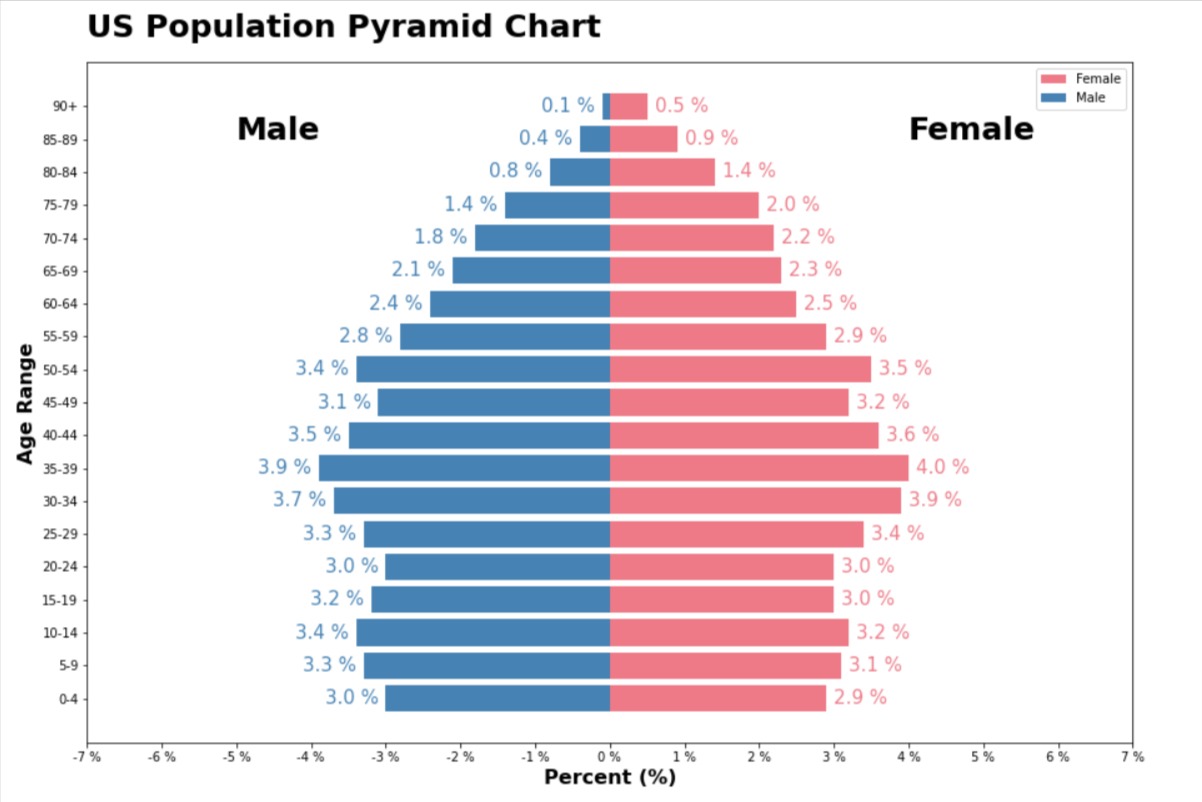
Population Pyramid Chart
Here, we have created our population pyramid using dataset we created in previous cell.
The code starts by importing the library and setting the figure size of the chart to be 15 inches by 10 inches.
The next two lines use the plt.barh() function to create horizontal bar charts for the male and female population data. The y parameter specifies the y-axis values for the bars, which in this case are the age groups from the DataFrame. The width parameter specifies the width of the bars, which are the corresponding male or female population percentages for each age group from the DataFrame. The left parameter is used for the male population chart to specify the horizontal position of the bars on the left side of the y-axis.
The plt.text() function is used to add the labels "Male" and "Female" to the chart, with the corresponding x and y positions specified. A for loop is then used to add percentage labels for each age group to the chart, with the corresponding x and y positions calculated based on the values in the DataFrame.
The plt.xlim() function is used to set the limits of the x-axis, and the plt.xticks() function is used to specify the tick labels for the x-axis. The plt.legend() function is used to add a legend to the chart, and the plt.xlabel(), plt.ylabel(), and plt.title() functions are used to add labels and a title to the chart.
Overall, this code creates a population pyramid chart that displays the male and female population percentages for each age group. The chart is a useful visualization tool for understanding the age and gender distribution of a population.
female_color = "#ee7a87"
male_color = "#4682b4"
import matplotlib.pyplot as plt

fig = plt.figure(figsize=(15,10))

plt.barh(y=population_df["Age"], width=population_df["Female_Width"], color="#ee7a87", label="Female");
plt.barh(y=population_df["Age"], width=population_df["Male_Width"], left=population_df["Male_Left"],
         color="#4682b4", label="Male");

plt.text(-5, 17, "Male", fontsize=25, fontweight="bold");
plt.text(4, 17, "Female", fontsize=25, fontweight="bold");

for idx in range(len(population_df)):
    plt.text(x=population_df["Male_Left"][idx]-0.1, y=idx, s="{} %".format(population_df["Male"][idx]),
             ha="right", va="center",
             fontsize=15, color="#4682b4");
    plt.text(x=population_df["Female_Width"][idx]+0.1, y=idx, s="{} %".format(population_df["Female"][idx]),
             ha="left", va="center",
             fontsize=15, color="#ee7a87");

plt.xlim(-7,7);
plt.xticks(range(-7,8), ["{} %".format(i) for i in range(-7,8)]);

plt.legend(loc="best");

plt.xlabel("Percent (%)", fontsize=16, fontweight="bold")
plt.ylabel("Age Range", fontsize=16, fontweight="bold")
plt.title("US Population Pyramid Chart", loc="left", pad=20, fontsize=25, fontweight="bold");
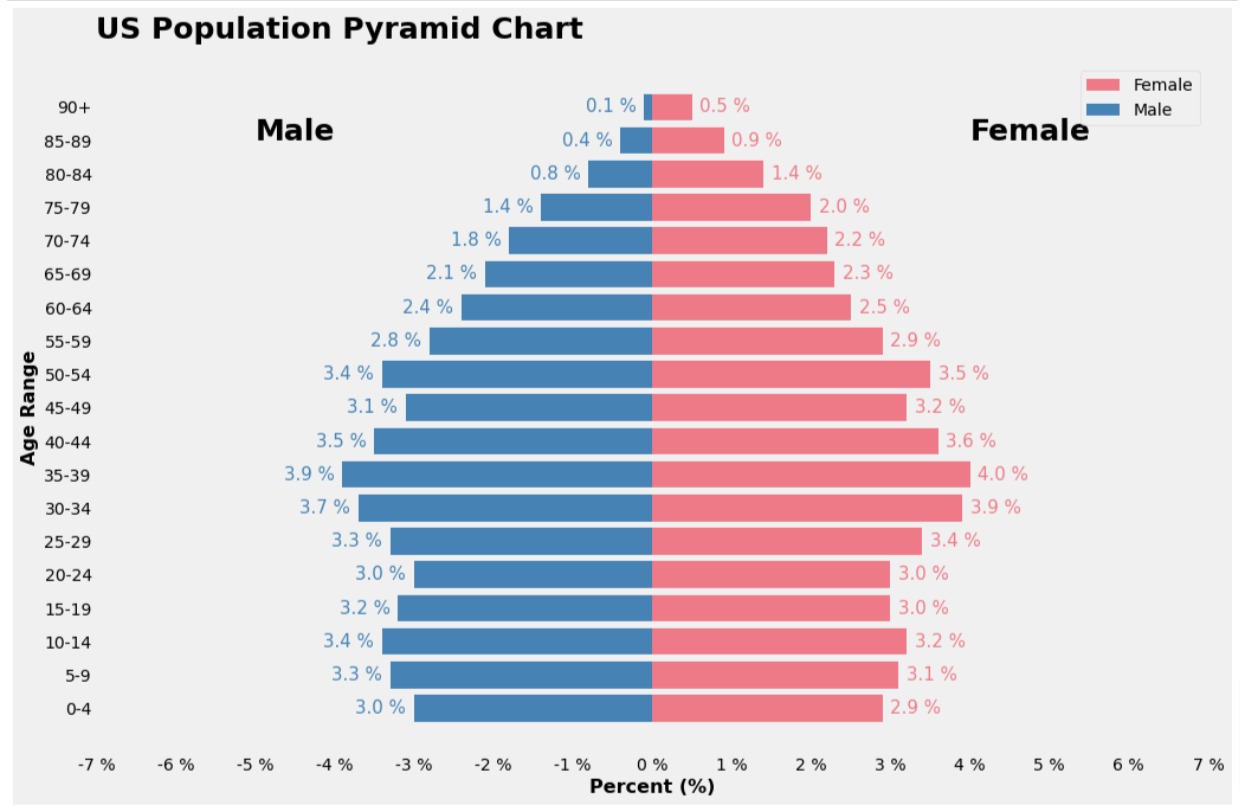
Below, we have simply wrapped our code for pyramid chart in context manager by calling plt.style.context() method. It sets theme fivethirtyeight for chart to improve the look of the chart.
If you are interested in learning how to add themes to chart to improve their look then please feel free to check our tutorial on the same.
import matplotlib.pyplot as plt

with plt.style.context("fivethirtyeight"):
    fig = plt.figure(figsize=(15,10))

    plt.barh(y=population_df["Age"], width=population_df["Female_Width"], color="#ee7a87", label="Female");
    plt.barh(y=population_df["Age"], width=population_df["Male_Width"], left=population_df["Male_Left"],
             color="#4682b4", label="Male");

    plt.text(-5, 17, "Male", fontsize=25, fontweight="bold");
    plt.text(4, 17, "Female", fontsize=25, fontweight="bold");

    for idx in range(len(population_df)):
        plt.text(x=population_df["Male_Left"][idx]-0.1, y=idx, s="{} %".format(population_df["Male"][idx]),
                 ha="right", va="center",
                 fontsize=15, color="#4682b4");
        plt.text(x=population_df["Female_Width"][idx]+0.1, y=idx, s="{} %".format(population_df["Female"][idx]),
                 ha="left", va="center",
                 fontsize=15, color="#ee7a87");

    plt.xlim(-7,7);
    plt.xticks(range(-7,8), ["{} %".format(i) for i in range(-7,8)]);

    plt.legend(loc="best");
    plt.grid(False);

    plt.xlabel("Percent (%)", fontsize=16, fontweight="bold")
    plt.ylabel("Age Range", fontsize=16, fontweight="bold")
    plt.title("US Population Pyramid Chart", loc="left", pad=20, fontsize=25, fontweight="bold");
 Sunny Solanki
Sunny Solanki
Intro: Software Developer | Youtuber | Bonsai Enthusiast
About: Sunny Solanki holds a bachelor's degree in Information Technology (2006-2010) from L.D. College of Engineering. Post completion of his graduation, he has 8.5+ years of experience (2011-2019) in the IT Industry (TCS). His IT experience involves working on Python & Java Projects with US/Canada banking clients. Since 2020, he’s primarily concentrating on growing CoderzColumn.
His main areas of interest are AI, Machine Learning, Data Visualization, and Concurrent Programming. He has good hands-on with Python and its ecosystem libraries.
Apart from his tech life, he prefers reading biographies and autobiographies. And yes, he spends his leisure time taking care of his plants and a few pre-Bonsai trees.
Contact: sunny.2309@yahoo.in


![YouTube Subscribe]() Comfortable Learning through Video Tutorials?
Comfortable Learning through Video Tutorials?
If you are more comfortable learning through video tutorials then we would recommend that you subscribe to our YouTube channel.
![Need Help]() Stuck Somewhere? Need Help with Coding? Have Doubts About the Topic/Code?
Stuck Somewhere? Need Help with Coding? Have Doubts About the Topic/Code?
 Stuck Somewhere? Need Help with Coding? Have Doubts About the Topic/Code?
When going through coding examples, it's quite common to have doubts and errors.
If you have doubts about some code examples or are stuck somewhere when trying our code, send us an email at coderzcolumn07@gmail.com. We'll help you or point you in the direction where you can find a solution to your problem.
You can even send us a mail if you are trying something new and need guidance regarding coding. We'll try to respond as soon as possible.
![Share Views]() Want to Share Your Views? Have Any Suggestions?
Want to Share Your Views? Have Any Suggestions?
 Want to Share Your Views? Have Any Suggestions?
If you want to
- provide some suggestions on topic
- share your views
- include some details in tutorial
- suggest some new topics on which we should create tutorials/blogs
 population-pyramid, matplotlib