How to put the chart into the tooltip of another chart in bqplot?
The bqplot is a data visualization library developed by Bloomberg developers. It's built on top of ipywidgets hence each individual component of bqplot is a widget. The ipywidgets library itself is built on top of the traitlets library which provides eventful classes that monitor changes in attributes and immediately calls callbacks for each change in the state of the widget. As the bqplot individual component is built of widgets, any changes to charts are immediately reflected. Our main aim of this tutorial is to add a bqplot chart into the tooltip of another chart. This will help us further expand the data that is getting displayed in the chart. We'll be explaining how to include another chart into the tooltip of the chart in bqplot as a part of this tutorial.
We expect that you have a little background on the bqplot to follow along. If you are interested in learning about bqplot then we suggest that you go through our tutorials on the same as it'll help you to grasp this tutorial fast. Below is a list of tutorials designed on bqplot by us.
- bqplot - Interactive Plotting using Internal Object Model API
- bqplot - Interactive Plotting in Python using bqplot
- How to link bqplot with ipywidgets to dynamically update charts?
Please feel free to go through them if you even want to refresh your knowledge of the bqplot.
We'll start by importing necessary libraries.
import numpy as np
import pandas as pd
import ipywidgets as widgets

from datetime import datetime
Load Datasets
We'll be loading datasets that we'll use for plotting various charts beforehand as pandas data frames. We'll be using below mentioned 2 datasets for our purpose.
- Wine Dataset - It has information about the number of various ingredients used in the creation of three different types of wines. It's easily available as a part of the scikit-learn library.
- Apple OHLC Dataset - It has OHLC data about apple from Apr 2019 - Mar 2020. It's easily available from yahoo finance.
We'll be loading each dataset as a pandas dataframe.
from sklearn.datasets import load_wine
apple_df = pd.read_csv('datasets/AAPL.csv', parse_dates=["Date"])

apple_df.head()
wine = load_wine()

wine_df = pd.DataFrame(data=wine.data, columns=wine.feature_names)
wine_df["WineType"] = [wine.target_names[t] for t in wine.target]

wine_df.head()
Example 1
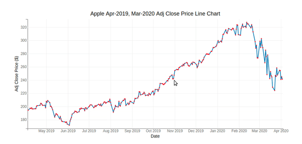
Our first example consists of a line and a scatter chart plotted on the same chart. The line and scatter chart are plotted for adj close price of apple data. Whenever a mouse if hovered over the chart then in a tooltip bar chart showing OHLC price for that day will be displayed.
Below we have first created a figure consisting of line and scatter chart representing adj close price using bqplot's internal object model API. We have then written a function named add_bar_chart_in_tooltip() which will be called each time a mouse hovers over a point on the scatter chart. The function is registered with the scatter chart using the on_hover() method. The function is required to have two parameters where the first parameter is the chart itself and the second parameter is a dictionary which has information about changes in the chart. It has an index key as a part of the data key which has index information about a point on whom the mouse hovered over.
Inside add_bar_chart_in_tooltip() function, we first take index of point on chart. We then use that index information to get that day's OHLC price data from the dataframe. The bar chart will be created of OHLC price using that data and will be set as a tooltip of scatter plot. This function will be called each time mouse is hovered over any point on the chart and a bar chart will be added in the tooltip of the scatter chart.
from bqplot import DateScale, LinearScale, Scatter, Lines, Axis, Figure

x_dt = DateScale()
y_lin = LinearScale()

scatter_chart = Scatter(x=apple_df.Date, y=apple_df["Adj Close"],
                        scales={"x":x_dt, "y":y_lin},
                        colors=["red"],
                        default_size=3)

line_chart = Lines(x=apple_df.Date, y=apple_df["Adj Close"],
                  scales={"x":x_dt, "y":y_lin})

ax_x = Axis(scale=x_dt, label="Date")
ax_y = Axis(scale=y_lin, orientation="vertical", label="Adj Close Price ($)")


def add_bar_chart_in_tooltip(chart, d):
    idx = d["data"]["index"] ## Retrieve index of point.
    x_scale = OrdinalScale(domain=["Open", "High", "Low", "Close"])
    y_scale = LinearScale()
    bar_chart = Bars(x=["Open", "High", "Low", "Close"],
                     y=apple_df.iloc[idx][["Open", "High", "Low", "Close"]].values.tolist(),
                     scales={'x': x_scale, 'y': y_scale},
                     colors=["tomato", "lime", "dodgerblue", "orange"],
                     label_display=True, label_font_style={"font-weight":"bold"})

    ax_x_in = Axis(scale=x_scale)
    ax_y_in = Axis(scale=y_scale, orientation="vertical", label="Price ($)")

    dt = apple_df.iloc[idx].Date

    fig = Figure(marks=[bar_chart], axes=[ax_x_in, ax_y_in],
                 background_style = {"fill":"gray"},
                 title="OHLC Bar Chart - %d-%s-%d"%(dt.day, dt.month_name(), dt.year))

    scatter_chart.tooltip = fig


scatter_chart.on_hover(add_bar_chart_in_tooltip)

Figure(marks=[line_chart, scatter_chart], axes=[ax_x, ax_y], title="Apple Apr-2019, Mar-2020 Adj Close Price Line Chart")
Example 2
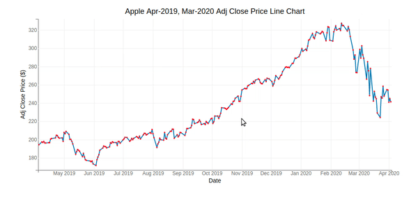
Our second example is again the same as the previous example consisting of a scatter plot and line chart. The only change this time is information getting displayed in the tooltip. We are displaying apple OHLC data for that index as a table in tooltip this time.
x_dt = DateScale()
y_lin = LinearScale()

scatter_chart = Scatter(x=apple_df.Date, y=apple_df["Adj Close"],
                        scales={"x":x_dt, "y":y_lin},
                        colors=["red"],
                        default_size=3)

line_chart = Lines(x=apple_df.Date, y=apple_df["Adj Close"],
                  scales={"x":x_dt, "y":y_lin})

ax_x = Axis(scale=x_dt, label="Date")
ax_y = Axis(scale=y_lin, orientation="vertical", label="Adj Close Price ($)")

def add_ohlc_price_table_in_tooltip(chart, d):
    idx = d["data"]["index"]
    temp_df = pd.DataFrame(apple_df.iloc[idx][["Date", "Open", "High", "Low", "Close"]]).T.set_index("Date")
    scatter_chart.tooltip = widgets.HTML(temp_df.to_html())


scatter_chart.on_hover(add_ohlc_price_table_in_tooltip)

Figure(marks=[line_chart, scatter_chart], axes=[ax_x, ax_y], title="Apple Apr-2019, Mar-2020 Adj Close Price Line Chart")
Example 3
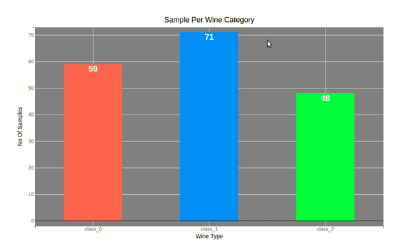
Our third example consists of a bar chart that will display information about a number of samples for 3 different types of wine as a bar chart. Whenever a mouse hovers over any bar, a pie chart consisting of the average value of ingredients used in the wine type represented by that bar will be displayed.
We'll first create a bar chart representing a number of samples per each wine type. We have used the same logic as previous examples where we have created a callback named add_pie_chart_in_tooltip() which will be called whenever the mouse hovers over any bar of the bar chart. The dictionary passed to add_pie_chart_in_tooltip() will have information about index of bar. That index will be used to retrieve information about average wine ingredients for that bar's wine type. We'll then create a pie chart of that data and it'll be added into the tooltip of the bar chart. This function will be called each time a mouse hovers over any bar and a pie chart will be added in the tooltip.
wine_cnt  = wine_df.groupby(by=["WineType"]).count()[["alcohol"]].rename(columns={"alcohol":"Count"})
wine_cnt
from bqplot import OrdinalScale, Bars, Pie

x_scale = OrdinalScale(domain=wine_cnt.index.tolist())
y_scale = LinearScale()

bar_chart = Bars(x=wine_cnt.index.tolist(), y = wine_cnt.Count.values.tolist(),
                 label_display=True,
                 label_font_style={"font-weight":"bold", "fill":"white", "font-size":"20px"},
                 label_display_format=".0f",
                 colors=["tomato", "dodgerblue", "lime"],
                 padding=0.5,
                 scales={"x":x_scale,  "y":y_scale})


def add_pie_chart_in_tooltip(chart, d):
    idx = d["data"]["index"]
    avg_wine_df = wine_df.groupby(by=["WineType"]).mean()
    avg_wine_df = avg_wine_df.drop(columns=["proline", "magnesium"])

    pie = Pie(sizes=avg_wine_df.iloc[idx].values.tolist(),
              labels=avg_wine_df.columns.tolist(),
              display_labels="outside", display_values=True, values_format='.2f',
              radius=120.0, inner_radius=50)

    pie_fig = Figure(marks=[pie],
                     fig_margin=dict(top=5, bottom=5, left=5, right=5),
                     title="Average Ingredients Per Wine Category %s"%wine.target_names[idx])

    bar_chart.tooltip = pie_fig


bar_chart.on_hover(add_pie_chart_in_tooltip)

ax_x_in = Axis(scale=x_scale, label="Wine Type")
ax_y_in = Axis(scale=y_scale, orientation="vertical", label="No Of Samples")

fig = Figure(marks=[bar_chart], axes=[ax_x_in, ax_y_in],
             background_style = {"fill":"gray"},
             title="Sample Per Wine Category")


fig.layout.height="600px"

fig

Example 4
Our fourth example is the same as the previous example consisting of a bar chart of wine samples count per wine type. The only difference in this example is that it'll display average ingredients information as a table instead of a pie chart into tooltip of the bar chart.
x_scale = OrdinalScale(domain=wine_cnt.index.tolist())
y_scale = LinearScale()

bar_chart = Bars(x=wine_cnt.index.tolist(), y = wine_cnt.Count.values.tolist(),
                 label_display=True,
                 label_font_style={"font-weight":"bold", "fill":"white", "font-size":"20px"},
                 label_display_format=".0f",
                 colors=["tomato", "dodgerblue", "lime"],
                 padding=0.5,
                 scales={"x":x_scale,  "y":y_scale})

def add_table_in_tooltip(chart, d):
    idx = d["data"]["index"]
    avg_wine_df = wine_df.groupby(by=["WineType"]).mean()
    bar_chart.tooltip = widgets.HTML(pd.DataFrame(avg_wine_df.iloc[idx]).to_html())


bar_chart.on_hover(add_table_in_tooltip)

ax_x_in = Axis(scale=x_scale, label="Wine Type")
ax_y_in = Axis(scale=y_scale, orientation="vertical", label="No Of Samples")

fig = Figure(marks=[bar_chart], axes=[ax_x_in, ax_y_in],
             background_style = {"fill":"gray"},
             title="Sample Per Wine Category")


fig.layout.height="600px"

fig
Example 5
Our fifth example is the same as the previous two examples with the only difference in the chart getting displayed into the tooltip. This time we are displaying a boxplot of ingredients used in wine type over whose bar mouse is hovered over in the bar chart.
from bqplot import Boxplot

x_scale = OrdinalScale(domain=wine_cnt.index.tolist())
y_scale = LinearScale()

bar_chart = Bars(x=wine_cnt.index.tolist(), y = wine_cnt.Count.values.tolist(),
                 label_display=True,
                 label_font_style={"font-weight":"bold", "fill":"white", "font-size":"20px"},
                 label_display_format=".0f",
                 colors=["tomato", "dodgerblue", "lime"],
                 padding=0.5,
                 scales={"x":x_scale,  "y":y_scale})

def add_boxplot_in_tooltip(chart, d):
    idx = d["data"]["index"]
    wine_df_idx = wine_df[wine_df.WineType == wine.target_names[idx]]
    wine_df_idx = wine_df_idx.drop(columns=["proline", "magnesium", "WineType"])

    x_ord = OrdinalScale()
    y_linear = LinearScale()

    boxplot = Boxplot(x=range(wine_df_idx.shape[1]), y=wine_df_idx.values.T,
                      scales={'x':x_ord, 'y':y_linear},
                      color="lime", names=wine_df_idx.columns,
                      outlier_color="white", stroke="white", box_width=30
                     )


    ax_x = Axis(scale=x_ord, label="Ingredients",
                label_offset="35px", grid_color="gray",
                tick_format="0.1f")
    ax_y = Axis(scale=y_linear, label="Distribution",
                orientation="vertical", label_offset="35px",
                grid_color="gray",
                tick_format="0.1f")

    boxplot_fig = Figure(marks=[boxplot],
                 axes=[ax_x, ax_y],
                 title="Avg Ingredients Stacked Bar Chart",
                 fig_margin= dict(top=60, bottom=40, left=50, right=20),

          )

    bar_chart.tooltip = boxplot_fig


bar_chart.on_hover(add_boxplot_in_tooltip)

ax_x_in = Axis(scale=x_scale, label="Wine Type")
ax_y_in = Axis(scale=y_scale, orientation="vertical", label="No Of Samples")

fig = Figure(marks=[bar_chart], axes=[ax_x_in, ax_y_in],
             background_style = {"fill":"gray"},
             title="Sample Per Wine Category")


fig.layout.height="600px"

fig

This ends our small tutorial explaining how we can add other charts into the tooltip of our main chart in bqplot. Please feel free to let us know your views in the comments section.
References
 Sunny Solanki
Sunny Solanki
Intro: Software Developer | Youtuber | Bonsai Enthusiast
About: Sunny Solanki holds a bachelor's degree in Information Technology (2006-2010) from L.D. College of Engineering. Post completion of his graduation, he has 8.5+ years of experience (2011-2019) in the IT Industry (TCS). His IT experience involves working on Python & Java Projects with US/Canada banking clients. Since 2020, he’s primarily concentrating on growing CoderzColumn.
His main areas of interest are AI, Machine Learning, Data Visualization, and Concurrent Programming. He has good hands-on with Python and its ecosystem libraries.
Apart from his tech life, he prefers reading biographies and autobiographies. And yes, he spends his leisure time taking care of his plants and a few pre-Bonsai trees.
Contact: sunny.2309@yahoo.in


![YouTube Subscribe]() Comfortable Learning through Video Tutorials?
Comfortable Learning through Video Tutorials?
If you are more comfortable learning through video tutorials then we would recommend that you subscribe to our YouTube channel.
![Need Help]() Stuck Somewhere? Need Help with Coding? Have Doubts About the Topic/Code?
Stuck Somewhere? Need Help with Coding? Have Doubts About the Topic/Code?
 Stuck Somewhere? Need Help with Coding? Have Doubts About the Topic/Code?
When going through coding examples, it's quite common to have doubts and errors.
If you have doubts about some code examples or are stuck somewhere when trying our code, send us an email at coderzcolumn07@gmail.com. We'll help you or point you in the direction where you can find a solution to your problem.
You can even send us a mail if you are trying something new and need guidance regarding coding. We'll try to respond as soon as possible.
![Share Views]() Want to Share Your Views? Have Any Suggestions?
Want to Share Your Views? Have Any Suggestions?
 Want to Share Your Views? Have Any Suggestions?
If you want to
- provide some suggestions on topic
- share your views
- include some details in tutorial
- suggest some new topics on which we should create tutorials/blogs
 bqplot, tooltip