Timeline using Matplotlib | Python
In the world of data visualization, timelines play an essential role in representing events and their chronology. They are useful for displaying the sequence of historical events, project timelines, and various time-based datasets. Matplotlib is a popular Python library that can be used to create high-quality visualizations, including timelines.
A timeline is a visualization of events that occurred over a period of time, where each event is represented as a point on the timeline. The timeline can be further enhanced by adding labels, markers, and other visual elements to provide more context and meaning to the data.

What Can You Learn From This Article?
In this tutorial, we will explore how to create a timeline using Matplotlib. We will start by loading our data and organizing it into a format that can be easily plotted. Then we will use Matplotlib to create the timeline and add markers, labels, and other visual elements to make the timeline more informative and visually appealing.
We will also explore various customization options available in Matplotlib to fine-tune the appearance of the timeline. By the end of this tutorial, you will have a solid understanding of how to create a timeline using Matplotlib and be able to apply your new skills to your own data visualization projects.
Video Tutorial
Please feel free to check below video tutorial if feel comfortable learning through videos.
First, we have imported matplotlib and printed the version that we have used in our tutorial.
import matplotlib

print("Matplotlib Version : {}".format(matplotlib.__version__))
Load Dataset
Below, we have created a simple dataset that has the release dates of various apple iPhones over the years. The dataset is maintained as pandas dataframe. We have also added one column named Level which has random numbers in the range of -6 to 6. This column will be used to decide the length of vertical/horizontal lines in the timeline chart.
import pandas as pd
import numpy as np

dates = ["2007-6-29", "2008-7-11", "2009-6-29", "2010-9-21", "2011-10-14", "2012-9-21", "2013-9-20",
         "2014-9-19", "2015-9-25", "2016-3-31", "2016-9-16", "2017-9-22", "2017-11-3", "2018-9-21",
         "2018-10-26", "2019-9-20", "2020-11-13", "2021-9-24", "2022-9-16"
        ]
phones = ["iPhone", "iPhone-3G", "iPhone-3GS", "iPhone 4", "iPhone 4S", "iPhone 5", "iPhone 5C/5S",
          "iPhone 6/6 Plus", "iPhone 6S/6s Plus", "iPhone SE", "iPhone 7/7 Plus", "iPhone 8/8 Plus",
          "iPhone X", "iPhone Xs/Max", "iPhone XR", "iPhone 11/Pro/Max", "iPhone 12 Pro", "iPhone 13 Pro",
          "iPhone 14 Plus/Pro Max"
         ]

iphone_df = pd.DataFrame(data={"Date": dates, "Product": phones})
iphone_df["Date"] = pd.to_datetime(iphone_df["Date"])
iphone_df["Level"] = [np.random.randint(-6,-2) if (i%2)==0 else np.random.randint(2,6) for i in range(len(iphone_df))]

iphone_df
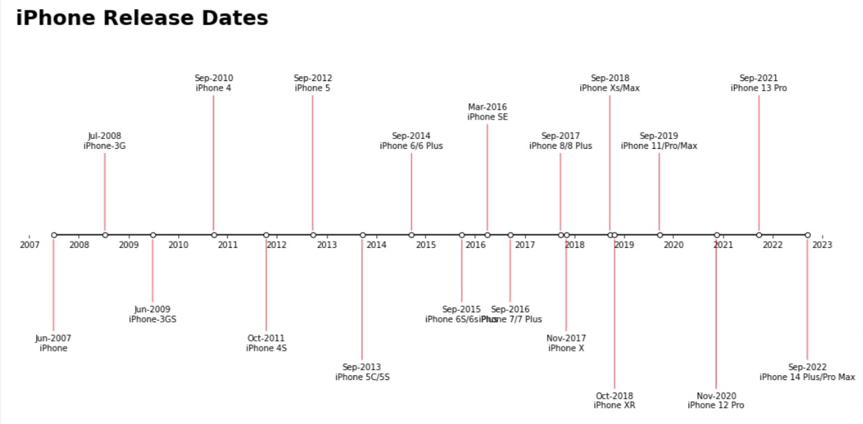
Below, we have created our first timeline chart.
The first line imports the required module of Matplotlib. Then, the next line creates a figure and axis object of size 18x9 inches.
The third line plots a horizontal line using "-o" markers at y=0 for each date in the dataframe iphone_df. The markerfacecolor is set to white, and the line color is black.
Next, the x-axis ticks are set to be displayed at yearly intervals between 2007-2023 using pd.date_range() and range() functions. The y-axis limits are set between -7 and 7.
In the for loop, the annotation text for each date is created by extracting the month and year from the date using strftime() function. The product name and level of the iPhone release are also extracted. This loop adds vertical lines as well as text next to those lines specifying the phone name.
The ax.annotate() function is used to place the annotation text at each date's location with an arrow pointing toward its level. The arrow style is set to "-", the color is set to "red", and the linewidth is set to 0.8.
Finally, the axis spines are set to be invisible, and the bottom spine is moved to the center using set_position() function. The y-axis is hidden, and the title "iPhone Release Dates" is added at the left of the plot with a fontsize of 25 and fontweight of "bold".
import matplotlib.pyplot as plt

fig, ax = plt.subplots(figsize=(18,9))

ax.plot(iphone_df.Date, [0,]* len(iphone_df), "-o", color="black", markerfacecolor="white");

ax.set_xticks(pd.date_range("2007-1-1", "2023-1-1", freq="ys"), range(2007, 2024));
ax.set_ylim(-7,7);

for idx in range(len(iphone_df)):
    dt, product, level = iphone_df["Date"][idx], iphone_df["Product"][idx], iphone_df["Level"][idx]
    dt_str = dt.strftime("%b-%Y")
    ax.annotate(dt_str + "\n" + product, xy=(dt, 0.1 if level>0 else -0.1),xytext=(dt, level),
                arrowprops=dict(arrowstyle="-",color="red", linewidth=0.8),
                ha="center"
               );

ax.spines[["left", "top", "right", "bottom"]].set_visible(False);
ax.spines[["bottom"]].set_position(("axes", 0.5));
ax.yaxis.set_visible(False);
ax.set_title("iPhone Release Dates", pad=10, loc="left", fontsize=25, fontweight="bold");
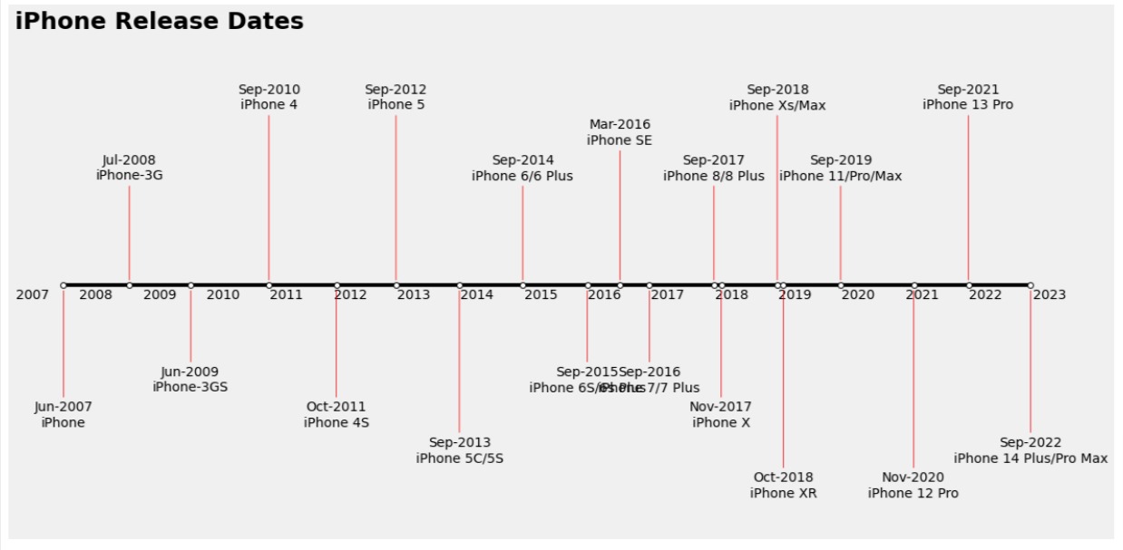
Below, we have tried to improve the look of our timeline chart by adding fivethirtyeight theme to it. The majority of the code is same as earlier. The code is wrapped in context by calling plt.style.context("fivethirtyeight") which sets theme of context.
import matplotlib.pyplot as plt

with plt.style.context("fivethirtyeight"):
    fig, ax = plt.subplots(figsize=(18,9))

    ax.plot(iphone_df.Date, [0,]* len(iphone_df), "-o", color="black", markerfacecolor="white");

    ax.set_xticks(pd.date_range("2007-1-1", "2023-1-1", freq="ys"), range(2007, 2024));
    ax.set_ylim(-7,7);

    for idx in range(len(iphone_df)):
        dt, product, level = iphone_df["Date"][idx], iphone_df["Product"][idx], iphone_df["Level"][idx]
        dt_str = dt.strftime("%b-%Y")
        ax.annotate(dt_str + "\n" + product, xy=(dt, 0.1 if level>0 else -0.1),xytext=(dt, level),
                    arrowprops=dict(arrowstyle="-",color="red", linewidth=0.8),
                    ha="center"
                   );

    ax.spines[["left", "top", "right", "bottom"]].set_visible(False);
    ax.spines[["bottom"]].set_position(("axes", 0.5));
    ax.yaxis.set_visible(False);
    ax.set_title("iPhone Release Dates", pad=10, loc="left", fontsize=25, fontweight="bold");
    ax.grid(False)
Below, we have created a third timeline chart which is a vertical timeline chart. The majority of the code is the same as earlier with the only change being that the x and y axes values of a few functions are reversed,
import matplotlib.pyplot as plt

with plt.style.context("fivethirtyeight"):
    fig, ax = plt.subplots(figsize=(9,18))

    ax.plot([0,]* len(iphone_df), iphone_df.Date, "-o", color="black", markerfacecolor="white");

    ax.set_yticks(pd.date_range("2007-1-1", "2023-1-1", freq="ys"), range(2007, 2024));
    ax.set_xlim(-7,7);

    for idx in range(len(iphone_df)):
        dt, product, level = iphone_df["Date"][idx], iphone_df["Product"][idx], iphone_df["Level"][idx]
        dt_str = dt.strftime("%b-%Y")
        ax.annotate(dt_str + "\n" + product, xy=(0.1 if level>0 else -0.1, dt),
                    xytext=(level, dt),
                    arrowprops=dict(arrowstyle="-",color="red", linewidth=0.8),
                    va="center"
                   );

    ax.spines[["left", "top", "right", "bottom"]].set_visible(False);
    ax.spines[["left"]].set_position(("axes", 0.5));
    ax.xaxis.set_visible(False);
    ax.set_title("iPhone Release Dates", pad=10, loc="left", fontsize=25, fontweight="bold");
    ax.grid(False)

 Sunny Solanki
Sunny Solanki
Intro: Software Developer | Youtuber | Bonsai Enthusiast
About: Sunny Solanki holds a bachelor's degree in Information Technology (2006-2010) from L.D. College of Engineering. Post completion of his graduation, he has 8.5+ years of experience (2011-2019) in the IT Industry (TCS). His IT experience involves working on Python & Java Projects with US/Canada banking clients. Since 2020, he’s primarily concentrating on growing CoderzColumn.
His main areas of interest are AI, Machine Learning, Data Visualization, and Concurrent Programming. He has good hands-on with Python and its ecosystem libraries.
Apart from his tech life, he prefers reading biographies and autobiographies. And yes, he spends his leisure time taking care of his plants and a few pre-Bonsai trees.
Contact: sunny.2309@yahoo.in


![YouTube Subscribe]() Comfortable Learning through Video Tutorials?
Comfortable Learning through Video Tutorials?
If you are more comfortable learning through video tutorials then we would recommend that you subscribe to our YouTube channel.
![Need Help]() Stuck Somewhere? Need Help with Coding? Have Doubts About the Topic/Code?
Stuck Somewhere? Need Help with Coding? Have Doubts About the Topic/Code?
 Stuck Somewhere? Need Help with Coding? Have Doubts About the Topic/Code?
When going through coding examples, it's quite common to have doubts and errors.
If you have doubts about some code examples or are stuck somewhere when trying our code, send us an email at coderzcolumn07@gmail.com. We'll help you or point you in the direction where you can find a solution to your problem.
You can even send us a mail if you are trying something new and need guidance regarding coding. We'll try to respond as soon as possible.
![Share Views]() Want to Share Your Views? Have Any Suggestions?
Want to Share Your Views? Have Any Suggestions?
 Want to Share Your Views? Have Any Suggestions?
If you want to
- provide some suggestions on topic
- share your views
- include some details in tutorial
- suggest some new topics on which we should create tutorials/blogs
 timeline, matplotlib