Sales Funnel Charts using Matplotlib | Python
Sales funnel charts are a useful visualization tool for businesses and marketers to track their sales performance and identify areas for improvement. A sales funnel represents the journey that a customer takes from initial awareness of a product or service to making a purchase, and can be divided into several stages such as website visits, lead generation, and customer conversion. By visualizing the number of customers or prospects at each stage of the funnel, businesses can gain valuable insights into the effectiveness of their marketing and sales efforts.
Matplotlib is a popular data visualization library for Python that can be used to create a variety of charts and graphs, including sales funnel charts. With its extensive range of customization options and user-friendly interface, Matplotlib makes it easy to create professional-looking sales funnel charts that effectively convey important sales data.
What Can You Learn From This Article?
In this tutorial, we will explain how to create sales funnel charts using Matplotlib, famous Python data visualization library. We will begin by discussing the basic structure and components of a sales funnel chart, then move on to creating and customizing our own chart using Matplotlib.
By the end of the tutorial, you will have the knowledge and skills to create informative and visually appealing sales funnel charts that can help drive business success.
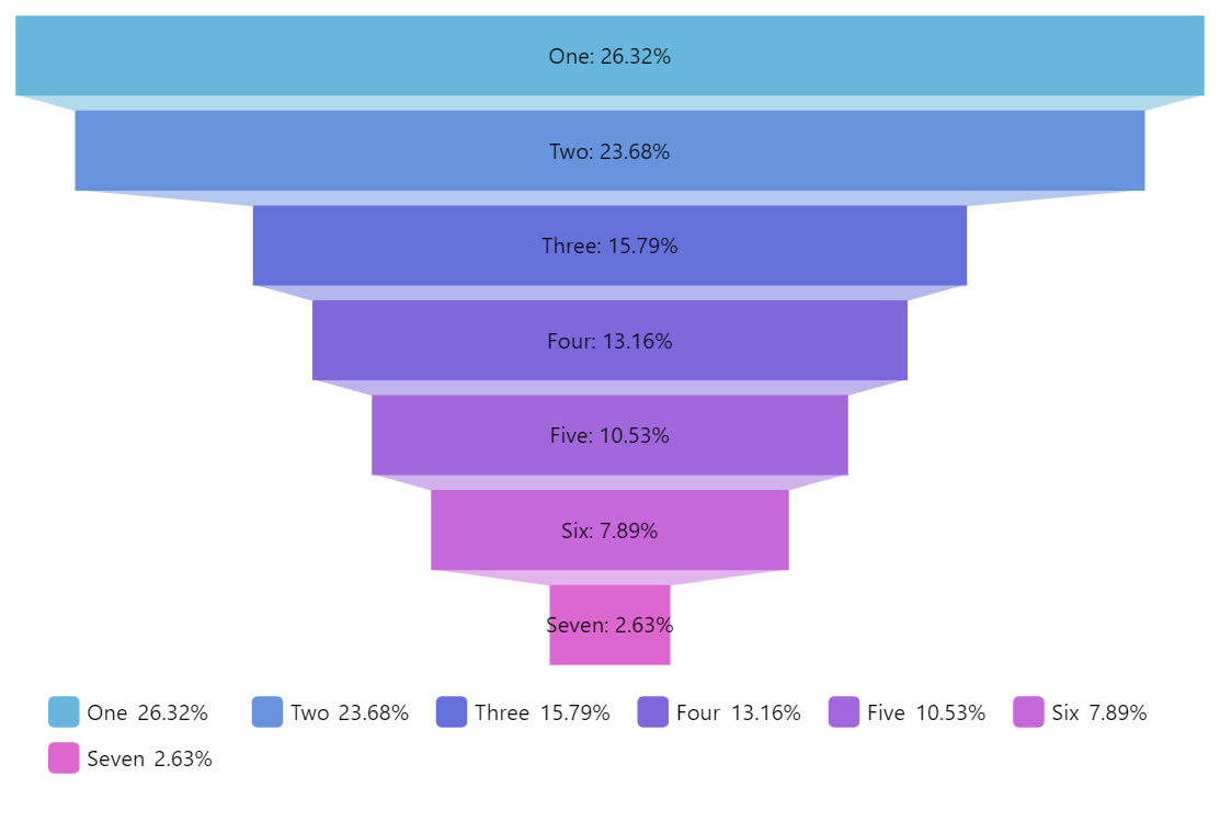
Below, we have included images that we'll try to mimic in our tutorial.

Video Tutorial
Please feel free to check below video tutorial if feel comfortable learning through videos.
First, we have imported matplotlib and printed the version that we have used in our tutorial.
import matplotlib

print("Matplotlib Version : {}".format(matplotlib.__version__))
Load Dataset
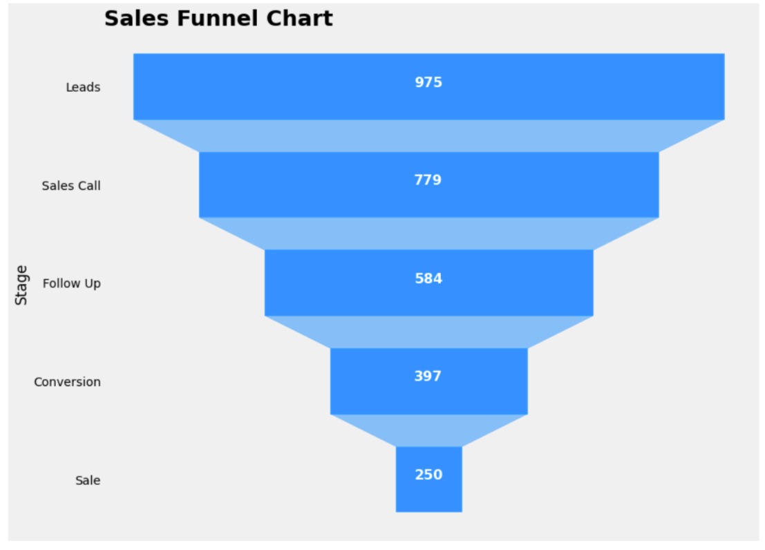
Below, we have simply created a pandas dataframe which will have data about our sales funnel chart. It has column where labels of various stages of sales process are present and another column has count of those stages.
import pandas as pd

labels = ["Leads", "Sales Call", "Follow Up", "Conversion", "Sale"]
vals = [975, 779, 584, 397, 250]

df = pd.DataFrame({"Labels": labels, "Values": vals})

df
Funnel Chart 1
Below, we have created our first funnel chart using data we loaded in previous cell as pandas dataframe.
The code starts by importing the necessary package and creating a figure object with a predefined size.
The fill_betweenx() function is then used to plot each stage of the funnel. This function takes the y-axis values as a list and the x-axis values as two lists. The color parameter is used to set the color of each stage of the funnel. The x-axis values are specified for each stage separately to obtain the trapezoidal shape of the funnel.
The xticks() function is used to remove the x-axis ticks and labels, and yticks() function is used to set the y-axis ticks and labels. The labels are taken from the Labels column of the data frame and are reversed using the slicing technique.
The text() function is used to annotate each stage of the funnel with the respective values. It takes the x and y coordinates, the text to be displayed, and the formatting parameters such as font size, font weight, and color. The zip function is used to iterate over the y-axis values and corresponding values from the Values column of the data frame.
Finally, the ylabel() function is used to set the y-axis label, and the title() function is used to set the title of the chart with formatting parameters such as location, font size, and font weight.
colors = ["#a9d18e", "#ffc000", "#ed7d31", "#5b9bd5", "#4472c4"]
import matplotlib.pyplot as plt

fig = plt.figure(figsize=(12,10))

plt.fill_betweenx(y=[1, 3.8], x1=[10,12], x2=[8,6], color=colors[0]);
plt.fill_betweenx(y=[4, 6.8], x1=[12,14], x2=[6,4], color=colors[1]);
plt.fill_betweenx(y=[7, 9.8], x1=[14,16], x2=[4,2], color=colors[2]);
plt.fill_betweenx(y=[10, 12.8], x1=[16,18], x2=[2,0], color=colors[3]);
plt.fill_betweenx(y=[13, 15.8], x1=[18,20], x2=[0,-2], color=colors[4]);

plt.xticks([],[]);
plt.yticks([2,5,8,11,14], df["Labels"][::-1]);

for y, value in zip([2,5,8,11,14], df["Values"][::-1]):
    plt.text(9, y, value, fontsize=16, fontweight="bold", color="white", ha="center");

plt.ylabel("Stages");

plt.title("Sales Funnel", loc="center", fontsize=25, fontweight="bold");

Below, we have simply introduced theme to our previous funnel chart.
Apart from theme, we have also highlighted one stage of funnel chart by adding black line around it.
If you are interested in learning about how to introduce themes to your matplotlib charts to improve their looks then please feel free to check below link.
import matplotlib.pyplot as plt

with plt.style.context("fivethirtyeight"):
    fig = plt.figure(figsize=(12,10))

    plt.fill_betweenx(y=[1, 3.8], x1=[10,12], x2=[8,6], color=colors[0]);
    plt.fill_betweenx(y=[4, 6.8], x1=[12,14], x2=[6,4], color=colors[1]);
    plt.fill_betweenx(y=[7, 9.8], x1=[14,16], x2=[4,2], facecolor=colors[2], edgecolor="black", linewidth=5);
    plt.fill_betweenx(y=[10, 12.8], x1=[16,18], x2=[2,0], color=colors[3]);
    plt.fill_betweenx(y=[13, 15.8], x1=[18,20], x2=[0,-2], color=colors[4]);

    plt.xticks([],[]);
    plt.yticks([2,5,8,11,14], df["Labels"][::-1]);

    for y, value in zip([2,5,8,11,14], df["Values"][::-1]):
        plt.text(9, y, value, fontsize=16, fontweight="bold", color="white", ha="center");

    plt.grid(visible=False);
    plt.ylabel("Stages");

    plt.title("Sales Funnel", loc="center", fontsize=25, fontweight="bold");

Funnel Chart 2
Below, we have created another pattern of funnel chart which is quite commonly used. We have used same data as our previous example to create this funnel chart.
Like our previous examples, it also uses fill_betweenx() method to create rectangles and trapezoids of funnel chart.
import matplotlib.pyplot as plt

with plt.style.context("fivethirtyeight"):
    fig = plt.figure(figsize=(12,10))

    plt.fill_betweenx(y=[12,14], x1=[18,18], x2=[0,0], color="dodgerblue");

    plt.fill_betweenx(y=[11,12], x1=[16,18], x2=[2,0], color="dodgerblue", alpha=0.5);
    plt.fill_betweenx(y=[9,11], x1=[16,16], x2=[2,2], color="dodgerblue");

    plt.fill_betweenx(y=[8,9], x1=[14,16], x2=[4,2], color="dodgerblue", alpha=0.5);
    plt.fill_betweenx(y=[6,8], x1=[14,14], x2=[4,4], color="dodgerblue");

    plt.fill_betweenx(y=[5,6], x1=[12,14], x2=[6,4], color="dodgerblue", alpha=0.5);
    plt.fill_betweenx(y=[3,5], x1=[12,12], x2=[6,6], color="dodgerblue");

    plt.fill_betweenx(y=[2,3], x1=[10,12], x2=[8,6], color="dodgerblue", alpha=0.5);
    plt.fill_betweenx(y=[0,2], x1=[10,10], x2=[8,8], color="dodgerblue");

    plt.yticks([1,4,7,10,13], df["Labels"][::-1]);
    plt.xticks([],[]);

    plt.ylabel("Stage");

    for y, val in zip([1,4,7,10,13],df["Values"][::-1]):
        plt.text(9,y,val, ha="center", fontsize=16, fontweight="bold", color="white")

    plt.grid(visible=False);
    plt.title("Sales Funnel Chart", loc="left", fontsize=25, fontweight="bold");
 Sunny Solanki
Sunny Solanki
Intro: Software Developer | Youtuber | Bonsai Enthusiast
About: Sunny Solanki holds a bachelor's degree in Information Technology (2006-2010) from L.D. College of Engineering. Post completion of his graduation, he has 8.5+ years of experience (2011-2019) in the IT Industry (TCS). His IT experience involves working on Python & Java Projects with US/Canada banking clients. Since 2020, he’s primarily concentrating on growing CoderzColumn.
His main areas of interest are AI, Machine Learning, Data Visualization, and Concurrent Programming. He has good hands-on with Python and its ecosystem libraries.
Apart from his tech life, he prefers reading biographies and autobiographies. And yes, he spends his leisure time taking care of his plants and a few pre-Bonsai trees.
Contact: sunny.2309@yahoo.in


![YouTube Subscribe]() Comfortable Learning through Video Tutorials?
Comfortable Learning through Video Tutorials?
If you are more comfortable learning through video tutorials then we would recommend that you subscribe to our YouTube channel.
![Need Help]() Stuck Somewhere? Need Help with Coding? Have Doubts About the Topic/Code?
Stuck Somewhere? Need Help with Coding? Have Doubts About the Topic/Code?
 Stuck Somewhere? Need Help with Coding? Have Doubts About the Topic/Code?
When going through coding examples, it's quite common to have doubts and errors.
If you have doubts about some code examples or are stuck somewhere when trying our code, send us an email at coderzcolumn07@gmail.com. We'll help you or point you in the direction where you can find a solution to your problem.
You can even send us a mail if you are trying something new and need guidance regarding coding. We'll try to respond as soon as possible.
![Share Views]() Want to Share Your Views? Have Any Suggestions?
Want to Share Your Views? Have Any Suggestions?
 Want to Share Your Views? Have Any Suggestions?
If you want to
- provide some suggestions on topic
- share your views
- include some details in tutorial
- suggest some new topics on which we should create tutorials/blogs
 sales-funnel-chart, funnel-chart, matplotlib