How to Plot Radar Charts in Python [plotly]?
The radar chart is a technique to display multivariate data on the two-dimensional plot where three or more quantitative variables are represented by axes starting from the same point. The relative position and angle of lines are of no importance. Each observation is represented by a single point on all axes. All points representing each quantitative variable is connected in order to generate a polygon. All quantitative variables of data are scaled to the same level for comparison. We can look at the single observation of data to look at how each quantitative variable representing that samples are laid out on the chart.
The radar chart can be useful in identifying and comparing the behavior of observations. We can identify which observations are similar as well as outliers. The radar charts can be used at various places like sports to compare player performance, employee performance comparison, comparison of various programs based on different attributes, etc.
The radar chart also commonly referred to as a web chart, spider chart, spider web chart, star chart, star plot, cobweb chart, polar chart, etc.
The radar charts also have a few limitations which are worth highlighting. If there are many observations to be displayed then radar charts get crowded. As more polygons are layered on top of each other, distinguishing observations becomes difficult. Each axis of the radar chart has the same scale which means that we need to scale data and bring all columns to the same scale. The alternative charts to avoid pitfalls of radar charts are parallel coordinate charts and bar charts.
The parallel coordinates chart is almost the same chart as radar chart except that it lays out quantitative variables in parallel vertically unlike radar chart which lays out them as radially. We have covered small a tutorial explaining the usage of parallel coordinates chart using python. Please feel free to explore it if you want to learn about how to plot a parallel coordinates chart in python.
This ends our small intro of radar charts. We'll now start with the coding part by importing necessary libraries.
import pandas as pd
import numpy as np

from sklearn.datasets import load_iris, load_wine
from sklearn.preprocessing import MinMaxScaler
We'll be first loading 2 datasets available from scikit-learn.
- IRIS Flowers Dataset It has dimension measured for 3 different IRIS flower types.
- Wine Dataset It has information about various ingredients of wine like alcohol, malic acid, ash, magnesium, etc for three different wine categories.
Both of these datasets are available from the sklearn.datasets module. We'll be loading them and keeping them as a dataframe for using them later for radar charts.
Radar chart expects those quantitative variables that we are going to plot are on the same scale. We have used scikit-learn MinMaxScaler scaler to scale data so that each column’s data gets into range [0-1]. Once data is into the same range [0-1] for all quantitative variables then it becomes easy to see its impact. We'll be scaling both iris and wine datasets using MinMaxScaler.
iris = load_iris()
iris_data = MinMaxScaler().fit_transform(iris.data)
iris_data = np.hstack((iris_data, iris.target.reshape(-1,1)))

iris_df = pd.DataFrame(data=iris_data, columns=iris.feature_names+ ["FlowerType"])
iris_df.head()
wine = load_wine()
wine_data = MinMaxScaler().fit_transform(wine.data)
wine_data = np.hstack((wine_data, wine.target.reshape(-1,1)))

wine_df = pd.DataFrame(data=wine_data, columns=wine.feature_names+ ["WineCat"])
wine_df.head()
We have grouped iris flowers dataset by flower type and have then take the mean of each column. This will give us the average value of each data dimension for each flower type. We'll use this data to plot radar charts.
avg_iris  = iris_df.groupby("FlowerType").mean()
avg_iris
We have grouped the wine dataset by wine categories and have then taken the mean of each column. This will give us the average value of each data dimension for each wine category that we'll use to plot radar charts. We can take an individual samples and create a radar chart from it as well but here we'll be creating a radar chart of the average of each category so that we'll get an idea about each category as a whole.
avg_wine = wine_df.groupby("WineCat").mean()
avg_wine
Plotly provides two different methods for creating radar charts.
- plotly.express.line_polar
- plotly.graph_objects.Scatterpolar
We'll be explaining both one by one now.
Plotly Express
The plotly express module provides a method named line_polar() which can be used for creating a radar chart. It accepts dataframe as input and column name of dataframe which can be used for radar chart axis and axis values. It has two important parameters:
theta- It accepts string name representing column name of dataframe where the name of different quantitative variables is stored. It also accepts a list of string names representing quantitative variable names.r- It accepts string name representing column name of dataframe where values about particular observation are present. It also accepts a list of values representing value for each quantitative variable passed to thethetaparameter.
There are other attributes of data that are generic to plotly for plot decoration.
We'll be first plotting IRIS flower setosa based on average values we have calculated for this flower type.
import plotly.express as px
fig = px.line_polar(
                    r=avg_iris.loc[0].values,
                    theta=avg_iris.columns,
                    line_close=True,
                    range_r = [0,1.0],
                    title="IRIS - %s"%iris.target_names[0])


fig.show()
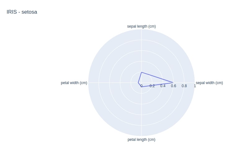
The line_close parameter if set to True will connect end variables to create the polygon. We have also set the range_r attribute to 0-1 because we scaled down all variables between 0-1 using MinMaxScaler earlier.
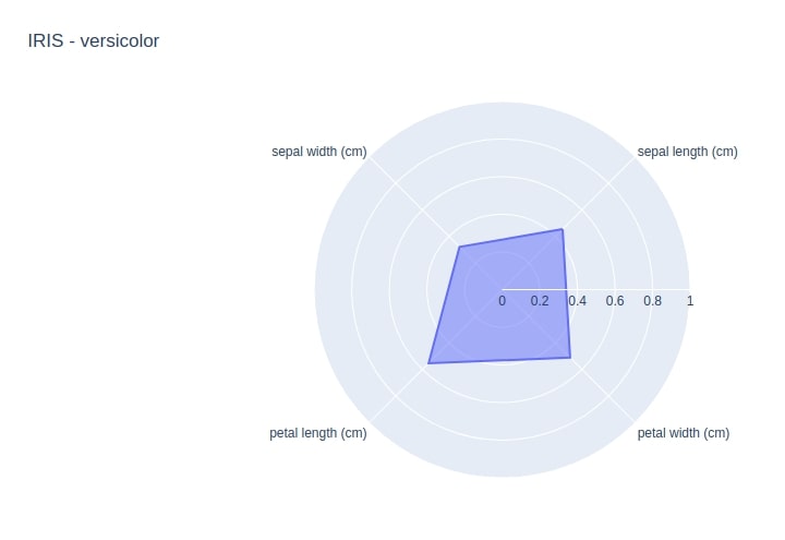
Below we are using same line_polar() function to plot radar chart for IRIS Versicolor flower type. We can also later update chart attributes by using the update_traces() method. We are filling radar chart polygon this time by setting fill attribute value to toself. We can also change the direction of quantitative variables layout by setting the direction attribute to counterclockwise. We can also set the start angle from where we want to start plotting quantitative variables by setting the start_angle attribute. The default for start_angle is 90.
fig = px.line_polar(
                    r=avg_iris.loc[1].values,
                    theta=avg_iris.columns,
                    line_close=True,
                    range_r = [0,1.0],
                    title="IRIS - %s"%iris.target_names[1],
                    direction="counterclockwise", start_angle=45
                    )

fig.update_traces(fill='toself')
fig.show()
Below we have plotted the radar chart for Wine of class 0. The wine dataset has 13 variables to compare.
fig = px.line_polar(
                    r=avg_wine.loc[0].values,
                    theta=avg_wine.columns,
                    line_close=True,
                    range_r = [0,1.0],
                    title="WINE - %s"%wine.target_names[0]
                    )

fig.update_traces(fill='toself')
fig.show()
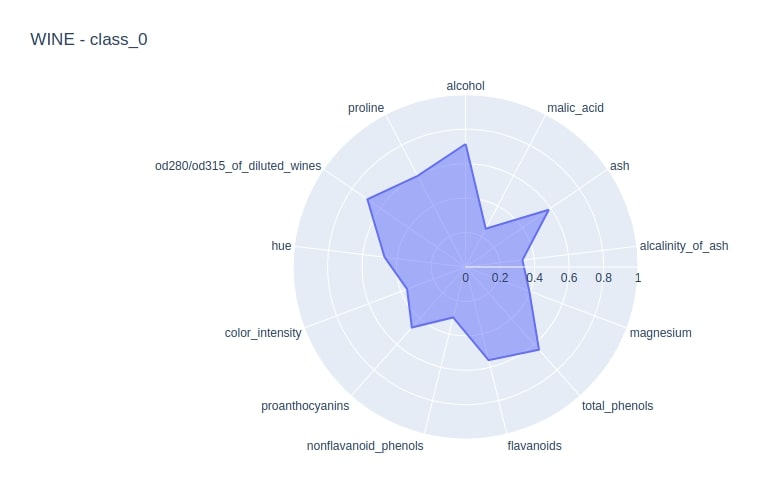
fig = px.line_polar(
                    r=avg_wine.loc[1].values,
                    theta=avg_wine.columns,
                    line_close=True,
                    title="WINE - %s"%wine.target_names[1],
                    range_r = [0,1.0]
                    )

fig.update_traces(fill='toself')
fig.show()
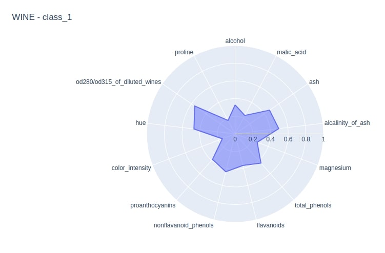
We can see from the above two figures that alcohol is more in wine category 0 compared to wine category 1. The ash is also more in wine category 0 compared to wine category 1. We can compare all different quantitative variables this way.
Plotly Graph Objects
The second method provided by plotly is Scatterpolar available as a part of the graph_objects module of plotly. It has almost the same parameter requirement as that of line_polar() for creating radar charts. It expects that we provide parameter r and theta for generating radar charts. We can specify fill color, line color, fill, etc attributes by passing them directly to this method.
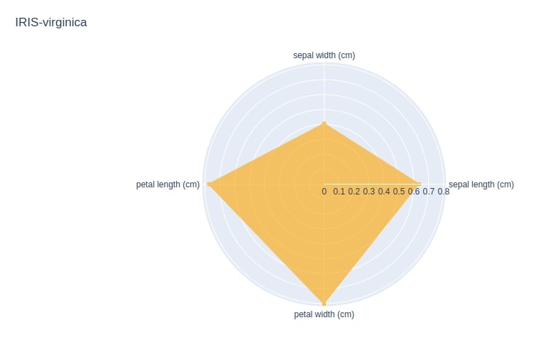
Below we are using Scatterpolar to generate radar chart for IRIS flower type verginica.
import plotly.graph_objects as go

fig = go.Figure()
fig.add_trace(
                go.Scatterpolar(
                                r=avg_iris.loc[2].values,
                                theta=avg_iris.columns,
                                fill='toself',
                                name="IRIS-%s"%iris.target_names[2],
                                fillcolor="orange", opacity=0.6, line=dict(color="orange")
                                )
                )

fig.update_layout(
    polar=dict(
        radialaxis=dict(
          visible=True
        ),
      ),
    showlegend=False,
    title="IRIS-%s"%iris.target_names[2]
)

fig.show()
We are now combining polygon for all 3 different iris flower types in a single radar chart. We are not filling color in the radar chart. We also have repeated first value 2 times in our logic in order to join ends of polygons of a radar chart.
fig = go.Figure()

for i in range(3):
    fig.add_trace(
                go.Scatterpolar(
                                r=avg_iris.loc[i].values.tolist() + avg_iris.loc[i].values.tolist()[:1],
                                theta=avg_iris.columns.tolist() + avg_iris.columns.tolist()[:1],
                                name="IRIS-%s"%iris.target_names[i],
                                showlegend=True,
                                )
                )

fig.update_layout(
    polar=dict(
        radialaxis=dict(
                        visible=True,
                        range=[0, 1]
                    )
            ),

    title="IRIS Flower Variables According to Flower Categories"
)

fig.show()
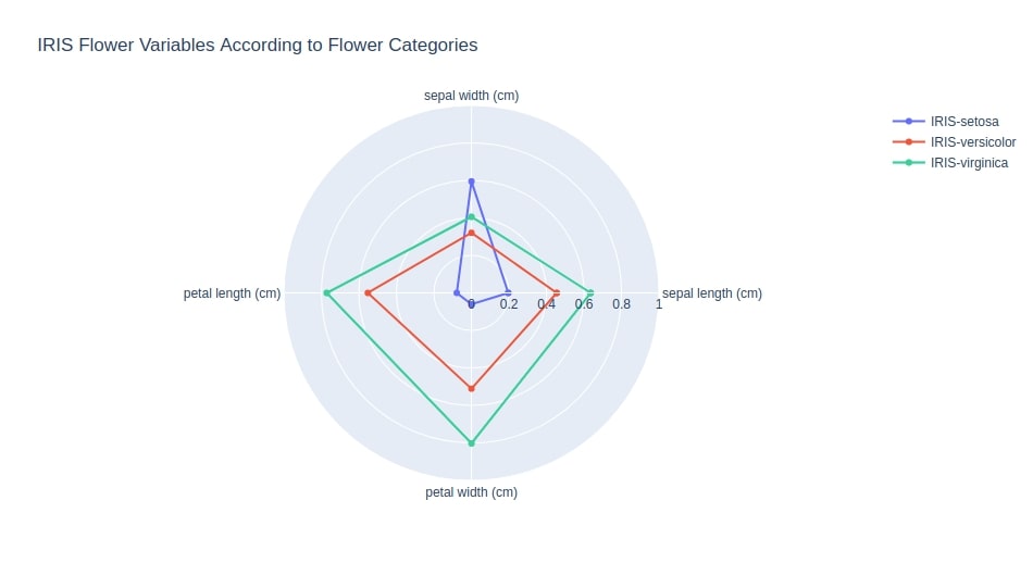
We can easily compare quantitative variables of different flower types easily now. We can see that iris setosa has on an average more sepal width compared to the other two. Iris versicolor is smaller in size compared to iris virginica. Iris virginica has the biggest petal length, petal width, and sepal length compared to the other two.
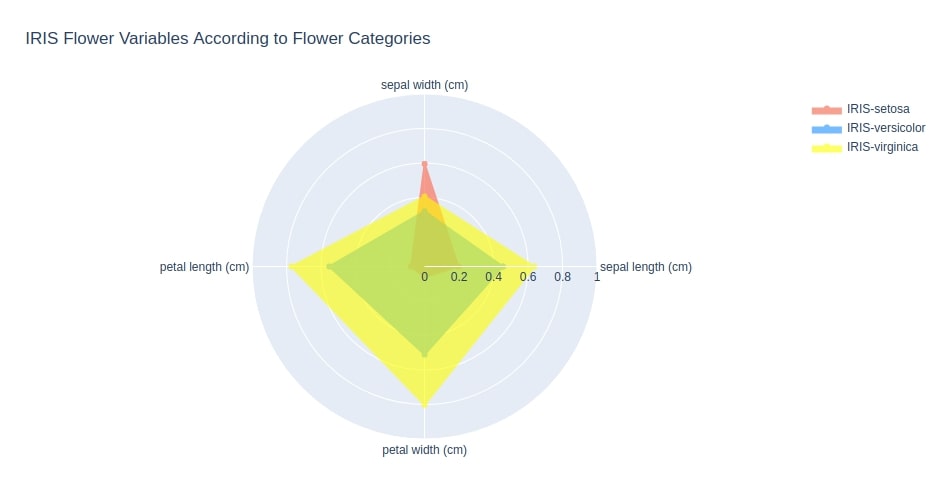
Below we are again plotting three different iris flowers with their polygon filled in this time.
fig = go.Figure()

colors= ["tomato", "dodgerblue", "yellow"]
for i in range(3):
    fig.add_trace(
                go.Scatterpolar(
                                r=avg_iris.loc[i].values.tolist() + avg_iris.loc[i].values.tolist()[:1],
                                theta=avg_iris.columns.tolist() + avg_iris.columns.tolist()[:1],
                                fill='toself',
                                name="IRIS-%s"%iris.target_names[i],
                                fillcolor=colors[i], line=dict(color=colors[i]),
                                showlegend=True, opacity=0.6
                                )
                )

fig.update_layout(
    polar=dict(
        radialaxis=dict(
                        visible=True,
                        range=[0, 1]
                    )
            ),
    title="IRIS Flower Variables According to Flower Categories"
)

fig.show()
Below we are plotting three different wine types on a single radar chart. We can easily compare different quantitative variables across different wine types now.
fig = go.Figure()

for i in range(3):
    fig.add_trace(
                go.Scatterpolar(
                                r=avg_wine.loc[i].values,
                                theta=avg_wine.columns,
                                fill='toself',
                                name="WINE-%s"%wine.target_names[i],
                                showlegend=True,
                                )
                )

fig.update_layout(
    polar=dict(
        radialaxis=dict(
                        visible=True,
                        range=[0, 1]
                    )
            ),
    title="Wine Variables According to Wine Categories"
)

fig.show()
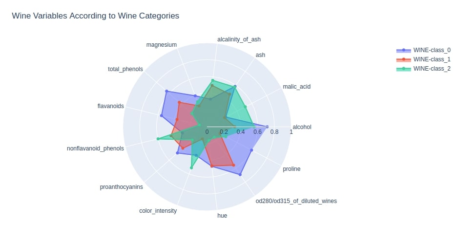
We can notice from the above chart that wine class 0 has the highest amount of alcohol. Wine class 0 also has more proline, magnesium, phenols, flavonoids, proanthocyanins, and od280/od315 compared to the other two wine types. Wine class 2 has more malic acid, the alkalinity of ash, non-flavonoid phenols, and color intensity compared to the other two wine types.
This ends our small tutorials explaining radar charts plotting using python. Please feel free to let us know your views in the comments section.
References
 Sunny Solanki
Sunny Solanki
Intro: Software Developer | Youtuber | Bonsai Enthusiast
About: Sunny Solanki holds a bachelor's degree in Information Technology (2006-2010) from L.D. College of Engineering. Post completion of his graduation, he has 8.5+ years of experience (2011-2019) in the IT Industry (TCS). His IT experience involves working on Python & Java Projects with US/Canada banking clients. Since 2020, he’s primarily concentrating on growing CoderzColumn.
His main areas of interest are AI, Machine Learning, Data Visualization, and Concurrent Programming. He has good hands-on with Python and its ecosystem libraries.
Apart from his tech life, he prefers reading biographies and autobiographies. And yes, he spends his leisure time taking care of his plants and a few pre-Bonsai trees.
Contact: sunny.2309@yahoo.in


![YouTube Subscribe]() Comfortable Learning through Video Tutorials?
Comfortable Learning through Video Tutorials?
If you are more comfortable learning through video tutorials then we would recommend that you subscribe to our YouTube channel.
![Need Help]() Stuck Somewhere? Need Help with Coding? Have Doubts About the Topic/Code?
Stuck Somewhere? Need Help with Coding? Have Doubts About the Topic/Code?
 Stuck Somewhere? Need Help with Coding? Have Doubts About the Topic/Code?
When going through coding examples, it's quite common to have doubts and errors.
If you have doubts about some code examples or are stuck somewhere when trying our code, send us an email at coderzcolumn07@gmail.com. We'll help you or point you in the direction where you can find a solution to your problem.
You can even send us a mail if you are trying something new and need guidance regarding coding. We'll try to respond as soon as possible.
![Share Views]() Want to Share Your Views? Have Any Suggestions?
Want to Share Your Views? Have Any Suggestions?
 Want to Share Your Views? Have Any Suggestions?
If you want to
- provide some suggestions on topic
- share your views
- include some details in tutorial
- suggest some new topics on which we should create tutorials/blogs
 radar-chart, plotly