How to Plot Parallel Coordinates Plot in Python [Matplotlib & Plotly]?
Parallel coordinates charts are commonly used to visualize and analyze high dimensional multivariate data. It represents each data sample as polyline connecting parallel lines where each parallel line represents an attribute of that data sample. If we take an example of IRIS flowers dataset which has 4 dimensions (petal width & length, sepal width, and length) recorded then there will be four parallel lines drawn vertically in 2d plane and each sample of the flower will be drawn as polyline connecting points on these four parallel lines according to that samples measurements. It’s a common practice to scale data in order to get all data variables in the same range for better understanding. The scaling let us analyze data variables which are on totally different scales.
The parallel coordinates chart can become very cluttered if there are many data points to be plotted. We can highlight only a few points in visualization to avoid cluttering. We'll be covering plotting parallel coordinates chart in python using pandas (matplotlib) and plotly. We'll be loading various datasets from scikit-learn in order to explain the plot better.
The radar charts are another alternative for analysis and visualization of multivariate data where parallel lines (axes) are organized radially. If you are interested in learning plotting radar charts in python then we have already covered detailed tutorial - How to Plot Radar Chart in Python? and we suggest that you go through it as well. Andrews’s plot is one more alternative to parallel coordinates plot which is a Fourier transform of parallel coordinates plot.
This ends our small introduction to the parallel coordinates chart. We'll now start by importing necessary libraries.
import pandas as pd
import numpy as np

import matplotlib.pyplot as plt

from sklearn.datasets import load_iris, load_boston, load_wine
from sklearn.preprocessing import MinMaxScaler

import plotly.express as px
import plotly.graph_objects as go

%matplotlib inline
We'll be first loading 3 datasets available from scikit-learn.
- IRIS Flowers Dataset It has dimension measured for 3 different IRIS flower types.
- Wine Dataset It has information about various ingredients of wine like alcohol, malic acid, ash, magnesium, etc for three different wine categories.
- Boston Housing Price Dataset - It has information about various attributes of the house and surrounding area for Boston as well as house prices.
All datasets are available from the sklearn.datasets module. We'll be loading them and keeping them as a dataframe for using them later for parallel coordinates plot.
We'll be plotting charts with scaled data as well in order to compare it to non-scaled data. We have used scikit-learn MinMaxScaler scaler to scale data so that each column’s data gets into range [0-1]. Once data is into the same range [0-1] for all quantitative variables then it becomes easy to see its impact. We'll be scaling iris, Boston, and wine datasets using MinMaxScaler.
iris = load_iris()
iris_data = np.hstack((iris.data, iris.target.reshape(-1,1)))

iris_df = pd.DataFrame(data=iris_data, columns=iris.feature_names+ ["FlowerType"])
iris_df.head()
iris_data_scaled = MinMaxScaler().fit_transform(iris.data)
iris_data_scaled = np.hstack((iris_data_scaled, iris.target.reshape(-1,1)))

iris_scaled_df = pd.DataFrame(data=iris_data_scaled, columns=iris.feature_names+ ["FlowerType"])
iris_scaled_df.head()
wine = load_wine()
wine_data = np.hstack((wine.data, wine.target.reshape(-1,1)))

wine_df = pd.DataFrame(data=wine_data, columns=wine.feature_names+ ["WineCategory"])
wine_df.head()
wine_data_scaled = MinMaxScaler().fit_transform(wine.data)
wine_data_scaled = np.hstack((wine_data_scaled, wine.target.reshape(-1,1)))

wine_scaled_df = pd.DataFrame(data=wine_data_scaled, columns=wine.feature_names+ ["WineCategory"])
wine_scaled_df.head()
boston = load_boston()
boston_data = np.hstack((boston.data, boston.target.reshape(-1,1)))

boston_df = pd.DataFrame(data=boston_data, columns=boston.feature_names.tolist()+ ["HousePrice"])
boston_df.head()
boston_data_scaled = MinMaxScaler().fit_transform(boston.data)
boston_data_scaled = np.hstack((boston_data_scaled, boston.target.reshape(-1,1)))

boston_scaled_df = pd.DataFrame(data=boston_data_scaled, columns=boston.feature_names.tolist()+ ["HousePrice"])
boston_scaled_df.head()
We'll be explaining two ways to plot a parallel coordinates chart.
- Pandas [Matplotlib] - First we'll be explaining the usage of pandas for plotting parallel coordinates chart. Pandas provide ready-made function as a part of its visualization module for plotting parallel coordinates charts. Pandas use matplotlib behind the scene for plotting hence all charts will be static.
- Plotly - Plotly provides two ways to create parallel coordinates charts. Plotly charts are interactive.
- Plotly Express
- Plotly Graph Objects
Pandas [Matplotlib]
The pandas module named plotting provides ready to use method named parallel_coordinates which can be used to plot parallel coordinates charts. We need to provide it dataframe which has all data and categorical column name according to which various category samples will be colored.
It also has a parameter named color which accepts a list of color names to use for categories of column provided.
IRIS Parallel Coordinates Charts
Below we have provided iris dataframe as input and FlowerType column for coloring samples according to flower category. We also have provided color names for categories.
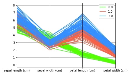
pd.plotting.parallel_coordinates(iris_df, "FlowerType", color=["lime", "tomato","dodgerblue"]);
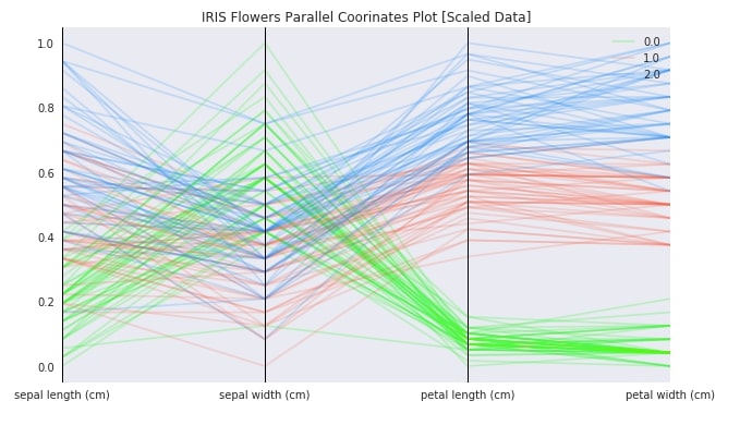
Below we are again plotting parallel coordinates chart for iris data but with scaled data this time. We can see that this time we are able to make differences in samples clearly due to scaled data. It's advisable to scale data before plotting a parallel coordinates chart. As pandas use matplotlib behind the scene, we can decorate charts using matplotlib methods.
with plt.style.context(("ggplot", "seaborn")):
    fig = plt.figure(figsize=(10,6))
    pd.plotting.parallel_coordinates(iris_scaled_df, "FlowerType",
                                     color=["lime", "tomato","dodgerblue"],
                                     alpha=0.2)

    plt.title("IRIS Flowers Parallel Coorinates Plot [Scaled Data]")
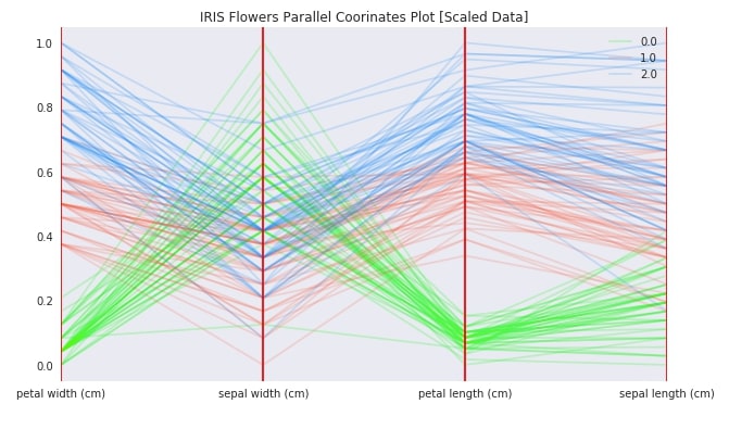
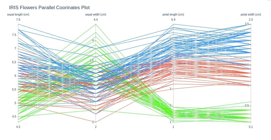
Below we are again plotting parallel coordinates chart using iris scaled data, but this time we have changed column order by providing a list of columns as input to cols parameter of parallel_coordinates method. We can also ignore columns of dataframe if we don't want to include them in the chart by providing a list of column names to be included in the chart to cols parameter.
with plt.style.context(("ggplot", "seaborn")):
    fig = plt.figure(figsize=(10,6))
    pd.plotting.parallel_coordinates(iris_scaled_df, "FlowerType",
                                     cols= ["petal width (cm)", "sepal width (cm)", "petal length (cm)", "sepal length (cm)"],
                                     color=["lime", "tomato","dodgerblue"],
                                     alpha=0.2,
                                     axvlines_kwds={"color":"red"})
    plt.title("IRIS Flowers Parallel Coorinates Plot [Scaled Data]")
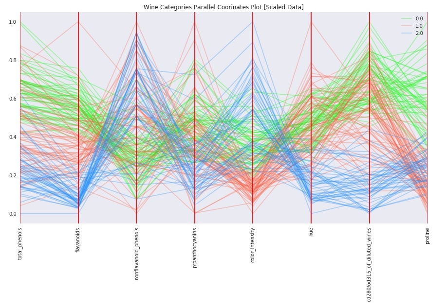
Wine Dataset Parallel Coordinates Chart
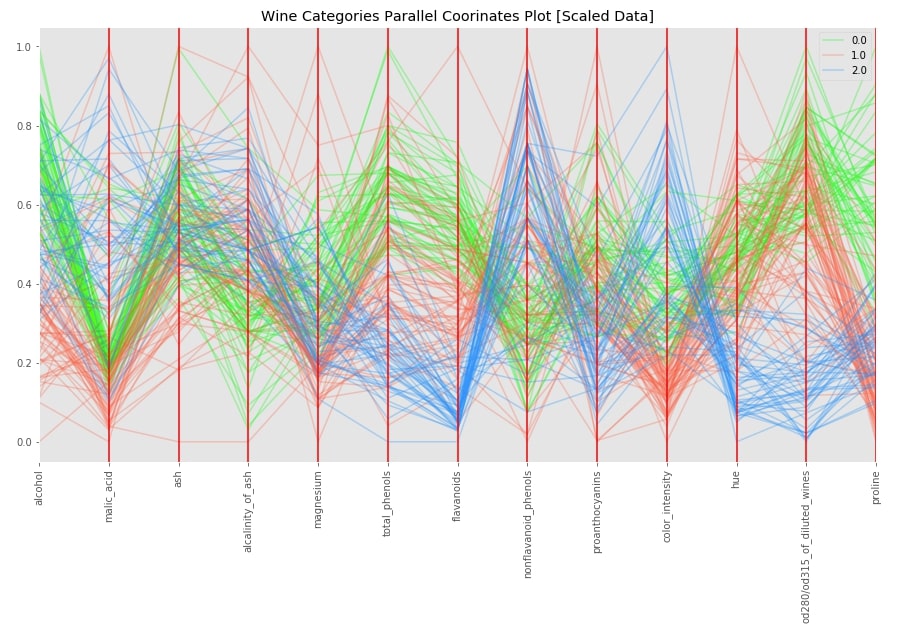
Below we have plotted parallel coordinates chart for wine scaled dataframe. We can see that few columns of data clearly show different values based on categories whereas for a few others its not clear.
with plt.style.context(("ggplot")):
    fig = plt.figure(figsize=(15,8))
    pd.plotting.parallel_coordinates(wine_scaled_df, "WineCategory",
                                     color=["lime", "tomato","dodgerblue"],
                                     alpha=0.3,
                                     axvlines_kwds={"color":"red"})
    plt.xticks(rotation=90)
    plt.title("Wine Categories Parallel Coorinates Plot [Scaled Data]")
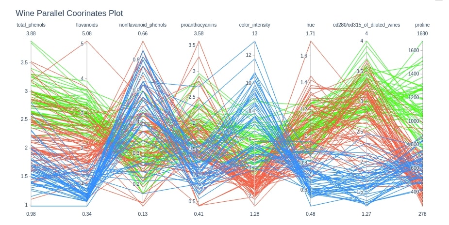
with plt.style.context(("ggplot", "seaborn")):
    fig = plt.figure(figsize=(15,8))
    pd.plotting.parallel_coordinates(wine_scaled_df, "WineCategory",
                                     cols=["total_phenols", "flavanoids", "nonflavanoid_phenols", "proanthocyanins", "color_intensity", "hue", "od280/od315_of_diluted_wines", "proline"],
                                     color=["lime", "tomato","dodgerblue"],
                                     alpha=0.3,
                                     axvlines_kwds={"color":"red"})
    plt.xticks(rotation=90)
    plt.title("Wine Categories Parallel Coorinates Plot [Scaled Data]")
Plotly
Plotly is a very famous interactive data visualization library. It provided two modules named plotly.express and plotly.graph_objects for plotting parallel coordinates chart.
Plotly Express
The plotly.express module has a method named parallel_coordinates which accepts dataframe containing data and categorical column name which to use to color samples of data according to categories.
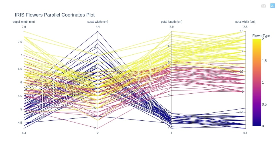
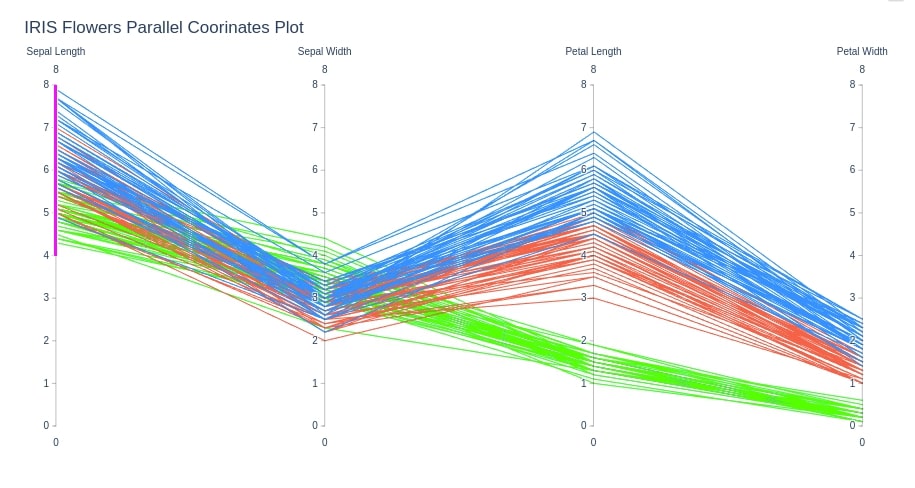
IRIS Dataset Parallel Coordinates Chart
Below we are creating a parallel coordinates chart for iris data. We have provided the FlowerType column to color attribute in order to color samples according to iris flower types.
cols = ['sepal length (cm)', 'sepal width (cm)', 'petal length (cm)', 'petal width (cm)']

fig = px.parallel_coordinates(iris_df, color="FlowerType", dimensions=cols,
                              title="IRIS Flowers Parallel Coorinates Plot")
fig.show()
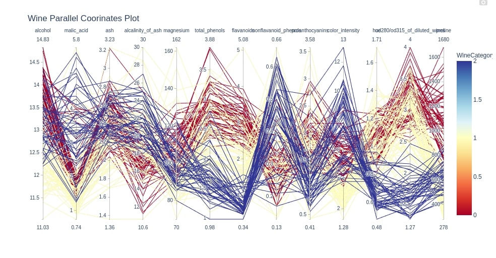
Wine Data Parallel Coordinates Charts
Below we are creating a parallel coordinates chart for the wine dataset. We are providing column names as input to the dimensions parameter of the method.
cols = ['alcohol', 'malic_acid', 'ash', 'alcalinity_of_ash', 'magnesium', 'total_phenols', 'flavanoids',
'nonflavanoid_phenols', 'proanthocyanins', 'color_intensity', 'hue', 'od280/od315_of_diluted_wines', 'proline']

fig = px.parallel_coordinates(wine_df, color="WineCategory", dimensions=cols,
                              color_continuous_scale=px.colors.diverging.RdYlBu, width=1000,
                              title="Wine Parallel Coorinates Plot")
fig.show()
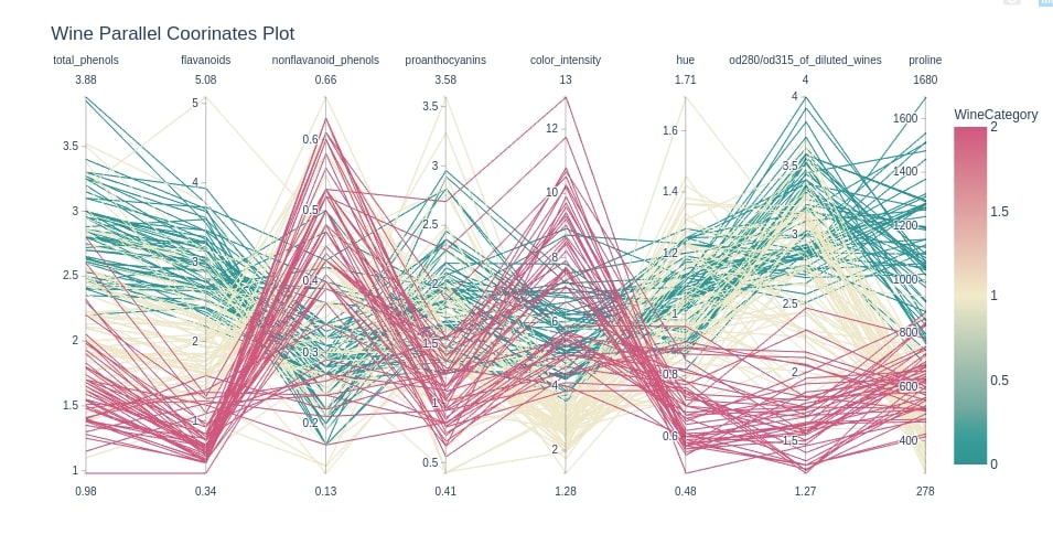
Below we are again creating a parallel coordinates chart for the wine dataset but this time with the last few columns which has samples clearly showing differences based on the wine category. We have also changed the colors of the chart by setting the color_continuous_scale attribute.
cols = ["total_phenols", "flavanoids", "nonflavanoid_phenols", "proanthocyanins", "color_intensity",
        "hue", "od280/od315_of_diluted_wines", "proline"]

fig = px.parallel_coordinates(wine_df, color="WineCategory", dimensions=cols,
                              color_continuous_scale=px.colors.diverging.Tealrose,
                              title="Wine Parallel Coorinates Plot")
fig.show()
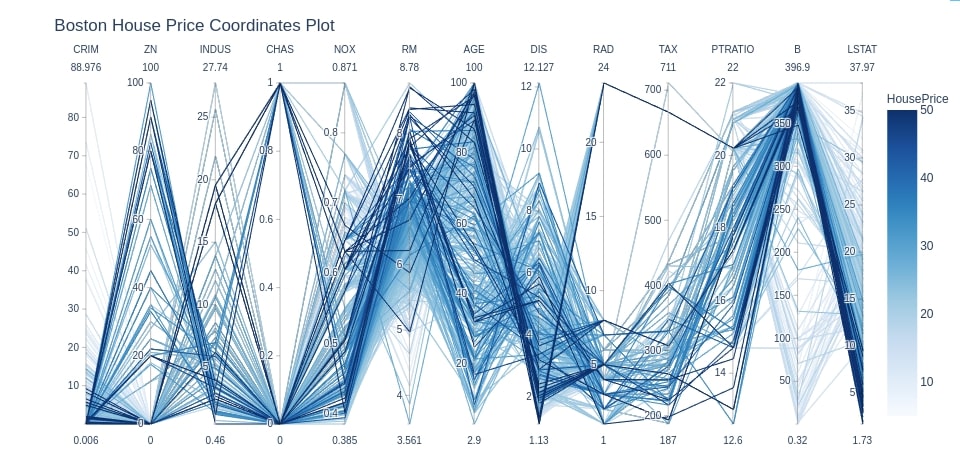
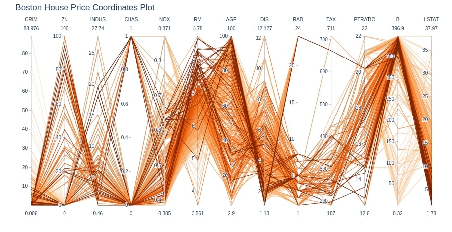
Boston House Price Dataset Parallel Coordinates Chart
Below we are plotting the parallel coordinates chart for the Boston dataset. We are using HousePrice as an attribute to color samples. We can analyze which attributes are contributing to high house prices.
cols = ['CRIM', 'ZN', 'INDUS', 'CHAS', 'NOX', 'RM', 'AGE', 'DIS', 'RAD', 'TAX',
       'PTRATIO', 'B', 'LSTAT',]
fig = px.parallel_coordinates(boston_df, color="HousePrice", dimensions=cols,
                              color_continuous_scale=px.colors.sequential.Blues,
                              title="Boston House Price Coordinates Plot")
fig.show()
Plotly Graph Objects
The second way to generate parallel coordinates charts in plotly is by using the graph_objects module. It provides a method named Parcoords which can be used for plotting parallel coordinates charts. We need to provide values for two important parameters of Parcoords in order to generate the chart:
line- It accepts dictionary where we pass column name to be used to color samples of data. We can also specify a color to use for categories as a part of this dictionary.dimensions- It accepts a list of dictionaries as input where each dictionary represents one dimension of data. We need to provide a list of values to be used and label for that values in the dictionary. We can also providerangefor values. Thecontraintrangeattribute let us highlight only that range of values from total values.
IRIS Dataset Parallel Coordinates Chart
Below we are plotting parallel coordinates chart for iris dataset.
fig = go.Figure(data=
    go.Parcoords(
        line = dict(color = iris_df['FlowerType'],
                   colorscale = [[0,'lime'],[0.5,'tomato'],[1,'dodgerblue']]),
        dimensions = list([
            dict(range = [0,8],
                constraintrange = [4,8],
                label = 'Sepal Length', values = iris_df['sepal length (cm)']),
            dict(range = [0,8],
                label = 'Sepal Width', values = iris_df['sepal width (cm)']),
            dict(range = [0,8],
                label = 'Petal Length', values = iris_df['petal length (cm)']),
            dict(range = [0,8],
                label = 'Petal Width', values = iris_df['petal width (cm)'])
        ])
    )
)

fig.update_layout(
    title="IRIS Flowers Parallel Coorinates Plot"
)

fig.show()
cols = ['sepal length (cm)', 'sepal width (cm)', 'petal length (cm)', 'petal width (cm)',]

fig = go.Figure(data=
    go.Parcoords(
        line = dict(color = iris_df['FlowerType'],
                   colorscale = [[0,'lime'],[0.5,'tomato'],[1,'dodgerblue']]),
        dimensions = [dict(label=col, values=iris_df[col]) for col in cols]
    )
)

fig.update_layout(
    title="IRIS Flowers Parallel Coorinates Plot"
)

fig.show()
Wine Dataset Parallel Coordinates Chart
Below we are plotting parallel coordinates chart for wine dataset.
cols = ["total_phenols", "flavanoids", "nonflavanoid_phenols", "proanthocyanins", "color_intensity",
        "hue", "od280/od315_of_diluted_wines", "proline"]


fig = go.Figure(data=
    go.Parcoords(
        line = dict(color = wine_df['WineCategory'],
                   colorscale = [[0,'lime'],[0.5,'tomato'],[1,'dodgerblue']]),
        dimensions = [dict(label=col, values=wine_df[col]) for col in cols]
    )
)

fig.update_layout(
    title="Wine Parallel Coorinates Plot"
)

fig.show()
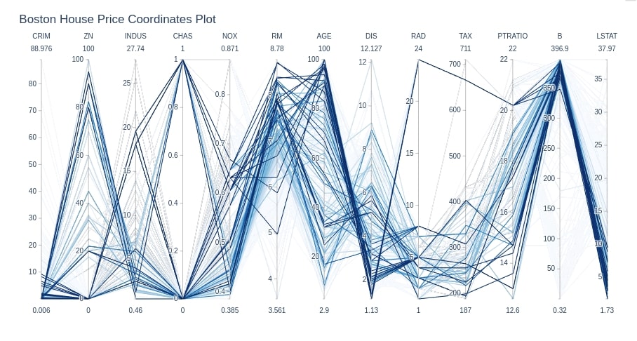
Boston House Dataset Parallel Coordinates Chart
Below we are plotting the parallel coordinates chart for the Boston dataset.
cols = ['CRIM', 'ZN', 'INDUS', 'CHAS', 'NOX', 'RM', 'AGE', 'DIS', 'RAD', 'TAX',
       'PTRATIO', 'B', 'LSTAT',]

fig = go.Figure(data=
    go.Parcoords(
        line = dict(color = boston_df['HousePrice'],
                   colorscale = px.colors.sequential.Oranges),
        dimensions = [dict(label=col, values=boston_df[col]) for col in cols]
    )
)

fig.update_layout(
    title="Boston House Price Coordinates Plot"
)

fig.show()
Below we are again plotting parallel coordinates chart for Boston house price dataset but this time for houses with prices in the range of 25,000-50,000 only by setting cmin and cmax parameters of dictionary given to line parameter.
cols = ['CRIM', 'ZN', 'INDUS', 'CHAS', 'NOX', 'RM', 'AGE', 'DIS', 'RAD', 'TAX',
       'PTRATIO', 'B', 'LSTAT',]

fig = go.Figure(data=
    go.Parcoords(
        line = dict(color = boston_df['HousePrice'],
                   colorscale = px.colors.sequential.Blues,
                   cmin=25, cmax=50),
        dimensions = [dict(label=col, values=boston_df[col]) for col in cols]
    )
)

fig.update_layout(
    title="Boston House Price Coordinates Plot"
)

fig.show()
This ends our small tutorial on parallel coordinates charts plotting using python. Please feel free to let us know your views in the comments section.
References
 Sunny Solanki
Sunny Solanki
Intro: Software Developer | Youtuber | Bonsai Enthusiast
About: Sunny Solanki holds a bachelor's degree in Information Technology (2006-2010) from L.D. College of Engineering. Post completion of his graduation, he has 8.5+ years of experience (2011-2019) in the IT Industry (TCS). His IT experience involves working on Python & Java Projects with US/Canada banking clients. Since 2020, he’s primarily concentrating on growing CoderzColumn.
His main areas of interest are AI, Machine Learning, Data Visualization, and Concurrent Programming. He has good hands-on with Python and its ecosystem libraries.
Apart from his tech life, he prefers reading biographies and autobiographies. And yes, he spends his leisure time taking care of his plants and a few pre-Bonsai trees.
Contact: sunny.2309@yahoo.in


![YouTube Subscribe]() Comfortable Learning through Video Tutorials?
Comfortable Learning through Video Tutorials?
If you are more comfortable learning through video tutorials then we would recommend that you subscribe to our YouTube channel.
![Need Help]() Stuck Somewhere? Need Help with Coding? Have Doubts About the Topic/Code?
Stuck Somewhere? Need Help with Coding? Have Doubts About the Topic/Code?
 Stuck Somewhere? Need Help with Coding? Have Doubts About the Topic/Code?
When going through coding examples, it's quite common to have doubts and errors.
If you have doubts about some code examples or are stuck somewhere when trying our code, send us an email at coderzcolumn07@gmail.com. We'll help you or point you in the direction where you can find a solution to your problem.
You can even send us a mail if you are trying something new and need guidance regarding coding. We'll try to respond as soon as possible.
![Share Views]() Want to Share Your Views? Have Any Suggestions?
Want to Share Your Views? Have Any Suggestions?
 Want to Share Your Views? Have Any Suggestions?
If you want to
- provide some suggestions on topic
- share your views
- include some details in tutorial
- suggest some new topics on which we should create tutorials/blogs
 parallel-coodinates-chart, matplotlib, plotly