Hexbin Charts using Matplotlib | Hexgonal Binning | Python
Data visualization is an essential tool for gaining insights into complex data sets. One of the popular visualization techniques is the hexbin chart, which provides an effective way to visualize large amounts of data by grouping and aggregating data points into hexagonal bins. Hexbin charts offer an alternative to traditional scatter plots, particularly useful when dealing with large datasets with overlapping data points.
What Can You Learn From This Article?
In this tutorial, we will explore how to create hexbin charts using Matplotlib, a popular data visualization library in Python. The tutorial covers in detail how to use hexbin() method of matplotlib to create hexbin charts. It also covers various parameters of the method in detail with examples. By the end of this article, readers will have a comprehensive understanding of how to use hexbin charts to visualize their data using Matplotlib.
Video Tutorial
Please feel free to check below video tutorial if feel comfortable learning through videos.
First, we have imported matplotlib and printed the version that we have used in our tutorial.
import matplotlib

print("Matplotlib Version : {}".format(matplotlib.__version__))
Load Wine Dataset
In this section, we have loaded the dataset that we'll use to create hexbin charts in our tutorial.
The code loads the wine dataset using the load_wine() method from the datasets module, which returns a Bunch object that contains the wine dataset's data and metadata. After loading the dataset, the code converts it into a pandas DataFrame, and adds a target variable column to the DataFrame.
The wine dataset has information about various ingredients used in creation of 3 different types of wine.
from sklearn import datasets
import pandas as pd

wine = datasets.load_wine()

wine_df = pd.DataFrame(data=wine.data, columns=wine.feature_names)
wine_df["WineType"] = wine.target

wine_df.head()
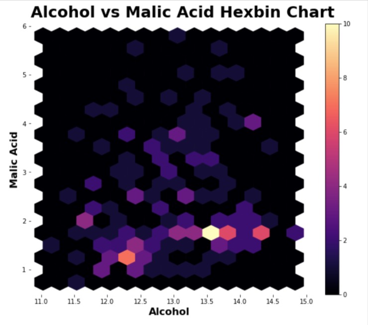
1. Initial Hexbin Chart
In this section, we have created our first hexbin chart exploring relationship between the values of ingredients "alcohol" and "malic acid" of our wine dataset.
The code starts by importing pyplot API of matplotlib.
Then, The code creates a new figure object with the specified width and height, 10 and 8 inches respectively. It adds a subplot to the figure.
The next line creates a hexbin plot of the two variables, 'alcohol' and 'malic_acid', from the wine dataset named wine_df using hexbin() method of pyplot API. The gridsize parameter specifies the number of hexagons in the x and y directions, and the cmap parameter specifies the color map to use. Then, the code adds colorbar to the chart. The colorbar shows the number of samples matching a particular combination of ingredients.
The next line of code hides the spines (lines around the chart) of the subplot on all sides - bottom, top, left, and right.
Then, we have added x-axis label, y-axis label, and chart title.
import matplotlib.pyplot as plt

fig = plt.figure(figsize=(10,8))

ax = fig.add_subplot(1,1,1)

plt.hexbin(x=wine_df["alcohol"], y=wine_df["malic_acid"],
           gridsize=(15,10), cmap="magma"
          );

plt.colorbar();

ax.spines[["bottom", "top", "left", "right"]].set_visible(False);

plt.xlabel("Alcohol", fontsize=16, fontweight="bold")
plt.ylabel("Malic Acid", fontsize=16, fontweight="bold")
plt.title("Alcohol vs Malic Acid Hexbin Chart", loc="left", pad=10, fontsize=25, fontweight="bold");
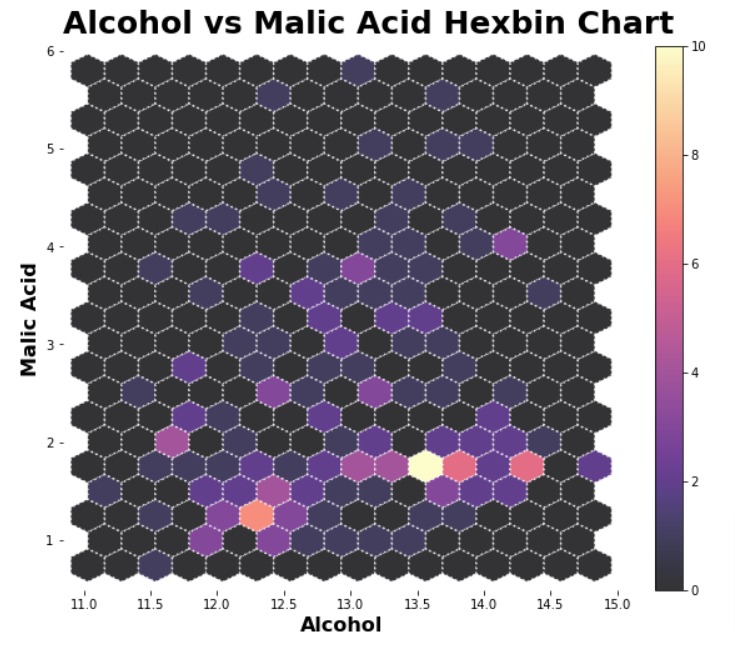
2. Modify Line Properties
In this example, we have explained how to modify various line properties of hexagons in the hexbin chart.
The majority of the code is same as our previous example with the addition of a few new parameters in a call to hexbin(). The linewidth parameter lets us specify line width, edgecolor parameter lets us specify line color, line style parameter lets us specify line style (dashed, dotted, etc), and alpha parameter lets us specify the opacity of hexagons.
import matplotlib.pyplot as plt

fig = plt.figure(figsize=(10,8))

ax = fig.add_subplot(1,1,1)

plt.hexbin(x=wine_df["alcohol"], y=wine_df["malic_acid"],
           linewidth=1.5, edgecolor="white", linestyle="dotted", alpha=0.8,
           gridsize=(15,10), cmap="magma"
          );

plt.colorbar();

ax.spines[["bottom", "top", "left", "right"]].set_visible(False);

plt.xlabel("Alcohol", fontsize=16, fontweight="bold")
plt.ylabel("Malic Acid", fontsize=16, fontweight="bold")
plt.title("Alcohol vs Malic Acid Hexbin Chart", loc="left", pad=10, fontsize=25, fontweight="bold");
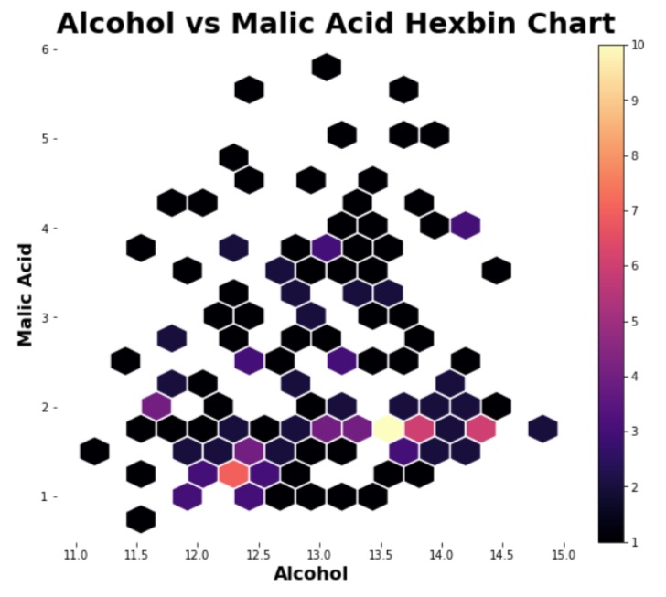
3. Include Range Of Values in Colorbar
In this section, we have explored how to include a range of values in the hexbin chart.
Our previous hexbin charts included all values but the code below includes hexagons where there is a minimum of 1 example present in data for the combination of two ingredients (alcohol & malic acid). We can set the minimum count using mincnt parameter of hexbin() method.
The resulting hexbin chart has omitted hexagons with 0 counts.
import matplotlib.pyplot as plt

fig = plt.figure(figsize=(10,8))

ax = fig.add_subplot(1,1,1)

plt.hexbin(x=wine_df["alcohol"], y=wine_df["malic_acid"],
           linewidth=1.5, edgecolor="white", mincnt=1,
           gridsize=(15,10), cmap="magma"
          );

plt.colorbar();

ax.spines[["bottom", "top", "left", "right"]].set_visible(False);

plt.xlabel("Alcohol", fontsize=16, fontweight="bold")
plt.ylabel("Malic Acid", fontsize=16, fontweight="bold")
plt.title("Alcohol vs Malic Acid Hexbin Chart", loc="left", pad=10, fontsize=25, fontweight="bold");
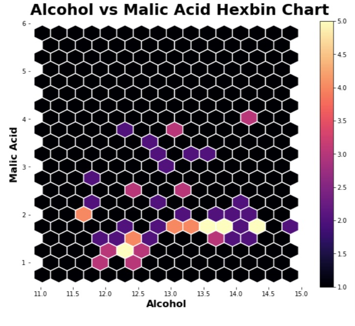
Below, we have created another example explaining how to specify a range of values. This time, we have used vmin and vmax parameters to specify a range.
import matplotlib.pyplot as plt

fig = plt.figure(figsize=(10,8))

ax = fig.add_subplot(1,1,1)

plt.hexbin(x=wine_df["alcohol"], y=wine_df["malic_acid"],
           linewidth=1.5, edgecolor="white",
           vmin=1, vmax=5,
           gridsize=(15,10), cmap="magma"
          );

plt.colorbar();

ax.spines[["bottom", "top", "left", "right"]].set_visible(False);

plt.xlabel("Alcohol", fontsize=16, fontweight="bold")
plt.ylabel("Malic Acid", fontsize=16, fontweight="bold")
plt.title("Alcohol vs Malic Acid Hexbin Chart", loc="left", pad=10, fontsize=25, fontweight="bold");
4. Distribution of Third Variable
In this section, we have explained how to use a hexbin chart to understand the distribution of values of third variable for a combination of the main two values.
Below, we have created a hexbin chart that shows the relationship between values of alcohol and malic acid but the hexagon color is based on the values of column WineType. The third column is specified using C parameter. The values of column WineType are averaged by default.
import matplotlib.pyplot as plt

fig = plt.figure(figsize=(10,8))

ax = fig.add_subplot(1,1,1)

plt.hexbin(x=wine_df["alcohol"], y=wine_df["malic_acid"], C=wine_df["WineType"],
           linewidth=1.5, edgecolor="black",
           gridsize=(15,10), cmap="RdYlGn"
          );

plt.colorbar();

ax.spines[["bottom", "top", "left", "right"]].set_visible(False);

plt.xlabel("Alcohol", fontsize=16, fontweight="bold")
plt.ylabel("Malic Acid", fontsize=16, fontweight="bold")
plt.title("Alcohol vs Malic Acid Hexbin Chart", loc="left", pad=10, fontsize=25, fontweight="bold");
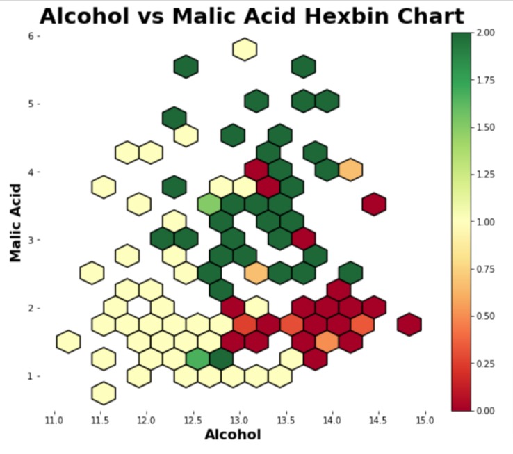
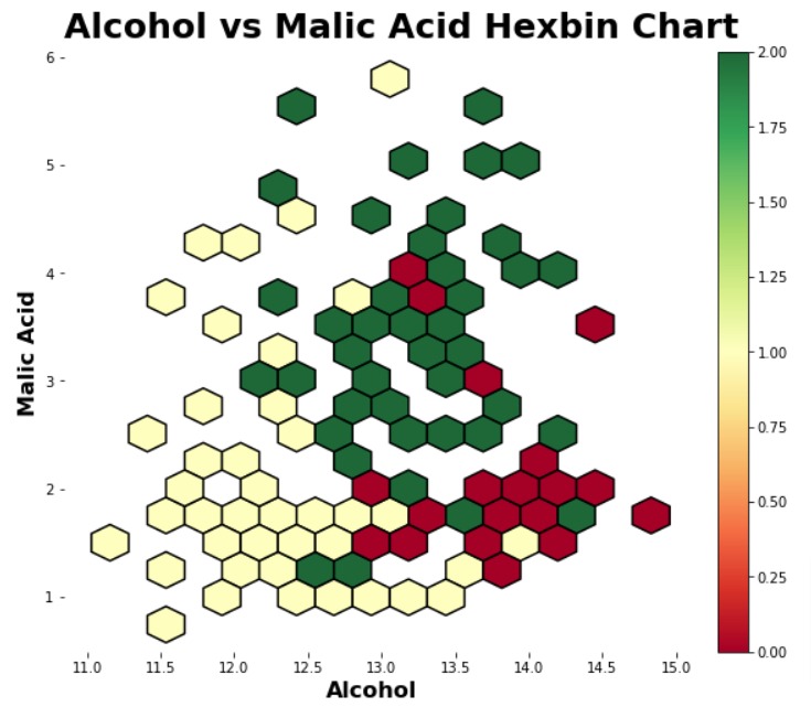
As we said in the previous example by default average is taken for values provided through C parameter, but what if you want to perform some other function on the values like minimum, maximum, and standard deviation. We can do that using reduce_C_function parameter. We need to provide a function to it that we want to apply to list of values. The function will be applied to all WineType values that match the particular combination of alcohol and malic acid values.
import matplotlib.pyplot as plt
import numpy as np

fig = plt.figure(figsize=(10,8))

ax = fig.add_subplot(1,1,1)

plt.hexbin(x=wine_df["alcohol"], y=wine_df["malic_acid"], C=wine_df["WineType"],
           linewidth=1.5, edgecolor="black", reduce_C_function=np.max,
           gridsize=(15,10), cmap="RdYlGn"
          );

plt.colorbar();

ax.spines[["bottom", "top", "left", "right"]].set_visible(False);

plt.xlabel("Alcohol", fontsize=16, fontweight="bold")
plt.ylabel("Malic Acid", fontsize=16, fontweight="bold")
plt.title("Alcohol vs Malic Acid Hexbin Chart", loc="left", pad=10, fontsize=25, fontweight="bold");
 Sunny Solanki
Sunny Solanki
Intro: Software Developer | Youtuber | Bonsai Enthusiast
About: Sunny Solanki holds a bachelor's degree in Information Technology (2006-2010) from L.D. College of Engineering. Post completion of his graduation, he has 8.5+ years of experience (2011-2019) in the IT Industry (TCS). His IT experience involves working on Python & Java Projects with US/Canada banking clients. Since 2020, he’s primarily concentrating on growing CoderzColumn.
His main areas of interest are AI, Machine Learning, Data Visualization, and Concurrent Programming. He has good hands-on with Python and its ecosystem libraries.
Apart from his tech life, he prefers reading biographies and autobiographies. And yes, he spends his leisure time taking care of his plants and a few pre-Bonsai trees.
Contact: sunny.2309@yahoo.in


![YouTube Subscribe]() Comfortable Learning through Video Tutorials?
Comfortable Learning through Video Tutorials?
If you are more comfortable learning through video tutorials then we would recommend that you subscribe to our YouTube channel.
![Need Help]() Stuck Somewhere? Need Help with Coding? Have Doubts About the Topic/Code?
Stuck Somewhere? Need Help with Coding? Have Doubts About the Topic/Code?
 Stuck Somewhere? Need Help with Coding? Have Doubts About the Topic/Code?
When going through coding examples, it's quite common to have doubts and errors.
If you have doubts about some code examples or are stuck somewhere when trying our code, send us an email at coderzcolumn07@gmail.com. We'll help you or point you in the direction where you can find a solution to your problem.
You can even send us a mail if you are trying something new and need guidance regarding coding. We'll try to respond as soon as possible.
![Share Views]() Want to Share Your Views? Have Any Suggestions?
Want to Share Your Views? Have Any Suggestions?
 Want to Share Your Views? Have Any Suggestions?
If you want to
- provide some suggestions on topic
- share your views
- include some details in tutorial
- suggest some new topics on which we should create tutorials/blogs
 hexbin-charts, matplotlib