Event Plot using Matplotlib | Python
Data visualization is an essential aspect of data analysis, and Matplotlib is a popular data visualization library for Python. It provides a wide range of tools for creating various types of graphs, charts, and plots. One of the most useful features of Matplotlib is its ability to create event plots.
Event plots are a type of chart that shows events on a timeline, and they are particularly useful in neuroscience for representing neural events, where it is usually called a spike raster, dot raster, or raster plot.
However, it is useful in any situation where you wish to show the timing or position of multiple sets of discrete events, such as the arrival times of people to a business on each day of the month or the date of hurricanes each year of the last century.
What Can You Learn From This Article?
In this tutorial, we have focused on how to create event plots using "Matplotlib". We have covered the "eventplot()" function available for creating event plots, and how to customize their properties, such as markers, colors, and labels. We have also demonstrated how to create stacked event plots, which can show multiple events happening at the same time.
By the end of this article, you will have a solid understanding of how to create event plots using Matplotlib and be able to apply this knowledge to your own data visualization projects. So, let's get started and learn how to create powerful and informative event plots using Matplotlib.
Video Tutorial
Please feel free to check below video tutorial if feel comfortable learning through videos.
Below, we have imported matplotlib and printed the version that we'll use for our purpose.
import matplotlib

print("Matplotlib Version : {}".format(matplotlib.__version__))
import numpy as np
Chart 1
In this section, we have explained how to create a simple event plot that represents the occurrence of one event over time.
Below, we have first generated 30 random numbers in the range 0-365 which will be used to represent 30 major releases of project per year.
major_releases = sorted(np.random.randint(0, 365, size=30))

major_releases[:10]
The code imports the Matplotlib library and sets the style to "fivethirtyeight".
Then, it creates a figure object with a size of 12x7 inches and then creates an event plot using the "eventplot()" function, with the input argument "positions" set to a list of data representing the release dates of a project. The first parameter to "eventplot()" function is list of lists representing the occurrence of various events. In this case, we are representing only a single event which is major releases.
The x-axis label and plot title are set using the "xlabel()" and "title()" functions, respectively.
The title is aligned to the left of the plot using the "loc" parameter, with extra padding and a larger font size and weight. This code creates an event plot that shows the release dates of a project on the x-axis, without any y-axis information.
import matplotlib.pyplot as plt

plt.style.use("fivethirtyeight");

fig = plt.figure(figsize=(12,7))

plt.eventplot(positions=[major_releases]);

plt.xlabel("Dayes of Year");
plt.title("Project Releases", loc="left", pad=20, fontsize=30, fontweight="bold");
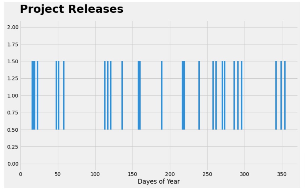
Chart 2
In this section, we have created another example demonstrating how to create an event plot for representing multiple events.
Below, we have first created 3 different lists with random numbers in the range 0-365. These lists will be used to represent events major releases, minor releases, and patches dates.
major_releases = sorted(np.random.randint(0, 365, size=30))
minor_releases = sorted(np.random.randint(0, 365, size=30))
patches = sorted(np.random.randint(0, 365, size=30))
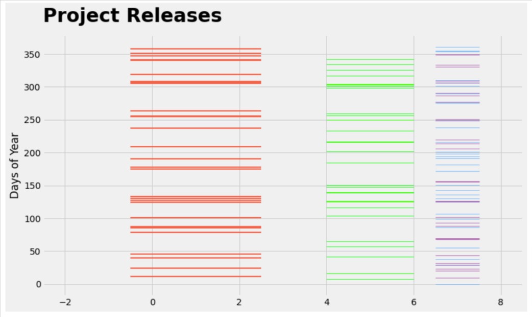
The code creates an event plot using the "eventplot()" function, with the input arguments "positions", "lineoffsets", "linewidths", "linelengths", and "colors".
The "positions" argument is set to a list of data representing the release dates of a project for major releases, minor releases, and patches.
The "lineoffsets" argument is set to a list of values that specify the vertical offset of each set of events from the x-axis.
The "linewidths" argument is set to a list of values that specify the line width of each set of events.
The "linelengths" argument is set to a list of values that specify the length of each line that represents an event.
The "colors" argument is set to a list of colors corresponding to each set of events.
The code creates an event plot that shows the release dates of a project for major releases, minor releases, and patches on the x-axis, with each set of events represented by different line styles, colors, and vertical offsets.
import matplotlib.pyplot as plt

plt.style.use("fivethirtyeight");

fig = plt.figure(figsize=(12,7))

plt.eventplot(positions=[major_releases, minor_releases, patches],
              lineoffsets=[1,5,7], linewidths=[2,1,0.5], linelengths=[3,2,1],
              colors=["tomato", "lime", "dodgerblue"]
             );

plt.xlabel("Dayes of Year");
plt.title("Project Releases", loc="left", pad=20, fontsize=30, fontweight="bold");
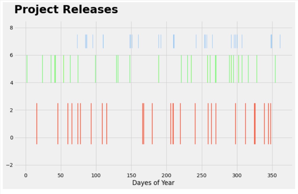
Chart 3
In this example, we have created one more example explaining how to create an event plot using multiple events. This time, we have represented two events at same offset.
Below, we have first created 4 lists of random numbers in the range 0-365 to represent major releases, minor releases, patches, and emergency releases.
major_releases = sorted(np.random.randint(0, 365, size=30))
minor_releases = sorted(np.random.randint(0, 365, size=30))
patches = sorted(np.random.randint(0, 365, size=30))
emergency_releases = sorted(np.random.randint(0, 365, size=30))
The code is almost same as our previous example with only change being that patches and emergency releases have same line offsets.
import matplotlib.pyplot as plt

plt.style.use("fivethirtyeight");

fig = plt.figure(figsize=(12,7))

plt.eventplot(positions=[major_releases, minor_releases, patches, emergency_releases],
              lineoffsets=[1,5,7,7], linewidths=[2,1,0.5, 0.5], linelengths=[3,2,1, 1],
              colors=["tomato", "lime", "dodgerblue", "purple"],
             );

plt.xlabel("Dayes of Year");
plt.title("Project Releases", loc="left", pad=20, fontsize=30, fontweight="bold");
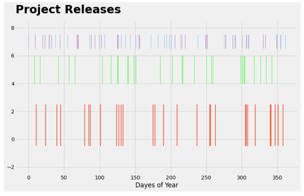
Chart 4
In this example, we have explained how to set line styles for lines represented in an event plot. We can do that using "linestyles" parameter of 'eventplot()' function.
import matplotlib.pyplot as plt

plt.style.use("fivethirtyeight");

fig = plt.figure(figsize=(12,7))

plt.eventplot(positions=[major_releases, minor_releases, patches, emergency_releases],
              lineoffsets=[1,5,7,7], linewidths=[2,1,0.5, 0.5], linelengths=[3,2,1, 1],
              colors=["tomato", "lime", "dodgerblue", "purple"],
              linestyles=["solid", "dashed", "dotted", "-."]
             );

plt.xlabel("Dayes of Year");
plt.title("Project Releases", loc="left", pad=20, fontsize=30, fontweight="bold");
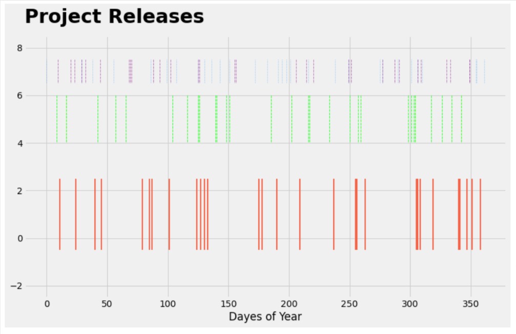
Chart 5
In this example, we have explained how to change the orientation of our event plot. We can do that using "orientation" parameter. We have set it to "vertical" here. By default, it is "horizontal".
import matplotlib.pyplot as plt

plt.style.use("fivethirtyeight");

fig = plt.figure(figsize=(12,7))

plt.eventplot(positions=[major_releases, minor_releases, patches, emergency_releases],
              lineoffsets=[1,5,7,7], linewidths=[2,1,0.5, 0.5], linelengths=[3,2,1, 1],
              colors=["tomato", "lime", "dodgerblue", "purple"],
              orientation="vertical",
             );

plt.ylabel("Days of Year");
plt.title("Project Releases", loc="left", pad=20, fontsize=30, fontweight="bold");
This ends our small tutorial explaining how to create an event plot using python data visualization library "matplotlib".
- plt.eventplot() - Plot identical parallel lines at the given positions.
References
 Sunny Solanki
Sunny Solanki
Intro: Software Developer | Youtuber | Bonsai Enthusiast
About: Sunny Solanki holds a bachelor's degree in Information Technology (2006-2010) from L.D. College of Engineering. Post completion of his graduation, he has 8.5+ years of experience (2011-2019) in the IT Industry (TCS). His IT experience involves working on Python & Java Projects with US/Canada banking clients. Since 2020, he’s primarily concentrating on growing CoderzColumn.
His main areas of interest are AI, Machine Learning, Data Visualization, and Concurrent Programming. He has good hands-on with Python and its ecosystem libraries.
Apart from his tech life, he prefers reading biographies and autobiographies. And yes, he spends his leisure time taking care of his plants and a few pre-Bonsai trees.
Contact: sunny.2309@yahoo.in


![YouTube Subscribe]() Comfortable Learning through Video Tutorials?
Comfortable Learning through Video Tutorials?
If you are more comfortable learning through video tutorials then we would recommend that you subscribe to our YouTube channel.
![Need Help]() Stuck Somewhere? Need Help with Coding? Have Doubts About the Topic/Code?
Stuck Somewhere? Need Help with Coding? Have Doubts About the Topic/Code?
 Stuck Somewhere? Need Help with Coding? Have Doubts About the Topic/Code?
When going through coding examples, it's quite common to have doubts and errors.
If you have doubts about some code examples or are stuck somewhere when trying our code, send us an email at coderzcolumn07@gmail.com. We'll help you or point you in the direction where you can find a solution to your problem.
You can even send us a mail if you are trying something new and need guidance regarding coding. We'll try to respond as soon as possible.
![Share Views]() Want to Share Your Views? Have Any Suggestions?
Want to Share Your Views? Have Any Suggestions?
 Want to Share Your Views? Have Any Suggestions?
If you want to
- provide some suggestions on topic
- share your views
- include some details in tutorial
- suggest some new topics on which we should create tutorials/blogs
 evet-plots, matplotlib