Bullet Charts using Matplotlib | Python
Data visualization is an essential aspect of data analysis and communication. It is crucial to present data in a format that is easy to comprehend, and bullet charts have proven to be an excellent way to visualize data.
Bullet charts are a variation of bar charts that display a single measure along with qualitative ranges that help in understanding the data better.
Matplotlib is a powerful data visualization library in Python that provides a simple and effective way to create bullet charts.
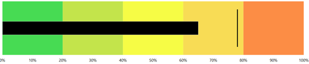
Below, we have included sample images showing how bullet chart looks.

What Can You Learn From This Article?
As a part of this tutorial, we will explore how to create bullet charts using Python data viz library "Matplotlib" and see some examples of how they can be used to represent different types of data. First, we have created a simple bullet chart from sample image above and then added a theme to improve its look further.
Video Tutorial
Please feel free to check below video tutorial if feel comfortable learning through videos.
First, we have imported matplotlib and printed the version that we have used in our tutorial.
import matplotlib

print("Matplotlib Version : {}".format(matplotlib.__version__))
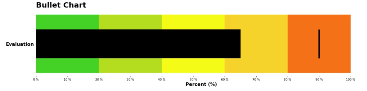
Below we have created our bullet chart using matplotlib.
First, it defines a list of colors to use for the chart.
Then, it creates a new figure. The figsize parameter specifies the size of the figure.
Next, it adds a subplot to the figure with ax = fig.add_subplot(1,1,1) line. The "1,1,1" parameter specifies that the subplot should be a single plot.
The next line creates two horizontal bar charts using the plt.barh() method.
The first bar chart has five bars with a width of 2 and starting at positions 0, 2, 4, 6, and 8, respectively. The y parameter specifies the y-axis positions for the bars, and the color parameter specifies the color for each bar. It is used to create a long horizontal bar of various colors specifying stages.
The second bar chart is a single bar with a width of 6.5 and a height of 0.4, colored black. It is an inner bar chart used to represent current value of the metric.
The next line creates a vertical line using the plt.vlines() method. This is used to represent some kind of threshold for metric value.
The next two lines set the x and y tick labels using the plt.xticks() and plt.yticks() methods. The fontsize and fontweight parameters specify the font size and weight of the tick labels.
The next line hides the spines (the lines that frame the chart).
Finally, the last two lines set the x-axis label and the title of the chart using the plt.xlabel() and plt.title() methods. The loc parameter specifies the location of the title, and the pad parameter specifies the padding around the title.
import matplotlib.pyplot as plt

colors = ["#19d228", "#b4dd1e", "#f4fb16", "#f6d32b", "#fb7116"]

fig = plt.figure(figsize=(20,4))

ax = fig.add_subplot(1,1,1)

plt.barh(y=[0,0,0,0,0], width=[2,2,2,2,2], left=[0,2,4,6,8], color=colors);
plt.barh(y=[0], width=[6.5], color="black", height=0.4);

plt.vlines(x=9.0, ymin=-0.2, ymax=0.2, color="black", linewidth=5);

plt.xticks(range(0,11), ["{} %".format(i) for i in range(0,101,10)]);
plt.yticks([0], ["Evaluation"], fontsize=16, fontweight="bold");

ax.spines[["bottom", "top", "left", "right"]].set_visible(False);

plt.xlabel("Percent (%)", fontsize=16, fontweight="bold");
plt.title("Bullet Chart", loc="left", pad=15, fontsize=25, fontweight="bold");
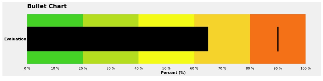
Below, we have recreated our previous example bullet chart but we have introduced a theme to the chart to improve its look. We have wrapped chart code in call to plt.style.context("fivethirtyeight") method. This will apply theme fivethirtyeight to chart.
import matplotlib.pyplot as plt

with plt.style.context("fivethirtyeight"):
    fig = plt.figure(figsize=(20,4))

    ax = fig.add_subplot(1,1,1)

    plt.barh(y=[0,0,0,0,0], width=[2,2,2,2,2], left=[0,2,4,6,8], color=colors);
    plt.barh(y=[0], width=[6.5], color="black", height=0.4);

    plt.vlines(x=9.0, ymin=-0.2, ymax=0.2, color="black", linewidth=5);

    plt.xticks(range(0,11), ["{} %".format(i) for i in range(0,101,10)]);
    plt.yticks([0], ["Evaluation"], fontsize=16, fontweight="bold");

    ax.spines[["bottom", "top", "left", "right"]].set_visible(False);

    plt.grid(False);

    plt.xlabel("Percent (%)", fontsize=16, fontweight="bold");
    plt.title("Bullet Chart", loc="left", pad=15, fontsize=25, fontweight="bold");
This ends our small tutorial explaining how to create bullet charts using the Matplotlib library in Python. Bullet charts are a type of bar chart that is useful for visualizing a single measure along with qualitative ranges.
The author provided step-by-step instructions for creating a bullet chart using Matplotlib, including setting the figure size, adding subplots, creating horizontal and vertical lines, setting the tick labels, hiding the spines, and adding a title and axis label.
The author also included a sample chart and provided tips for customizing the chart to meet different data visualization needs.
Overall, the article provides a helpful introduction to bullet charts and how to create them using Matplotlib in Python.
References
 Sunny Solanki
Sunny Solanki
Intro: Software Developer | Youtuber | Bonsai Enthusiast
About: Sunny Solanki holds a bachelor's degree in Information Technology (2006-2010) from L.D. College of Engineering. Post completion of his graduation, he has 8.5+ years of experience (2011-2019) in the IT Industry (TCS). His IT experience involves working on Python & Java Projects with US/Canada banking clients. Since 2020, he’s primarily concentrating on growing CoderzColumn.
His main areas of interest are AI, Machine Learning, Data Visualization, and Concurrent Programming. He has good hands-on with Python and its ecosystem libraries.
Apart from his tech life, he prefers reading biographies and autobiographies. And yes, he spends his leisure time taking care of his plants and a few pre-Bonsai trees.
Contact: sunny.2309@yahoo.in


![YouTube Subscribe]() Comfortable Learning through Video Tutorials?
Comfortable Learning through Video Tutorials?
If you are more comfortable learning through video tutorials then we would recommend that you subscribe to our YouTube channel.
![Need Help]() Stuck Somewhere? Need Help with Coding? Have Doubts About the Topic/Code?
Stuck Somewhere? Need Help with Coding? Have Doubts About the Topic/Code?
 Stuck Somewhere? Need Help with Coding? Have Doubts About the Topic/Code?
When going through coding examples, it's quite common to have doubts and errors.
If you have doubts about some code examples or are stuck somewhere when trying our code, send us an email at coderzcolumn07@gmail.com. We'll help you or point you in the direction where you can find a solution to your problem.
You can even send us a mail if you are trying something new and need guidance regarding coding. We'll try to respond as soon as possible.
![Share Views]() Want to Share Your Views? Have Any Suggestions?
Want to Share Your Views? Have Any Suggestions?
 Want to Share Your Views? Have Any Suggestions?
If you want to
- provide some suggestions on topic
- share your views
- include some details in tutorial
- suggest some new topics on which we should create tutorials/blogs
 bullet-chart, matplotlib