Simple Dashboard using Panel | <70 Lines of Python Code
Data visualization is a crucial part of any data analysis project, as it helps us to better understand and communicate insights from our data. With the increasing amount of data being generated, it is important to have tools that can quickly create interactive dashboards that can provide insights in real time.
What Can You Learn From This Article?
In this tutorial, we will explain how to build a simple dashboard using "Panel", a Python library that enables developers to easily create interactive web apps. Tutorial explains creation of a dashboard with less than 70 lines of Python code. We will walk through the steps needed to create a dashboard that displays data from a CSV file and can be interacted with in real time.
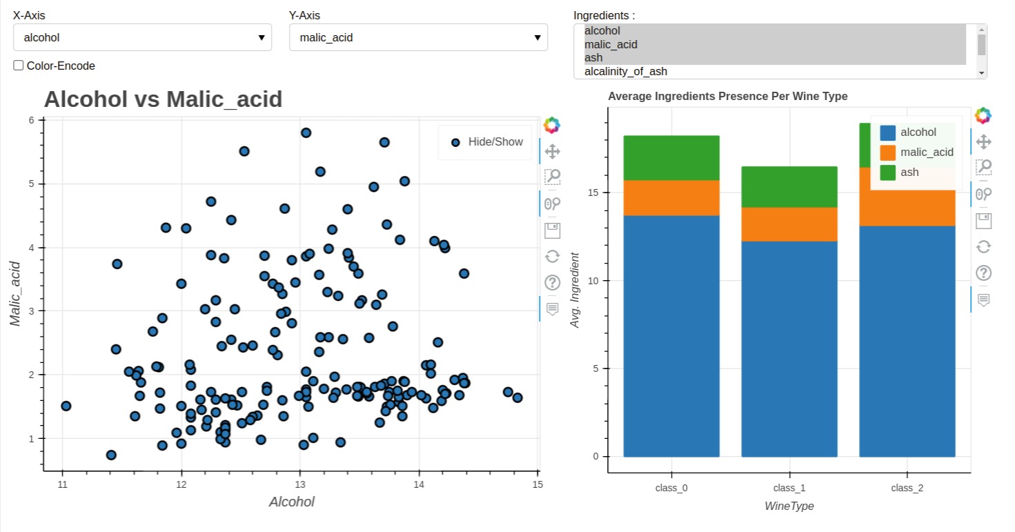
Below, we have included a sample image showing how our dashboard looks.
Dashboard created using Panel can be displayed in Jupyter Notebook as well as an independent web app. We'll first create dashboard in Jupyter Notebook and then will also bring it up as an individual web app.
Whether you are a data scientist, developer, or someone who is just getting started with Python, this tutorial will give you a solid foundation in building interactive dashboards with Panel.
Video Tutorial
If you are comfortable learning through videos then please check our video tutorial. We recommend learning through video and then visiting the blog for code so that if you face any issue with code, you can solve it as you'll have better knowledge.
The code below imports several Python libraries: pandas, pandas_bokeh, sklearn, and panel.
The pn.extension() function is called to activate the Panel extension for Jupyter Notebook or JupyterLab. This allows the creation of interactive visualizations that can be displayed within the notebook or browser.
import pandas as pd
import pandas_bokeh
from sklearn.datasets import load_wine

import panel as pn

pn.extension()
Load Data
In this section, we have loaded the wine dataset which we'll use for our dashboard creation.
The below code defines a function named load_data() that loads the "wine" dataset using the load_wine() function from the sklearn.datasets module. This dataset contains ingredients measurements for three different types of wines.
The function then creates a pandas DataFrame named wine_df from the wine data using pd.DataFrame(). The columns parameter is set to wine.feature_names, which is a list of the column names for the dataset.
The function also adds a new column named "WineType" to the DataFrame, which contains the wine types as strings instead of integers. This is done by mapping the target values (wine.target) to their corresponding names (wine.target_names) using a list comprehension.
The function returns the resulting DataFrame wine_df.
After defining the function, the code calls the function and assigns the resulting DataFrame to wine_df. It also creates a new list named ingredients containing the names of all columns except for the "WineType" column. Finally, it displays the first few rows of the wine_df DataFrame using the head() method.
def load_data():
    wine = load_wine()
    wine_df = pd.DataFrame(wine.data, columns=wine.feature_names)
    wine_df["WineType"] = [wine.target_names[t] for t in wine.target]
    return wine_df

wine_df = load_data()
ingredients = wine_df.drop(columns=["WineType"]).columns.tolist()

wine_df.head()
print("Ingredients : {}".format(ingredients))
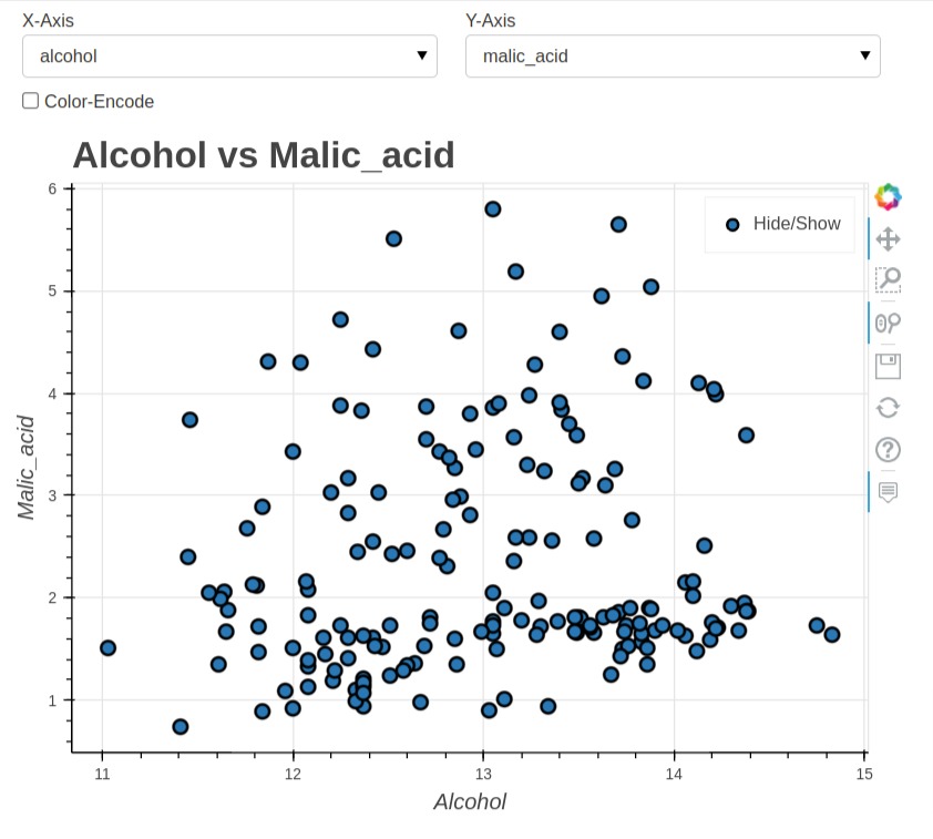
1. Create Scatter Chart
In this section, we have created our first chart which is a scatter chart showing a relationship between two ingredients from our wine dataframe. We have also included code to create widgets and link them with the chart.
The code defines a function named create_scatter_chart() that creates a scatter plot of two variables from the wine_df DataFrame using the plot_bokeh.scatter() method from the pandas_bokeh library.
The function takes three parameters: x_axis, y_axis, and color_encode, which specify the columns of the DataFrame to use as the x-axis and y-axis of the scatter plot, respectively, and specifies whether to encode the wine types using color (if True) or not (if False).
Inside the function, the plot_bokeh.scatter() method is called on the wine_df DataFrame with the specified x_axis and y_axis columns. If color_encode is True, the category parameter is set to "WineType", which means that the wine types will be encoded using different colors in the plot.
The function also specifies the x-axis label (xlabel), y-axis label (ylabel), title (title), font sizes (fontsize_title and fontsize_label), and figure size (figsize) of the plot. It sets show_figure to False, which means that the plot is not displayed immediately.
Finally, the function returns the resulting scatter plot object (scatter_fig).
We'll reuse this function to create a scatter chart with different parameters.
def create_scatter_chart(x_axis="alcohol", y_axis="malic_acid", color_encode=False):
    scatter_fig = wine_df.plot_bokeh.scatter(x=x_axis,y=y_axis, category="WineType" if color_encode else None,
                               xlabel=x_axis.capitalize(),ylabel=y_axis.capitalize(),
                               title="{} vs {}".format(x_axis.capitalize(), y_axis.capitalize()),
                               fontsize_title=20, fontsize_label=12,
                                figsize=(650,500),
                               show_figure=False
                              )

    return scatter_fig
The code below defines three Panel widgets using the pn.widgets module.
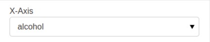
The first widget is a Select widget (dropdown) named x_axis, which creates a dropdown menu with the label "X-Axis" and a list of options specified by the options parameter. In this case, the options parameter is set to ingredients. The value parameter is set to "alcohol", which is the default value of the dropdown menu.
The second widget is also a Select widget named y_axis, which creates a dropdown menu with the label "Y-Axis" and a list of options specified by the options parameter. The options parameter is also set to ingredients, and the value parameter is set to "malic_acid", which is the default value of the dropdown menu.
The third widget is a Checkbox widget named color_encode, which creates a checkbox with the label "Color-Encode" and a default value of False.
The last line of the code displays the x_axis widget, which is a Panel object that can be added to a dashboard or layout.
x_axis = pn.widgets.Select(name="X-Axis", options=ingredients, value="alcohol")
y_axis = pn.widgets.Select(name="Y-Axis", options=ingredients, value="malic_acid")

color_encode = pn.widgets.Checkbox(name="Color-Encode", value=False)

x_axis
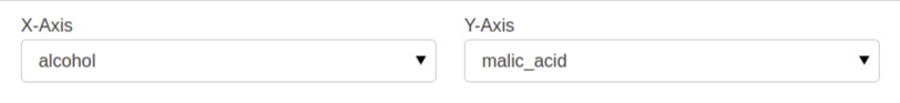
The pn.Row() function takes one or more Panel objects as arguments and arranges them in a row-like fashion. In this case, the x_axis and y_axis widgets, which were defined in the previous code snippet, are passed as arguments to pn.Row().
This code creates a Panel layout with two dropdown menus, the x_axis and y_axis, arranged side by side in a row. This is a common way to let the user select the variables to display in a scatter plot.
pn.Row(x_axis, y_axis)
The below code starts by creating a Panel layout named first_chart using the pn.Column() function, which arranges its arguments vertically in a column. The first_chart layout consists of three items: a row of dropdown menus created using pn.Row(x_axis, y_axis), the color_encode checkbox widget, and the initial scatter plot created by calling the create_scatter_chart() function.
The update_scatter_chart() function takes an event parameter and is triggered when the user changes the value of one of the x_axis, y_axis, or color_encode widgets. The function updates the scatter plot by calling the create_scatter_chart() function with the new values of the x_axis, y_axis, and color_encode widgets, and sets the new scatter plot as the object of the third item in the first_chart Column layout.
The last three lines of code use the param.watch() method from the panel library to watch for changes in the value attribute of the x_axis, y_axis, and color_encode widgets. When one of these widgets is changed, the update_scatter_chart() function is called to update the scatter plot.
first_chart = pn.Column(
                        pn.Row(x_axis, y_axis),
                        color_encode,
                        create_scatter_chart()
                    )

def update_scatter_chart(event):
    first_chart[2].object = create_scatter_chart(x_axis.value, y_axis.value, color_encode.value)

x_axis.param.watch(update_scatter_chart, "value")
y_axis.param.watch(update_scatter_chart, "value")
color_encode.param.watch(update_scatter_chart, "value")

first_chart
print(first_chart)
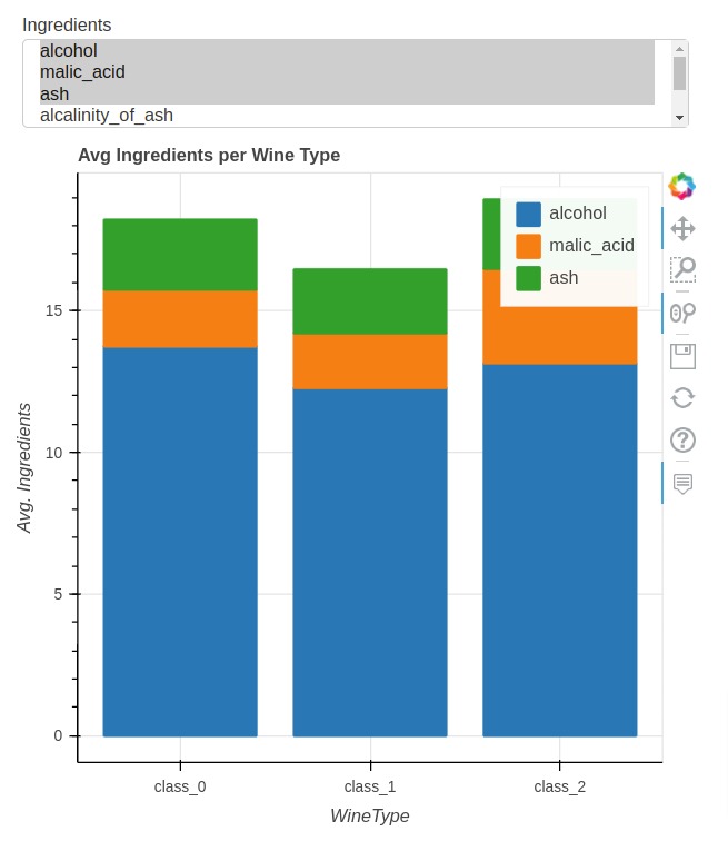
2. Create a Stacked Bar Chart
In this section, we have explained how to create a stacked bar chart for our dashboard and link it with the multi-select widget.
First, we have created a new dataframe below by grouping entries of our original wine dataframe based on WineType column values and then called mean() function to retrieve the average values of grouped entries. The resulting dataframe has average values of ingredients per wine type. Our second stacked bar chart will be created from this dataframe.
avg_wine_df = wine_df.groupby(by="WineType").mean().reset_index()

avg_wine_df
The below code defines a function named create_bar_chart() that creates a bar chart of the average ingredient values for each wine type. The function takes an optional parameter named ingredients, which is a list of ingredient names to include in the chart. If no ingredients list is provided, the chart defaults to showing the average values for the "alcohol", "malic_acid", and "ash" ingredients.
The create_bar_chart() function uses the plot_bokeh.bar() method of a pandas DataFrame named avg_wine_df to create the bar chart. The bar() method is used to create the stacked bar chart.
The "WineType" column of the avg_wine_df DataFrame is used as the x-axis variable, and the ingredients list is used as the y-axis variable. The stacked=True argument tells Bokeh to stack the bars for each ingredient on top of each other. The xlabel, ylabel, and title arguments set the labels for the x-axis, y-axis, and title of the chart, respectively.
The figsize argument sets the size of the figure in pixels.
def create_bar_chart(ingredients=["alcohol", "malic_acid", "ash"]):
    bar_fig = avg_wine_df.plot_bokeh.bar(x="WineType", y=ingredients, stacked=True,
                               xlabel="WineType", ylabel="Avg. Ingredients",
                               title="Avg Ingredients per Wine Type",
                               figsize=(500,500), show_figure=False
                              )

    return bar_fig
The below code above creates a second chart using Panel layout. The chart consists of a MultiSelect widget, which allows the user to select which ingredients to display on the chart, and a bar chart of the average values of the selected ingredients for each wine type.
The MultiSelect widget is created using the pn.widgets.MultiSelect() function. The widget is given the name "Ingredients", and the options argument is set to the ingredients list, which contains the names of all the ingredients in the wine dataset. The value argument is set to a list of three ingredients: "alcohol", "malic_acid", and "ash", which are the default ingredients to display on the chart.
The second_chart object is a Panel Column layout, which places the multi_select widget above the bar chart.
The update_bar_chart() callback is defined to update the bar chart whenever the value attribute of the multi_select widget is changed. The function calls the create_bar_chart function with the updated multi_select.value list of selected ingredients, and updates the second_chart[1].object attribute with the new bar chart object.
multi_select = pn.widgets.MultiSelect(name="Ingredients", options=ingredients,
                                      value=["alcohol", "malic_acid", "ash"])

second_chart = pn.Column(
            multi_select,
            create_bar_chart()
        )

def update_bar_chart(event):
    second_chart[1].object = create_bar_chart(multi_select.value)

multi_select.param.watch(update_bar_chart, "value")

second_chart
print(second_chart)
3. Merge Charts to Create Dashboard
In this section, we have simply copy-pasted code for the first chart and second chart and then combined them using pn.Row() function to create our final dashboard. The dashboard is displayed in jupyter notebook and can be interacted with.
## First Chart with Widgets
first_chart = pn.Column(
                        pn.Row(x_axis, y_axis),
                        color_encode,
                        create_scatter_chart()
                    )

def update_scatter_chart(event):
    first_chart[2].object = create_scatter_chart(x_axis.value, y_axis.value, color_encode.value)

x_axis.param.watch(update_scatter_chart, "value")
y_axis.param.watch(update_scatter_chart, "value")
color_encode.param.watch(update_scatter_chart, "value")

## Second Chart with Widgets
multi_select = pn.widgets.MultiSelect(name="Ingredients", options=ingredients,
                                      value=["alcohol", "malic_acid", "ash"])

second_chart = pn.Column(
            multi_select,
            create_bar_chart()
        )

def update_bar_chart(event):
    second_chart[1].object = create_bar_chart(multi_select.value)

multi_select.param.watch(update_bar_chart, "value")

dashboard = pn.Row(first_chart, second_chart)

dashboard
Running Dashboard as Independent Web App
Panel Let us run our dashboard as an independent app. It let us serve the dashboard from jupyter notebook as well as a Python file. We simply need to call a method named servable() on an object which we need to serve as a web app and then call the below command from shell to bring the web server up to serve the web app.
- panel serve --show jupyter_notebook/pythonfile
In our case, this will be:
- panel serve --show simple_panel_dashboard.ipynb
dashboard.servable()
Web App from Python File
Below, we have included the code for the whole web app which can be saved to a python file. We have saved it to a file named simple_dashboard_panel.py. We can then call below command to run server.
- panel serve --show simple_panel_dashboard.py
import pandas as pd
import pandas_bokeh
from sklearn.datasets import load_wine

import panel as pn

def load_data():
    wine = load_wine()
    wine_df = pd.DataFrame(wine.data, columns=wine.feature_names)
    wine_df["WineType"] = [wine.target_names[t] for t in wine.target]
    return wine_df

wine_df = load_data()
ingredients = wine_df.drop(columns=["WineType"]).columns.tolist()

avg_wine_df = wine_df.groupby(by="WineType").mean().reset_index()

x_axis = pn.widgets.Select(name="X-Axis", options=ingredients)
y_axis = pn.widgets.Select(name="Y-Axis", options=ingredients, value="malic_acid")

color_encode = pn.widgets.Checkbox(name="Color-Encode", value=False)

def create_scatter_chart(x_axis="alcohol", y_axis="malic_acid", color_encode=False):
    scatter_fig = wine_df.plot_bokeh.scatter(x=x_axis, y=y_axis, xlabel=x_axis.capitalize(), ylabel=y_axis.capitalize(), category="WineType" if color_encode else None,
                                         title="{} vs {}".format(x_axis.capitalize(), y_axis.capitalize()),
                                         figsize=(650,500),
                                         fontsize_title= 20, fontsize_label=12, show_figure=False)
    return scatter_fig

first_chart = pn.Column(
                        pn.Row(x_axis, y_axis),
                        color_encode,
                        create_scatter_chart()
                    )

def update_scatter_chart(event):
    first_chart[2].object = create_scatter_chart(x_axis.value, y_axis.value, color_encode.value)

x_axis.param.watch(update_scatter_chart, "value")
y_axis.param.watch(update_scatter_chart, "value")
color_encode.param.watch(update_scatter_chart, "value")

multiselect = pn.widgets.MultiSelect(name="Ingredients :", value=["alcohol", "malic_acid", "ash"], options=ingredients)

def create_bar_chart(ingredients):
    bar_fig = avg_wine_df.plot_bokeh.bar(x="WineType", y=ingredients,
                                        stacked=True,
                                        ylabel="Avg. Ingredient", figsize=(500, 500),
                                        title="Average Ingredients Presence Per Wine Type",
                                        show_figure=False
                                        )
    return bar_fig

second_chart = pn.Column(
                            multiselect,
                            create_bar_chart(["alcohol", "malic_acid", "ash"])
                        )

def update_bar_chart(event):
    second_chart[1].object = create_bar_chart(multiselect.value)

multiselect.param.watch(update_bar_chart, "value")

dashboard = pn.Row(first_chart, second_chart)

dashboard.servable()
 Sunny Solanki
Sunny Solanki
Intro: Software Developer | Youtuber | Bonsai Enthusiast
About: Sunny Solanki holds a bachelor's degree in Information Technology (2006-2010) from L.D. College of Engineering. Post completion of his graduation, he has 8.5+ years of experience (2011-2019) in the IT Industry (TCS). His IT experience involves working on Python & Java Projects with US/Canada banking clients. Since 2020, he’s primarily concentrating on growing CoderzColumn.
His main areas of interest are AI, Machine Learning, Data Visualization, and Concurrent Programming. He has good hands-on with Python and its ecosystem libraries.
Apart from his tech life, he prefers reading biographies and autobiographies. And yes, he spends his leisure time taking care of his plants and a few pre-Bonsai trees.
Contact: sunny.2309@yahoo.in


![YouTube Subscribe]() Comfortable Learning through Video Tutorials?
Comfortable Learning through Video Tutorials?
If you are more comfortable learning through video tutorials then we would recommend that you subscribe to our YouTube channel.
![Need Help]() Stuck Somewhere? Need Help with Coding? Have Doubts About the Topic/Code?
Stuck Somewhere? Need Help with Coding? Have Doubts About the Topic/Code?
 Stuck Somewhere? Need Help with Coding? Have Doubts About the Topic/Code?
When going through coding examples, it's quite common to have doubts and errors.
If you have doubts about some code examples or are stuck somewhere when trying our code, send us an email at coderzcolumn07@gmail.com. We'll help you or point you in the direction where you can find a solution to your problem.
You can even send us a mail if you are trying something new and need guidance regarding coding. We'll try to respond as soon as possible.
![Share Views]() Want to Share Your Views? Have Any Suggestions?
Want to Share Your Views? Have Any Suggestions?
 Want to Share Your Views? Have Any Suggestions?
If you want to
- provide some suggestions on topic
- share your views
- include some details in tutorial
- suggest some new topics on which we should create tutorials/blogs
 dashboard, panel