Basic Principles of Information Visualization
We'll be discussing the basic principles of visualizing data that you have collected and analyzed. We'll be talking about various principles to keep in mind when forming visualization which makes sense to the human brain. Our main focus during this blog will be to learn about ways that help present data that is intuitive to the human brain and can be very easily interpreted without any kind of training.
Data Visualization
Data visualization is divided into 3 categories:
- Information Visualization: It typically refers to abstract information that may not have a position in space like line chart representing stock price over years.
Examples: static plots using matplotlib, seaborn, etc. - Scientific Visualization: It typically refers to representing data that has a physical representation in space like sonography report, methane distribution in combustion engine, CT Scan report, MRI scan report where each data point has an actual 3D location in space.
- Visual Analytics: It typically refers to interactive dashboards/visualizations and statistical algorithms that one can analyze from a different aspect.
Examples: dashboards using dash, plotly, bokeh, voila, panel, etc
We'll be concentrating on Information Visualization in this blog.
What is Information Visualization?
It refers to the visual representation of information keeping below mentioned goals in mind:
- Effective Communication of Information
- Clarity
- Integrity (You represent only information and nothing else)
- Stimulate viewer engagement
Our main focus will be the effectiveness of visualized information as it helps with faster interpretations, more distinctions and fewer errors.
Why Information Visualization Important?
As the amount of data increases over time, we need an efficient way to represent such a vast amount of data so that meaningful insight can be derived from it which would be otherwise impossible by going through it manually.
One more motivation behind information visualization is that the human visual system has the highest bandwidth channel to the human brain. Our brain can easily interpret information represented on screen which has almost a million pixels of data.
The human brain is also extremely good at detecting patterns in data represented visually.
Data Visualizations can reveal data that sometimes you might not be able to derive using statistics.
Important Topics of Information Visualizations
We'll be covering below mentioned important topics of information visualizations which can help one represent data very accurately using visualization:
- Data Types and Visual Mappings
- Data Dimensions
- Visual Encodings
- Visual Perception
- Evaluation
1. Data Types and Visual Mappings
In order to visualize data, we need to map datasets to visual attributes. It's also referred to as data encoding. It generally consists of two steps:
- Classify data types
- Determine which visual attributes represent data types most effectively.
1.1. Data Types
- Nominal (Fruits: apples, oranges,...)
- Ordinal (Quality of mean : Grade A, AA, AAA)
- Quantitative
- Interval (Dates: Jan 5,2015; location: [LAT 45 LONG 153])
- Ratio (Physical measurement: length, mass ...)
Operations Permitted On Data Types
- Nominal:
- Operation: =, !=
- Ordered
- Operations: =, !=, >, <, >=, <=
- Quantitative - Interval:
- Operations: =, !=, >, <, >=, <=, -
- Can measure distances/spans
- Quantitative - Ratio:
- Operations: =, !=, >, <, >=, <=, -, /
- Can measure ratios/proportions
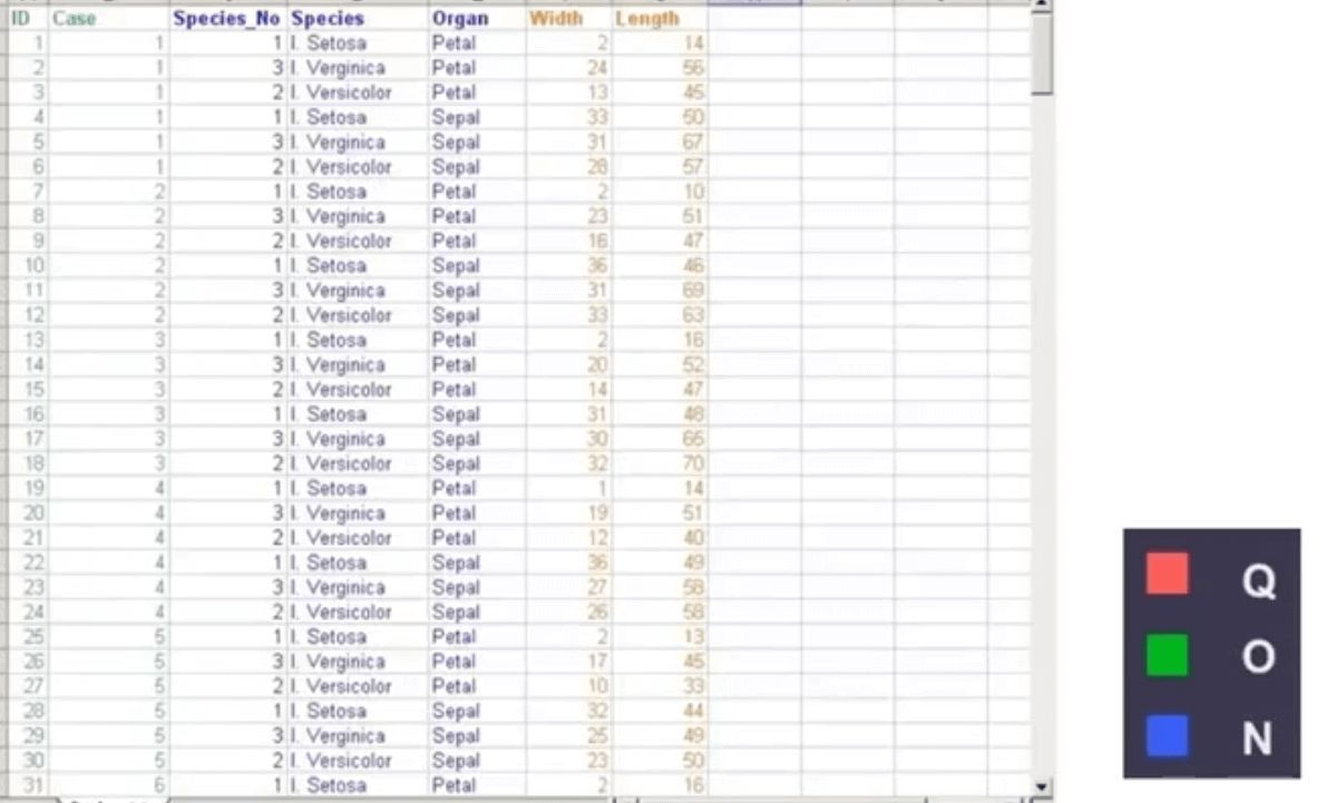
Small Exercise
Please feel free to look at the small dataset below and try to identify which columns refer to which data type(nominal, ordinal or quantitative?).
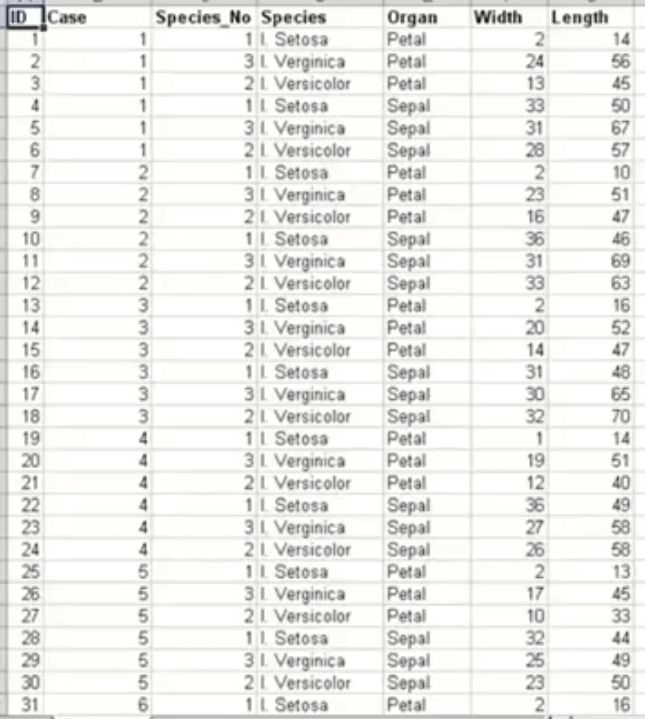
ANSWER:
1.2. Mapping Data Types to Visual Attributes
French cartographer Bertin presented 7 key visual attributes that can be used to represent data in 0/1/2 dimensions. Below we have mentioned that 7 attributes:
- Position - Position in (X, Y) dimension
- Size - the size of data
- Value
- Texture - Texture like a dashed line, dotted line, etc.
- Color
- Orientation - Data from various angles.
- Shape - Markers in scatter plot like a triangle, squares, circles, etc.
Bertin also provided levels of organization which you can use with various data types:
| Attribute | level of organization |
|---|---|
| Position | N O Q |
| Size | N O Q |
| Value | N O q |
| Texture | N o |
| Color | N |
| Orientation | N |
| Shape | N |
N - Nominal, O - Ordered, Q - Quantitative
We can deduce below points from the table above:
- position and size can be used for nominal, ordered & quantitative data
- Value can be used for nominal, ordinal and in few scenarios quantitative.
- Texture can be used for nominal and in few scenarios for ordered attributes.
- Color, Orientation, and Shape can only be used for nominal data.
Small Exercises
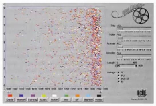
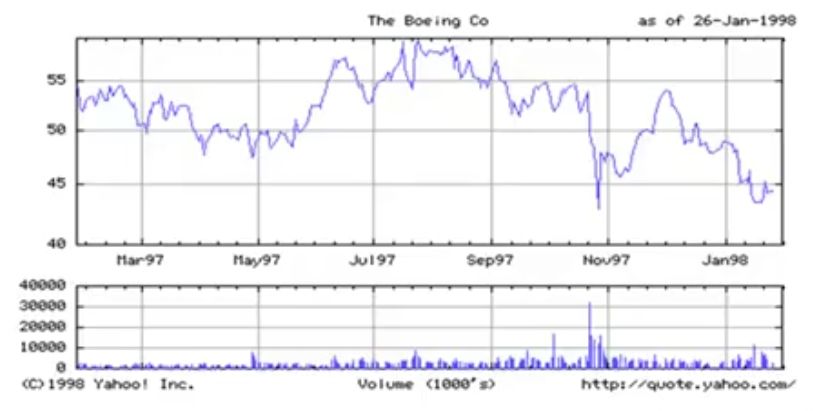
Please go through the image below and identify which data types and mappings are represented in the following visualization:
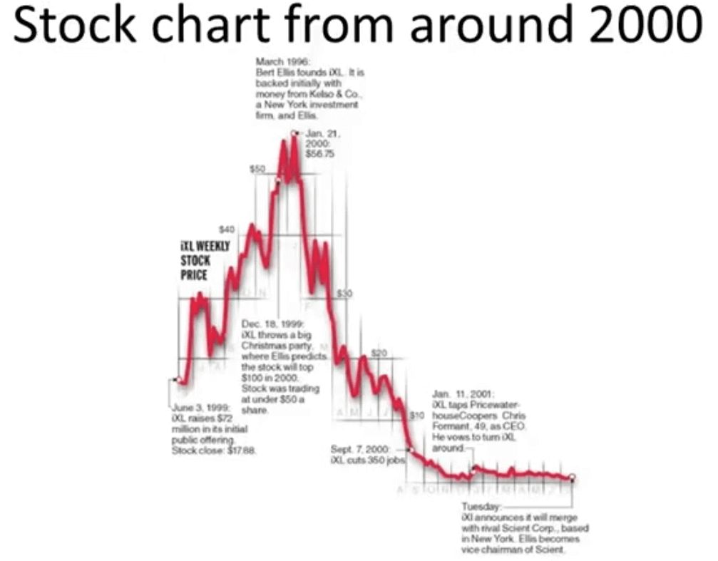
ANSWER:
Above graphs has 2 different variables represented:
- x-axis : time (Quantitative)
- y-axis : price (Quantitative)
Please go through the image below and identify which data types and mappings are represented in the following visualization:
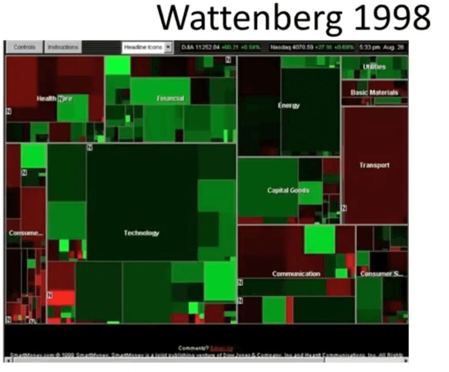
ANSWER:
Above graphs have 4 different variables represented:
- Rectangle Area: Market Cap (Quantitative)
- Rectangle Position: Market Sector (Nominal)
- Color Hue: Gain or Loss (Nominal / Ordinal)
- Color Value: Magnitude of Gain or Loss (Quantitative)
2. Data Combinations & Dimensions
We'll effect of dimensionality on data types to visual attributes mappings. We'll consider data of different dimensions and which visualization can be used to represent it.
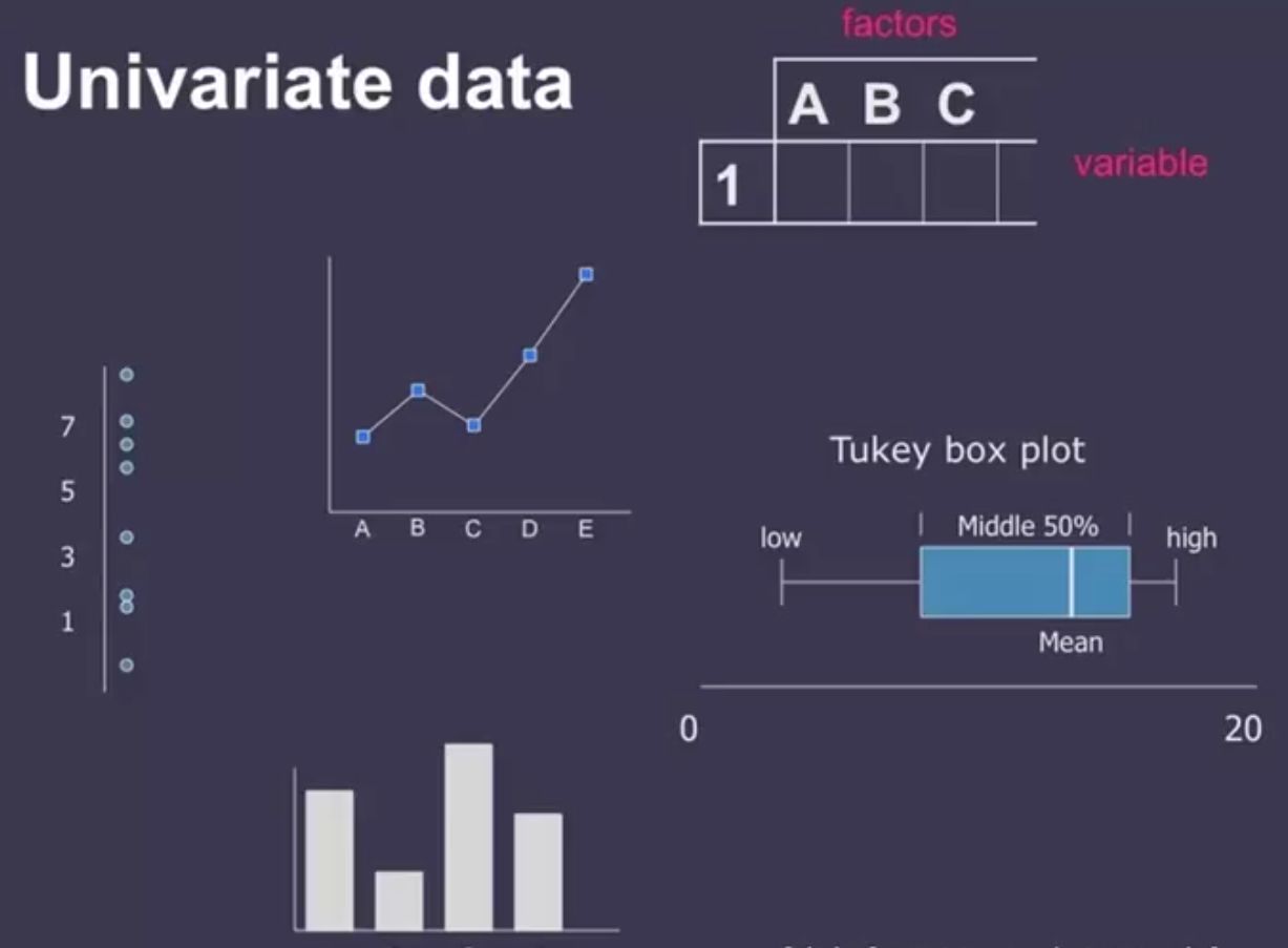
Univariate Data
A dataset with a single variable can be represented with various plots like line chart, bar chart, box plot, dot chart, etc.
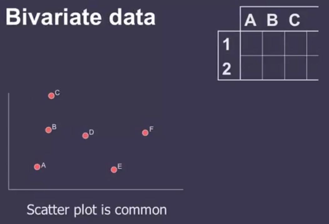
Bivariate Data
A dataset with 2 variables can be easily described using 2D scatter plots.
Trivariate Data
A dataset with 3 variables can be represented with 3D scatter plots but we can't really see an exact representation of the 3rd dimension on a 2-dimensional surface.
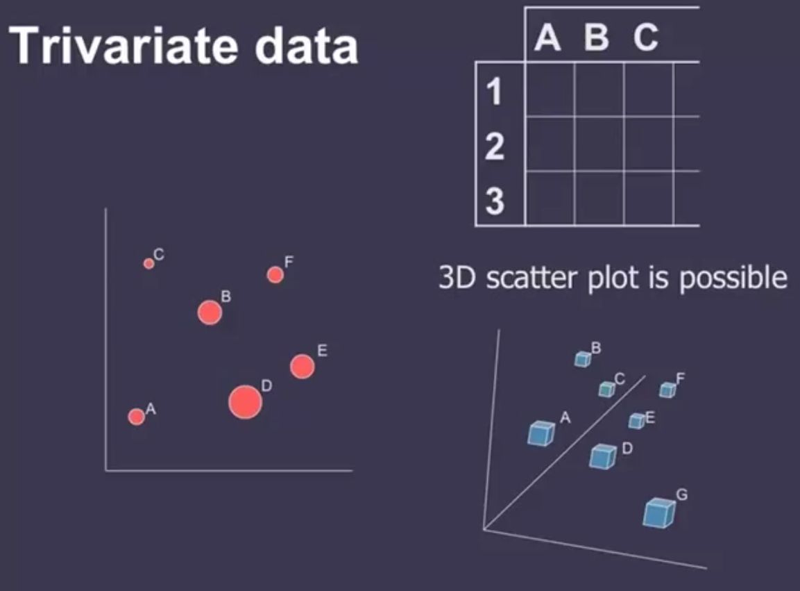
As we can see above that we can't really say where E and F are in relation to one another in 3D scatter plot. Hence, it'll be a better choice to use 2D scatter plot with 3rd dimension represented with attribute.
Two variables [x,y] can map to points(scatter plots, maps, etc.). The third variable [z] must use color, size, shape, etc.
Multidimensional Data
How many variables can be depicted in an image?
Past research shows that it's not possible to cross a barrier of 3 variables on 2D surface visualization but one can use more attributes to represent more than 3-dimensional data.
3. Effective Visual Encodings
Information visualization is all about choosing effective visual encodings to represent information from a given dataset. But choosing best encoding (or mapping) from many possibilities is a challenge. Hence, we'll consider below mentioned 3 basic principles when deciding best encoding:
- Importance Ordering: Encode the most important information in the most perceptually accurate way.
- Expressiveness: Depict all the data and only the data.
- Consistency: Properties of image (visual attributes) should match properties of data.
Importance Ordering
Decades of research has found out below mentioned perceptual properties by our human brain:
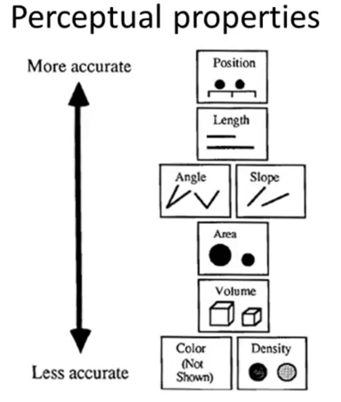
Our brain can accurately identify the difference in position, length and less accurately in color and density. One should decide importance ordering according to the above perceptual properties for the best results.
Expressiveness
Expressiveness is defined as below:
- The sentences (i.e. the visualizations) in the language express
allthe facts in the set of data, andonlythe facts in the data.
Some examples of expressiveness would be that we can not use color/hue to represent which color is greater than another, can't use length attribute to represent a nominal variable, etc.
Consistency
Consistency refers that the properties of the image (visual attributes) that should match the properties of the data. E.g. Don't map one-dimensional data to two-or-three dimensional representations.
Small Exercise
Please go through the below dataset and try to create visualizations that take into account as many dimensions as possible.
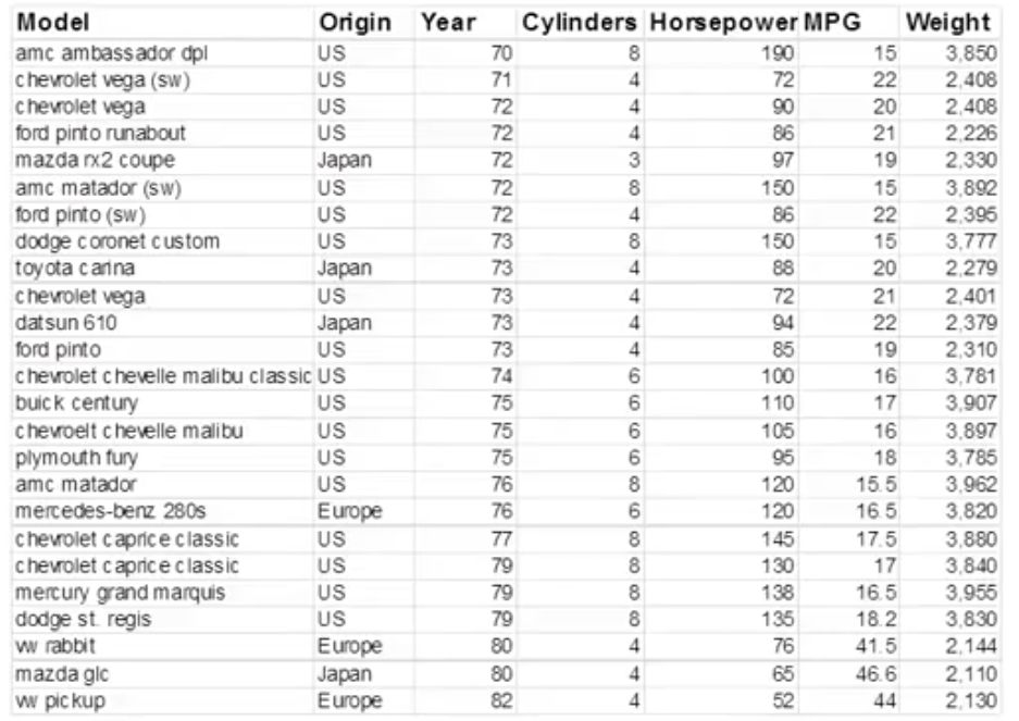
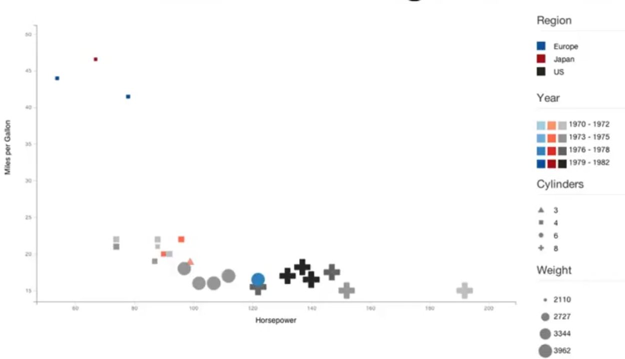
ANSWER
Please find below one of the possible answers on how different variables are encoded. Please make a note that this is not an efficient answer and there can be a different efficient way to represent as well.
Please go through the below image and try to answer whether it's an effective visual representation of data. If yes then try to reason why and if not then why not.
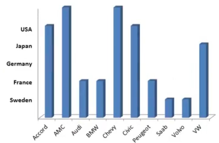
ANSWER
NO. The above visual representation is not expressive because it implies incorrect ordinal relationships among countries.
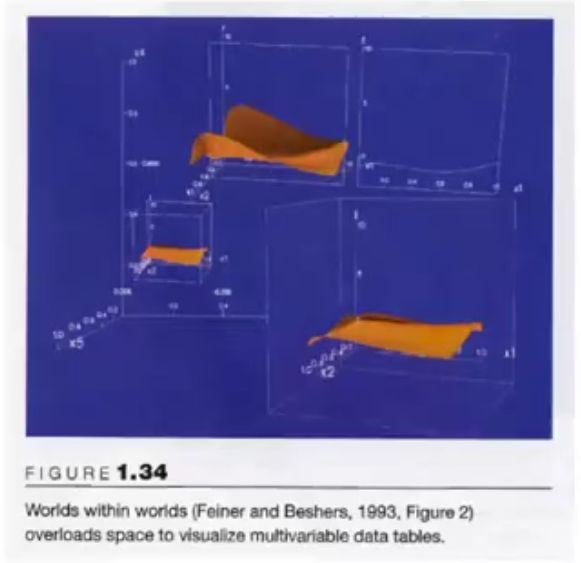
How can one increase the amount of information encoded by spatial position?
There 5 different ways to increase the amount of information encoded by visual representation on 2D surface.
- 1. Composition: It refers to the orthogonal placement of axes. Here you create 2D metric space and align data up along x & y axes in multiple different ways.
- 2. Alignment: It refers to the repetition of an axis at a different position in the space.
- 3. Folding: It refers to the continuation of an axis in an orthogonal dimension.
- 4. Recursion: It refers to repeated subdivision of space.
- 5. Overloading: It refers to the reuse of the same space for different data.
3. Visual Perception
Till now we have discussed data types, visual mappings, etc. Now we'll move on to another end of the spectrum and talk about how the human mind processes that information. It's important to understand how visual perception works in order to effectively design visualizations.
How the Eye Works
70% of our body's sense receptors reside in our eyes. The eye and the visual cortex of the brain form a massively parallel processor that provides the highest bandwidth channel to human cognitive centers. It's important to keep in mind that the eye is not a camera and attention is selective. The camera has good optics whereas the eye has relatively poor optics. The camera has a single focus, white balance, exposure whereas the eye is constantly scanning, constantly adjusting focus, constantly adapting. The camera captures full image whereas the eye works with the mental reconstruction of the image.
How to Use Perceptual Properties of Eye to Design Visualization
- 1. Information visualization should cause what is meaningful to stand out.
Please check the below example which explains what should be kept in mind when designing visualization.
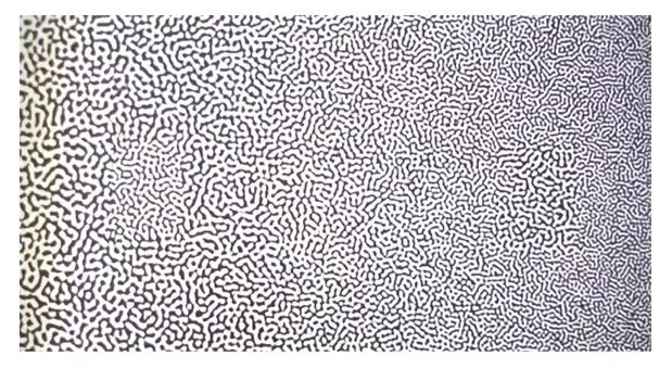
- 2. Preattentive Processing: It implies that certain basic visual properties are detected immediately by low-level visual system. If decision takes a fixed amount of time regardless of a number of distractors, it's considered to be preattentive.
Please check the below example which explains the above point clearly.
Image 1:
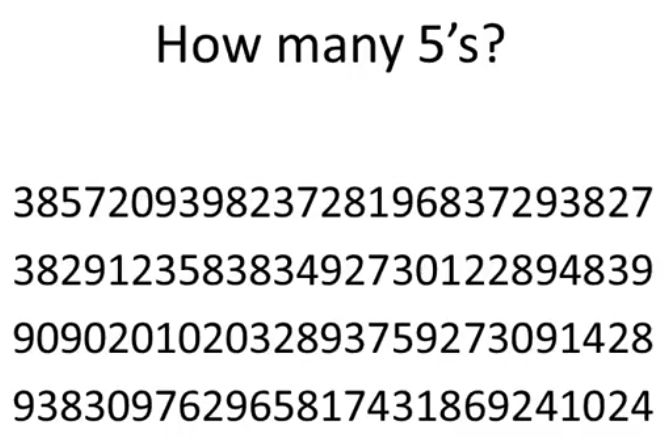
Image 2:
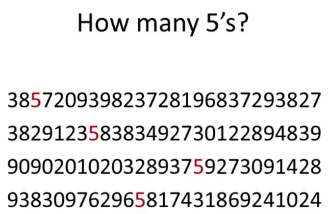
We can clearly see that it takes time to clearly guess a number of fives in the first image than in the second image. It's therefore important to take into consideration points like what can be perceived immediately, which properties are good discriminators, which can mislead viewers when designing visualization.
Below is a list of points which are preattentive:
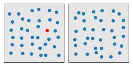
Color(Hue)is preattentive: Detection of the red circle in group of blue circles is preattentive in below visualization.
Form(Curvature)is preattentive: Curved form "pops out" of display in the below image.
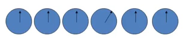
Detection of the slanted linein a sea of vertical lines is preattentive.
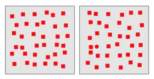
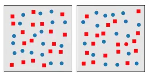
Note; It's important to note that while color and form can be preattentive to the eye but the conjunction of both is not. We can see it in below visualization that it's hard to find a red circle in a sea of req square and blue circle distractors.
- 3. Estimating Magnitude: It refers to how our eye estimates the magnitude of quantitative attributes of data.
Small Exercise
To understand the magnitude, let's start with a simple guessing example. Please try to guess how an area of the small circle is related to a big circle in the below image. Make two guesses after considering.
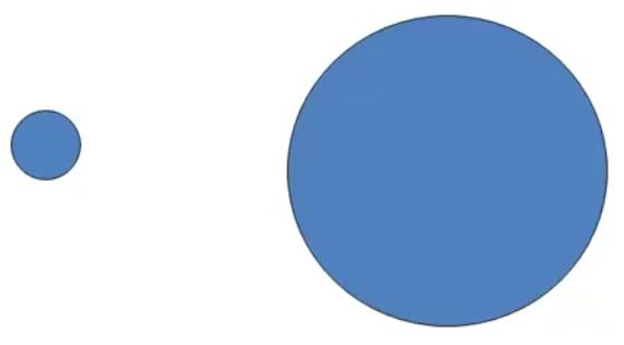
ANSWER
The correct answer is big circles area is 25 times that of small circle.
Research shows that below are magnitude by which people underestimate/overestimate various properties:
Length:0.9 to 1.1Area:0.6 to 0.9 (Underestimation)Volume:0.5 to 0.8 (Even more underestimation)
In the above image, the majority of people think that a big circle has an area of around 16 times that of the small circle. People generally guess magnitude for line accurately.
The below image shows how good the human eye is at estimating relative magnitude for various attributes.
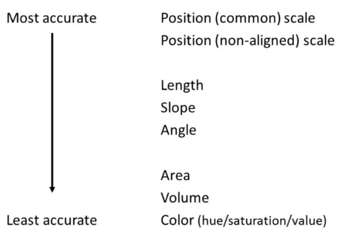
We can notice above that the human eye can accurately estimate magnitude related to the position and least accurately for Color. It suggests that Color(hue/saturation/value) is not a good attribute when representing quantitative variable.
4. How to Evaluate a Visualization
Below is a list of important points to critique when evaluating a visualization:
- First, consider the purpose of the visualization and who is the intended audience.
- Then, ascertain your initial reaction. It helps us decide whether the initial reaction is positive/negative.
- Then, examine the visualization in detail. It helps decide what works and what doesn't.
- Then, answer questions like the following:
- Is design visually appealing/aesthetically pleasing?
- Is it immediately understandable? If not, is it understandable after a short period of study?
- Does it provide insight or understanding that was not obtainable with original representation (text, table, etc)?
- Does it provide insight or understanding better than some alternative visualization would? Or does it require excessive cognitive effort? What kind of visualization might have been better?
- Does the visualization reveal trends, patterns, gaps, and/or outliers? Can the viewer make effective comparisons?
- Does the visualization successfully highlight important information, while providing context for that information?
- Does it distort the information? If it transforms it in some way, is this misleading or helpfully simplifying?
- Does it omit important information?
- Is it memorable?
- Does it use visual components properly? (Does it properly represent the data using lines, color, position, etc? Does it transform nominal, interval, and quantitative information properly?)
- Does it use labels and legends appropriately?
Conclusion
Above mentioned are basic principles if followed well will help you design visualization effectively and will help you get meaningful insights from data. It's also good practice to critique visualization after it’s designed by asking questions mentioned above as it'll help improve end result.
References
- Data Visualization Lectures by Cecilia Aragon on Coursera Course - Introduction to Data Science. The course is no longer available on Coursera when this article was published.
 Sunny Solanki
Sunny Solanki
Intro: Software Developer | Youtuber | Bonsai Enthusiast
About: Sunny Solanki holds a bachelor's degree in Information Technology (2006-2010) from L.D. College of Engineering. Post completion of his graduation, he has 8.5+ years of experience (2011-2019) in the IT Industry (TCS). His IT experience involves working on Python & Java Projects with US/Canada banking clients. Since 2020, he’s primarily concentrating on growing CoderzColumn.
His main areas of interest are AI, Machine Learning, Data Visualization, and Concurrent Programming. He has good hands-on with Python and its ecosystem libraries.
Apart from his tech life, he prefers reading biographies and autobiographies. And yes, he spends his leisure time taking care of his plants and a few pre-Bonsai trees.
Contact: sunny.2309@yahoo.in


![]() Want to Share Your Views? Have Any Suggestions?
Want to Share Your Views? Have Any Suggestions?
 Want to Share Your Views? Have Any Suggestions?
If you want to
- provide some suggestions on topic
- share your views
- include some details in tutorial
- suggest some new topics on which we should create tutorials/blogs
 data-visualizaton